The Micro-Mobility Platforms Dashboard in Power BI helps shared scooter, bike-share, e-bike, and urban mobility teams review operations across 5 report pages, 5 executive KPI cards, and 18 focused chart views. Instead of rebuilding a report from scratch, users can open the .pbix file in Power BI Desktop, replace the sample data source, refresh the model, and start reviewing trips, revenue, operating cost, contribution profit, rider behavior, fleet mix, market performance, and trend movement.
Micro-mobility teams often manage thousands of daily trip records across cities, zones, rider segments, vehicle types, weather conditions, and platform channels. A small change in trip volume, charging cost, repair cost, rider rating, or acquisition quality can change profitability quickly. This dashboard gives managers a ready visual layer for monthly reviews, city performance meetings, fleet planning, and growth analysis.
Download the Micro-Mobility Platforms Dashboard in Power BI
Key Features of Micro-Mobility Platforms Dashboard in Power BI
- 5 report pages: Overview Page, Market, Fleet, Riders, and Trend.
- 5 KPI cards: Total Trips, Total Revenue, Total Operating Cost, Contribution Profit, and Completed Records.
- Interactive slicers: Filter dashboard views quickly by available operational and business fields.
- Profitability reporting: Compare contribution profit, profit margin, revenue, and operating cost by city, platform, vehicle type, zone, channel, and time period.
- Rider and fleet analysis: Review rider rating, user segments, plan revenue, incident rate, vehicle type cost, and trip demand.
- Editable Power BI file: Customize visuals, model relationships, fields, labels, and measures in Power BI Desktop.
For users new to Power BI, Microsoft provides a useful introduction to Power BI Desktop, including how reports are built and edited.
Dashboard Pages Explanation
1 – Overview Page
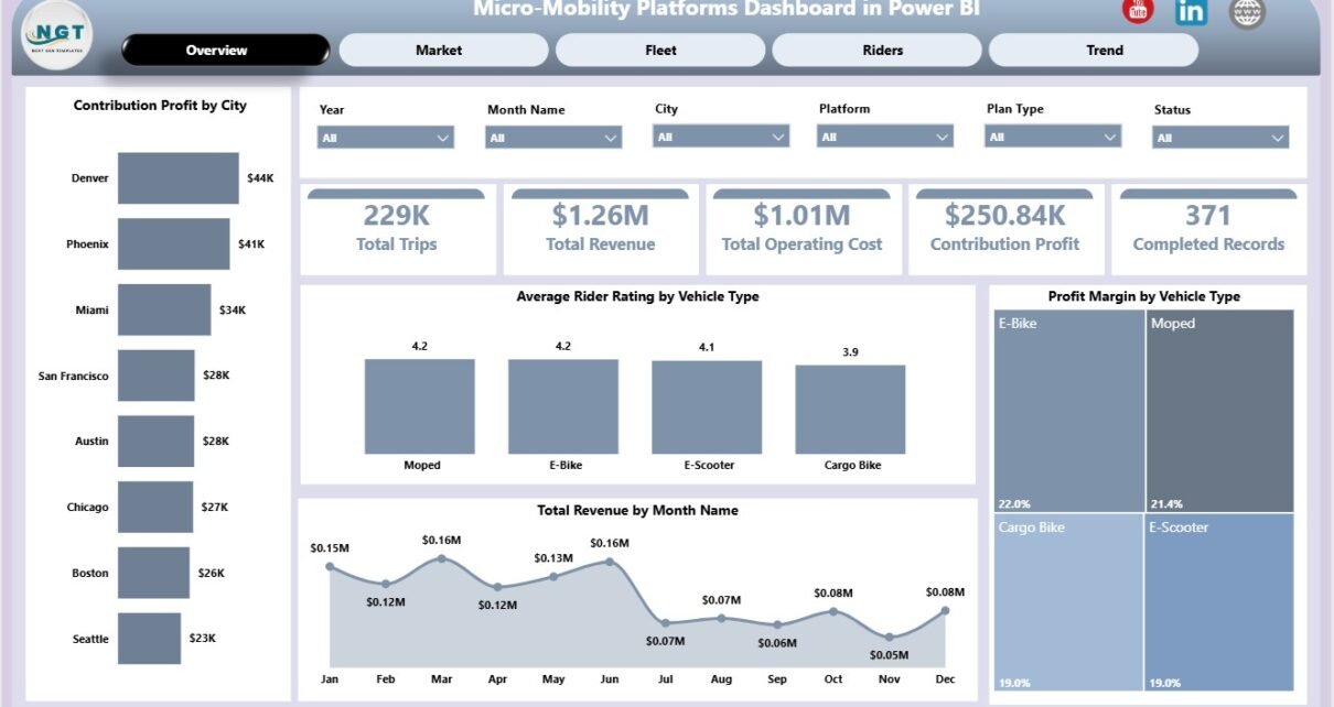
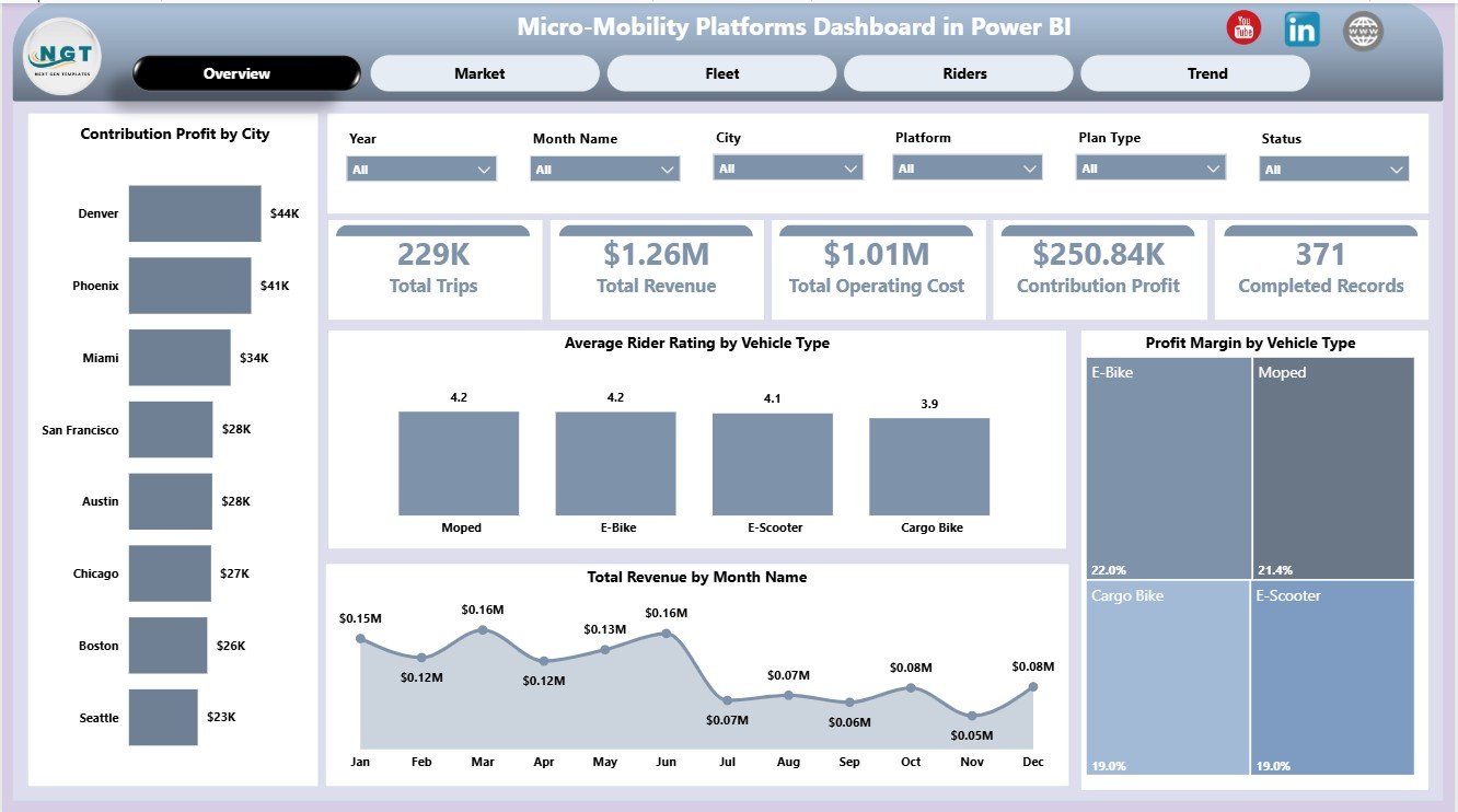
The Overview Page gives a high-level view of the business. At the top, cards show Total Trips, Total Revenue, Total Operating Cost, Contribution Profit, and Completed Records so leaders can understand scale, cost, profitability, and completion activity before drilling into detailed pages.
Contribution Profit by City: This chart compares contribution profit across cities. It helps managers identify profitable markets, weaker locations, and cities where pricing, utilization, or cost control needs attention.
Average Rider Rating by Vehicle Type: This visual compares rider satisfaction by vehicle category. It helps teams understand whether scooters, bikes, e-bikes, or other modes are creating different rider experiences.
Profit Margin by Vehicle Type: This chart shows margin differences across vehicle types. It supports fleet allocation, repair planning, and replacement decisions by connecting asset mix to profitability.
Total Revenue by Month Name: This chart tracks monthly revenue movement. It is useful for spotting seasonality, campaign effects, and changes in rider demand.
2 – Market
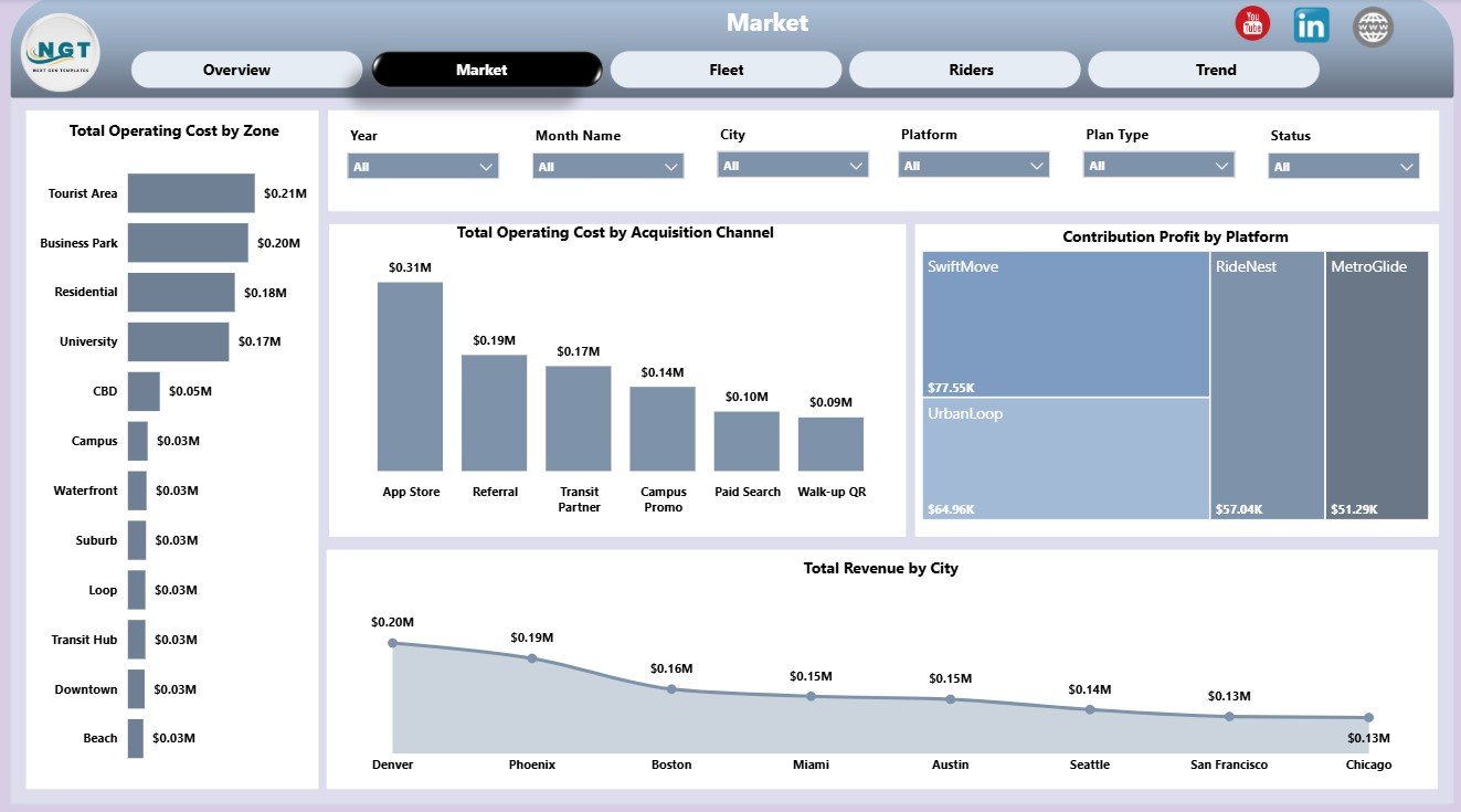
The Market page focuses on zones, acquisition channels, platforms, and cities. It gives operations and growth teams a market-facing view of where cost is concentrated and where revenue or contribution profit is strongest.
Total Operating Cost by Zone: This chart shows which zones create the most operating cost. It can point to maintenance, rebalancing, charging, parking, staffing, or local operating pressure.
Total Operating Cost by Acquisition Channel: This view connects acquisition sources with cost behavior. It helps marketing and finance discuss whether growth channels are producing efficient operating outcomes.
Contribution Profit by Platform: This chart compares profit by platform or service source. It helps identify which channel creates stronger economics after cost.
Total Revenue by City: This chart ranks cities by revenue. It helps market managers compare strong and weak markets quickly.
3 – Fleet
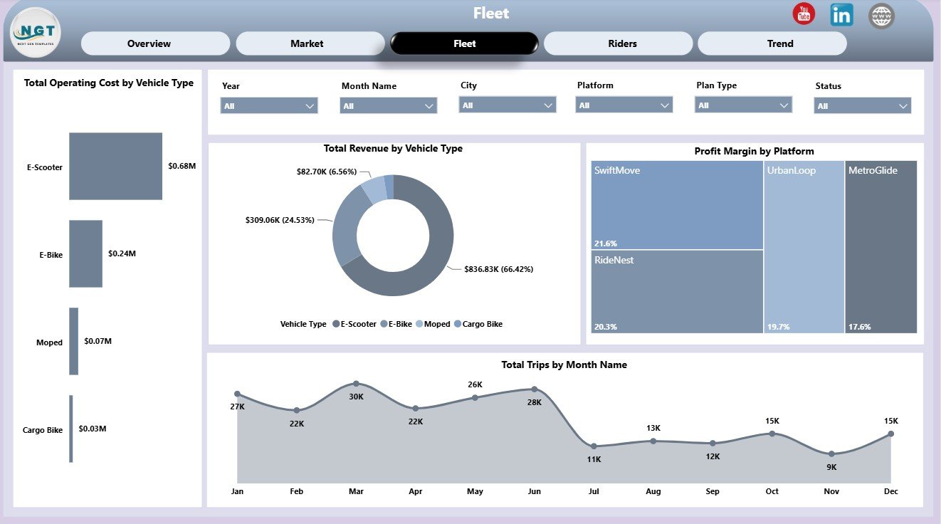
The Fleet page reviews vehicle type, platform margin, and trip demand by month. Fleet managers can use it to see which vehicle types cost more, which generate revenue, and whether trip demand is rising or falling.
Total Operating Cost by Vehicle Type: This chart compares cost by fleet category. It supports decisions around maintenance cycles, charging strategy, field service effort, and replacement planning.
Total Revenue by Vehicle Type: This view compares revenue generated by each vehicle category. It helps teams decide which fleet assets deserve more deployment focus.
Profit Margin by Platform: This chart compares margin by platform. It helps reveal whether platform fees, incentives, pricing, or rider behavior are affecting profitability.
Total Trips by Month Name: This chart shows trip demand across months. It supports staffing, vehicle deployment, and seasonal planning.
4 – Riders
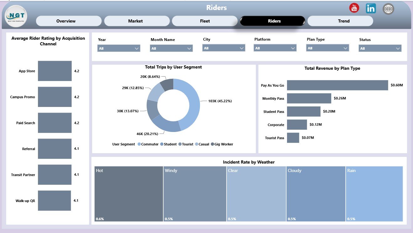
The Riders page connects rider quality, revenue, trip behavior, and incident context. It is useful for customer experience, growth, and safety-focused review meetings.
Average Rider Rating by Acquisition Channel: This chart compares rider rating by acquisition source. It helps growth teams see whether some sources bring riders with better or worse experience signals.
Total Trips by User Segment: This chart compares trip demand by user segment. It helps teams understand how commuters, casual riders, tourists, students, or other segments contribute to usage.
Total Revenue by Plan Type: This view compares revenue across subscription, pass, and pay-as-you-go plans. It supports pricing and plan mix decisions.
Incident Rate by Weather: This chart compares incident rate by weather condition. It helps operations teams review safety risk during rain, heat, cold, or poor visibility.
5 – Trend
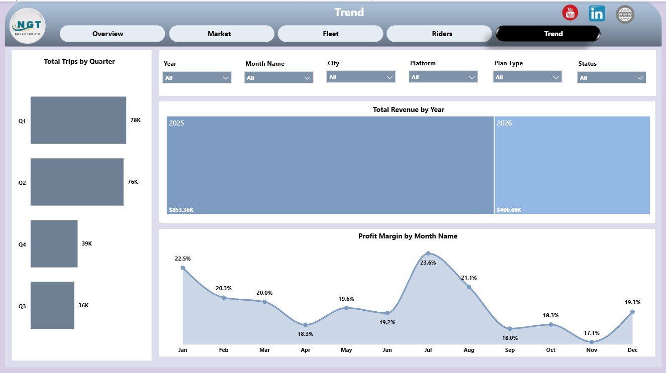
The Trend page is built for time-based review. It helps leadership separate one-off movement from longer-term changes across quarters, years, and months.
Total Trips by Quarter: This chart tracks trip volume by quarter. It helps compare operating periods and understand seasonal demand patterns.
Total Revenue by Year: This chart reviews annual revenue movement. It gives a simple signal of growth, contraction, or flat performance.
Profit Margin by Month Name: This chart tracks margin by month. It helps identify months where cost pressure, incentives, or demand mix affected profitability.
Micro-Mobility Platforms Dashboard in Power BI vs. Tableau vs. Paid Fleet SaaS – Feature Comparison
| Feature | This Power BI dashboard | Tableau or Qlik alternative | Paid fleet SaaS |
|---|---|---|---|
| Cost | One-time template purchase | License and build cost | Recurring subscription |
| Platform | Power BI Desktop and Power BI Service | BI platform setup required | Vendor cloud platform |
| Setup time | Open .pbix and replace sample source | Model and visuals must be built | Implementation and onboarding |
| Real-time team collaboration | Available after publishing to Power BI Service | Available by plan | Usually included by plan |
| Mobile access | Available through Power BI apps after publishing | Available by plan | Usually included |
| Customizable fields | Editable visuals, measures, model, labels, and pages | Editable with BI skills | Limited by vendor permissions |
| Share with link | Available through Power BI permissions | Available by plan | Depends on seats and plan |
| Year-1 cost at 5 users | Template price plus any Microsoft licensing needed | Often hundreds or thousands | Often hundreds or thousands |
| Mobility reporting | Trips, revenue, cost, profit, riders, fleet, city, platform, and trend views | Must be built or adapted | Depends on purchased modules |
Who Should Use This Template
This dashboard is useful for shared scooter operators, bike-share teams, e-bike platforms, urban mobility analysts, transportation consultants, fleet operations managers, city managers, and finance teams that already have structured trip, rider, cost, vehicle, and revenue data.
It is not a live telematics tool, rider billing system, GPS tracker, dispatch tool, or work-order system. It works best as a reporting layer after operational data is exported from approved business systems.
Real-World Use Cases
Anika, city operations manager: reviews operating cost by zone and contribution profit by city before deciding where field teams should focus rebalancing work.
Marcus, fleet finance lead: compares profit margin by vehicle type and platform before recommending whether to expand scooters, bikes, or e-bikes.
Priya, growth analyst: reviews acquisition channel rating, plan type revenue, and user segment trips to understand which customer groups create valuable demand.
Advantages of Micro-Mobility Platforms Dashboard in Power BI
The biggest advantage is speed. The core pages, visuals, and layout are already built, so users can focus on replacing sample data and interpreting results. Power BI also makes it easier to connect data sources, publish reports, and maintain interactive slicers compared with static screenshots or manual slide decks.
The dashboard also supports cross-functional review. Finance can focus on contribution profit and operating cost. Fleet teams can review vehicle type economics. Growth teams can evaluate acquisition channels and plan types. Leadership can use trend pages to understand whether the business is improving over time.
Opportunities for Improvement
Teams with advanced Power BI skills can extend the dashboard further by adding row-level security, automated refresh through Power BI Service, extra DAX measures, deeper cohort analysis, map visuals, or live database connections. These are optional upgrades; the template is already useful as a starting reporting file.
Best Practices
- Keep source field names consistent before refreshing the model.
- Review city and vehicle type definitions so comparisons are fair.
- Separate completed and cancelled trip logic before interpreting contribution profit.
- Use slicers during review meetings instead of duplicating pages for every segment.
- Validate operating cost definitions with finance before sharing executive conclusions.
Explore Relevant Templates
You may also like Micro-Mobility Platforms Dashboard in Excel, Smart Parking Systems KPI Dashboard in Power BI, and more Power BI Dashboard templates.
Frequently Asked Questions
What is included in the Micro-Mobility Platforms Dashboard in Power BI?
It includes 5 Power BI report pages: Overview Page, Market, Fleet, Riders, and Trend, with KPI cards, slicers, and analysis visuals for trips, revenue, cost, contribution profit, riders, fleet, and time trends.
Can I use my own data?
Yes. Open the .pbix file in Power BI Desktop, connect it to your own structured data source, keep the needed fields aligned, and refresh the model.
Do I need Power BI Pro?
No. You can open and edit the dashboard in free Power BI Desktop. Power BI Pro is only needed for publishing and sharing through Power BI Service.
Can I customize the visuals?
Yes. You can edit visuals, labels, pages, model relationships, and measures if you are comfortable working in Power BI.
Is this a live fleet management platform?
No. It is an analytics dashboard template. It does not replace telematics, billing, dispatch, maintenance, or vehicle control tools.
Is this a subscription?
No. It is a one-time downloadable Power BI template.
About the Author
Built by PK – Microsoft Certified Professional with 15+ years of Excel, Google Sheets, and Power BI experience. Founder of NextGenTemplates, reaching 300K+ subscribers across YouTube channels. Every template is hand-built and tested before release.
Conclusion
The Micro-Mobility Platforms Dashboard in Power BI gives mobility teams a practical way to review trips, revenue, operating cost, contribution profit, rider experience, vehicle performance, market performance, and trend movement in one editable report. It is a strong fit for teams that want a ready Power BI starting point without paying for a custom build or recurring analytics subscription.
Click here to purchase Micro-Mobility Platforms Dashboard in Power BI
Visit our YouTube channel to learn step-by-step Excel and Power BI tutorials.