Organ Donation Networks Dashboard in Excel is a ready-to-use workbook for tracking organ donation referrals, recovered organs, transplanted organs, recovery cost, cold ischemic time, non-utilization, consent authorization, hospitals, states, regions, networks, organ types, blood types, and monthly trends.
The reporting need is serious. OrganDonor.gov reports more than 103,000 people on the U.S. transplant waiting list, and HRSA reported more than 48,000 organ transplants in 2024. For organ procurement organizations, transplant teams, and healthcare analysts, clean Excel reporting can make review meetings faster and performance gaps easier to spot. This dashboard lets you replace the sample data, refresh the workbook, and review multiple pages without building every chart manually.
Click here to purchase Organ Donation Networks Dashboard in Excel
Organ Donation Networks Dashboard in Excel
Key Features of Organ Donation Networks Dashboard in Excel
The workbook includes 5 dashboard pages: Overview, Network, Organ Mix, Utilization, and Trends. Together, these pages cover executive KPIs, coordinator activity, hospital cost, state-level transplant rate, organ type analysis, blood type mix, recipient group referrals, status tracking, non-utilization, authorization percentage, and month-over-month patterns.
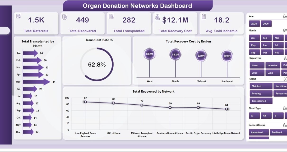
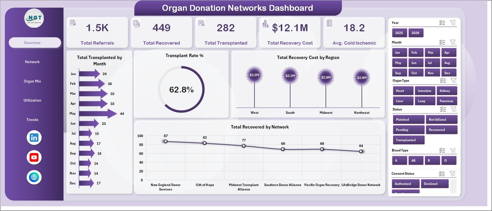
The Overview page includes 5 high-level cards: Total Referrals, Total Recovered, Total Transplanted, Total Recovery Cost, and Avg. Cold Ischemic. These cards give managers a quick read on volume, outcome, cost, and time-sensitive organ preservation metrics.
The template also includes multiple slicers, so users can filter the dashboard quickly and review focused views by available fields. The Data sheet holds the source records, and the Support sheet contains PivotTables that drive the entire dashboard dynamically.
Dashboard Pages Explanation
1 – Overview Page
The Overview page summarizes the organ donation network at a leadership level. It includes KPI cards for Total Referrals, Total Recovered, Total Transplanted, Total Recovery Cost, and Avg. Cold Ischemic.
Total Transplanted by Month: This chart shows transplanted volume by month, helping teams identify monthly peaks, dips, and changes in transplant activity.
Transplant Rate % by Overall Cases: This view compares transplant outcomes against overall cases, making it easier to monitor conversion from referral to transplant.
Total Recovery Cost by Region: This chart compares recovery cost across regions, helping finance teams find cost concentration and regional variance.
Total Recovered by Network: This chart shows recovered volume by network, highlighting where recovery performance is strongest.
Organ Donation Networks Dashboard in Excel
2 – Network
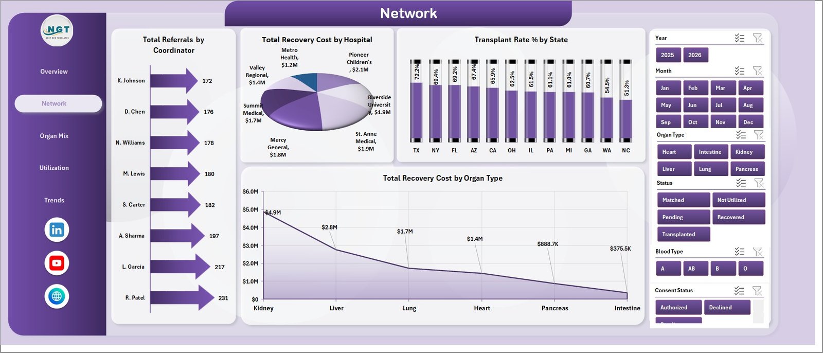
The Network sheet focuses on coordinator, hospital, state, and organ type performance.
Total Referrals by Coordinator: This chart shows how referral volume is distributed by coordinator and helps managers review workload balance.
Total Recovery Cost by Hospital: This chart compares recovery cost by hospital so analysts can identify where recovery expense is highest.
Transplant Rate % by State: This chart reviews transplant rate by state and supports regional performance comparisons.
Total Recovery Cost by Organ Type: This chart breaks recovery cost down by organ type and helps teams review cost patterns by organ category.
Network
3 – Organ Mix
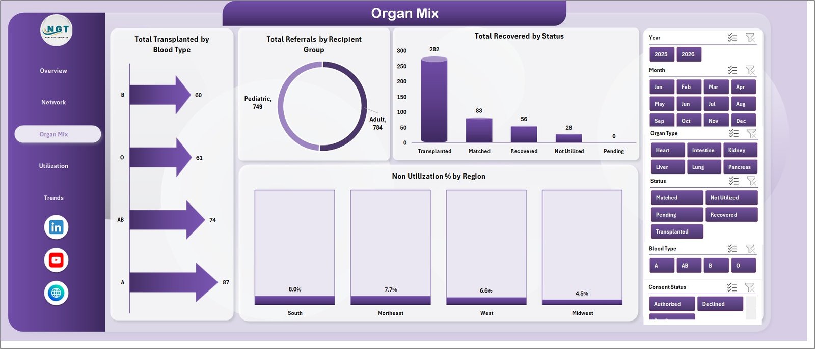
The Organ Mix sheet helps users understand transplant and recovery patterns by blood type, recipient group, status, and region.
Total Transplanted by Blood Type: This chart compares transplanted volume by blood type and helps teams understand the mix of transplant outcomes.
Total Referrals by Recipient Group: This chart shows referral volume by recipient group, supporting population-level planning and reporting.
Total Recovered by Status: This chart breaks recovered counts by status so users can understand how cases move through the workflow.
Non Utilization % by Region: This chart highlights non-utilization percentage by region, helping users identify areas needing deeper operational review.
Organ Mix
4 – Utilization
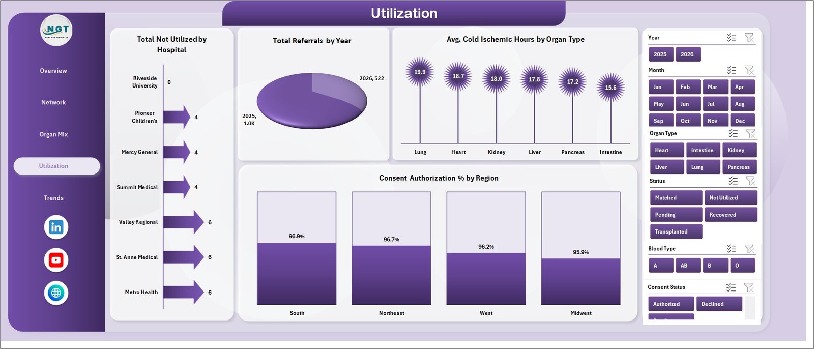
The Utilization sheet focuses on non-utilized volume, referral trend by year, cold ischemic time, and authorization performance.
Total Not Utilized by Hospital: This chart compares non-utilized organs or cases by hospital and points teams toward areas for process review.
Total Referrals by Year: This chart shows annual referral movement and helps users understand long-term activity changes.
Avg. Cold Ischemic Hours by Organ Type: This chart tracks cold ischemic hours by organ type, an important logistics and preservation metric.
Consent Authorization % by Region: This chart compares authorization percentage across regions and supports outreach, training, and coordinator discussions.
Utilization
5 – Trends
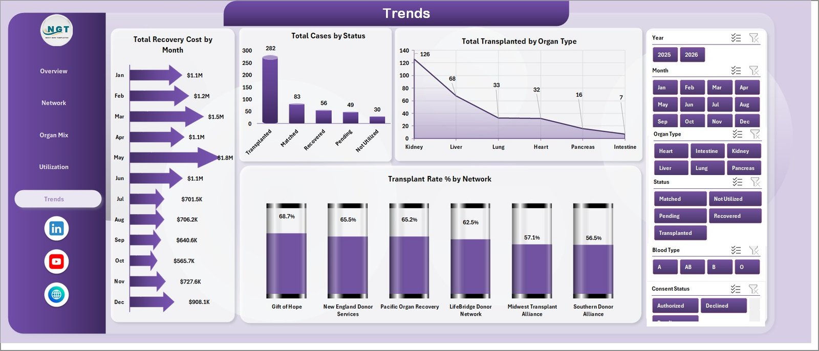
The Trends sheet helps teams review cost, case status, transplant type, and network-level transplant rate over time.
Total Recovery Cost by Month: This chart tracks monthly recovery cost and helps identify budget spikes or unusual cost movement.
Total Cases by Status: This chart shows total cases by status, giving users a quick view of the donation and transplant workflow mix.
Total Transplanted by Organ Type: This chart compares transplanted counts by organ type and shows which organ categories contribute most to transplant volume.
Transplant Rate % by Network: This chart compares transplant rate by network and supports network-level benchmarking.
Trends
6 – Data Sheet Tab
The Data Sheet tab is where you add data in the same format as the sample records. Keep the headers and structure unchanged so PivotTables, slicers, and dashboard charts continue to work correctly.

Data Sheet tab
7 – Support Sheet
The Support Sheet contains the PivotTables used to create the dashboard dynamically. After updating the Data sheet, go to the Data tab in the Excel Ribbon and click Refresh All. All pivots and charts will refresh, and you can keep this sheet hidden.

Support sheet tab
Organ Donation Networks Dashboard in Excel vs. Google Sheets vs. Paid Healthcare SaaS – Feature Comparison
| Feature | Organ Donation Networks Dashboard in Excel | Google Sheets Alternative | Paid Healthcare SaaS |
|---|---|---|---|
| Cost | $17.99 one-time sale price | Low cost, but usually manual build | Monthly or annual subscription |
| Platform | Microsoft Excel | Browser-based spreadsheet | Vendor cloud platform |
| Setup time | Replace data and refresh | Build charts, formulas, and pivots manually | Onboarding and configuration required |
| Real-time team collaboration | Possible with OneDrive or SharePoint | Strong collaboration | Plan-dependent |
| Customizable fields | Fully editable workbook | Fully editable sheet | Limited by vendor settings |
| Share with link | Possible through Microsoft 365 | Built in | Plan-dependent |
| Year-1 cost at 5 users | Template price plus existing Excel licensing | Workspace cost plus build time | Often hundreds or thousands per year |
| Donation network analytics | Pre-built for referrals, recovery, transplant, cost, utilization, and ischemic hours | Requires manual design | Depends on vendor reports |
Who Should Use This Template
This template is useful for organ procurement organizations, transplant coordination teams, hospital operations analysts, nonprofit healthcare networks, healthcare consultants, and finance teams reviewing recovery cost.
It is not a donor registry, EHR, organ matching system, compliance platform, live OPTN data feed, or clinical decision support system. It is an Excel analytics dashboard for reporting after data has been exported or prepared.
Real-World Use Cases
Neha, a transplant operations manager, uses the Overview and Utilization pages before weekly review meetings to check referrals, transplant rate, cold ischemic hours, and non-utilized cases.
Marcus, a healthcare finance analyst, reviews recovery cost by region, hospital, organ type, and month to prepare budget variance commentary for leadership.
Elena, a healthcare consultant, adapts the workbook for client workshops and uses slicers to compare network, state, and hospital patterns during performance review sessions.
Advantages of Organ Donation Networks Dashboard in Excel
The main advantage is speed. Instead of creating PivotTables, charts, slicers, and formatting from scratch, users can start with a ready dashboard and focus on replacing the sample data.
The workbook also keeps reporting local and editable. Teams that already use Microsoft Excel can customize chart colors, adjust PivotTables, add fields, or copy visuals into PowerPoint reports. Because the dashboard uses familiar Excel components, analysts can audit and modify the structure without being locked into a vendor dashboard.
The sheet structure also supports repeated review. Data sits in one tab, PivotTables sit in the Support sheet, and dashboard pages stay clean for presentation.
Opportunities for Improvement
The dashboard does not connect automatically to live transplant systems or OPTN data. Users need to export or prepare their own source data and paste it into the Data sheet.
The workbook is designed for reporting and analysis, not clinical workflow execution. Organizations needing secure role-based records, real-time case management, automated matching, audit workflows, or compliance controls should use dedicated healthcare systems.
Excel collaboration depends on how the file is stored. If multiple users must edit simultaneously, use OneDrive or SharePoint carefully, or maintain one controlled master file.
Best Practices
Keep the original template as a backup before adding your data. Work from a copied file so you can always return to the original structure.
Do not rename or delete source columns in the Data sheet unless you are comfortable updating the related PivotTables and charts.
Refresh the workbook after every major data update. Go to the Data tab in Excel and click Refresh All so the Support sheet, slicers, and charts update together.
Review outliers before presenting results. Large cost changes, low authorization percentages, unusual cold ischemic hours, and high non-utilization rates should be checked against source records.
Explore Relevant Templates
You may also like Online Therapy Apps Dashboard in Excel, Dialysis Centers Dashboard in Excel, and Nonprofit Organizations Dashboard in Google Sheets.
Browse more Excel Dashboard templates and Health and Safety Excel templates.
Frequently Asked Questions
What does the Organ Donation Networks Dashboard track?
It tracks referrals, recovered organs, transplanted organs, recovery cost, average cold ischemic hours, transplant rate, consent authorization, non-utilization, hospitals, states, regions, networks, organ types, blood types, recipient groups, status, month, and year.
Can I use my own organ donation data?
Yes. Replace the sample records in the Data sheet while keeping the same column structure, then click Refresh All in Excel.
Does this dashboard require macros?
No macros are required for the standard dashboard workflow. It uses Excel tables, PivotTables, charts, and slicers.
Can I customize the dashboard pages?
Yes. You can edit chart styles, slicers, PivotTables, colors, formulas, and source fields in Microsoft Excel.
Is this connected to OPTN or any live transplant database?
No. This is a standalone Excel dashboard. You need to export or prepare your own data and add it to the Data sheet.
Is this a clinical decision support tool?
No. It is an analytics workbook for reporting and review. It should not be used as a donor matching system, EHR, registry, or clinical decision tool.
About the Author
Built by PK – Microsoft Certified Professional with 15+ years of Excel, Google Sheets, and Power BI experience. Founder of NextGenTemplates, reaching 300K+ subscribers across YouTube channels. Every template is hand-built and tested before release.
Conclusion
The Organ Donation Networks Dashboard in Excel gives healthcare and transplant analytics teams a structured way to review referrals, recovery, transplants, cost, cold ischemic hours, utilization, consent authorization, and network performance. With five dashboard pages, a Data sheet, and a Support sheet powered by PivotTables, it is built for fast reporting inside Microsoft Excel.
Click here to purchase Organ Donation Networks Dashboard in Excel
Instant download. One-time payment. No subscription.
Visit our YouTube channel for step-by-step video tutorials: Youtube.com/@PK-AnExcelExpert
Last updated: July 18, 2026