A DIY and home improvement chain generates an awkward mix of numbers. Comparable-store sales growth behaves like a supermarket metric. Special-order fill rate and job-site delivery behave like a distribution metric. Pro customer mix behaves like a B2B metric. And shrink, safety incidents and associate turnover behave like nothing else on the list, because for all three a lower number is the good outcome. Most monthly review packs flatten that into a single column of percentages and quietly punish the teams doing well on the lower-is-better metrics.
The DIY Home Improvement Stores KPI Dashboard in Excel is built to avoid exactly that. It is a month-picker KPI scorecard carrying 15 retail KPIs across 8 KPI groups, with per-KPI direction flags so a falling shrink rate scores above target instead of below it. It ships as a 10-sheet .xlsx workbook with 24 months of sample data – twelve months of 2025 actuals and targets plus twelve months of 2024 prior-year figures – and it contains no macros, no Power Query, no data model and no add-ins. Every number on every page is a plain worksheet formula, so it opens in Excel 2013 and later, in Microsoft 365 and in Excel for the web.
One thing to settle before anything else, because the names are nearly identical. This is the KPI scorecard: one dropdown, 15 traffic-light rows, a single-KPI trend page and a group roll-up. It is not the DIY Home Improvement Stores Dashboard in Excel, which is the analytical line – pivots and slicers over a transaction table. Different question, different tool. Plenty of teams end up running both.
Key Features of the DIY Home Improvement Stores KPI Dashboard in Excel
One dropdown drives the entire scorecard
Cell D6 on the KPI Dashboard sheet lists the twelve months of your reporting year. Change it and the 15 KPI rows, the seven summary cards and the whole KPI Analysis page re-read from that month. There is no refresh step, no query to run and no data model to reload – the recalculation is instant because it is worksheet arithmetic.
Direction-aware achievement, so lower-is-better KPIs are scored honestly
Every KPI carries a UTB (upper the better) or LTB (lower the better) flag on the KPI Definition sheet. Achievement is Actual ÷ Target for UTB and Target ÷ Actual for LTB. In the shipped KPI set, Recordable Safety Incidents, Inventory Shrink Rate and Associate Turnover Rate all run LTB, so cutting them scores above 100% exactly the way beating a sales target does. The arrows follow the same logic: the arrow shows the raw direction, its colour shows whether that direction is good for that KPI, which is why a falling cost shows a green down-arrow.
Traffic lights you can re-cut in two formulas
On Target from 100%, At Risk from 95% to 99%, Missed below 95%. Those thresholds are not baked into conditional formatting rules you would have to unpick – they live in the formulas in columns L and U on KPI Dashboard. A chain with a tighter governance band edits two cells.
MTD and YTD side by side, with prior year on both
Each KPI row carries Actual, Target, Achievement %, Status, Prior Year and a vs-PY movement for month-to-date and year-to-date. Rate and ratio KPIs run as YTD running averages; counts such as recordable safety incidents accumulate through the year. Both MTD and YTD are stored in the input sheets rather than derived, so you keep control of how your year-to-date is defined instead of inheriting someone else’s assumption.
Room to grow without touching a formula
The sheets are wired for 22 KPI rows. Fifteen are filled; seven are live and empty. Type a new KPI on KPI Definition and it flows through the three input sheets, the scorecard, the trend picker and the analysis roll-up immediately. Rename one there and every sheet follows. Clear a row and the summary cards recount themselves.
Dashboard Pages Explanation
Home
A navigation page grouping the workbook into Dashboard Pages, Input Sheets and Reference & Help, with a five-point summary of what the template does. One click to anywhere.
KPI Dashboard – the scorecard
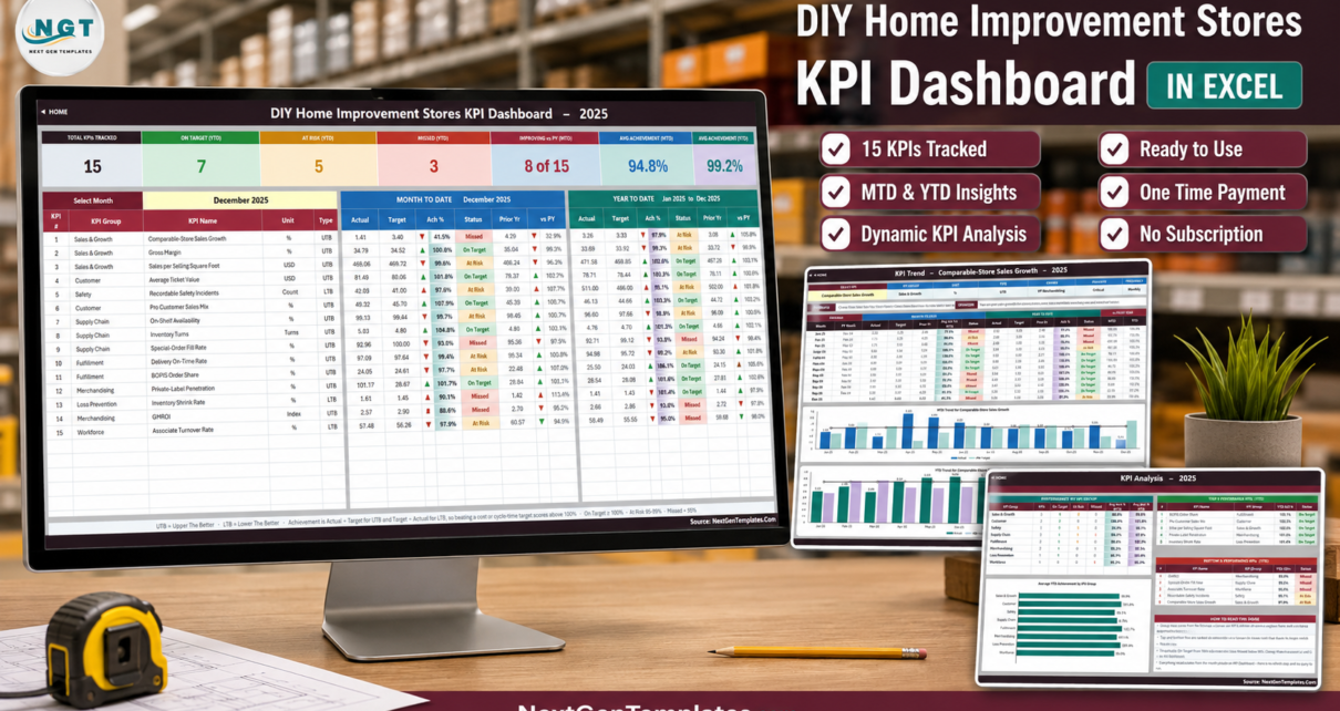
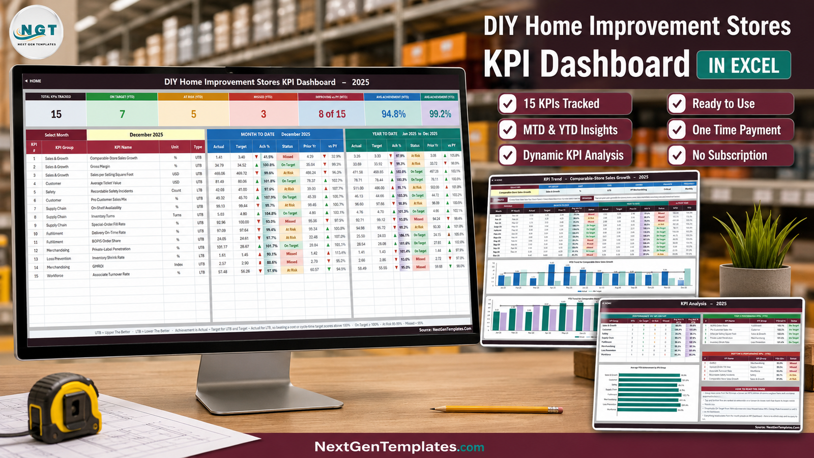
The month picker sits top-left with the selected month beside it. Above the table are seven summary cards: Total KPIs Tracked, On Target (YTD), At Risk (YTD), Missed (YTD), Improving vs PY (MTD), Avg Achievement (MTD) and Avg Achievement (YTD). Below them, one row per KPI with its number, group, name, unit and type, then a MONTH TO DATE block and a YEAR TO DATE block. In the shipped December 2025 sample the cards read 15 tracked, 7 On Target, 5 At Risk, 3 Missed, 8 of 15 improving versus prior year, 94.8% average achievement MTD and 99.2% YTD.
KPI Trend – one KPI, twelve months, two charts
Cell B4 is a dropdown of every KPI name. Choosing one redraws an attribute strip (group, unit, type, owner, priority, frequency), the KPI’s formula and definition, a twelve-month table with MTD and YTD blocks and a vs-prior-year pair, and two combo charts – Actual and Prior Year as columns with Target as a line, one for MTD and one for YTD. It is the page you open the moment something on the scorecard turns red, because it tells you whether you are looking at a one-month wobble or a nine-month slide.
KPI Analysis – group roll-up and ranked movers
Performance by KPI Group counts On Target, At Risk and Missed per group and shows average achievement for MTD and YTD, with a horizontal bar chart of average YTD achievement by group. Beside it sit the top five and bottom five KPIs ranked on YTD achievement. In the sample the top five are BOPIS Order Share (106.1%), Pro Customer Sales Mix (103.3%), Sales per Selling Square Foot (102.6%), Private-Label Penetration (101.6%) and Inventory Shrink Rate (101.4%); the bottom five are GMROI (93.0%), Special-Order Fill Rate (93.5%), Associate Turnover Rate (95.0%), Recordable Safety Incidents (95.1%) and Comparable-Store Sales Growth (97.9%).
The three input sheets
KPI Input – Actual, KPI Input – Target and KPI Input – PY share one grid: a row per KPI, an MTD and a YTD column for each of twelve months. Cell E3 on the Actual sheet is the first month of the reporting year – change it and the Target sheet, the Prior Year sheet, the month dropdown and every sheet title re-base themselves. These are the only three sheets you normally type in.
KPI Definition and Support
KPI Definition is the master list: number, group, name, unit, formula, definition, UTB/LTB type, owner, priority and frequency. Every other sheet reads from it. Support holds the helper calculations – selected month, arrow glyphs, dropdown lists, chart series, distinct group list and ranking helpers – and needs no editing.
The 15 KPIs, and what each one actually measures
Sales & Growth. Comparable-Store Sales Growth (year-on-year growth for stores open at least 13 months, excluding new and closed stores). Gross Margin ((Net Sales – COGS) ÷ Net Sales × 100). Sales per Selling Square Foot (Net Sales ÷ Total Selling Square Footage).
Customer. Average Ticket Value (Total Net Sales ÷ Number of Transactions). Pro Customer Sales Mix (Pro Customer Sales ÷ Total Sales × 100 – the share coming from trade rather than DIY consumers).
Safety. Recordable Safety Incidents (count of OSHA-recordable associate and customer injury incidents; lower the better).
Supply Chain. On-Shelf Availability (SKUs In-Stock on Shelf ÷ Total Active Shelf SKUs × 100). Inventory Turns (COGS ÷ Average Inventory at Cost). Special-Order Fill Rate (Special Orders Fulfilled Complete ÷ Special Orders Placed × 100).
Fulfillment. Delivery On-Time Rate (home and job-site deliveries completed within the promised window). BOPIS Order Share (buy-online-pickup-in-store orders ÷ total online orders × 100).
Merchandising. Private-Label Penetration (own-brand and exclusive sales as a share of total). GMROI (Gross Margin Dollars ÷ Average Inventory at Cost).
Loss Prevention. Inventory Shrink Rate (value lost to theft, damage and administrative error as a percentage of sales; lower the better).
Workforce. Associate Turnover Rate (annualised hourly associate turnover; lower the better).
Each one also carries an accountable owner – VP Merchandising, VP Supply Chain, VP Pro Sales, Director EHS, Director Loss Prevention, Director Fulfillment, Director E-Commerce, Director Special Orders, VP Store Operations, VP Human Resources and the CFO – plus a Critical / High / Medium priority. The scorecard doubles as a governance document, which is usually the part that survives longest inside an organisation.
Excel KPI Scorecard vs. Google Sheets vs. Paid Retail BI – Feature Comparison
| This Excel KPI Dashboard | Google Sheets KPI Dashboard | Paid retail BI (NetSuite Analytics, Zoho Analytics) | |
|---|---|---|---|
| Cost | $12.99 one time | $8.99-$13.99 one time | $50-$300 per user per month |
| Platform | Excel 2013+, Microsoft 365, Excel for the web | Browser, any device | Browser plus a connected ERP or POS |
| Setup time | Under an hour | Under an hour | 2-8 weeks of data-source mapping |
| Real-time team collaboration | Via OneDrive or SharePoint co-authoring | Native | Native |
| Mobile access | Excel mobile app | Full | Full, native apps |
| Customizable fields | Every cell – nothing locked or hidden | Every cell | Only what the vendor exposes |
| Share with a link | OneDrive or SharePoint | Native | Native, seat-gated |
| Year-1 cost at 5 users | $12.99 | $8.99-$13.99 | $3,000-$18,000 |
| Connects to your POS / ERP | No – you type or paste monthly figures | No | Yes |
| Works offline | Yes, completely | No | No |
Who Should Use This Template
It suits a multi-store DIY, hardware or home improvement chain running a monthly management review; a regional operations manager who wants comp sales, availability, shrink and turnover on one page instead of six tabs; a merchandising lead watching private-label penetration against GMROI; and a finance analyst who rebuilds the same board pack every month.
It does not suit anyone expecting a live feed. The three input sheets are typed or pasted and the workbook connects to nothing. It also holds one chain-level figure per KPI per month – there is no store-by-store, department or SKU breakdown. If you need to slice a transaction table by branch and category, that is the analytical dashboard, not this.
Real-World Use Cases
The monthly leadership review. A regional operations manager for a 14-store hardware chain pastes the month’s figures into the three input sheets on the first Tuesday, sets the month picker and walks the room down 15 rows. Seven green, five amber, three red – argued with in one glance rather than one slide at a time.
The merchandising conversation. Private-Label Penetration at 101.6% of its YTD target alongside GMROI at 93.0% – the worst YTD performer in the sample – says the own-brand push is landing but the margin return on inventory is not following. The trend page shows whether that gap has been widening all year before it reaches the buying team.
The safety and shrink review. Two lower-is-better KPIs in different states: Recordable Safety Incidents At Risk at 95.1% YTD, Inventory Shrink Rate On Target at 101.4%. A naive percentage would have flattened those into one number and one wrong conversation.
Advantages of the DIY Home Improvement Stores KPI Dashboard in Excel
- It opens. No macro warning, no “enable content” banner, no add-in prompt, no data-model reload. IT security teams do not have to make a decision about it.
- Nothing is hidden. Every formula is readable, traceable and editable. If you disagree with how YTD is calculated, you can see exactly where it comes from and change it.
- The KPI arithmetic is documented in the file. Handing someone the KPI Definition sheet means they argue with the definition rather than guess at it – which is the single most common cause of a scorecard being quietly ignored.
- It scales to 22 KPIs with no formula work and beyond that with a fill-down and two range edits.
- Sample data is included so every chart, traffic light and card is visibly working before you type anything.
Opportunities for Improvement
Three things worth knowing before you buy, stated plainly:
The Home and Read Me pages say “14 KPIs” while the file ships 15. It is a text typo in the two help pages only. KPI Definition lists 15, the scorecard shows 15 rows and the Total KPIs Tracked card reads 15. The working sheets are all correct.
The Frequency column is a label, not a switch. Inventory Shrink Rate is marked Quarterly and On-Shelf Availability and Delivery On-Time Rate are marked Weekly, but the input grid is monthly for every KPI without exception. Treat Owner, Priority and Frequency as governance documentation for your review calendar.
The Read Me’s “Cumulative or average YTD” note still uses examples from an aerospace build – it mentions aircraft deliveries and non-conformance reports. The rule it describes is correct and applies here (counts accumulate, rates average); only the illustrations are from the wrong industry.
And the structural limit already stated: it is input-driven and chain-level. No connector, no store-by-store split.
Best Practices
- Set cell E3 before you type anything. Getting the reporting-year start right first means the Target sheet, PY sheet and month dropdown are already correct when you paste.
- Fill the prior-year sheet even if it feels like effort. Half the value of the scorecard is the vs-PY column, and a chain that only fills Actual and Target loses the “is this normal for December?” answer entirely.
- Agree your UTB/LTB flags with the owners. Getting a direction flag wrong is the one error that silently inverts a KPI’s whole story.
- Decide your MTD/YTD convention once and write it down. Because both are stored rather than derived, the workbook will faithfully reproduce whatever convention you feed it – including an inconsistent one.
- Move the thresholds to match your governance. 100 / 95 is a sensible default, not a rule. If your board treats 98% as green, change columns L and U rather than explaining the discrepancy every month.
- Keep the file on OneDrive or SharePoint so co-authoring and version history do the collaboration work. Microsoft’s own guidance on co-authoring Excel workbooks covers the setup.
Explore Relevant Templates
- DIY Home Improvement Stores Dashboard in Excel – the analytical companion to this scorecard.
- Hypermarkets KPI Dashboard in Excel – the same scorecard engine for big-box grocery and general merchandise.
- Online Furniture Retail KPI Dashboard in Excel – for the e-commerce side of a home and hardlines business.
- Order Fulfillment KPI Dashboard in Excel – deeper on delivery, BOPIS and special-order performance.
- Discount Stores KPI Dashboard in Excel – the value-retail sibling on the same line.
- Garden Center Dashboard in Excel – the adjacent seasonal category.
Frequently Asked Questions
Does it connect to my POS, ERP or inventory system?
No. It is an input-driven scorecard – you type or paste monthly figures into three input sheets and the workbook does the scoring, the traffic lights and the charts. No connector, no Power Query, no data model. That is why it opens instantly anywhere and why nothing breaks when a source system changes, but buy it knowing it.
How many KPIs are there really?
Fifteen. The Home and Read Me pages carry a leftover “14 KPIs” line, which is a typo in those two help pages; KPI Definition, the scorecard and the Total KPIs Tracked card all show 15. There is room for 22 in total.
Can I add my own KPIs?
Yes, with no formula work. Fill the next empty row on KPI Definition and the input sheets, scorecard, trend picker and analysis page all pick it up. Renaming happens on KPI Definition only. Going past 22 needs a fill-down on each sheet and two range edits, documented in the Read Me.
Are there macros?
None. No VBA, no add-ins, no Power Query. It is a plain .xlsx built from VLOOKUP, MATCH, INDEX and COUNTIF, and it works in Excel for the web as well as the desktop app.
Can I see results store by store?
Not here – this workbook holds one chain-level figure per KPI per month. Branch, category and SKU comparison is what the analytical dashboard is for.
Is the sample data real?
No. It is plausible sample data for 2025 and 2024 so you can see the whole template working before you type a number. Replace it on the three input sheets.
What do I actually download?
One ZIP holding the .xlsx workbook and a user manual PDF. Instant download, lifetime access to the file, one payment, no subscription.
About the Author
Built by PK – Microsoft Certified Professional with 15+ years of Excel, Google Sheets, and Power BI experience. Founder of NextGenTemplates, reaching 300K+ subscribers across YouTube channels. Every template is hand-built and tested before release.
Conclusion
A DIY and home improvement chain does not fail its monthly review because nobody has the numbers. It fails because the numbers arrive in four different shapes, get flattened into one column, and the lower-is-better metrics end up looking like failures. The DIY Home Improvement Stores KPI Dashboard in Excel fixes the flattening: 15 KPIs, 8 groups, per-KPI direction flags, editable traffic-light bands, MTD and YTD with prior year on both, a single-KPI trend page and a group roll-up – all driven by one dropdown and all built from formulas you can read.
It will not fetch your data for you, and it will not break a chain-level figure down by store. Everything else on the list, it does the moment you open it.
For walkthroughs of this and every other template, subscribe on YouTube: youtube.com/@PKAnExcelExpert.