The Actuarial Services KPI Dashboard in Excel tracks 15+ actuarial KPIs across 7 interactive worksheets with MTD and YTD comparisons, conditional formatting arrows, and trend charts. This ready-to-use Excel template recalculates every metric automatically when you replace sample data with your own actuarial figures. Setup takes under 10 minutes — no macros, no VBA, no add-ins required.
Actuarial teams at insurance companies, consulting firms, and pension funds spend an average of 4–6 hours per month manually compiling KPI reports from scattered spreadsheets. The Actuarial Services KPI Dashboard in Excel eliminates that overhead by centralizing all performance data into a structured, formula-driven workbook that updates with a single dropdown selection.
Key Features of Actuarial Services KPI Dashboard in Excel
👉 Click here to Purchase the Actuarial Services KPI Dashboard in Excel
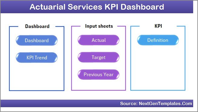
The Actuarial Services KPI Dashboard in Excel includes 7 purpose-built worksheets: Home, Dashboard, KPI Trend, Actual Numbers Input, Target Number Input, Previous Year Numbers, and KPI Definition. Each sheet serves a specific function in the actuarial performance tracking workflow.
The Dashboard sheet displays MTD Actual, Target, and Previous Year data alongside YTD equivalents for every KPI. Conditional formatting arrows (▲▼) instantly flag whether each KPI is beating or missing its target. The KPI Trend sheet lets you select any individual KPI from a dropdown and view its 12-month MTD and YTD trend charts comparing Actual, Target, and Previous Year lines.
Three separate input sheets (Actual, Target, Previous Year) keep data organized. The KPI Definition sheet documents each metric’s name, group, unit, formula, definition, and type (LTB or UTB), ensuring consistent interpretation across your entire actuarial team.
Dashboard Pages Explanation
1. Home Sheet: This is an index sheet with 6 navigation buttons to jump to the respective worksheet.
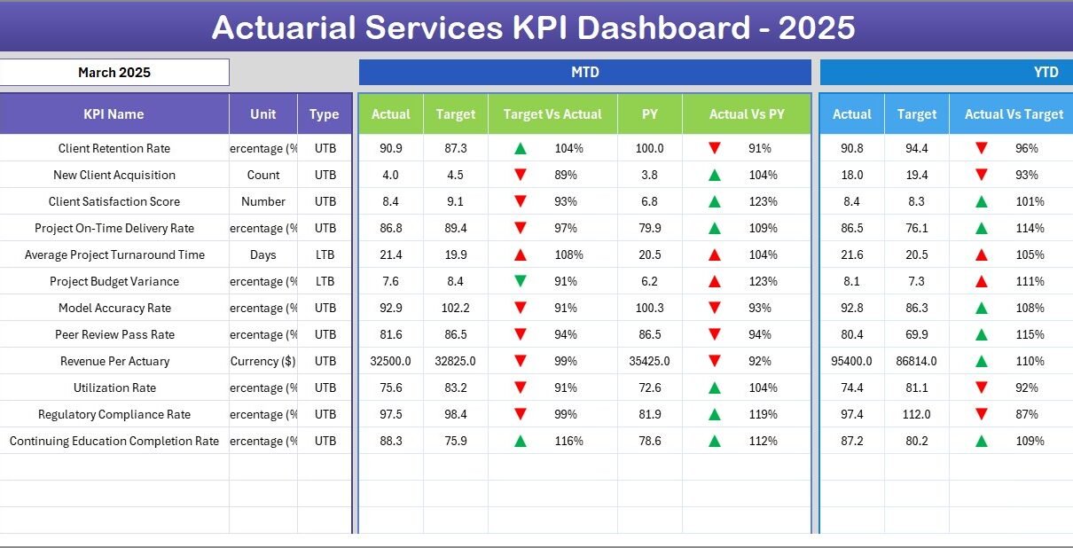
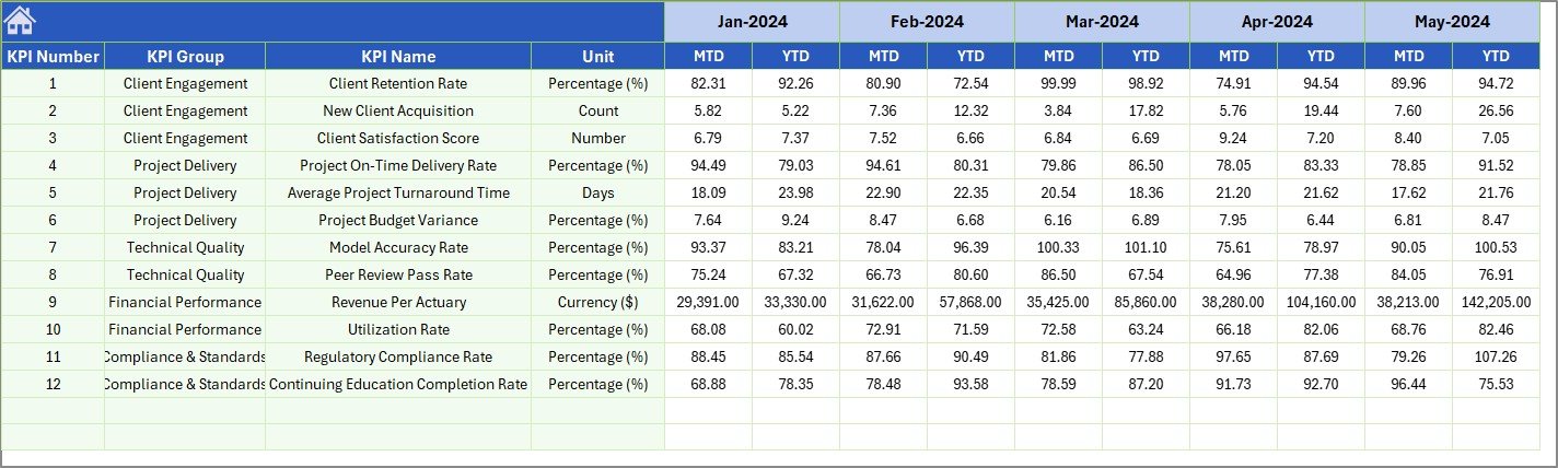
2. Dashboard Sheet: The main analytics view. Select any month from the dropdown on range D3 and all KPI numbers update. You see MTD Actual, Target, Previous Year alongside YTD Actual, Target, Previous Year with Target vs Actual and PY vs Actual conditional formatting up/down arrows.
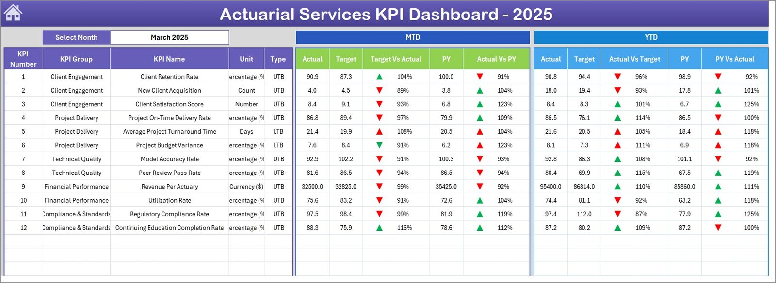 Actuarial Services KPI Dashboard
3. KPI Trend Sheet: Select any KPI from the dropdown on range C3. The sheet shows KPI Group, Unit, Type (LTB/UTB), Formula, and Definition. MTD and YTD trend charts plot Actual, Target, and Previous Year lines across 12 months.
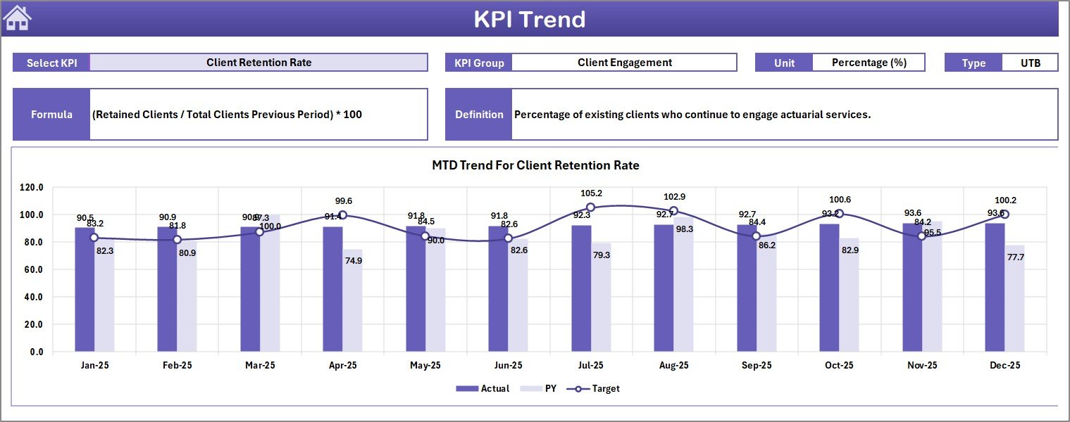 KPI Trend Sheet
4. Actual Numbers Input Sheet: Enter actual MTD and YTD numbers for each KPI per month. Change the starting month of the year on range E1.
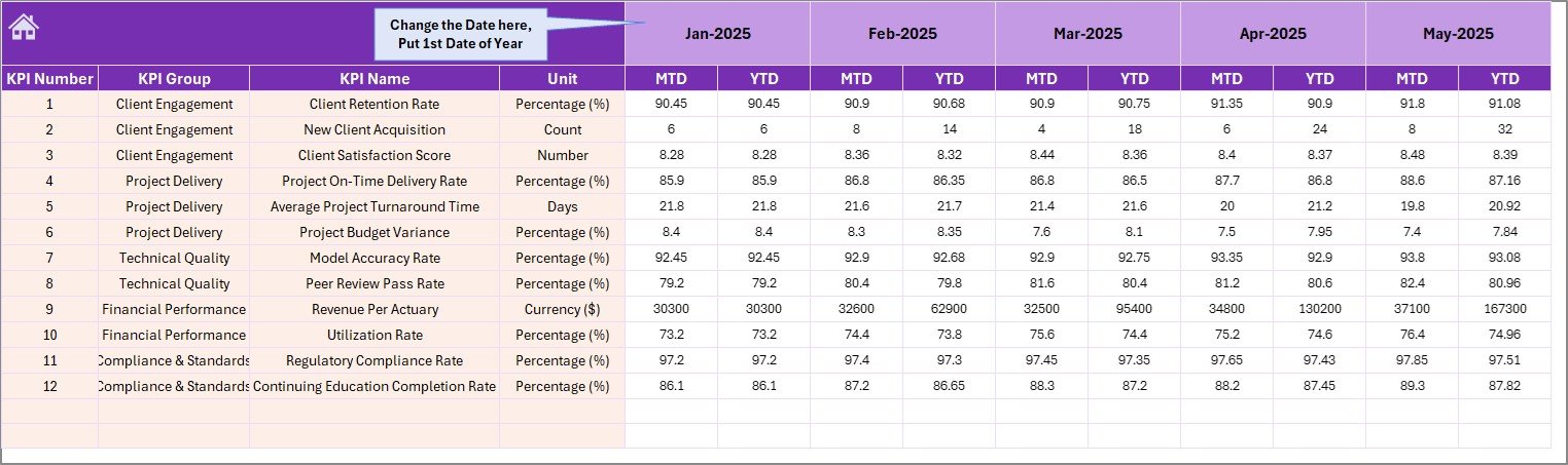 Actual Numbers Input Sheet
5. Target Number Input Sheet: Enter target numbers for each KPI as MTD and YTD values for every month.
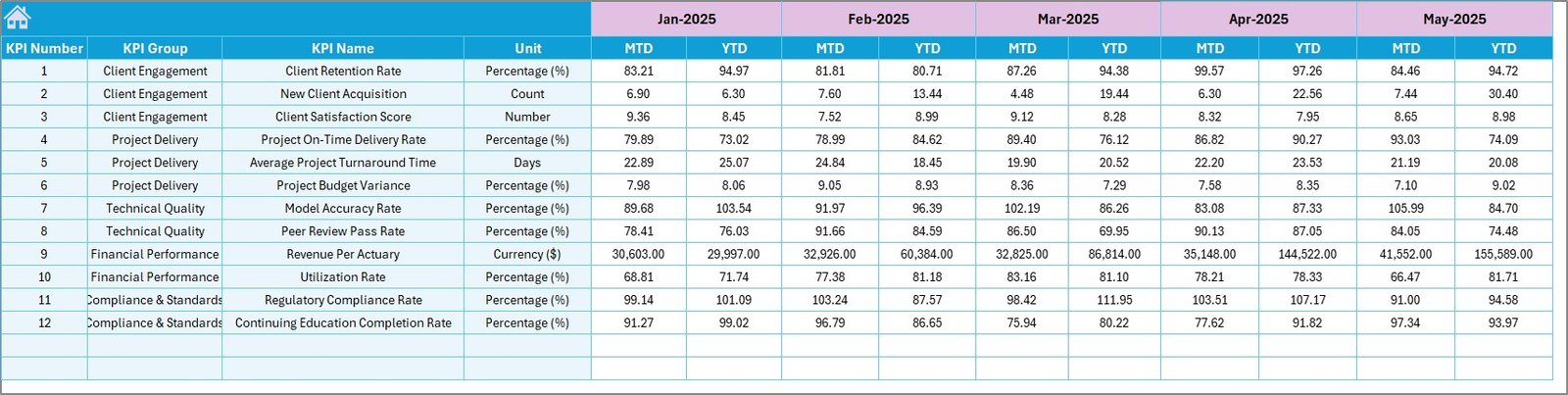 Target Number Input Sheet
6. Previous Year Number Sheet: Enter previous year data in the same format as the current year for year-over-year comparison.
 Previous Year Number Input Sheet
7. KPI Definition Sheet: Enter each KPI’s Name, Group, Unit, Formula, Definition, and Type (LTB or UTB). The KPI Trend sheet pulls this metadata automatically.
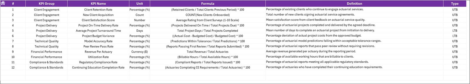 KPI Definition Sheet
Actuarial Services KPI Dashboard in Excel vs. Google Sheets vs. Milliman Integrate — Feature Comparison
| Feature | Actuarial Services KPI Dashboard in Excel | Google Sheets Equivalent | Milliman / Arius Analytics |
|---|---|---|---|
| Cost | $14.99 one-time | $9.99 one-time | $200–$500/user/month |
| Platform | Microsoft Excel (desktop) | Google Sheets (browser) | Cloud SaaS |
| Setup Time | Under 10 minutes ✅ | 10–15 minutes | 4–12 weeks |
| Real-time Collaboration | Via OneDrive/SharePoint | Built-in | Built-in |
| Customizable KPIs | Unlimited ✅ | Manual setup | Limited to plan |
| Offline Access | Full offline ✅ | Limited | No |
| Year-1 Cost (5 users) | $14.99 total ✅ | $9.99 total | $12,000–$30,000 |
| MTD/YTD Trend Charts | Built-in ✅ | Manual | Varies |
| Actuarial-Specific KPIs | Built-in ✅ | Manual setup | Advanced |
For actuarial teams that want structured KPI tracking without paying $200–$500/user/month for enterprise analytics, the Actuarial Services KPI Dashboard in Excel sits in the sweet spot.
Who Should Use This Template
👉 Click here to Purchase the Actuarial Services KPI Dashboard in Excel
✅ Perfect for:
- Actuarial analysts at insurance companies with 5–200 employees tracking loss ratios, reserve adequacy, and claim severity monthly
- Actuarial operations leads needing monthly MTD/YTD KPI reports for leadership presentations and regulatory reviews
- Insurance consultants delivering structured actuarial KPI scorecards to client companies
- Finance teams at mid-size insurers comparing actual combined ratios against annual targets
❌ Not a fit if:
- You need API integrations with actuarial modeling platforms like Milliman or Willis Towers Watson
- Your organization requires automated data feeds from reserving systems like Arius or ResQ
- You need SOC 2 compliance with audit trails on KPI data changes
Real-World Use Cases
Meera manages actuarial operations at a mid-size life insurer in Mumbai. She uses the Actuarial Services KPI Dashboard in Excel to track loss ratio, reserve adequacy, and claim severity across 12 product lines monthly. Before quarterly reviews, she selects the relevant month on the Dashboard sheet and exports it as a PDF — replacing a 5-hour manual reporting process with a 10-minute refresh.
James runs the actuarial desk at a P&C insurer in London. He enters monthly targets for combined ratio, expense ratio, and premium sufficiency. The conditional formatting arrows instantly show which KPIs missed target — helping him prepare variance reports for the CFO without building pivot tables from scratch.
Anita is an actuarial consultant in Singapore. She uses the KPI Trend sheet to present 12-month performance trajectories to insurer clients during quarterly strategy sessions. Comparing Actual vs Target vs Previous Year helps spot seasonal patterns in claims development and plan reserve adjustments.
Advantages of Actuarial Services KPI Dashboard in Excel
The dashboard saves 4–6 hours of manual reporting per month by automating MTD/YTD calculations, conditional formatting comparisons, and trend chart generation. Because it runs on standard Excel formulas with no macros, it works across Excel 2016, 2019, 2021, Microsoft 365, and Excel for Mac without compatibility issues.
The structured KPI Definition sheet ensures every team member interprets metrics consistently — loss ratio, combined ratio, reserve adequacy, and expense ratio all carry documented formulas and definitions. Year-over-year comparison against previous year data provides long-term trend visibility that monthly snapshots miss.
Opportunities for Improvement
👉 Click here to Purchase the Actuarial Services KPI Dashboard in Excel
The dashboard relies on manual data entry — it does not connect to actuarial modeling systems or policy administration platforms for automated data feeds. Teams managing 50+ KPIs may find the single-page Dashboard view dense; a drill-through approach (available in the Actuarial Services Dashboard in Power BI) offers more interactive filtering for larger KPI sets.
Best Practices
Update actual numbers within the first 5 business days of each month to keep the Dashboard current. Use the KPI Definition sheet to document every metric’s formula before sharing the workbook with new team members. Set the fiscal year start month on cell E1 of the Actual Numbers Input sheet to align with your organization’s reporting calendar. Review the KPI Trend sheet quarterly to identify metrics trending below target over 3+ consecutive months — these need corrective action plans.
Explore Relevant Templates
🔹 Actuarial Services Dashboard in Power BI — 5-page interactive Power BI dashboard with slicers for claims, premiums, risk categories, and regional analysis.
🔹 Reinsurance Services KPI Dashboard in Excel — Same 7-sheet Excel KPI structure for reinsurance teams tracking ceded premiums and treaty performance.
🔹 Insurance Brokers KPI Dashboard in Excel — Policy retention, claims ratio, and commission tracking for brokerage teams.
🔹 Underwriting Efficiency KPI Dashboard in Google Sheets — Browser-based underwriting KPI tracking with real-time collaboration.
🔹 Browse All KPI Dashboard Templates
Frequently Asked Questions
What KPIs does the Actuarial Services KPI Dashboard in Excel track?
The Actuarial Services KPI Dashboard in Excel tracks any KPI you define — loss ratio, combined ratio, reserve adequacy, claim severity, expense ratio, premium sufficiency, and more. You enter KPI names on the KPI Definition sheet, making the dashboard fully customizable.
How long does setup take?
Setup takes under 10 minutes. Enter your KPI definitions, fill in actual and target numbers, and the Dashboard sheet auto-populates with MTD and YTD comparisons, conditional formatting arrows, and trend charts.
Does this work on Mac?
Yes. The dashboard uses only standard Excel formulas — no macros, no VBA. It works on Excel for Mac, Excel 2016, 2019, 2021, and Microsoft 365.
How does this compare to Milliman or Arius analytics?
👉 Click here to Purchase the Actuarial Services KPI Dashboard in Excel
Enterprise actuarial platforms cost $200–$500 per user per month and require weeks of implementation. The Actuarial Services KPI Dashboard in Excel costs $14.99 one-time with no subscription and full offline access. For monthly reporting needs, this template delivers 90% of the reporting value at under 1% of the annual cost.
Can I add more KPIs?
Yes. Add new rows on the KPI Definition sheet and corresponding rows on the Actual, Target, and Previous Year input sheets. The Dashboard and KPI Trend sheets reference these dynamically.
Is there a Power BI version?
Yes. The Actuarial Services Dashboard in Power BI offers interactive slicer-based analytics with drill-through pages for claims, premiums, and risk categories.
Can I use this for other insurance verticals?
Yes. The KPI Definition sheet is fully flexible — rename KPIs for underwriting, claims management, reinsurance, or direct insurance operations. The structure works for any MTD/YTD KPI tracking use case. Learn more about Excel formulas and functions on Microsoft Learn.
About the Author
Built by PK — Microsoft Certified Professional with 15+ years of Excel, Google Sheets, and Power BI experience. Founder of NextGenTemplates, reaching 300K+ subscribers across YouTube channels. Every template is hand-built and tested before release.
Conclusion
The Actuarial Services KPI Dashboard in Excel gives actuarial teams a structured, formula-driven workbook that tracks 15+ KPIs with MTD/YTD comparisons, conditional formatting arrows, and 12-month trend charts — all updating from 3 simple input sheets.
👉 Click here to Purchase the Actuarial Services KPI Dashboard in Excel
✅ Instant download · One-time payment · No subscription
🎥 Visit our YouTube channel: Youtube.com/@PK-AnExcelExpert
👉 Click here to Purchase the Actuarial Services KPI Dashboard in Excel