Coffee Chains Dashboard in Excel is a professionally designed, ready-to-use Excel dashboard that empowers coffee business owners, franchise managers, and analysts to track sales performance, profitability, and customer satisfaction across multiple coffee chain locations. With 5 interactive dashboard pages, a structured data sheet, and a hidden support sheet powered by pivot tables, this template delivers end-to-end visibility into your coffee chain operations without requiring any macros or VBA skills.
Whether you run an independent coffee shop or manage a growing network of outlets, this dashboard transforms raw transaction data into actionable insights with just one click. In this post, we walk you through every page of the dashboard, explain its key features, and show you how to get the most out of it.
Click here to Purchase the Coffee Chains Dashboard in Excel
Key Features of Coffee Chains Dashboard in Excel
The Coffee Chains Dashboard in Excel includes 5 interactive dashboard pages covering chain performance, product profitability, regional distribution, and customer segmentation. It tracks 5 high-level KPIs — Total Revenue, Net Profit, Total Records, Customer Rating, and Total Quantity — all visible on the Overview page. Built-in slicers allow users to instantly filter data across multiple dimensions.
Every chart in the dashboard is connected to pivot tables housed in a dedicated Support Sheet. When you update the Data Sheet and click Refresh All, the entire dashboard regenerates with your latest numbers. This makes it a zero-maintenance, plug-and-play solution for busy professionals who need fast answers from their data.
Key capabilities include multi-chain profitability comparison, product-level margin analysis, revenue breakdown by region and city tier, store type performance tracking, and customer segmentation by order channel and loyalty status. The template works in Microsoft Excel 2016 and later without macros or VBA.
Dashboard Pages Explained
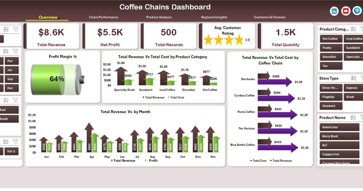
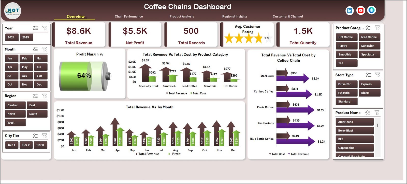
1. Overview Page
The Overview page serves as the command center of the Coffee Chains Dashboard in Excel. At the top, 5 KPI cards provide a high-level snapshot of your business: Total Revenue, Net Profit, Total Records, Customer Rating, and Total Quantity. Below the cards, four analytical charts present Profit Margin % by Overall, Total Revenue Vs Total Cost by Product Category, Total Revenue Vs Total Cost by Coffee Chain, and Total Revenue by Month. Multiple slicers are provided on this page for quick, dynamic filtering.
Coffee Chains Dashboard in Excel
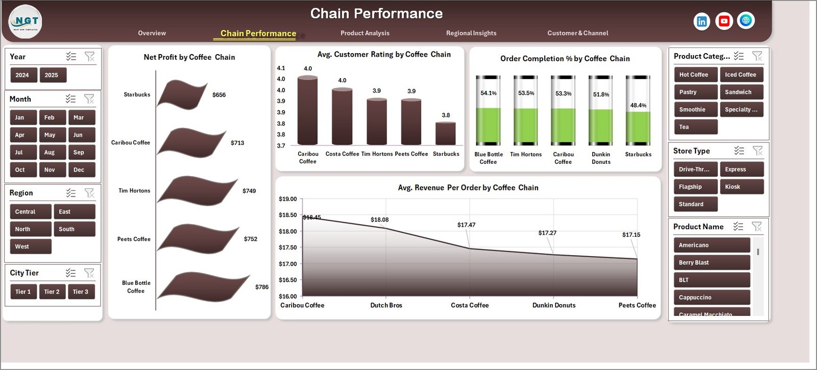
2. Chain Performance
The Chain Performance page lets you compare individual coffee chains head-to-head. It visualizes Net Profit by Coffee Chain, Average Customer Rating by Coffee Chain, Order Completion % by Coffee Chain, and Average Revenue Per Order by Coffee Chain. This is invaluable for franchise managers who need to identify which outlets are outperforming and which need attention.
Chain Performance
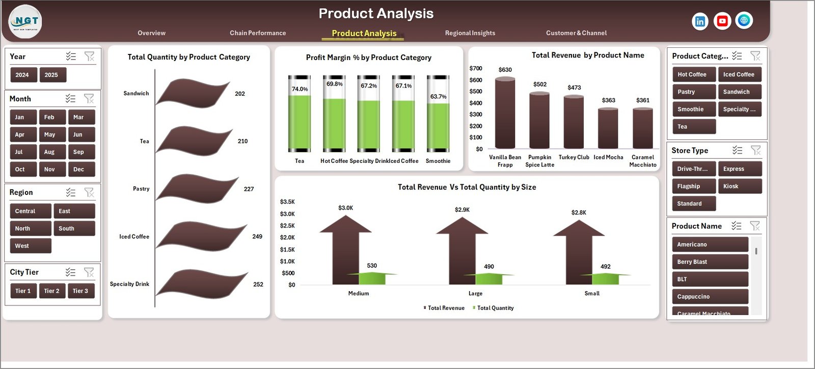
3. Product Analysis
This page focuses on product-level profitability and volume. It includes Total Quantity by Product Category, Profit Margin % by Product Category, Total Revenue by Product Name, and Total Revenue Vs Total Quantity by Size. Use this page to identify your highest-margin products and spot opportunities to optimize your menu or pricing strategy.
Product Analysis
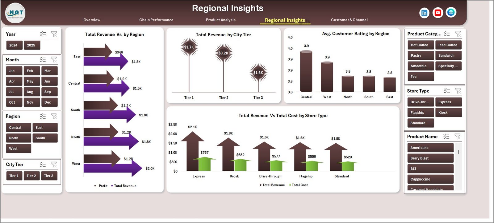
4. Regional Insights
The Regional Insights page breaks down your revenue and customer satisfaction geographically. It features Total Revenue by Region, Total Revenue by City Tier, Average Customer Rating by Region, and Total Revenue Vs Total Cost by Store Type. This is especially useful for multi-location businesses planning expansion or resource allocation.
Regional Insights
5. Customer & Channel
This page dives into how customers are engaging with your coffee chains. It analyzes Total Revenue Vs Total Records by Order Channel, Total Revenue by Customer Type, and Total Revenue by Loyalty Member status. Understanding these patterns helps marketing and operations teams craft targeted campaigns and improve customer retention.
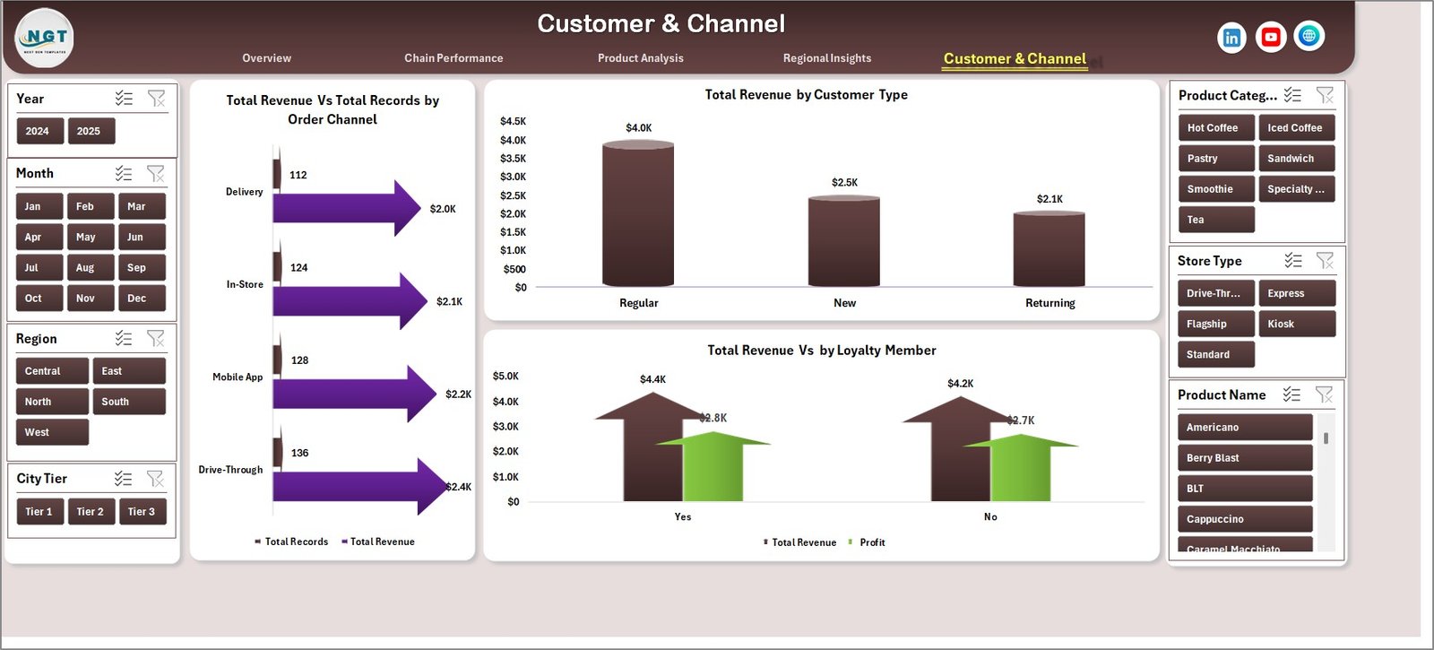
Customer & Channel
6. Data Sheet
The Data Sheet is where you input your coffee chain transaction records. It comes pre-loaded with sample data so you can see how the dashboard works immediately. To use your own data, simply replace the sample rows with your records in the same column format. Fields include Coffee Chain name, Product Category, Product Name, Revenue, Cost, Quantity, Region, City Tier, Store Type, Customer Type, Order Channel, Loyalty Member status, and Customer Rating.
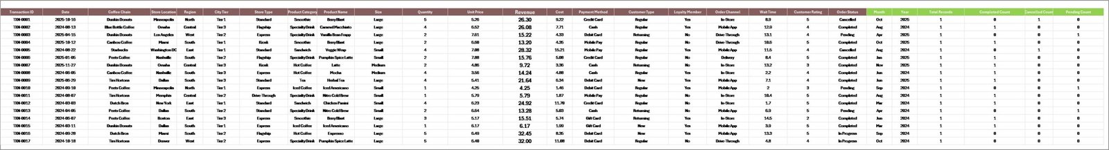
Data Sheet
7. Support Sheet
The Support Sheet contains all the pivot tables that power every chart across the 5 dashboard pages. After updating your data, navigate to the Data tab in the Excel Ribbon and click Refresh All. Every pivot table refreshes instantly, and all connected charts update accordingly. You can keep this sheet hidden during everyday use.
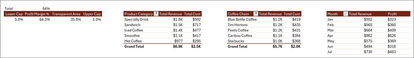
Support Sheet
Advantages of the Coffee Chains Dashboard in Excel
This dashboard eliminates the need for expensive BI tools by delivering professional-grade analytics within Microsoft Excel. It consolidates revenue tracking, profitability analysis, customer segmentation, and regional comparison into a single workbook. The pivot-driven architecture ensures that data updates propagate instantly across all 5 pages, saving hours of manual chart maintenance.
Because it requires no VBA, macros, or external add-ins, the template is compatible with virtually any version of Excel from 2016 onward. The slicer-based filtering on the Overview page makes it easy for non-technical users to explore data without modifying formulas or chart configurations. For coffee chain managers who need to present findings to stakeholders, the clean, professional layout is presentation-ready out of the box.
Opportunities for Improvement
While the current version covers five key analytical dimensions, users managing large-scale operations may want to add time-period comparison features (year-over-year or quarter-over-quarter trending). Adding conditional formatting rules to the KPI cards to highlight underperforming metrics could further enhance at-a-glance usability. For multi-currency operations, a currency conversion layer in the Data Sheet would be beneficial. Power users could also consider connecting the workbook to an external data source via Power Query for automated data ingestion.
Best Practices for Using This Dashboard
Always maintain a consistent column structure in the Data Sheet when adding new records. Before sharing the dashboard with stakeholders, refresh all pivot tables first to ensure the visuals reflect the most current data. Use the slicers on the Overview page strategically — for example, filter by a specific coffee chain and month to present focused performance reviews during team meetings.
If you need to customize the dashboard, start by adding new pivot tables in the Support Sheet and link them to new charts on any page. Keep the Data Sheet clean by avoiding merged cells, blank rows, or inconsistent date formats. For best performance with large datasets, save the file in .xlsx format and avoid enabling unnecessary Excel add-ins. Also explore related Excel Dashboard Templates for different industries and use cases.
Explore Relevant Templates
- Food and Beverage Dashboard in Excel – Full-scope analytics for food and beverage businesses with revenue, cost, and profitability tracking.
- Restaurants & Food Services KPI Dashboard in Excel – KPI-focused dashboard for restaurant chains and food service operations.
- Franchise Performance KPI Dashboard in Excel – Track franchise-level metrics including revenue, growth, and compliance.
- Food Service KPI Dashboard in Excel – Dedicated KPI tracking for food service industry operations.
- Hospitality KPI Scorecard in Excel – Scorecard-style KPI tracking for the hospitality and hotel management sector.
You can also find complementary resources on Microsoft Learn for advanced Excel techniques like Power Query and Power Pivot that can extend the capabilities of this dashboard.
Frequently Asked Questions
What is the best Excel dashboard for tracking coffee chain performance?
The Coffee Chains Dashboard in Excel is specifically designed for tracking coffee chain performance. It includes 5 interactive pages covering revenue, profitability, product analytics, regional insights, and customer segmentation across multiple coffee chain outlets — all powered by pivot tables that auto-refresh when data is updated.
How do I update the data in this coffee chain dashboard?
Navigate to the Data Sheet tab, replace the sample records with your own coffee chain transaction data in the same column format, then go to the Data tab in the Excel Ribbon and click Refresh All. All 5 dashboard pages update automatically.
Can this dashboard compare performance across different coffee chains?
Yes. The Chain Performance page provides side-by-side comparison of Net Profit, Customer Ratings, Order Completion %, and Average Revenue Per Order for each coffee chain in your dataset.
Does this dashboard work in Google Sheets?
This dashboard is optimized for Microsoft Excel 2016 and later. Some features like slicers and pivot chart formatting may not work correctly in Google Sheets. If you need a Google Sheets version, check out the Food and Beverage Dashboard in Google Sheets as an alternative.
What data fields are required to use this dashboard?
The Data Sheet expects fields including Coffee Chain name, Product Category, Product Name, Revenue, Cost, Quantity, Region, City Tier, Store Type, Customer Type, Order Channel, Loyalty Member status, and Customer Rating. A pre-loaded sample dataset shows the exact format.
Is this dashboard suitable for a single coffee shop or only for chains?
While designed for multi-chain analysis, it works perfectly for a single coffee shop too. Simply enter your data with one chain name, and all pages will display your individual shop’s analytics across products, regions, and customer segments.
Conclusion
The Coffee Chains Dashboard in Excel is a powerful, zero-maintenance analytics solution for anyone in the coffee business. Its 5 interactive pages, pivot-powered architecture, and slicer-based filtering make it easy to track revenue, profitability, product performance, regional distribution, and customer behavior — all from a single Excel workbook.
Click here to Purchase the Coffee Chains Dashboard in Excel
For step-by-step video tutorials on building and customizing Excel dashboards, visit our YouTube channel:
👉 Youtube.com/@PK-AnExcelExpert