Part of the free Module 7: Conditional Formatting · Lesson 3 of 15 · Full Excel course
Updated on 5 September 2026 · Works in Excel 365, 2021, 2019 and 2016 unless noted.
Data bars in Excel are a conditional formatting rule that draws a horizontal bar inside each cell, with the bar length proportional to the cell value. They turn a column of numbers into an in-cell bar chart without inserting a chart object. This lesson shows you how to apply gradient and solid data bars, control the scale with More Rules, hide the numbers, handle negative values and build a bar-in-cell mini chart next to a number.
What data bars are and when to use them
A data bar is a mini chart that lives inside the cell alongside the number. The largest value in the selected range gets the longest bar and the smallest gets the shortest, so you can compare rows instantly without reading every figure. The bars redraw whenever a value changes.
Data bars work best on a single measure in one column: sales by region, completion percentages, stock levels or budget used. They are weaker on grids that mix units, because every cell in the rule shares one scale. Use a colour scale when you want a heat map across a grid, and icon sets when you need a status symbol rather than a length.
You can follow along with the course practice file: Conditional-Formatting.xlsx.
Apply data bars to a range
The example uses a day-wise, location-wise sales table in B2:G9.
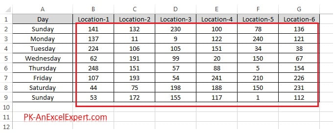
- Select the range that should receive the bars, here B2:G9. Do not include headers or totals.
- Go to Home > Conditional Formatting > Data Bars. The gallery shows six Gradient Fill and six Solid Fill presets.
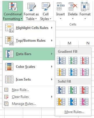
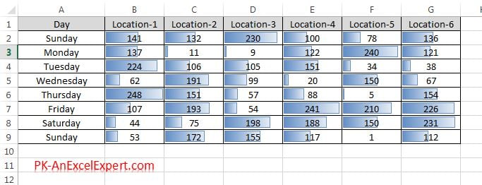
- Hover over a preset to preview it on the sheet, then click a Gradient Fill colour. The bar fades from solid colour to transparent so the number stays readable.
- Alternatively choose a Solid Fill colour. Solid bars have a crisp edge, which makes small differences easier to compare, but a dark colour can hide the number underneath.
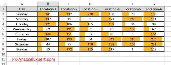
Gradient fill versus solid fill
Both fills use the same scale, so the choice is about readability. Gradient bars fade out towards the right, which keeps the number legible even when the bar fills the cell. Solid bars end with a hard edge, so two bars of nearly equal length are easier to tell apart, which matters in a ranking table. A practical rule: use gradient fill when the numbers must be read, and solid fill when you plan to tick Show Bar Only or put the bars in a helper column next to the numbers. A border from More Rules stops light colours disappearing on a white background.
Minimum and Maximum types in More Rules
To control the scale, open Home > Conditional Formatting > Data Bars > More Rules, or edit an existing rule through Manage Rules > Edit Rule. The dialog has a Minimum and a Maximum drop-down with the same list of types.
| Type | What it does | Use it when |
|---|---|---|
| Automatic (default) | Excel picks the scale. In Excel 2010 and later, positive-only data is measured from zero, so a value of 50 gets a bar half as long as 100. Negative values move the axis. | Most tables. Bars are proportional to the values. |
| Lowest Value / Highest Value | The smallest value gets the shortest bar and the largest gets the longest, regardless of zero. This was the Excel 2007 default. | You want to exaggerate small differences between similar numbers. |
| Number | Fixed value you type in, for example Minimum 0 and Maximum 100. | Percentages, scores out of a known total, or when several sheets must share one scale. |
| Percent | A percentage of the range between the lowest and highest value. Minimum 0 and Maximum 100 equals Lowest/Highest Value. | You want to clip extremes, for example Maximum 90 so the top 10 percent of the range is a full bar. |
| Formula | A formula that returns a number, evaluated once for the whole rule. | The scale depends on another cell, such as a target or a budget cap. |
| Percentile | A percentile of the values. Maximum 95 gives a full bar to everything at or above the 95th percentile. | Data with outliers that would otherwise shrink every other bar. |
With the Formula type, write the formula as you would in a cell: =$H$1 where H1 holds the target, or =MAX($B$2:$G$9)*1.2 for 20 percent headroom. Use absolute references such as $H$1, because the rule is evaluated once for the whole Applies-to range, not cell by cell. Press F2 inside the formula box before using the arrow keys, otherwise Excel inserts cell references instead of moving the cursor.
Show Bar Only, bar direction and borders
The lower half of the More Rules dialog controls how the bar looks.
- Show Bar Only hides the number and leaves the bar. The value stays in the cell, so formulas still work and it shows in the formula bar.
- Fill switches between Gradient and Solid; Color sets any bar colour.
- Border adds a thin outline that makes pale bars visible and gives solid bars a chart-like finish.
- Bar Direction offers Context, Left-to-Right and Right-to-Left. Context follows the sheet direction. Pair a Right-to-Left column with a Left-to-Right column either side of a label to get a butterfly or tornado layout.
Negative values and the axis
When the range contains negative numbers, Excel draws an axis inside the cell and points negative bars to the left. Click Negative Value and Axis in More Rules to control this.
- Negative bar fill and border colour: keep the same colour as positive bars, or choose a separate one. Red for negatives and blue or green for positives is the usual convention for variance columns.
- Axis settings: Automatic places the axis according to the balance of positive and negative values, so a mostly negative column gets more room on the left. Cell midpoint fixes the axis in the centre for a symmetrical variance chart. None removes the axis and draws negative bars in the same direction as positive ones, in the negative colour.
- Axis colour: the thin vertical line. Pick a grey for a softer look.
Build a bar-in-cell mini chart next to a number
Reports look cleaner with the number in one column and the bar in the next, so the bar never covers the digits. Use a helper column and Show Bar Only.
- Assume sales values sit in C2:C9. In D2 enter
=C2and fill down to D9. Column D now mirrors column C. - Select D2:D9 and go to Home > Conditional Formatting > Data Bars > More Rules.
- Tick Show Bar Only, set Fill to Solid, choose a colour and set Minimum to Number 0. Set Maximum to Number with a round figure above your largest value, or leave it Automatic.
- Click OK, widen column D to about 20 characters and right-align column C so the numbers sit next to the bars.
The result reads like a bar chart embedded in the table, and it updates when the source changes. For a variance column, mirror the difference instead, for example =C2-B2, and use Negative Value and Axis to colour shortfalls red.
Worked example
A regional manager tracks monthly sales against a target of 1,000 units held in cell H1.
| Region (B) | Units (C) | Bar (D) |
|---|---|---|
| North | 820 | =C2 |
| South | 1,150 | =C3 |
| East | 460 | =C4 |
| West | 990 | =C5 |
- Select D2:D5 and open Data Bars > More Rules.
- Tick Show Bar Only. Set Minimum to Number
0. Set Maximum to Formula and enter=$H$1. - Choose Solid Fill, blue, with a darker blue border. Click OK.
Result: North shows a bar 82 percent of the cell width, East 46 percent, West 99 percent, and South fills the cell because it exceeds the target. Change H1 to 1,200 and every bar shrinks in proportion, because the Maximum is tied to the target, not to the largest value in the list.
Tips and common mistakes
- Widen the column first. Narrow columns compress the scale and make every bar look the same length.
- One rule per measure. Apply data bars to each column separately when the columns hold different units, otherwise revenue and unit counts share one scale.
- Exclude totals. A total row is usually several times larger than any row, so it takes the full bar and flattens the rest.
- Use Percentile for outliers. Maximum Percentile 95 keeps one huge value from shrinking every other bar.
- Numbers stored as text get no bar. Convert them with Data > Text to Columns or by multiplying by 1.
- Check the Applies-to range after inserting rows. Rows added below the range do not inherit the rule; extend it in Manage Rules.
Practice exercise
Open the practice file or type the sales table above, then complete these tasks.
- Apply a Gradient Fill data bar to B2:G9, then change it to Solid Fill with a border through Manage Rules.
- Edit the rule so Minimum is Number 0 and Maximum is Percentile 90. Note which cells now show a full bar.
- Add a helper column that mirrors column G with
=G2, apply Show Bar Only and widen it to 20 characters. - Create a variance column with
=G2-B2, apply data bars and set negative bars to red with the axis at Cell midpoint. - Put a target in H1, set the helper column Maximum to the Formula
=$H$1, and change H1 to see the bars rescale.
Key takeaways
- Data bars draw a bar inside each cell whose length is proportional to the value, and they update live.
- Gradient fill keeps numbers readable; solid fill is crisper and suits Show Bar Only.
- More Rules controls the scale with Automatic, Lowest/Highest Value, Number, Percent, Formula and Percentile types.
- Negative Value and Axis settings colour negative bars and position the axis for variance charts.
- A mirrored helper column with Show Bar Only gives you a clean bar-in-cell chart next to the number.
Related lessons
- Conditional Formatting course hub
- Colour Scales in Excel
- New Rule: Format all cells based on their values
- Manage and Clear Conditional Formatting Rules
- SUMIFS formula
- Excel Dashboard course
- Microsoft Support: Display comparative data visually with data bars
Frequently asked questions
How do I show only the bar and hide the number?
Go to Home > Conditional Formatting > Manage Rules, select the data bar rule, click Edit Rule and tick Show Bar Only. The value stays in the cell, so formulas that reference it keep working and you can still see it in the formula bar.
Why is the longest bar not filling the whole cell?
Gradient bars leave a small margin on the right by design. If a solid bar also stops short, the Maximum type is probably set to a Number or Formula higher than your largest value. Set Maximum back to Automatic or Highest Value, or lower the number, and the top value fills the cell.
Can data bars start from zero instead of the smallest value?
Yes. In Excel 2010 and later the Automatic type already measures positive data from zero. If bars still look relative, open More Rules and set Minimum to Number 0. Bars are then strictly proportional to the values, so 50 gets half the bar of 100.
How do I make negative data bars red?
Open More Rules and click Negative Value and Axis. Under Negative bar fill colour choose Fill color and pick red. Under Axis settings choose Cell midpoint for a symmetrical variance chart, or Automatic to give more space to whichever side has larger values.
Can I put the data bar in a different cell from the number?
Yes. Create a helper column that mirrors the value with a formula such as =C2, apply data bars to that column and tick Show Bar Only. The number stays in its own column and the bar appears next to it, and both update when the source changes.
Want the finished version? Ready-made Excel KPI dashboards, trackers and VBA systems are available at NextGenTemplates.com.