Disability Support NGOs Dashboard in Power BI is built for NGOs, nonprofit disability service providers, branch coordinators, program managers, and donor reporting teams that need a clearer way to monitor service hours, funds utilized, donations, cases, budgets, beneficiaries, outcomes, and branch performance. Disability inclusion is a large operational responsibility: the World Health Organization estimates that about 1.3 billion people, or 16% of the global population, experience significant disability. For support NGOs, that makes reporting more than an internal task. It affects funding, follow-up, access, and accountability.
This Power BI dashboard gives your team 5 report pages, high-level KPI cards, slicer-driven filtering, and ready visual analysis for program, beneficiary, funding, and branch review. Open the file in Microsoft Power BI Desktop, replace the sample data with your own records, refresh, and use the report for monthly management reviews or donor updates.
Key Features of Disability Support NGOs Dashboard in Power BI
- 5 connected report pages: Overview Page, Program Analysis, Beneficiary Insights, Funding Tracker, and Branch Performance.
- 5 executive KPI cards: Total Service Hours, Total Funds Utilized, Total Donations, Total Cases, and Total Budget.
- Program completion tracking: Review completion rate by service type, disability type, and overall records.
- Funding visibility: Track budget utilization, total budget, and funds utilized across funding sources and regions.
- Beneficiary insights: Analyze beneficiaries by month, age group, NGO branch, and status.
- Outcome analysis: Review average outcome rating by disability type to support service quality discussions.
- Interactive slicers: Apply filters quickly and review focused views without rebuilding visuals.
- Power BI Desktop ready: Use the editable .pbix file for your own reporting process.
Dashboard Pages Explanation
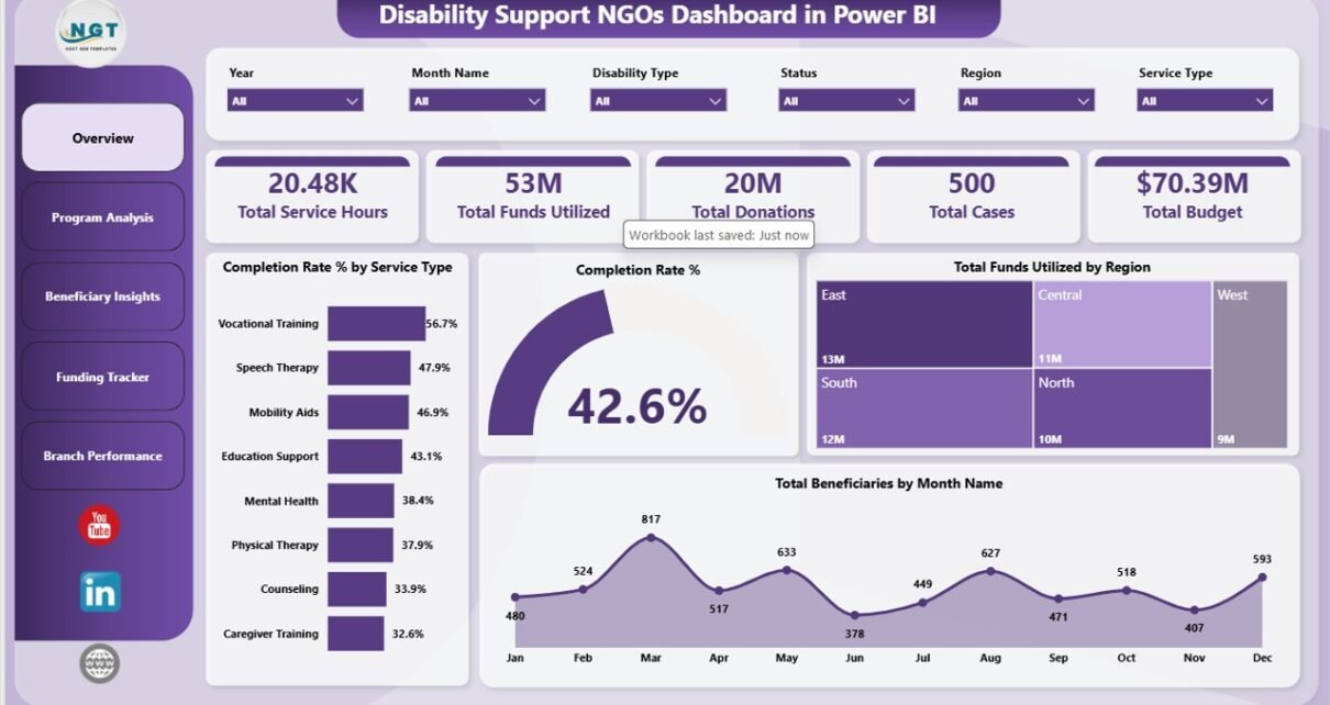
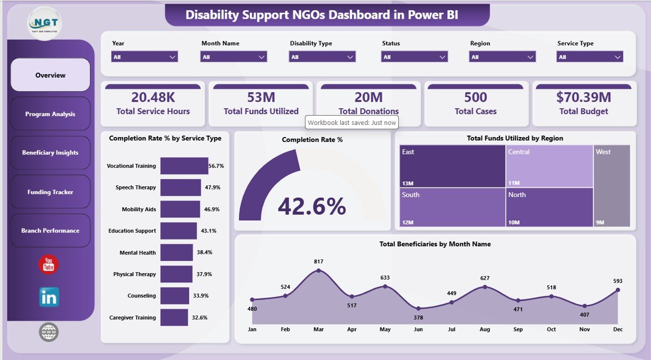
1. Overview Page
The Overview Page gives management a high-level summary of disability support operations. At the top of the page, the KPI cards show Total Service Hours, Total Funds Utilized, Total Donations, Total Cases, and Total Budget. These cards help leaders see workload, financial usage, fundraising, case volume, and available budget in one place.
Completion Rate % by Service Type compares how successfully each service type is completed. This helps program managers identify services that are running well and services that need more follow-up or process review.
Completion Rate % by Overall Records summarizes completion health across the full dataset. It gives leadership a quick program-wide view before drilling into service, branch, or disability-level detail.
Total Funds Utilized by Region shows where funding has been used geographically. This helps teams compare spending with regional demand and identify areas that may need more attention.
Total Beneficiaries by Month Name tracks month-wise beneficiary reach. It helps teams identify seasonal patterns, outreach progress, and months where service volume changes sharply.
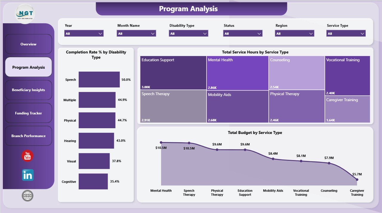
2. Program Analysis
The Program Analysis page is focused on service delivery and program workload. It helps managers understand which services consume the most time, budget, and operational attention.
Completion Rate % by Disability Type compares completion outcomes across disability categories. This can help teams identify whether certain groups face barriers or need additional support.
Total Service Hours by Service Type shows how staff or volunteer effort is distributed across services. This is useful for capacity planning, resource allocation, and workload review.
Total Budget by Service Type compares budget allocation across services. Program and finance leaders can use it to check whether funding matches demand and strategic priorities.
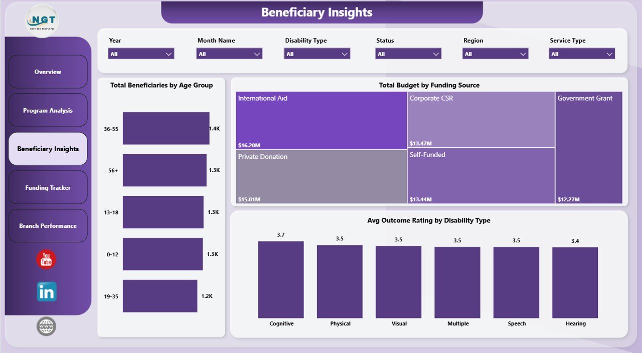
3. Beneficiary Insights
The Beneficiary Insights page helps NGOs understand the people they serve, not just the volume of services delivered. This page is useful for planning targeted programs and reviewing outcomes across groups.
Total Beneficiaries by Age Group shows beneficiary distribution by age band. It supports planning for children, adults, seniors, or age-specific disability support programs.
Total Budget by Funding Source shows how different funding sources support program delivery. This is useful for grant reporting, donor dependency review, and funding diversification discussions.
Avg Outcome Rating by Disability Type compares outcome ratings across disability categories. It helps teams identify where service quality, accessibility, or follow-up may need improvement.
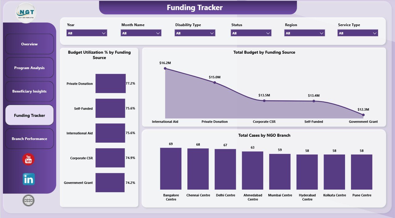
4. Funding Tracker
The Funding Tracker page is designed for finance review, donor reporting, and grant monitoring. It connects funding sources, budget utilization, and case activity in one report page.
Budget Utilization % by Funding Source shows how much of each funding source has been used. This helps finance teams avoid underuse, overspending, and reporting surprises near donor deadlines.
Total Budget by Funding Source compares budget value by source. It helps leaders see which funding channels carry the largest share of disability support programs.
Total Cases by NGO Branch compares case volume across branches. When used with budget charts, it helps leaders understand whether resources are aligned with operational demand.
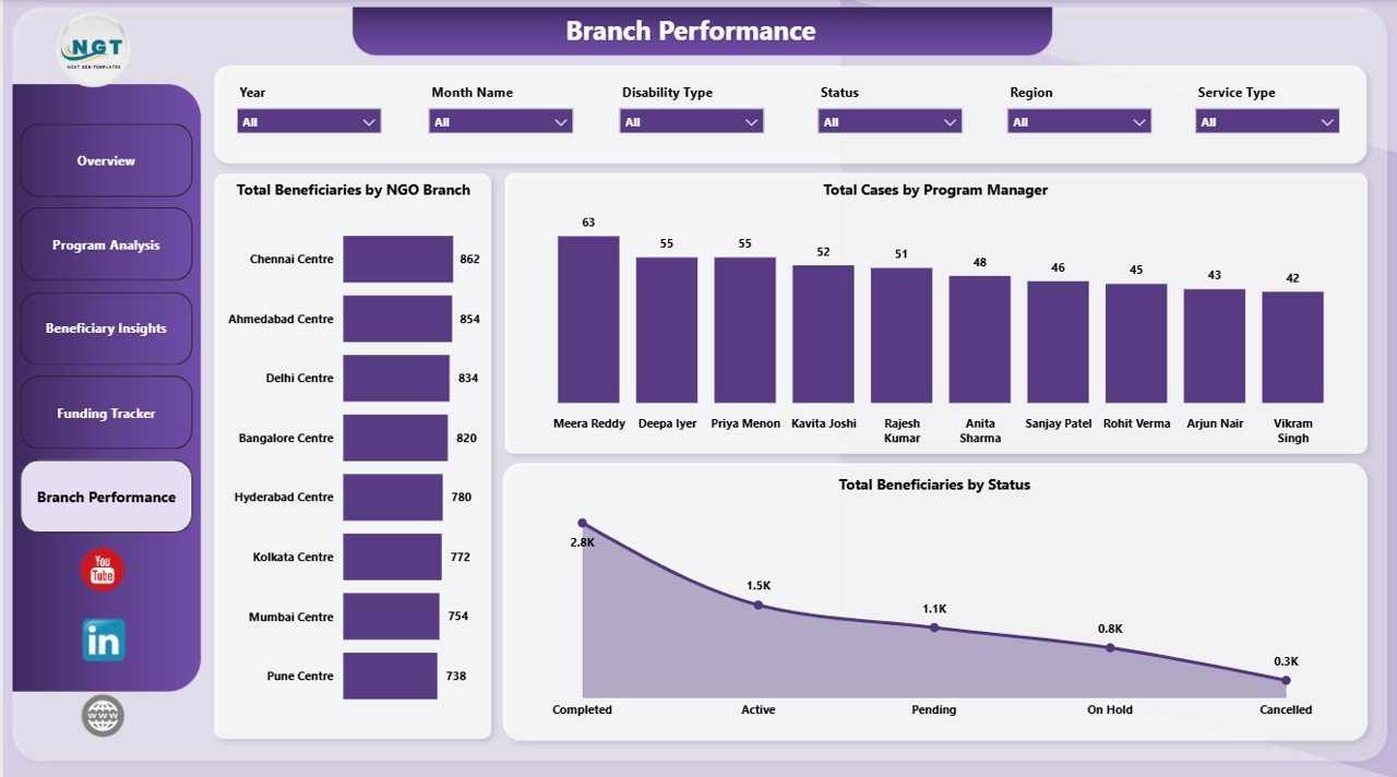
5. Branch Performance
The Branch Performance page helps managers compare delivery across NGO branches, program managers, and beneficiary status groups. It is useful for operational review meetings and follow-up planning.
Total Beneficiaries by NGO Branch compares beneficiary reach by branch. This helps leaders identify high-volume locations and locations that may need outreach support.
Total Cases by Program Manager shows case ownership by manager. It supports workload balancing, coaching, and accountability conversations.
Total Beneficiaries by Status summarizes progress across beneficiary status groups. This helps teams see pending work, completed support, and cases needing timely follow-up.
Disability Support NGOs Dashboard in Power BI vs. Tableau vs. Paid Nonprofit SaaS – Feature Comparison
| Feature | This Power BI dashboard | Tableau or Qlik alternative | Paid nonprofit SaaS |
|---|---|---|---|
| Cost | $17.99 one-time | Desktop or cloud licensing | Monthly or annual subscription |
| Platform | Power BI Desktop | Tableau or Qlik | Vendor-hosted web app |
| Setup time | Open, replace data, refresh | Build visuals and data model | Implementation and onboarding |
| Real-time collaboration | Available when published with Microsoft licensing | Available on paid cloud plans | Usually included |
| Mobile access | Available through Power BI service if published | Depends on plan | Usually available |
| Customizable fields | Editable .pbix file | Editable but build-heavy | Limited by vendor setup |
| Share with link | Requires Power BI publishing setup | Requires cloud setup | Usually available |
| Program and funding views | Built in | Must be built | Depends on plan |
| Year-1 cost at 5 users | $17.99 plus Microsoft licensing if publishing online | Often hundreds or thousands | Often hundreds or thousands |
Who Should Use This Template
This template is ideal for disability support NGOs, nonprofit program directors, branch coordinators, donor reporting teams, grants analysts, service coordinators, and consultants who need a Power BI reporting layer for beneficiaries, service hours, funding, donations, cases, budgets, and branch performance.
It works best when your team already stores program data in a structured source such as Excel, CSV, SharePoint, or another exportable system. It is not meant to replace secure beneficiary intake, donor CRM, accounting software, appointment scheduling, or a case management platform.
Real-World Use Cases
Amina, NGO program director: Amina reviews the Overview Page before monthly board meetings to explain service hours, funds utilized, donations, cases, and budget status.
Ravi, branch coordinator: Ravi uses Branch Performance to compare beneficiaries by branch and cases by program manager before assigning follow-up work.
Sofia, grants analyst: Sofia uses Funding Tracker to prepare donor updates with budget utilization and case volume by branch.
Advantages of Disability Support NGOs Dashboard in Power BI
- Clear executive summary: KPI cards make leadership review faster.
- Better program visibility: Completion rate, service hours, and budget charts support practical decisions.
- Funding accountability: Funding source and utilization views help with donor and grant reporting.
- Branch comparison: Branch and program manager views support workload balancing.
- Editable report: Power BI Desktop users can adjust visuals, measures, and layouts.
Opportunities for Improvement
The dashboard is intentionally focused on reporting, so it does not include user logins, role-based permissions, automated beneficiary intake, donor communication, audit trails, or secure case storage. Organizations handling sensitive beneficiary data should use proper access control, privacy procedures, and secure storage. If your NGO needs mobile field data entry, case notes, appointment workflows, or donor CRM features, use this dashboard alongside a dedicated operational system.
Best Practices
- Keep field names and data types consistent when replacing sample data.
- Refresh the report after every major data update.
- Use consistent branch, region, service type, disability type, and funding source names.
- Review unusually low outcome ratings before presenting results externally.
- Keep a backup copy before changing the data model or DAX measures.
Explore Relevant Templates
You can download the product here: Disability Support NGOs Dashboard in Power BI. You may also like Disability Support NGOs Dashboard in Excel, Special Education Dashboard in Power BI, and Digital Microloans Dashboard in Power BI. Browse more Power BI dashboard templates on NextGenTemplates.
Frequently Asked Questions
What does the Disability Support NGOs Dashboard in Power BI track?
It tracks service hours, funds utilized, donations, cases, budgets, beneficiaries, service types, disability types, funding sources, NGO branches, program managers, regions, outcome ratings, and statuses.
Can I use this dashboard with my own NGO data?
Yes. Replace the sample data with your own structured records and refresh the Power BI report.
Do I need Power BI Pro?
No. You can open and edit the file in Power BI Desktop. Power BI Pro is only needed if you publish and share through the Power BI service.
Can I customize the visuals?
Yes. You can edit charts, measures, page layouts, colors, and fields in Power BI Desktop.
Is this a case management system?
No. It is a reporting dashboard, not a secure case management, donor CRM, accounting, or beneficiary intake platform.
How should sensitive beneficiary data be handled?
Your organization should follow its privacy, access-control, storage, and data protection policies when using beneficiary data.
About the Author
Built by PK – Microsoft Certified Professional with 15+ years of Excel, Google Sheets, and Power BI experience. Founder of NextGenTemplates, reaching 300K+ subscribers across YouTube channels. Every template is hand-built and tested before release.
Conclusion
The Disability Support NGOs Dashboard in Power BI gives nonprofit teams a practical way to review service hours, funds utilized, donations, cases, budgets, beneficiaries, outcome ratings, and branch performance. It is useful for monthly reviews, board reporting, donor updates, and program planning. For more Excel and Power BI dashboard tutorials, visit YouTube.com/@PKAnExcelExpert.