Managing electricity tenders demands accuracy, speed, and transparency. However, many organizations still depend on scattered Excel files, manual summaries, and static reports. As a result, decision-making becomes slow, errors increase, and profitability suffers.
That is exactly where an Electricity Tender Dashboard in Power BI becomes a powerful and modern solution.
In this in-depth guide, you will learn what an Electricity Tender Dashboard in Power BI is, why it is essential, how it works, its complete dashboard structure, key features, advantages, best practices, and frequently asked questions. Moreover, the language remains simple, clear, and business-friendly so that anyone can understand and apply it easily.
Click to Purchases Electricity Tender Dashboard in Power BI
What Is an Electricity Tender Dashboard in Power BI?
An Electricity Tender Dashboard in Power BI is a centralized analytical solution designed to track, monitor, and analyze electricity-related tenders using interactive visuals.
Instead of reviewing hundreds of tender records manually, this dashboard converts raw tender data into:
-
Clear KPI cards
-
Interactive charts
-
Utility-wise, region-wise, and tender-type insights
-
Monthly performance trends
As a result, tender managers, finance teams, and leadership gain instant visibility into bid performance, costs, profits, and success rates.
Why Do Electricity Companies Need a Tender Dashboard?
Electricity tenders involve high bid values, long contract durations, and strict compliance requirements. Therefore, even a small mistake can lead to major financial loss.
An Electricity Tender Dashboard in Power BI helps because:
-
It centralizes all tender data in one place
-
It improves decision speed and accuracy
-
It highlights profitable and risky tenders early
-
It supports data-driven bidding strategies
Moreover, Power BI ensures real-time insights and easy sharing across teams.
Click to Purchases Electricity Tender Dashboard in Power BI
How Does an Electricity Tender Dashboard in Power BI Work?
The working process remains simple and effective.
-
First, you capture tender data in a structured source such as Excel or a database
-
Then, you connect the data to Power BI
-
After that, Power BI models and cleans the data
-
Finally, the dashboard displays KPIs, charts, and trends
Because Power BI updates automatically, users always see the latest information without manual effort.
What Data Is Used in an Electricity Tender Dashboard?
To create meaningful insights, the dashboard typically uses:
-
Tender number
-
Utility name
-
Region
-
Tender type
-
Bid value
-
Estimated project cost
-
Profit amount
-
Profit margin %
-
Tender status
-
Awarded value
-
Contract duration
-
Tender month
When this data stays clean and consistent, the dashboard delivers accurate and actionable results.
Click to Purchases Electricity Tender Dashboard in Power BI
Structure of Electricity Tender Dashboard in Power BI
This Electricity Tender Dashboard contains 5 analytical pages, each designed for a specific business purpose.
1. Overview Page: What Does the Summary Show?
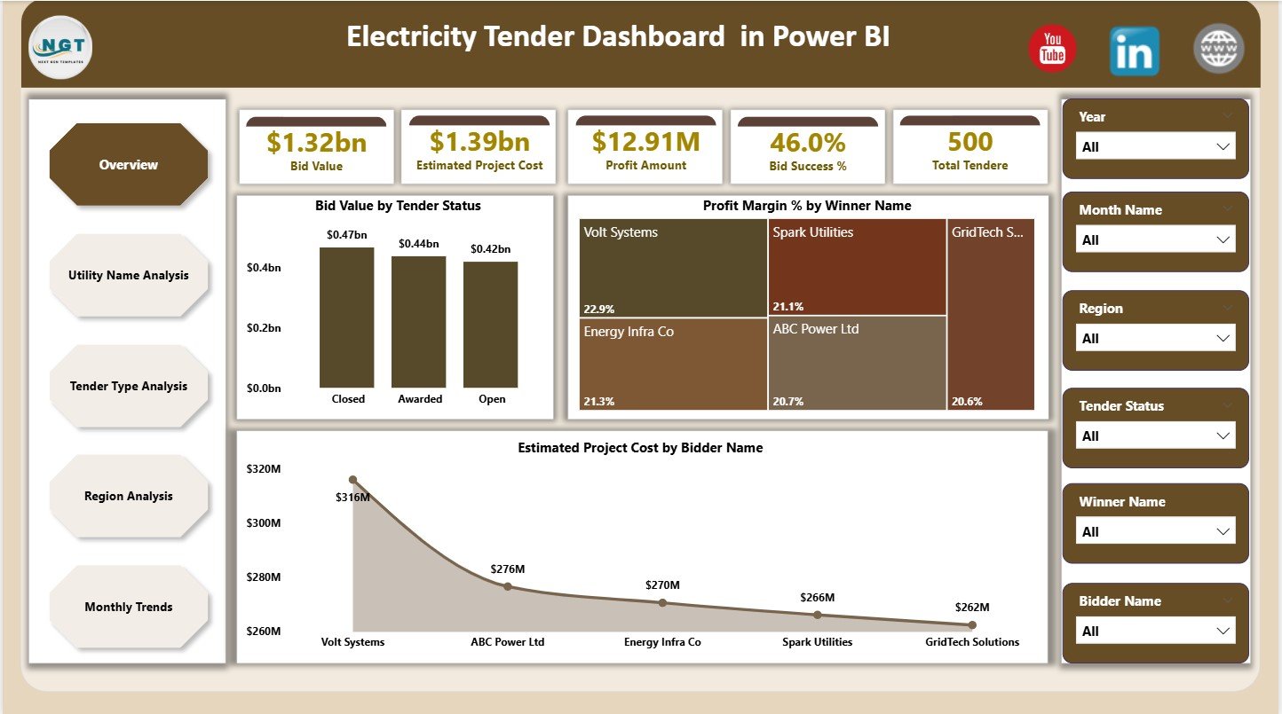
The Overview Page acts as the control center of the dashboard. Here, decision-makers see a complete snapshot of tender performance.
KPI Cards on Overview Page
The dashboard displays 5 key cards:
-
Bid Value – Total value of bids submitted
-
Estimated Project Cost – Expected cost for all tenders
-
Profit Amount – Overall projected profit
-
Bid Success % – Percentage of awarded tenders
-
Total Tenders – Count of all tenders
Because these cards appear at the top, users instantly understand performance.
Charts on Overview Page
The Overview Page includes 3 powerful charts:
-
Bid Value by Tender Status
Helps track awarded, pending, and lost tenders -
Profit Margin % by Winner Name
Shows which bidders generate better margins -
Estimated Project Cost by Bidder Name
Highlights cost distribution across bidders
Together, these visuals support quick and confident decisions.
2. Utility Name Analysis: How Does Utility-Wise Performance Look?
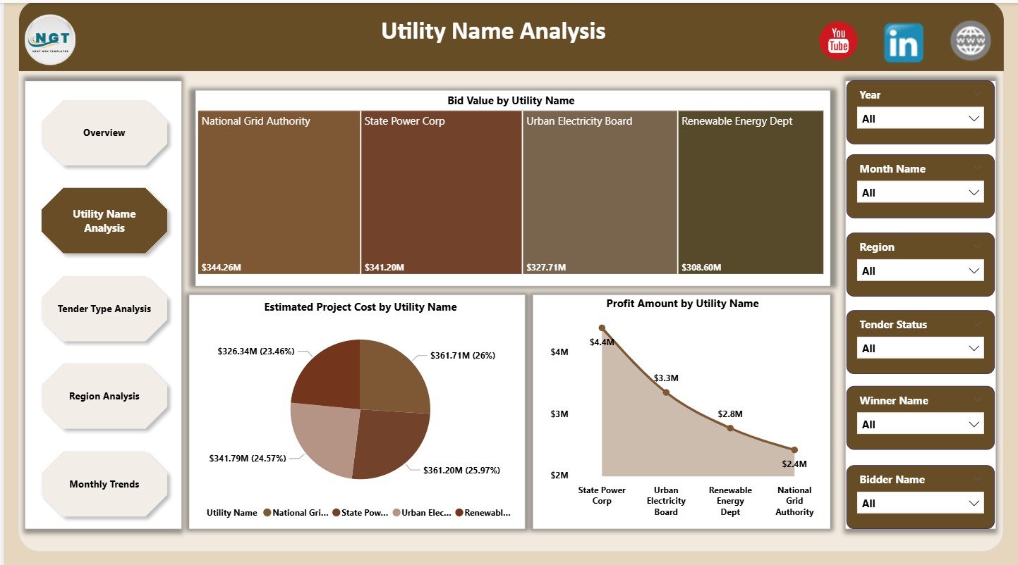
The Utility Name Analysis page focuses on performance across different electricity utilities.
Charts on Utility Name Analysis Page
This page contains 3 focused charts:
-
Bid Value by Utility Name
Identifies utilities with higher bidding exposure -
Estimated Project Cost by Utility Name
Helps control cost-heavy utilities -
Profit Amount by Utility Name
Reveals utilities delivering better profitability
As a result, teams can prioritize utilities with strong returns.
3. Tender Type Analysis: Which Tender Types Perform Better?
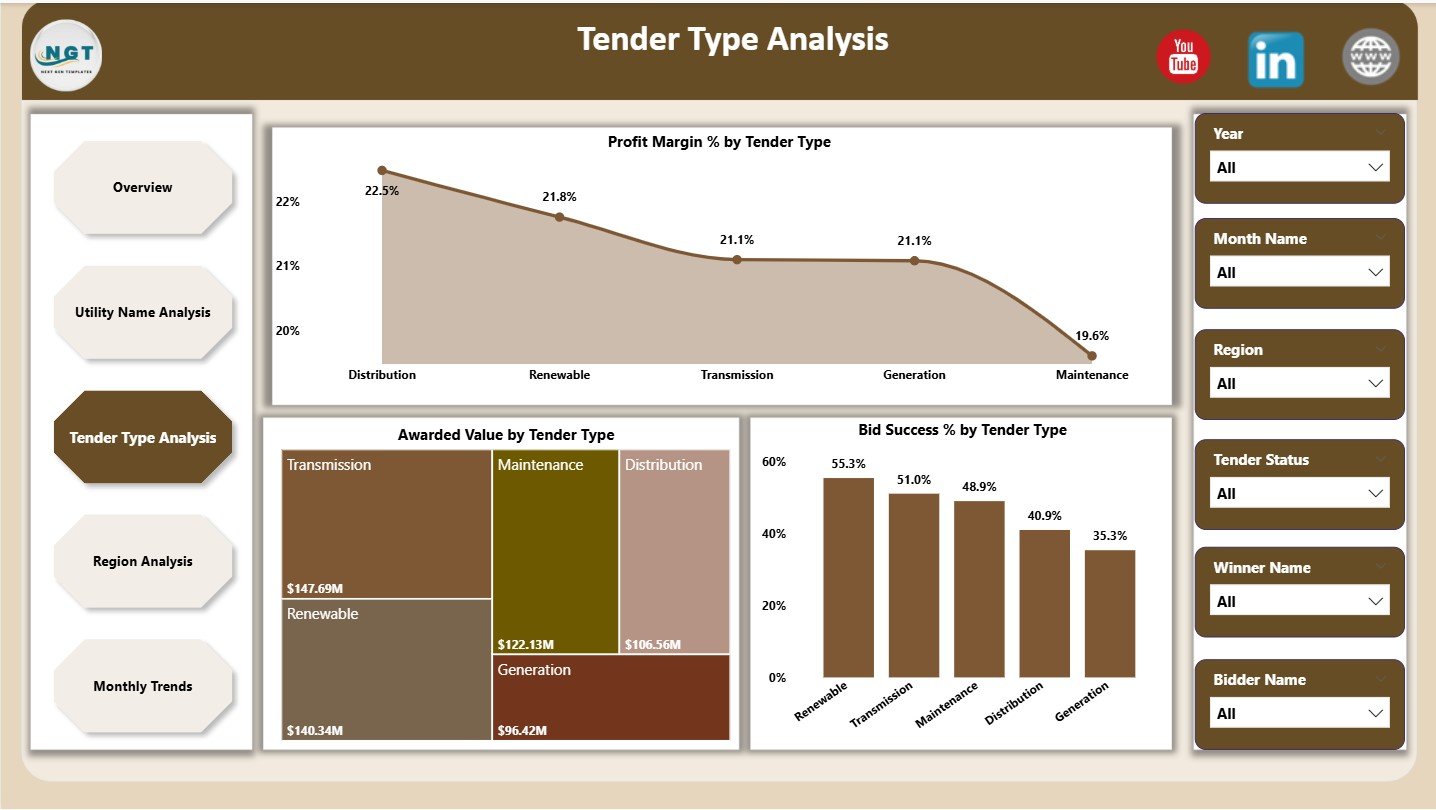
Different tender types deliver different results. Therefore, analyzing them separately becomes essential.
Charts on Tender Type Analysis Page
This page includes 3 insightful charts:
-
Profit Margin % by Tender Type
Shows which tender types generate higher margins -
Awarded Value by Tender Type
Highlights revenue contribution -
Bid Success % by Tender Type
Reveals winning probability
Because of this analysis, teams can focus on tender types that offer higher success and profit.
4. Region Analysis: How Do Regions Impact Tender Performance?
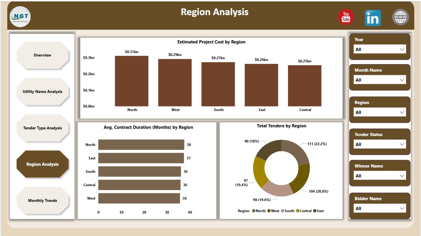
Electricity tenders often vary by geography. Therefore, regional insights help reduce risk and improve planning.
Charts on Region Analysis Page
This page displays 3 regional charts:
-
Estimated Project Cost by Region
Helps manage region-wise cost exposure -
Average Contract Duration (Months) by Region
Supports long-term planning -
Total Tenders by Region
Shows tender volume distribution
As a result, management can allocate resources more efficiently.
Click to Purchases Electricity Tender Dashboard in Power BI
5. Monthly Trends: How Does Performance Change Over Time?
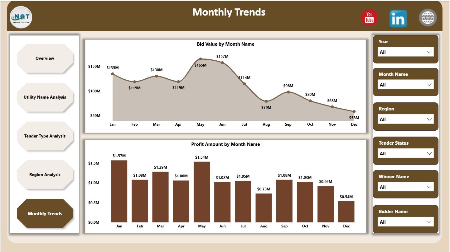
Trends reveal patterns that numbers alone cannot show. Therefore, the Monthly Trends page becomes crucial.
Charts on Monthly Trends Page
This page contains 2 trend charts:
-
Bid Value by Month
Tracks bidding activity over time -
Profit Amount by Month
Highlights seasonal profitability
With this view, teams can forecast future performance more accurately.
Key Features of Electricity Tender Dashboard in Power BI
This dashboard offers multiple practical features:
-
Interactive slicers for dynamic filtering
-
Real-time KPI tracking
-
Multi-page analytical structure
-
Drill-down and cross-filtering
-
Clean and professional visuals
Because of these features, users gain full control over tender analysis.
Advantages of Electricity Tender Dashboard in Power BI
Using this dashboard delivers significant business benefits.
Improved Decision-Making
Because insights appear instantly, leaders make faster and better decisions.
Higher Bid Success Rate
By analyzing past success trends, teams improve future bidding strategies.
Better Cost Control
Cost-related visuals help reduce budget overruns.
Increased Profitability
Profit-focused KPIs highlight high-margin opportunities.
Time Savings
Automation removes manual reporting work completely.
Opportunities for Improvement in Electricity Tender Analysis
Even with a strong dashboard, continuous improvement matters.
-
Add forecast measures for future tenders
-
Include risk scoring for bids
-
Integrate vendor performance ratings
-
Connect live data sources
These enhancements further increase dashboard value.
Click to Purchases Electricity Tender Dashboard in Power BI
Best Practices for the Electricity Tender Dashboard in Power BI
To get maximum value, follow these best practices:
Maintain Clean Data
Always validate bid values, costs, and dates before loading data.
Use Standard Naming
Consistent tender types, regions, and utilities improve analysis accuracy.
Update Data Regularly
Frequent updates ensure decisions rely on fresh insights.
Limit Visual Overload
Use only meaningful charts on each page.
Train Users
Ensure users understand slicers and filters properly.
Who Should Use an Electricity Tender Dashboard in Power BI?
This dashboard suits:
-
Electricity distribution companies
-
Power generation firms
-
EPC contractors
-
Tender management teams
-
Finance and strategy departments
Because of its flexibility, organizations of all sizes benefit from it.
Why Power BI Is Ideal for Electricity Tender Dashboards?
Power BI offers:
-
Fast data processing
-
Strong visualization capabilities
-
Easy sharing and collaboration
-
Secure access controls
Therefore, Power BI remains a preferred tool for tender analytics.
How Does This Dashboard Improve Tender Strategy?
This dashboard transforms raw tender data into strategic insights. Moreover, it reveals:
-
Which tenders to target
-
Which regions to avoid
-
Which utilities deliver better margins
-
Which months perform best
As a result, organizations bid smarter and grow profitably.
Conclusion
An Electricity Tender Dashboard in Power BI is no longer optional. Instead, it has become essential for modern electricity businesses that want clarity, control, and confidence in tender decisions.
By combining structured data, interactive visuals, and real-time insights, this dashboard helps teams improve bid success, control costs, and maximize profits. Moreover, its five-page structure ensures complete analysis from overview to trends.
If you want faster decisions, better planning, and higher returns, this dashboard delivers exactly that.
Click to Purchases Electricity Tender Dashboard in Power BI
Frequently Asked Questions (FAQs)
What is an Electricity Tender Dashboard in Power BI?
It is a Power BI solution that analyzes electricity tender data using KPIs, charts, and trends.
Can this dashboard handle large datasets?
Yes, Power BI efficiently handles large tender datasets without performance issues.
Is this dashboard suitable for multiple regions?
Yes, the Region Analysis page supports multi-region tender tracking.
Can users filter data easily?
Yes, interactive slicers allow quick filtering by utility, region, tender type, and time.
Does this dashboard help improve bid success?
Yes, historical analysis helps refine bidding strategies and improve success rates.
Can this dashboard be customized?
Yes, organizations can easily add KPIs, charts, or data sources.
Click to Purchases Electricity Tender Dashboard in Power BI
Visit our YouTube channel to learn step-by-step video tutorials