Environmental organizations today operate in a data-driven world. Companies that provide environmental services must monitor fuel consumption, emissions reduction, operational efficiency, service response time, and financial performance simultaneously. However, many organizations still depend on scattered spreadsheets and manual reporting systems. As a result, managers struggle to analyze performance quickly and make timely decisions.Therefore, businesses increasingly adopt intelligent dashboards that convert raw operational data into meaningful insights. One powerful solution is the Environmental Services Dashboard in Power BI.This article explains everything you need to know about the Environmental Services Dashboard in Power BI. You will learn its structure, features, benefits, implementation approach, best practices, and practical use cases. Moreover, you will understand how this ready-to-use dashboard helps organizations improve sustainability performance while increasing operational efficiency.
Click to buy Environmental Services Dashboard in Power BI
What Is an Environmental Services Dashboard in Power BI?
An Environmental Services Dashboard in Power BI is an interactive business intelligence solution designed to monitor environmental operations, service efficiency, emissions data, and financial performance in one centralized platform.
Instead of reviewing multiple reports, decision-makers can view all important environmental KPIs through visual charts, cards, and filters. Consequently, teams identify trends faster and take corrective action without delay.
Power BI transforms operational datasets into dynamic visuals. Therefore, users can explore performance by region, service channel, contract type, weather condition, or time period with just a few clicks.
Why Do Environmental Service Organizations Need a Dashboard?
Environmental service providers handle complex operations daily. For example:
- Waste management services
- Facility environmental maintenance
- Sustainability monitoring programs
- Emission reduction initiatives
- Field service operations
Because these activities generate large volumes of data, manual analysis becomes inefficient. However, dashboards simplify analysis and improve visibility.
As a result, organizations gain:
- Real-time operational insights
- Faster service monitoring
- Improved sustainability tracking
- Better financial transparency
- Data-driven decision making
Key Features of the Environmental Services Dashboard in Power BI
The Environmental Services Dashboard includes five interactive pages, each designed to analyze a specific operational area. Together, these pages provide a complete performance overview.
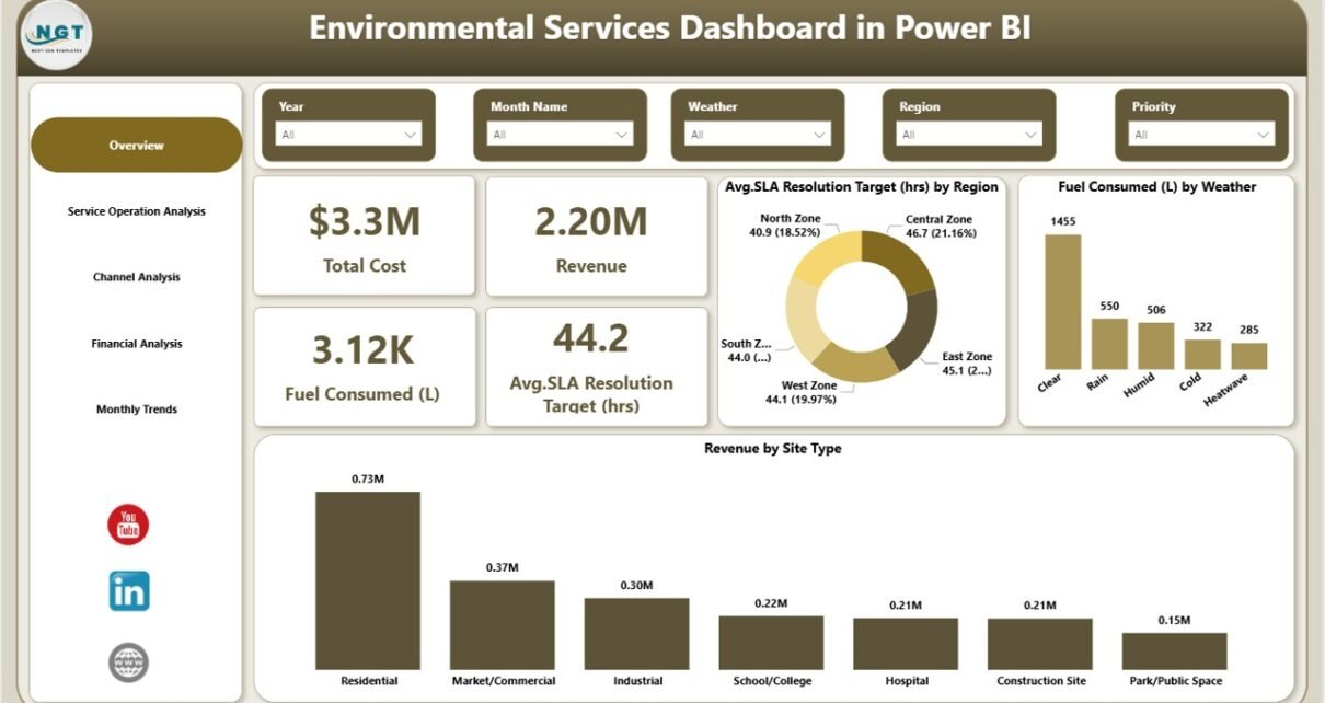
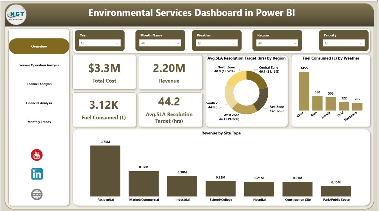
Overview Page – How Does It Provide Instant Performance Insights?
The Overview Page acts as the central monitoring screen of the dashboard. Users immediately understand overall performance when they open the report.
KPI Cards Displayed
The dashboard highlights four important performance indicators:
- Total Cost
- Revenue
- Fuel Consumed (Liters)
- Average SLA Resolution Target (Hours)
These KPI cards help managers quickly evaluate operational efficiency and financial health.
Visual Charts Available
Additionally, the overview includes powerful visualizations:
- Average SLA Resolution Target (Hours) by Region
- Fuel Consumed (L) by Weather Condition
- Revenue by Site Type
Because slicers allow filtering, users can analyze performance across multiple dimensions instantly.
Click to buy Environmental Services Dashboard in Power BI
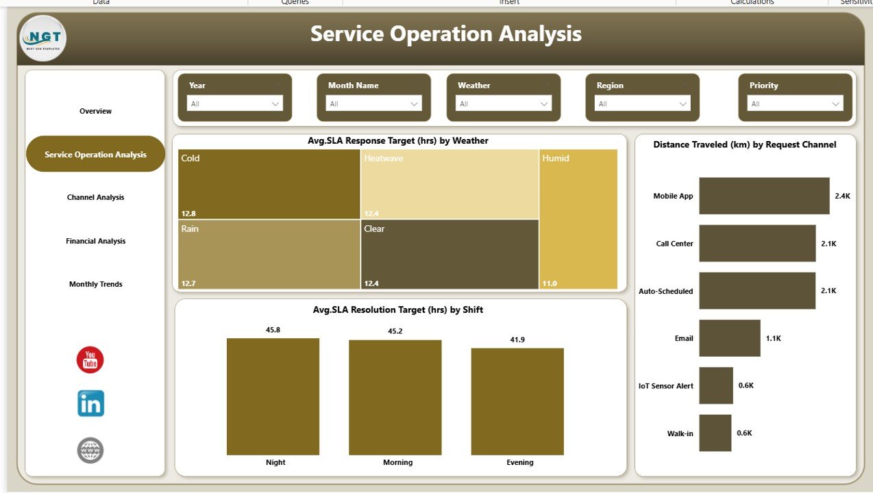
Service Operation Analysis – How Can You Monitor Operational Efficiency?
The Service Operation Analysis Page focuses on service delivery performance. Environmental service companies must ensure timely responses while minimizing operational costs.
Key Charts Included
- Average SLA Response Target (Hours) by Weather
- Distance Travelled (KM) by Request Channel
- Average SLA Resolution Target (Hours) by Shift
These visuals help managers understand how operational factors influence service efficiency.
For example:
- Weather conditions may delay services.
- Certain request channels may require longer travel distances.
- Shift patterns may affect response time.
Therefore, leaders can optimize workforce planning and route management effectively.
Click to buy Environmental Services Dashboard in Power BI
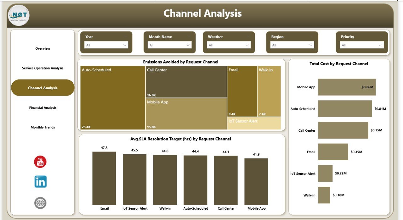
Channel Analysis – Which Service Channels Perform Better?
Environmental organizations receive service requests through multiple channels such as mobile apps, emails, portals, or call centers. However, not every channel performs equally.
The Channel Analysis Page evaluates performance by request channel.
Charts Included
- Emissions Avoided by Request Channel
- Total Cost by Request Channel
- Average SLA Resolution (Hours) by Request Channel
This analysis helps organizations identify:
- Most cost-efficient channels
- Channels delivering faster service resolution
- Sustainability impact by communication method
Consequently, companies allocate resources more strategically.
Click to buy Environmental Services Dashboard in Power BI
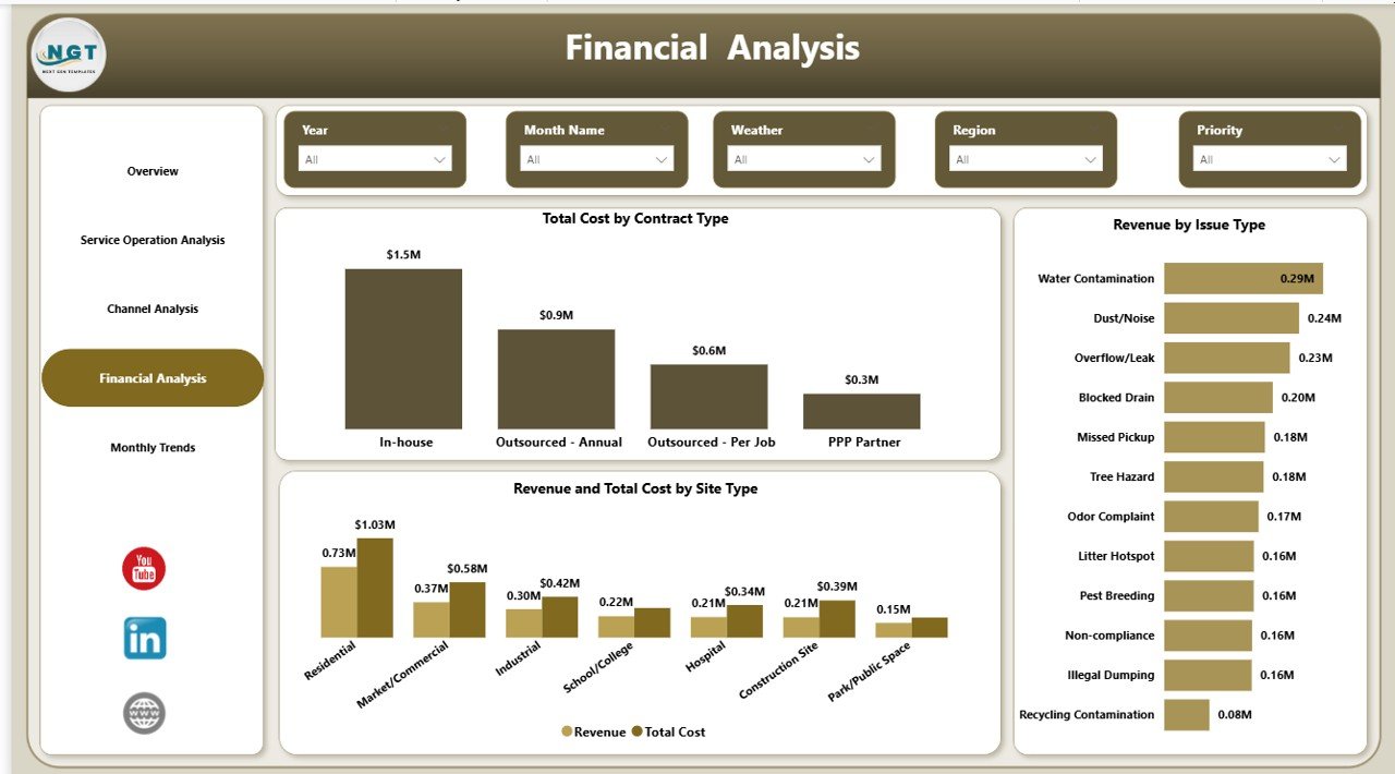
Financial Analysis – How Does the Dashboard Support Financial Decisions?
Financial visibility remains essential for environmental service operations. Without clear financial analytics, organizations cannot measure profitability accurately.
The Financial Analysis Page provides deep financial insights.
Key Charts
- Total Cost by Contract Type
- Revenue by Issue Type
- Revenue and Total Cost by Site Type
These visuals help decision-makers compare revenue generation against operational expenses.
As a result, companies can:
- Evaluate profitable contracts
- Identify high-cost service areas
- Improve pricing strategies
- Control operational spending
Click to buy Environmental Services Dashboard in Power BI
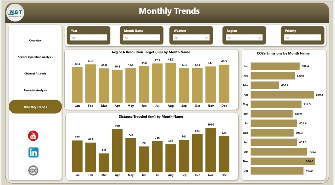
Monthly Trends – Why Is Trend Analysis Important?
Trend analysis allows organizations to evaluate long-term performance instead of focusing only on current data.
The Monthly Trends Page provides historical insights using monthly comparisons.
Charts Available
- Average SLA Resolution Target (Hours) by Month
- CO2e Emissions by Month
- Distance Travelled (KM) by Month
Because trends reveal patterns over time, managers can forecast performance and plan improvements proactively.
Click to buy Environmental Services Dashboard in Power BI
What KPIs Can You Track in an Environmental Services Dashboard?
A well-designed environmental dashboard tracks both operational and sustainability metrics.
Operational KPIs
- SLA Resolution Time
- Service Response Time
- Distance Travelled
- Service Requests Volume
- Shift Efficiency
Environmental KPIs
- CO2e Emissions
- Emissions Avoided
- Fuel Consumption
- Sustainability Impact Score
Financial KPIs
- Total Cost
- Revenue
- Contract Profitability
- Cost per Service Request
Tracking these KPIs together creates a balanced performance view.
Advantages of Environmental Services Dashboard in Power BI
Organizations gain several benefits when they implement this dashboard.
Centralized Data Monitoring
Teams access all operational and environmental metrics in one place.
Faster Decision Making
Visual analytics allow instant performance evaluation.
Improved Sustainability Tracking
Companies monitor emissions and environmental impact effectively.
Operational Optimization
Managers identify inefficiencies quickly and improve processes.
Interactive Filtering
Users analyze data using slicers without technical expertise.
Better Financial Visibility
Revenue and cost comparisons support smarter budgeting.
Real-Time Insights
Power BI updates dashboards automatically when data refreshes.
How Does Power BI Improve Environmental Data Analysis?
Power BI offers powerful analytics capabilities that traditional spreadsheets cannot match.
Interactive Visualization
Users explore data dynamically instead of reading static reports.
Automated Calculations
The system calculates KPIs automatically, reducing manual work.
Drill-Down Analysis
Managers investigate root causes behind performance changes.
Data Integration
Power BI connects with Excel, databases, and cloud platforms.
Scalability
Organizations expand dashboards as operations grow.
Therefore, Power BI becomes an ideal platform for environmental analytics.
Who Can Use the Environmental Services Dashboard?
This dashboard benefits multiple industries and roles.
Industries
- Waste management companies
- Environmental consulting firms
- Facility management providers
- Sustainability service organizations
- Municipal environmental departments
Professional Roles
- Operations Managers
- Sustainability Managers
- Financial Analysts
- Service Coordinators
- Executive Leadership Teams
Because the interface remains simple, both technical and non-technical users can operate it easily.
How to Implement an Environmental Services Dashboard in Power BI?
Successful implementation requires structured steps.
Step 1: Define KPIs
Identify operational, environmental, and financial metrics.
Step 2: Prepare Data Sources
Collect service data, fuel usage, emissions records, and financial data.
Step 3: Clean and Structure Data
Ensure consistent formats and remove duplicate entries.
Step 4: Import Data into Power BI
Load datasets into Power BI Desktop.
Step 5: Create Data Relationships
Connect tables logically for accurate analysis.
Step 6: Design Visualizations
Build charts, KPI cards, and slicers.
Step 7: Publish Dashboard
Share reports securely through Power BI Service.
Best Practices for the Environmental Services Dashboard
Following best practices ensures long-term dashboard success.
Keep KPIs Simple
Focus only on metrics that support decision making.
Maintain Data Accuracy
Update datasets regularly to ensure reliable insights.
Use Consistent Units
Standardize measurement units such as liters, hours, and kilometers.
Enable User-Friendly Filters
Provide slicers for region, weather, and time period.
Monitor Data Refresh
Schedule automatic refresh to maintain real-time analytics.
Train Users
Educate teams on interpreting visuals correctly.
Review KPIs Periodically
Update metrics as business priorities change.
Common Challenges and How to Overcome Them
Data Silos
Different departments store data separately. Integrate sources into one dataset.
Poor Data Quality
Clean data before importing into Power BI.
Overloaded Dashboards
Avoid too many visuals. Keep layouts clean and focused.
Lack of Adoption
Provide training and demonstrate dashboard value.
Real-World Use Cases of Environmental Services Dashboards
Waste Collection Optimization
Companies track travel distance and fuel usage to reduce operational costs.
Sustainability Reporting
Organizations monitor emissions avoided for ESG reporting.
Service Efficiency Monitoring
Managers evaluate SLA performance across regions.
Contract Performance Evaluation
Financial teams compare revenue and costs by contract type.
Future Trends in Environmental Analytics
Environmental analytics continues to evolve rapidly.
AI-Based Forecasting
Predict emissions and service demand automatically.
IoT Integration
Sensors provide real-time environmental data.
Predictive Maintenance
Organizations anticipate service issues before failures occur.
Sustainability Scorecards
Companies measure environmental impact alongside profitability.
As technology advances, dashboards will become even more intelligent and automated.
Conclusion
Environmental service organizations must balance operational efficiency, financial performance, and sustainability goals simultaneously. However, manual reporting limits visibility and slows decision-making.
The Environmental Services Dashboard in Power BI solves this challenge by combining operational analytics, environmental metrics, and financial insights into one interactive platform. Because it provides real-time visualization and trend analysis, organizations improve efficiency, reduce costs, and enhance sustainability outcomes.
Therefore, adopting a structured Power BI dashboard empowers teams to move from reactive management toward proactive, data-driven decision making.
Frequently Asked Questions (FAQs)
What is an Environmental Services Dashboard?
An Environmental Services Dashboard is a Power BI report that tracks environmental operations, emissions, service performance, and financial metrics using interactive visuals.
Why should organizations use Power BI for environmental analytics?
Power BI provides automated calculations, interactive dashboards, and real-time insights that simplify complex environmental data analysis.
Can small organizations use this dashboard?
Yes. Small and medium businesses benefit because Power BI scales according to organizational needs.
What data is required for this dashboard?
You need service operation data, fuel consumption records, emissions information, and financial performance data.
How often should the dashboard be updated?
Organizations should refresh data daily or weekly depending on operational requirements.
Does the dashboard support sustainability reporting?
Yes. It tracks emissions and environmental impact metrics, which support ESG and sustainability reporting.
Is technical knowledge required to use the dashboard?
No. Users interact through slicers and visuals, making it easy for non-technical teams.
Visit our YouTube channel to learn step-by-step video tutorials
Watch the step-by-step video tutorial:
Click to buy Environmental Services Dashboard in Power BI