The Medical Practice Dashboard in Power BI is a comprehensive, professionally designed analytics template that empowers healthcare administrators, clinic managers, and medical business analysts to monitor every aspect of their practice — from patient visits and revenue to departmental performance and operational efficiency. This ready-to-use Power BI template includes 5 interactive dashboard pages with KPI cards, dynamic charts, and slicers that enable real-time filtering and analysis across multiple dimensions.
Whether you run a small private practice or a multi-department hospital, this Medical Practice Dashboard in Power BI provides instant visibility into the metrics that matter most — Total Visits, Total Revenue, Average Wait Time, Completion Rate, and Average Patient Satisfaction. Simply replace the sample data with your own, click Refresh, and all 5 pages update automatically.
Click here to Purchase the Medical Practice Dashboard in Power BI
Key Features of the Medical Practice Dashboard in Power BI
This Power BI template is packed with features designed specifically for medical practice analytics:
- 5 Interactive Dashboard Pages — Overview, Department Analysis, Patient Insights, Financial Review, and Operational KPIs give you a 360-degree view of your practice.
- KPI Cards on Overview Page — Total Visits, Total Revenue, Avg Wait Time, Completion Rate, and Avg Patient Satisfaction displayed prominently at the top for quick reference.
- Revenue Analysis Across Dimensions — Total Revenue by Visit Type, Total Revenue by Gender, Profit Margin by Payment Status, and Total Visits by Month Name on the Overview page alone.
- Department Performance Tracking — Avg Patient Satisfaction, Net Profit, and Avg Wait Time broken down by department for targeted operational improvements.
- Patient Demographic Insights — Track visit types, diagnosis categories, and insurance types to understand patient segments and revenue sources.
- Financial Deep-Dive — Profit Margin by Department, Total Revenue by Payment Status, and monthly revenue trends for financial planning and forecasting.
- Operational KPI Monitoring — Avg Consultation Duration by Department, Total Cost by Treatment Type, and Avg Wait Time trends to optimize daily operations.
- Dynamic Slicers and Filters — Filter all pages by department, visit type, time period, and other dimensions for instant focused analysis.
- Ready-to-Use .pbix File — No DAX coding or data modeling required. Open in Power BI Desktop (free), replace data, and refresh.
Dashboard Pages Explained
1. Overview Page
The Overview page serves as the high-level command center of the Medical Practice Dashboard in Power BI. At the top, five KPI cards instantly display Total Visits, Total Revenue, Avg Wait Time, Completion Rate, and Avg Patient Satisfaction. Below the cards, four key visualizations provide actionable insights: Total Revenue by Visit Type breaks down income across different appointment categories, Total Revenue by Gender shows gender-based revenue distribution, Profit Margin by Payment Status reveals how different payment methods affect profitability, and Total Visits by Month Name highlights seasonal trends and patient flow patterns. Multiple slicers allow you to filter the entire dashboard instantly by department, visit type, and other dimensions.
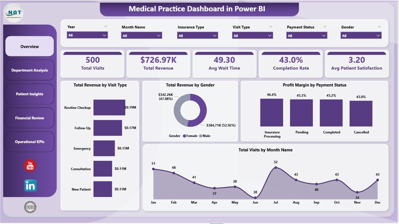
Overview Page
2. Department Analysis
The Department Analysis page is specifically designed for healthcare administrators who need to compare performance across departments. It features three powerful visualizations: Avg Patient Satisfaction by Department helps identify departments excelling in patient care and those needing improvement. Net Profit by Department shows which departments are contributing the most to the bottom line. Avg Wait Time by Department pinpoints operational bottlenecks where patients are waiting too long. This page is invaluable for making data-driven decisions about staffing, resource allocation, and quality improvement initiatives. If you’re also tracking department-level metrics in Excel, check out the Medical Practice Dashboard in Excel blog post for a comparison.
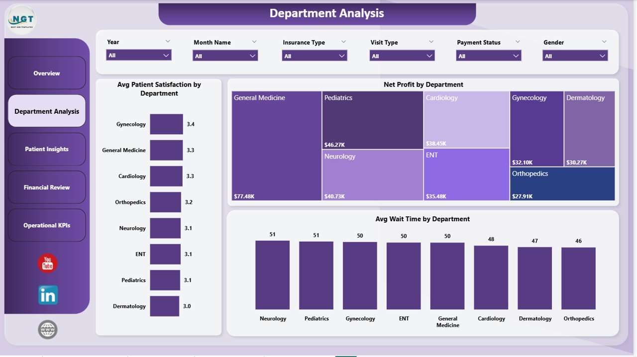
Department Analysis
3. Patient Insights
The Patient Insights page dives deep into patient demographics and clinical patterns. Total Visits by Visit Type reveals the distribution of appointments across categories such as new patient visits, follow-ups, emergency consultations, and routine check-ups. Total Revenue by Diagnosis Category shows which medical conditions generate the most revenue, helping practice managers understand their specialty mix. Total Revenue by Insurance Type breaks down income by insurance provider, enabling better contract negotiations and network planning. This page is especially useful for practice managers and billing teams who want to optimize patient mix and revenue streams. For similar patient tracking in Google Sheets, explore the Hospital Patient Flow Dashboard in Power BI.
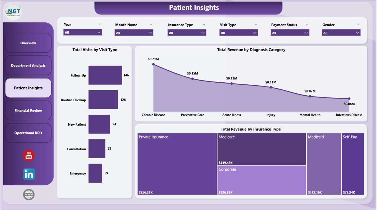
Patient Insights
4. Financial Review
The Financial Review page is a must-have for CFOs, financial controllers, and practice owners. Profit Margin by Department reveals which departments deliver the highest margins and which ones are dragging down profitability. Total Revenue by Payment Status tracks how much revenue comes from different payment states — paid, pending, denied, or partially paid — enabling better collections management. Total Revenue by Month Name shows monthly revenue trends across the year, making it easy to spot seasonal patterns, forecast future revenue, and plan budgets accordingly. This page transforms raw financial data into clear, actionable insights for strategic decision-making.
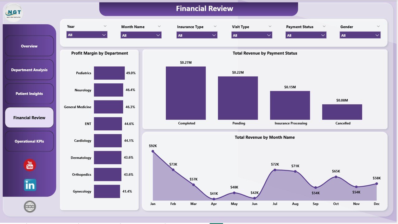
Financial Review
5. Operational KPIs
The Operational KPIs page tracks the day-to-day operational health of your medical practice. Avg Consultation Duration by Department shows how much time doctors spend with patients in each department, helping identify departments where appointments are running too long or too short. Total Cost by Treatment Type breaks down operational costs by treatment category, enabling cost optimization and pricing reviews. Avg Wait Time by Month Name reveals monthly wait time trends so operations managers can plan staffing levels and schedule adjustments. This page is essential for anyone responsible for improving patient experience and operational efficiency.
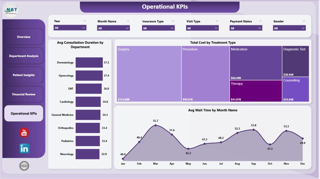
Operational KPIs
Advantages of the Medical Practice Dashboard in Power BI
- Instant Analytics — No coding or complex setup required. Open, connect your data, and refresh to see results immediately.
- Comprehensive Coverage — 5 dedicated pages cover every major aspect of medical practice management: overview, departments, patients, finance, and operations.
- Data-Driven Decisions — Replace guesswork with facts. Identify underperforming departments, track revenue trends, and optimize patient wait times using visual analytics.
- Fully Customizable — Add new pages, create custom DAX measures, change color themes, or modify chart types to match your organization’s reporting standards.
- Power BI Desktop Compatible — Works with the free Power BI Desktop application from Microsoft. No premium license required to use the template locally.
- Cross-Platform Data Sources — Connect to Excel files, SQL Server databases, cloud sources, or any Power BI-supported data connector to populate the dashboard.
Opportunities for Improvement
- Row-Level Security — Adding RLS would allow department heads to only see their own department’s data when published to Power BI Service, enhancing data governance.
- Scheduled Refresh — If published to Power BI Service with a gateway connection, you could set up automatic daily or hourly data refreshes for real-time monitoring.
- Drill-Through Pages — Adding drill-through functionality from the Overview page to detailed patient-level or visit-level reports would enable deeper ad-hoc analysis.
- Benchmark Comparisons — Including industry benchmark KPIs alongside actual metrics would provide context for performance evaluation.
- Alert Configuration — Setting up data alerts for critical KPIs like wait time exceeding thresholds or revenue dropping below targets would enable proactive management.
Best Practices for Using This Dashboard
- Update Data Regularly — For the most accurate insights, refresh your data weekly or daily. Set up a scheduled refresh if using Power BI Service.
- Use Slicers Strategically — Start with the Overview page for a high-level picture, then use slicers to drill into specific departments, time periods, or visit types.
- Share with Stakeholders — Publish the dashboard to Power BI Service and share it with department heads, finance teams, and executive leadership for organization-wide visibility.
- Track Trends Over Time — Use the monthly trend charts to identify patterns and set realistic improvement targets for KPIs like wait time and patient satisfaction.
- Combine with Other Templates — Pair this dashboard with the Veterinary Clinic Dashboard in Power BI or other healthcare templates from NextGenTemplates for a complete analytics ecosystem across specialties.
Explore Relevant Templates
If you found this Medical Practice Dashboard in Power BI useful, explore these related templates from NextGenTemplates.com:
- Medical Practice Dashboard in Excel — The same analytics in an Excel-based dashboard with pivot tables and automated charts.
- Healthcare & Hospital Management Bundle — 8 premium templates across Excel, Power BI, and VBA covering every healthcare analytics need.
- Hospital Patient Flow Dashboard in Google Sheets — Track patient flow and hospital operations in Google Sheets with Apps Script automation.
- Dermatology Clinics Dashboard in Power BI — Specialized Power BI analytics for dermatology practices tracking clinic performance and doctor productivity.
- Veterinary Clinic Dashboard in Power BI — Power BI analytics for veterinary clinics with patient, treatment, and revenue tracking.
Frequently Asked Questions
What is the best Power BI template for tracking medical practice performance?
The Medical Practice Dashboard in Power BI from NextGenTemplates is one of the most comprehensive options available. It includes 5 interactive pages — Overview, Department Analysis, Patient Insights, Financial Review, and Operational KPIs — covering all major analytics needs for clinics and hospitals. The template tracks Total Visits, Total Revenue, Avg Wait Time, Completion Rate, Avg Patient Satisfaction, and many more KPIs across departments, visit types, and time periods.
How do I set up the Medical Practice Dashboard in Power BI?
Setup is simple: download the .pbix file, open it in Power BI Desktop (free from Microsoft), review the sample data structure, replace it with your own medical practice data (patient visits, billing records, department details), and click Refresh. All 5 dashboard pages, KPI cards, charts, and slicers update automatically — no DAX coding or data modeling required.
Can I use this dashboard for multiple clinic locations?
Yes. You can add a location field to your data source and use the slicer functionality to filter all dashboard pages by location. This makes it easy to compare performance across multiple clinic branches or hospital campuses within a single dashboard.
What KPIs are tracked on the Overview page?
The Overview page displays 5 key metric cards at the top: Total Visits, Total Revenue, Avg Wait Time, Completion Rate, and Avg Patient Satisfaction. Below the cards, four visualizations show Total Revenue by Visit Type, Total Revenue by Gender, Profit Margin by Payment Status, and Total Visits by Month Name — providing a complete snapshot of practice performance.
Is Power BI Desktop free to use with this template?
Yes. Power BI Desktop is a free application from Microsoft that you can download and install on any Windows computer. You can open, edit, customize, and use this .pbix template entirely within Power BI Desktop without any paid license. A Power BI Pro or Premium license is only needed if you want to publish and share the dashboard online through Power BI Service.
How does this compare to the Excel version of the Medical Practice Dashboard?
Both templates track the same core KPIs and cover similar analytical areas. The Power BI version offers more interactive filtering through slicers, handles larger datasets more efficiently, and provides a more polished visual experience. The Excel version is better suited for users who prefer working within Excel and need compatibility with older systems. You can explore the Medical Practice Dashboard in Excel to compare.
Conclusion
The Medical Practice Dashboard in Power BI is a powerful, ready-to-use analytics solution for any healthcare organization that wants to move beyond spreadsheets and manual reporting. With 5 interactive pages covering Overview metrics, Department Analysis, Patient Insights, Financial Review, and Operational KPIs, this template provides everything clinic managers, hospital administrators, and healthcare analysts need to make informed, data-driven decisions.
Click here to Purchase the Medical Practice Dashboard in Power BI
Visit our YouTube channel for step-by-step video tutorials on Power BI dashboards and templates:
👉 Youtube.com/@PK-AnExcelExpert