Container shipping plays a major role in global trade. Businesses depend on efficient shipping operations to reduce costs, improve delivery performance, and maintain healthy profit margins. However, shipping companies often struggle to track costs, fuel usage, revenue, delay reasons, customer segments, and shipping lines. Data stays scattered across spreadsheets, emails, and systems, which makes analysis slow and difficult.
A Container Shipping Dashboard in Excel solves these challenges. It gives logistics teams a clear and interactive view of shipping KPIs in one simple Excel file. You track cost, revenue, fuel consumption, profit, booking trends, customer behaviour, and monthly patterns with ease. Because everything runs inside Excel, anyone can use the dashboard without technical skills or advanced tools.
In this complete guide, you will learn everything about the dashboard, including its features, working structure, pages, advantages, best practices, and frequently asked questions.
Click to Purchases Container Shipping Dashboard in Excel
What Is a Container Shipping Dashboard in Excel?
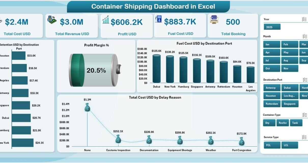
A Container Shipping Dashboard in Excel is a ready-to-use reporting and analytics tool designed to track shipping performance. It displays cost, revenue, profit, fuel usage, booking count, detention charges, delay reasons, and port-wise performance. The dashboard uses slicers, charts, and KPI cards, so users understand complex shipping data in seconds.
This dashboard includes five analytical pages and two support sheets. Each page highlights a different part of the shipping process such as customer segment performance, shipping line performance, cost behaviour, and monthly trends.
Since the dashboard runs in Excel, it works for logistics teams, freight forwarders, shipping companies, import-export businesses, and supply chain analysts.
Why Do Logistics Teams Need a Container Shipping Dashboard?
Shipping operations include many moving parts. Costs change daily, routes behave differently, ports cause delays, and fuel prices fluctuate. Without proper tracking, the company cannot:
-
Identify profitable routes
-
Understand fuel consumption patterns
-
Control detention and demurrage
-
Analyze customer segment behaviour
-
Track shipping line performance
-
Compare monthly cost trends
-
Improve profit margins
A dashboard brings all shipping insights to one place. You make decisions faster because you get complete data visibility in minutes instead of hours.
Click to Purchases Container Shipping Dashboard in Excel
Key Features of the Container Shipping Dashboard in Excel
This dashboard includes five analytical pages, a support sheet, and a data sheet. Below is a complete breakdown of each page.
1. Overview Page: The Main Shipping Performance Summary
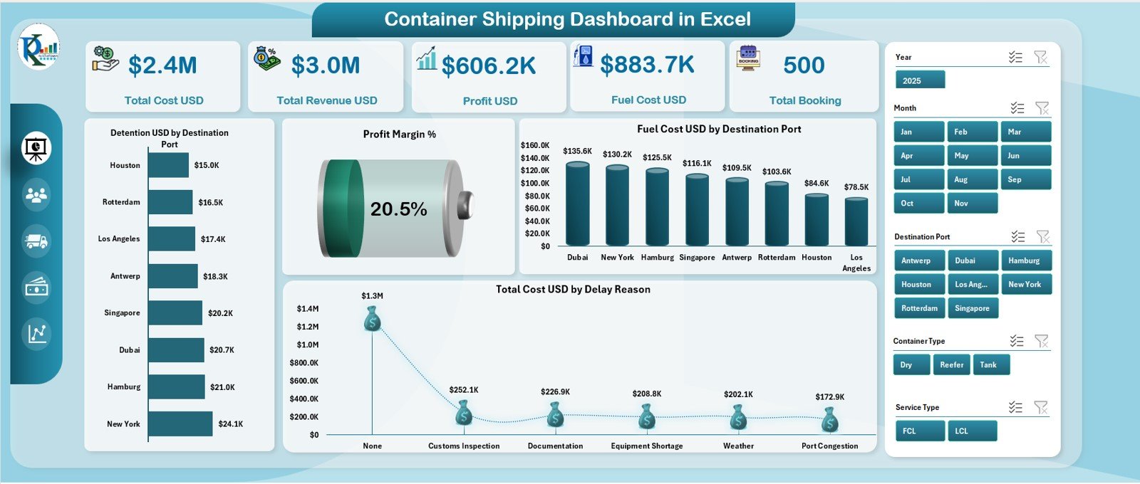
The Overview page gives a complete snapshot of the shipping business.
KPI Cards
You see five KPI cards that highlight the most important shipping metrics:
-
Total Cost (USD)
-
Total Revenue (USD)
-
Profit (USD)
-
Fuel Cost (USD)
-
Total Booking
These KPIs help you understand the financial and operational status instantly.
Key Charts on the Overview Page
The page also includes four powerful charts:
-
Profit Margin %
-
Fuel Cost (USD) by Destination Port
-
Total Cost (USD) by Delay Reason
-
Detention (USD) by Destination Port
These charts highlight performance gaps and improvement areas.
Click to Purchases Container Shipping Dashboard in Excel
2. Customer Segment Analysis Page: Track Customer Profitability
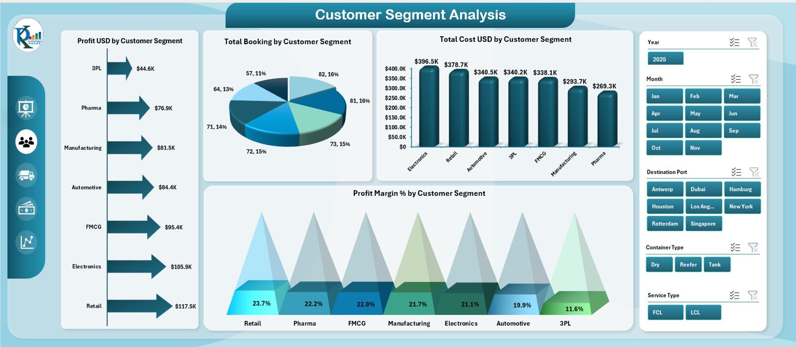
This page focuses on customer behaviour and profitability.
You see four charts that break down performance by customer segment:
-
Total Booking by Customer Segment
-
Total Cost (USD) by Customer Segment
-
Profit (USD) by Customer Segment
-
Profit Margin % by Customer Segment
Because of these insights, you understand:
-
Which customer types generate higher profit
-
Which customer segments reduce performance
-
How to optimize pricing models
-
Where to focus marketing efforts
This page helps businesses build smarter customer strategies.
3. Shipping Line Analysis Page: Compare Performance Across Lines
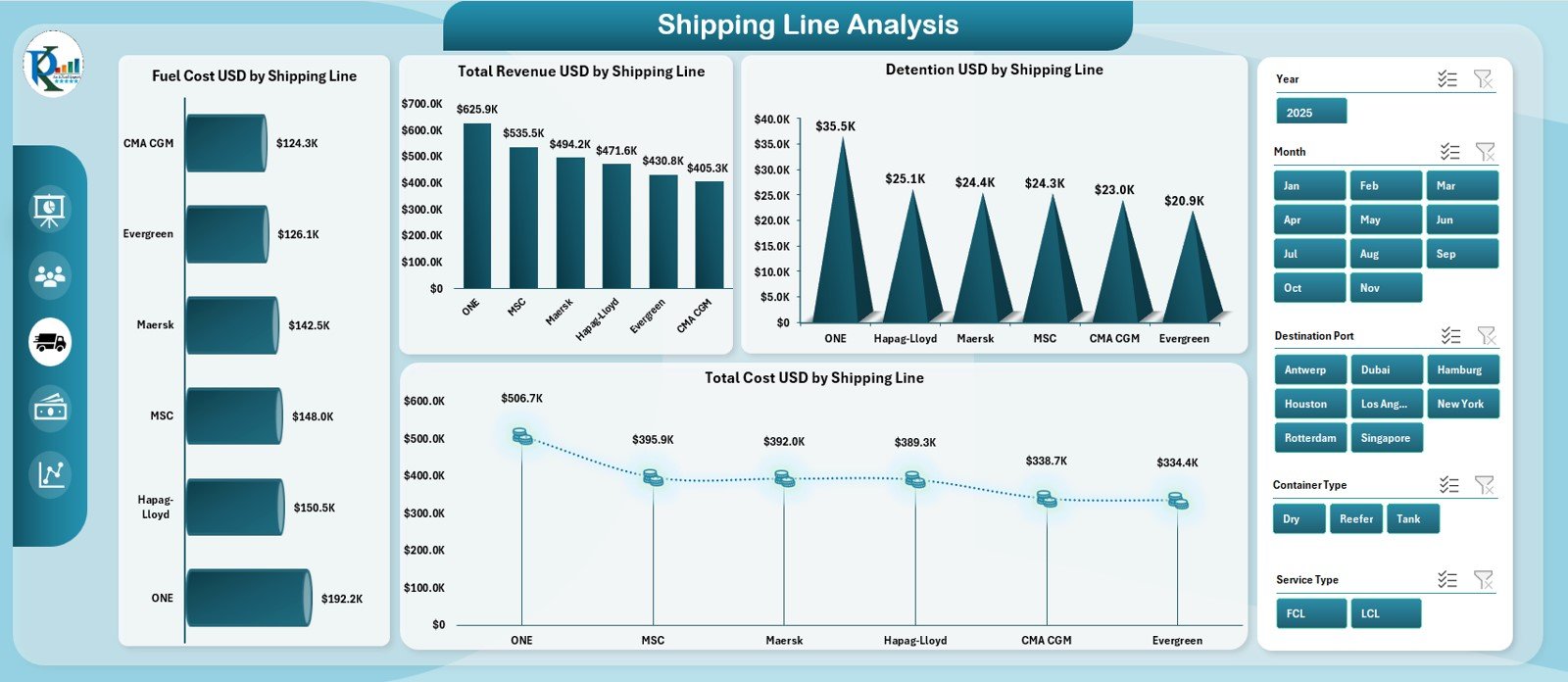
Shipping lines behave differently due to cost differences, service quality, fuel usage, and route variations. This page helps you compare shipping lines on major KPIs.
You see four charts:
-
Total Revenue (USD) by Shipping Line
-
Detention (USD) by Shipping Line
-
Fuel Cost (USD) by Shipping Line
-
Total Cost (USD) by Shipping Line
These insights help you choose the best shipping partners and negotiate better contracts.
4. Cost Analysis Page: Understand Route and Cost Behaviour
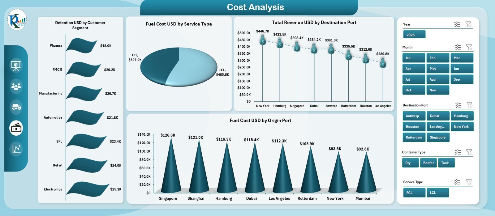
Cost analysis is important because shipping costs fluctuate often. This page highlights cost behaviour across multiple dimensions.
It includes four charts:
-
Fuel Cost (USD) by Service Type
-
Total Revenue (USD) by Destination Port
-
Fuel Cost (USD) by Origin Port
-
Detention (USD) by Customer Segment
This page helps you identify areas where the cost increases and where profit reduces.
Click to Purchases Container Shipping Dashboard in Excel
5. Monthly Trends Page: Track Month-Wise Performance
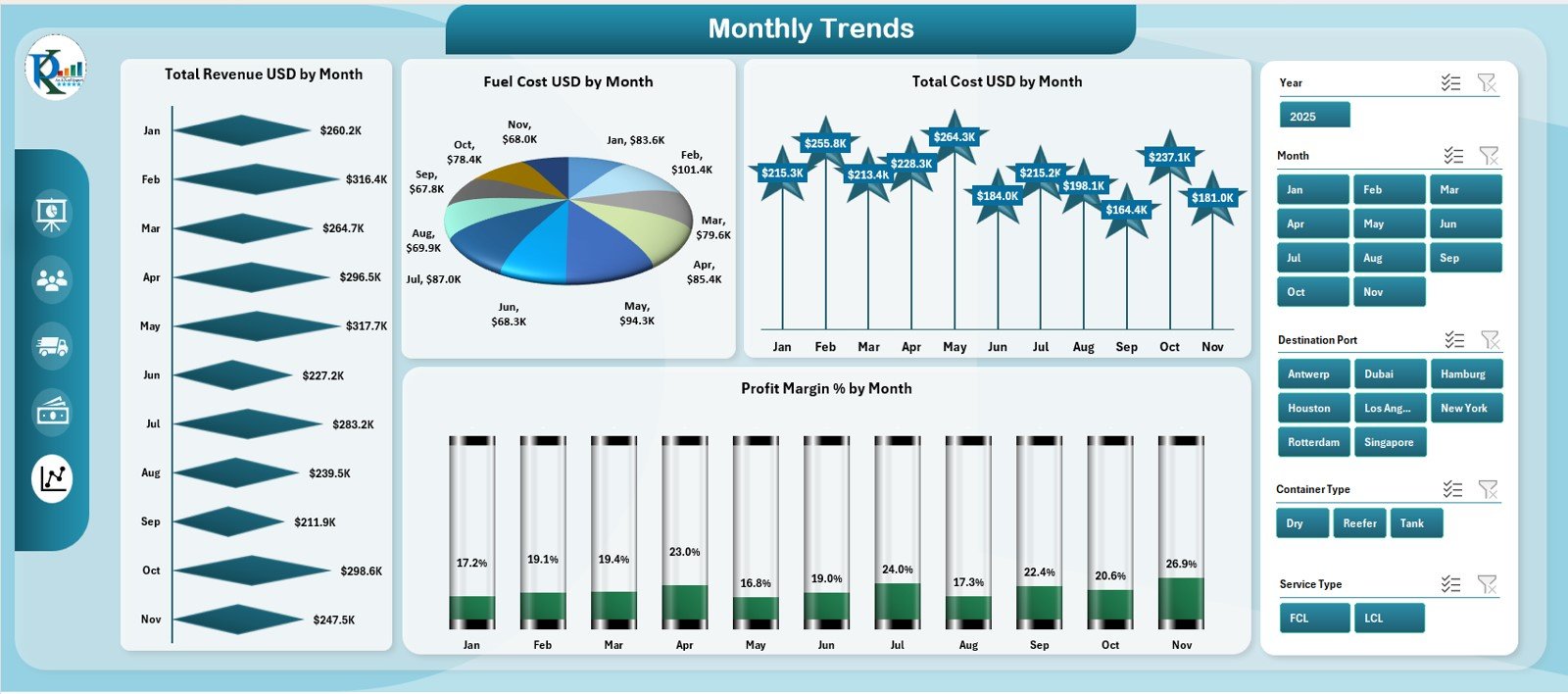
This page highlights month-to-month performance patterns. It includes four trend charts:
-
Fuel Cost (USD) by Month
-
Total Cost (USD) by Month
-
Profit Margin % by Month
-
Total Revenue (USD) by Month
Because of these charts, you understand:
-
Seasonal trends
-
Revenue patterns
-
Cost peaks
-
Fuel behaviour
-
Profit improvements
This page helps plan forecasts and budgets with accurate insights.
Support Sheet
The Support Sheet stores helper lists, drop-downs, category references, and formulas needed for the dashboard. It keeps the backend clean and organized.
Data Sheet
The Data Sheet stores raw transaction data. You enter:
-
Destination ports
-
Origin ports
-
Fuel cost
-
Detention cost
-
Service type
-
Revenue
-
Cost
-
Delay reasons
-
Shipping line
-
Booking numbers
The dashboard reads this data and updates all visuals automatically.
How the Dashboard Helps in Decision-Making
A strong container shipping dashboard helps logistics teams in many ways.
1. Better Cost Control
You track fuel cost, detention, and total cost to control expenses.
2. Improved Profitability
Profit and profit margin insights help identify high-performing routes and customer segments.
3. Faster Data Analysis
Charts and slicers reduce hours of manual reporting.
4. Stronger Negotiation
Shipping line performance helps negotiate better contracts.
5. Route Optimization
Port-wise analysis highlights which destinations produce higher cost or better profit.
6. Smarter Decision-Making
Each page gives direct insights for operations, finance, and customer management teams.
Click to Purchases Container Shipping Dashboard in Excel
Advantages of the Container Shipping Dashboard in Excel
Below are the major benefits:
1. Easy to Use
Anyone familiar with Excel can use the dashboard instantly.
2. Complete Visibility
You get a full view of cost, revenue, profit, and trends.
3. Real-Time Updated Insights
The dashboard refreshes automatically when you update the data sheet.
4. Smart Navigation
The page navigator on the left side allows quick movement.
5. Accurate Performance Tracking
Charts and KPI cards highlight strengths and weaknesses clearly.
6. Time Saving
You avoid preparing manual reports every month.
7. Works for Any Shipping Business Size
Small, medium, and large companies can use this dashboard effectively.
Best Practices for Using the Container Shipping Dashboard
Follow these practices for better results:
1. Update Data on Time
Enter fresh data every week or month for accurate analysis.
2. Keep Naming Consistent
Keep port names, shipping lines, and segments consistent.
3. Review Trends Monthly
Use the Monthly Trends page to understand behaviour patterns.
4. Focus on High-Cost Routes
Track cost drivers and reduce unnecessary expenses.
5. Use Customer Segment Insights
Identify profitable customer segments and build better strategies.
6. Monitor Fuel Cost Closely
Fuel cost changes regularly, so monitor it for better forecasting.
7. Validate Detention Data
Detention cost increases quickly, so track it properly.
Conclusion
A Container Shipping Dashboard in Excel gives logistics teams a complete view of performance. It tracks cost, revenue, profit, fuel usage, bookings, customer segments, and monthly trends. Because it uses Excel, it remains simple, flexible, and user-friendly. Businesses use this dashboard to control cost, improve decisions, and increase profitability.
As shipping operations grow complex, a strong dashboard becomes the foundation for smart logistics management. This tool helps companies stay efficient, competitive, and profitable.
Click to Purchases Container Shipping Dashboard in Excel
Frequently Asked Questions (FAQs)
1. What is a Container Shipping Dashboard?
It is an Excel-based tool that tracks container shipping KPIs such as cost, revenue, fuel usage, detention, and profit.
2. Who uses this dashboard?
Shipping companies, logistics teams, freight forwarders, supply-chain analysts, and exporters.
3. Do I need special software?
No. Everything works in Microsoft Excel.
4. Can I customize the dashboard?
Yes. You can add more KPIs, charts, and filters.
5. How often should I update the data?
Update it weekly or monthly for best results.
6. Does it support profit analysis?
Yes. It shows profit, profit margin %, and cost comparisons.
7. Can I track customer segments?
Yes. The Customer Segment Analysis page covers all metrics.
8. Does it show monthly trends?
Yes. The Monthly Trends page displays clear line and bar charts.
9. Can beginners use this dashboard?
Yes. It is simple, clean, and built for non-technical users.
10. Is it useful for cost reduction?
Absolutely. Cost analysis insights help you reduce fuel, detention, and route-based costs.
Click to Purchases Container Shipping Dashboard in Excel
Visit our YouTube channel to learn step-by-step video tutorials
