Research and Development (R&D) institutes drive innovation, scientific discovery, and long-term growth. However, without clear performance visibility, even the best research initiatives lose direction. Therefore, leaders must track projects, budgets, impact, and collaboration outcomes in a structured way.
That is exactly where a Research & Development Institutes Dashboard in Power BI delivers massive value.
In this in-depth, SEO-friendly guide, you will learn what this dashboard is, why it matters, how it works, page-by-page explanations, advantages, best practices, and frequently asked questions. Moreover, you will discover how this dashboard transforms scattered R&D data into a single, decision-ready system using Power BI.
Click to Purchases Research & Development Institutes Dashboard
What Is a Research & Development Institutes Dashboard in Power BI?
A Research & Development Institutes Dashboard in Power BI is a centralized analytical solution designed to monitor, analyze, and visualize R&D performance metrics in real time.
Instead of managing multiple Excel sheets, PDF reports, and manual summaries, R&D leaders can track projects, budgets, funding sources, departments, research domains, and trends in one interactive dashboard. Consequently, decision-making becomes faster, clearer, and more accurate.
This dashboard supports:
-
Strategic planning and prioritization
-
Budget control and variance analysis
-
Performance evaluation across departments and domains
-
Transparency for stakeholders and funding agencies
As a result, institutes gain control over both scientific output and financial efficiency.
Why Do Research & Development Institutes Need a Power BI Dashboard?
R&D institutes operate in a complex environment. They manage long project cycles, uncertain outcomes, multiple funding sources, and cross-functional collaboration. Therefore, manual reporting fails to deliver timely insights.
Common Challenges Without a Dashboard
-
Data scattered across departments
-
Delayed budget and spend tracking
-
No clear visibility of project impact
-
Difficulty comparing departments and research domains
-
Weak accountability for funding utilization
However, when institutes use a Power BI dashboard, they solve these challenges immediately. Moreover, they gain confidence in every strategic review meeting.
How Does a Research & Development Dashboard in Power BI Work?
This dashboard pulls structured data from Excel, databases, or enterprise systems. Then, Power BI transforms raw numbers into interactive visuals. Additionally, slicers allow users to filter data dynamically by department, domain, region, funding source, or time period.
As a result:
-
Leaders explore data without technical skills
-
Analysts reduce reporting time drastically
-
Stakeholders see the same single version of truth
-
Click to Purchases Research & Development Institutes Dashboard
What Are the Key Pages in the Research & Development Institutes Dashboard in Power BI?
This dashboard contains five powerful pages, each designed for a specific analytical purpose. Let us explore them one by one.
1. What Insights Does the Overview Page Provide?

The Overview Page acts as the command center of the entire dashboard. From this page, leadership can quickly understand overall R&D performance.
Key Elements on the Overview Page
-
Interactive slicers to filter data instantly
-
Four KPI cards, such as:
-
Total projects
-
Ongoing project percentage
-
Average project rating
-
Total budget vs actual spend
-
Visual Charts Included
-
Ongoing Project % – shows execution progress clearly
-
Project Rating by Region – highlights regional research performance
-
Budget vs Actual Spend by Project Type – reveals spending efficiency
-
Variance by Collaboration Type – identifies over- or under-spending patterns
Therefore, decision-makers can spot risks and opportunities within seconds.
2. How Does the Department Analysis Page Improve Accountability?
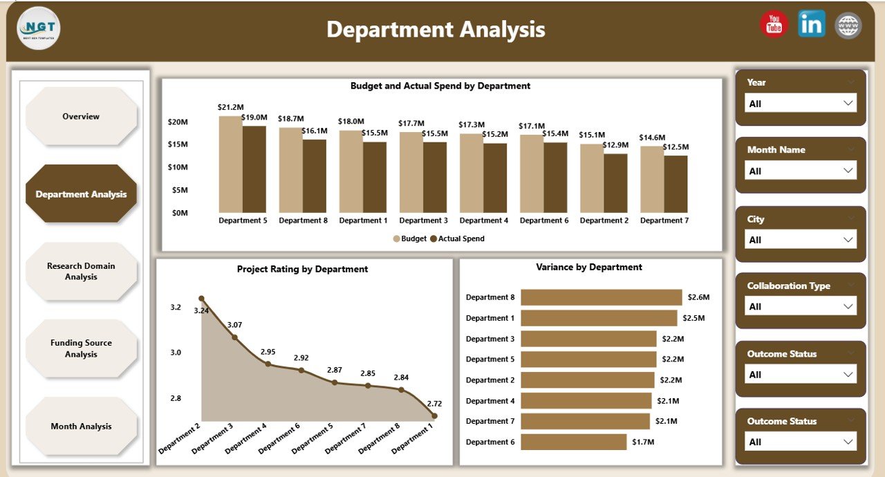
The Department Analysis page focuses on performance at the departmental level. Since departments drive execution, this view becomes critical.
Charts on the Department Analysis Page
-
Budget and Actual Spend by Department
-
Project Rating by Department
-
Variance by Department
As a result, leaders can:
-
Identify high-performing departments
-
Control cost overruns early
-
Allocate resources more effectively
Moreover, departments gain transparency, which improves accountability and performance culture.
3. Why Is Research Domain Analysis Essential?
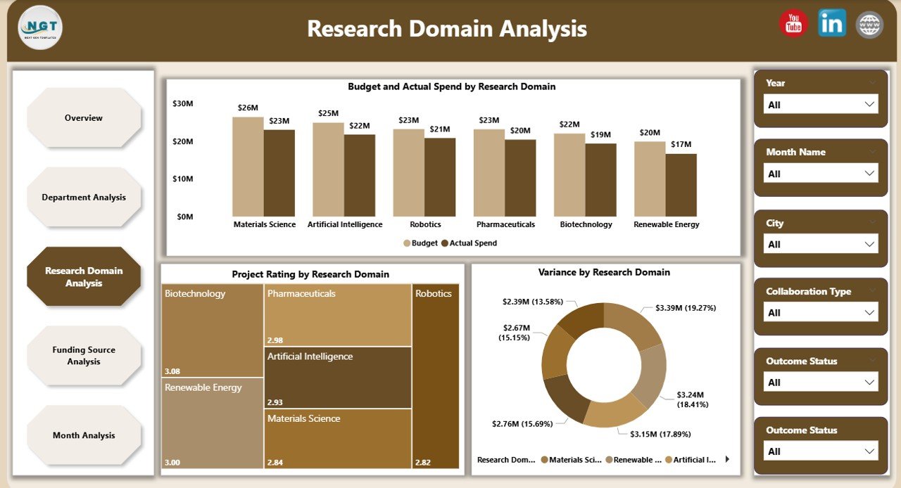
R&D institutes often work across multiple research domains such as biotechnology, materials science, AI, energy, or healthcare. Therefore, leaders must compare outcomes across domains.
Insights from the Research Domain Analysis Page
-
Budget and Actual Spend by Research Domain
-
Project Rating by Research Domain
-
Variance by Research Domain
Because of this structure, institutes can:
-
Prioritize high-impact research areas
-
Reduce funding to low-performing domains
-
Align research focus with strategic goals
Consequently, research investments become data-driven rather than assumption-based.
Click to Purchases Research & Development Institutes Dashboard
4. How Does Funding Source Analysis Strengthen Financial Governance?
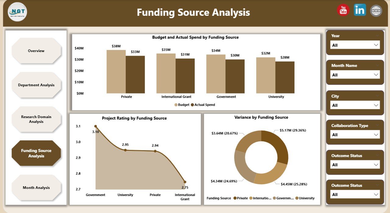
Funding often comes from governments, grants, private partners, and international agencies. Therefore, institutes must track fund utilization carefully.
Funding Source Analysis Page Includes
-
Budget and Actual Spend by Funding Source
-
Project Rating by Funding Source
-
Variance by Funding Source
This page ensures:
-
Compliance with funding requirements
-
Transparency for auditors and donors
-
Better planning for future funding cycles
As a result, institutes build trust with funding agencies and partners.
5. What Trends Does the Monthly Analysis Page Reveal?
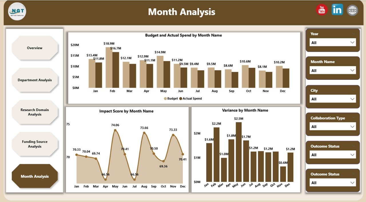
The Monthly Trends page highlights performance over time. Since trends reveal patterns, this page becomes vital for forecasting.
Charts on the Monthly Trends Page
-
Budget vs Actual Spend by Month
-
Impact Score by Month
-
Variance by Month
Therefore, leaders can:
-
Detect seasonal spending patterns
-
Identify delays or acceleration in impact
-
Improve future budget planning
What KPIs Can You Track Using This Dashboard?
This dashboard supports a wide range of R&D KPIs, including:
-
Number of active and completed projects
-
Budget allocated vs actual spend
-
Variance percentage
-
Project rating and impact score
-
Department-wise performance
-
Research domain efficiency
-
Funding source utilization
Because of this flexibility, institutes can easily customize KPIs based on their objectives.
Click to Purchases Research & Development Institutes Dashboard
Advantages of Research & Development Institutes Dashboard in Power BI
1. Centralized Performance Visibility
Instead of scattered reports, everything appears in one dashboard.
2. Faster and Better Decisions
Since insights update instantly, leadership responds quickly.
3. Strong Budget Control
Variance analysis prevents overspending and waste.
4. Improved Research Impact
Project ratings and impact scores highlight what truly works.
5. Transparency for Stakeholders
Funding agencies and boards see clear, reliable data.
6. Scalability
As institutes grow, the dashboard grows with them.
Best Practices for the Research & Development Institutes Dashboard in Power BI
1. Define Clear KPIs First
Always align KPIs with institutional strategy.
2. Maintain Clean and Consistent Data
Accurate input ensures reliable insights.
3. Use Slicers Strategically
Limit slicers to meaningful dimensions to avoid confusion.
4. Review Dashboard Monthly
Regular reviews keep insights actionable.
5. Train Users Properly
Ensure leadership and analysts understand how to interact with visuals.
6. Secure Sensitive Data
Apply role-based access for funding and budget details.
Who Can Benefit from This Dashboard?
-
Research directors and institute heads
-
Department leaders and program managers
-
Finance and grants management teams
-
Government and funding agencies
-
Strategy and planning committees
Therefore, this dashboard serves both operational and strategic audiences.
How Does This Dashboard Improve Long-Term R&D Strategy?
This dashboard does more than reporting. It enables:
-
Evidence-based funding decisions
-
Strategic domain prioritization
-
Continuous performance improvement
-
Higher research ROI
As a result, institutes move from reactive management to proactive leadership.
Conclusion: Why Is a Research & Development Institutes Dashboard in Power BI a Must-Have?
A Research & Development Institutes Dashboard in Power BI transforms complex R&D operations into a clear, structured, and insight-driven system. Instead of guessing performance, leaders see it. Instead of reacting late, teams act early.
Therefore, if your institute aims to improve research impact, control budgets, and strengthen accountability, this dashboard becomes an essential decision-support tool.
Frequently Asked Questions (FAQs)
What data sources can feed this Power BI dashboard?
You can connect Excel files, databases, ERP systems, and research management tools.
Can we customize KPIs and visuals?
Yes, the dashboard supports full customization based on institutional needs.
Is this dashboard suitable for small research institutes?
Absolutely. Both small and large institutes benefit from structured analytics.
How often does the dashboard update?
Updates can run daily, weekly, or in real time depending on data refresh settings.
Does this dashboard support funding compliance reporting?
Yes, funding source analysis ensures transparency and audit readiness.
Can non-technical users use this dashboard easily?
Yes, interactive visuals and slicers make it user-friendly for all roles.
Visit our YouTube channel to learn step-by-step video tutorials