Managing ports and harbors involves complex operations. Every day, vessels arrive, cargo moves, fuel costs fluctuate, and operating expenses change. Therefore, port authorities and logistics managers must track performance in real time. However, many organizations still rely on scattered reports and manual spreadsheets. As a result, they struggle to see the full picture.
So, how can you monitor port performance clearly and efficiently?
The answer is simple.
You need a Ports and Harbors Dashboard in Excel.
This ready-to-use Excel dashboard helps you track revenue, operating cost, fuel cost, delay hours, and customer satisfaction in one structured system. Moreover, it transforms raw operational data into interactive insights. Consequently, decision-makers can identify problems early and improve efficiency quickly.
Click to Purchases Ports and Harbors Dashboard in Excel
In this detailed guide, you will learn:
-
What a Ports and Harbors Dashboard in Excel is
-
Why port authorities need it
-
Complete explanation of all 5 dashboard pages
-
Advantages of Ports and Harbors Dashboard in Excel
-
Best Practices for the Ports and Harbors Dashboard
-
Frequently Asked Questions with Answers
Let us explore everything step by step.
What Is a Ports and Harbors Dashboard in Excel?
A Ports and Harbors Dashboard in Excel is a structured performance monitoring system built inside Microsoft Excel. It helps port managers track key operational and financial metrics using interactive charts, slicers, and summary cards.
Instead of reviewing multiple files, you can:
-
Track revenue by cargo type
-
Monitor operating cost by delay reason
-
Analyze fuel cost by country
-
Evaluate customer satisfaction score
-
Compare vessel performance
-
Review monthly trends
Because this dashboard runs in Excel, you can easily customize it based on your port operations. Furthermore, you can use Pivot Tables and Pivot Charts to ensure dynamic analysis without complex formulas.
Why Do Ports and Harbors Need a Structured Dashboard?
Ports operate in a high-pressure environment. Ships must dock on time. Cargo must move efficiently. Fuel consumption must stay under control. Meanwhile, customers expect fast and reliable service.
Without a dashboard:
-
Managers waste time compiling reports
-
Cost overruns go unnoticed
-
Delay patterns remain hidden
-
Customer satisfaction drops
-
Strategic decisions lack data support
However, when you implement a Ports and Harbors Dashboard in Excel, you gain:
-
Clear visibility
-
Faster decision-making
-
Improved cost control
-
Better performance tracking
-
Data-driven strategy
Therefore, every modern port authority should adopt a structured monitoring system.
Key Features of the Ports and Harbors Dashboard in Excel
This dashboard includes a Page Navigator located on the left side. As a result, users can switch between analytical pages easily. Additionally, right-side slicers allow dynamic filtering based on specific criteria.
The Excel file contains 5 analytical pages, along with a Support Sheet and a Data Sheet.
Let us explore each page in detail.
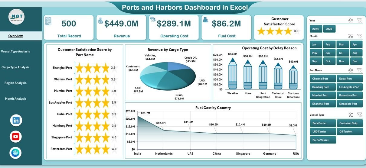
1. Overview Page – How Does It Provide Complete Operational Visibility?
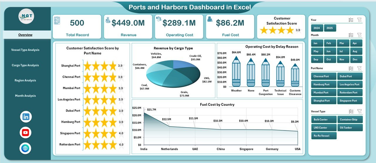
The Overview Page acts as the main control center. Here, you get a summary of overall port performance.
Key Elements:
-
Right-side slicers for dynamic filtering
-
4 performance cards for quick insights
-
4 analytical charts
Charts Included:
-
Customer Satisfaction Score by Port Name
-
Revenue by Cargo Type
-
Operating Cost by Delay Reason
-
Fuel Cost by Country
Why Is This Page Important?
First, it gives you a quick snapshot of operations. Then, it highlights performance gaps instantly. For example:
-
If fuel cost increases in a specific country, you can investigate immediately.
-
If operating cost rises due to delay reasons, you can analyze bottlenecks.
-
If customer satisfaction declines, you can review service issues.
Therefore, the Overview Page supports strategic monitoring at the highest level.
2. Vessel Type Analysis – Why Should You Analyze Vessel Performance?
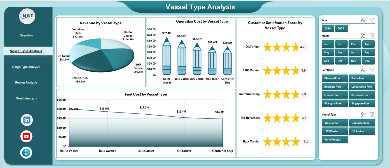
Different vessel types generate different revenue levels. Moreover, they consume fuel differently and experience varying delay patterns.
This page focuses on performance by vessel type.
Charts Included:
-
Customer Satisfaction Score by Vessel Type
-
Revenue by Vessel Type
-
Operating Cost by Vessel Type
-
Fuel Cost by Vessel Type
What Insights Can You Gain?
-
Identify high-revenue vessel types
-
Detect expensive vessel operations
-
Compare fuel efficiency
-
Measure customer experience by vessel category
Consequently, port managers can optimize berth allocation and resource planning.
Click to Purchases Ports and Harbors Dashboard in Excel
3. Cargo Type Analysis – How Does It Improve Cost and Delay Control?
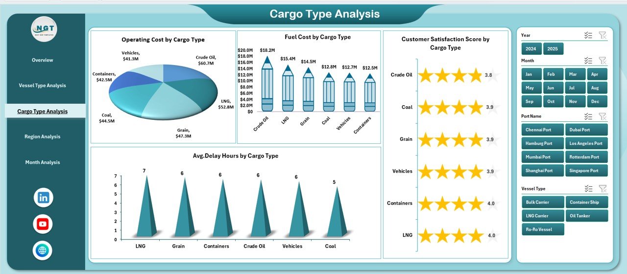
Cargo handling differs based on type. For example, liquid cargo requires special equipment, while container cargo demands fast turnaround.
Therefore, cargo-specific analysis becomes critical.
Charts Included:
-
Customer Satisfaction Score by Cargo Type
-
Average Delay Hours by Cargo Type
-
Operating Cost by Cargo Type
-
Fuel Cost by Cargo Type
Why Does This Matter?
-
You can identify cargo types that cause maximum delay.
-
You can monitor which cargo generates the highest revenue.
-
You can control cost-heavy cargo operations.
As a result, you can adjust handling processes and improve efficiency.
4. Region Analysis – How Can Regional Monitoring Improve Strategy?
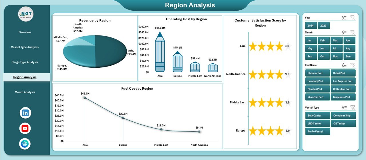
Ports often operate across multiple regions. However, performance may vary significantly by location.
This page analyzes performance region-wise.
Charts Included:
-
Customer Satisfaction Score by Region
-
Revenue by Region
-
Operating Cost by Region
-
Fuel Cost by Region
Strategic Benefits:
-
Compare regional profitability
-
Identify high-cost regions
-
Detect customer satisfaction trends
-
Plan regional expansion
Therefore, regional monitoring supports long-term strategic planning.
Click to Purchases Ports and Harbors Dashboard in Excel
5. Month Analysis – Why Is Monthly Trend Monitoring Essential?
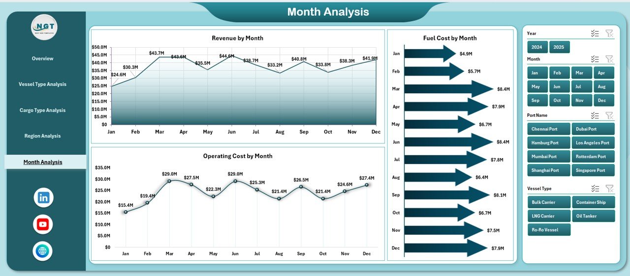
Operations change over time. Fuel prices fluctuate. Seasonal cargo demand increases. Delay patterns vary.
This page tracks performance month by month.
Charts Included:
-
Revenue by Month
-
Operating Cost by Month
-
Fuel Cost by Month
Why Is This Useful?
-
Identify seasonal revenue patterns
-
Track cost fluctuations
-
Forecast future trends
-
Improve budgeting accuracy
Consequently, managers can make proactive decisions rather than reactive ones.
Support Sheet – What Is Its Role?
The Support Sheet contains structured lists used for slicers and dropdown menus. Therefore, it ensures consistent data validation and filtering.
Data Sheet – Why Is Structured Data Important?
The Data Sheet captures raw operational data. It typically includes:
-
Port Name
-
Vessel Type
-
Cargo Type
-
Region
-
Revenue
-
Operating Cost
-
Fuel Cost
-
Delay Hours
-
Customer Satisfaction Score
-
Date
Because the dashboard uses Pivot Tables, you can update the data easily. Once you refresh the Pivot Tables, all charts update automatically.
Advantages of Ports and Harbors Dashboard in Excel
1. Improves Decision-Making
You get instant visibility into key metrics. Therefore, you can act quickly.
2. Enhances Cost Control
You can track operating and fuel costs clearly. As a result, you reduce financial waste.
3. Increases Operational Efficiency
You identify delay patterns early. Consequently, you improve turnaround time.
4. Boosts Customer Satisfaction
You monitor service performance regularly. Therefore, you maintain high service standards.
5. Provides Interactive Analysis
Slicers allow dynamic filtering. Thus, users can customize views instantly.
6. Saves Time
Instead of preparing manual reports, you refresh the dashboard in seconds.
Best Practices for the Ports and Harbors Dashboard
1. Maintain Clean Data
Always use structured tables. Moreover, avoid duplicate entries.
2. Update Data Regularly
Refresh data monthly or weekly. Consequently, your insights remain accurate.
3. Use Consistent KPIs
Define KPIs clearly. Then, ensure consistent measurement.
4. Train Users
Help managers understand slicers and filters. As a result, they can use the dashboard effectively.
5. Review Performance Periodically
Conduct monthly performance reviews using the dashboard. Therefore, you maintain accountability.
How Can This Dashboard Support Strategic Growth?
When you analyze revenue, cost, and customer satisfaction together, you gain a complete operational view. Furthermore, you can:
-
Plan infrastructure expansion
-
Optimize fuel contracts
-
Improve delay management
-
Increase profitability
-
Strengthen stakeholder confidence
Thus, the Ports and Harbors Dashboard becomes a strategic tool rather than just a reporting file.
Conclusion
Click to Purchases Ports and Harbors Dashboard in Excel
Ports and harbors operate in a dynamic environment. Therefore, managers need clear visibility into revenue, cost, fuel consumption, delays, and customer satisfaction. However, manual reporting slows decision-making.
The Ports and Harbors Dashboard in Excel solves this challenge. It organizes complex operational data into interactive charts and structured pages. Moreover, it supports strategic planning and operational improvement.
If you want better control, faster insights, and improved profitability, you should implement this dashboard today.
Frequently Asked Questions with Answers
1. Can I customize the Ports and Harbors Dashboard in Excel?
Yes. You can add new KPIs, charts, or slicers based on your operational needs.
2. Do I need advanced Excel skills to use this dashboard?
No. Basic Excel knowledge is sufficient. You only need to refresh Pivot Tables and use slicers.
3. Can I track multiple ports in one dashboard?
Yes. The dashboard supports multiple ports and regions.
4. How often should I update the data?
You should update it monthly. However, weekly updates provide better control.
5. Does this dashboard support financial forecasting?
Yes. You can analyze monthly trends and create projections based on historical data.
Visit our YouTube channel to learn step-by-step video tutorials