Shared Services Centers (SSC) play a critical role in modern organizations. Companies centralize functions such as finance, HR, procurement, IT services, payroll, and customer support into shared service centers to improve efficiency, reduce operational costs, and maintain consistent service quality.
However, managing multiple processes across departments can become complex. Leaders often struggle to monitor performance, track service delivery metrics, and ensure that operational goals align with business objectives.
Therefore, organizations increasingly rely on KPI dashboards to monitor and analyze performance effectively. One of the most practical tools for this purpose is the Shared Services Centers KPI Dashboard in Excel.
The Shared Services Centers KPI Dashboard in Excel provides a centralized and interactive platform that converts complex operational data into meaningful insights. Moreover, it helps managers track key performance indicators (KPIs), monitor performance trends, compare targets versus actual results, and identify areas for improvement.
In this detailed guide, we will explore everything about the Shared Services Centers KPI Dashboard in Excel, including its features, benefits, dashboard structure, best practices, and frequently asked questions.
Click to buy Shared Services Centers KPI Dashboard in Excel
What is a Shared Services Centers KPI Dashboard in Excel?
A Shared Services Centers KPI Dashboard in Excel is an interactive performance management tool that helps organizations track, measure, and analyze the operational performance of their shared service functions.
Shared service centers often manage multiple operational processes such as:
- Finance and accounting services
- Human resource management
- IT service management
- Procurement operations
- Payroll processing
- Customer support operations
Each department generates a large amount of operational data. Therefore, managers need a structured system to monitor key metrics such as efficiency, accuracy, service levels, and productivity.
An Excel-based KPI dashboard consolidates this information into visual reports and dynamic charts. As a result, managers can easily evaluate performance and make better decisions.
Why Do Shared Services Centers Need KPI Dashboards?
Shared services centers handle high volumes of transactions and service requests every day. Without proper monitoring tools, managers may struggle to understand operational performance.
A KPI dashboard helps organizations:
- Track departmental performance in real time
- Identify operational bottlenecks
- Monitor service quality metrics
- Improve employee productivity
- Compare targets with actual performance
- Make data-driven decisions
Because Excel offers powerful features such as pivot tables, formulas, conditional formatting, and charts, it becomes an excellent platform for building performance dashboards.
Key Features of the Shared Services Centers KPI Dashboard in Excel
The Shared Services Centers KPI Dashboard in Excel is a ready-to-use template designed to simplify KPI monitoring and performance analysis.
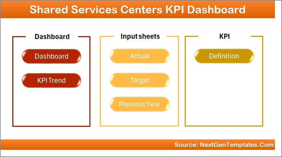
This dashboard contains 7 worksheets, each designed to serve a specific analytical purpose.
Let us explore each sheet in detail.
Summary Page
The Summary Page works as the navigation center of the dashboard.
This sheet contains an index layout that allows users to easily move between different sections of the dashboard.
Key Elements of the Summary Page
- Navigation buttons for quick access to all dashboard sheets
- Structured layout for user-friendly navigation
- Centralized entry point for all dashboard analysis pages
Because of this design, users can quickly move to the desired analysis section without searching through multiple worksheets.
Click to buy Shared Services Centers KPI Dashboard in Excel
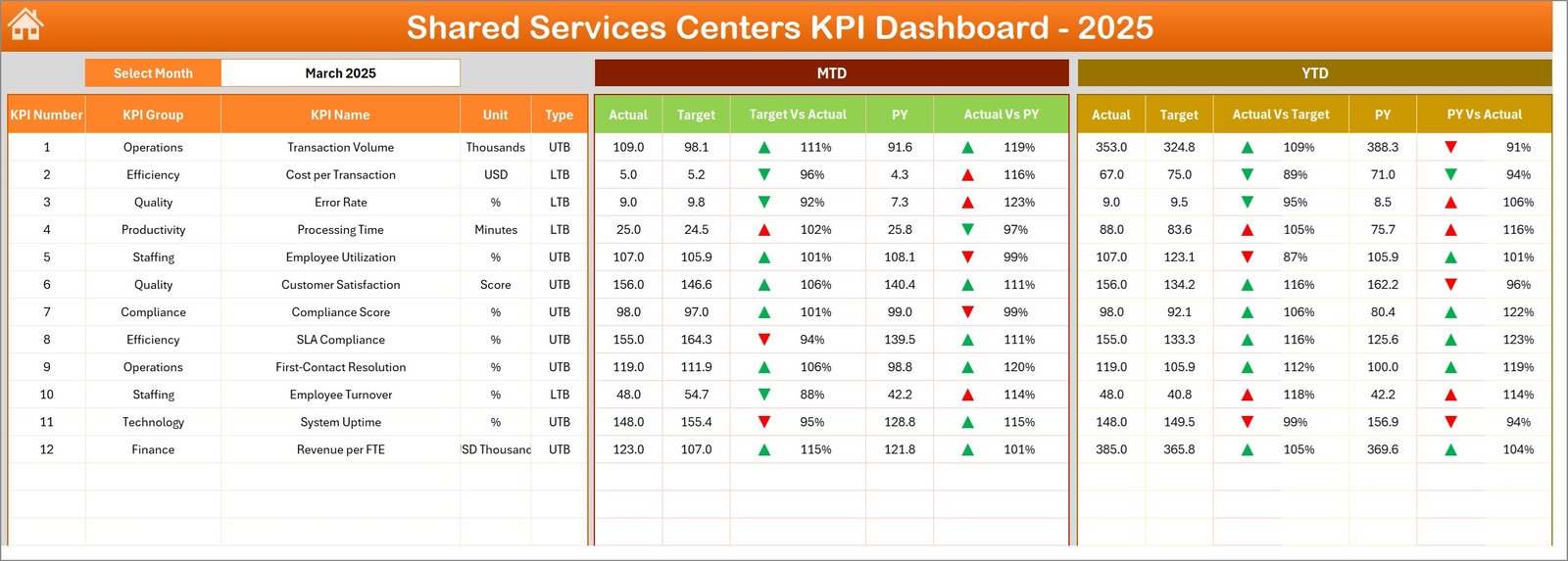
Dashboard Sheet Tab
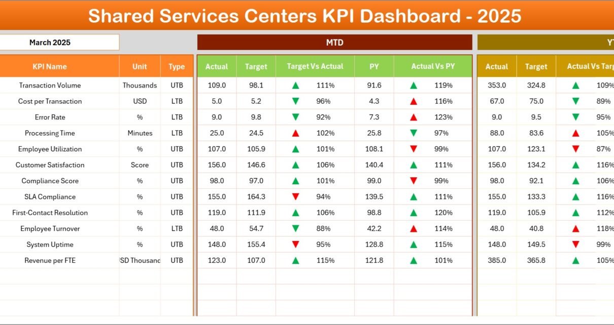
The Dashboard Sheet acts as the main analytics page where users can monitor all KPIs.
This page provides a consolidated view of performance indicators and comparisons between actual values and targets.
Key Features of the Dashboard Page
Users can select the month from the drop-down list located in cell D3. Once users change the month, the entire dashboard updates automatically.
The dashboard displays the following performance metrics:
MTD (Month-To-Date) Metrics
- MTD Actual Values
- MTD Target Values
- Previous Year MTD Values
- Target vs Actual Comparison
- Previous Year vs Actual Comparison
The dashboard uses conditional formatting arrows to visually show performance trends.
For example:
- Green arrows show positive performance
- Red arrows highlight negative performance
YTD (Year-To-Date) Metrics
In addition, the dashboard also shows Year-To-Date metrics, including:
- YTD Actual Values
- YTD Target Values
- Previous Year YTD Values
- Target vs Actual comparison
- Previous Year vs Actual comparison
Therefore, managers can easily monitor both short-term and long-term performance trends.
Click to buy Shared Services Centers KPI Dashboard in Excel
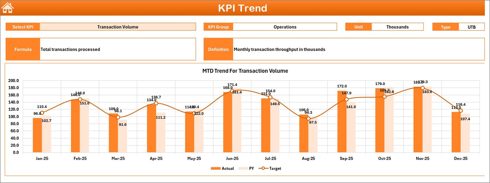
Trend Sheet Tab
The Trend Sheet provides detailed KPI trend analysis.
Users can select a specific KPI name from the drop-down menu in cell C3.
Once the KPI is selected, the dashboard displays important KPI information.
KPI Details Displayed
- KPI Group
- Unit of Measurement
- KPI Type (Lower the Better / Upper the Better)
- KPI Formula
- KPI Definition
Trend Charts
The sheet also includes visual trend charts showing:
- MTD Actual vs Target vs Previous Year
- YTD Actual vs Target vs Previous Year
These trend charts allow managers to track KPI performance across multiple months and identify performance patterns.
Click to buy Shared Services Centers KPI Dashboard in Excel
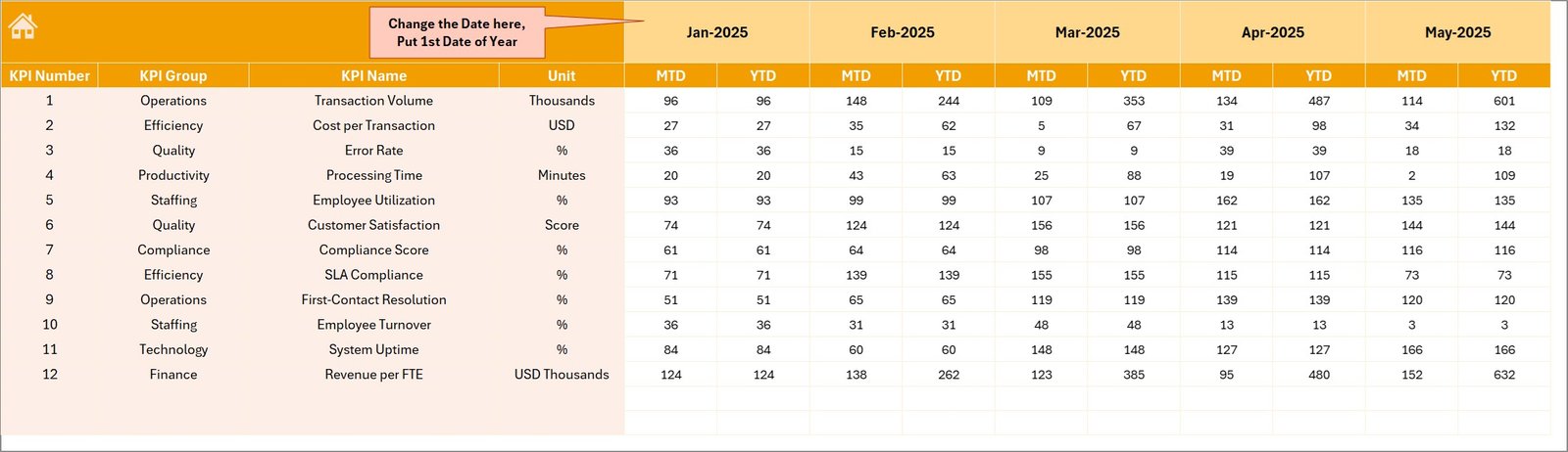
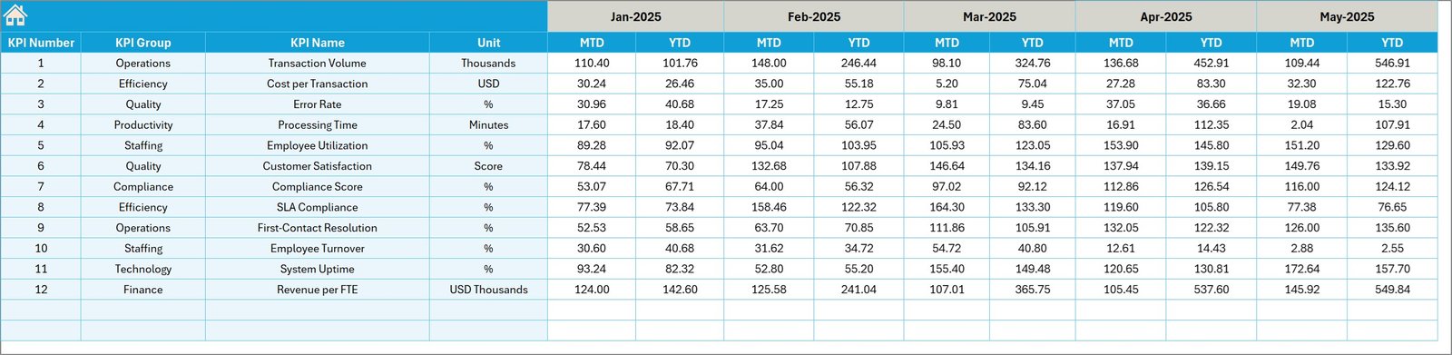
Actual Numbers Input Sheet
The Actual Numbers Input Sheet stores operational data for the current year.
Users must enter actual KPI values in this sheet.
Key Features
- Input fields for MTD actual numbers
- Input fields for YTD actual numbers
- Month selection cell located at E1
Users can define the starting month of the financial year in cell E1.
Once users enter data, the dashboard automatically updates all calculations and visualizations.
Click to buy Shared Services Centers KPI Dashboard in Excel
Target Sheet Tab
The Target Sheet contains target values for each KPI.
Managers enter target values for both:
- MTD targets
- YTD targets
Because the dashboard compares target values with actual performance, managers can easily evaluate whether operational goals are achieved.
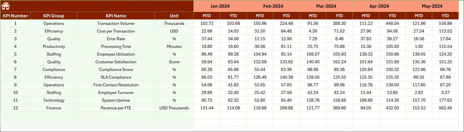
Previous Year Numbers Sheet Tab
Historical data plays an important role in performance analysis.
Therefore, the dashboard includes a Previous Year Numbers Sheet.
Users enter KPI values from the previous year using the same structure as the current year data.
This allows the dashboard to generate comparisons such as:
- Actual vs Previous Year performance
- YTD growth analysis
- Long-term performance tracking
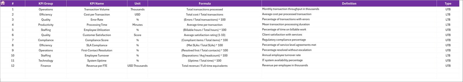
KPI Definition Sheet Tab
The KPI Definition Sheet works as the KPI reference library.
This sheet stores important KPI metadata.
Information Captured in This Sheet
- KPI Name
- KPI Group
- KPI Unit
- KPI Formula
- KPI Definition
This information helps users understand the purpose and calculation method of each KPI.
Because of this structured approach, organizations maintain KPI consistency across departments.
Advantages of Shared Services Centers KPI Dashboard in Excel
Organizations gain several benefits when they implement a KPI dashboard for shared services.
- Centralized Performance Monitoring
The dashboard consolidates performance metrics from multiple departments into a single view.
Therefore, managers can easily monitor organizational performance.
- Improved Decision Making
Managers can analyze performance trends, compare targets with actual results, and identify operational gaps.
As a result, leaders can make data-driven decisions.
- Enhanced Productivity
The dashboard highlights performance issues quickly.
Therefore, teams can address problems faster and improve operational efficiency.
- Better KPI Tracking
Excel dashboards allow companies to track dozens of KPIs simultaneously.
Moreover, automated calculations reduce manual reporting errors.
- Real-Time Insights
When users update the data input sheets, the dashboard automatically refreshes.
Consequently, managers receive up-to-date performance insights.
- Cost-Effective Solution
Excel dashboards provide powerful analytics without expensive business intelligence tools.
Therefore, even small organizations can implement KPI monitoring systems.
Opportunities for Improvement in Shared Services Centers
Even though shared services improve operational efficiency, organizations must continuously optimize their processes.
Below are some areas where companies can improve their SSC performance.
Process Automation
Automation tools can eliminate repetitive manual tasks and reduce errors.
Service Level Monitoring
Organizations should monitor service level agreements (SLAs) to ensure consistent service delivery.
Employee Training
Skilled employees improve service quality and operational performance.
Data Accuracy
Reliable data ensures accurate KPI calculations and better insights.
Cross-Department Collaboration
Departments must collaborate effectively to deliver seamless services.
Best Practices for the Shared Services Centers KPI Dashboard in Excel
Organizations should follow certain best practices to maximize the value of their KPI dashboards.
- Define Clear KPIs
Every KPI should have:
- A clear definition
- A measurable formula
- A specific business objective
- Maintain Data Accuracy
Ensure that users enter accurate data in input sheets.
Incorrect data can lead to misleading insights.
- Standardize KPI Definitions
Maintain a centralized KPI definition sheet to ensure consistency across departments.
- Use Visual Indicators
Conditional formatting and charts improve dashboard readability.
Managers can quickly identify performance changes.
- Update Data Regularly
Regular updates ensure that dashboards reflect current performance.
- Monitor Both MTD and YTD Metrics
Short-term and long-term performance analysis helps organizations maintain strategic focus.
- Review KPIs Periodically
Business objectives evolve over time.
Therefore, organizations should review KPIs regularly and update them if necessary.
How Can Organizations Use This KPI Dashboard Effectively?
Organizations can use the Shared Services Centers KPI Dashboard in Excel in many ways.
Operational Monitoring
Managers can monitor departmental performance on a monthly basis.
Performance Reviews
The dashboard supports quarterly and annual performance reviews.
Strategic Planning
Leaders can use historical trends to forecast future performance.
Management Reporting
Executives can present KPI dashboards during management meetings.
Who Can Benefit from This Dashboard?
Many professionals and departments can benefit from this dashboard.
Shared Services Managers
They can monitor operational performance and identify improvement opportunities.
Finance Teams
Finance teams can track transaction volumes, processing times, and service efficiency.
HR Departments
HR managers can analyze workforce productivity and service delivery metrics.
Operations Leaders
Operations managers can track service quality and efficiency metrics.
Senior Executives
Executives can review strategic performance indicators and organizational progress.
Conclusion
Shared Services Centers play a vital role in modern organizations by centralizing operational processes and improving efficiency.
However, managing multiple departments and service functions requires strong performance monitoring tools.
The Shared Services Centers KPI Dashboard in Excel provides a powerful and practical solution for monitoring key performance indicators. It consolidates operational data, tracks performance trends, compares targets with actual results, and highlights improvement opportunities.
Moreover, Excel offers flexibility, automation capabilities, and visual reporting features that make KPI monitoring simple and effective.
Therefore, organizations that implement KPI dashboards can improve transparency, enhance productivity, and support data-driven decision making.
Frequently Asked Questions (FAQs)
What is a KPI dashboard in shared services?
A KPI dashboard in shared services is a performance monitoring tool that tracks key metrics related to operational efficiency, service quality, and productivity within shared service departments.
Why should organizations use Excel for KPI dashboards?
Excel provides powerful analytical features such as formulas, pivot tables, charts, and conditional formatting. Therefore, it becomes a cost-effective and flexible tool for building KPI dashboards.
What KPIs are commonly used in shared services centers?
Common KPIs include:
- Transaction processing time
- Service request resolution time
- Error rate
- SLA compliance rate
- Employee productivity
- Customer satisfaction score
How often should KPI dashboards be updated?
Organizations should update KPI dashboards regularly, usually monthly or weekly, depending on operational requirements.
Can small organizations use KPI dashboards?
Yes. Small businesses can use Excel-based KPI dashboards because they are affordable, easy to implement, and highly customizable.
Visit our YouTube channel to learn step-by-step video tutorials
Watch the step-by-step video tutorial:
Click to buy Shared Services Centers KPI Dashboard in Excel