The co-working industry has experienced tremendous growth over the last decade. Startups, freelancers, remote teams, and even large corporations now prefer flexible office spaces instead of traditional long-term office leases. However, managing a co-working space successfully requires more than just offering desks and meeting rooms.
Operators must track occupancy rates, member satisfaction, revenue per desk, booking utilization, and operational efficiency. Without proper analytics, it becomes extremely difficult to understand whether the business performs well or needs improvement.
Therefore, many co-working operators now rely on data-driven performance monitoring systems. One of the most effective tools for this purpose is the Co-working Spaces KPI Dashboard in Power BI.
The Co-working Spaces KPI Dashboard in Power BI helps workspace operators monitor critical business metrics in real time. Moreover, the dashboard transforms raw data into meaningful insights using dynamic visuals, KPI indicators, slicers, and performance comparison charts.
Because Power BI provides powerful analytics and interactive reporting, managers can easily track key performance indicators, compare targets with actual performance, and identify operational trends.
In this detailed guide, you will learn everything about the Co-working Spaces KPI Dashboard in Power BI, including its features, structure, KPI framework, advantages, best practices, and frequently asked questions.
Click to Purchases Co-working Spaces KPI Dashboard in Power BI
What is a Co-working Spaces KPI Dashboard in Power BI?
A Co-working Spaces KPI Dashboard in Power BI is an interactive analytics report designed to track and monitor the key performance indicators of co-working facilities.
Instead of analyzing multiple spreadsheets or scattered reports, this dashboard centralizes all performance metrics into a single visual reporting platform.
Using this dashboard, managers can:
-
Monitor workspace occupancy and utilization
-
Track revenue and membership growth
-
Compare actual performance with targets
-
Evaluate month-to-date (MTD) and year-to-date (YTD) results
-
Analyze historical trends and performance changes
Furthermore, the dashboard uses Excel as the data source, which allows businesses to update numbers easily while Power BI automatically refreshes the visuals.
As a result, decision-makers gain real-time insights into operational performance, helping them improve workspace management and increase profitability.
Why Do Co-working Spaces Need KPI Dashboards?
Running a co-working space involves managing multiple operational components. These include workspace utilization, memberships, bookings, revenue streams, customer satisfaction, and facility costs.
However, when businesses track these metrics manually, they often face several challenges.
For example:
-
Data remains scattered across multiple spreadsheets
-
Managers struggle to identify performance trends
-
Teams cannot quickly detect underperforming KPIs
-
Decision-makers lack clear performance visibility
Therefore, a KPI dashboard solves these problems by centralizing performance monitoring.
Additionally, it enables managers to:
-
Track operational metrics in real time
-
Identify performance gaps quickly
-
Improve space utilization
-
Increase membership retention
-
Optimize revenue streams
Consequently, the Co-working Spaces KPI Dashboard in Power BI becomes an essential management tool.
Key Features of the Co-working Spaces KPI Dashboard in Power BI
The Co-working Spaces KPI Dashboard offers a structured and interactive reporting framework that simplifies workspace analytics.
Some of its most important features include:
Interactive KPI Monitoring
Users can track multiple KPIs across different categories using dynamic visuals.
MTD and YTD Analysis
The dashboard displays both Month-to-Date (MTD) and Year-to-Date (YTD) performance comparisons.
Target vs Actual Comparison
Managers can easily evaluate whether KPIs meet their targets.
Previous Year Comparison
The dashboard compares current performance with the same period of the previous year.
Dynamic Slicers
Users can filter the dashboard using slicers such as:
-
Month
-
KPI Group
-
KPI Name
Conditional Performance Indicators
Red and green icons clearly show whether KPIs perform above or below targets.
Drill-through KPI Definitions
Users can drill through to detailed KPI definitions, formulas, and explanations.
Excel Data Integration
The dashboard uses Excel files for data input, which makes updates simple and convenient.
Dashboard Pages Explained
The Co-working Spaces KPI Dashboard in Power BI consists of three interactive pages. Each page provides specific insights into workspace performance.
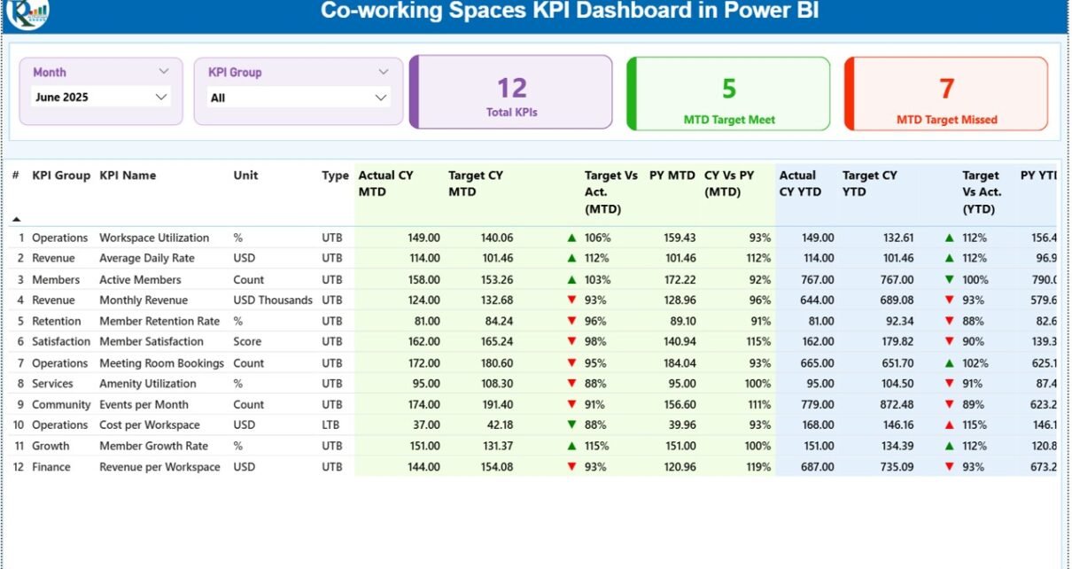
1. Summary Page – The Main Performance Overview

The Summary Page serves as the primary reporting interface of the dashboard. It provides a quick overview of all KPI performance indicators.
At the top of the page, users will find slicers for:
-
Month selection
-
KPI Group filtering
These slicers allow managers to analyze performance for specific time periods or KPI categories.
KPI Cards
Three KPI cards display high-level performance indicators:
-
Total KPIs Count – Displays the total number of KPIs monitored.
-
MTD Target Meet Count – Shows how many KPIs met their targets during the selected month.
-
MTD Target Missed Count – Displays the number of KPIs that failed to meet targets.
These indicators provide an instant snapshot of operational performance.
Detailed KPI Performance Table
Below the KPI cards, the dashboard displays a detailed KPI performance table containing multiple analytical fields.
The table includes the following columns:
KPI Number
Sequence number used to identify each KPI.
KPI Group
Represents the category of the KPI such as Operations, Revenue, Occupancy, or Customer Experience.
KPI Name
Defines the name of the performance metric.
Unit
Shows the unit of measurement such as percentage, count, currency, or hours.
Type (LTB or UTB)
Indicates the KPI direction.
-
LTB (Lower the Better) – Lower values indicate better performance.
-
UTB (Upper the Better) – Higher values indicate better performance.
Actual CY MTD
Shows the current year’s actual performance for the selected month.
Target CY MTD
Displays the target value set for the month.
MTD Icon
Displays red ▼ or green ▲ icons to indicate KPI performance against targets.
Target vs Actual (MTD)
Displays the percentage difference between actual and target values.
Formula used:
Actual MTD ÷ Target MTD
PY MTD
Displays the previous year’s performance for the same month.
CY vs PY (MTD)
Compares current performance with last year.
Formula used:
Current MTD ÷ Previous Year MTD
YTD KPI Metrics
The table also includes Year-to-Date (YTD) performance indicators.
These columns include:
-
Actual CY YTD
-
Target CY YTD
-
YTD Icon
-
Target vs Actual (YTD)
-
PY YTD
-
CY vs PY (YTD)
Therefore, managers can evaluate both short-term and long-term performance.
2. KPI Trend Page – Performance Over Time
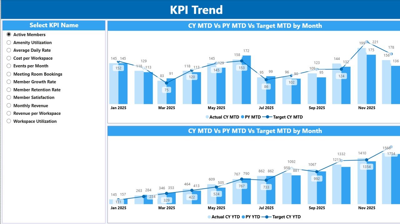
The KPI Trend Page helps users analyze performance changes across time.
On this page, users can select a specific KPI using a slicer available on the left side.
After selecting the KPI, the dashboard displays two combo charts.
MTD Trend Chart
This chart compares:
-
Current Year Actual
-
Previous Year Actual
-
Target Value
The visualization helps users identify monthly performance trends.
YTD Trend Chart
The second combo chart focuses on Year-to-Date performance.
It compares:
-
Current Year YTD
-
Previous Year YTD
-
Target YTD
Therefore, managers can easily evaluate whether the business performs better than the previous year.
Click to Purchases Co-working Spaces KPI Dashboard in Power BI
3. KPI Definition Page – Detailed KPI Explanation

The KPI Definition Page provides detailed information about each KPI.
However, this page remains hidden by default.
Users can access it through the drill-through feature from the summary page.
This page displays:
-
KPI Number
-
KPI Group
-
KPI Name
-
KPI Unit
-
KPI Formula
-
KPI Definition
-
KPI Type (LTB or UTB)
Consequently, users can understand how each KPI works and how it gets calculated.
To return to the main dashboard, users simply click the Back button.
Excel Data Source Structure
The dashboard uses Excel as the primary data source. Therefore, users can easily update data without changing the Power BI report structure.
The Excel file contains three worksheets.
1. Input_Actual Sheet
This sheet stores the actual performance data.
Users need to enter the following information:
-
KPI Name
-
Month (First date of the month)
-
MTD Value
-
YTD Value
After updating this sheet, Power BI automatically reflects the changes in the dashboard.
2. Input_Target Sheet
This sheet contains the target values for each KPI.
Users must enter:
-
KPI Name
-
Month
-
Target MTD
-
Target YTD
These values help calculate target vs actual performance indicators.
3. KPI Definition Sheet
This sheet contains metadata about KPIs.
It includes:
-
KPI Number
-
KPI Group
-
KPI Name
-
Unit
-
Formula
-
KPI Definition
-
KPI Type (LTB or UTB)
This information feeds the KPI Definition Page.
Advantages of the Co-working Spaces KPI Dashboard in Power BI
Using a KPI dashboard provides several operational and strategic advantages.
Real-Time Performance Monitoring
Managers can instantly monitor workspace performance metrics.
Improved Decision Making
The dashboard presents data visually, which helps managers make faster decisions.
Better Space Utilization
Operators can identify underutilized desks or meeting rooms.
Revenue Optimization
The dashboard highlights revenue-related KPIs, enabling better financial planning.
Performance Accountability
Teams can clearly see which KPIs meet targets and which require improvement.
Historical Performance Analysis
Managers can compare performance across months and years.
Centralized Data Reporting
Instead of using multiple reports, the dashboard centralizes all KPIs in one location.
Opportunities for Improvement
Although the dashboard already provides powerful analytics, organizations can further improve it.
For example:
-
Integrate real-time booking system data
-
Add member satisfaction metrics
-
Include occupancy heatmaps
-
Track membership churn rate
-
Monitor meeting room utilization
-
Include financial forecasting KPIs
-
Add location-wise analysis for multiple branches
These improvements would enhance operational intelligence even further.
Click to Purchases Co-working Spaces KPI Dashboard in Power BI
Best Practices for the Co-working Spaces KPI Dashboard in Power BI
Organizations should follow certain best practices to maximize the value of the dashboard.
Define Clear KPI Objectives
Each KPI should align with business goals such as revenue growth or occupancy improvement.
Update Data Regularly
Teams should update the Excel data source frequently to maintain dashboard accuracy.
Use Consistent KPI Definitions
All teams should follow the same KPI formulas and definitions.
Focus on Actionable KPIs
Avoid tracking too many metrics. Instead, focus on KPIs that drive decisions.
Train Team Members
Ensure that managers and staff understand how to interpret dashboard metrics.
Monitor Trends, Not Just Numbers
Instead of focusing only on monthly results, analyze trends across multiple months.
Review KPIs Periodically
Business conditions change. Therefore, organizations should review KPI frameworks regularly.
Conclusion
The Co-working Spaces KPI Dashboard in Power BI provides a powerful solution for monitoring workspace performance and operational efficiency.
Instead of manually analyzing spreadsheets, managers can view all important metrics in an interactive and visually appealing dashboard.
The dashboard tracks MTD and YTD performance, target comparisons, and historical trends, allowing operators to identify performance gaps quickly.
Moreover, the integration with Excel ensures that teams can update data easily without complex technical knowledge.
Therefore, organizations that adopt this dashboard can improve decision-making, increase workspace utilization, optimize revenue, and deliver better member experiences.
As the co-working industry continues to grow, data-driven workspace management will become essential. Tools like this KPI dashboard enable businesses to stay competitive and efficient.
Frequently Asked Questions (FAQs)
What is a KPI dashboard in Power BI?
A KPI dashboard in Power BI is an interactive report that tracks key performance indicators using charts, cards, tables, and filters.
Why should co-working spaces track KPIs?
Co-working operators should track KPIs to monitor occupancy rates, revenue, member retention, and operational efficiency.
Can beginners use this Power BI dashboard?
Yes. Since the data comes from Excel sheets, beginners can easily update the data without advanced Power BI knowledge.
What are MTD and YTD metrics?
MTD means Month-to-Date performance, while YTD represents Year-to-Date performance.
Can this dashboard support multiple co-working locations?
Yes. With minor modifications, users can add location fields to analyze performance across multiple branches.
Is Power BI suitable for workspace analytics?
Yes. Power BI offers advanced visualization, data modeling, and interactive filtering, which makes it ideal for workspace analytics.
Click to Purchases Co-working Spaces KPI Dashboard in Power BI
Visit our YouTube channel to learn step-by-step video tutorials