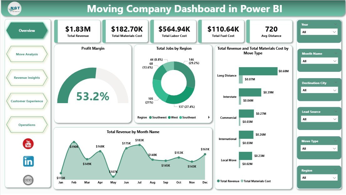
The Moving Company Dashboard in Power BI tracks 5 headline KPIs across 5 interactive report pages, with 15+ visuals covering revenue, profit margin, materials cost, labor cost, fuel cost, and customer rating. Setup takes under 10 minutes on free Power BI Desktop — connect the .pbix file to your job-level data, click Refresh, and every card, visual, and slicer across the Overview, Move Analysis, Revenue Insights, Customer Experience, and Operations pages rebuilds automatically.
If you run a moving, relocation, or commercial-mover business, the single most expensive mistake is judging the business on top-line revenue alone. Two moves at the same price can have wildly different margins once materials, labor, and fuel are stripped out. This dashboard puts that calculation in front of you in one click — without paying $99–$399 per user per month for SmartMoving or MoverBase.
Moving Company Dashboard in Power BI
Key Features of the Moving Company Dashboard in Power BI
The Moving Company Dashboard in Power BI is built natively in Power BI Desktop and uses a clean star-schema data model so every visual responds instantly to slicer selections. Here’s what you get inside the .pbix file:
- 5 KPI cards on the Overview page — Total Revenue, Total Materials Cost, Total Labor Cost, Total Fuel Cost, and Avg Distance.
- 15+ visuals across 5 report pages — covering profit margin, move-type profitability, region performance, lead-source ROI, customer rating, and operations.
- Cross-filtered slicers — click any region, move type, service type, or month and every visual on the page filters instantly.
- Profit Margin visual — strips materials, labor, and fuel cost from revenue to show true bottom-line percentage per move type.
- Fully editable DAX measures — add your own measures for Net Profit, Revenue per Truck, or Cost per Mile in seconds.
- Publishes to Power BI Service — share a browser link with your team if you have a Pro licence, or keep everything on Desktop for free.
For reference on how Power BI handles data modelling and DAX, see the official Microsoft Learn Power BI documentation.
Dashboard Pages Explanation
The .pbix file has 5 report pages. Below is a page-by-page breakdown with what each visual answers.
1. Overview Page — The main dashboard. At the top, 5 KPI cards display Total Revenue, Total Materials Cost, Total Labor Cost, Total Fuel Cost, and Avg Distance. Multiple slicers filter the page by region, move type, service type, or month. The page includes four key visuals: Profit Margin, Total Jobs by Region, Total Revenue and Total Materials Cost by Move Type, and Total Revenue by Month Name. This is the page owners open every Monday morning.
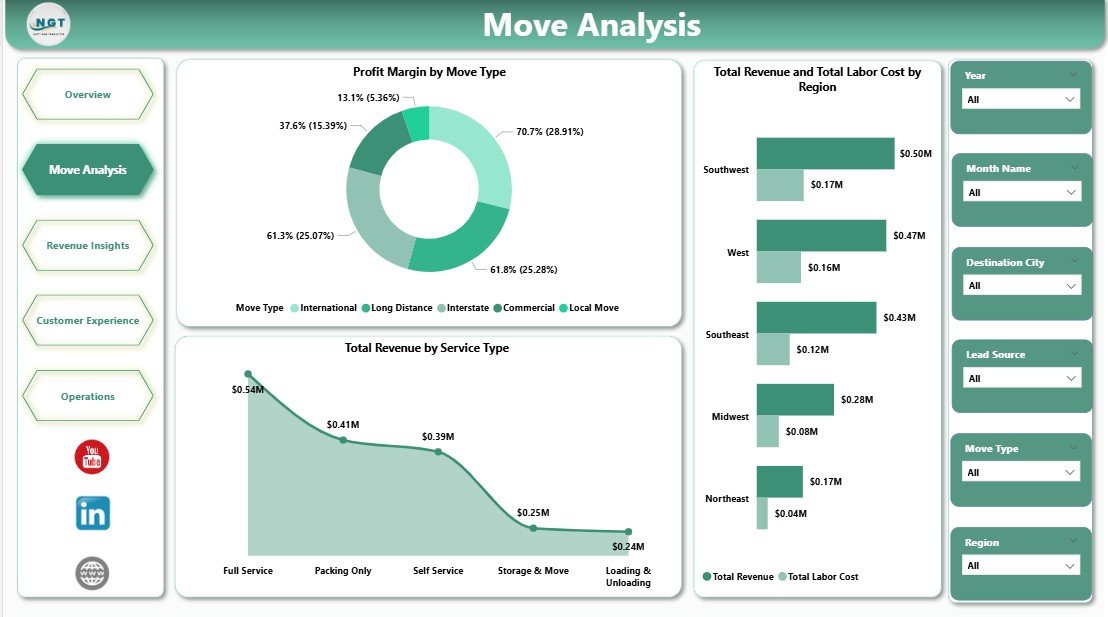
Move Analysis
2. Move Analysis Page — Three visuals zoom in on service-level profitability: Profit Margin by Move Type, Total Revenue and Total Labor Cost by Region, and Total Revenue by Service Type. Operations managers use this page to catch regions where labor cost is quietly eating margin and to decide which service types deserve more sales focus.
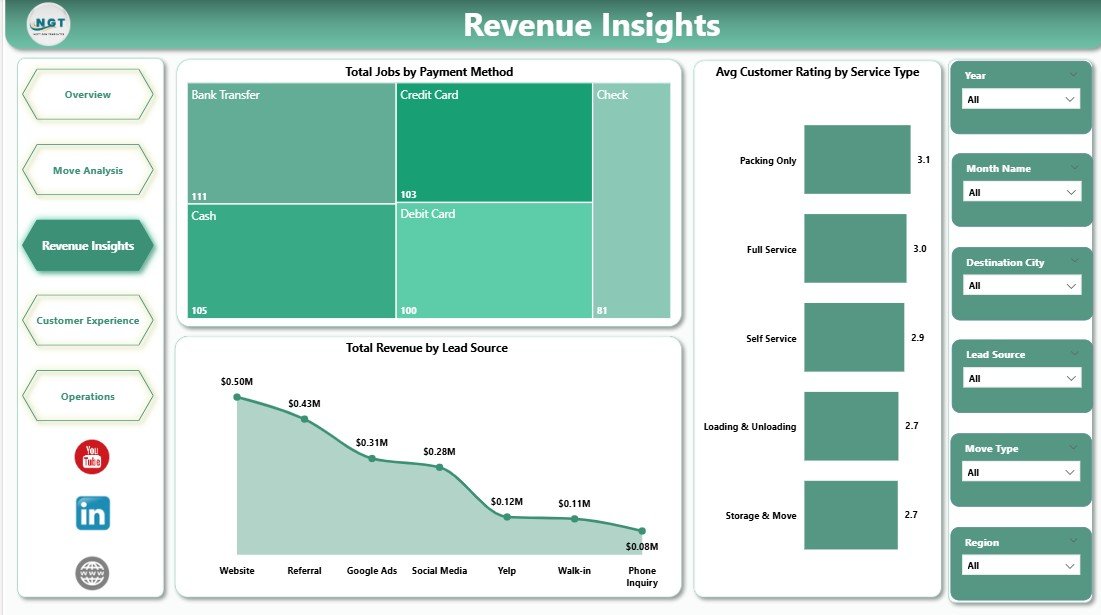
Revenue Insights
3. Revenue Insights Page — Three visuals on Total Jobs by Payment Method, Avg Customer Rating by Service Type, and Total Revenue by Lead Source. This page answers the single most important question in the business: which lead channels — Google Ads, referrals, Thumbtack, or direct website — actually convert to profitable bookings.
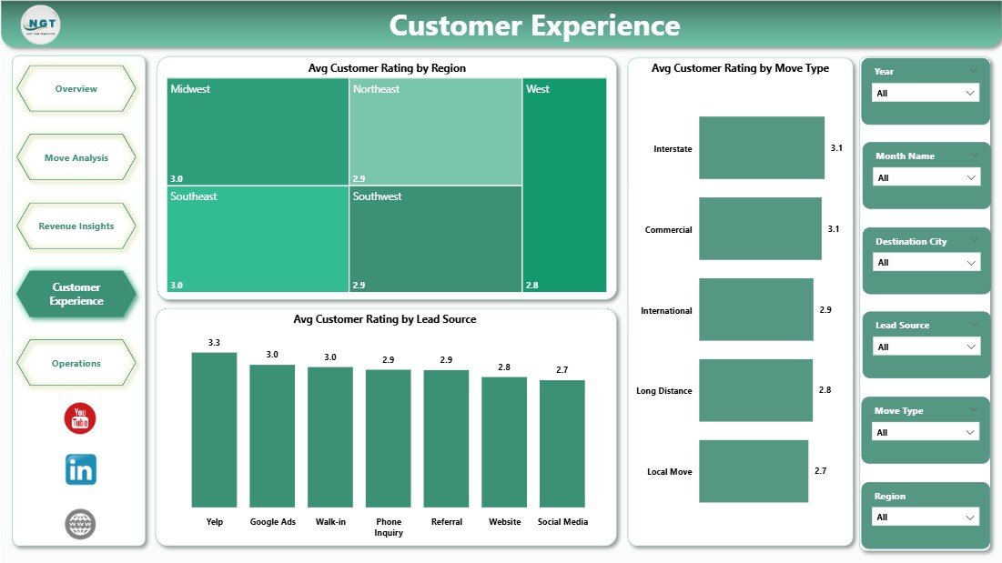
Customer Experience
4. Customer Experience Page — Three visuals covering Avg Customer Rating by Region, Avg Customer Rating by Move Type, and Avg Customer Rating by Lead Source. Quality managers use this page to flag crew-training needs and to identify lead sources that consistently produce unhappy customers — often the same channels that look cheap on a cost-per-lead basis.
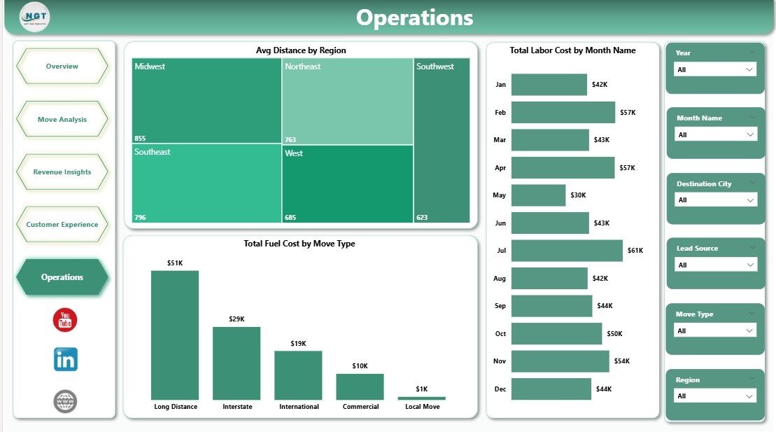
Operations
5. Operations Page — Three visuals covering Avg Distance by Region, Total Labor Cost by Month Name, and Total Fuel Cost by Move Type. Dispatchers and operations leads use this page for weekly scheduling, fuel cost control, and regional route-efficiency review.
Moving Company Dashboard in Power BI vs. Tableau / Qlik vs. SmartMoving / MoverBase — Feature Comparison
| Feature | Moving Company Dashboard in Power BI | Tableau / Qlik | SmartMoving / MoverBase |
|---|---|---|---|
| Cost | $17.99 one-time | $75+ / user / month | $99–$399 / user / month |
| Platform | Power BI Desktop (free) | Tableau / Qlik licence | Web + mobile SaaS |
| Setup time | Under 10 minutes | 2–4 hours rebuild | 2–4 weeks onboarding |
| Customizable DAX & visuals | ✅ Fully editable | ✅ Editable | ❌ Fixed reports |
| Per-user licence fees | None for Desktop | $75+ / user / month | $99+ / user / month |
| Customer data stays on device | ✅ Yes | ❌ Server-based | ❌ Vendor cloud |
| Year-1 cost at 5 users | $17.99 | $4,500+ | $5,940 – $23,940 |
| Revenue, fuel, labor, rating in one view | ✅ Pre-built | Needs rebuild | ✅ Pre-built |
For moving-company owners who want revenue-vs-cost visibility without paying $6,000+ per year in SaaS fees, the Moving Company Dashboard in Power BI sits in the sweet spot.
Who Should Use This Template
Perfect for:
- Owners of local moving companies (1–20 trucks) tracking jobs across 2–10 regions who already use Power BI
- Long-distance and commercial movers running 50–500 jobs per month
- Franchise operators benchmarking regional performance against HQ targets in Power BI Service
- BI leads and data analysts at relocation-services firms who want a ready-made starting point
- Dispatchers and operations leads running weekly crew scheduling and cost-control reviews
Not a fit if:
- You run 500+ trucks with integrated dispatch, fuel cards, and DOT compliance (use McLeod or TMW)
- You need live GPS tracking, automated crew SMS, or customer-facing booking portals (use SmartMoving or MoverBase)
- You don’t have Power BI Desktop — consider the Moving Company Dashboard in Excel version instead
Real-World Use Cases
Mike runs a 6-truck local moving company in Phoenix with 3 regional service areas. He opens the Moving Company Dashboard in Power BI every Monday morning and reviews the Total Revenue and Total Labor Cost by Region visual to spot which of his three territories is eating margin. The Avg Customer Rating by Lead Source chart helped him cut spend on a lead-gen channel that was producing 3.2-star reviews — saving roughly $2,400 per month in wasted ad spend while improving his overall rating from 4.3 to 4.7 in one quarter.
Priya manages operations at a long-distance mover with 18 trucks across 5 US states. She uses the Total Fuel Cost by Move Type visual to catch fuel-cost creep on long-haul commercial moves and publishes the report to Power BI Service so her regional managers see live updates. That single workflow replaced a SmartMoving plan that would have cost her $399 per user per month — saving the business around $4,700 per month in SaaS fees while giving her richer custom DAX measures than the SaaS option offered.
Carlos owns a commercial-relocation business in Miami with 25 crew members. He needs monthly P&L reports for his CFO but couldn’t justify $99 per user per month for MoverBase with 6 seats. The Moving Company Dashboard in Power BI gives him Profit Margin by Move Type and Total Revenue by Lead Source views, runs on Power BI Desktop, and cost the business $17.99 once. Over 12 months, that’s a difference of about $7,100.
Advantages of the Moving Company Dashboard in Power BI
Three advantages compound over time:
1. One-time cost vs. per-user SaaS. Most moving-company SaaS tools charge per seat. At 5 seats, SmartMoving’s base plan costs roughly $5,940 per year. This dashboard is $17.99 once — a break-even of under one hour of operator time.
2. Free Power BI Desktop for authoring. You don’t need a Power BI Pro licence to edit visuals, tweak DAX, or change slicers. Pro is only needed if you want to publish to Power BI Service and share a cloud report link with your team.
3. Data stays on your device. When using Power BI Desktop, customer contact details, crew pay rates, and move-level pricing never leave your machine. That’s a real privacy and IP advantage over cloud-only SaaS tools.
Opportunities for Improvement
In the spirit of giving an honest review, here’s what the dashboard doesn’t do:
- No live GPS tracking. This is a reporting tool, not an operational dispatch platform. If you need real-time truck location, you’ll need SmartMoving or a dedicated GPS tool.
- No automated customer SMS / email. Communication workflows still need a separate CRM.
- No integrated fuel-card feed. Fuel cost must be entered at the job level or pulled from an existing accounting export.
- Publishing to Power BI Service requires a Pro licence. Desktop authoring is free, but cloud sharing via Power BI Service typically needs Pro at around $10/user/month.
Best Practices
Three practices that operators consistently report make the biggest difference:
❶ Review the Overview page every Monday. Don’t wait for month-end. Weekly rhythm catches margin creep 3–4 weeks earlier than monthly reviews.
❷ Use the slicers aggressively. Filter by one region at a time when reviewing Customer Experience — regional patterns are almost always more actionable than blended company-wide averages.
❸ Add your own DAX measures for Net Profit and Revenue per Truck. These two measures are the single biggest upgrade you can make and take five minutes each.
Explore Relevant Templates
- 🔹 Moving Company Dashboard in Excel — Same 5 KPIs and charts in a pivot-table driven Excel file. For teams without Power BI.
- 🔹 Warehouse Efficiency Dashboard in Power BI — Sister Power BI template covering fulfilment rate, pick time, and shipping cost.
- 🔹 Trucking and Logistics Dashboard in HTML — Browser-based logistics scorecard for teams that want a no-install option.
- 🔹 Pharmacy Dashboard in Power BI — If you also run vertical-specific Power BI reporting, this is a reference for medical/retail ops.
- 💎 Save on the full logistics ops stack — Get the Manufacturing Excellence Bundle (8 premium Excel + Power BI operations templates).
Also browse all our Power BI Dashboard Templates for more industry-specific reports.
Frequently Asked Questions
What KPIs does the Moving Company Dashboard in Power BI track?
The Moving Company Dashboard in Power BI tracks 5 headline KPIs on the Overview page: Total Revenue, Total Materials Cost, Total Labor Cost, Total Fuel Cost, and Avg Distance. It also includes 15+ visuals across 5 pages covering profit margin, move type, labor cost, fuel cost, lead source, payment method, and customer rating analytics.
How does this compare to SmartMoving or MoverBase?
SmartMoving and MoverBase typically charge $99–$399 per user per month — reaching $6,000–$24,000 per year at 5 seats. The Moving Company Dashboard in Power BI is a $17.99 one-time purchase with no per-user fees for Desktop authoring, and keeps customer contact and pricing data on your device rather than in a vendor cloud.
How long does setup take?
Setup takes under 10 minutes. Open the .pbix file in Power BI Desktop, point the data source to your job-level records in Transform Data, then click Refresh. Every card, visual, and slicer across all 5 dashboard pages updates automatically. No DAX edits required for basic use.
Do I need a paid Power BI licence to use this template?
No. The Moving Company Dashboard in Power BI works entirely on free Power BI Desktop for Windows. A paid Power BI Pro or Premium licence is only required if you want to publish the report to the Power BI Service for cloud sharing with your team.
Can I customize the DAX measures and visuals?
Yes. Every DAX measure, visual, colour, and layout in the Moving Company Dashboard in Power BI is fully editable. Open the .pbix file, click any visual, and modify the fields, filters, or formatting. You can also add custom DAX measures for KPIs like Net Profit Margin or Revenue per Truck in minutes.
Is my customer and pricing data safe with this template?
Data stays on your device when using Power BI Desktop. The Moving Company Dashboard in Power BI doesn’t connect to any third-party cloud service, API, or external database by default. Customer contact details, crew pay rates, and move-level pricing never leave your machine unless you choose to publish to Power BI Service.
Can I share this report with my team?
Yes. You can email the .pbix file to team members who have Power BI Desktop, or publish the report to Power BI Service with a Pro licence and share a browser link. Many operators choose the Pro route for managers and Desktop-only for analysts — a flexible, low-cost hybrid.
About the Author
Built by PK — Microsoft Certified Professional with 15+ years of Excel, Google Sheets, and Power BI experience. Founder of NextGenTemplates, reaching 300K+ subscribers across YouTube channels. Every template is hand-built and tested before release.
Conclusion
The Moving Company Dashboard in Power BI is designed for owners and operations leads who want fast, visual answers to the questions that drive margin — not monthly SaaS bills. Five KPI cards, 15+ visuals, 5 focused report pages, and full DAX customisation, for $17.99 once.
👉 Click here to Purchase the Moving Company Dashboard in Power BI
✅ Instant download · One-time payment · No subscription · No per-user fees · Lifetime access
🎥 Visit our YouTube channel for step-by-step Power BI tutorials: Youtube.com/@PK-AnExcelExpert
📅 Last updated: April 2026