The IT Help Desk Dashboard in Excel is a 5-page reporting template that tracks 5 ticket KPIs across 14 charts, with slicer-driven filtering and a one-click pivot refresh. Setup takes under 10 minutes — replace the sample data on the Data sheet, click Refresh All, and every page recalculates automatically.
🌍 Trusted by 8,400+ teams in 40+ countries, this template replaces $25–$115 per agent per month help desk SaaS reporting with a one-time $17.99 download.
✅ Instant download · One-time payment · No subscription · No per-user fees · Lifetime access
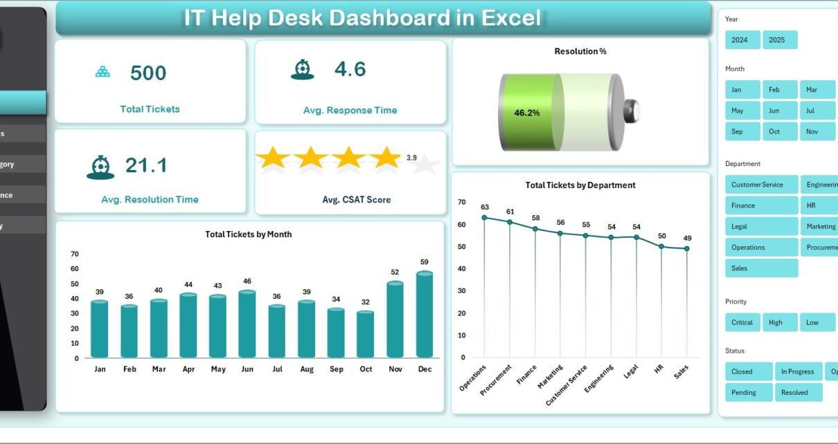
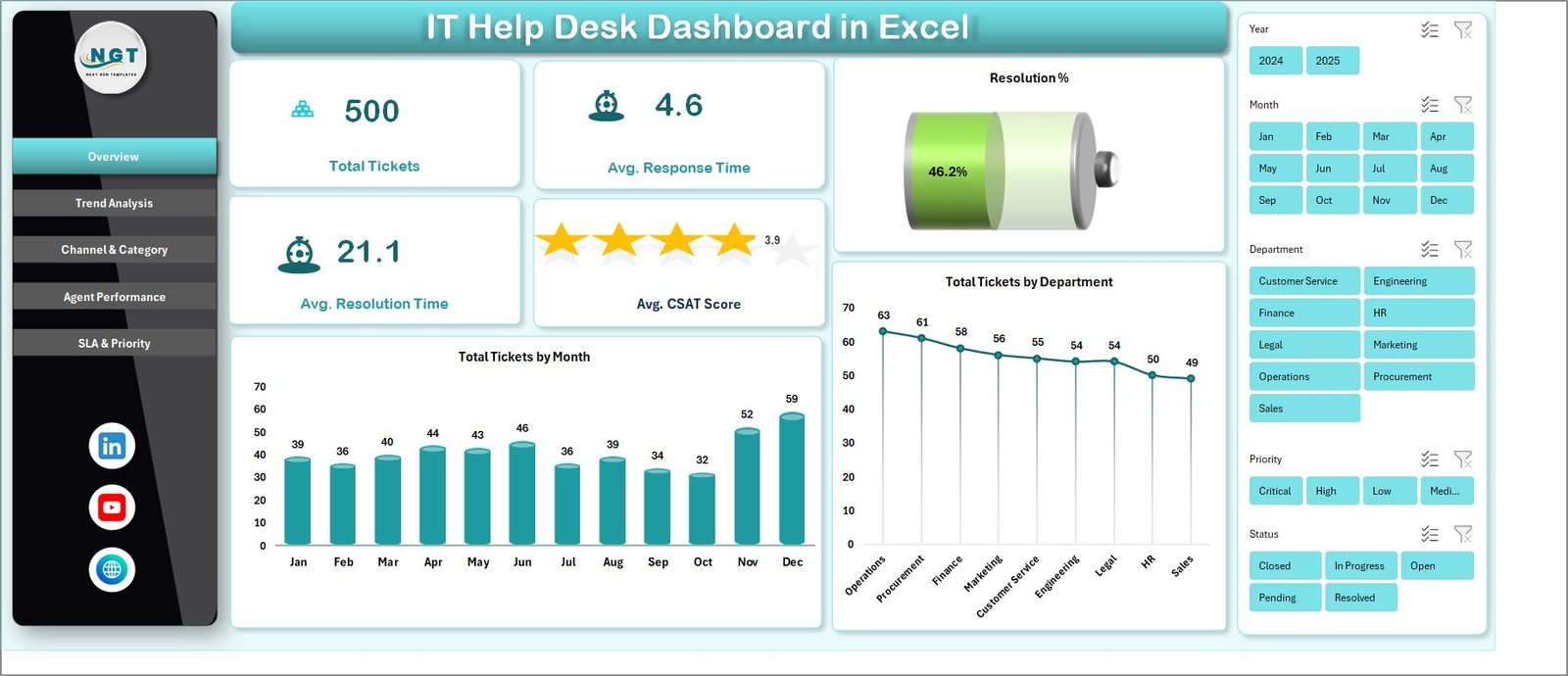 IT Help Desk Dashboard in Excel — Overview Page
Introduction
Most internal IT teams have a ticketing system but lack good reporting on top of it. Exporting the raw ticket log is one click, but turning that export into an SLA-compliance review or an agent scorecard is where Mondays disappear. The IT Help Desk Dashboard in Excel closes that gap. It’s a clean, pivot-driven Excel workbook with five purpose-built pages that turn raw ticket data into the metrics IT leaders are actually asked about: response time, resolution time, SLA compliance, CSAT, and agent productivity.
This is a reporting template — not a ticketing tool. If your team uses Zendesk, Freshdesk, Jira Service Management, ServiceNow, or any ticketing system that lets you export to Excel, this dashboard sits cleanly on top of that data and gives you presentation-ready charts in minutes.
Key Features of the IT Help Desk Dashboard in Excel
The IT Help Desk Dashboard in Excel was built around five repeatable reporting needs that show up in every help desk review. Each is anchored to its own page so you can navigate fast during meetings.
📊 Five interactive pages — Overview, Trend Analysis, Channel & Category, Agent Performance, and SLA & Priority. Each is a stand-alone view answering a specific leadership question.
📊 Five KPI cards on the Overview page — Total Tickets, Average Response Time, Average Resolution Time, Average CSAT Score, and Resolution %. These match the headline metrics most ITSM tools surface and most CIOs ask for.
📊 Slicer-driven filtering — Native Excel slicers for Department, Channel, Priority, and Category sit on each page. Click any slicer value and every chart on that page filters in unison.
📊 One-click refresh engine — A hidden Support sheet holds every pivot table feeding the charts. Update the Data sheet, click Refresh All on the Data ribbon, and the entire workbook recalculates.
📊 No macros, no add-ins — Pure native Excel. The file works in Excel 2016, 2019, 2021, Microsoft 365, Excel Online, and Excel for Mac. Nothing to install, no security prompts.
Dashboard Pages Explanation
1 — Overview Page
The Overview page leads with five KPI cards: Total Tickets, Average Response Time, Average Resolution Time, Average CSAT Score, and Resolution %. Below the cards sit the Department, Channel, Priority, and Category slicers, followed by two charts:
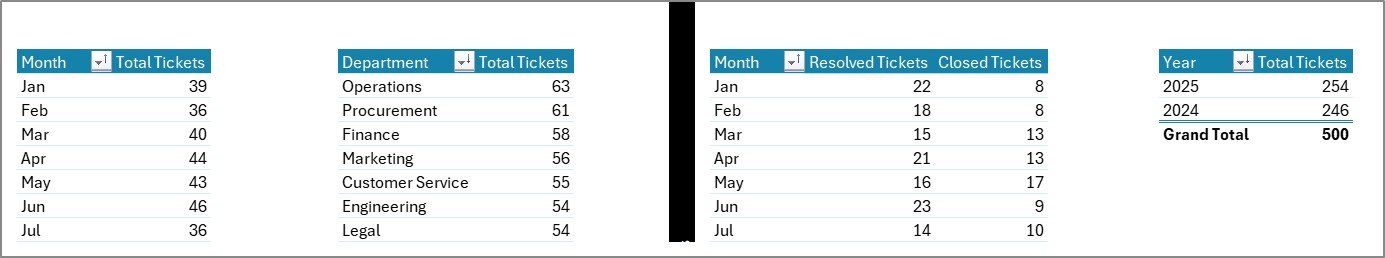
📊 Total Tickets by Month — Shows ticket volume rising and falling month-over-month, useful for spotting incident spikes and quiet periods.
📊 Total Tickets by Department — A horizontal comparison of which internal departments raise the most tickets, so you can plan support coverage by team size and need.
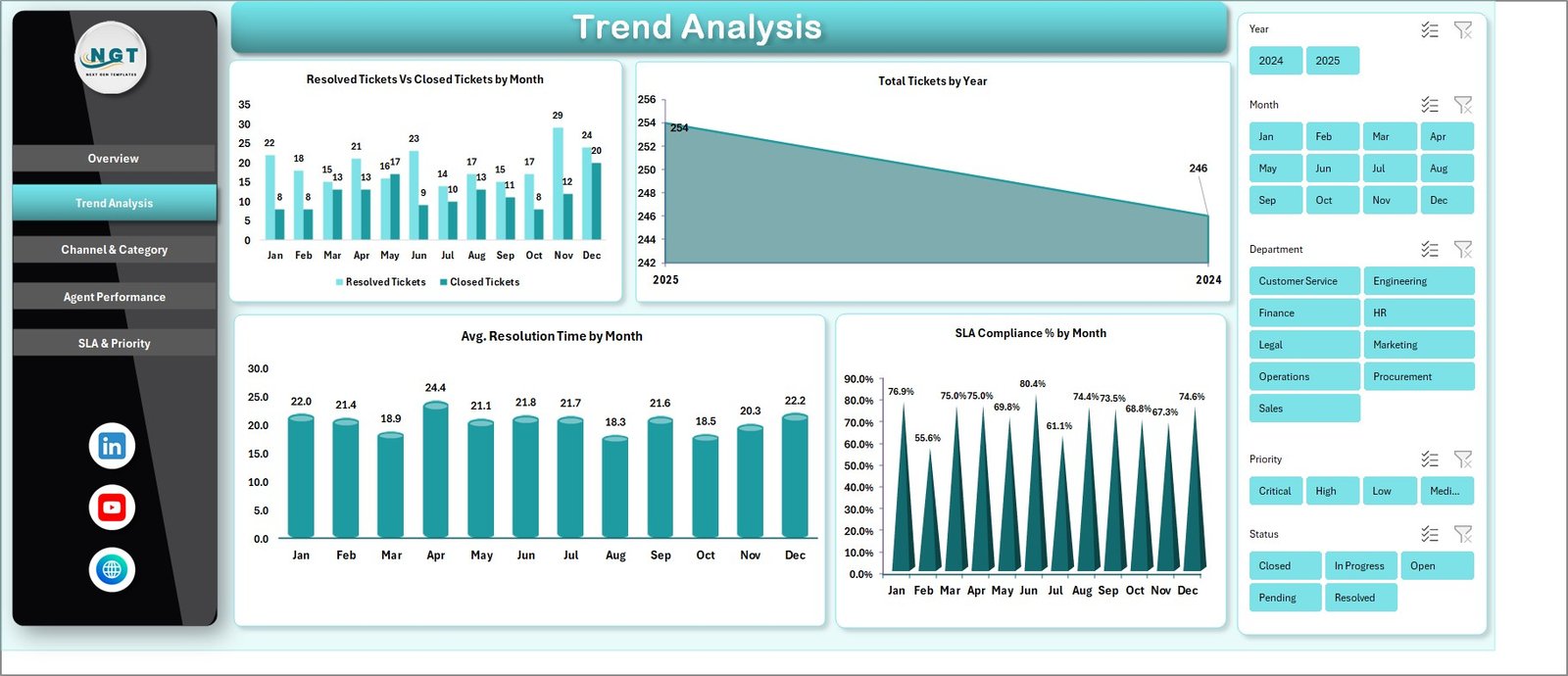 Trend Analysis Page
2 — Trend Analysis Page
This page tracks how your support operation moves over time:
📈 Resolved Tickets vs Closed Tickets by Month — Compares actual resolutions against what was simply marked closed.
📈 Total Tickets by Year — A year-on-year volume view showing whether ticket load is trending up, flat, or shrinking.
📈 Average Resolution Time by Month — A trend line for whether your team is getting faster or slower at closing tickets.
📈 SLA Compliance % by Month — Monthly compliance percentage so you can spot the months where SLAs slipped.
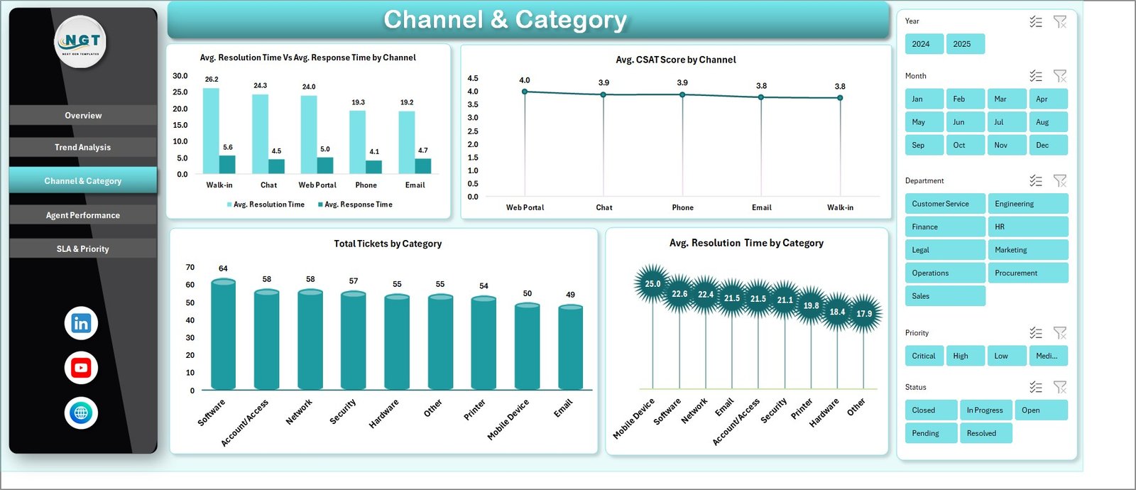 Channel & Category Page
3 — Channel & Category Page
This page breaks down where tickets come from and what they’re about:
📊 Average Resolution Time vs Average Response Time by Channel — Compare how quickly your team replies versus how long full resolution takes for Email, Phone, Chat, and Portal.
📊 Average CSAT Score by Channel — Identify which channel delivers the best customer satisfaction.
📊 Total Tickets by Category — A volume view across categories like Hardware, Software, Network, Access, and Account.
📊 Average Resolution Time by Category — See which categories are slowest to close so you can target training or staffing.
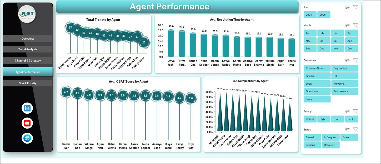 Agent Performance Page
4 — Agent Performance Page
A complete per-agent scorecard, all on a single page:
👤 Total Tickets by Agent — Workload distribution across the team.
👤 Average Resolution Time by Agent — Speed of closure per agent.
👤 Average CSAT Score by Agent — Customer-rated quality per agent.
👤 SLA Compliance % by Agent — Each agent’s hit rate against the SLA target.
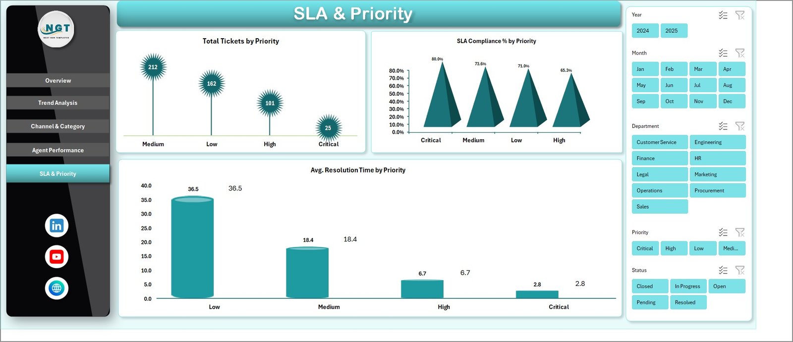 SLA & Priority Page
5 — SLA & Priority Page
Drill into severity-based performance:
🚨 Total Tickets by Priority — Distribution of P1, P2, P3, and P4 tickets.
🚨 SLA Compliance % by Priority — Hit rate at each priority tier — critical for executive reporting.
🚨 Average Resolution Time by Priority — Whether your high-priority tickets actually move faster.
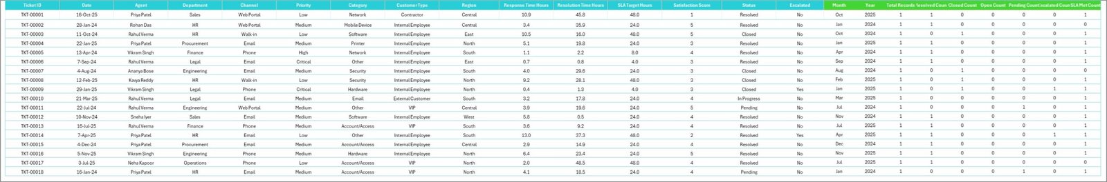 Data Sheet tab
6 — Data Sheet
This is where you paste your raw ticket export. Match the column structure (Ticket ID, Date, Department, Channel, Category, Priority, Agent, Response Time, Resolution Time, CSAT, Status, SLA met) and the entire dashboard updates after a single Refresh All.
 Support sheet tab
7 — Support Sheet
The Support sheet houses every pivot table that feeds the dashboard. Open the Data tab in the Excel ribbon, click Refresh All, and every pivot — and therefore every chart — recalculates. You can hide this sheet from end users and the dashboard stays fully dynamic.
IT Help Desk Dashboard in Excel vs. Google Sheets vs. Paid Help Desk SaaS — Feature Comparison
| Feature | IT Help Desk Dashboard in Excel | Google Sheets equivalent | Zendesk / Freshdesk / Jira Service Mgmt |
|---|---|---|---|
| Cost | $17.99 one-time | ~$10 one-time | $25–115 / agent / month |
| Platform | Microsoft Excel (offline) | Google Sheets (cloud) | Cloud SaaS |
| Setup time | Under 10 minutes ✅ | 15–20 minutes | Days to weeks |
| SLA compliance by priority | ✅ | ✅ | ✅ |
| Agent scorecard | ✅ | ✅ | ✅ |
| Slicer-based filtering | ✅ native Excel slicers | Filter views | UI filters |
| Works offline | ✅ | ❌ | ❌ |
| Year-1 cost at 5 agents | $17.99 | ~$10 | $1,500 – $6,900 |
| Real-time ticket queue | ❌ reporting only | ❌ reporting only | ✅ |
For IT teams that want full visibility into ticket volume, SLA compliance, and agent performance without paying $25–$115 per agent per month, the IT Help Desk Dashboard in Excel sits in the sweet spot.
Who Should Use This Template
Perfect for:
- IT managers running internal help desks of 2–50 agents who already use a ticketing system but need better Excel-based reporting
- MSPs and IT consultancies who export ticket data weekly and want a polished dashboard for client QBRs
- Service desk leads preparing monthly SLA compliance reports for leadership
- Solo IT admins at SMBs who want professional reporting without paying for an enterprise help desk suite
Not a fit if:
- You need a real-time ticket queue with auto-routing — this is a reporting dashboard, not a ticketing tool
- You’re an enterprise IT department needing ITIL change-management workflows or CMDB integration
- You don’t have a structured ticket export (you need at least Date, Channel, Priority, Agent, Resolution Time, and CSAT fields)
Real-World Use Cases
Daniel runs a 12-person internal IT help desk at a manufacturing firm. Every Monday morning he exports the previous week’s tickets from his ticketing system, pastes them into the Data sheet, and clicks Refresh All. By 9:30 AM he has a clean weekly SLA-compliance review for his director — without paying for an enterprise reporting add-on or building a custom Power BI report from scratch.
Priya leads a managed service provider serving 18 SMB clients. She uses one copy of the IT Help Desk Dashboard in Excel per client. Each quarterly business review now includes agent-level CSAT, SLA-by-priority, and channel mix charts — all pulled from a single template that she just updates with new data each cycle. What used to be three separate reports is now one consistent deliverable across every client.
Marco is a solo IT admin at a 60-person digital agency. He doesn’t have budget for Zendesk seats, so he tracks tickets in a shared spreadsheet and uses this template every month to show ownership where the help desk’s time actually goes — and which categories (Access, Hardware, Software) need process fixes versus more headcount.
Advantages of the IT Help Desk Dashboard in Excel
💰 Massive cost savings. A 5-agent team running Zendesk Suite would pay $1,500–$6,900 in year one for reporting features. This template costs $17.99 once and runs forever.
⚡ Speed to insight. Setup is under 10 minutes. Refresh time is seconds. There’s no warehouse, no ETL pipeline, no admin console.
📊 Executive-ready visuals. Charts and KPIs are formatted for leadership review — readable in screen-share calls and clean enough to drop into PowerPoint.
🔧 Fully customizable. Pivot tables, charts, slicers, and KPI formulas are all native Excel objects. Add your own metric in 5 minutes.
🔒 Data stays local. Nothing leaves your laptop. Useful for teams handling sensitive ticket content, internal investigations, or regulated industries.
Opportunities for Improvement
Honest disclosure — this template is a reporting dashboard, not a help desk replacement. Consider these limitations before buying:
It does not provide a real-time ticket queue, auto-routing, customer self-service portal, or knowledge base. For those, you still need Zendesk, Freshdesk, Jira Service Management, or similar. It also doesn’t track per-ticket comment threads — only the aggregate metrics you’ve exported.
For very large datasets (above ~500,000 ticket rows), Excel’s pivot engine slows down. At that scale, exporting your data to Power BI or to a SQL-backed BI tool will give better performance — though the same KPI logic still applies.
Best Practices
To get the most from the IT Help Desk Dashboard in Excel:
1️⃣ Standardize your column headers in your ticketing-system export so the paste-and-refresh workflow stays predictable week after week.
2️⃣ Save a “template copy” separately — never overwrite the master file with live data; copy it before each reporting cycle.
3️⃣ Hide the Support sheet before sharing with leadership — right-click the Support tab and choose Hide.
4️⃣ Use Excel’s share-by-link feature for distribution to leadership when stored in OneDrive or SharePoint.
5️⃣ Refresh the data weekly, not just monthly — a weekly cadence catches SLA slips early instead of after the month closes.
Explore Relevant Templates
📈 Customer Support SLA KPI Dashboard in Power BI — Power BI version focused on customer-facing support SLA compliance.
🛠️ Incident Management KPI Dashboard in Power BI — Pair this when you need MTTR, MTTA, and incident severity reporting.
🔐 Cybersecurity Risk Assessment KPI Dashboard in Power BI — Companion for IT leaders reporting both security and help desk KPIs.
🚀 Productivity Tracker KPI Dashboard in Power BI — Adds individual agent productivity tracking on top of help desk reporting.
Frequently Asked Questions
What KPIs does the IT Help Desk Dashboard in Excel track?
The IT Help Desk Dashboard in Excel tracks 5 core KPIs — Total Tickets, Average Response Time, Average Resolution Time, Average CSAT Score, and Resolution % — plus 14 charts covering SLA compliance, agent performance, ticket priority, channel mix, and ticket categories.
How long does setup take?
Setup takes under 10 minutes. Open the file, replace the sample data on the Data sheet with your own ticket export, then click Refresh All on the Data ribbon. Every chart and KPI updates automatically — no formula editing needed.
How does this compare to Zendesk or Freshdesk?
Zendesk and Freshdesk are full ticketing platforms costing $25–$115 per agent per month. The IT Help Desk Dashboard in Excel is a one-time $17.99 reporting layer that runs on top of any ticket data you already export — keeping budget on the team rather than on per-agent fees.
Does the template need macros or VBA?
No. The IT Help Desk Dashboard in Excel uses only native pivot tables, charts, and slicers. There is no VBA, no macro security prompt, and no add-in installation. It works in Excel 2016, 2019, 2021, Microsoft 365, and Excel Online.
Can I add my own KPIs or charts?
Yes. The hidden Support sheet contains all the pivot tables driving the dashboard. Copy any pivot, build a new chart, link it to a fresh slicer — the structure is open for customization. The Data sheet column layout is the only thing you should keep stable.
Is the file compatible with Mac Excel and Excel Online?
Yes. The IT Help Desk Dashboard in Excel works in Excel for Mac (2016 and later) as well as Microsoft 365 and Excel Online. Slicers and pivot tables behave the same way across platforms.
About the Author
Built by PK — Microsoft Certified Professional with 15+ years of Excel, Google Sheets, and Power BI experience. Founder of NextGenTemplates, reaching 300K+ subscribers across YouTube channels. Every template is hand-built and tested before release.
Conclusion
If your IT team already exports ticket data but loses Mondays building the same SLA, agent, and channel reports from scratch, the IT Help Desk Dashboard in Excel hands you a polished, executive-ready output for $17.99. No subscription, no per-agent fees, lifetime access.
📥 Click here to Purchase the IT Help Desk Dashboard in Excel
✅ Instant download · One-time payment · No subscription
🎥 Visit our YouTube channel for step-by-step video tutorials: Youtube.com/@PK-AnExcelExpert
📅 Last updated: May 2026