The global clean tech market crossed $1.7 trillion in annual investment in 2024, with renewable energy projects alone accounting for over 540 GW of new capacity additions. Yet most project teams running clean energy portfolios still rely on disconnected spreadsheets, a $25,000+/year enterprise SaaS subscription, or both. The Clean Tech Dashboard in Excel closes that gap with five interactive analysis pages, five executive KPI cards, eighteen pre-built charts, and multi-dimensional slicers — all driven by pivot tables and refreshable in under 10 minutes.
Whether you manage a 10-project pilot or a 500-project national rollout of solar, wind, EV, or energy-efficiency programs, this Clean Tech Dashboard in Excel gives you a single file that tracks budget vs. actuals, CO2 reduction, MW capacity added, jobs created, on-track percentage, cost variance, and budget utilization across regions, project types, funding sources, phases, priorities, and time. No subscription. No per-user fees. One-time purchase, lifetime access.
Key Features of Clean Tech Dashboard in Excel
- Five interactive analysis pages — Overview, Project Portfolio, Financial Analysis, Regional Insights, and Monthly Trend — each focused on one decision-making angle so leadership reviews stop hopping between five files.
- Five executive KPI cards on the Overview page: Total Budget, Total Actual Cost, Total Projects, Total CO2 Reduction, and Average Progress %. Sponsors see portfolio health in five seconds.
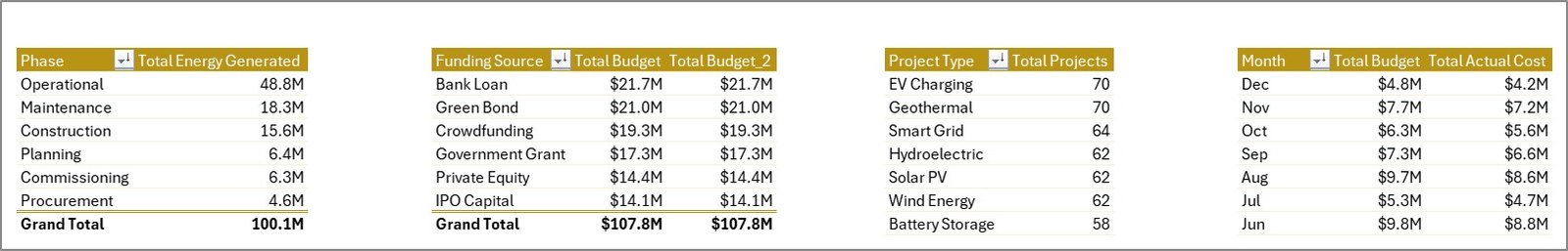
- Eighteen ready-made charts covering energy generated by phase, budget by funding source, cost variance by region, capacity in MW by region, jobs created, on-track percentage by month, and more — all driven by pivots in the hidden Support sheet.
- Multi-dimensional slicers filter the entire portfolio by Region, Project Type, Status, Phase, Funding Source, Priority, and Year with one click.
- Refresh-All workflow: drop new project rows into the Data sheet, click Data → Refresh All, and every chart, slicer, and KPI recalculates instantly. No formula edits required.
- Sustainability-specific metrics: total installed capacity (MW), CO2 reduction by region, and jobs created — the three metrics ESG reports and investor decks require.
- Fully editable and unlocked: recolor to your brand, add new KPIs, restructure columns, integrate with your existing workflow. Perpetual license.
Dashboard Pages Explanation
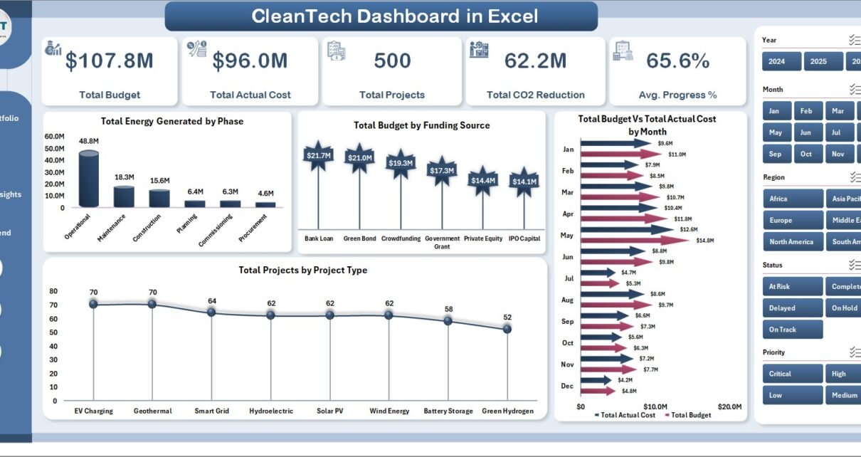
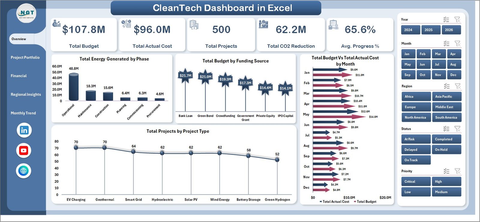
Page 1: Overview
The Overview page surfaces five KPI cards — Total Budget, Total Actual Cost, Total Projects, Total CO2 Reduction, and Average Progress % — alongside four anchor charts: Total Energy Generated by Phase, Total Budget by Funding Source, Total Budget Vs Total Actual Cost by Month, and Total Projects by Project Type. Slicers above the cards filter the entire portfolio instantly.
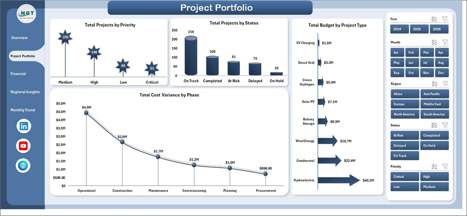
Page 2: Project Portfolio
The Project Portfolio page profiles the active project pipeline with Total Projects by Priority, Total Projects by Status, Total Budget by Project Type, and Total Cost Variance by Phase. Use this view to identify high-priority projects that are slipping or phases consuming the most budget.
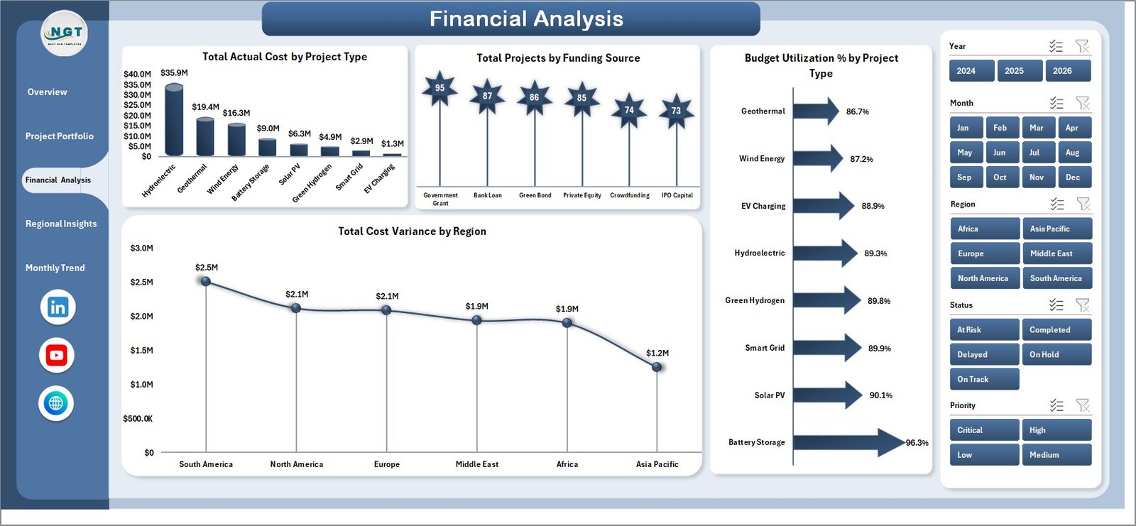
Page 3: Financial Analysis
The Financial Analysis page focuses on money flow — Total Actual Cost by Project Type, Total Projects by Funding Source, Budget Utilization % by Project Type, and Total Cost Variance by Region. This is the page CFOs and finance leads will return to before each quarterly review.
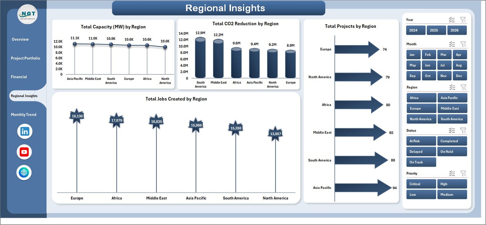
Page 4: Regional Insights
The Regional Insights page measures on-the-ground impact — Total Capacity (MW) by Region, Total CO2 Reduction by Region, Total Projects by Region, and Total Jobs Created by Region. These four charts answer where capital is being deployed and what return each region is generating.
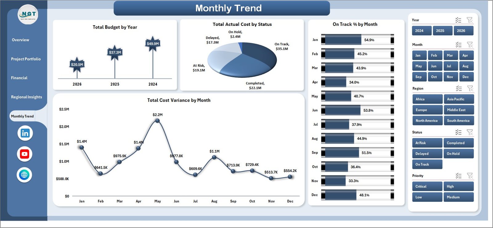
Page 5: Monthly Trend
The Monthly Trend page tracks portfolio performance over time with Total Budget by Year, Total Actual Cost by Status, On Track % by Month, and Total Cost Variance by Month. Use these to spot seasonal cost spikes and quarter-over-quarter delivery trends.
Data Sheet
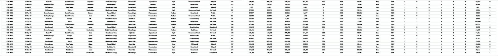
The Data Sheet is the input layer — add or replace project rows in the same column structure (Project ID, Project Type, Region, Phase, Funding Source, Budget, Actual Cost, Capacity in MW, CO2 Reduction, Jobs Created, Status, Priority, Start Date, End Date, Progress %) and the entire dashboard auto-updates after a single refresh.
Support Sheet
The Support Sheet hosts all pivot tables that power the dashboard’s charts and slicers. After updating data, click Data → Refresh All and every pivot recalculates. Keep this sheet hidden so stakeholders see only the polished dashboard pages.
Clean Tech Dashboard in Excel vs. Power BI vs. Paid Sustainability SaaS — Feature Comparison
| Feature | Clean Tech Dashboard in Excel | Power BI Equivalent | Watershed / Persefoni / Sphera |
|---|---|---|---|
| Cost | $17.99 one-time | $10/user/month (Power BI Pro) | $25,000–$150,000 / year |
| Platform | Microsoft Excel (.xlsx) | Power BI Desktop + Service | Vendor-hosted SaaS |
| Setup time | Under 10 minutes | 2–4 hours | 6–12 weeks onboarding |
| Sharing | Email, OneDrive, SharePoint ✅ | Requires PBI license per viewer | Per-seat license |
| Customisable charts/KPIs | Full control ✅ | Full control ✅ | Limited to vendor templates |
| Works offline | Yes ✅ | Desktop only | Cloud-only |
| CO2 + capacity tracking | Built-in ✅ | Manual model required | Built-in ✅ |
| Year-1 cost (5 users) | $17.99 | $600 | $25,000+ |
For clean energy and sustainability teams that want capacity, CO2, and budget tracking in one file without paying enterprise SaaS rates, the Clean Tech Dashboard in Excel sits in the sweet spot.
Who Should Use This Template
Perfect for:
- Project managers running portfolios of 5–500 clean energy, solar, wind, EV-infrastructure, or energy-efficiency projects
- Sustainability and ESG leads needing CO2 reduction, MW capacity, and jobs-created metrics in a single executive view
- Finance leads at clean-tech firms tracking budget vs. actuals across funding sources (grants, equity, debt, public funding)
- Consultants and impact-investing analysts presenting portfolio dashboards to clients without procuring SaaS for every engagement
- NGOs and government bodies reporting on the impact of clean energy programs by region
Not a fit if:
- You need automated carbon-emission ingestion from IoT, ERP, or supply-chain feeds (use Watershed or Persefoni)
- You need GHG Protocol Scope 1/2/3 calculation engines audited to ISO 14064 — this template tracks portfolio outcomes, not regulatory carbon accounting
- You don’t have Microsoft Excel 2016 or later (Power BI version available separately)
Real-World Use Cases
Anika manages a 60-project clean energy portfolio at a mid-sized renewable infrastructure firm. She uses the Clean Tech Dashboard in Excel to track budget vs. actuals by funding source, present quarterly CO2 reduction figures to her board, and identify which regions deliver the highest MW capacity per dollar invested — replacing a $40,000/year SaaS contract her CFO refused to renew. Her monthly board pack now takes 2 hours instead of 2 days.
Marcus runs ESG reporting at a private-equity-backed solar developer. He uses the Regional Insights page to show LPs the jobs-created impact across deployment regions and the Monthly Trend page to demonstrate on-track delivery percentage month-over-month. His team consolidated four separate Excel files into this single dashboard, cutting board-pack preparation from two days to three hours.
Priya leads the climate-action grant program at a regional NGO deploying $12M across rural clean-cooking, micro-grid, and solar-water-pumping projects. She uses the Financial Analysis page to show budget utilization by project type and the Project Portfolio page to keep grant officers informed on phase progress, replacing a manual reporting workflow that previously consumed an entire FTE.
Advantages of Clean Tech Dashboard in Excel
- One-time cost vs. recurring SaaS — $17.99 once, not $25,000+/year. Year-1 savings against enterprise carbon-accounting platforms exceed 99%.
- 10-minute setup — paste your project data, click Refresh All. No onboarding consultants, no vendor implementation team.
- Pivot-driven architecture — add new regions, funding sources, or project types and the dashboard auto-discovers them. No formula edits.
- Works on any Excel — Microsoft Excel 2016, 2019, 2021, and 365 (Windows and Mac). No Power BI license required for stakeholders.
- Offline-first — air-gapped environments, no cloud dependency, perfect for government and NGO field teams.
- Full ownership — unlocked file, your IP, your customisations, no vendor lock-in.
Opportunities for Improvement
To be transparent about what this template is and isn’t:
- Not a carbon-accounting engine — CO2 figures are inputs you provide (from project plans, M&V studies, or supplier data), not calculated from emission factors. For audited GHG Protocol Scope 1/2/3 calculations, use a dedicated platform.
- No automated data ingestion — the Data sheet is manually populated or pasted from your project-management system. Power Query can be added by an Excel-savvy user if needed.
- Single-file collaboration — if multiple users need to edit simultaneously, host on OneDrive/SharePoint with co-authoring enabled, or consider the Power BI version for service-based sharing.
- Charts are Excel-native — highly customisable but not as visually striking as some BI tools out-of-the-box. The trade-off is universal compatibility and zero learning curve.
Best Practices
- Standardise your project naming and IDs before importing. Inconsistent labels (e.g., “Solar PV” vs. “Solar-PV” vs. “PV Solar”) will create duplicate categories in slicers.
- Use one row per project per reporting period if you want to track progress changes month-over-month. Otherwise, one row per project is fine for static portfolio views.
- Hide the Support sheet before sharing externally (right-click tab → Hide). Investors and board members should see only the polished pages.
- Take monthly snapshots by saving copies with date suffixes (e.g., CleanTech-2026-05.xlsx). This builds an audit trail and lets you compare period-over-period.
- Update the CO2 reduction column from authoritative sources like IEA emission factors or your country’s grid carbon intensity figures.
- Sync your funding source taxonomy with your finance ledger so Budget Utilization % numbers reconcile with the accounting team’s view.
Explore Relevant Templates
- Solar Energy Dashboard in Excel — focused dashboard for solar-only project portfolios
- Energy Consumption Analysis Dashboard in Excel — pairs well for tracking energy savings post-deployment
- EV Fleet Dashboard in Excel — clean-mobility companion dashboard
- Climate Change NGOs Dashboard in Excel — for NGO-side impact reporting
- Renewable Infrastructure Projects Dashboard in Power BI — cross-platform alternative for Microsoft Fabric/Power BI teams
Frequently Asked Questions
What KPIs does the Clean Tech Dashboard in Excel track?
The Clean Tech Dashboard in Excel tracks 5 portfolio-level KPIs — Total Budget, Total Actual Cost, Total Projects, Total CO2 Reduction, and Average Progress %. It also analyses MW capacity by region, jobs created by region, cost variance by phase and region, budget utilization by project type, and on-track delivery percentage by month across 18 charts.
Which Excel version do I need?
The Clean Tech Dashboard in Excel works on Microsoft Excel 2016, 2019, 2021, and Excel for Microsoft 365 (Windows and Mac). Slicers and modern pivot features require Excel 2013 or later; older versions are not supported.
How long does setup take for a new portfolio?
Setup typically takes under 10 minutes. Open the Data sheet, paste your project rows into the existing column structure (Project ID, Type, Region, Funding Source, Budget, Actual Cost, Capacity in MW, CO2 Reduction, Jobs Created, Status, Priority, Progress %), then click Data → Refresh All. Every chart and slicer updates instantly.
Can I add new project types, regions, or funding sources?
Yes — the dashboard uses pivot tables in the Support sheet that auto-discover new categorical values. Add a new project type, region, or funding source in the Data sheet and after refresh, slicers, charts, and KPIs pick it up automatically. No formula edits required.
How does this compare to Watershed, Persefoni, or Sphera?
Watershed, Persefoni, and Sphera are enterprise carbon-accounting platforms starting at $25,000/year with multi-week onboarding. The Clean Tech Dashboard in Excel is a $17.99 one-time-purchase project portfolio tool — ideal for project tracking, budget oversight, and CO2 outcome reporting, but not a substitute for audited GHG Protocol calculation engines.
Is the file editable, or is it locked?
The Clean Tech Dashboard in Excel is fully editable and unlocked. You own a perpetual license to customize KPIs, add charts, recolor the layout to your brand palette, change column structures, and integrate with your existing workflow. No passwords, no hidden formulas.
Can I share the dashboard with my team?
Yes — share via email, OneDrive, SharePoint, Microsoft Teams, or any file-sharing service. Recipients need only Microsoft Excel (no Power BI license, no per-user SaaS seat). For external sharing, hide the Support sheet first so only the polished dashboard pages are visible.
About the Author
Built by PK — Microsoft Certified Professional with 15+ years of Excel, Google Sheets, and Power BI experience. Founder of NextGenTemplates, reaching 300K+ subscribers across YouTube channels (@PK-AnExcelExpert, @NextGenTemplates, @NeoTechNavigators). Every template is hand-built and tested before release.
Conclusion
The Clean Tech Dashboard in Excel is purpose-built for project teams running clean energy, renewable infrastructure, and sustainability portfolios who want executive-level reporting in a single file — without committing to a five-figure annual SaaS contract or training the entire team on a new platform. Five pages, five KPI cards, eighteen charts, and seven-dimensional slicer filtering give you the analytical depth of enterprise tooling at one-time-purchase economics.
👉 Click here to Purchase the Clean Tech Dashboard in Excel
✅ Instant download · One-time payment · No subscription · No per-user fees · Lifetime access
🎥 For step-by-step video tutorials, visit our YouTube channel: Youtube.com/@PK-AnExcelExpert
📅 Last updated: May 2026