Greenhouse farming depends on fast visibility into revenue, operating cost, yield, quality, crop batches, waste, and profit. When these numbers sit in separate spreadsheets, managers lose time and miss patterns that affect harvest planning, resource use, and margin. The Greenhouse Farming Dashboard in Excel turns structured greenhouse records into a multi-page reporting workbook with KPI cards, slicers, pivot-backed charts, and focused analysis pages.
This dashboard is built for greenhouse owners, farm managers, controlled-environment agriculture teams, quality reviewers, and agribusiness analysts who want Excel-based reporting without committing to a monthly software subscription. You can replace the sample data, refresh the workbook, and review the dashboard pages immediately.
Click here to view the Greenhouse Farming Dashboard in Excel
Greenhouse Farming Dashboard in Excel
Key Features of Greenhouse Farming Dashboard in Excel
- Multiple dashboard pages for Overview, Crop Insights, Farm Operations, Quality Review, and Cost Analysis.
- Executive KPI cards for Total Revenue, Net Farm Profit, Total Yield, Avg. Quality Score, and Total Crop Batches.
- Interactive slicers to filter reports quickly and compare greenhouse performance by available fields.
- Structured Data sheet where users add or replace records in the same format.
- Support sheet with pivot tables so the dashboard can refresh dynamically after data updates.
- Excel-native workflow using familiar charts, pivots, slicers, and Refresh All.
Dashboard Pages Explanation
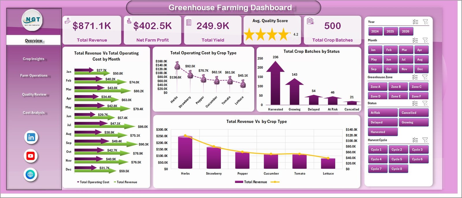
1. Overview Page
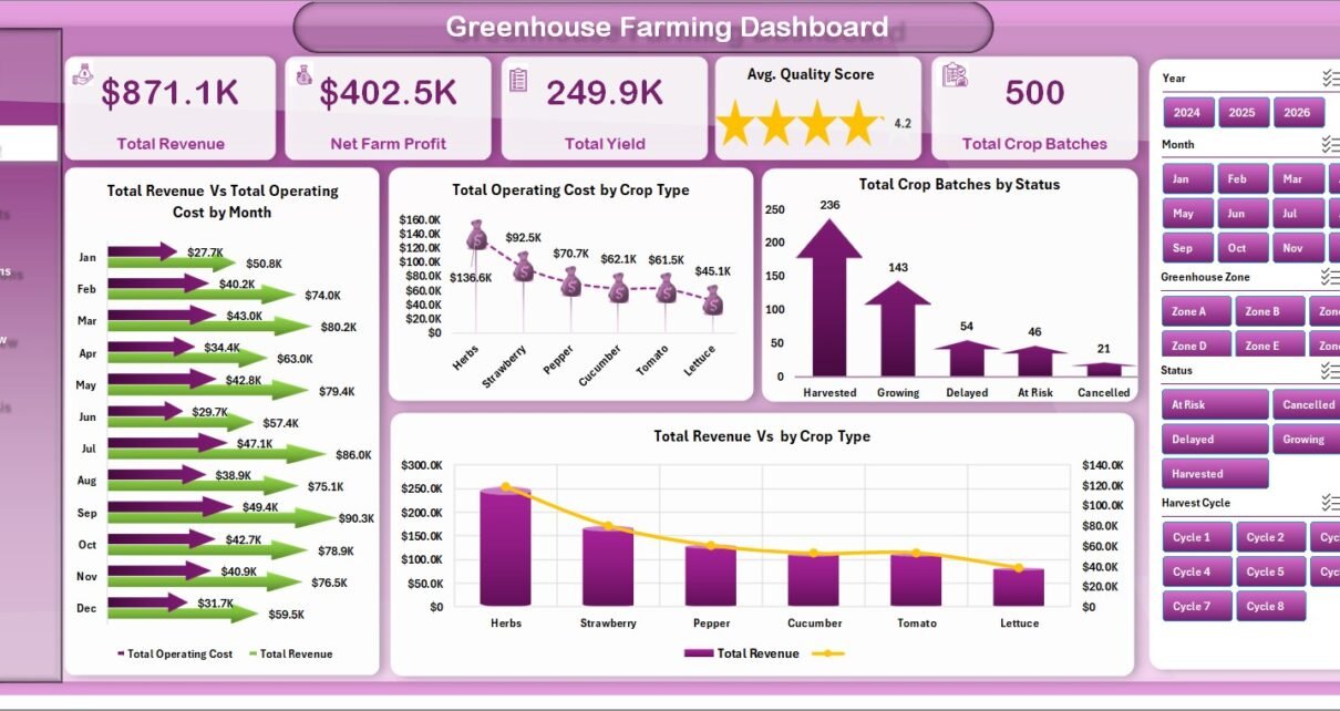
The Overview page gives a high-level view of the greenhouse operation. The top KPI cards show Total Revenue, Net Farm Profit, Total Yield, Avg. Quality Score, and Total Crop Batches so decision-makers can read financial, production, quality, and workload performance at a glance.
Total Revenue Vs Total Operating Cost by Month: This chart compares monthly revenue against operating cost. It helps identify months where sales are growing, costs are rising, or margin needs closer review.
Total Operating Cost by Crop Type: This chart shows which crop types consume the most operating cost. It supports crop planning, input cost review, and production mix decisions.
Total Crop Batches by Status: This chart summarizes crop batches by status. It helps teams quickly understand completed, active, delayed, or at-risk workload distribution.
Total Revenue Vs by Crop Type: This chart compares revenue contribution by crop type. It helps managers identify which crops are driving the strongest commercial performance.
Overview Page
2. Crop Insights
The Crop Insights tab focuses on crop-level performance across varieties, growing methods, harvest cycles, and farm sites.
Total Operating Cost by Variety: This chart shows how operating cost changes across crop varieties. It helps users see which varieties need tighter cost control or better planning.
Avg. Quality Score by Growing Method: This chart compares average quality by growing method. It helps teams understand which methods are producing stronger crop quality outcomes.
Harvest Completion % by Harvest Cycle: This view tracks completion performance across harvest cycles. It helps managers find cycles that are delayed or underperforming.
Total Revenue Vs Total Operating Cost by Farm Site: This comparison shows revenue and cost by farm site. It helps compare site-level financial performance and spot locations with cost pressure.
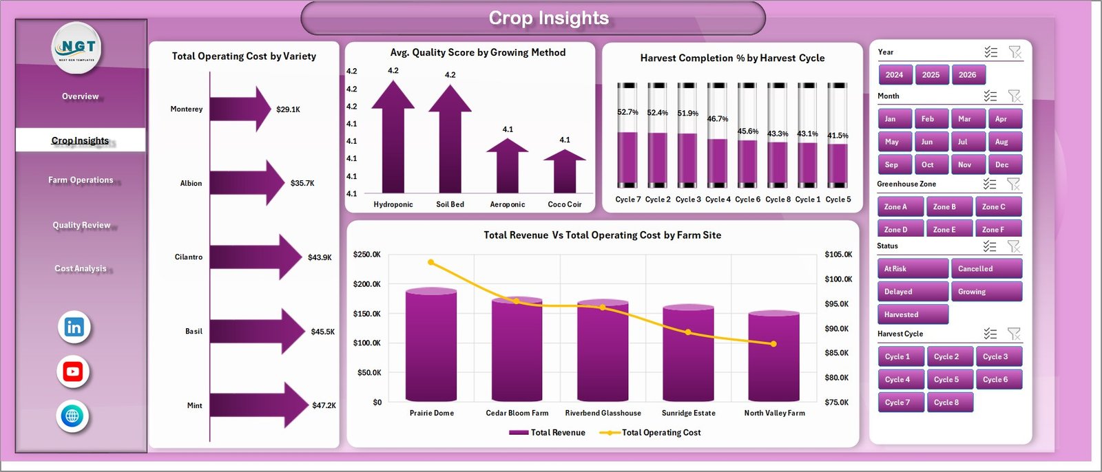
Crop Insights
3. Farm Operations
The Farm Operations tab helps users review operational performance across zones, irrigation systems, climate strategies, and inspection results.
Net Farm Profit by Greenhouse Zone: This chart shows which greenhouse zones contribute the most profit. It helps managers identify high-performing zones and zones that need operational improvement.
Avg. Quality Score by Irrigation System: This chart compares quality scores by irrigation system. It helps teams evaluate whether irrigation setup is influencing crop quality.
At Risk Batches by Climate Strategy: This chart highlights at-risk crop batches by climate strategy. It helps users spot climate approaches that may require monitoring or adjustment.
Total Crop Batches by Inspection Result: This chart summarizes batch counts by inspection outcome. It helps quality and operations teams understand pass, fail, review, or follow-up patterns.
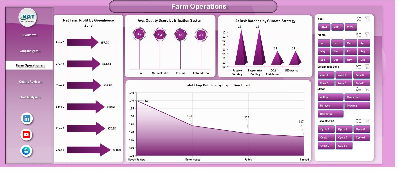
Farm Operations
4. Quality Review
The Quality Review tab connects crop quality, waste, harvest completion, and profit trends in one page.
Avg. Quality Score by Crop Type: This chart compares quality performance across crop types. It helps users identify crops with consistent quality and crops that need process improvement.
Waste Rate % by Status: This chart shows waste rate by batch status. It helps teams understand where waste is forming in the production lifecycle.
Harvest Completion % by Farm Site: This chart compares completion performance by site. It helps managers see which locations are staying on schedule and which may need support.
Net Farm Profit by Month: This chart tracks profit movement over time. It helps teams understand whether monthly performance is improving or declining.
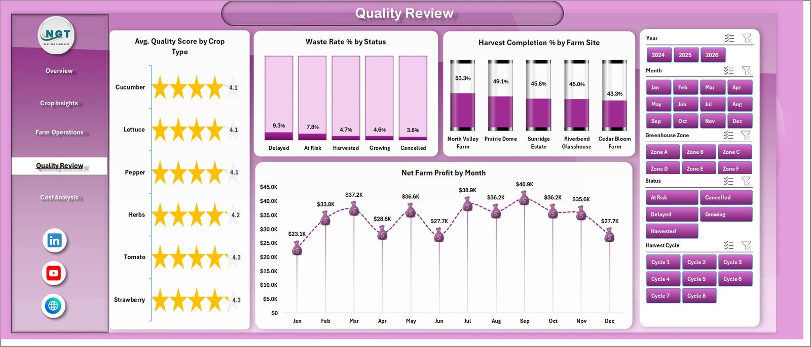
Quality Review
5. Cost Analysis
The Cost Analysis tab gives a dedicated financial view for revenue, cost, margin, and waste.
Total Revenue Vs Total Operating Cost by Quarter: This chart compares quarterly revenue and operating cost. It helps users see seasonal movement and quarter-level margin pressure.
Profit Margin % by Crop Type: This chart shows margin by crop type. It helps managers understand which crops are profitable after operating cost.
Total Waste by Farm Site: This chart highlights waste by site. It helps teams find locations where process, handling, quality, or harvest issues may be creating losses.
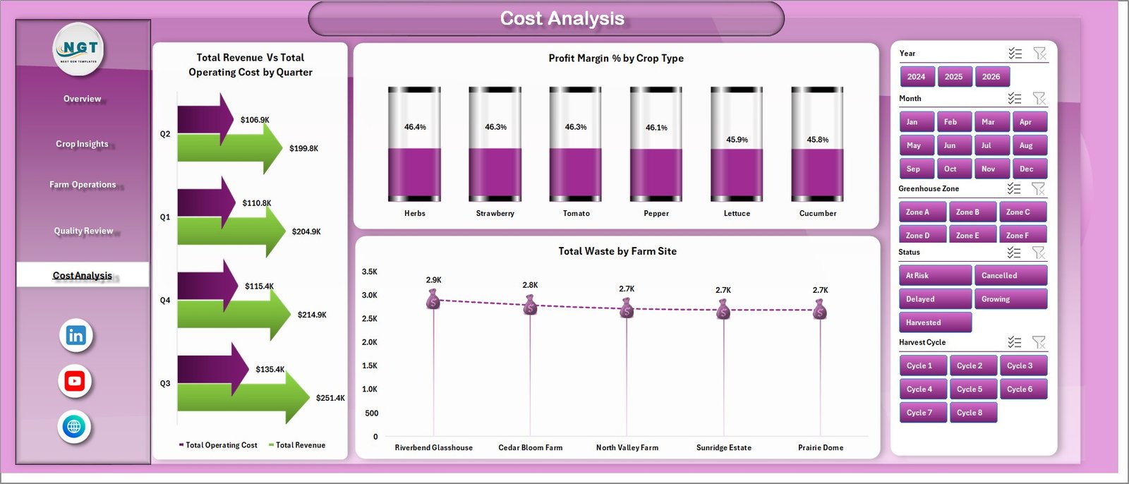
Cost Analysis
6. Data Sheet Tab
The Data sheet is where users add records in the same structured format. After replacing the sample data, the dashboard can be refreshed so the pivots, charts, cards, and slicers update with the new greenhouse information.
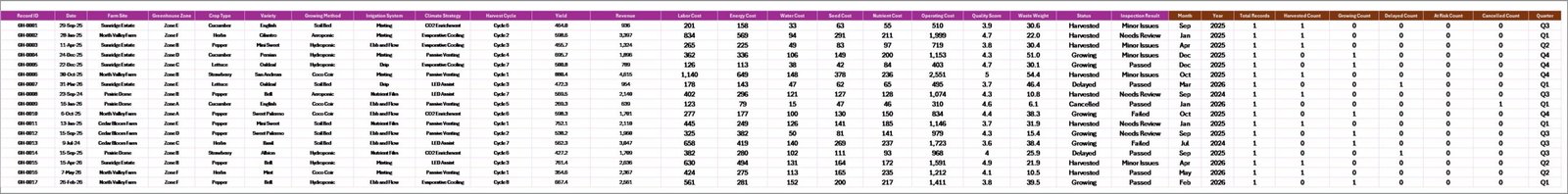
Data Sheet tab
7. Support Sheet
The Support sheet contains multiple pivot tables used to build the dashboard dynamically. After updating the Data sheet, go to the Data tab in the Excel ribbon and click Refresh All. All pivots and connected charts will refresh. This sheet can be kept hidden for day-to-day users.
Support sheet tab
Greenhouse Farming Dashboard in Excel vs. Google Sheets vs. Paid Farm SaaS – Feature Comparison
| Feature | This Excel Dashboard | Google Sheets Alternative | Paid Farm SaaS |
|---|---|---|---|
| Cost | $17.99 one-time | Low cost, but dashboard setup may be manual | Monthly or annual subscription |
| Platform | Microsoft Excel | Google Sheets | Vendor cloud system |
| Setup time | Replace data and refresh | Import data and configure reports | Requires onboarding |
| Real-time team collaboration | Available with OneDrive or SharePoint | Native collaboration | Usually included |
| Mobile access | Available with Excel web/mobile | Available in browser/mobile | Usually included |
| Customizable fields | Editable workbook, pivots, charts, and formulas | Editable but may need rebuilds | Limited by vendor plan |
| Share with link | Possible through Microsoft 365 | Native link sharing | Usually included |
| Year-1 cost at 5 users | $17.99 plus Excel/Microsoft licensing already used | Low if self-managed | Often hundreds or thousands |
| Refresh workflow | Uses Excel Refresh All | Uses spreadsheet refresh or formulas | Vendor controlled |
Who Should Use This Template
This template is useful for greenhouse owners, farm site managers, agriculture analysts, crop quality teams, agribusiness consultants, and Excel users who need a ready-made greenhouse reporting workbook. It is especially helpful when the team already tracks greenhouse records in spreadsheets and wants a cleaner dashboard layer.
It is not designed for live climate control, IoT sensor automation, pesticide compliance workflows, procurement approvals, or full farm ERP management.
Real-World Use Cases
Aarav, greenhouse owner: Aarav checks Total Revenue, Total Operating Cost, and Net Farm Profit before weekly planning meetings, then filters the dashboard by crop type and site.
Meera, operations manager: Meera uses Farm Operations to review at-risk batches by climate strategy and inspection results before assigning follow-up work.
Daniel, agriculture consultant: Daniel uses Cost Analysis and Quality Review pages to explain where clients are losing margin through waste, low completion, or quality issues.
Advantages of Greenhouse Farming Dashboard in Excel
- It keeps financial, crop, quality, operations, and cost analysis in one workbook.
- It uses Excel features that many farm teams already understand.
- It gives management a quick view through KPI cards and slicers.
- It supports deeper review through dedicated analysis tabs.
- It avoids a recurring dashboard software fee for teams that prefer spreadsheet-based reporting.
Opportunities for Improvement
The dashboard works best when data is entered consistently. If the greenhouse team has live sensor feeds, ERP data, or complex production workflows, additional integration work may be required. Teams that need real-time automation should treat this as a reporting template, not a control system.
Best Practices
- Keep the Data sheet column structure unchanged when replacing sample records.
- Refresh all pivots after every major data update.
- Review data quality before presenting dashboard results.
- Use slicers for focused analysis instead of duplicating dashboard pages.
- Keep the Support sheet hidden if end users only need the dashboard tabs.
Microsoft also provides guidance on refreshing PivotTable data in Excel here: Refresh PivotTable data.
Explore Relevant Templates
You may also like Greenhouse Farming KPI Dashboard in Excel, Agriculture Farm Dashboard in Google Sheets, and Drone Farming Startups Dashboard in Power BI. Browse more Excel Dashboard templates.
Frequently Asked Questions
What is the Greenhouse Farming Dashboard in Excel?
It is an Excel dashboard template for tracking greenhouse revenue, operating cost, yield, quality score, crop batches, waste, operations, and profit.
Can I add my own data?
Yes. Replace the sample records in the Data sheet using the same format, then refresh the workbook.
Does it include slicers?
Yes. The dashboard uses slicers so users can filter the analysis quickly.
Why is there a Support sheet?
The Support sheet contains pivot tables used to power the dashboard. It can be hidden after setup.
Do I need macros?
No macros are required for the basic dashboard workflow unless the downloaded workbook explicitly includes optional automation.
Is this a full greenhouse management system?
No. It is a reporting dashboard, not live climate control or farm ERP software.
About the Author
Built by PK – Microsoft Certified Professional with 15+ years of Excel, Google Sheets, and Power BI experience. Founder of NextGenTemplates, reaching 300K+ subscribers across YouTube channels. Every template is hand-built and tested before release.
Conclusion
The Greenhouse Farming Dashboard in Excel gives greenhouse teams a practical way to review revenue, cost, yield, quality, crop batches, waste, and profit from one workbook. With multiple dashboard pages, slicers, a structured Data sheet, and a pivot-backed Support sheet, it helps users move from scattered records to clearer analysis.
Download the Greenhouse Farming Dashboard in Excel from NextGenTemplates
Visit our YouTube channel to learn step-by-step Excel dashboard tutorials.