Insurance Tech Startups Dashboard in Power BI is a ready-to-use reporting template for insurtech founders, insurance analysts, product managers, venture teams, and startup finance leaders. It helps track Total Startups, Total Premium Revenue, Total Policies Sold, Total Operating Cost, Total Claim Payout, policy activation, funding stage, startup status, product type, customer type, region, business model, segment, and market-fit signals from one interactive Power BI report.
Insurance technology is a fast-moving category. Grand View Research estimated the global insurtech market at USD 5.45 billion in 2022 and projected it to reach USD 152.43 billion by 2030, while newer forecasts continue to show strong growth. That growth creates a simple reporting problem: teams need faster ways to review funding, policies, claims, cost, and customer satisfaction without rebuilding every dashboard from scratch.
Power BI is useful for this work because it supports interactive reports, slicers, model-based measures, and sharing through Microsoft tools. Microsoft explains Power BI as a platform for connecting to data, visualizing insights, and sharing reports across an organization: Microsoft Learn Power BI overview.
Click here to purchase Insurance Tech Startups Dashboard in Power BI
Key Features of Insurance Tech Startups Dashboard in Power BI
- 5 report pages: Overview Page, Funding, Growth, Claims, and Market Fit.
- 5 KPI cards: Total Startups, Total Premium Revenue, Total Policies Sold, Total Operating Cost, and Total Claim Payout.
- Interactive slicers: Quickly filter by region, startup, month, status, funding stage, business model, product type, customer type, and segment.
- Funding analytics: Compare operating cost by business model, policies sold by month, and startup count by region.
- Growth analytics: Review policies sold by product type, premium revenue by segment, and claim payout by segment.
- Claims analytics: Analyze claim payout by region, customer satisfaction by business model, and startup mix by business model.
- Market-fit analytics: Compare operating cost by funding stage, customer satisfaction by customer type, and premium revenue by startup.
Dashboard Pages Explanation
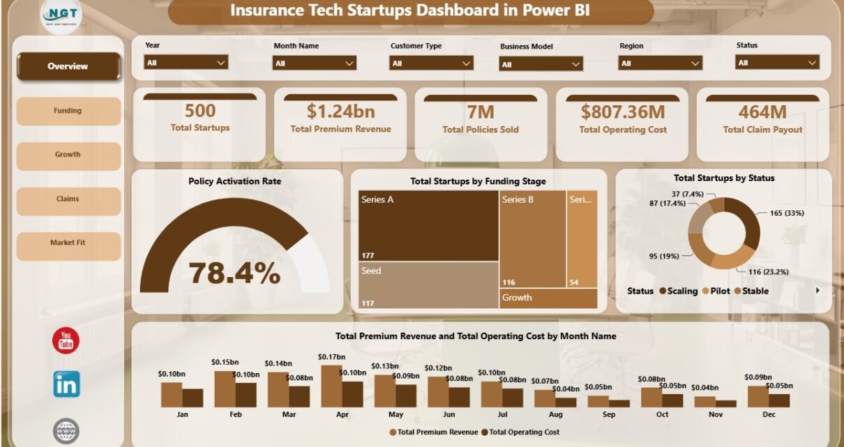
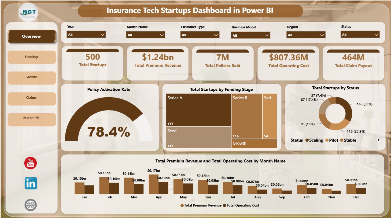
1. Overview Page
The Overview Page provides the executive summary of the dashboard. At the top, KPI cards show Total Startups, Total Premium Revenue, Total Policies Sold, Total Operating Cost, and Total Claim Payout. These cards help users understand scale, revenue, expense, and claims exposure before reviewing detailed pages.
Policy Activation Rate: This chart shows how effectively policy activity turns into activated coverage. It helps teams evaluate onboarding strength and whether policy growth is translating into usable customer relationships.
Total Startups by Funding Stage: This visual breaks startup records by funding stage. It helps investors and founders understand whether the dataset is concentrated in early-stage, growth-stage, or mature companies.
Total Startups by Status: This chart separates startups by current status. It helps users quickly compare active, paused, closed, scaling, or other status groups.
Total Premium Revenue and Total Operating Cost by Month Name: This trend compares monthly premium revenue and operating cost side by side. It helps leadership see whether revenue is growing faster than cost or whether spending pressure is increasing.
Click here to purchase Insurance Tech Startups Dashboard in Power BI
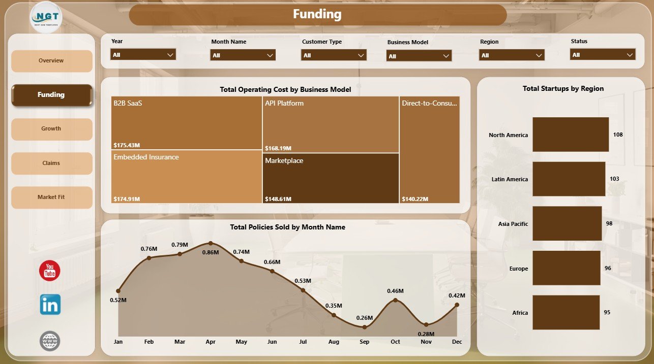
2. Funding
The Funding page focuses on spending, sales momentum, and regional distribution. It is useful for investor updates, portfolio reviews, and leadership meetings where teams need to connect business model, operating cost, and policy sales.
Total Operating Cost by Business Model: This chart compares operating cost across business models. It helps identify which models are more cost-intensive and where efficiency work may be needed.
Total Policies Sold by Month Name: This monthly trend tracks policy sales over time. It helps teams identify strong sales months, slow periods, and seasonal movement.
Total Startups by Region: This visual compares startup count by region. It helps teams understand geographic concentration and where expansion or partnership activity may be strongest.
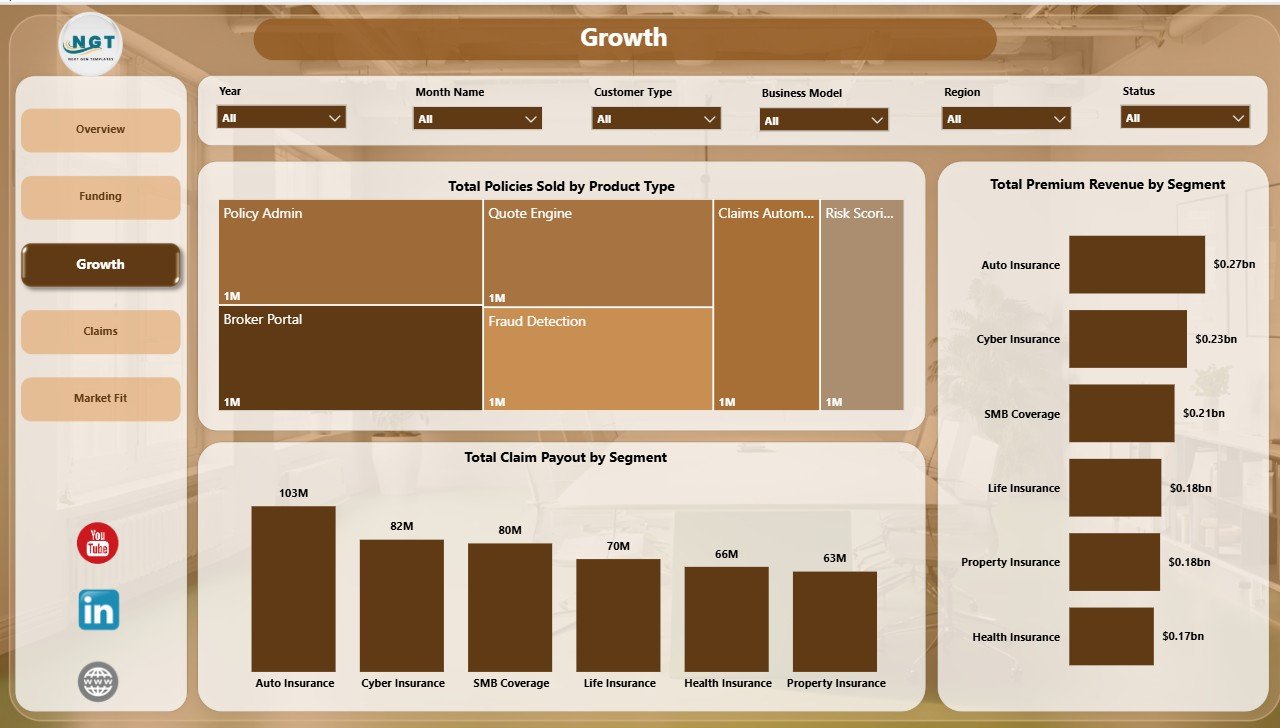
3. Growth
The Growth page connects policy sales, premium revenue, and claims by product and segment. It is designed for teams that need to compare commercial traction against customer and product dimensions.
Total Policies Sold by Product Type: This chart shows which insurance product types are generating the most sales. Product and sales teams can use it to identify stronger offerings and underperforming categories.
Total Premium Revenue by Segment: This visual compares premium revenue across segments. It helps users identify the segments driving the largest revenue contribution.
Total Claim Payout by Segment: This chart compares claim payout by segment. It helps teams connect growth with claims exposure and service demand.
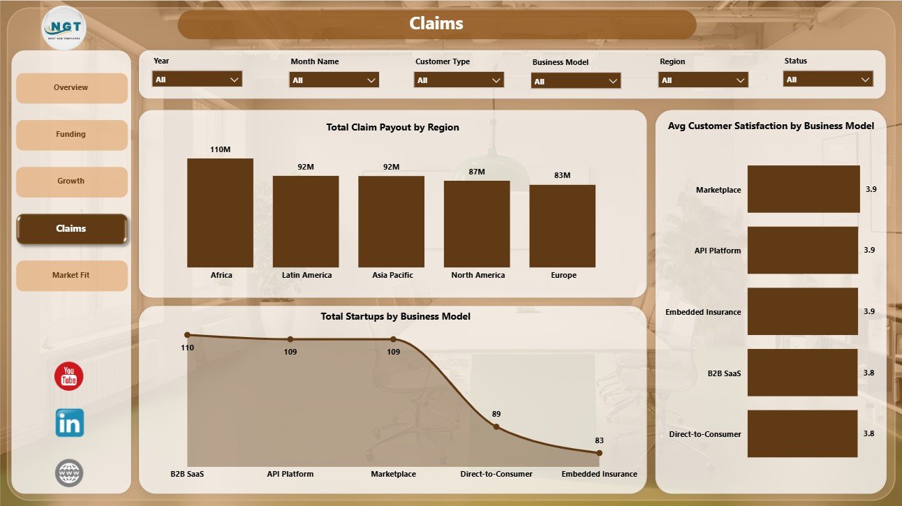
4. Claims
The Claims page is built for risk, claims, and customer-experience review. It brings together regional claim payout, satisfaction by business model, and startup distribution by business model.
Total Claim Payout by Region: This chart compares claim payout across regions. It helps identify geographies with heavier claims exposure and supports regional risk discussions.
Avg Customer Satisfaction by Business Model: This visual compares average satisfaction by business model. It helps teams see where customer experience is stronger or weaker.
Total Startups by Business Model: This chart shows startup count by business model. It helps users understand the mix of business types represented in the dashboard.
Click here to purchase Insurance Tech Startups Dashboard in Power BI
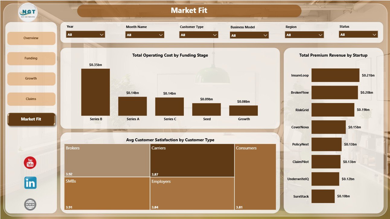
5. Market Fit
The Market Fit page helps users review whether cost, satisfaction, and startup-level premium revenue are aligned. It is useful for product-market fit discussions, startup benchmarking, and investor reporting.
Total Operating Cost by Funding Stage: This chart compares operating cost across funding stages. It helps teams understand how spending changes as startups mature.
Avg Customer Satisfaction by Customer Type: This visual compares satisfaction by customer type. It helps identify customer groups with stronger adoption experience and clearer market fit.
Total Premium Revenue by Startup: This chart ranks premium revenue by startup. It helps users identify the strongest revenue contributors and candidates for deeper review.
Insurance Tech Startups Dashboard in Power BI vs. Tableau vs. Paid CRM/SaaS – Feature Comparison
| Feature | Insurance Tech Startups Dashboard in Power BI | Tableau alternative | Paid insurance SaaS |
|---|---|---|---|
| Cost | $17.99 one-time template price | License plus build time | Monthly or annual subscription |
| Platform | Power BI Desktop / Power BI Service | Tableau | Vendor cloud platform |
| Setup time | Open PBIX and replace sample data | Build or customize workbook | Implementation and onboarding |
| Real-time team collaboration | Available through Power BI Service | Available through Tableau Cloud | Usually included |
| Mobile access | Power BI mobile app | Tableau mobile app | Vendor app or browser |
| Customizable fields | Editable report model and visuals | Editable with Tableau skills | Depends on plan and admin rights |
| Share with link | Possible through Power BI publishing | Possible through Tableau sharing | Usually login-controlled |
| Year-1 cost at 5 users | $17.99 plus Microsoft licensing | License and development cost | Often hundreds or thousands |
| Insurtech startup analytics | Funding, policies, premium, claims, cost, satisfaction, and market fit included | Requires build or adaptation | Depends on vendor module |
Who Should Use This Template
This template is best for insurtech startup founders, insurance product managers, insurance analysts, venture analysts, accelerator teams, startup finance teams, and consultants who need a practical Power BI reporting layer. It is also useful for teams that already track insurance startup performance in spreadsheets and want a cleaner dashboard view.
It is not intended to replace policy administration software, claims workflow tools, payment systems, compliance systems, customer portals, or actuarial pricing engines. It is a dashboard template for analysis and presentation.
Real-World Use Cases
Founder investor update: Neha, an insurtech founder, uses the Overview and Funding pages to show premium revenue, operating cost, policies sold, claim payout, and funding-stage context in a monthly investor review.
Portfolio analysis: Arjun, a venture analyst, uses startup count by funding stage, region, business model, and status to compare portfolio shape before an accelerator board meeting.
Product-market fit review: Maria, an insurance innovation consultant, uses customer satisfaction by customer type, premium revenue by startup, and policy sales by product type to identify stronger market-fit signals.
Advantages of Insurance Tech Startups Dashboard in Power BI
- Faster reporting: The core pages are already built, so users can focus on replacing data and interpreting results.
- Better executive visibility: KPI cards and slicers make it easier to scan the full portfolio before drilling into details.
- Insurance-specific structure: The report focuses on policies, premium revenue, claim payout, operating cost, satisfaction, funding, and market fit.
- Editable Power BI file: Users can adjust visuals, colors, fields, and calculations to match internal reporting needs.
- One-time purchase: The template is useful for teams that do not want to start with an expensive SaaS reporting implementation.
Opportunities for Improvement
The dashboard is designed as a reporting template, so teams with advanced needs can extend it further. Possible improvements include connecting live policy data, adding claims severity metrics, building predictive loss-ratio measures, adding role-level security, or creating separate pages for investor reporting and operational management.
Best Practices
- Keep the source data fields consistent before refreshing the report.
- Validate premium revenue, operating cost, policies sold, and claim payout totals after each data refresh.
- Use slicers during review meetings to compare segments, business models, regions, and funding stages.
- Create a documented refresh process if multiple people maintain the dashboard.
- Publish to Power BI Service only after checking visuals, filters, and access permissions.
Explore Relevant Templates
You may also like the Insurance Tech Startups Dashboard in Excel. You can also browse more Power BI templates and Power BI Dashboard templates.
Frequently Asked Questions
What is included in the Insurance Tech Startups Dashboard in Power BI?
The template includes 5 Power BI report pages: Overview Page, Funding, Growth, Claims, and Market Fit. It also includes KPI cards, slicers, and charts for startup, policy, claims, revenue, cost, and satisfaction analysis.
Can I replace the sample data with my own data?
Yes. You can replace the sample data with your own insurance startup records, then refresh the Power BI report.
Do I need Power BI Desktop?
Yes. The downloadable file is designed to open in Power BI Desktop.
Can I customize the dashboard?
Yes. You can edit visuals, colors, measures, slicers, and layout inside Power BI.
Is this a full insurance management system?
No. This is a reporting dashboard template, not a claims processing, policy administration, billing, compliance, or customer portal system.
Can I publish this dashboard to Power BI Service?
Yes, if you have the right Microsoft account, Power BI license, and sharing permissions.
About the Author
Built by PK – Microsoft Certified Professional with 15+ years of Excel, Google Sheets, and Power BI experience. Founder of NextGenTemplates, reaching 300K+ subscribers across YouTube channels. Every template is hand-built and tested before release.
Conclusion
Insurance Tech Startups Dashboard in Power BI gives teams a focused way to monitor insurtech performance across funding, growth, claims, and market fit. It is especially useful when you need a visual report for leadership or investor conversations without building the entire Power BI model from a blank page.
Click here to purchase Insurance Tech Startups Dashboard in Power BI
Visit our YouTube channel for step-by-step tutorials: Youtube.com/@PKAnExcelExpert