NFT Art Marketplaces Dashboard in Power BI is a ready-to-use reporting template for NFT marketplace teams, digital art businesses, creator managers, and Web3 analysts. The dashboard includes 5 Power BI pages, 4 top KPI cards, 18 analytical visuals, and multiple slicers for quick filtering. Instead of reviewing sales, bids, listings, fees, royalties, buyer regions, chains, and auctions in separate exports, users can bring the main performance story into one Power BI report.
This dashboard is useful when a marketplace needs to answer practical questions quickly: Which marketplace generates the most sales? Which art category has the strongest listing volume? Which creator tier converts better? Which blockchain carries the most activity? Which sale type produces the most bids and revenue?
Click here to purchase NFT Art Marketplaces Dashboard in Power BI
Key Features of NFT Art Marketplaces Dashboard in Power BI
- 5 report pages: Overview, Sales, Creator, Chain Mix, and Auction View.
- 4 KPI cards: Total Views, Total Sales, Total Bids, and Sold Listings.
- 18 analytical visuals: Review marketplace fees, sales, listings, sell-through rate, royalties, blockchain mix, buyer regions, bids, and auctions.
- Power BI structure: Open the .pbix file in Power BI Desktop and adapt it to your prepared source data.
- Interactive filtering: Use slicers to review performance by marketplace, blockchain, creator tier, buyer region, art category, sale type, and date fields where available.
- Executive and operational views: Use the Overview page for fast summaries and the remaining pages for deeper analysis.
Dashboard Pages Explanation
1. Overview Page
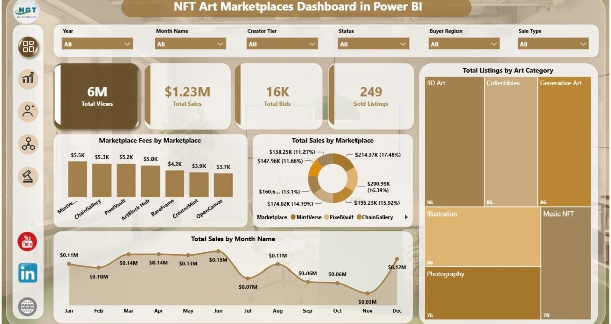
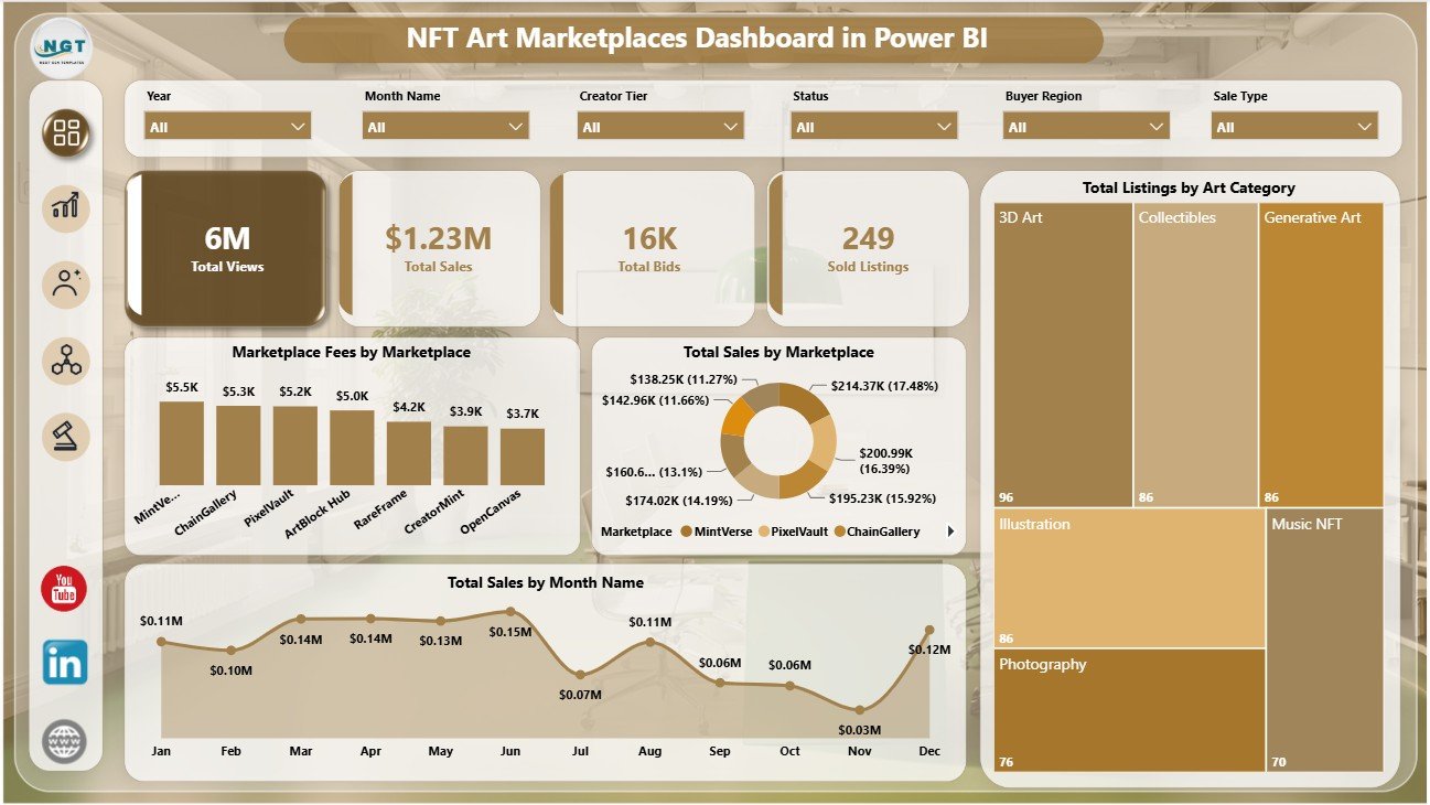
The Overview page is the main executive summary. At the top, it shows Total Views, Total Sales, Total Bids, and Sold Listings so users can quickly understand marketplace activity.
Marketplace Fees by Marketplace compares platform fees across marketplaces and helps identify where cost pressure is higher. Total Sales by Marketplace shows which marketplace contributes the strongest revenue.
Total Sales by Month Name shows monthly sales movement and helps users detect seasonality, campaign effects, or demand changes. Total Listings by Art Category explains how listed inventory is distributed across NFT art categories.
2. Sales Page
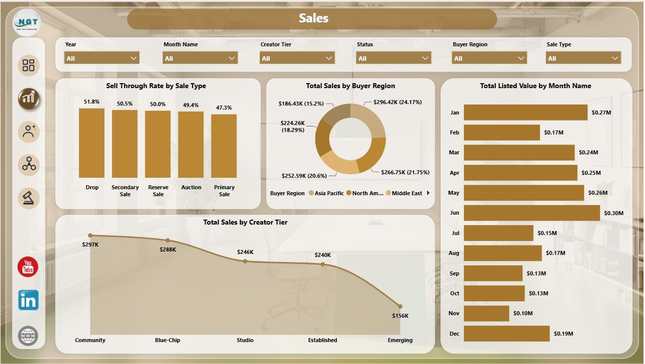
The Sales page focuses on revenue, buyer geography, listed value, and creator tier contribution. It helps marketplace teams understand where sales are happening and which creator groups are driving results.
Sell Through Rate by Sale Type compares how effectively different sale models convert listings into sold items. Total Sales by Buyer Region reveals which regions are contributing the most marketplace revenue.
Total Listed Value by Month Name shows the value of listed assets over time, which helps teams track pipeline movement. Total Sales by Creator Tier compares sales performance across creator segments.
3. Creator Page
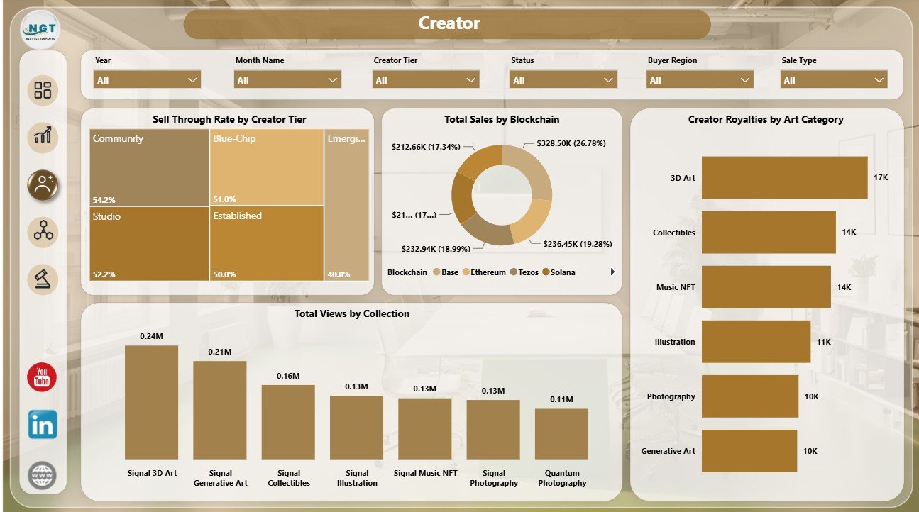
The Creator page is designed for artist relations, collection management, and creator performance review. It helps teams see which creators and collections are gaining attention and generating value.
Sell Through Rate by Creator Tier compares how creator tiers perform after listings go live. Total Sales by Blockchain shows which blockchain networks are contributing the most sales.
Creator Royalties by Art Category explains where royalty value is generated by category. Total Views by Collection identifies collections that attract the most audience interest.
4. Chain Mix Page
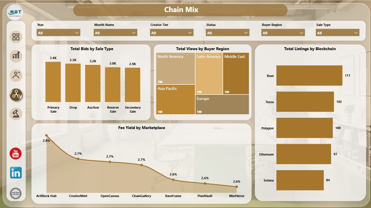
The Chain Mix page helps users compare marketplace behavior across blockchain, buyer region, sale type, and platform economics. This is useful when a marketplace supports multiple chains or has buyers from multiple regions.
Total Bids by Sale Type shows which sale model attracts stronger bidding activity. Total Views by Buyer Region reveals where demand and attention are coming from.
Total Listings by Blockchain compares inventory distribution across chains. Fee Yield by Marketplace helps users understand fee efficiency and marketplace monetization.
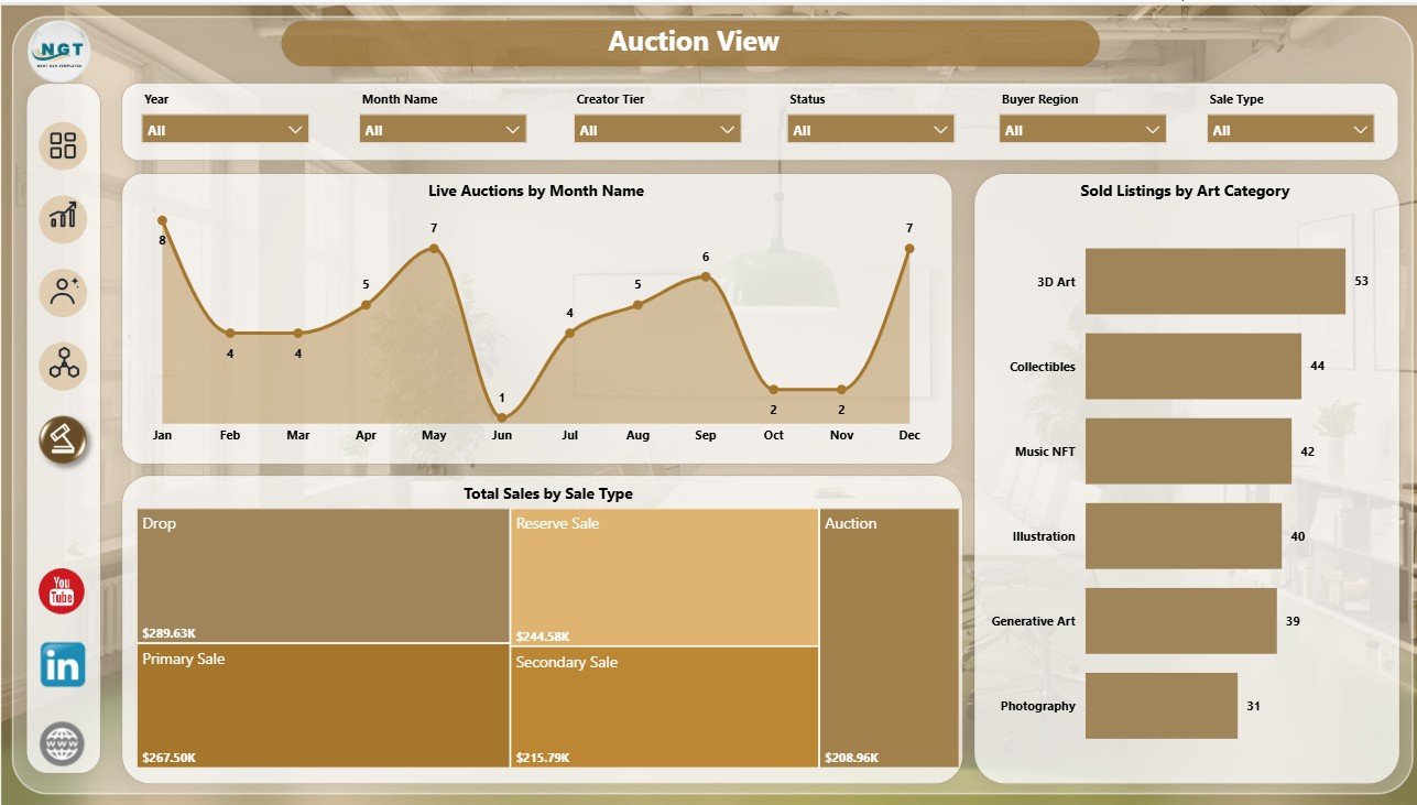
5. Auction View Page
The Auction View page focuses on active marketplace selling performance. It is helpful for teams that need to monitor live auction activity and sold listing movement.
Live Auctions by Month Name shows auction volume over time and helps users see when auction activity rises or slows. Sold Listings by Art Category reveals which categories convert into sold listings.
Total Sales by Sale Type compares revenue by sale method, helping users evaluate auctions against other sales formats.
NFT Art Marketplaces Dashboard in Power BI vs. Tableau vs. Paid CRM/SaaS – Feature Comparison
| Feature | This Power BI Dashboard | Tableau Alternative | Paid SaaS Alternative |
|---|---|---|---|
| Cost | $17.99 one-time template purchase | May require creator licenses | Monthly subscription |
| Platform | Power BI Desktop and Power BI Service | Tableau Desktop or Cloud | Vendor-hosted platform |
| Setup time | Open the .pbix and replace sample data | Dashboard rebuild usually required | Often needs onboarding |
| Real-time team collaboration | Available through Power BI Service | Available through Tableau Cloud or Server | Usually included |
| Mobile access | Available through Power BI apps | Available through Tableau apps | Usually included |
| Customizable fields | Editable model, visuals, fields, and filters | Editable if rebuilt | Often limited by plan |
| Share with link | Supported through Power BI Service | Supported through Tableau Cloud or Server | Usually account-based |
| Year-1 cost at 5 users | $17.99 plus any Microsoft licensing | Can be hundreds or thousands depending on license | Often $600 to $6,000+ |
| NFT marketplace analysis | Built into the report pages | Requires custom build | Depends on product coverage |
Who Should Use This Template
This template is a good fit for NFT marketplace founders, digital art operators, Web3 analysts, creator relations teams, investor reporting teams, agencies serving NFT clients, and collection managers. It is especially useful for teams that already export or prepare marketplace data and want a clean Power BI report structure.
It is not intended to be a live blockchain indexer, wallet-monitoring system, smart contract analytics platform, or automated API connector. Those workflows require separate data engineering. This dashboard works best after the data has already been prepared for reporting.
Real-World Use Cases
Maya, an NFT marketplace operator, uses the Overview page to prepare a weekly business snapshot showing views, sales, bids, sold listings, marketplace fees, and monthly sales movement.
Dev, a creator success manager, uses the Creator page to compare sell-through rate by creator tier, royalties by art category, and collection views before planning creator campaigns.
Arun, a Web3 reporting analyst, uses Chain Mix and Auction View to explain blockchain listing mix, regional buyer interest, live auction activity, and sale type revenue.
Advantages of NFT Art Marketplaces Dashboard in Power BI
- It brings 5 NFT marketplace reporting pages into one Power BI file.
- It includes executive KPI cards and deeper analysis pages.
- It avoids recurring dashboard subscription costs for teams that only need a template.
- It can be customized in Power BI Desktop.
- It is built around practical NFT marketplace metrics such as bids, sold listings, royalties, fees, chains, and auctions.
Opportunities for Improvement
The dashboard does not automatically connect to live NFT marketplaces. Advanced users can extend it with Power Query, APIs, databases, or blockchain data providers. Teams with very large transaction histories may also want a database layer before loading data into Power BI.
Best Practices
- Keep marketplace, blockchain, buyer region, art category, creator tier, and sale type names consistent.
- Validate sales, fee, royalty, bid, and listed value fields before refreshing the report.
- Refresh the dataset after replacing sample data.
- Use slicers to isolate one marketplace, chain, or creator tier before drawing conclusions.
- Review Overview first, then move into Sales, Creator, Chain Mix, and Auction View for detail.
For users new to Power BI, Microsoft provides official guidance for getting started with Power BI Desktop here: Microsoft Learn – Get started with Power BI Desktop.
Explore Relevant Templates
- NFT Art Marketplaces Dashboard in Power BI
- NFT Art Marketplaces Dashboard in Excel
- Mutual Funds Dashboard in Power BI
- Browse more Power BI templates
Frequently Asked Questions
What is the NFT Art Marketplaces Dashboard in Power BI?
It is a ready-to-use Power BI dashboard template for tracking NFT marketplace views, sales, bids, sold listings, fees, royalties, creator tiers, art categories, blockchains, buyer regions, and auctions.
How many pages are included?
The report includes 5 pages: Overview, Sales, Creator, Chain Mix, and Auction View.
What KPI cards are shown on the Overview page?
The top KPI cards show Total Views, Total Sales, Total Bids, and Sold Listings.
Can I use my own data?
Yes. Replace the sample data with your own prepared marketplace data and refresh the report in Power BI Desktop.
Does it automatically connect to blockchain data?
No. This is a dashboard template, not a live blockchain or NFT marketplace API connector.
Can I customize the visuals?
Yes. You can edit visuals, colors, fields, measures, filters, and pages in Power BI Desktop.
About the Author
Built by PK – Microsoft Certified Professional with 15+ years of Excel, Google Sheets, and Power BI experience. Founder of NextGenTemplates, reaching 300K+ subscribers across YouTube channels. Every template is hand-built and tested before release.
Conclusion
The NFT Art Marketplaces Dashboard in Power BI gives marketplace teams a practical way to turn NFT art sales, listings, bids, views, fees, royalties, chains, and auctions into clear reporting pages. With 5 pages, 4 KPI cards, and 18 visuals, it can help users move from scattered exports to structured Power BI analysis.
Visit our YouTube channel for step-by-step Excel, Power BI, and dashboard tutorials: YouTube.com/@PKAnExcelExpert