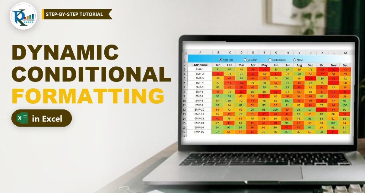
Dynamic conditional formatting in Excel lets one table switch between a heat map, data bars and traffic-light icons with a single click. In this tutorial you build it with four Form Control option buttons and three conditional formatting rules whose limits come from formulas, so no VBA is needed. The trick is simple: every rule checks which button is selected, and when it is not its turn, the rule receives FALSE instead of a number and stays switched off. You can reuse the same idea in any report or dashboard table.
Watch the Video Tutorial
In the video PK copies the sales table to a new sheet, adds four option buttons, links them to cell O1 and then creates the heat map, data bar and traffic-light rules one by one, including a common mistake and its fix.
What You Will Build
- Four option buttons (Heat Map, Data Bar, Traffic Lights and None) linked to one cell.
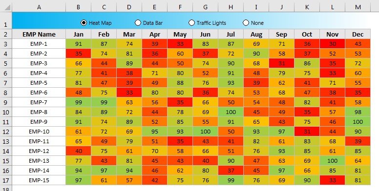
- A heat map made with a 3-color scale: red for the lowest values, orange for the middle and green for the highest.
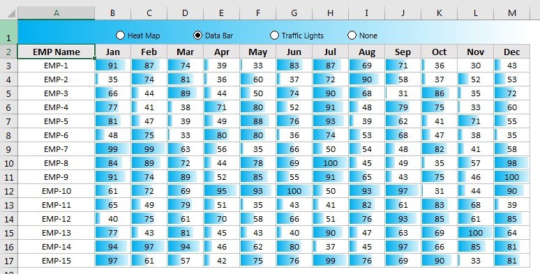
- Gradient data bars that appear only when Data Bar is selected.
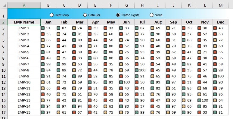
- Traffic-light icons: green for 80 and above, yellow from 60 to below 80, red below 60.
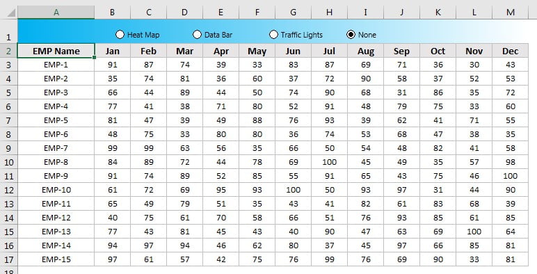
- A None option that shows the plain numbers with no formatting at all.
How the Sheet Is Laid Out
The example is a monthly score table for 15 employees:
- A2 holds the header EMP Name and A3:A17 the names EMP-1 to EMP-15.
- B2:M2 hold the months Jan to Dec.
- B3:M17 hold the values. This is the range that gets all three rules.
- Row 1 carries the four option buttons, and O1 is their linked cell.
Format the table first (borders, a grey header row with black font and sensible column widths) so the colours have a clean grid to sit in.
Part 1 – Insert and Link the Option Buttons
Step 1: Insert the first option button
Go to Developer → Insert → Form Controls → Option Button and click in row 1 above the table. Click into the caption and rename it Heat Map. If the Developer tab is missing, switch it on in File → Options → Customize Ribbon.
Step 2: Duplicate it three times
Select the button and press Ctrl+D to duplicate it (Ctrl+C and Ctrl+V work too). Rename the copies Data Bar, Traffic Lights and None. Select all four, then use Format → Align → Align Top (the tab is called Shape Format in newer versions) and Distribute Horizontally so they sit neatly in one line.
Step 3: Link the buttons to a cell
Right-click any option button, choose Format Control, and on the Control tab set the Cell link to $O$1. Option buttons on the same sheet work as one group, so one link is enough for all four. Now click each button and watch O1: Heat Map gives 1, Data Bar 2, Traffic Lights 3 and None 4. That number is the switch every rule will read.
Part 2 – Dynamic Conditional Formatting Rules
All three rules use the same rule type: Home → Conditional Formatting → New Rule → Format all cells based on their values. Instead of letting Excel pick the lowest and highest value automatically, you change each Type box to Formula and supply your own value. The shortcut Alt, O, D opens the Conditional Formatting Rules Manager, where New Rule takes you to the same dialog.
Step 4: Heat map with a 3-color scale (button 1)
Select B3:M17, open New Rule and set Format Style to 3-Color Scale. Change Minimum, Midpoint and Maximum to Formula and enter:
Minimum   =IF($O$1=1,MIN($B$3:$M$17),FALSE)
Midpoint  =IF($O$1=1,AVERAGE($B$3:$M$17),FALSE)
Maximum   =IF($O$1=1,MAX($B$3:$M$17),FALSE)
Pick red for the minimum, orange for the midpoint and green for the maximum, then click OK. If None is selected nothing happens yet; click Heat Map and the table lights up.
How the formula works
$O$1=1asks whether the Heat Map button is selected.- If it is,
MIN,AVERAGEandMAXof the whole range give the colour scale its three anchor points, so the lowest score is the reddest and the highest the greenest. - If it is not, the formula returns
FALSE. The colour scale then has no valid numbers to work with, so the rule does not paint anything. That is the whole switch. - Every reference is absolute (
$O$1,$B$3:$M$17), so all cells compare against the same cell and the same range.
Step 5: Data bars (button 2)
Select B3:M17 again, open New Rule and choose Format Style → Data Bar. Set Minimum and Maximum to Formula. Copy the heat map formula and change two things: the button number becomes 2, and the maximum uses MAX:
Minimum   =IF($O$1=2,MIN($B$3:$M$17),FALSE)
Maximum   =IF($O$1=2,MAX($B$3:$M$17),FALSE)
Choose a bar colour and change Fill from Solid Fill to Gradient Fill, then click OK. Click Data Bar and the heat map disappears while the bars appear.
Step 6: Traffic lights with an icon set (button 3)
Select B3:M17 once more, open New Rule and choose Format Style → Icon Sets with the 3 Traffic Lights icon style. For both the green and the yellow icon, set the operator to >= and the Type to Formula:
Green  when value is  >=  =IF($O$1=3,80,FALSE)
Yellow when < Formula and >=  =IF($O$1=3,60,FALSE)
Red    when < Formula
Click OK. With Traffic Lights selected, every score of 80 or more gets a green light, 60 up to 79 a yellow light and anything below 60 a red light. Here the formulas return fixed thresholds instead of MIN and MAX, because traffic lights are about targets, not about the spread of the data.
Step 7: None (button 4)
You do not need a rule for None. When O1 is 4, all three rules return FALSE and the table shows plain numbers.
Optional Alternative: a Drop-Down Instead of Option Buttons
This variation is an addition and is not shown in the video. If you prefer a drop-down list, put a Data Validation list with the four names (Heat Map, Data Bar, Traffic Lights, None) in a cell such as N1, and in O1 turn the chosen name into a number with MATCH against the same four names. Because O1 still returns 1 to 4, all the rules above keep working without a single change. A drop-down also takes less space on a crowded dashboard.
Common Errors and Fixes
The icons or colours never appear
This exact mistake happens in the video. If you type the formula in the Value box without the leading equals sign, Excel stores it as text and wraps it in quotes, so the rule compares against a word instead of a number. Open the rule with Manage Rules → Edit Rule, delete the quotes and make sure the formula starts with =.
Two formats show at the same time
One rule is using the wrong button number. Check that the heat map formulas test $O$1=1, the data bar formulas $O$1=2 and the icon set formulas $O$1=3.
Clicking a button does not change O1
Right-click the button, open Format Control and confirm the cell link is $O$1. Also make sure you are not still in Design Mode on the Developer tab.
Colours look wrong after adding rows
The MIN, MAX and AVERAGE ranges are fixed to B3:M17. If the table grows, edit the Applies to range and the ranges inside the formulas in the Rules Manager.
Tips
- Hide the linked cell: give O1 a white font or move the link to a helper column so users only see the buttons.
- Change the traffic-light targets by replacing 80 and 60 with cell references such as
$Q$1, so managers can adjust thresholds without opening the rule. - Use the same switch cell for charts and labels too, for example a title that reads the selected view with CHOOSE.
- Keep a None option. It is useful for printing and for checking the raw numbers.
- Microsoft’s guide to conditional formatting in Excel explains color scales, data bars and icon sets in more depth.
Want It Ready-Made?
If you want the finished workbook with all four option buttons and rules already set up, get Dynamic Conditional Formatting in Excel from NextGenTemplates.com, or browse more Excel charts and visualization templates. To build interactive reports like this from scratch, with slicers, charts and dashboard tables, take the course Excel Pivot Tables and Dashboards on NextGenTemplates Academy.
Related Tutorials
- Dynamic Conditional Formatting with a Check Box in 4 Steps
- Excel Form Controls: Combo Box, Spin Button and Option Buttons
- Traffic Lights in MS Excel
- Sales Analysis Heat Map by Time and Day
- Excel Conditional Formatting Tutorial: 12 Free Chapters
Frequently Asked Questions
Can I change conditional formatting with a button in Excel without VBA?
Yes. Link Form Control option buttons to a cell, then make every rule read that cell. Each rule returns its real limits only when its own button number is selected and FALSE otherwise, so only one format is visible at a time.
Why do the rules use FALSE instead of 0?
A 0 is still a valid number, so the color scale, data bar or icon set would keep working with a strange limit. FALSE gives the rule nothing usable, so it stays off until its button is selected.
Do the option buttons need separate cell links?
No. Option buttons on the same sheet act as one group. Linking one of them to O1 is enough, and O1 returns 1 to 4 depending on which button is selected.
How do I change the traffic-light limits?
Edit the icon set rule and replace 80 and 60 in the two formulas with your own targets, or point them to cells so the limits can be changed on the sheet.
Does this work in every Excel version?
The video uses Excel 2013, and the same steps work in later desktop versions of Excel, including Microsoft 365. Formula-based limits for color scales, data bars and icon sets are a standard conditional formatting feature.
About the Author
PK is a Microsoft Excel expert and trainer and the founder of PK: An Excel Expert and NextGenTemplates.com. He has been teaching Excel, Power Query and Power BI since 2016 on his YouTube channel.
Conclusion
Dynamic conditional formatting in Excel comes down to one linked cell and three rules that check it. Option buttons write 1 to 4 into O1, the heat map, data bar and icon set rules return real values only for their own number, and FALSE keeps the others switched off. Build it once and you can give any report table a one-click choice of views.