Part of the free Module 8: Basic Charts · Lesson 8 of 12 · Full Excel course
Updated on 5 September 2026 · Works in Excel 365, 2021, 2019 and 2016 unless noted.
A doughnut chart in Excel shows each category as a segment of a ring, so every arc is that category’s share of the whole. It is a pie chart with the centre removed, and that hole is the point: you can park a total, a percentage or a KPI figure inside it. Build one from Insert > Charts > Insert Pie or Doughnut Chart > Doughnut.
Sample data for this lesson
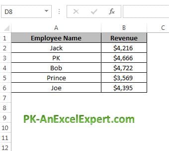
The whole lesson uses one small table of employee-wise revenue in A1:B6. Five employees is a good size for a doughnut, because each segment is still wide enough to read. Type this into a blank sheet, or open the practice file linked further down.
| Cell | Employee Name (column A) | Revenue (column B) |
|---|---|---|
| Row 1 | Employee Name | Revenue |
| Row 2 | Jack | 4216 |
| Row 3 | PK | 4666 |
| Row 4 | Bob | 4722 |
| Row 5 | Prince | 3569 |
| Row 6 | Joe | 4395 |
Put =SUM(B2:B6) in B7 as well. The total is 21,568 and you will use that cell later for the figure in the centre of the ring.
How to create a doughnut chart in Excel
The doughnut lives in the same gallery as the pie, so the insert path is short. Select the labels and the values together, including the headers, and Excel reads column A as the category axis and column B as the series.
- Select A1:B6, headers included.
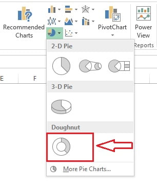
- Go to Insert > Charts > Insert Pie or Doughnut Chart > Doughnut. The icon is the ring at the bottom of the gallery.
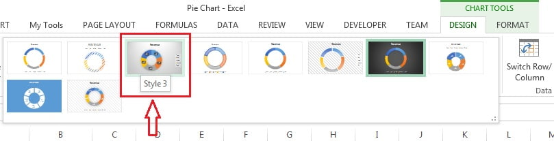
- Excel drops a ring on the sheet with a legend. Click the chart, open the Chart Design tab (it is called Design under Chart Tools in Excel 2016 and 2019) and pick Style 3 in the Chart Styles gallery. That style turns on percentage labels for you.
- Click the chart title and type a real name, such as Revenue Share by Employee.
Format the ring: hole size, labels and angle
Three settings do most of the work. All of them sit in the Format Data Series pane, which you open by right-clicking the ring itself and choosing Format Data Series, or by pressing Ctrl + 1 with the ring selected.
| Setting | Where to find it | What it does | Suggested value |
|---|---|---|---|
| Doughnut Hole Size | Format Data Series > Series Options | Controls ring thickness. Larger percentage means a thinner ring and a bigger hole. | 50% to 65% for labels, 75% for a KPI tile |
| Angle of first slice | Format Data Series > Series Options | Rotates the ring so the first segment starts where you want it. | 0 degrees, so the first category starts at 12 o’clock |
| Data labels, Percentage | Right-click a label > Format Data Labels > Label Options | Shows each segment as a share of the total instead of the raw number. | Percentage on, Value off |
| Label position | Format Data Labels > Label Options | Doughnut labels only sit on the ring; there is no Outside End or Best Fit as there is for a pie. | Leave on the ring, or use leader-free callouts |
- If the style did not add labels, click the plus sign beside the chart and tick Data Labels.
- Right-click any label, choose Format Data Labels, tick Percentage and untick Value. Tick Category Name too if you plan to delete the legend.
- Right-click the ring, choose Format Data Series and set Doughnut Hole Size to about 60%.
- In the same pane set Angle of first slice to 0 so the ring starts at the top and reads clockwise.
- Set the label number format to 0.0% if one decimal place helps; whole percentages are usually enough.
Worked example: revenue share by employee
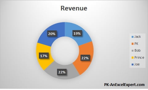
With the sample data above and percentage labels switched on, the chart reports these shares. The arithmetic is simply each employee’s revenue divided by the 21,568 total, which you can check on the sheet with a helper column of =B2/$B$7 formatted as a percentage.
| Employee | Revenue | Share of total | Segment reads |
|---|---|---|---|
| Jack | 4,216 | =4216/21568 | 19.5% |
| PK | 4,666 | =4666/21568 | 21.6% |
| Bob | 4,722 | =4722/21568 | 21.9% |
| Prince | 3,569 | =3569/21568 | 16.5% |
| Joe | 4,395 | =4395/21568 | 20.4% |
| Total | 21,568 | 100% |
Rounded to one decimal place the five labels add up to 99.9%, not 100%. That is normal rounding, not an Excel fault. Bob leads on 21.9% and Prince trails on 16.5%, and because the five values are close together the segments look similar. That similarity is the honest signal here: revenue is spread fairly evenly across the team, and a column chart would rank them more clearly than the ring does.
Put the total in the centre with a linked text box
Excel has no built-in centre label for a doughnut, so you add a text box and link it to a cell. The link is live, so the figure updates when the data changes.
- Select the chart, then go to Insert > Text > Text Box and draw a small box over the hole. Drawing it while the chart is selected attaches the box to the chart, so it moves with it.
- With the box selected but no cursor inside it, click in the formula bar, type
=$B$7and press Enter. The total appears in the box. - Centre the text, increase the font size, and set Shape Fill and Shape Outline to No Fill and No Outline.
A text box can only display one cell, so build the exact sentence you want in a helper cell first, for example =TEXT(B7,"#,##0")&" total", and link the box to that cell.
Multi-ring doughnut for two series
Unlike a pie, a doughnut accepts more than one series and draws each as its own ring. Use it to compare the same categories across two periods.
- Lay the data out with categories down column A and two value columns, for example 2025 in column B and 2026 in column C.
- Select A1:C6 and insert the doughnut. Excel draws the first series as the inner ring and the second as the outer ring.
- Reduce Doughnut Hole Size to about 40% so both rings have room.
- Add data labels to the outer ring only, and rely on the legend for the categories.
- Keep the colours consistent per category across both rings, then lighten the inner ring so the outer, current-year ring reads as the main one.
Be honest about the limitation: the outer ring is physically longer than the inner ring, so equal percentages produce visibly different arc lengths. Two rings is the sensible maximum, and only when the rings share the same categories.
Single KPI progress doughnut
The most useful doughnut on a dashboard is not a share chart at all. It is a two-segment progress ring: the achieved value, plus a remainder that is made invisible. Using the same revenue total against a 24,000 target:
| Cell | Label | Formula or value | Result |
|---|---|---|---|
| E2 | Target | 24000 | 24,000 |
| E3 | Achieved | =SUM(B2:B6) |
21,568 |
| E4 | Remaining | =MAX(0,E2-E3) |
2,432 |
| E5 | Progress | =E3/E2 |
89.9% |
- Select E3:E4 only, the achieved value and the remainder, then insert the doughnut from Insert > Charts > Insert Pie or Doughnut Chart > Doughnut.
- Click the ring once to select the series, then click the remainder segment a second time to select that single point.
- Open Format Data Point > Fill & Line and set Fill to No fill, or to a pale grey if you want the track visible. Set the border to No line.
- Select the achieved segment and give it one strong accent colour.
- Set Doughnut Hole Size to about 75% for a slim ring, and Angle of first slice to 0 so progress grows clockwise from the top.
- Delete the legend, the title and the gridline clutter, then add a text box in the hole linked to E5 to show 89.9%.
Wrapping the remainder in MAX(0, ...) matters, because a doughnut cannot plot a negative number. Without it, beating the target would break the ring.
Choosing colours
- One accent, the rest grey. If the story is about a single category, colour that segment and leave the others in shades of grey.
- Shades of one hue for ranked data. Darkest for the largest segment, lightest for the smallest, so the ring reads in order.
- Match your dashboard theme. Use Chart Design > Change Colors for a themed palette rather than picking fills one by one.
- Add a thin white border. A 1 to 2 point white outline on the series separates neighbouring segments cleanly.
- Do not rely on colour alone. Percentage labels on the ring keep the chart readable for colour-blind viewers and in print.
Download the practice file
Download the Doughnut Chart Excel file to practise with exactly this data, or click the chart image below.
When to use a doughnut chart, and when not to
| Use a doughnut when | Use something else when |
|---|---|
| You need one KPI percentage, such as progress towards a target, with the number in the centre. | You are comparing many categories. Past five or six segments the arcs become slivers; use a bar chart. |
| You have up to five categories that genuinely sum to a meaningful whole. | The values do not add up to a whole, for example unrelated metrics or overlapping groups. |
| Space is tight and the chart sits in a dashboard tile. | You are showing change over time. A ring has no time axis; use a line chart. |
| You want the total or a live figure displayed inside the chart. | The differences are small and ranking matters. Arc lengths of similar size are hard to compare. |
| Two related series share the same categories and one comparison ring is enough. | Any value is negative, or you need three or more rings. |
Tips and common mistakes
- Sort the source data before you chart it. Segment order follows row order, so sorting largest to smallest gives a ring that reads cleanly from the top.
- Do not stack three or more rings. Readers cannot compare arcs across rings of different circumference. Split them into separate small charts instead.
- Negative values will not plot. Excel draws the absolute value or nothing at all, which quietly misstates the data. Fix the source or switch chart type.
- Zero values create invisible segments that still consume a legend entry and a label slot. Filter them out of the range.
- Delete the legend once labels carry the category name. Showing the name twice wastes the space that made you choose a doughnut.
- Do not push the hole past about 80%. The ring gets so thin that labels no longer sit on it and small segments disappear.
- Type the centre figure as a link, never as literal text. A hard-typed total goes stale the moment the data refreshes.
Errors and how to fix them
| Symptom | Cause | Fix |
|---|---|---|
| Labels show 4216 instead of 19.5% | Value is ticked in the label options, Percentage is not | Format Data Labels, tick Percentage and untick Value |
| Percentages add up to 99.9% or 100.1% | Rounding of the displayed labels | Show one decimal place, or accept it and note the total separately |
| The chart shows one solid ring with no segments | Only a single cell or a single row was selected | Reselect the full range A1:B6 and reinsert the chart |
| Two rings appear when you wanted one | An extra numeric column was included in the selection | Chart Design > Select Data and remove the second series |
| The centre text box does not move with the chart | The box was drawn on the sheet, not on a selected chart | Cut the box, select the chart, then paste so it becomes part of the chart |
| The remainder segment still shows a colour | The whole series was formatted rather than the single point | Click the ring, click that segment again, then set Fill to No fill |
Practice exercise
- Build the doughnut from A1:B6, then set the hole to 60% and the angle of first slice to 0.
- Turn on percentage labels, add the category name to the labels and delete the legend.
- Add a text box in the hole linked to
=$B$7, then change Bob’s revenue to 6,000 and confirm both the segments and the centre figure update. - Add a second value column for last year, chart both columns and reduce the hole so the two rings are readable.
- Build the progress doughnut from the Achieved and Remaining cells, hide the remainder with No fill and show 89.9% in the centre.
Key takeaways
- A doughnut chart is a ring-shaped part-to-whole chart built from Insert > Charts > Insert Pie or Doughnut Chart > Doughnut.
- Doughnut Hole Size sets ring thickness and Angle of first slice sets where the first segment starts.
- Percentage data labels, not raw values, are what make a share chart readable.
- The centre figure comes from a text box linked to a cell, so it stays live.
- A value plus a no-fill remainder turns the doughnut into a single-KPI progress ring.
- Keep it to five or six categories, one KPI, and at most two rings; anything more belongs in a bar or line chart.
Related lessons
- Basic Charts course hub
- Pie chart in Excel
- Column chart in Excel
- Chart elements: titles, labels and legends
- Progress circle chart in the Advanced Charts module
- SUM function for the total behind the centre label
- Available chart types in Office on Microsoft Support
Frequently asked questions
How do I put the total in the middle of a doughnut chart?
Select the chart, go to Insert, Text, Text Box and draw a small box over the hole. With the box selected, click in the formula bar, type =$B$7 and press Enter. Set the shape fill and outline to none, then centre and enlarge the text. The figure updates automatically when the data changes.
How do I change the thickness of the ring?
Right-click the ring and choose Format Data Series, then adjust Doughnut Hole Size under Series Options. A smaller percentage gives a thicker ring, a larger percentage gives a thinner one. Around 50 to 65 percent suits a labelled share chart, while 75 percent suits a slim KPI progress ring.
Doughnut chart or pie chart, which should I use?
They encode the same information. Choose the doughnut when you want a total, a percentage or a KPI figure displayed in the centre, when the chart must fit a compact dashboard tile, or when you need two rings for two related series. Choose the pie when the segments themselves are the only story.
Can a doughnut chart show more than one series?
Yes. Each series becomes a concentric ring, with the first series innermost. Two rings work if both share the same categories, for example this year against last year. Avoid three or more, because arcs on rings of different circumference cannot be compared fairly by eye.
Why do my doughnut percentages not add up to 100?
Excel rounds each displayed label independently, so five labels can total 99.9 or 100.1 percent. The underlying values are correct. Show one decimal place if the gap bothers you, or state the exact total in the centre of the ring instead of relying on the labels.
Want the finished version? Ready-made Excel dashboards, trackers and KPI systems are available at NextGenTemplates.com.