Part of the free Module 9: Advanced Charts and Infographics · Lesson 1 of 8 · Full Excel course
Updated on 5 September 2026 · Works in Excel 365, 2021, 2019 and 2016 unless noted.
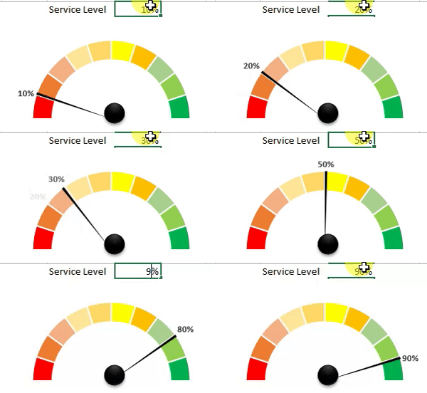
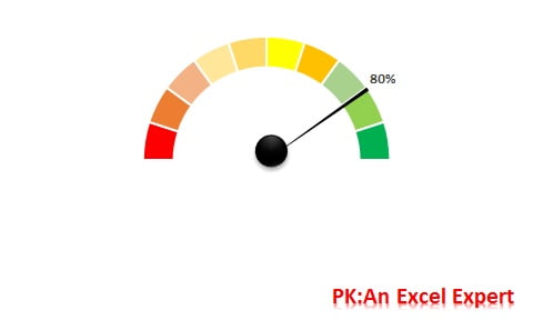
A speedometer chart in Excel, also called a gauge chart, shows one KPI as a needle on a semicircular dial coloured from red to green. Excel has no built-in gauge type, so you build it from a doughnut chart (the dial) and a pie chart (the needle) that share one chart area. This lesson builds the gauge from a blank sheet and links the needle and its label to a single KPI cell.
How a speedometer chart works
The dial is a doughnut chart with ten equal slices for the visible upper half and one large hidden slice for the lower half. The needle is a pie chart on the secondary axis with three slices: the KPI value, a thin 1 percent needle slice and the remainder. Only the needle slice is filled, so it looks like a pointer. Change the KPI cell and the needle rotates.
Use a speedometer for one headline metric on a dashboard, such as service level, quality score or utilisation, where the reader needs a quick good-or-bad reading rather than a trend. The technique works in every desktop version from Excel 2013 to Microsoft 365 and needs no VBA.

The support data explained
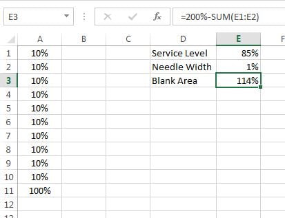
Every speedometer needs two small ranges: the dial bands and the needle values. The table below shows what each cell does so you can adapt the layout later.
| Cell | Entry | Purpose |
|---|---|---|
| A1:A10 | 10% in each cell | Ten equal bands of the visible dial (total 100%) |
| A11 | 100% | Hidden lower half of the doughnut |
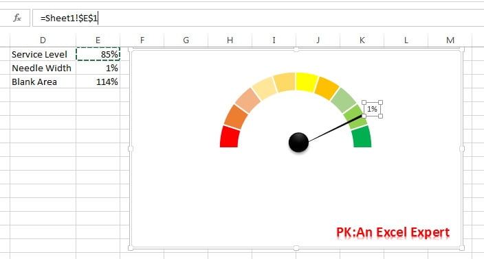
| E1 | 85% (the KPI) | Value the needle points to; link this to your data |
| E2 | 1% | Needle width; 1 to 2 percent looks best |
| E3 | =200%-SUM(E1:E2) |
Remainder so the pie always totals 200%, matching the doughnut |
The doughnut totals 200 percent (ten bands of 10 percent plus the 100 percent hidden slice). The pie must total the same 200 percent, otherwise the two charts rotate at different rates and the needle points to the wrong band.
Step 1: set up the data
- In A1:A10 enter 10% in each cell. In A11 enter 100%.
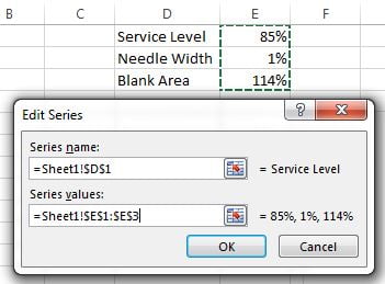
- In D1 type the metric name (Service Level) and in E1 its value (85%).
- In D2 type Needle Width and in E2 enter 1%.
- In D3 type Blank Area and in E3 enter
=200%-SUM(E1:E2).

Step 2: build the dial with a doughnut chart
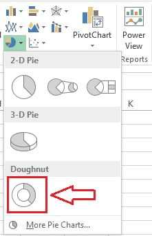
- Select A1:A11 and go to Insert > Charts > Insert Pie or Doughnut Chart > Doughnut.

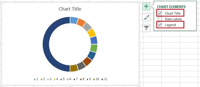
- Click the plus sign beside the chart and untick Chart Title and Legend.

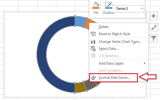
- Right-click the doughnut and choose Format Data Series.

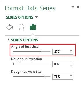
- Set Angle of first slice to 270 degrees so the large 100 percent slice moves to the bottom half.

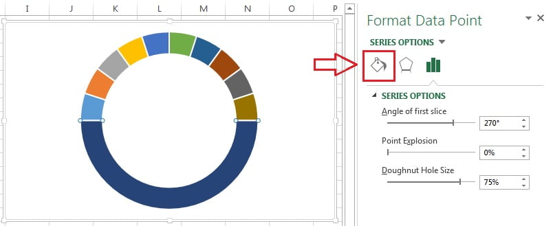
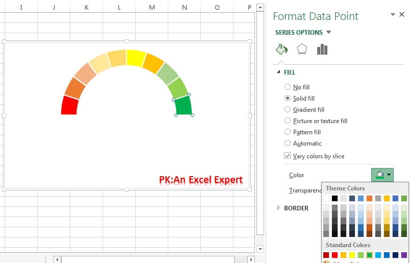
- Double-click the lower half slice to open Format Data Point and click the Fill & Line icon.

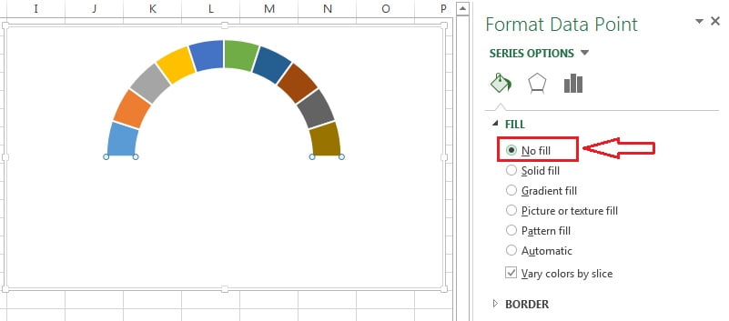
- Choose No fill so the lower half disappears and only the semicircle remains.

- Click each remaining slice in turn and fill it from red on the left, through yellow, to green on the right.

Step 3: add the needle as a pie chart
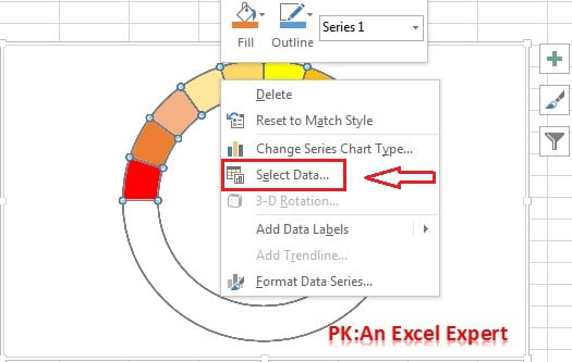
- Right-click the doughnut and choose Select Data.

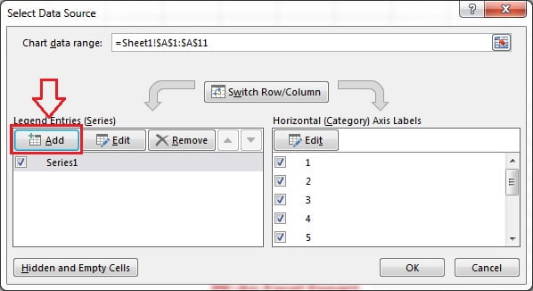
- Click Add under Legend Entries (Series).

- Set Series name to D1 (Service Level) and Series values to E1:E3. Click OK twice.

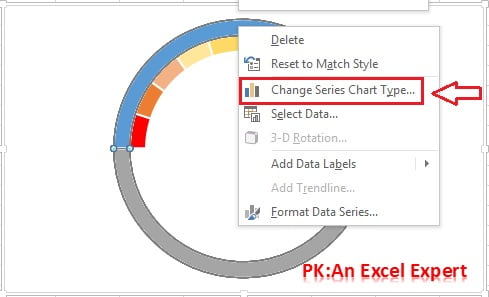
- A second doughnut ring appears outside the first. Right-click it and choose Change Series Chart Type.

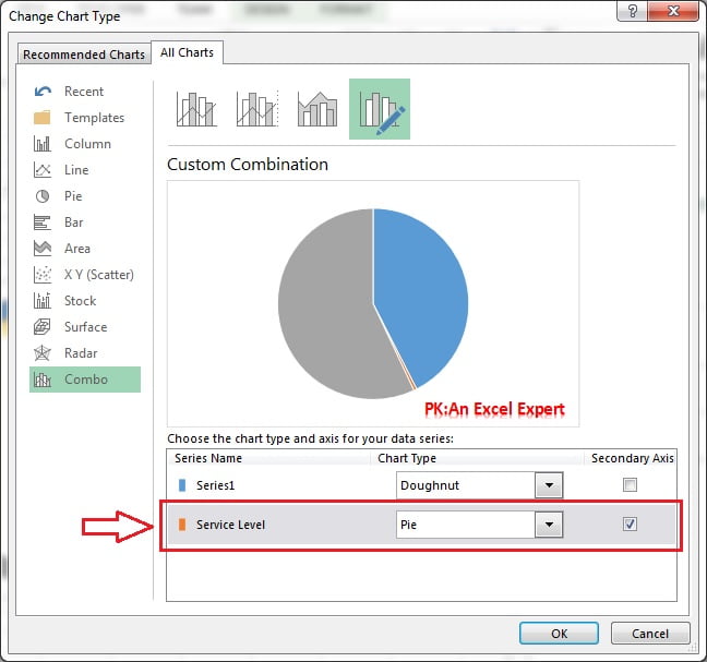
- Set the Service Level series to Pie and tick Secondary Axis, then click OK.

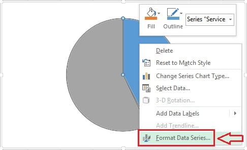
- Right-click the pie and choose Format Data Series.

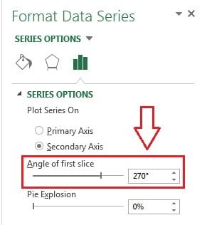
- Set Angle of first slice to 270 degrees so the pie lines up with the dial.

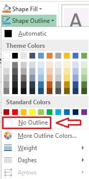
- With the pie selected, go to Format > Shape Outline > No Outline.

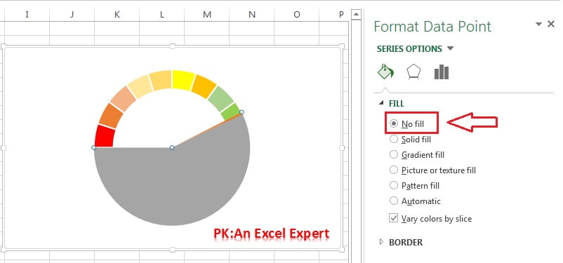
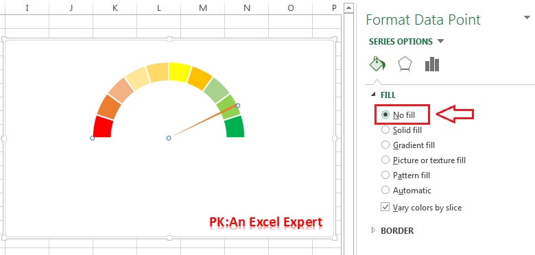
- Double-click the large value slice (blue) and set its fill to No fill.

- Double-click the remainder slice (grey) and set it to No fill as well.

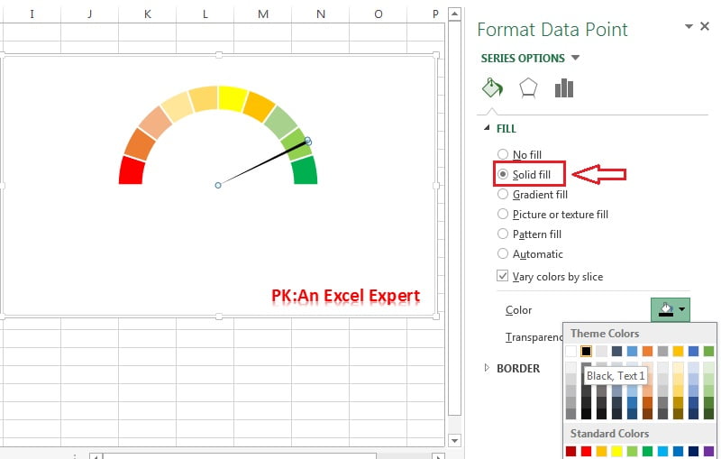
- Double-click the thin needle slice and fill it black.

Step 4: finish the needle hub and link the label
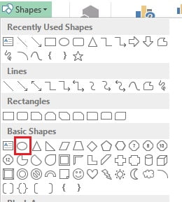
- Go to Insert > Shapes, pick the Oval under Basic Shapes and drag a small circle over the centre of the needle. Hold Shift while dragging to keep it round.

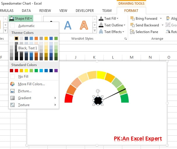
- With the oval selected, choose Format > Shape Fill > Black.

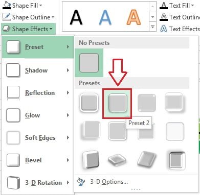
- Choose Format > Shape Effects > Preset > Preset 2 to give the hub a little depth.

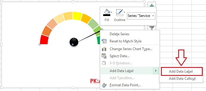
- Double-click the needle slice to select only that point, right-click it and choose Add Data Label.

- The label shows 1%. Click it once, type = in the formula bar, click cell E1 and press Enter. The label now shows the KPI value and follows the needle.

Worked example: a service level gauge with thresholds
A support team reports service level each week. Type this small table in G1:H4, then point E1 at the current week.
| Week | Service level |
|---|---|
| Week 1 | 72% |
| Week 2 | 81% |
| Week 3 | 88% |
- In E1 enter
=MIN(H4,100%). The MIN cap stops the needle disappearing into the hidden half if a value ever exceeds 100 percent. - Colour bands 1 to 7 red (0 to 70 percent), bands 8 and 9 amber (70 to 90 percent) and band 10 green (90 to 100 percent) to match the team’s targets.
- Change H4 from 88% to 72% and back. The needle swings from the amber zone to red and the linked label updates each time.
Result: a gauge that reads 88% with the needle in the amber band, and a label that always matches the source cell.
Download the practice file and video
Click the chart below to download the finished speedometer workbook and compare it with your own. A polished, resizable version with extra styling is also available: Get the Speedometer Chart template.

When to use a speedometer chart
- One headline KPI against a target band: service level, quality score, utilisation, on-time delivery.
- Executive dashboards where a quick red-amber-green reading matters more than the trend.
- Not for comparing several values or showing change over time; a bar chart or line chart does that better.
Tips and common mistakes
- Keep the totals equal. The doughnut totals 200 percent, so E3 must be
=200%-SUM(E1:E2). A different total shrinks or stretches the pie and misaligns the needle. - Rotate both charts. Both the doughnut and the pie need Angle of first slice at 270 degrees. If only one is rotated, the needle points to the wrong band.
- Use the secondary axis. If the pie sits behind the doughnut, it is still on the primary axis. Reopen Change Chart Type and tick Secondary Axis.
- Cap the input. Values above 100 percent send the needle into the hidden lower half. Wrap the KPI in
MIN(value,100%). - Group the parts. Select the chart and the oval and press Ctrl+G so they move and resize together on a dashboard.
- Keep the needle thin. A width of 1 to 2 percent is enough. Thicker needles hide the band they point to.
- Clear the backgrounds. Set the chart area and plot area to No fill so the gauge sits cleanly on a coloured dashboard.
Practice exercise
- Build the gauge with five bands of 20 percent instead of ten and confirm the needle still points correctly at 85 percent.
- Add a second KPI cell (Quality Score) and copy the finished chart. Point the copy at the new cell by editing the pie series values.
- Replace the fixed 1 percent needle width with a cell reference and test widths of 0.5, 1 and 3 percent.
- Use a data validation drop-down (see the Data Validation module) to pick a week, and make E1 look up that week’s service level with VLOOKUP.
Key takeaways
- Excel has no gauge chart type; a doughnut dial plus a pie needle on the secondary axis produces one.
- The dial uses ten 10 percent bands and a hidden 100 percent slice; the pie must total the same 200 percent.
- Rotate both series by 270 degrees so the visible half sits at the top.
- Hide every pie slice except the thin needle and fill it black.
- Link the needle’s data label to the KPI cell so the number always matches the pointer.
- Use the gauge for one headline KPI, not for comparisons or trends.
Related lessons
- Advanced Charts and Infographics course hub
- Battery chart in Excel
- Progress circle chart in Excel
- Bullet chart in Excel (a compact alternative to gauges)
- Doughnut chart basics and pie chart basics
- Excel Dashboard module for placing gauges in a full layout
- Microsoft Support: Present your data in a doughnut chart
Frequently asked questions
Does Excel have a built-in speedometer or gauge chart?
No. Excel has no native gauge type in any version, including Microsoft 365. The standard method is to combine a doughnut chart for the dial with a pie chart for the needle on the secondary axis, as shown in this lesson. Third-party add-ins exist, but the manual build is free, portable and easy to restyle.
How do I make the needle move automatically?
Change the value in cell E1, or link E1 to your data with a formula. The pie series is calculated from E1, E2 and E3, so the needle rotates as soon as the value changes. If the workbook is set to manual calculation, press F9 to refresh.
Can I show more or fewer colour bands?
Yes. Use five cells of 20 percent for five bands or twenty cells of 5 percent for finer control. The visible bands must total 100 percent and the hidden slice must remain 100 percent so the doughnut still totals 200 percent and stays aligned with the needle.
Why does my needle point to the wrong place?
Almost always one of three causes: the pie total is not 200 percent, one of the two series is not rotated to 270 degrees, or the pie is on the primary axis. Check E3, then check Angle of first slice on both series, then confirm Secondary Axis is ticked.
Can I build a full-circle gauge instead of a semicircle?
Yes. Remove the 100 percent hidden slice, make the ten bands total 100 percent, and set E3 to =100%-SUM(E1:E2). Keep the 270 degree rotation if you want the needle to start at the left, or use 0 degrees to start at the top.
Want the finished version? Ready-made Excel gauge charts, dashboards and KPI templates are available at NextGenTemplates.com.