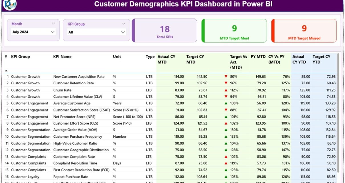
The Customer Demographics KPI Dashboard in Power BI tracks any customer-demographic metric you load into it across 3 connected pages, with a 15-column scorecard table that compares MTD and YTD actuals against both targets and prior-year numbers. Built on Power BI Desktop (a free download from Microsoft), the .pbix file ships ready to slice and analyze the moment you replace the sample Excel data with your own.
If you have ever tried to build a demographic scorecard from scratch in Power BI, you know how long the DAX measures take — Lower-the-Better logic, Year-over-Year deltas, MTD vs YTD splits, conditional formatting on icons. This template does all of that out of the box. The focus keyword for this post is Customer Demographics KPI Dashboard in Power BI, and the goal is to show you exactly what is inside, who it is for, and how it compares to the alternatives you might be evaluating.
Key Features of the Customer Demographics KPI Dashboard in Power BI
The dashboard is built around four design choices that make it usable on day one without learning DAX, Power Query, or any of the heavier Power BI internals.
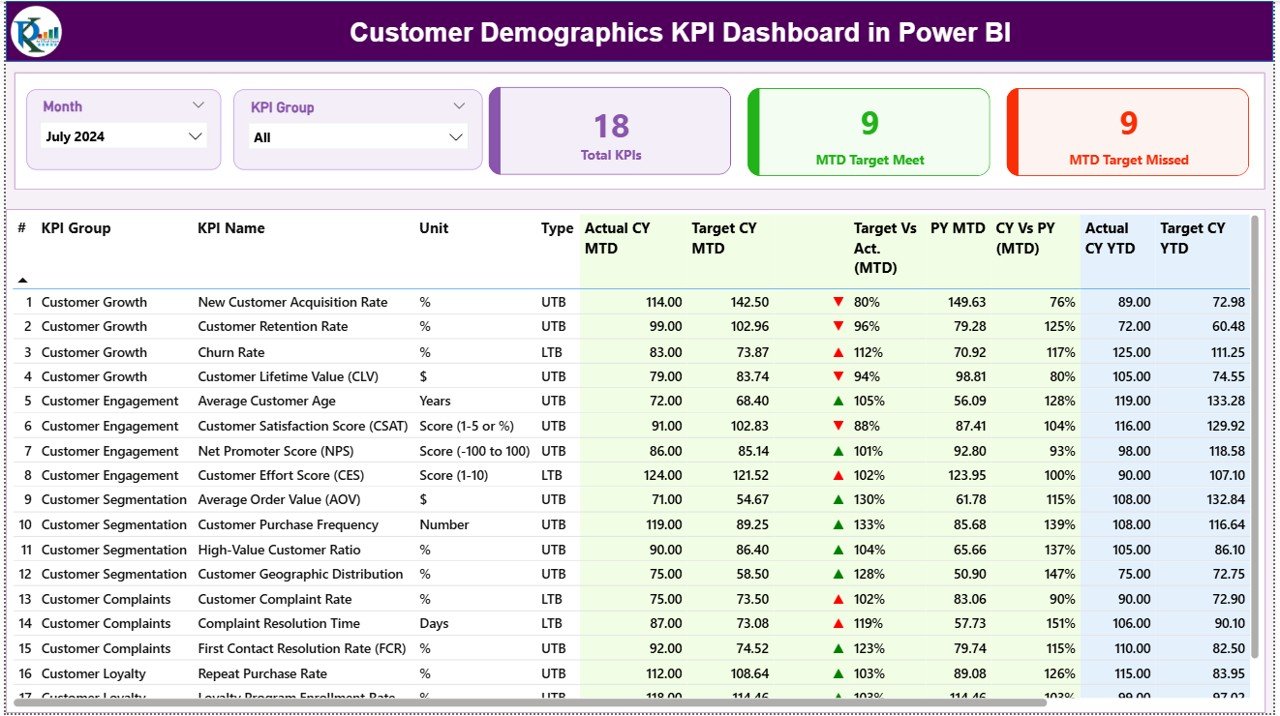
- Two top-level slicers — Month and KPI Group — drive every visual on the Summary page. Click a month, every card and table row filters; click a KPI Group, you see only that category.
- Three live KPI cards on the Summary page show Total KPIs count, MTD Target Met count, and MTD Target Missed count. The headline scorecard reads in under three seconds.
- 15-column detailed KPI table with KPI Number, KPI Group, KPI Name, Unit, Type (LTB / UTB), Actual CY MTD, Target CY MTD, MTD Icon (▼/▲ red/green), Target Vs Actual MTD %, PY MTD, CY Vs PY MTD %, Actual CY YTD, Target CY YTD, YTD Icon, Target Vs Actual YTD %, PY YTD, and CY Vs PY YTD %. Every comparison your manager asks for, in one row.
- Drill-through KPI Definition page — right-click any KPI row in the Summary table to see the KPI’s formula and definition. This single feature removes 90% of the “what does this metric actually mean?” Slack threads.
The Customer Demographics KPI Dashboard in Power BI also handles Lower-the-Better and Upper-the-Better metrics automatically. Customer Acquisition Cost, Churn Rate, and Time-to-Resolution should ideally go down — the dashboard shows green ▲ when they fall below target. Customer Lifetime Value, Retention Rate, and Repeat Purchase Rate should go up — same green ▲, opposite direction. The Type column in your KPI Definition sheet controls the logic; nothing for you to wire up.
Dashboard Pages Explanation
The Customer Demographics KPI Dashboard in Power BI is a 3-page report. Two pages are visible by default; the third is a hidden drill-through page you reach by right-clicking a KPI row.
Page 1: Summary Page
This is the landing page. At the top sit two slicers — Month and KPI Group — that filter every visual below. Three KPI cards beneath the slicers show Total KPIs count, MTD Target Met count, and MTD Target Missed count. The detailed KPI table at the bottom lists every demographic metric with the 15-column comparison structure (MTD Actual vs Target vs PY, YTD Actual vs Target vs PY, plus auto-flipping status icons).
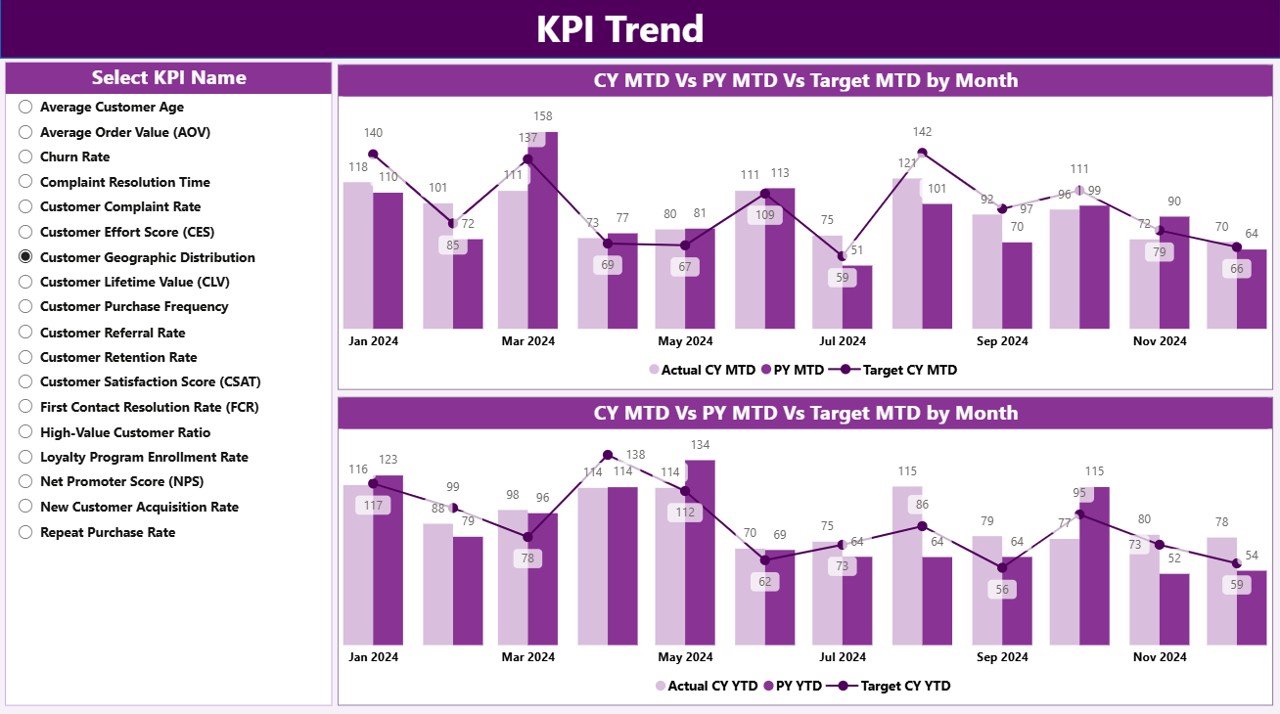
Page 2: KPI Trend Page
This page is where you drill into a single KPI’s trajectory. Two combo charts plot Current Year Actual, Previous Year Actual, and Target — one chart for MTD, one for YTD. A slicer on the left lets you pick which demographic metric to visualize (Customer Acquisition by Age Band, Repeat Purchase Rate by Region, New vs Returning Customer Split, and so on). The combo chart layout makes it obvious whether a metric is improving against the prior year and whether it’s tracking toward target.
Page 3: KPI Definition Page (Hidden Drill-Through)
This is a hidden drill-through page that surfaces the Formula and Definition of any KPI you right-click in the Summary table. It is the documentation layer baked directly into the report — your team always knows exactly how Customer Lifetime Value, Average Order Frequency, or Customer Demographic Index is calculated. A back button on the top-left corner returns you to the Summary page in one click.

Customer Demographics KPI Dashboard in Power BI vs. Tableau / Qlik vs. HubSpot / Salesforce — Feature Comparison
| Feature | Customer Demographics KPI Dashboard in Power BI | Tableau / Qlik equivalent | HubSpot / Salesforce |
|---|---|---|---|
| Cost | $11.99 one-time ✅ | $70-75 / user / month | $50-150 / user / month |
| Platform | Power BI Desktop (free) ✅ | Tableau Desktop / Qlik Sense (paid) | Cloud-only SaaS |
| Setup time | Under 10 minutes ✅ | 2-4 hours (data modelling) | 4-8 hours (CRM mapping + admin) |
| MTD + YTD vs Target + Prior Year built-in | ✅ Yes, pre-built | ❌ Must be built from scratch | ❌ Custom report builder required |
| Drill-through to KPI definitions | ✅ Yes | Possible (advanced setup) | Limited |
| LTB / UTB icon logic | ✅ Auto-flipping ▲/▼ | ❌ Manual calculated fields | ❌ Not native |
| Year-1 cost at 5 users | $11.99 ✅ | ~$4,200 | ~$3,000-$9,000 |
| Lifetime access | ✅ Yes | ❌ Subscription only | ❌ Subscription only |
For teams that want enterprise-grade customer demographic reporting without the $3,000+ annual seat fees, the Customer Demographics KPI Dashboard in Power BI sits in the sweet spot.
Who Should Use This Template
Perfect for:
- Marketing managers at 10-500-person companies who need monthly demographic scorecards
- E-commerce store owners on Shopify, WooCommerce, or Etsy tracking buyer age, region, gender, and repeat-purchase patterns
- Customer analysts and CRM analysts moving from Excel to Power BI without learning DAX
- Agency strategists building demographic deep-dives for retainer clients
- Founders presenting quarterly board updates with a clean MTD vs YTD vs target view
Not a fit if:
- You need SOC 2, SSO, and row-level security at the platform layer — use Power BI Premium with custom RLS instead
- You need real-time streaming dashboards — this is built on a refreshable Excel source, not a live SQL connection
- You are on macOS only — Power BI Desktop runs on Windows only (consider the Customer Demographics KPI Dashboard in Excel instead)
Real-World Use Cases
Priya leads marketing at a 45-person DTC skincare brand. She uses the Customer Demographics KPI Dashboard in Power BI to track Repeat Purchase Rate by age band, Customer Acquisition Cost by channel, and First-Order AOV by region every month. The MTD-vs-YTD-vs-target view replaces the three separate Excel files she used to send her CEO before each Monday standup. Onboarding new hires to the metrics takes 15 minutes — they right-click any KPI to read its definition, no internal wiki needed.
Marcus is the founder of a B2B SaaS startup. His five-person team didn’t have budget for HubSpot Marketing Hub Pro, so they bought this Power BI template and plugged in their Stripe customer export. The KPI Definition drill-through means new hires understand “Trial-to-Paid Conversion” and “Average Contract Value” on day one — no Slack thread required. Marcus refreshes the data file every Sunday evening and the Monday board update is done in under five minutes.
👉 Click here to purchase the Customer Demographics KPI Dashboard in Power BI
Aisha runs analytics consulting for retail clients. She white-labels the dashboard for each engagement, swaps in the client’s KPI list and data, and delivers a Power BI report in two days instead of two weeks. Clients keep the .pbix file for ongoing use — no monthly seat fees, no lock-in. The KPI Definition page acts as her built-in documentation, which means fewer support questions weeks later.
Advantages of the Customer Demographics KPI Dashboard in Power BI
The single biggest advantage is the one-time price. At $11.99, this template replaces the demographic-reporting layer that HubSpot, Salesforce, and Tableau price at $50-150 per user per month. A 5-user team using HubSpot Marketing Hub Pro pays roughly $54,000 per year. The same team using this Power BI template pays $11.99, once, forever.
The second advantage is the speed-to-insight. Replacing the sample data takes under 10 minutes. There is no CRM mapping step, no integration consultant, no data warehouse build-out. Open the Excel file, paste your numbers into Input_Actual and Input_Target, refresh the .pbix, done.
The third advantage is portability. Because the dashboard reads from an Excel data source, you can hand the .pbix and the Excel file to any team member, any client, or any subsidiary, and they can run it on their own machine without licensing complications. This matters a lot for agencies, consultants, and bootstrapped founders.
👉 Click here to purchase the Customer Demographics KPI Dashboard in Power BI
Opportunities for Improvement
The dashboard is opinionated about its structure. It assumes you want MTD + YTD comparisons against both target and prior year, with auto-flipping LTB/UTB icons. If your team only tracks YTD numbers, half of the columns will be empty. This is a deliberate choice — most marketing teams need the dual view — but it is worth flagging.
The Excel data source approach also means there is no live database connection. If your customer data lives in a warehouse like Snowflake, BigQuery, or Postgres, you will need to export to Excel on a refresh schedule. For teams that need true streaming or hourly refresh, a custom Power BI build connected directly to the warehouse is a better fit.
Finally, the dashboard is built in Power BI Desktop, which runs on Windows only. macOS users will need a Windows VM or should consider the Customer Demographics KPI Dashboard in Excel sibling, which runs on macOS natively.
Best Practices
Keep the Month column in the Input_Actual and Input_Target sheets as the first date of the month. The slicer and the trend chart both group on that date, so mixing in mid-month dates or quarter-end dates will produce inconsistent visuals.
Use the KPI Group column intentionally. Two or three crisp groups (Acquisition, Retention, Demographic Breakdown) make the KPI Group slicer useful. Twenty groups make it noisy. Most teams settle on 3-5 groups within the first month.
Fill the KPI Definition sheet thoroughly before sharing the report with stakeholders. The drill-through page is most useful when every KPI has a one-paragraph definition and a clear formula. Spending 30 minutes on this once saves hours of explanation later.
Refresh on a fixed cadence. Marketing managers we have spoken with usually refresh monthly on the first business day, with the prior month’s MTD now locked. Sticking to a schedule makes the “Current Year vs Previous Year” comparison meaningful.
Explore Relevant Templates
The Customer Demographics KPI Dashboard in Power BI fits naturally into a broader stack of customer-analytics templates on NextGenTemplates:
- Customer Demographics KPI Dashboard in Excel — the Excel sibling for spreadsheet-first teams or macOS users.
- Customer Support SLA KPI Dashboard in Power BI — pair demographic insight with first-response time, resolution rate, and SLA compliance.
- Customer Churn KPI Dashboard in Google Sheets — layer churn tracking on top of demographic acquisition data.
- Customer Retention KPI Scorecard in Excel — the retention companion to your demographic acquisition reporting.
- CRM Dashboard in HTML — a lightweight HTML version for embedding into internal portals.
For a full directory of Power BI dashboards, browse the Power BI Dashboards category page.
👉 Click here to purchase the Customer Demographics KPI Dashboard in Power BI
Frequently Asked Questions
What KPIs does the Customer Demographics KPI Dashboard in Power BI track?
The Customer Demographics KPI Dashboard in Power BI tracks any customer-demographic KPI you load into the Input_Actual sheet — examples include Customer Acquisition Cost, Repeat Purchase Rate, Customer Lifetime Value, New vs Returning Customer Split, Average Order Value by age band, and Customer Retention Rate by region. The KPI Group slicer lets you organize metrics into categories like Acquisition, Retention, and Demographic Breakdown.
How long does setup take?
Setup for the Customer Demographics KPI Dashboard in Power BI takes under 10 minutes. Open the .pbix file in Power BI Desktop, edit the three Excel sheets (Input_Actual, Input_Target, KPI Definition), hit Refresh in Power BI Desktop, and every visual — including all three pages — updates automatically. No DAX, no Power Query editing required.
Do I need a Power BI Pro license to use this dashboard?
No. The Customer Demographics KPI Dashboard in Power BI runs entirely in Power BI Desktop, which is a free download from Microsoft. A Power BI Pro license is only needed if you want to publish the report to the Power BI Service for cloud sharing with non-desktop users. For local use, no subscription is required.
How does this compare to HubSpot or Salesforce?
HubSpot Marketing Hub Pro starts at $890/month and Salesforce Marketing Cloud starts at $1,250/month — both with annual contracts and per-user fees. The Customer Demographics KPI Dashboard in Power BI is a one-time $11.99 purchase with lifetime access, no per-user fees, and full control over your data file. It does not replace a CRM, but it replaces the demographic-reporting layer most teams pay extra for.
👉 Click here to purchase the Customer Demographics KPI Dashboard in Power BI
Can I add my own KPIs to the dashboard?
Yes. The Customer Demographics KPI Dashboard in Power BI is fully extensible. Add a new row to the KPI Definition sheet with the KPI Number, Group, Name, Unit, Formula, Definition, and Type (LTB or UTB), then add matching rows in Input_Actual and Input_Target. The Summary page table and KPI Trend slicer pick up the new KPI on the next refresh.
Is there an Excel version of this dashboard?
Yes. The Customer Demographics KPI Dashboard in Excel is the sibling template for teams that prefer to stay in Excel without Power BI Desktop. The Power BI version is faster, slicer-driven, and supports the drill-through KPI Definition page; the Excel version is more familiar for traditional spreadsheet users.
Is the data kept private?
Yes. All data stays on your local machine. The Customer Demographics KPI Dashboard in Power BI is a downloadable .pbix file with a paired Excel data source — there is no cloud sync, no third-party service, and no telemetry. Power BI Desktop reads the Excel file directly from your hard drive.
About the Author
Built by PK — Microsoft Certified Professional with 15+ years of Excel, Google Sheets, and Power BI experience. Founder of NextGenTemplates, reaching 300K+ subscribers across YouTube channels. Every template is hand-built and tested before release.
Conclusion
The Customer Demographics KPI Dashboard in Power BI gives marketing teams, e-commerce founders, and analytics consultants a complete monthly + yearly demographic scorecard for a one-time $11.99 — replacing the demographic-reporting layer that paid SaaS tools price at $50-150 per user per month. With 3 connected pages, slicers, auto-flipping LTB/UTB logic, and a drill-through KPI Definition page, it is ready to use the moment you replace the sample Excel data.
👉 Click here to purchase the Customer Demographics KPI Dashboard in Power BI
Instant download · One-time payment · No subscription · Lifetime access
For step-by-step video tutorials on Power BI dashboards, customer-demographic analysis, and more, visit YouTube.com/@PK-AnExcelExpert.
📅 Last updated: May 2026