Running an HVAC service business means juggling dozens of data points every week — service calls, technician dispatches, parts cost, response times, customer ratings, and regional profit. When all of that lives in scattered spreadsheets or a field service CRM export you never really look at, you end up managing the business on feel rather than data. The HVAC Service Dashboard in Excel fixes that in one workbook.HVAC Service Dashboard in Excel
In this post I’ll walk through the full dashboard — every page, every chart, and how the pivot tables are wired so you can drop your own HVAC service data in and get an instant operational view. If you want the ready-to-use file, you can grab the HVAC Service Dashboard in Excel on NextGenTemplates.
Click to buy HVAC Service Dashboard in Excel
Why an HVAC Service Dashboard Matters
HVAC service is a high-volume, multi-variable business. A typical shop handles installations, repairs, scheduled maintenance, inspections, and emergency calls — across residential, commercial, and industrial customers — with a field team of technicians spread across several regions. Without a clear dashboard, you end up asking questions you can’t easily answer:
- Which technician has the highest completion rate this month?
- Is our average response time slipping on high-priority calls?
- Which region is actually profitable after parts cost?
- Are emergency calls eating into margin?
- Which equipment type drives the most revenue?
This dashboard answers every one of those questions on a single screen, with slicers that let you drill into any time period, region, technician, or service type.HVAC Service Dashboard in Excel
Dashboard Structure – 7 Sheets
The workbook has 7 sheets: 5 analytical dashboard pages, 1 Data Sheet, and 1 Support Sheet containing all the pivot tables. Here is what each one covers.
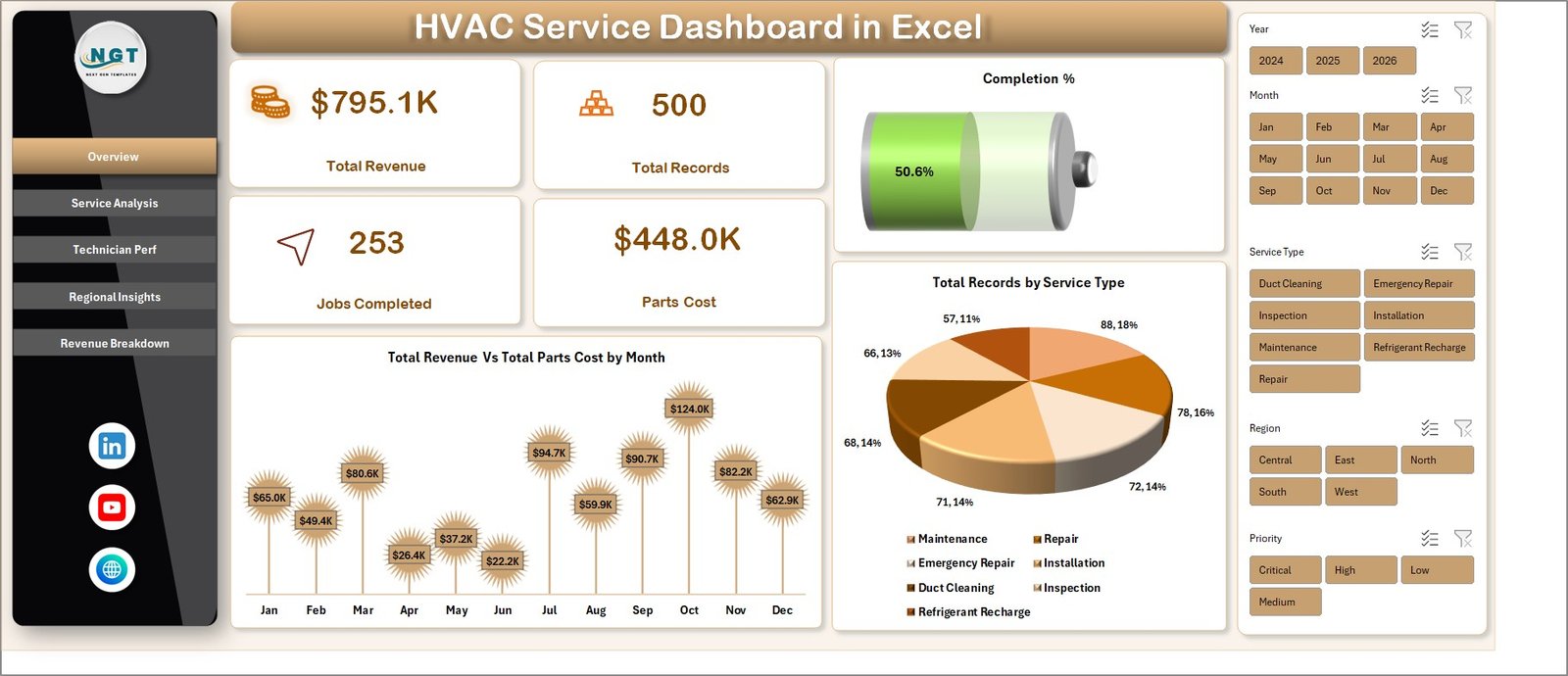
1. Overview Page
The Overview page is the first tab and the one service managers will use daily. At the top, five KPI cards display the most critical operational numbers:
- Total Revenue — sum of all service revenue across the selected period
- Total Records — total number of service calls logged
- Jobs Completed — count of calls marked completed
- Parts Cost — total parts spend
- Completion % — jobs completed divided by total records
Below the KPI cards, two charts give you a visual pulse of the business:
- Total Revenue Vs Total Parts Cost by Month — a combo chart with revenue as a column and parts cost as a line. It instantly shows whether margin is expanding or shrinking month over month.
- Total Records by Service Type — a column chart that ranks installation, repair, maintenance, inspection, and emergency calls by volume. Useful for spotting which service lines are growing fastest.
Slicers on the side let you filter by region, technician, service type, or priority without writing a single formula.HVAC Service Dashboard in Excel
Overview
Click to buy HVAC Service Dashboard in Excel
2. Service Analysis
The Service Analysis page is built for operations managers who want to understand labor efficiency and response quality. It has four charts:
- Total Labor Cost by Service Type — identifies which service categories consume the most labor hours (and where you might be under-quoting).
- Total Records by Equipment Type — shows demand split across AC units, furnaces, heat pumps, boilers, and ventilation systems.
- Avg. Response Time by Priority — critical for SLA tracking. Compares average response time across low, medium, high, and emergency calls.
- Avg. Service Duration by Service Type — highlights which job types take longest, so you can adjust scheduling windows and technician dispatch.

Service Analysis
Click to buy HVAC Service Dashboard in Excel
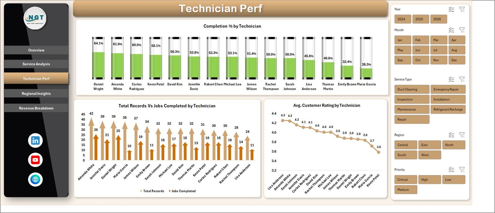
3. Technician Perf
This is the page every service supervisor opens during monthly reviews. It has three technician-level charts that make performance visible without manual ranking:
- Completion % by Technician — the single most important productivity metric in field service. Ranks every technician by completion rate.
- Total Records Vs Jobs Completed by Technician — a side-by-side comparison of assigned workload versus delivered work. Highlights technicians who are under-performing or being overloaded.
- Avg. Customer Rating by Technician — reveals the service-quality side of the story. A technician with high completion but low rating is a coaching opportunity.
Technician Perf
Click to buy HVAC Service Dashboard in Excel
4. Regional Insights
The Regional Insights page is where owners and sales leaders spend their time. It translates operational data into geographic profitability. Charts include:
- Total Records Vs Jobs Completed by Region — regional workload versus delivery performance.
- Net Profit by Region — profitability ranking across all service territories. Shows where you should invest more dispatch capacity and where you might be losing money.
- Total Revenue Vs Total Parts Cost by Customer Type — compares revenue and parts spend across residential, commercial, and industrial customers.
- Avg. Revenue Per Job by Customer Type — identifies which customer segment delivers the highest average ticket size.
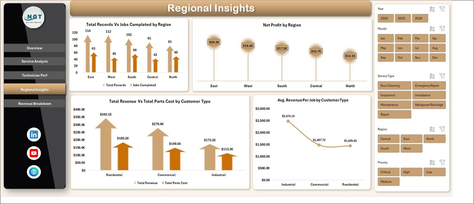
Regional Insights
Click to buy HVAC Service Dashboard in Excel
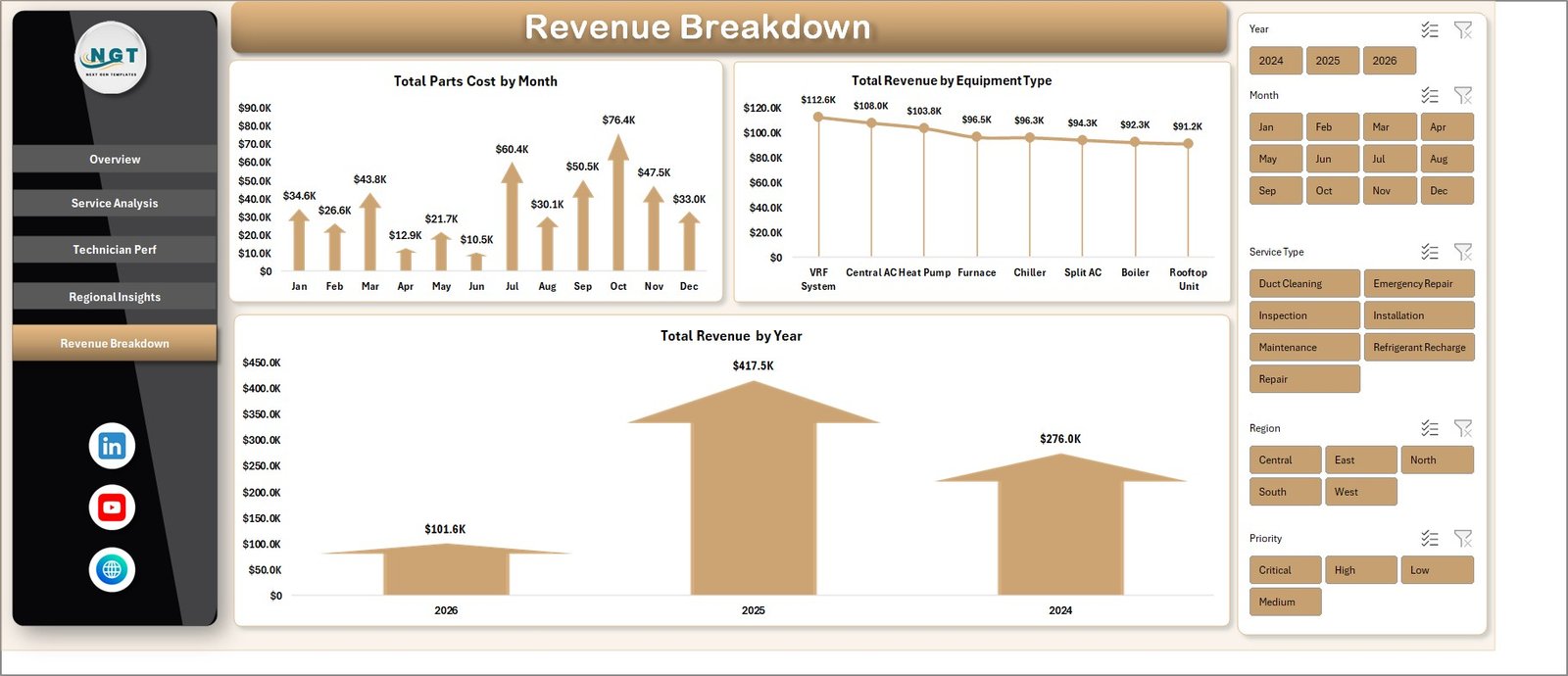
5. Revenue Breakdown
This page is a finance-oriented view — what’s the money doing over time and across equipment? Three charts:
- Total Parts Cost by Month — monthly parts consumption pattern. Useful for inventory planning and vendor negotiations.
- Total Revenue by Equipment Type — ranks equipment categories by revenue contribution.
- Total Revenue by Year — year-over-year trend line for growth tracking.
Revenue Breakdown
Click to buy HVAC Service Dashboard in Excel
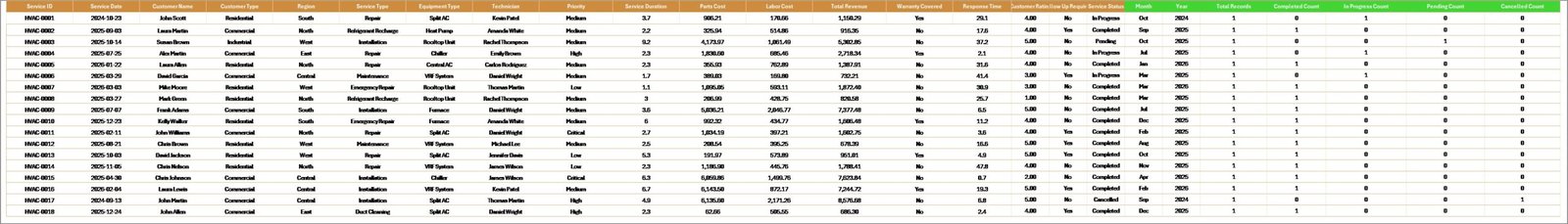
6. Data Sheet
The Data Sheet is the input tab. You paste your HVAC service records here, keeping the same column order as the template. The columns are designed to match what most field service CRMs export — Service ID, Date, Service Type, Equipment Type, Technician, Region, Customer Type, Priority, Response Time, Service Duration, Labor Cost, Parts Cost, Revenue, Completion Status, and Customer Rating.
If your CRM exports extra fields, you can add columns to the right without breaking anything. Just don’t delete or reorder the existing columns — the pivot tables reference them directly.HVAC Service Dashboard in Excel
Data Sheet tab
Click to buy HVAC Service Dashboard in Excel
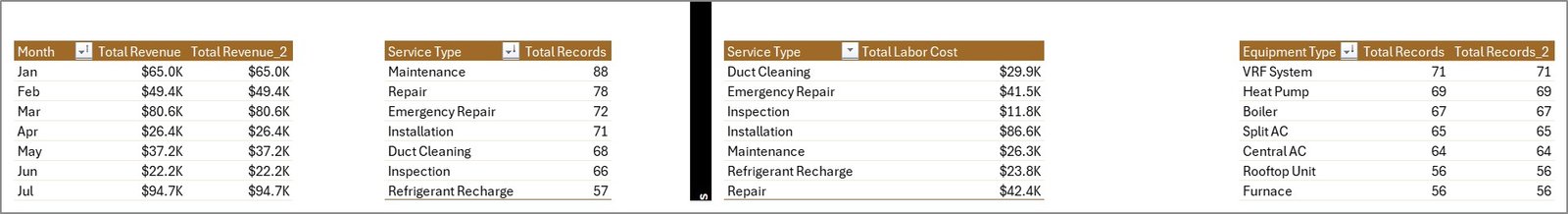
7. Support Sheet
The Support Sheet is the engine room. It holds every pivot table that feeds every chart on every dashboard page. You don’t need to touch it in normal use — just right-click the sheet tab and hide it so end users never see it.
When you update the Data Sheet with new service records, go to the Data tab on the Excel ribbon and click Refresh All. Every pivot and every chart updates in one click. No formulas to drag, no ranges to extend.
Support sheet tab
Click to buy HVAC Service Dashboard in Excel
How to Use the Dashboard in 4 Steps
- Open the file in Microsoft Excel (2016, 2019, 2021, or Microsoft 365 on Windows or Mac).
- Go to the Data Sheet tab and replace the sample data with your own HVAC service records in the exact column order.HVAC Service Dashboard in Excel
- Click Data → Refresh All on the Excel ribbon. Every pivot table and chart updates instantly.
- Open any dashboard tab (Overview, Service Analysis, Technician Perf, Regional Insights, Revenue Breakdown) and use the slicers to filter by region, technician, service type, or priority.
Who This Dashboard Is For
The dashboard is built for HVAC service companies, commercial HVAC contractors, facility maintenance teams, field service managers, dispatch coordinators, and multi-location service operations. Because the Data Sheet uses generic service fields — Service Type, Equipment Type, Technician, Region — the same template works for plumbing, electrical, elevator, and general facility maintenance with minimal renaming.
Get the Template
You can download the full working file on NextGenTemplates: HVAC Service Dashboard in Excel. It ships as a ready-to-use .xlsx file with sample data pre-loaded so you can explore every chart before dropping in your own records.
For more Excel dashboards across HR, Finance, Sales, Supply Chain, Manufacturing, and Service operations, browse the full Excel Dashboard collection.
Watch the Video Tutorial
Subscribe to PK – An Excel Expert on YouTube for step-by-step walkthroughs on how to build, customize, and extend dashboards like this one.
Click to buy HVAC Service Dashboard in Excel