Organic Seeds Providers Dashboard in Power BI is built for seed suppliers, agribusiness teams, organic farming distributors, procurement managers, and analysts who need a clean way to monitor sales, cost, order fulfillment, provider quality, germination results, rejection risk, and product mix in one report. Many seed providers manage 100+ order records across providers, crop categories, seed varieties, certifications, countries, regions, customer segments, and sales channels. When that data is scattered across spreadsheets, monthly review becomes slow. This Power BI dashboard turns those records into 5 focused pages with KPI cards, slicers, and ready visuals for quick decision-making.
You can open the PBIX file in Power BI Desktop, replace the sample data with your own source, refresh the report, and customize the pages as needed. For more on how Power BI reports work, you can also review Microsoft Learn Power BI report guidance.
Key Features of Organic Seeds Providers Dashboard in Power BI
This dashboard includes 5 Power BI pages: Overview, Provider, Product Mix, Channels, and Fulfillment. Each page is designed around a practical question that seed providers often ask, such as which providers drive revenue, which seed varieties carry higher cost, which crop categories have stronger germination, and where rejection rate is affecting order quality.
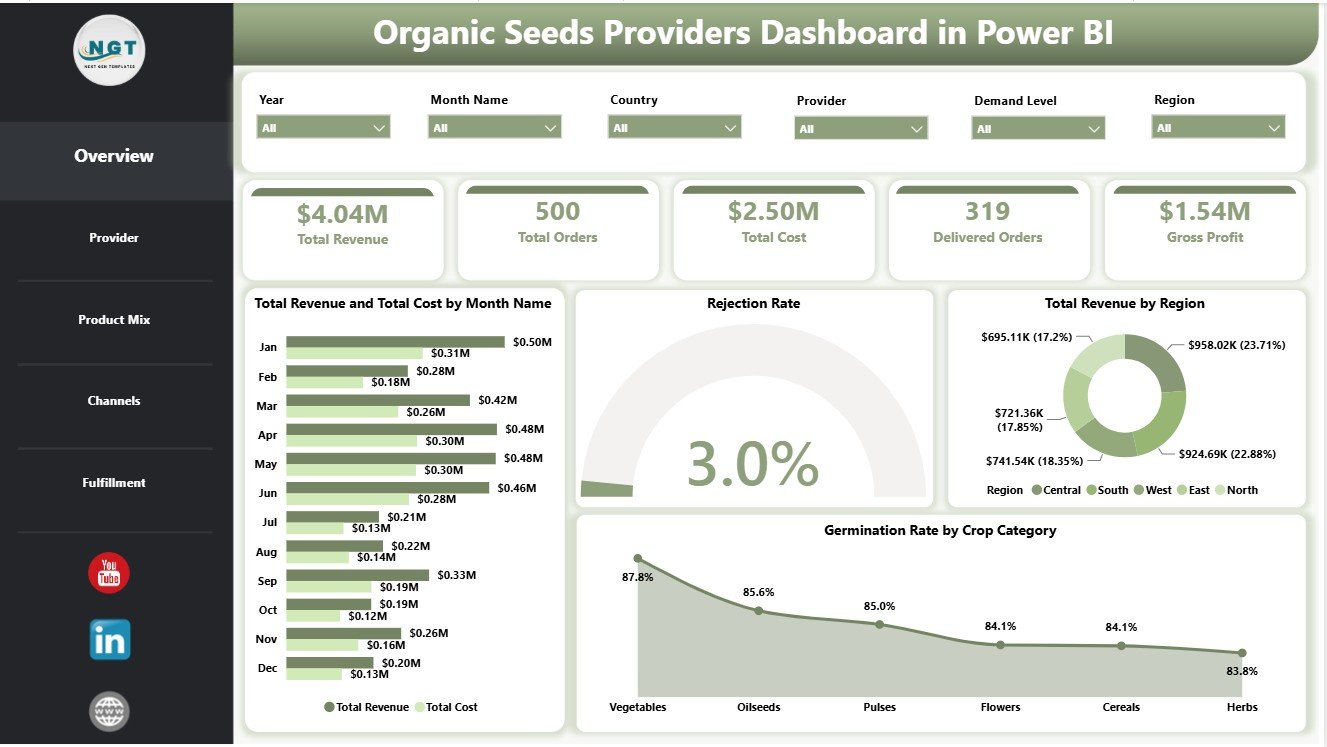
The Overview page includes KPI cards for Total Revenue, Total Orders, Total Cost, Delivered Orders, and Gross Profit. These cards help leadership review the business at a glance before moving into provider, product, channel, and fulfillment detail.
The report also includes visuals for revenue vs. cost, rejection rate, revenue by region, germination rate, provider economics, certification profitability, lead time, seed variety cost, customer segment quantity, sales channel revenue, delivered orders, and monthly gross profit. Slicers allow users to filter the report quickly during review meetings.
Dashboard Pages Explanation
1. Overview Page
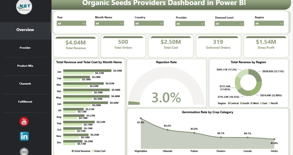
The Overview page is the executive summary of the Organic Seeds Providers Dashboard in Power BI. At the top, the report displays Total Revenue, Total Orders, Total Cost, Delivered Orders, and Gross Profit. These cards let users see the main business outcome before they review charts in detail.
Total Revenue and Total Cost by Month Name: This chart compares sales and cost by month. It helps users see whether revenue growth is improving faster than cost or whether margin pressure is appearing in certain months.
Rejection Rate by Overall Orders: This chart reviews rejected order share against the overall order base. It helps quality and fulfillment teams understand whether rejection risk is stable or needs provider-level follow-up.
Total Revenue by Region: This visual shows where revenue is coming from geographically. It helps sales teams compare regional contribution and identify markets that deserve attention.
Germination Rate by Crop Category: This chart compares germination performance across crop categories. It helps quality teams identify crop groups with stronger or weaker seed viability.
2. Provider
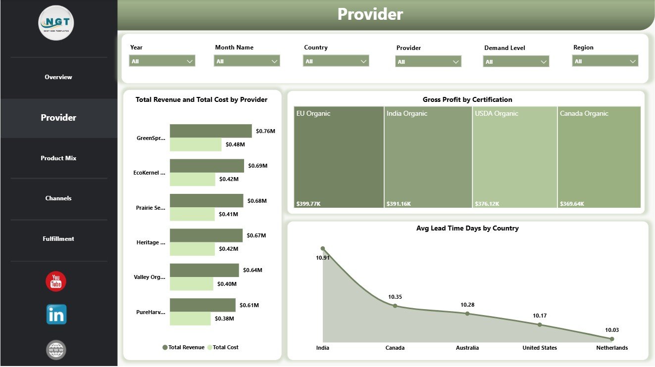
The Provider page is useful for supplier review and procurement discussions. It focuses on provider-level commercial performance, certification profitability, and lead time by country.
Total Revenue and Total Cost by Provider: This chart compares provider-level revenue and cost side by side. It helps users see which providers generate strong sales and which ones may create higher cost pressure.
Gross Profit by Certification: This visual compares gross profit by certification type. It helps managers understand whether certain certifications support stronger margin performance.
Avg Lead Time Days by Country: This chart shows delivery speed by country. It helps procurement and operations teams identify locations where lead time may be affecting fulfillment.
3. Product Mix
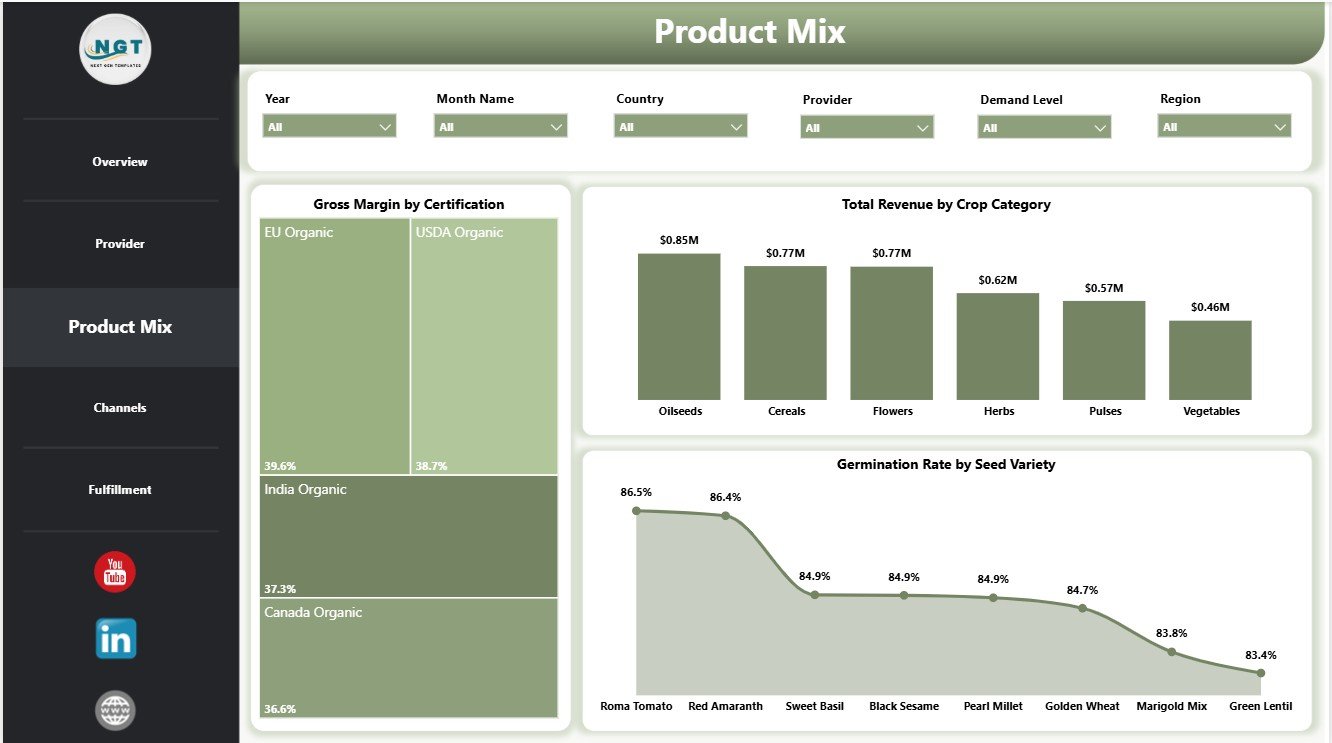
The Product Mix page helps users review what is being sold and how product-level quality and margin differ. It is helpful for product managers, sales leaders, and quality teams.
Gross Margin by Certification: This chart shows margin performance by certification group. It helps users understand which certification categories are more profitable.
Total Revenue by Crop Category: This visual compares revenue by crop category. It helps sales teams see which crop groups are driving the strongest commercial result.
Germination Rate by Seed Variety: This chart compares germination quality by seed variety. It helps quality teams identify varieties that may need closer testing or supplier review.
4. Channels
The Channels page connects cost, demand, and revenue by the way products are sold. It is useful when teams need to compare sales channels and customer segments.
Total Cost by Seed Variety: This chart identifies varieties that carry higher total cost. It helps managers understand where product cost is concentrated.
Total Quantity Sold by Customer Segment: This visual compares order volume by customer segment. It helps teams understand where demand is strongest.
Total Revenue by Sales Channel: This chart compares revenue across sales channels. It helps sales managers identify channels that create the highest value.

5. Fulfillment
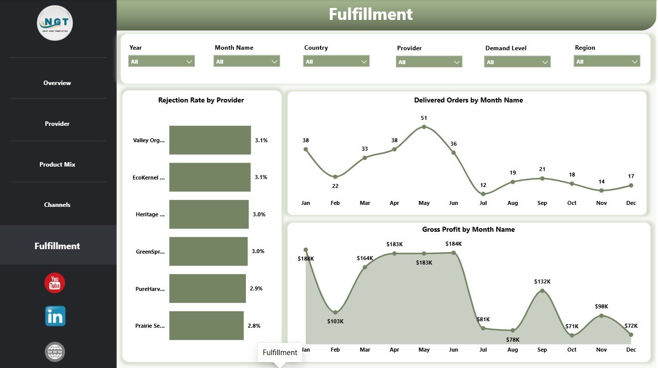
The Fulfillment page supports delivery and provider quality review. It helps teams connect order delivery with rejection and profit movement.
Rejection Rate by Provider: This chart highlights provider-level rejection risk. It helps users find providers that may require quality checks or service improvement.
Delivered Orders by Month Name: This visual tracks delivered orders over time. It helps operations teams see monthly fulfillment movement and delivery activity.
Gross Profit by Month Name: This chart shows monthly gross profit. It helps leaders understand whether fulfillment activity is converting into healthy profit.
Organic Seeds Providers Dashboard in Power BI vs. Tableau vs. Paid CRM/SaaS – Feature Comparison
| Feature | This Power BI Dashboard | Tableau or Qlik Alternative | Paid Farm SaaS |
|---|---|---|---|
| Cost | $17.99 one-time template | License cost plus dashboard build time | Monthly or annual subscription |
| Platform | Power BI Desktop and Power BI Service | Tableau or Qlik environment | Vendor cloud platform |
| Setup time | Open PBIX, connect or replace data, refresh | Build model, visuals, and calculations manually | Onboarding and configuration |
| Real-time team collaboration | Available after publishing to Power BI Service | Available by platform plan | Usually included by plan |
| Mobile access | Power BI mobile app after publishing | Vendor mobile app | Usually included |
| Customizable fields | Edit pages, measures, visuals, slicers, and model relationships | Editable with analyst skills | Depends on vendor permissions |
| Share with link | Available through Power BI permissions | Available through platform permissions | Usually login controlled |
| Year-1 cost at 5 users | Template cost plus any Microsoft licensing | License cost plus analyst time | Often hundreds or thousands |
| Seed provider metrics | Revenue, orders, cost, delivered orders, gross profit, rejection, germination, provider, crop, certification, channel, and fulfillment | Must be designed manually | Depends on available modules |
Who Should Use This Template
This dashboard is suitable for organic seed providers, seed distributors, agricultural input suppliers, procurement managers, agribusiness analysts, farm supply companies, operations managers, fulfillment teams, and consultants. It works best when the user already has structured data or can export sales, provider, product, quality, and fulfillment records from another system.
It is not a replacement for a live ERP, warehouse system, seed certification compliance platform, or CRM automation tool. It is a reporting template designed to make prepared data easier to analyze in Power BI.
Real-World Use Cases
Anika, seed provider owner: uses the Overview page before monthly review meetings to check revenue, orders, cost, delivered orders, and gross profit.
Rohan, procurement manager: uses the Provider and Fulfillment pages to compare lead time, provider cost, provider revenue, and rejection rate before supplier negotiations.
Meera, agribusiness consultant: uses the Product Mix and Channels pages to prepare client reports on certification performance, crop categories, seed varieties, customer segments, and sales channels.
Advantages of Organic Seeds Providers Dashboard in Power BI
The main advantage is speed. Instead of building pages, slicers, cards, and visuals from scratch, users can start from a prepared PBIX structure and adapt it to their own data. The dashboard also separates analysis into practical pages, so each user can move from high-level results to provider, product, channel, and fulfillment details without losing context.
Another advantage is flexibility. Power BI Desktop allows users to edit visuals, add measures, change colors, connect new sources, and publish to Power BI Service when the report is ready for team access.
Opportunities for Improvement
The dashboard depends on clean, structured input data. If provider names, crop categories, certification values, or dates are inconsistent, users should clean those fields before relying on the analysis. Teams with live ERP or warehouse systems may also want to connect the PBIX report directly to exported tables or a governed data model.
For advanced reporting, users can add custom DAX measures, scheduled refresh, row-level security, and additional pages for inventory, claims, returns, or certification audit tracking.
Best Practices
Keep provider names consistent, use standard crop category and seed variety names, and check that all revenue and cost fields are numeric before refreshing the report. Review rejection rate and germination rate definitions with the quality team so everyone understands the same calculation logic.
Use the Overview page for leadership review, the Provider page for supplier meetings, the Product Mix page for product planning, the Channels page for sales review, and the Fulfillment page for operations follow-up. When sharing with a team, publish the report to Power BI Service and control access through workspace permissions.
Explore Relevant Templates
You can download the product here: Organic Seeds Providers Dashboard in Power BI. Related dashboards include Organic Seeds Providers Dashboard in Excel, Indoor Farming Systems Dashboard in Power BI, and Agriculture and Farm Dashboard in Power BI.
Frequently Asked Questions
What does the Organic Seeds Providers Dashboard in Power BI track?
It tracks Total Revenue, Total Orders, Total Cost, Delivered Orders, Gross Profit, rejection rate, germination rate, provider, certification, country, region, crop category, seed variety, sales channel, customer segment, quantity sold, lead time, and month.
Do I need Power BI Desktop to use it?
Yes. Open the PBIX file in Power BI Desktop, which is free from Microsoft. Power BI Service is optional for sharing, browser access, and scheduled refresh.
Can I connect my own data?
Yes. You can replace the sample source or connect your own structured data source, then refresh the report.
Can I customize the report?
Yes. You can change visuals, slicers, measures, pages, labels, colors, and data connections in Power BI Desktop.
Is this a seed inventory system?
No. This is a Power BI analytics dashboard for prepared data. It is not a live inventory, warehouse, ERP, or certification compliance system.
Is it a subscription?
No. It is sold as a one-time downloadable template.
About the Author
Built by PK – Microsoft Certified Professional with 15+ years of Excel, Google Sheets, and Power BI experience. Founder of NextGenTemplates, reaching 300K+ subscribers across YouTube channels. Every template is hand-built and tested before release.
Conclusion
The Organic Seeds Providers Dashboard in Power BI gives seed providers and agribusiness teams a practical way to review provider performance, revenue, cost, gross profit, rejection rate, germination rate, channels, product mix, and fulfillment in one editable report. It is especially useful for teams that want Power BI reporting without building every page from scratch.
For more tutorials, visit PK An Excel Expert on YouTube.