In this article you will learn how to create a stunning and beautiful battery chart in excel. You can use this battery chart in business dashboard or presentation to show the KPI metrics.
Below are the steps to create this stunning battery chart
- We will create this chart to Service Level metric.
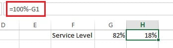
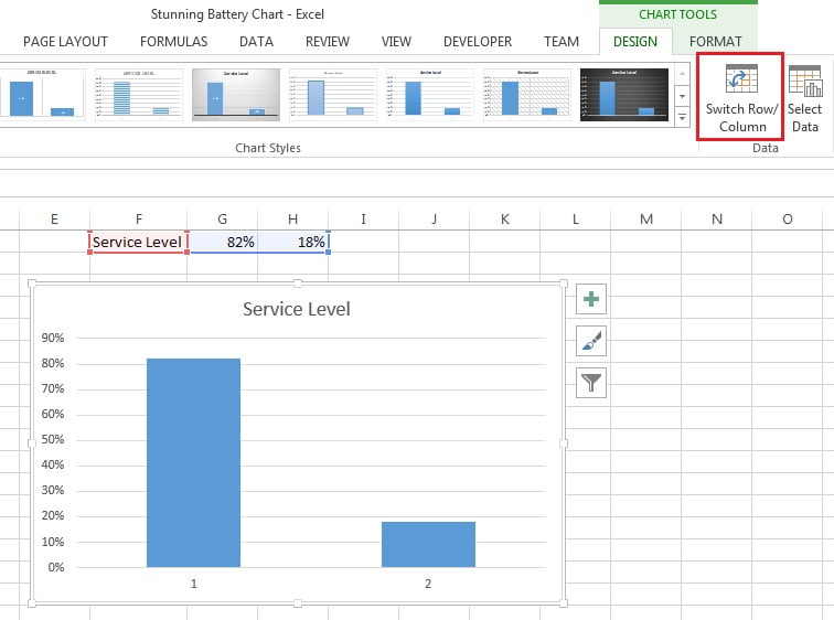
- Put the service level actual value on Range “G1“
- Put the formula “=100%-G1” on cell “H1“
- Select the range “G1:H1“
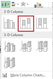
- Go to the Insert tab >>Charts>>Insert the 2D Stacked Column Chart.
- Select the chart.
- Go to Design tab and click on Switch Row/Column.
- Right click on the Vertical Axis and click on Format Axis.
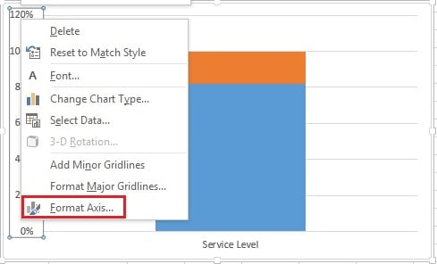
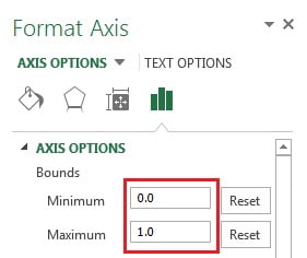
In the format Axis window
- Put Minimum as “0“
- Put Maximum as “1“
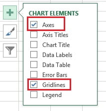
- Remove the Axis and Gridlines from the chart.
- click on Chart Elements (+ button of chart) and uncheck Axis and Gridlines or just select axis and gridlines and press delete.
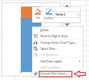
- Right click on the blue slice of the chart and click on Format Data Series.
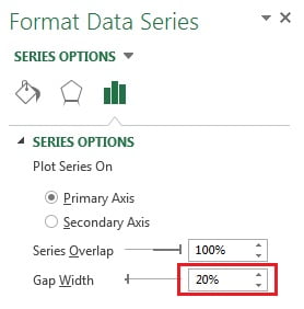
- Put the Gap Width as “20%” in the Format Data Series window.
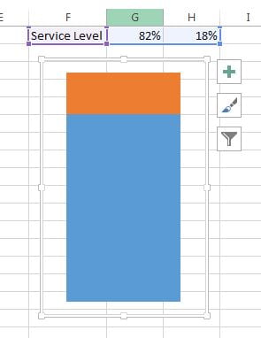
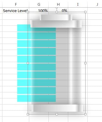
- Make the chart little bit of smaller.
- After doing the above given setting our chart will look like below given image.
- Now go to the Insert tab>>Shapes>>Insert a Rectangle.
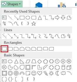
- Drag a small rectangle on the worksheet as given in below image.
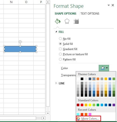
- Right click on the rectangle and click on Format Shape.
- In the format shape window select the Solid fill available under the Fill.
- Open the color list and click on More Colors.
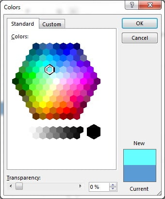
- Color window will opened.
- Select the Standard tab.
- Choose the Sky blue color and click on OK.
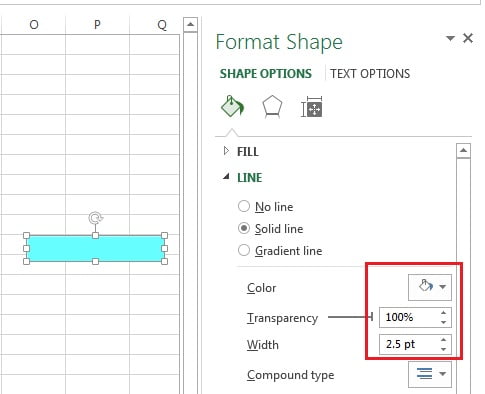
- Now go to the Line option in the Format Shape window.
- Select the Solid line.
- Choose Color as white.
- Choose the Transparency as “100%“
- Choose the Width as “2.5pt“
- Now copy (Press Ctrl+C) the rectangle.
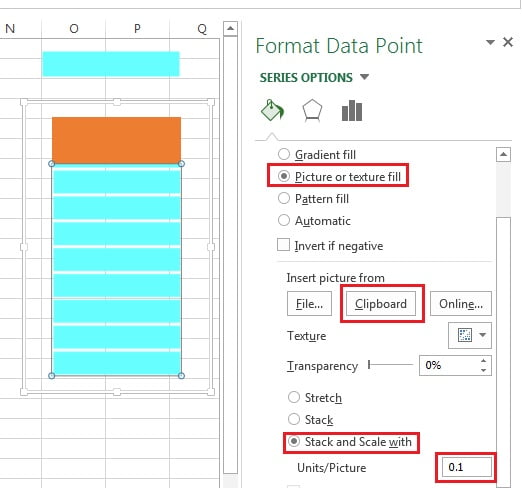
- Double click on the blue slice.
- Format Data Points window will be opened.
- Select the Picture or texture fill available under Fill.
- Click on Clipboard. Since we have already copied the rectangle so it will be filled in the chart.
- Select the Stack and Skill with.
- Put Units/Picture as “0.1“
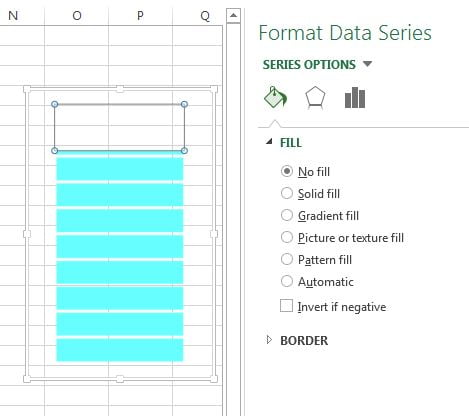
- Now select the Orange slice of the chart.
- Fill it as No fill.
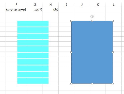
- Go to the Insert tab>>Shapes>>Insert a rectangle as given in below image.
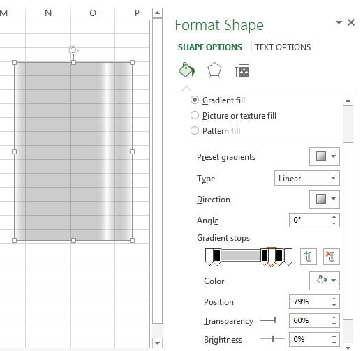
- Right click on this rectangle and click on Format Shape.
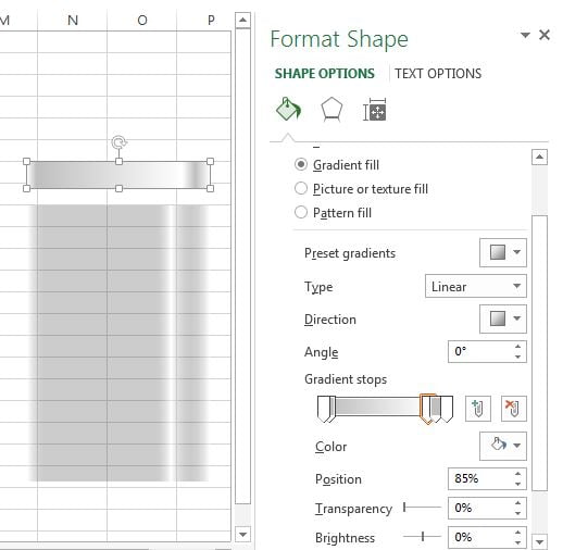
- Fill the Gradient fill in the rectangle.
- Choose the Type as Linear.
- Angle as “0°“
- In the Gradient Stops take 6 stops as given in below image.
- For 1st, 4th and 6th stops, choose the White color with “60%” transparency.
- For the 2nd, 3rd and 5th stops, choose the Black color with “80% “transparency.
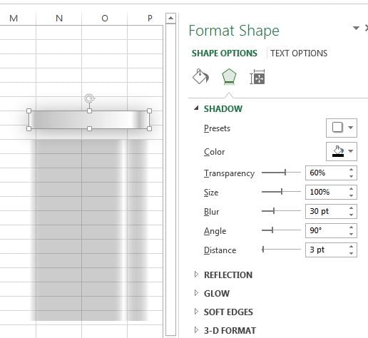
- Now insert the small rectangle with same width of big rectangle to create the upper cap of battery.
- Right click on this rectangle and click on Format Shape.
- Fill the Gradient fill in the rectangle.
- Choose the Type as Linear.
- Angle as “0°“
- In the Gradient Stops take 5 stops as given in below image.
- For 1st, 3rd and 5th stops, choose the White color with “0%” transparency.
- For the 2nd and 4th stops, choose the light grey color with “0% “transparency.
- Now keep small rectangle selected and go to Effects option of Format Shape.
- Go to the Shadow and select the options as given in below image.
- Now copy the small rectangle and put it on the bottom and top of big rectangle.
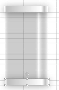
- Copy the top rectangle and make another small rectangle.
- Keep it on the top of battery.
- Now select all 4 rectangles and right click and click on Group.
- Type “100%” on the cell “G1“
- Keep this group on the chart.
- Adjust the chart and shape group properly.
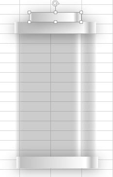
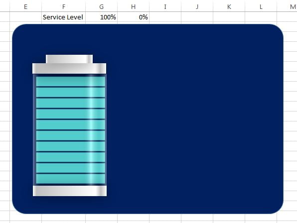
- Go to the Insert Tab >> Shapes>>Insert a Rounded Rectangle.
- Drag a big rounded rectangle on the worksheet.
- Right click on rounded rectangle and click on “Send to back“.
- Fill the Dark Blue color in this rounded rectangle.
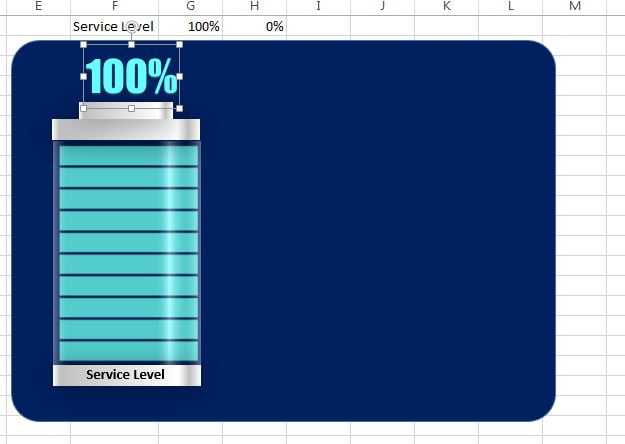
- Now go to Insert tab and insert a Text box.
- Drag a small text box and type Service Level in this text box.
- Fill the color as No fill.
- Choose Outline as No outline.
- Keep this text box on the bottom of the battery.
- Insert another text box.
- Select the text box and click on cell “G1” so it will be connected with this cell.
- Fill the color as No fill.
- Take outline as No outline.
- Choose Font Name as “Impact“
- Choose Font size as “32“
- Choose Font color as “Sky blue“
- Keep this text box on the top of battery.
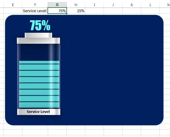
Now our chart is ready and if we will change the value on cell “G1” then chart will be changed accordingly. For example if we type 75% on cell “G1” then it will look like below image.
Click to buy Stunning Battery Chart
Visit our YouTube channel to learn step-by-step video tutorials
Watch the step-by-step video tutorial:
Click to buy Stunning Battery Chart