Urban transportation systems handle millions of passengers every single day. Because of this scale, metro and subway operators constantly face challenges related to crowding, delays, revenue tracking, and operational efficiency. However, when data remains scattered across multiple systems or static reports, decision-making becomes slow and reactive.
That is exactly why a Metro and Subway Dashboard in Power BI becomes a powerful and essential solution.
This detailed, SEO-friendly guide explains what a Metro and Subway Dashboard in Power BI is, how it works, its key features, advantages, best practices, and frequently asked questions. Moreover, the article explains each dashboard page clearly so that transport authorities, planners, and analysts can easily understand how to use it for smarter decisions.
By the end of this article, you will clearly understand why this dashboard plays a critical role in modern public transportation management.
Click to Purchases Metro and Subway Dashboard in Power BI
What Is a Metro and Subway Dashboard in Power BI?
A Metro and Subway Dashboard in Power BI is an interactive and visual reporting solution designed to analyze passenger trips, crowding levels, revenue, delays, and performance trends across metro lines, cities, ticket types, and time periods.
Instead of reviewing multiple spreadsheets or static PDF reports, this dashboard brings all transit data into one centralized Power BI file. As a result, users can monitor performance in real time, identify operational issues, and take corrective action quickly.
Moreover, because Power BI supports slicers, filters, and drill-downs, users can analyze data at both a high level and a detailed level without technical complexity.
Why Do Metro and Subway Systems Need a Power BI Dashboard?
Metro and subway networks operate in highly dynamic environments. Therefore, they require fast, accurate, and visual insights to maintain service quality.
Here is why a Metro and Subway Dashboard in Power BI is essential:
-
Because passenger demand changes daily, operators need real-time visibility
-
Because crowding impacts safety, teams must track congestion continuously
-
Because revenue comes from multiple ticket types, financial analysis becomes complex
-
Because delays affect passenger satisfaction, monitoring delay trends becomes critical
-
Because cities and lines perform differently, comparative analysis becomes necessary
As a result, this dashboard enables data-driven planning instead of guesswork.
How Does a Metro and Subway Dashboard in Power BI Work?
The dashboard works by connecting structured metro data—such as trips, revenue, crowding, delays, ticket types, cities, and months—to Power BI.
After data modeling and transformation, Power BI generates interactive visuals, KPI cards, and charts. Then, users can apply slicers to filter data by metro line, city, ticket type, or month.
Because everything updates dynamically, users always see accurate and up-to-date insights.
Key Features of Metro and Subway Dashboard in Power BI
This Metro and Subway Dashboard includes 5 professionally designed pages, each focused on a specific type of analysis.
Let us explore each page in detail.
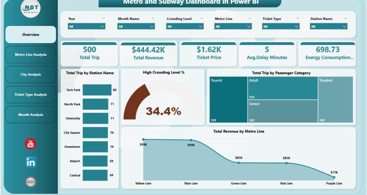
1. Overview Page: What Does the Overall Metro Performance Look Like?
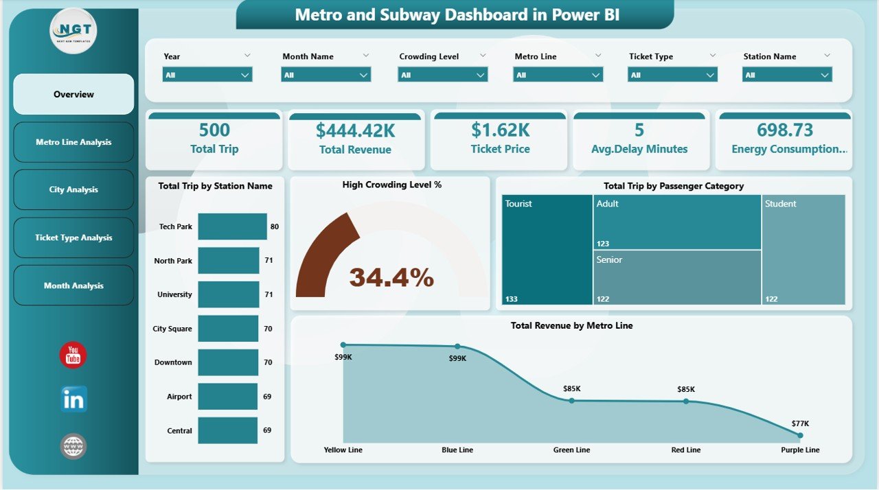
The Overview Page acts as the main landing page of the dashboard. Because decision-makers often start here, this page highlights the most important KPIs at a glance.
Key Elements of the Overview Page
-
Interactive slicers for filtering data
-
High-level KPI cards for instant insights
-
Summary metrics across stations, passenger categories, and metro lines
KPIs and Cards Included
-
Total Trip by Station Name
Shows which stations handle the highest passenger volume -
High Crowding Level %
Indicates congestion levels across the network -
Total Trip by Passenger Category
Breaks down trips by commuter types such as regular, student, or senior -
Total Revenue by Metro Line
Displays revenue contribution from each metro line
Because all metrics respond to slicers, users can instantly analyze performance for specific time periods or segments.
2. Metro Line Analysis: Which Metro Lines Perform Better or Worse?
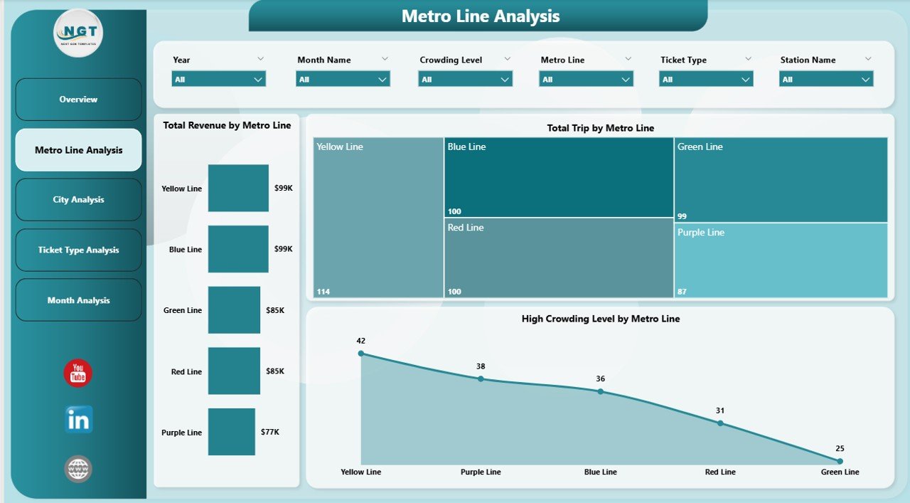
The Metro Line Analysis Page focuses on performance comparison across different metro lines.
Since each line serves different routes and passenger volumes, this analysis helps identify strengths and bottlenecks.
Charts Included in Metro Line Analysis
-
Total Trip by Metro Line
Highlights passenger demand across metro lines -
High Crowding Level % by Metro Line
Identifies lines experiencing congestion issues -
Total Revenue by Metro Line
Shows financial performance of each line
Why This Page Matters
-
Because high-demand lines may need capacity expansion
-
Because overcrowded lines may require schedule adjustments
-
Because low-revenue lines may need pricing or service review
As a result, transit planners can balance capacity, comfort, and profitability effectively.
Click to Purchases Metro and Subway Dashboard in Power BI
3. City Analysis: How Do Different Cities Compare?
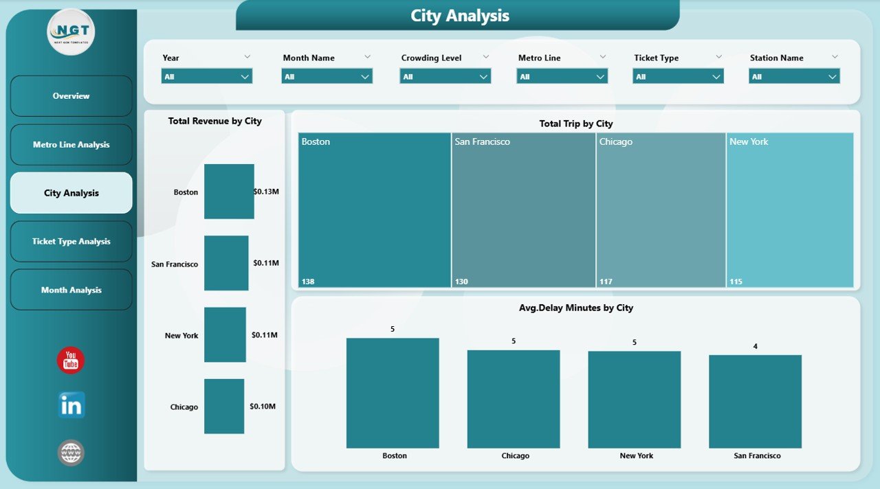
The City Analysis Page provides a city-level view of metro performance.
Since metro systems often operate across multiple cities or zones, this page enables geographic comparison.
Charts Included in City Analysis
-
Total Trip by City
Shows passenger demand city-wise -
Total Revenue by City
Highlights revenue contribution from each city -
Average Delay Minutes by City
Identifies cities facing operational delays
Insights You Can Gain
-
Which cities generate the highest ridership
-
Which cities contribute the most revenue
-
Which cities face frequent delays
Because of these insights, authorities can prioritize infrastructure upgrades where needed most.
4. Ticket Type Analysis: Which Ticket Types Drive Usage and Revenue?
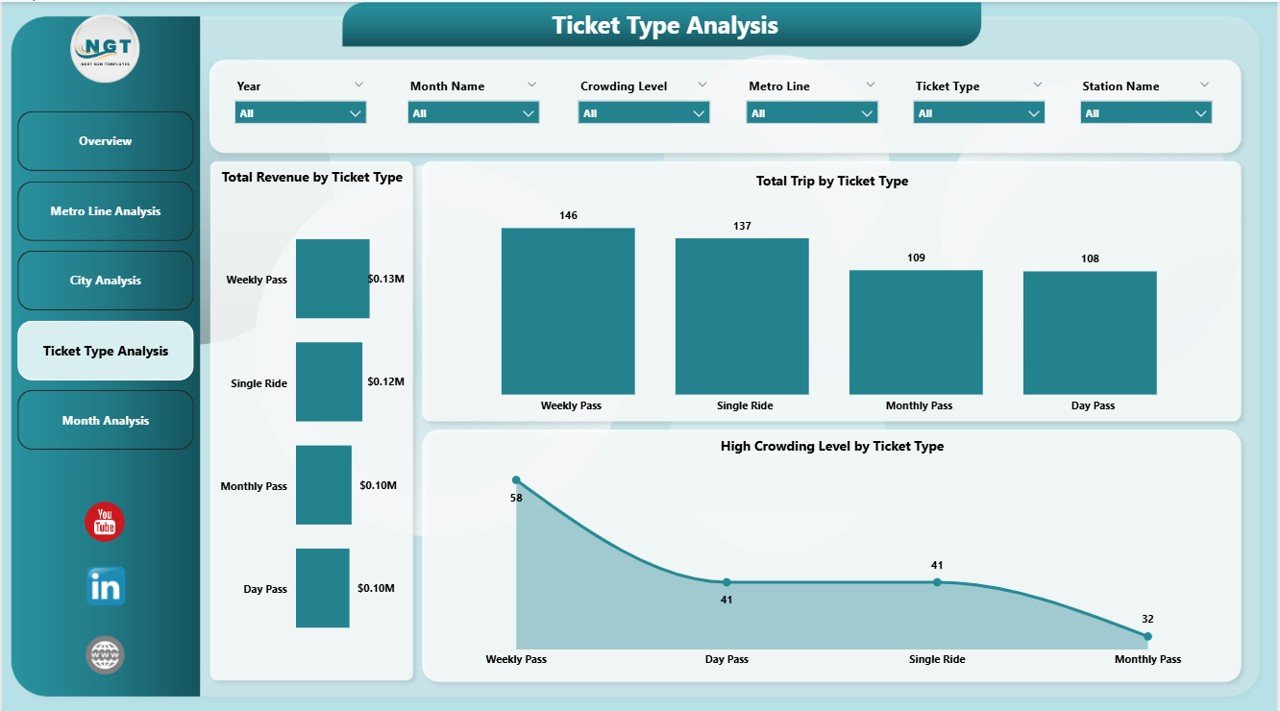
The Ticket Type Analysis Page focuses on ticket-level performance.
Since metro systems offer multiple ticket types, understanding their impact becomes essential.
Charts Included in Ticket Type Analysis
-
Total Trip by Ticket Type
Displays usage of single-journey, daily, weekly, or monthly passes -
Total Revenue by Ticket Type
Shows which ticket types generate maximum revenue -
High Crowding Level by Ticket Type
Analyzes congestion patterns by ticket usage
Why Ticket Analysis Is Important
-
Because monthly passes may cause peak-hour congestion
-
Because single tickets may generate higher per-trip revenue
-
Because pricing strategies depend on ticket performance
As a result, transport authorities can refine ticket policies intelligently.
5. Month Analysis: How Does Performance Change Over Time?
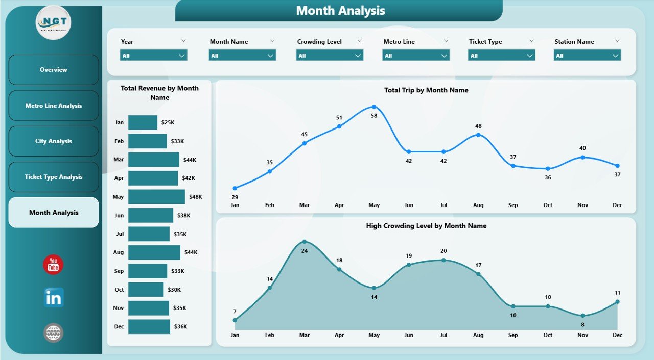
The Month Analysis Page focuses on time-based trends.
Because metro usage varies seasonally, monthly analysis helps forecast demand accurately.
Charts Included in Month Analysis
-
Total Trip by Month
Tracks ridership trends over time -
Total Revenue by Month
Shows revenue fluctuations month-wise -
High Crowding Level by Month
Identifies peak congestion periods
Key Benefits of Monthly Analysis
-
Helps plan capacity during peak months
-
Supports budget forecasting
-
Improves seasonal scheduling
Therefore, this page supports both operational and financial planning.
Advantages of Metro and Subway Dashboard in Power BI
Click to Purchases Metro and Subway Dashboard in Power BI
Using a Metro and Subway Dashboard in Power BI delivers several strategic advantages.
1. Centralized Data Visibility
-
Combines trips, revenue, crowding, and delays in one place
-
Eliminates manual reporting
2. Faster Decision-Making
-
Real-time visuals replace static reports
-
Interactive filters speed up analysis
3. Improved Passenger Experience
-
Helps reduce crowding and delays
-
Supports service optimization
4. Better Revenue Management
-
Identifies high-performing ticket types and lines
-
Supports pricing and promotion decisions
5. Scalability and Flexibility
-
Easily adapts to new cities, lines, or metrics
-
Supports future data expansion
Who Should Use a Metro and Subway Dashboard in Power BI?
This dashboard suits a wide range of stakeholders:
-
Metro authorities and transport departments
-
Urban planners and city administrators
-
Operations and scheduling teams
-
Revenue and finance teams
-
Policy makers and leadership
Because the dashboard remains intuitive, both technical and non-technical users can use it confidently.
Best Practices for the Metro and Subway Dashboard in Power BI
To maximize value, follow these best practices while using or building the dashboard.
1. Use Clean and Consistent Data
-
Standardize station, city, and line names
-
Validate ticket and revenue data regularly
2. Design Clear and Simple Visuals
-
Avoid cluttered charts
-
Use consistent color themes
3. Focus on Actionable KPIs
-
Track crowding, delays, and revenue trends
-
Avoid unnecessary metrics
4. Leverage Slicers Effectively
-
Enable filtering by month, city, and line
-
Keep slicers user-friendly
5. Review Performance Regularly
-
Conduct weekly and monthly reviews
-
Use insights to drive improvements
How Does This Dashboard Support Smart City Initiatives?
Click to Purchases Metro and Subway Dashboard in Power BI
Smart cities rely on data-driven decisions. Therefore, this dashboard aligns perfectly with smart mobility goals.
-
Improves public transport efficiency
-
Enhances commuter satisfaction
-
Supports sustainable urban planning
-
Reduces congestion and emissions
As a result, cities can deliver better transportation services while optimizing resources.
Conclusion: Why Is a Metro and Subway Dashboard in Power BI Essential?
A Metro and Subway Dashboard in Power BI transforms raw transit data into meaningful insights. Instead of reacting to problems, metro authorities can anticipate challenges and act proactively.
Because the dashboard offers visibility across trips, revenue, crowding, cities, ticket types, and months, it becomes an indispensable tool for modern urban transportation systems.
If your organization aims to improve efficiency, passenger satisfaction, and revenue performance, this dashboard provides the clarity and control you need.
Frequently Asked Questions (FAQs)
1. What data is required for a Metro and Subway Dashboard in Power BI?
You need trip data, station details, metro lines, city information, ticket types, revenue data, crowding levels, delay minutes, and date fields.
2. Can this dashboard handle multiple cities and metro lines?
Yes, the dashboard supports multiple cities and metro lines through dynamic filters and slicers.
3. Does this dashboard support monthly and yearly analysis?
Yes, it includes month-wise analysis and can easily extend to yearly trends.
4. Can non-technical users use this dashboard?
Yes, Power BI’s interactive visuals make the dashboard easy to use for non-technical users.
5. Can this dashboard integrate with real-time data sources?
Yes, Power BI supports live data connections, scheduled refreshes, and API-based integrations.
6. How does this dashboard help reduce crowding?
By identifying high crowding levels by line, city, ticket type, and month, operators can adjust schedules and capacity.
7. Is this dashboard customizable?
Yes, you can easily add new KPIs, charts, cities, or metro lines based on business needs.
Visit our YouTube channel to learn step-by-step video tutorials