The Customer Support SLA KPI Dashboard in Power BI tracks customer support SLA performance across 3 interactive pages, with MTD and YTD comparisons against targets and prior-year benchmarks. Setup takes under 10 minutes — just fill 3 Excel tabs and every Power BI visual updates automatically. The dashboard ships as a .pbix file plus an Excel data source so support managers can replace a $1,500–$12,900-per-year help-desk analytics subscription with a one-time $11.99 purchase.
For most customer support teams, SLA reporting lives in scattered Excel tabs, vendor dashboards, and manual PowerPoint exports. The Customer Support SLA KPI Dashboard in Power BI consolidates First Response Time, Average Handle Time, SLA Compliance %, First Contact Resolution Rate, CSAT, ticket backlog, and any other KPI you define into a single Summary page — with red ▼ and green ▲ status icons against monthly and year-to-date targets. This blog post walks through every page, every column, every formula, and how to put the template to work in your monthly support-leadership reporting cycle.
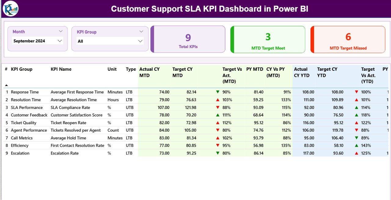
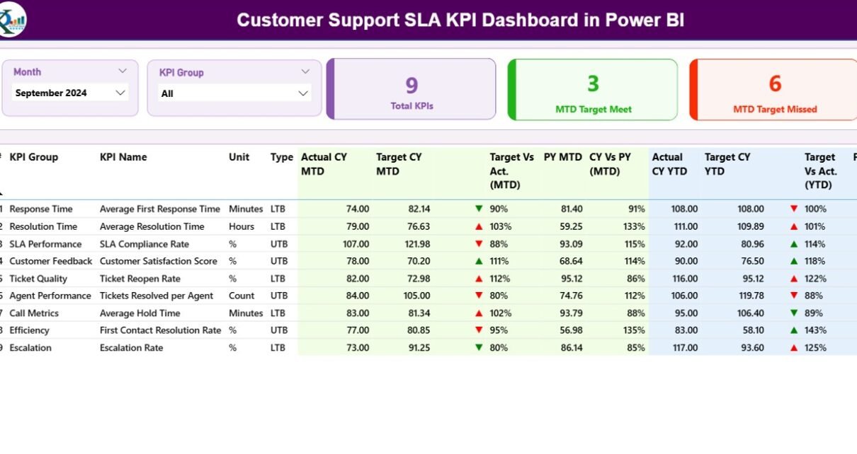
Customer Support SLA KPI Dashboard — Summary Page
Key Features of the Customer Support SLA KPI Dashboard in Power BI
- 3-page Power BI structure — a Summary page with a detailed KPI table, a KPI Trend page with MTD and YTD combo charts, and a hidden drill-through KPI Definition page.
- MTD and YTD comparison built in — every SLA KPI shows Actual CY MTD vs Target CY MTD, Actual CY YTD vs Target CY YTD, and side-by-side comparison with the same period of the previous year.
- Visual status indicators — red ▼ and green ▲ icons in the MTD Icon and YTD Icon columns instantly flag SLA KPIs missing target. Logic auto-flips between LTB (Lower the Better) and UTB (Upper the Better) based on KPI type.
- Two interactive slicers on the Summary page (Month, KPI Group) plus a KPI-name slicer on the Trend page so support leaders can drill into one metric at a time.
- 3 KPI summary cards at the top of the Summary page — Total KPIs count, MTD Target Met count, and MTD Target Missed count — for a 5-second SLA posture check.
- Excel-driven data source — no DAX coding needed. Fill three worksheets (Input_Actual, Input_Target, KPI Definition) and the .pbix file refreshes the entire dashboard.
- Built for support leaders — track classic help-desk KPIs like First Response Time, Average Handle Time, Resolution Time, SLA Compliance %, First Contact Resolution Rate, ticket backlog, and escalation rate in one scorecard.
Dashboard Pages Explanation
1) Summary Page
This is the main page of the Customer Support SLA KPI Dashboard. At the top, a Month slicer and a KPI Group slicer let you filter the entire view in one click. Three cards display the headline numbers — Total KPIs count, MTD Target Met count, and MTD Target Missed count — so a support leader can read SLA posture in five seconds.
Below the cards sits the detailed KPI table with the following columns:
- KPI Number — the sequence number of the KPI as defined in the Excel data source.
- KPI Group — the category or group the KPI belongs to (for example, Response, Resolution, Customer Satisfaction, Backlog).
- KPI Name — the descriptive name of the KPI (for example, First Response Time, SLA Compliance %).
- Unit — the unit of measurement (minutes, hours, %, count, etc.).
- Type — the KPI type, either LTB (Lower the Better) or UTB (Upper the Better). The dashboard uses this flag to flip the red/green icon logic.
- Actual CY MTD — the actual value for the current month-to-date.
- Target CY MTD — the target value for the current month-to-date.
- MTD Icon — a red ▼ or green ▲ icon showing whether the MTD KPI is on or off target.
- Target Vs Act. (MTD) — percentage value calculated as Actual MTD / Target MTD.
- PY MTD — the same-period MTD number from the previous year.
- CY Vs PY (MTD) — percentage comparison calculated as Current Year MTD / Previous Year MTD.
- Actual CY YTD — the actual year-to-date value for the current year.
- Target CY YTD — the target year-to-date value for the current year.
- YTD Icon — a red ▼ or green ▲ icon flagging YTD KPIs against target.
- Target Vs Act. (YTD) — percentage value calculated as Actual YTD / Target YTD.
- PY YTD — the same-period YTD number from the previous year.
- CY Vs PY (YTD) — percentage comparison calculated as Current Year YTD / Previous Year YTD.
2) KPI Trend Page
The KPI Trend page contains two combo charts that show Actual numbers for the Current Year, Previous Year, and Targets — one for MTD and one for YTD. A slicer on the left lets you isolate a specific KPI by name, so a support manager can pull up just First Response Time or SLA Compliance % to discuss in a leadership review.
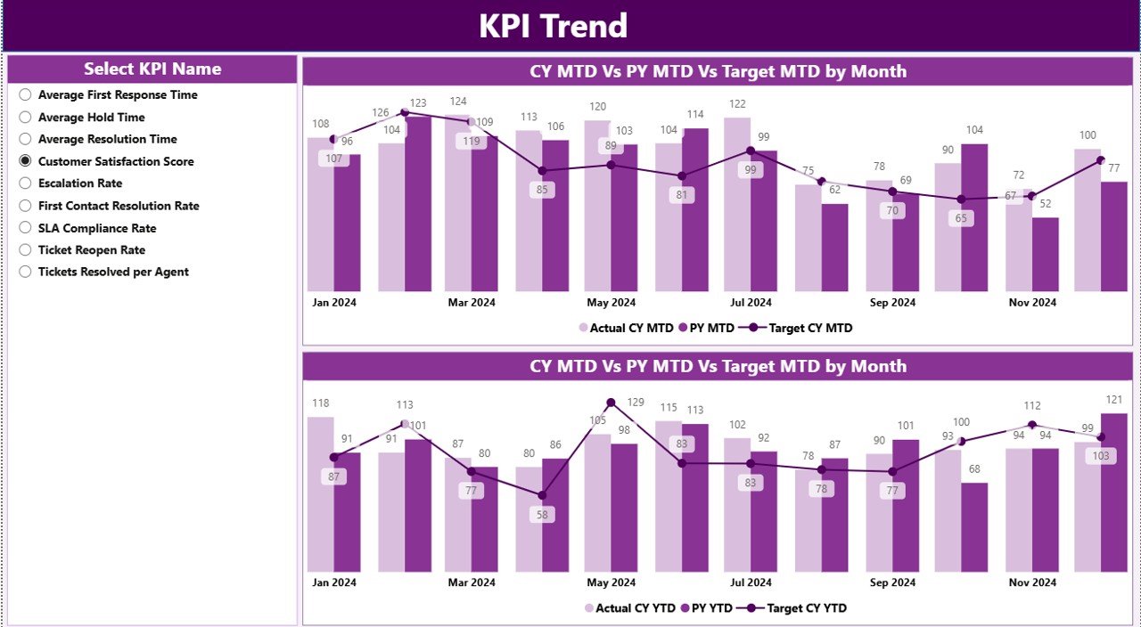
KPI Trend Page — MTD and YTD Combo Charts
3) KPI Definition Page
The KPI Definition page is a hidden drill-through page. From the Summary page, right-click any KPI row and choose Drill through to see that KPI’s formula and definition in detail — a useful onboarding aid when a new analyst or support team lead joins. To return to the main page, click the back button at the top-left corner.
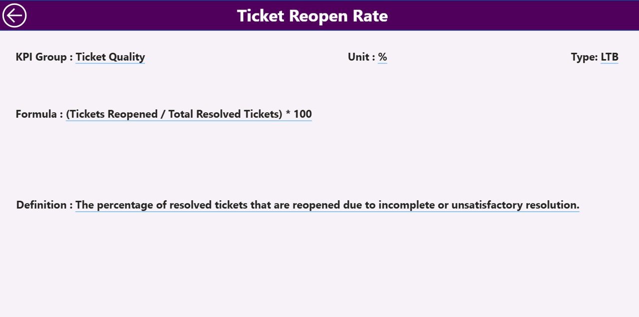
KPI Definition Page — Drill-Through Detail
Excel Data Source
The dashboard pulls from an Excel file with three worksheets:
- Input_Actual — fill in the Actual number per KPI Name, Month (use the first date of the month), MTD number, and YTD number.
- Input_Target — fill in the Target number per KPI Name, Month (first date of the month), MTD number, and YTD number.
- KPI Definition — fill in KPI Number, KPI Group, KPI Name, Unit, Formula, Definition, and Type (LTB or UTB).
Once the three tabs are populated, open the .pbix file in Power BI Desktop (free download from Microsoft) and click Refresh. All three pages update automatically.
Customer Support SLA Dashboard vs. Tableau Alternative vs. Paid Help-Desk SaaS — Feature Comparison
| Feature | This Power BI Dashboard | Tableau / Qlik Equivalent | Paid Help-Desk SaaS (Zendesk Explore, Freshdesk, ServiceNow) |
|---|---|---|---|
| Cost | $11.99 one-time | $70–$150 / user / month | $25–$215 / agent / month |
| Platform | Power BI Desktop (free from Microsoft) | Tableau / Qlik Sense | Vendor-hosted SaaS portal |
| Setup time | Under 10 minutes — fill 3 Excel tabs | 2–4 hours data modeling | 2–8 weeks implementation |
| MTD & YTD vs PY comparison | ✅ Built in | Custom calculations needed | Limited (vendor-defined) |
| Drill-through to KPI definitions | ✅ Hidden page included | Build manually | Rare |
| Custom KPIs (LTB / UTB) | ✅ Just edit the Excel tab | Edit data source + formulas | Restricted to vendor catalog |
| Year-1 cost at 5 agents | $11.99 | $4,200–$9,000 | $1,500–$12,900 |
| Lifetime access | ✅ One-time payment | ❌ Recurring | ❌ Recurring |
For support teams that want SLA-grade KPI tracking without paying $1,500+ per year for help-desk analytics add-ons, the Customer Support SLA KPI Dashboard in Power BI sits in the sweet spot.
Who Should Use This Template
Perfect for:
- Customer support managers at 10–500 person companies who report monthly SLA performance to leadership.
- Help-desk team leads tracking First Response Time, Resolution Time, and CSAT against monthly targets.
- BPO and contact center supervisors managing multiple SLA tiers who need a defensible monthly scorecard for their client.
- IT service managers running ITIL-style support operations who report incident SLA compliance to the business.
- Customer experience analysts who already export ticket data from Zendesk, Freshdesk, or ServiceNow and need a clean monthly reporting layer.
Not a fit if:
- You need real-time SLA breach alerting wired live into a help-desk system — that’s a Zendesk Explore or ServiceNow Performance Analytics use case.
- Nobody on the team can edit an Excel file. The dashboard is template-driven, not zero-touch.
- You want live ticket queue management. This is a monthly KPI reporting tool, not a ticketing system.
Real-World Use Cases
Megan runs customer support at a 220-person SaaS company. Every month she reports 12 SLA KPIs to the COO. She uses the Customer Support SLA KPI Dashboard in Power BI to track First Response Time, Resolution Time, SLA Compliance %, First Contact Resolution Rate, and CSAT against targets, then exports the Summary page to PDF for the leadership pack — replacing a $9,600/year Zendesk Explore Professional subscription her team rarely fully used.
Rohan is a contact center supervisor managing a 35-agent help desk for a mid-market BFSI client. He duplicates the .pbix file at the start of each quarter, swaps the Excel data, and delivers branded monthly SLA scorecards to the client within 30 minutes. The drill-through KPI Definition page means new account managers don’t have to ask what each metric measures.
Priya leads CX analytics at a 90-person ecommerce company. She tracks MTD vs Target on 14 support KPIs, and the CY-vs-PY columns let her show the leadership team a clear year-over-year trend on response and resolution times — exactly the evidence the board wants when reviewing whether to invest in headcount or automation.
Advantages of the Customer Support SLA KPI Dashboard
- One-time cost replaces recurring SaaS spend. A typical 5-agent help desk pays $1,500–$12,900 per year for analytics tooling. A one-time $11.99 purchase keeps the budget for headcount or training.
- Same-template scaling. The same .pbix can serve a 5-agent team and a 50-agent team — only the Excel data source grows.
- Audit-friendly KPI definitions. The drill-through KPI Definition page documents the formula and meaning of every metric, which compliance and audit teams routinely ask for in BPO and ITIL environments.
- Plays well with existing help-desk tools. Zendesk, Freshdesk, ServiceNow, Salesforce Service Cloud, and Jira Service Management all export ticket data to Excel. This dashboard becomes the executive reporting layer on top of that operational data.
- Year-over-year storytelling. The CY vs PY MTD and YTD columns make it easy to demonstrate improvement trends in leadership reviews — far easier than rebuilding a comparison every quarter.
Opportunities for Improvement
To set realistic expectations, here are the trade-offs worth knowing:
- Refresh is manual. The dashboard refreshes when you click Refresh in Power BI Desktop or schedule a refresh in the Power BI Service. It is not a real-time live feed.
- Excel is the data source. Pulling thousands of raw tickets directly from a help-desk API into the Excel tabs is out of scope — the file expects pre-aggregated monthly KPI numbers, which is the right grain for SLA reporting but not for operational ticket analysis.
- Single-year focus per file. Each .pbix is set up around one Current Year and one Previous Year. Multi-year historical analysis is best done by archiving prior-year files rather than expanding the same template.
- No row-level security out of the box. If you publish to the Power BI Service for multiple regional support teams, you’ll need to add RLS rules manually.
Best Practices
- Standardize KPI definitions before populating data. Fill the KPI Definition tab first — Group, Name, Unit, Formula, Type — and freeze the list before loading any Actual / Target numbers.
- Use the first date of the month. The dashboard expects month-anchored dates, so always use the first day of each month in the Input_Actual and Input_Target tabs.
- Mark KPIs LTB or UTB carefully. Response Time and ticket backlog are LTB (Lower the Better). SLA Compliance %, CSAT, and First Contact Resolution Rate are UTB (Upper the Better). The icon logic depends on this.
- Refresh in Power BI Desktop after every Excel update. Saving Excel does not automatically refresh the .pbix. Click Home > Refresh.
- Lock the Excel file with a clear monthly cadence. Lock the previous month’s Actuals before publishing the leadership pack to keep numbers stable for board reviews.
- Add company branding once, not every month. Theme colors, header logo, and titles live in the .pbix — set them up in month one and they carry forward.
Explore Relevant Templates
If the Customer Support SLA KPI Dashboard fits your reporting cadence, these companion Power BI KPI scorecards use the same 3-page architecture and Excel-driven workflow:
- Cybersecurity Risk Assessment KPI Dashboard in Power BI — security KPI scorecard with the same Summary, Trend, and Definition page structure, ideal for CISOs reporting to the board.
- SaaS Onboarding Dashboard in Power BI — Customer Success companion for tracking time-to-value, activation rates, and onboarding completion.
- Office IT Helpdesk Dashboard in Power BI — operational ticket-volume view for IT helpdesks, complementary to this SLA-focused scorecard.
Browse the full Power BI KPI Dashboard collection on NextGenTemplates for more SLA, finance, HR, and operations scorecards.
Frequently Asked Questions
What KPIs does the Customer Support SLA KPI Dashboard track?
The Customer Support SLA KPI Dashboard in Power BI tracks any SLA KPIs you define in the Excel KPI Definition tab — typical examples include First Response Time, Average Handle Time, Resolution Time, SLA Compliance %, First Contact Resolution Rate, CSAT, NPS, ticket backlog, and escalation rate.
How does this compare to Zendesk Explore or Freshdesk Analytics?
Zendesk Explore and Freshdesk Analytics cost $25–$215 per agent per month with live ticket data and breach alerting. The Customer Support SLA KPI Dashboard in Power BI is a one-time $11.99 purchase for monthly board-style SLA reporting — ideal for teams that already have a help-desk tool and just need a clean, audit-friendly reporting layer on top.
How long does setup take?
Setup of the Customer Support SLA KPI Dashboard takes under 10 minutes if you already have your KPI list and target values ready. You fill the three Excel tabs (Input_Actual, Input_Target, KPI Definition), open the .pbix in Power BI Desktop, and click Refresh — all three pages update automatically.
Do I need Power BI Pro or just Power BI Desktop?
Power BI Desktop (free from Microsoft) is enough to open and edit the Customer Support SLA KPI Dashboard in Power BI. Power BI Pro is only needed if you want to publish to the Power BI Service and share live dashboards with colleagues — for PDF exports and personal use, free Desktop is sufficient.
Can I add or remove SLA KPIs?
Yes. Add a new row in the KPI Definition tab of the Excel data source, then add corresponding monthly rows in Input_Actual and Input_Target. The Customer Support SLA KPI Dashboard will pick up the new KPI automatically on the next refresh — no DAX edits required.
What is LTB vs UTB?
LTB (Lower the Better) applies to KPIs where a lower value is good — for example, First Response Time or ticket backlog. UTB (Upper the Better) applies to KPIs where a higher value is good — for example, SLA Compliance % or First Contact Resolution Rate. The dashboard automatically flips the red/green icon logic per KPI type.
Can I rebrand the dashboard with my company colors and logo?
Yes. Open the .pbix file in Power BI Desktop and edit the theme colors, header images, and titles. The Customer Support SLA KPI Dashboard structure stays intact — only the visual styling is updated.
About the Author
Built by PK — Microsoft Certified Professional with 15+ years of Excel, Google Sheets, and Power BI experience. Founder of NextGenTemplates, reaching 300K+ subscribers across YouTube channels (@PK-AnExcelExpert, @NextGenTemplates, @NeoTechNavigators). Every template is hand-built and tested before release.
Conclusion
The Customer Support SLA KPI Dashboard in Power BI packages monthly SLA reporting into a clean 3-page deliverable: a Summary page with red/green status icons, a KPI Trend page for combo-chart drill-down, and a hidden KPI Definition drill-through page for documentation. Powered by an Excel data source — Input_Actual, Input_Target, and KPI Definition — it is ready for any support manager who wants to retire a per-agent SaaS analytics subscription and own the reporting outright.
👉 Click here to Purchase the Customer Support SLA KPI Dashboard in Power BI
✅ Instant download · One-time payment · No subscription · Lifetime access
Visit our YouTube channel for step-by-step Power BI tutorials: YouTube.com/@PK-AnExcelExpert
📅 Last updated: April 2026