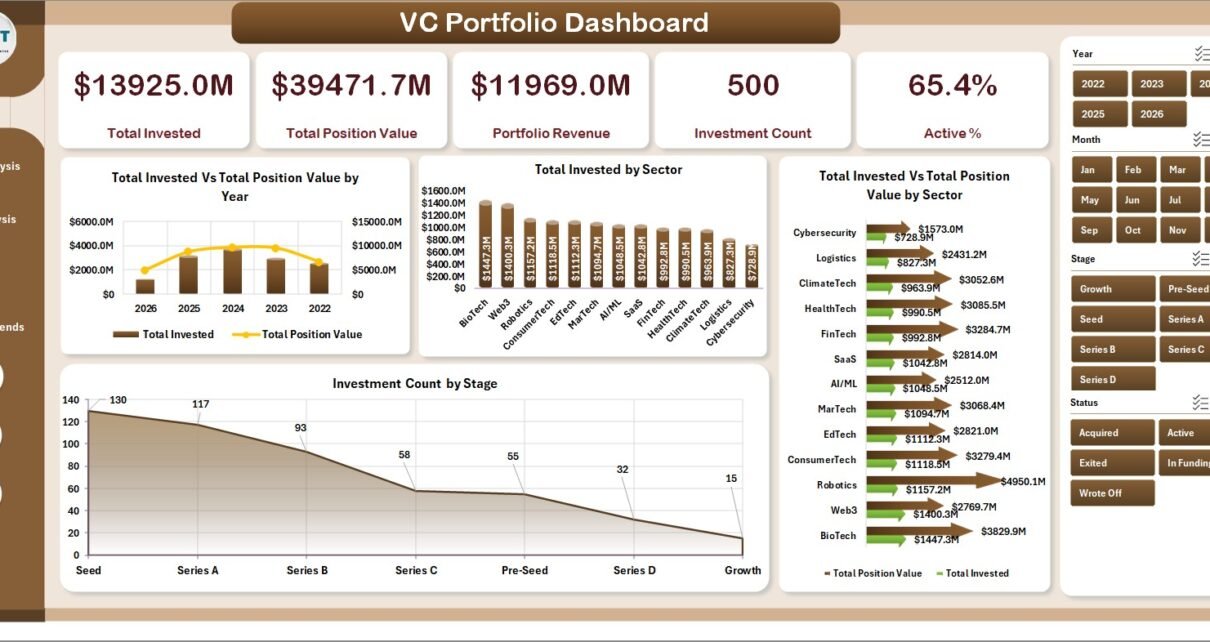
The VC Portfolio Dashboard in Excel tracks 5 fund-level KPIs and 20+ pivot-driven charts across 5 interactive analytics pages. It covers every dimension a venture investor reviews monthly — invested capital, position value, portfolio revenue, ROI by sector and stage, lead partner performance, runway, monthly burn, and regional concentration. Setup takes under 10 minutes and the entire workbook refreshes from a single click.
Most emerging-manager VC funds, family offices, and corporate venture (CVC) teams don’t need the $24,000-a-year overhead of Carta or Visible to run a clean quarterly LP report. They need a workbook that ingests their portfolio data, surfaces the right cuts, and exports cleanly to PDF for the LP letter. The VC Portfolio Dashboard in Excel does exactly that — pivot tables on the back, slicers on the front, and a structured Data sheet you paste into.
Key Features of the VC Portfolio Dashboard in Excel
- 5 interactive analytics pages — Overview, Sector Analysis, Stage Analysis, Partner Performance, and Regional Trends — plus a Data sheet and a hidden Support sheet.
- 5 fund-level KPI cards on the Overview page: Total Invested, Total Position Value, Portfolio Revenue, Investment Count, and Active %.
- 20+ pivot-driven charts covering ROI %, Avg. Monthly Burn, Avg. Runway Months, Active %, and Exit % across sectors, stages, lead partners, and regions.
- Slicers on every page for one-click filtering by Sector, Stage, Lead Partner, Region, Status, and Risk Level.
- Native Excel only — pivot tables, slicers, and pivot charts. No VBA macros, no Power Query, no add-ins required. Compatible with Excel 2016, 2019, 2021, Microsoft 365, and Excel for Mac.
- One-click refresh via Data → Refresh All, plus a fully unlocked workbook so you can add custom KPIs and rebrand it for client engagements.
Dashboard Pages Explanation
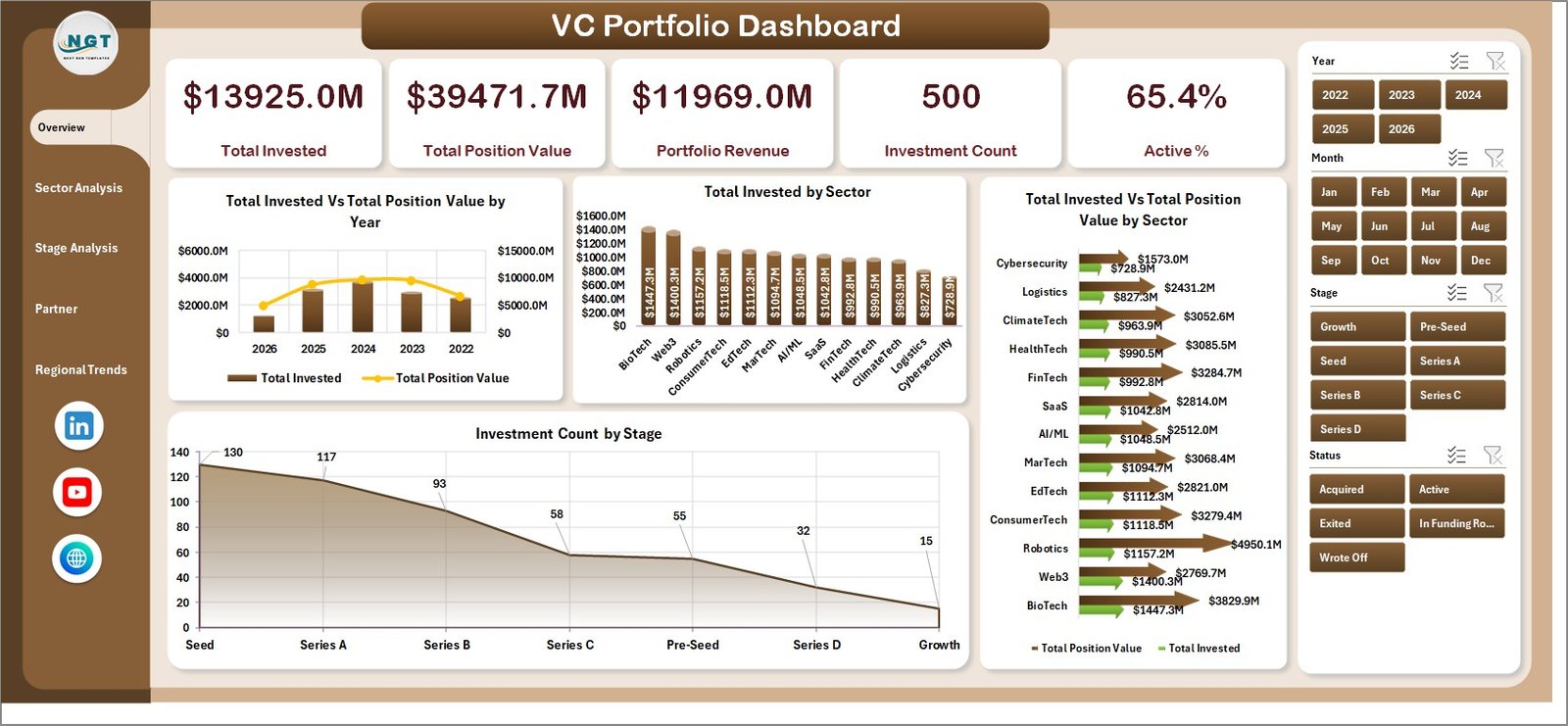
1. Overview Page
The Overview page is the fund-level command centre. The five KPI cards — Total Invested, Total Position Value, Portfolio Revenue, Investment Count, and Active % — sit above four interactive charts:
- Total Invested vs. Total Position Value by Year — vintage-year value creation: which years the fund has marked up, and which still sit at cost.
- Total Invested by Sector — capital allocation by industry vertical.
- Total Invested vs. Total Position Value by Sector — where the markups are concentrated.
- Investment Count by Stage — pre-seed/seed/Series A/Series B+ deal mix.
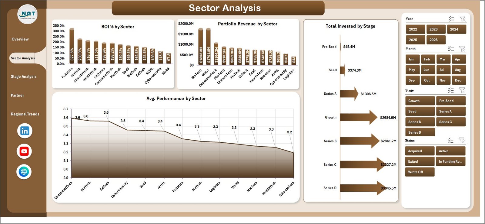
2. Sector Analysis
Use this page to compare sector performance side-by-side. The four charts are ROI % by Sector, Portfolio Revenue by Sector, Total Invested by Stage, and Avg. Performance by Sector. Together they tell partners where the next fund should deploy more capital and which sectors should be put on a temporary pause.
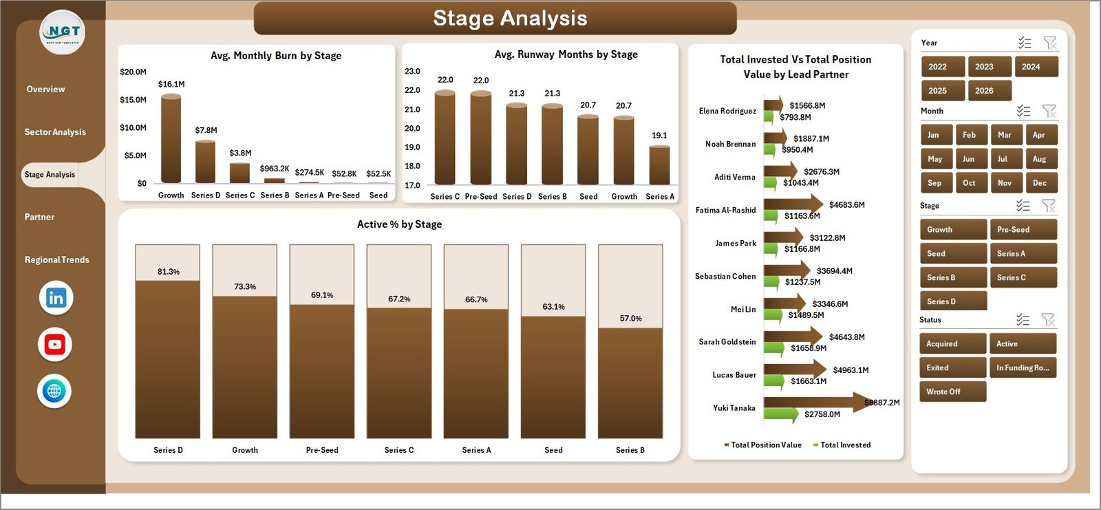
3. Stage Analysis
The operational health page. Charts: Avg. Monthly Burn by Stage, Avg. Runway Months by Stage, Total Invested vs. Total Position Value by Lead Partner, and Active % by Stage. This is the page that catches the Series A company running out of runway before the partner check-in flags it — and the one that anchors the carry-allocation conversation each year.
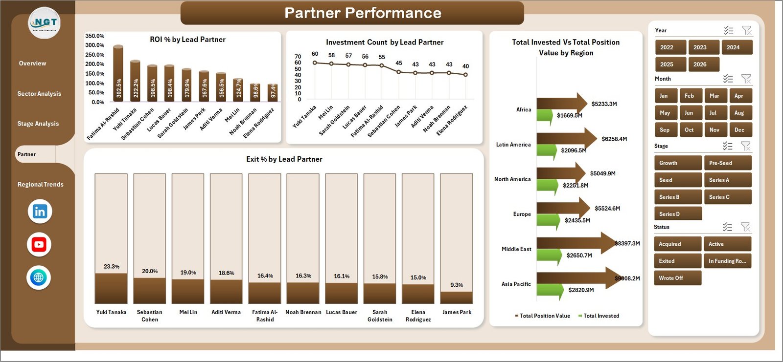
4. Partner Performance
The carry-allocation page. ROI % by Lead Partner, Investment Count by Lead Partner, Total Invested vs. Total Position Value by Region, and Exit % by Lead Partner together show which partners are sourcing high-performance deals and which need to revisit their thesis. Managing partners use this page for compensation reviews and for sizing each partner’s discretionary budget for the next vintage.
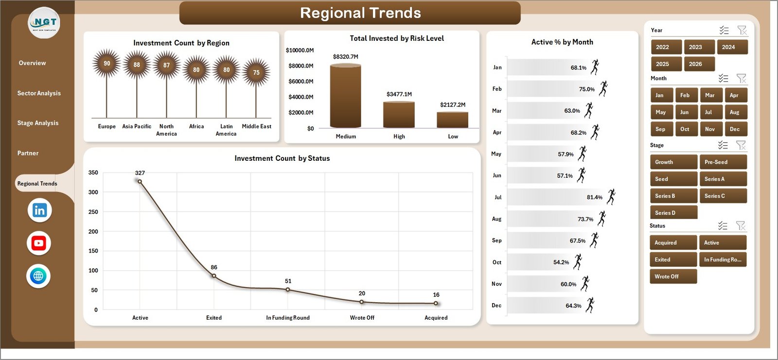
5. Regional Trends
The geographic exposure and risk page. Investment Count by Region, Total Invested by Risk Level, Active % by Month (cohort survival over time), and Investment Count by Status (Active, Exited, Written Off, Acquired, IPO). LPs ask for the regional concentration cut every quarter — this page produces it in one click.
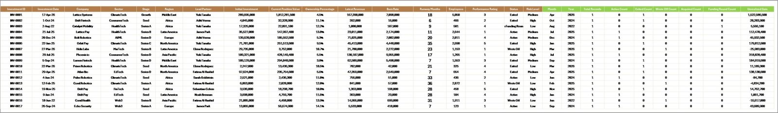
6. Data Sheet
This is the input layer. Every column is pre-headered: Company Name, Sector, Stage, Region, Lead Partner, Invest Date, Invested Amount, Position Value, Portfolio Revenue, Monthly Burn, Runway Months, Status, Risk Level, Active Flag, and Exit Flag. Add as many rows as your fund needs — the dashboard scales to thousands of portfolio companies.
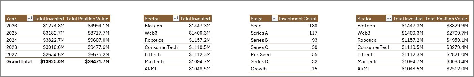
7. Support Sheet
The pivot engine. After updating the Data sheet, click Data → Refresh All in the Excel ribbon — every pivot table on this sheet refreshes, and every chart and KPI card across the five dashboard pages updates instantly. Read more on how Excel pivot tables work in Microsoft’s official pivot-table guide. Once the dashboard is live for end users, you can hide this sheet via right-click → Hide.
VC Portfolio Dashboard in Excel vs. Google Sheets vs. Paid VC Portfolio SaaS — Feature Comparison
| Feature | VC Portfolio Dashboard in Excel | Google Sheets equivalent | Carta / AngelList / Visible |
|---|---|---|---|
| Cost | $17.99 one-time | $9 – $15 one-time | $2,400 – $24,000 / year |
| Platform | Microsoft Excel (Win + Mac) | Google Sheets (cloud only) | Cloud SaaS |
| Setup time | Under 10 minutes | Under 15 minutes | 4 – 12 weeks (data migration) |
| Data ownership | 100% yours (local file) | Google account | Vendor servers |
| Custom KPIs and charts | Unlimited | Unlimited | Restricted to vendor templates |
| Works offline | ✅ Yes | ❌ No | ❌ No |
| LP-ready PDF export | ✅ Native | ✅ PDF export | Branded reports (paid tier) |
| Year-1 cost at 5 fund-team users | $17.99 | $9 – $15 | $12,000 – $120,000 |
For emerging managers and family offices that want LP-ready portfolio reporting without paying $20K/year for Carta or Visible, the VC Portfolio Dashboard in Excel sits in the sweet spot.
Who Should Use This Template
Perfect for:
- Emerging-manager VC funds (Fund I – Fund III) tracking 10 – 80 portfolio companies in a single workbook.
- Family offices and angel syndicates that need a clean view of invested capital, position value, and ROI by sector.
- Corporate venture (CVC) teams reporting portfolio health to a parent-company finance committee.
- Accelerator and incubator program managers tracking cohort progression, runway, and exits.
- Finance MBAs and consultants building a VC portfolio model for case studies or client engagements.
Not a fit if:
- You run a Tier-1 fund with $1B+ AUM and need SOC 2 certification, multi-currency, and SSO.
- You need real-time SAFE/convertible-note valuation, full cap-table modelling, or 409A integration.
- Your team doesn’t use Excel or Google Sheets.
Real-World Use Cases
Maya — Portfolio Operations, $120M Emerging-Manager VC Fund. Every quarter Maya replaces the Data sheet with the latest portfolio export, hits Refresh All, and uses the Sector Analysis and Stage Analysis pages to draft the LP letter. The Active % by Stage chart catches struggling Series A companies before the partner check-in. The Total Invested vs. Total Position Value by Lead Partner chart feeds straight into the carry-allocation discussion. Replaces about 6 hours of manual reporting per quarter — and avoids the $24,000/year that Visible would cost her firm.
Arjun — CIO, Single-Family Office, $40M across 35 angel investments. Arjun uses the Overview page weekly to track Total Invested vs. Total Position Value by Year and the Regional Trends page to monitor concentration in any single geography. The Investment Count by Status chart lets him present a clean Active / Exited / Written Off split to the principal at the monthly review.
Lakshmi — Corporate Venture Lead, Fortune 500 Industrial Company. She maintains a 12-company CVC portfolio and reports to the CFO every month. The Partner Performance page and Total Invested vs. Position Value by Region chart together give her a one-page view of value creation by deal lead and by geography — the format the parent-company finance committee asks for.
Advantages of the VC Portfolio Dashboard in Excel
- Cost efficiency. $17.99 one-time vs. $2,400 – $24,000/year for cloud VC SaaS — a payback of roughly two days for a small fund.
- Time savings. Replaces 4 – 6 hours of manual reporting per quarter for a typical 30-portfolio-company fund.
- Data ownership. The workbook lives on your local drive (or your fund’s SharePoint). Nothing leaves your control.
- Auditability. Every chart traces to a pivot table on the Support sheet, which traces to a row in the Data sheet — full lineage for LP audits.
- Customisability. The file is fully unlocked. Add a new KPI like DPI or TVPI by adding a column in the Data sheet, dropping a pivot measure on the Support sheet, and linking a cell on the Overview page.
Opportunities for Improvement
To set realistic expectations: the VC Portfolio Dashboard in Excel is a portfolio reporting dashboard, not a full fund-administration suite. It does not handle SAFE/convertible-note conversion modelling, IRR/TVPI/DPI computation natively (you can add it as a column in the Data sheet), multi-currency translation at FX rates, or LP capital-call and distribution waterfalls. Funds with those needs typically pair the dashboard with a separate fund-admin solution. The workbook is also a single-file model, which means real-time multi-user collaboration is not native — for that, an investment manager would copy the structure into Google Sheets or move to a SaaS platform.
Best Practices
- Refresh the Data sheet at a fixed cadence (monthly or quarterly) and timestamp each refresh in a hidden cell — this gives the LP letter a clear “as-of” date.
- Use the Risk Level column actively. Tag every company as Low / Medium / High based on burn-vs-runway, then watch the Total Invested by Risk Level chart on the Regional Trends page.
- Hide the Support sheet before sharing the file with the IC, LPs, or external advisors — it’s the engine, not the deliverable.
- Export individual pages as PDF (one page per PDF) and drop them straight into the LP letter Word document. The chart resolution holds up at print scale.
- If you run multiple funds, save one copy per fund (Fund I.xlsx, Fund II.xlsx) — the dashboard is fund-scoped, not multi-fund.
Explore Relevant Templates
- Investor Relations Dashboard in Power BI — for funds and startups managing LP and shareholder communications.
- Business Angel Networks KPI Dashboard in Excel — for angel syndicates and angel network managers.
- Crowdfunding Platforms KPI Dashboard in Excel — for equity and rewards crowdfunding operators.
- SaaS Financial Model Dashboard in Power BI — pairs well for VC-backed SaaS portfolio companies.
- Startup Hubs KPI Dashboard in Power BI — for startup ecosystem and accelerator program operators.
- Browse all Excel Dashboard Templates on NextGenTemplates.
Frequently Asked Questions
What KPIs does the VC Portfolio Dashboard in Excel track?
The VC Portfolio Dashboard in Excel tracks 5 fund-level KPIs — Total Invested, Total Position Value, Portfolio Revenue, Investment Count, and Active % — alongside 20+ pivot-driven charts covering ROI %, Avg. Monthly Burn, Avg. Runway Months, Active %, and Exit % across sectors, stages, lead partners, and regions.
Will this dashboard work on Excel for Mac?
Yes. The VC Portfolio Dashboard in Excel uses only native Excel features — pivot tables, slicers, pivot charts, and KPI cards — fully supported on Excel for Mac (2016 onwards) and Microsoft 365 for Mac. There are no VBA macros, no Power Query, and no platform-specific features.
How does this compare to Carta or Visible.vc?
Carta and Visible are full-stack VC portfolio SaaS tools costing $2,400 – $24,000 per year and require 4 – 12 weeks of data migration. The VC Portfolio Dashboard in Excel is a $17.99 one-time purchase delivering the same portfolio-level KPI cards, sector/stage breakdowns, and partner ROI views — without the subscription, the migration project, or the vendor lock-in.
How many portfolio companies can the dashboard handle?
The dashboard has been tested with up to 5,000 portfolio rows. For typical emerging-manager and family-office use cases (10 – 200 companies, 4 – 8 quarters of history each), the VC Portfolio Dashboard in Excel refreshes in 1 – 3 seconds on standard hardware.
How long does setup take?
Setup takes under 10 minutes. Open the file, paste your portfolio data into the Data sheet, click Refresh All, and every page is live. The included sample dataset lets you explore the VC Portfolio Dashboard in Excel before loading your own numbers.
Can I add custom KPIs like DPI or TVPI?
Yes — the template is fully unlocked. To add DPI (Distributions to Paid-In) or TVPI (Total Value to Paid-In), add a column in the Data sheet, drop a pivot measure on the Support sheet, and link a cell on the Overview page. Chart colours and slicer styles can also be changed via Excel’s standard ribbons.
Is this a one-time purchase or a subscription?
One-time purchase. Pay $17.99 once, download the file, use it forever. No recurring fees, no per-user seats, no usage caps. Use the VC Portfolio Dashboard in Excel on as many machines, funds, and client engagements as you want.
About the Author
Built by PK — Microsoft Certified Professional with 15+ years of Excel, Google Sheets, and Power BI experience. Founder of NextGenTemplates, reaching 300K+ subscribers across YouTube channels. Every template is hand-built and tested before release. Subscribe to Youtube.com/@PK-AnExcelExpert for step-by-step tutorials.
Conclusion
For emerging-manager VC funds, family offices, and corporate venture teams, the VC Portfolio Dashboard in Excel hits the rare combination of LP-grade reporting, full data ownership, and a one-time price tag. The 5 KPI cards on the Overview page give partners the high-level read in 30 seconds, and the four analytics pages (Sector, Stage, Partner, Regional) cover every cut LPs ask for during the quarterly review.
👉 Click here to Purchase the VC Portfolio Dashboard in Excel on NextGenTemplates.
✅ Instant download · One-time payment · No subscription
Last updated: May 2026