The Oil and Gas Analysis Dashboard in Power BI is built for upstream and downstream operators who want a single, refresh-ready board view of revenue, production, profit margin, downtime, and safety compliance — without paying $30,000 a year for an enterprise oil & gas analytics platform. This post walks through every page, every KPI, and every visual in the .pbix file so you can decide if it’s the right fit for your operation.
Click to buy Oil and Gas Analysis Dashboard in Power BI
The dashboard tracks 5 executive KPI cards, ships 13+ pre-built visuals across 5 pages, supports cross-page slicers, and works with Row-Level Security (RLS). Setup takes under 10 minutes. One-time payment of $17.99 — no subscription, no per-user fees.
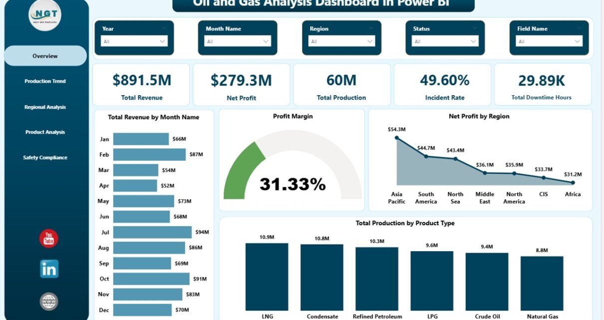
Oil and Gas Analysis Dashboard in Power BI — Overview page
🔑 Key Features at a Glance
- 5 KPI cards — Total Revenue, Net Profit, Total Production, Incident Rate, and Total Downtime Hours.
- 5 dashboard pages — Overview, Production Trend, Regional Analysis, Product Analysis, and Safety Compliance.
- 13+ pre-built visuals — column, bar, donut, gauge, and trend charts; no DAX writing required.
- Cross-page slicers — filter by region, field, operator, well type, product type, or month and the entire dashboard reflows.
- Editable .pbix — open in free Power BI Desktop, replace data, and refresh.
- RLS-ready — Power BI’s native Row-Level Security works out of the box for regional access control.
- Power BI Service compatible — publish the .pbix to the cloud workspace for browser and mobile access.
📊 Dashboard Walkthrough — Page by Page
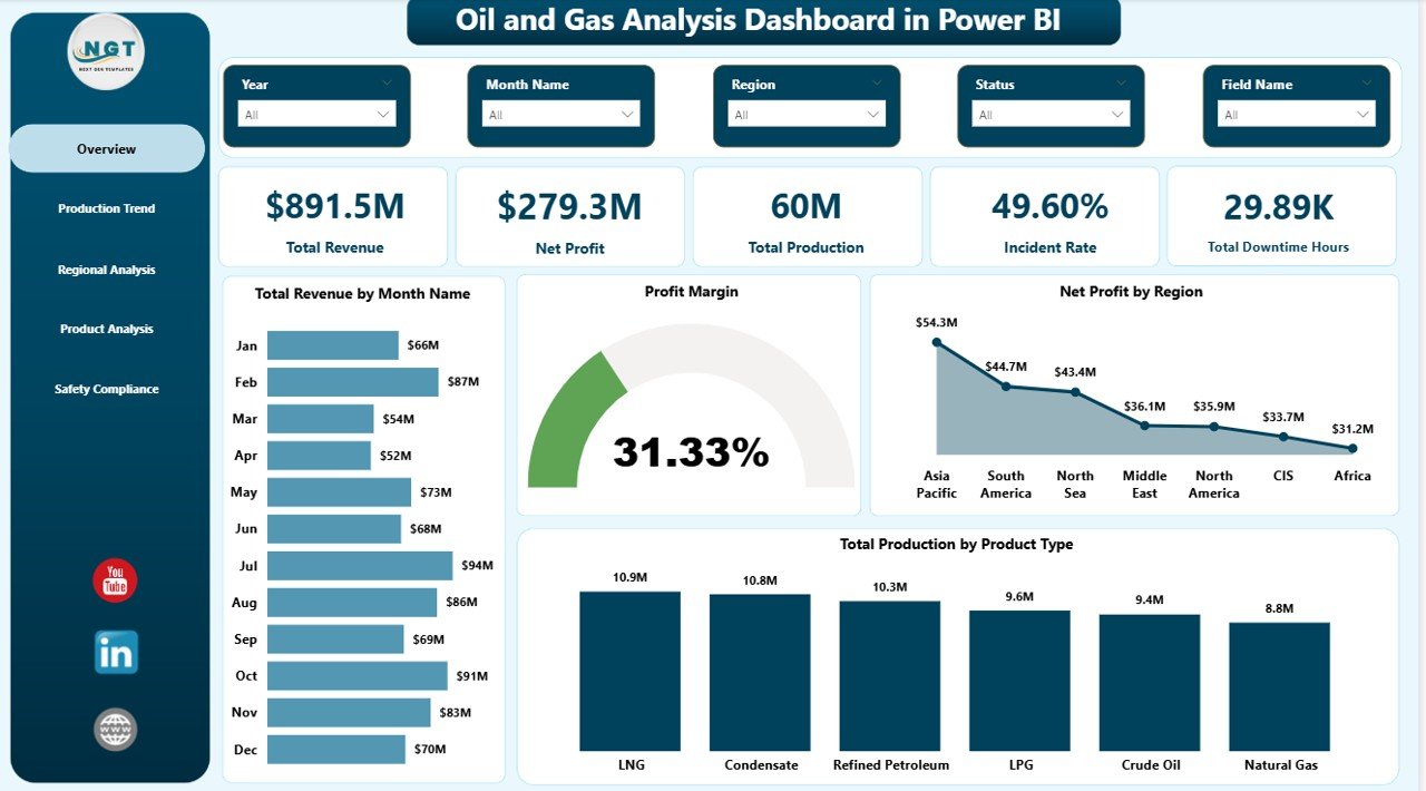
Page 1 — Overview
The Overview page is the executive landing screen. Five KPI cards anchor the top of the canvas: Total Revenue, Net Profit, Total Production, Incident Rate, and Total Downtime Hours. These are the same five metrics that show up on most upstream operator monthly reviews. They give a one-glance sense of whether the business made money, produced what it planned, and stayed safe.
Below the cards, four analytical visuals tell the rest of the story:
- Total Revenue by Month Name — month-by-month revenue swings to spot seasonality and price-cycle effects.
- Profit Margin — KPI gauge showing margin against a target line.
- Net Profit by Region — bar chart breaking down profitability by geography.
- Total Production by Product Type — donut chart splitting volume across crude, gas, condensate, and refined products.
Page 2 — Production Trend
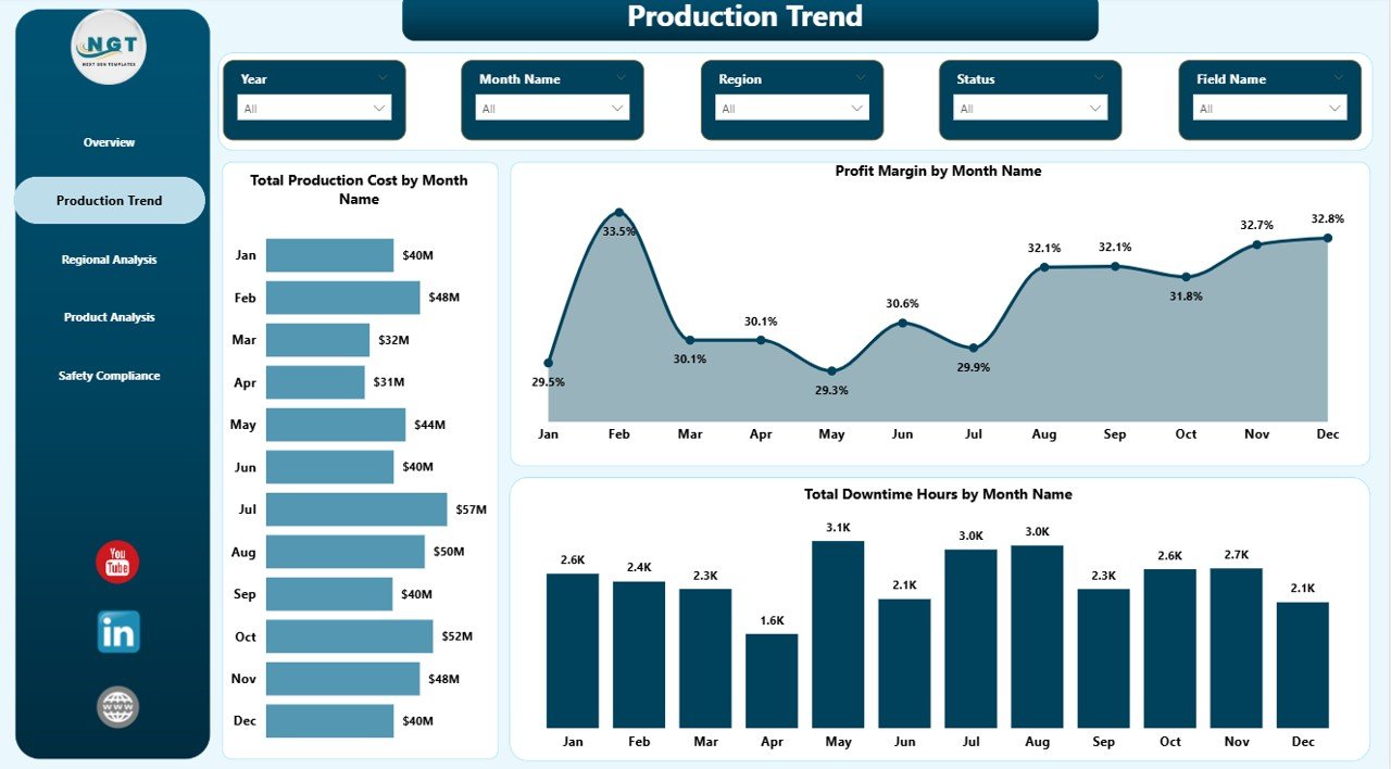
Page 2 focuses entirely on time-series performance with three trend visuals:
- Total Production Cost by Month Name — line chart that shows whether unit production costs are creeping up or trending down.
- Profit Margin by Month Name — month-over-month margin trajectory; the leading indicator for whether revenue growth is profitable growth.
- Total Downtime Hours by Month Name — bar chart that surfaces unplanned outages, planned maintenance windows, and seasonal downtime.
This is the page operations managers open first on Monday mornings.
Page 3 — Regional Analysis
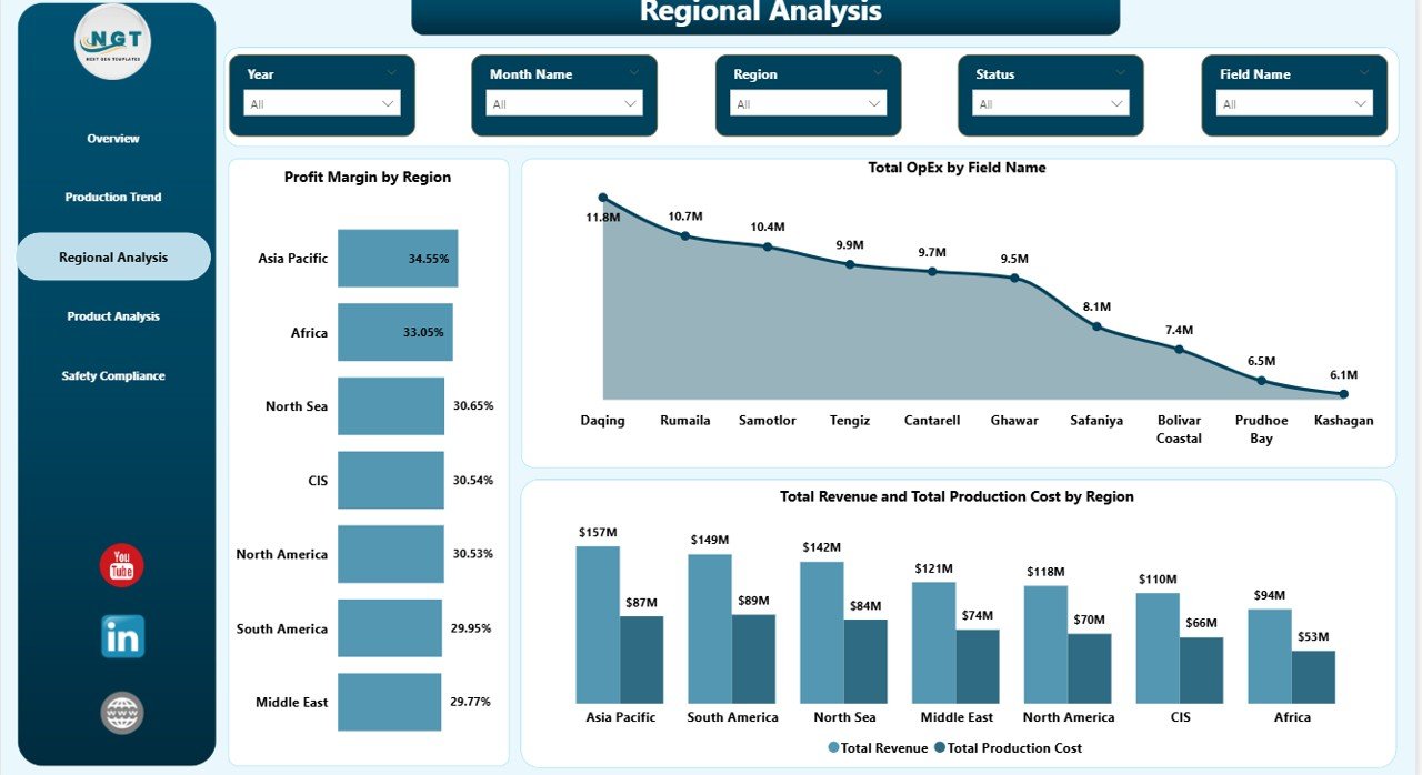
Page 3 cuts the entire dataset by geography, which is exactly the view E&P managers and regional VPs ask for:
- Profit Margin by Region — horizontal bar chart ranking regions by net margin.
- Total OpEx by Field Name — drills below region into individual fields, exposing the cost-intensive assets.
- Total Revenue and Total Production Cost by Region — combination chart pairing top-line revenue with operating cost in the same visual; the gap between the two bars is the regional profit story.
Page 4 — Product Analysis
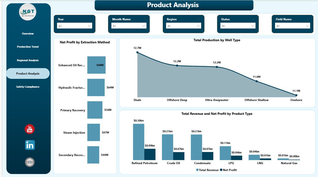
Page 4 reorients the data around what’s being produced and how it’s being extracted. It’s the page that informs portfolio and drilling-mix decisions.
- Net Profit by Extraction Method — compares profitability across conventional, hydraulic fracturing, EOR, thermal, and offshore methods.
- Total Production by Well Type — splits volume across vertical, horizontal, directional, and multilateral wells.
- Total Revenue and Net Profit by Product Type — paired bars revealing which high-revenue products are also high-margin.
Page 5 — Safety Compliance
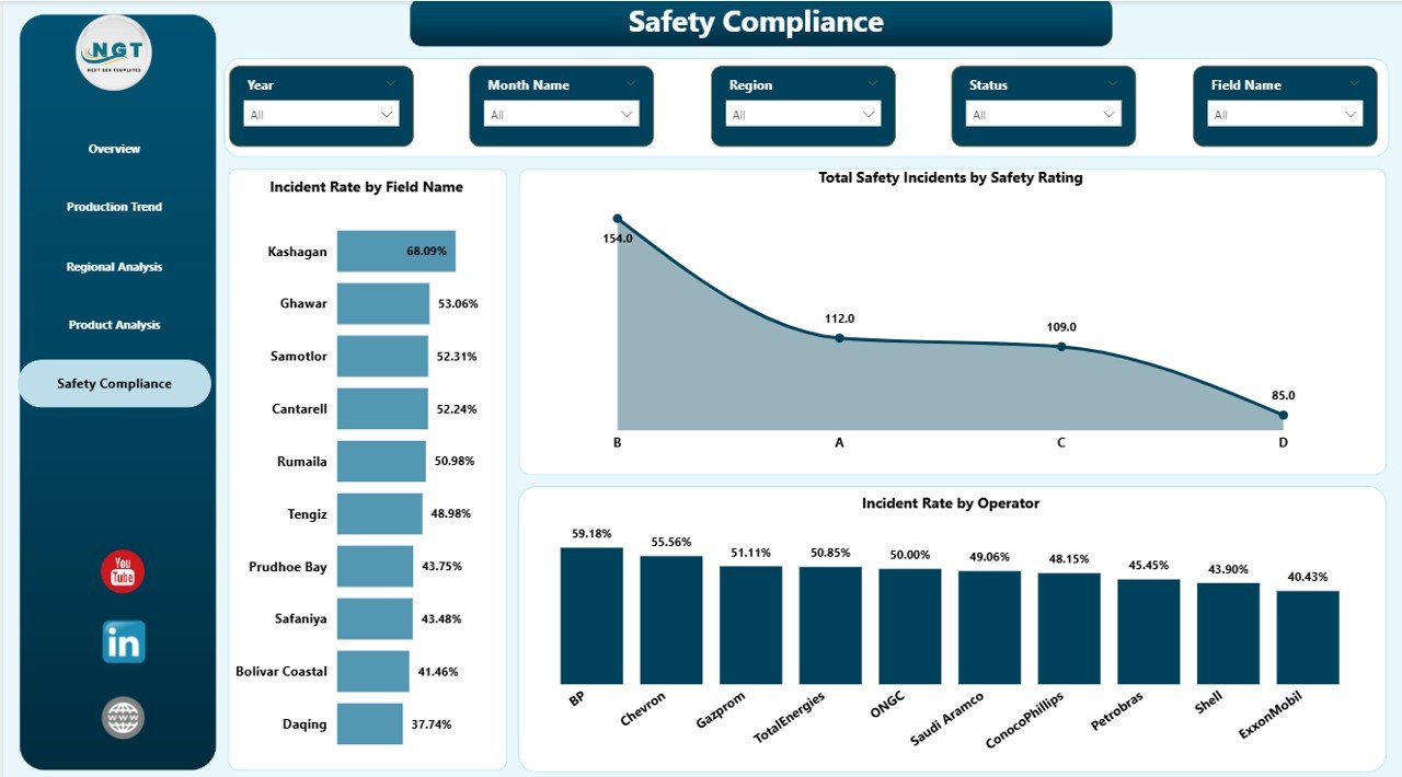
Safety is the page that often saves the business. It’s the standing slide in HSE reviews and contractor performance meetings:
- Incident Rate by Field Name — ranked bar chart showing exactly which fields have the highest incident frequency. This is your action list for HSE audits.
- Total Safety Incidents by Safety Rating — distribution of incidents across rating bands.
- Incident Rate by Operator — performance comparison across crews, contractors, and operating partners.
📋 Power BI vs Excel vs Paid Oil & Gas SaaS
The honest comparison most blog posts won’t write:
| Capability | This Power BI Template | Excel Sister Template | Spotfire / IHS / P2 SaaS |
|---|---|---|---|
| Cost | $17.99 one-time | $17.99 one-time | $8K – $40K+/year |
| Platform | Free Power BI Desktop | Microsoft Excel | Vendor portal |
| Setup time | < 10 minutes | < 10 minutes | 3–8 weeks |
| Cross-page slicers | Yes | Slicer-driven (per-page) | Yes |
| Browser & mobile | Yes (Power BI Service) | No | Yes |
| Auto-refresh from sources | Yes (SQL/SharePoint/ERP) | Manual / Power Query | Yes |
| Row-Level Security (RLS) | Yes | No | Yes |
| Year-1 cost (5 users) | ~$617.99 | $17.99 | $15K – $50K |
Year-1 cost for the Power BI version assumes Power BI Pro at $10/user/month for five users plus the one-time $17.99 template fee. Most teams already have Microsoft 365 E5 or equivalent, in which case the Pro license is bundled.
👥 Who Should Use This Dashboard
- ✅ E&P operations managers — Monday-morning briefings on revenue, production, and downtime across all fields.
- ✅ Oilfield finance controllers — monthly OpEx, CapEx, and net profit reporting by region.
- ✅ HSE managers — single-page incident-by-field-and-operator view for monthly safety committee meetings.
- ✅ Energy industry consultants — starter file for client deliverables; cuts engagement prep time from 2 weeks to 2 days.
- ✅ Power BI analysts new to oil & gas — working data model and DAX measure pattern to learn from.
💼 Real-World Use Cases
Use Case 1 — Independent E&P with 6 producing fields: The CEO wanted a single Monday-morning report covering revenue, net profit, downtime, and incident rate across all 6 fields. The team replaced the sample data with their monthly close exports and were live in under an hour. The Regional Analysis page replaced a 14-tab Excel pack the controller used to send weekly.
Use Case 2 — Oilfield service contractor working across 4 operators: The HSE lead used Page 5 (Safety Compliance) as their monthly contractor scorecard. The Incident Rate by Operator visual, paired with the Safety Rating distribution, became the standing slide in the contractor performance review meeting with their largest client.
Use Case 3 — Energy consulting firm: The team uses the .pbix as a starter file for client engagements. They duplicate, swap in client well-level data, rebrand the colour theme, and deliver a 5-page board pack in 2 days instead of building from scratch over 2 weeks.
✨ Advantages
- Fast time-to-value — under 10 minutes to swap data and refresh.
- No DAX writing required — every visual is wired to ready measures.
- Cross-page slicers mean a single filter applies across the entire dashboard, not just one page.
- Native Power BI features — RLS, mobile layouts, scheduled refresh, drill-through, all out of the box.
- One-time cost beats $30K+/year SaaS by an order of magnitude for small-to-mid operators.
⚠️ Opportunities for Improvement
Honest limitations worth knowing before purchase:
- This is a refresh-based BI report, not a streaming dashboard. If you need real-time SCADA or PI Historian integration, this is not the right tool.
- It does not include reservoir engineering models like decline-curve forecasting or production simulation. Those need specialist software like Aries or Harmony Enterprise.
- The data model uses a single denormalised fact table designed for clarity, not for billion-row scale. For very large data sets (50M+ rows), consider switching to a Direct Query or composite model.
- Currency is single-tenant in the sample file. If you operate in multiple currencies, you’ll need to add an FX conversion step in Power Query.
🛠️ Best Practices When Using This Dashboard
- Don’t hand-edit visuals. Modify the underlying measures and let the visual rebuild itself. This keeps the report maintainable.
- Use the Power Query editor to repoint the sample data source to your real source (SQL, SharePoint, OData). Never paste live data into the .pbix file directly.
- Set up scheduled refresh in Power BI Service so the dashboard refreshes automatically every morning before stand-up.Oil and Gas Analysis Dashboard in Power BI
- Configure RLS at the region level if you have regional managers; it’s the single biggest unlock once you publish to the Service.Oil and Gas Analysis Dashboard in Power BI
- Build a mobile layout for the Overview page so executives can check KPIs from their phone.
- Standardise field names in your source system before refreshing. The dashboard groups by Field Name and Operator — typos create duplicate categories.
The official Power BI documentation at powerbi.microsoft.com covers RLS configuration, scheduled refresh, and mobile layout in detail.
🔗 Explore Relevant Templates
If this dashboard fits your operation, these companion templates extend the analytics stack:
- 📊 Oil and Gas Analysis Dashboard in Excel — Excel sister template for teams that prefer pivot tables and slicers.
- 🛢️ Oil and Gas Dashboard in Power BI — the original single-page version, great for embedded reporting.
- ⚡ Energy Trading KPI Dashboard in Google Sheets — for trading and commercial teams.
- 🏭 Contract Manufacturing Dashboard in Power BI — same Power BI structure, contract-mfg context.
- 🔧 Preventive Maintenance Dashboard in Power BI — pairs well with the Safety Compliance page on the oil & gas dashboard.
- 📦 Browse all Power BI Dashboards on NextGenTemplates.
❓ Frequently Asked Questions
Do I need a paid Power BI license?
No. Power BI Desktop is free from Microsoft and lets you open, edit, and view the .pbix file. A Power BI Pro license (~$10/user/month) is only required if you want to publish to the Power BI Service and share with workspace members.
Can I connect this dashboard to SQL Server, SharePoint, or my ERP?
Yes. The template is built on Power Query. Repoint the data source from the sample file to SQL Server, Azure SQL, SharePoint Lists, OData, Oracle, SAP, or any other source supported by Power BI — without rebuilding any visuals.Oil and Gas Analysis Dashboard in Power BI
Does it support Row-Level Security?
Yes. Add RLS roles in Power BI Desktop, deploy them with the report to the Service, and assign Azure AD users or groups to roles. Regional managers see only their region; executives see all data; everyone uses the same .pbix.
What KPIs does it track?
Five executive KPIs on the Overview page — Total Revenue, Net Profit, Total Production, Incident Rate, Total Downtime Hours — plus 13+ analytical visuals across Production Trend, Regional Analysis, Product Analysis, and Safety Compliance.
How long does the setup take?
Under 10 minutes for most teams. Open the .pbix, paste your data into the existing data table, click Refresh, and all 5 pages update.
Is it editable? Can I rebrand the colours?
Yes. Power BI themes, colour palettes, fonts, logos, and visual headers are all editable. Most teams rebrand in 15–30 minutes using the JSON theme file approach.
Is there an Excel version?
Yes. The Oil and Gas Analysis Dashboard in Excel tracks the same KPIs using pivot tables and slicers in Excel. Both versions are sold separately.
👤 About the Author
Built by PK, Microsoft Certified Professional with 15+ years of Power BI, Excel, and Google Sheets experience. PK runs the YouTube channel @PK-AnExcelExpert with 300K+ subscribers across the network and has shipped 5,500+ dashboard templates serving 8,400+ customers in 40+ countries.
✅ Conclusion
The Oil and Gas Analysis Dashboard in Power BI is the right fit if you need a refresh-ready, executive-grade upstream analytics report without the implementation cost or annual licence fees of an enterprise SaaS. Five KPIs, five pages, 13+ visuals, cross-page slicers, RLS, and Power BI Service compatibility — all from a $17.99 one-time .pbix file.
If real-time SCADA or reservoir simulation is a hard requirement, this is not the right tool. For everyone else operating 1 to 50 fields who wants a single Monday-morning report, this is one of the fastest paths to an upstream BI capability.
👉 Click here to Purchase the Oil and Gas Analysis Dashboard in Power BI
Click to buy Oil and Gas Analysis Dashboard in Power BI