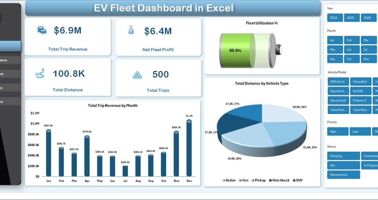
The EV Fleet Dashboard in Excel is a pivot-driven workbook that consolidates 5 fleet KPIs across 5 interactive pages, with 14 pre-built charts and slicers covering trip revenue, energy consumption, route economics, and driver scoring. Drop your trip log into the Data sheet, click Data → Refresh All, and every chart on every page redraws automatically — usually inside 10 minutes from open to first dashboard view.
🌍 Trusted by 8,400+ teams across 40+ countries who replace recurring fleet SaaS bills with one-time-purchase Excel, Google Sheets, Power BI, and HTML templates from NextGenTemplates.
✅ Instant download · One-time payment · No subscription · No per-vehicle fees · Lifetime access
According to the IEA Global EV Outlook 2024, electric vehicle stock crossed 40 million units worldwide and fleet operators are increasingly responsible for tracking energy cost, charging utilization, and CO2 reduction alongside traditional revenue and utilization KPIs. The EV Fleet Dashboard in Excel packages those KPIs into one workbook so depot managers, sustainability leads, and CFOs can stop juggling spreadsheets and report from a single source.
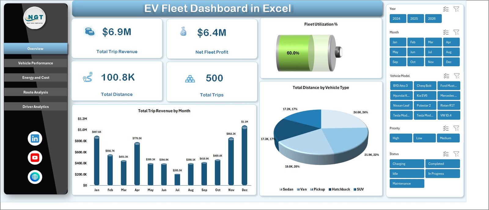
EV Fleet Dashboard in Excel — Overview Page with 5 KPIs and Slicers
Key Features of EV Fleet Dashboard in Excel
Built specifically for electric and hybrid fleet operators, this workbook handles the metrics legacy fleet templates miss — kWh consumed, charging cost per depot, and CO2 saved by route type — all alongside the standard revenue, profit, distance, and trip-volume figures. Every visual is wired to a hidden Support sheet of pivot tables, so adding a single row of trip data ripples through 14 charts and 5 slicers without a single formula edit.
📊 Five Headline KPI Cards on the Overview Page. The dashboard opens with Total Trip Revenue, Net Fleet Profit, Total Distance, Total Trips, and Fleet Utilization % stacked across the top row. These are the same five numbers most fleet managers report to leadership monthly, so the workbook is immediately useful out of the box without renaming or reformatting anything.
⚡ Dedicated Energy and Cost Analysis Page. A separate tab tracks Total Energy Consumed by Month, Total Charging Cost by Depot, Total Charging Cost by Vehicle Type, and Total Energy Consumed by Route Type. This is where depot managers reconcile actual kWh draw against utility bills and where finance teams price-check charging contracts.
🚗 Driver Performance Scorecard. Average Driver Rating by Driver and Total Distance by Driver charts on the Driver Analytics page surface the top performers and identify drivers whose route volume or rating is drifting below the cohort average — useful for monthly 1:1s or training assignments.
🌱 Built-In CO2 Saved Tracking. Total CO2 Saved by Route Type on the Route Analysis page lets sustainability and ESG teams pull carbon-reduction figures for quarterly disclosures or board reports without buying a separate ESG tool. The metric scales automatically as new trips are added.
🎛️ Synchronized Slicers Across All Pages. Multiple slicers at the top of the Overview page filter every chart simultaneously by Vehicle Type, Depot, Route Type, or any other dimension you add. One click filters all 14 visuals at once, so you can answer questions like “How did the Mumbai depot perform on long-haul routes last month?” in seconds.
🔄 Pivot-Powered Refresh Workflow. All charts pull from pivot tables on a hidden Support sheet. Paste new rows in the Data sheet, click Data → Refresh All in the ribbon, and every page rebuilds. No VBA, no macros, no external connections — the workbook runs identically on Excel for Windows and Excel for Mac.
Dashboard Pages Explanation
The workbook ships as a single .xlsx file with 7 tabs — 5 dashboard pages plus a Data sheet for trip records and a Support sheet that hosts the pivot tables. Below is a walkthrough of every page and the visuals it contains.
Page 1 — Overview
The Overview page is the homepage for the entire dashboard. Five KPI cards line the top: Total Trip Revenue, Net Fleet Profit, Total Distance, Total Trips, and Fleet Utilization %. Below the KPI cards sit two trend charts — Total Trip Revenue by Month and Total Distance by Vehicle Type — alongside the slicer panel that drives every page.
📈 Total Trip Revenue by Month reveals seasonal demand patterns and helps schedule fleet capacity around peak months.
🚗 Total Distance by Vehicle Type splits mileage across sedan, SUV, van, and truck classes so you can right-size the next vehicle order.
Overview Page — 5 KPI Cards plus Slicer Panel
Page 2 — Vehicle Performance
The Vehicle Performance page benchmarks every model in the fleet on revenue, profit, energy efficiency, and trip status. This is the page fleet purchasing managers reference before signing the next vehicle order.
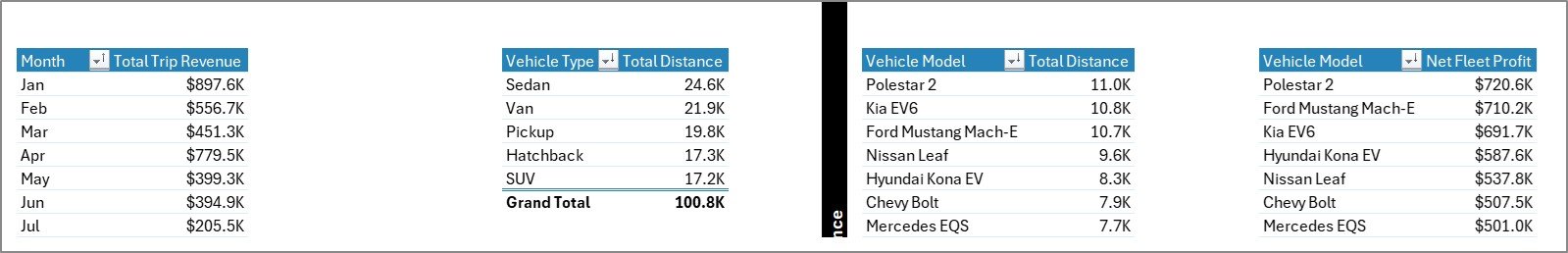
🔋 Total Distance by Vehicle Model — identify which models are clocking the most kilometres and which are under-utilized.
💰 Net Fleet Profit by Vehicle Model — ranks every model by bottom-line contribution.
⚡ Energy Efficiency by Vehicle Type — surfaces the kWh-per-kilometre leaders and laggards across vehicle classes.
📊 Total Trips by Status — splits completed, cancelled, and in-progress trips so dispatchers can spot operational bottlenecks.
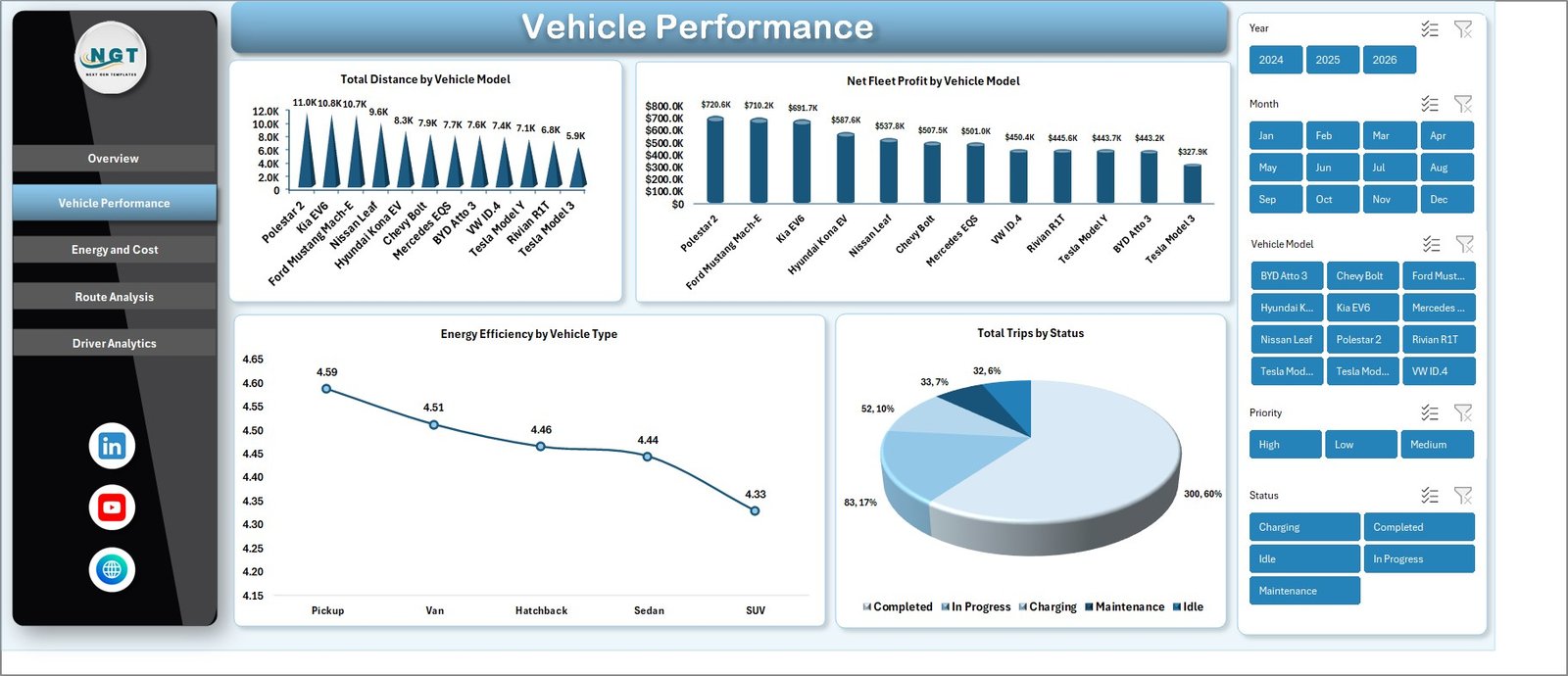
Vehicle Performance — Distance, Profit, and Efficiency by Model
Page 3 — Energy and Cost
This is where finance teams live. The Energy and Cost page consolidates every kWh consumed and every dollar spent on charging, broken down by month, depot, vehicle type, and route. If your charging utility invoice ever surprised you, this page is where the variance gets explained.
⚡ Total Energy Consumed by Month — charts seasonal kWh draw to forecast charging budgets.
🏢 Total Charging Cost by Depot — reveals which depot is paying the most for energy and where to negotiate better tariffs.
🚗 Total Charging Cost by Vehicle Type — compares charging spend across sedan, SUV, and van fleets.
🛣️ Total Energy Consumed by Route Type — breaks energy consumption across urban, highway, and last-mile route patterns.
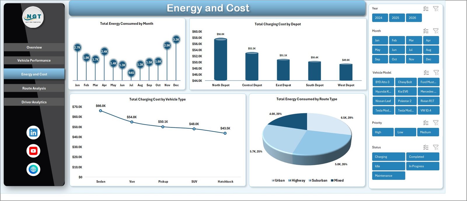
Energy and Cost Page — Charging spend by Depot and Vehicle Type
Page 4 — Route Analysis
Route Analysis shifts the lens from vehicles to journeys. This page is built for operations managers who plan dispatch and sustainability leads who report carbon savings — the same data, two perspectives.
🛣️ Total Distance by Route Type — quantifies kilometres across urban, highway, and last-mile categories.
📍 Total Trips by Trip Purpose — segments trips by purpose (delivery, passenger, maintenance) for capacity planning.
⚠️ Total Distance by Priority — flags how much distance is consumed by high-priority versus standard trips.
🌱 Total CO2 Saved by Route Type — the headline ESG metric every fleet running EVs needs to pull at quarter-end.
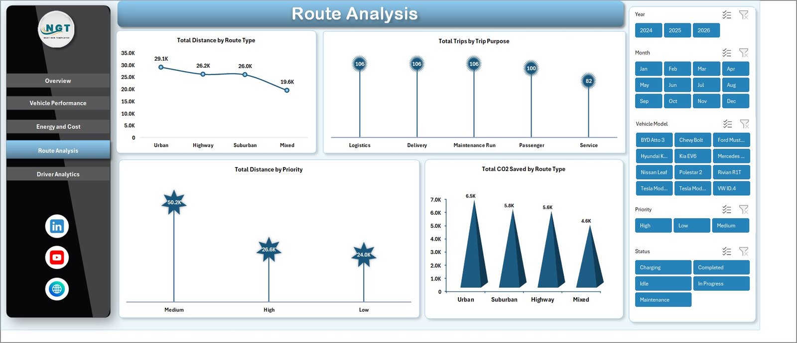
Route Analysis — CO2 Saved and Distance by Route Type
Page 5 — Driver Analytics
Driver Analytics consolidates the people side of the fleet onto a single page. Average rating and distance metrics make it straightforward to identify standouts, schedule refresher training, and substantiate driver-of-the-month awards with hard numbers.
⭐ Average Driver Rating by Driver — a rating ladder that surfaces top performers and outliers needing coaching.
📏 Total Distance by Driver — total kilometres driven per person, useful for fair work allocation reviews.
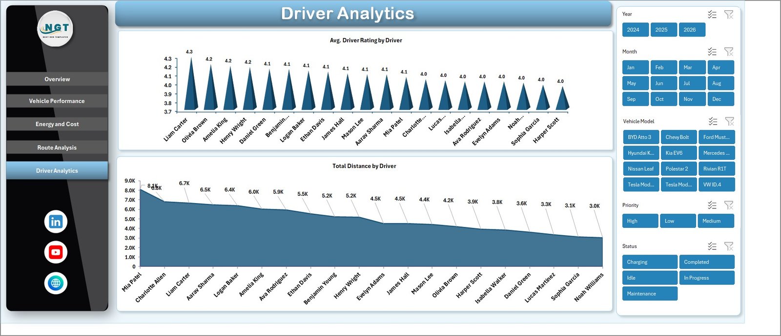
Driver Analytics — Rating and Distance per Driver
Data Sheet — Trip Log
The Data sheet is the heart of the workbook. Replace the sample rows with your trip log — trip ID, vehicle, depot, driver, distance, energy consumed, revenue, and so on. Keep the column headers exactly as shown so the pivot tables continue to point to the right fields. After paste, click Data → Refresh All.
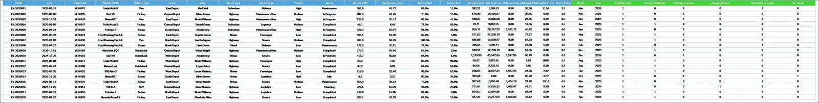
Data Sheet — Replace sample rows with your own trip log
Support Sheet — Pivot Tables
The Support sheet hosts the pivot tables that drive every chart. Once you have confirmed everything refreshes correctly, right-click the tab and choose Hide — end users only see the 5 dashboard pages plus the Data sheet. The pivots continue to work whether the tab is visible or hidden.
Support Sheet — Hidden Pivot Tables Powering the Dashboard
EV Fleet Dashboard in Excel vs. Google Sheets Equivalent vs. Paid Fleet SaaS — Feature Comparison
| Feature | EV Fleet Dashboard in Excel | Google Sheets equivalent | Paid Fleet SaaS (Samsara / Geotab) |
|---|---|---|---|
| Cost | $17.99 one-time | $9-15 one-time | $25–60 / vehicle / month |
| Platform | Microsoft Excel (offline) | Google Sheets (cloud only) | Web + iOS + Android |
| Setup time | Under 10 minutes | Under 10 minutes | 2–6 weeks (telematics install) |
| Real-time team collaboration | Via OneDrive / SharePoint | ✅ Native | ✅ Native |
| Mobile access | Excel mobile app | ✅ Native browser | ✅ Native |
| Customizable charts & slicers | ✅ Full pivot-table control | Limited slicer controls | Vendor-locked widgets |
| Hardware/telematics required | ❌ None | ❌ None | ✅ Required |
| Year-1 cost (50 vehicles) | $17.99 total | $9-15 total | $15,000–36,000 |
| Tracks CO2 Saved by Route Type | ✅ Built-in | ✅ Built-in | Add-on module |
For fleets that want clear monthly reporting on EV trips, energy costs, and driver performance without paying $25 per vehicle per month, the EV Fleet Dashboard in Excel sits in the sweet spot.
Who Should Use This Template
Perfect for:
- Fleet managers operating 5–500 electric vehicles who need a monthly executive view of revenue, energy, and CO2
- Last-mile delivery and logistics teams transitioning from ICE to EV vehicles
- Sustainability and ESG analysts who report carbon savings alongside cost data
- EV charging depot operators reconciling kWh draw against utility invoices
- Excel-first analysts who don’t want to migrate to a new fleet platform
Not a fit if:
- You need live GPS tracking or real-time telematics (use Samsara or Geotab instead)
- You operate 1,000+ vehicles and require SOC 2 compliance and SSO
- You don’t have any historical trip data — the dashboard reports on data you already collect
Real-World Use Cases
Marcus runs operations at a 60-vehicle EV last-mile delivery startup in Austin. Every Monday morning he replaces last week’s trip data, refreshes all pivots, and screenshots the Energy and Cost page for his CFO. The exercise that used to take 90 minutes in a logistics SaaS now takes 12 minutes — and it costs him $0 a month after the one-time template purchase, instead of the $1,500 monthly subscription his board had originally approved.
Priya manages sustainability reporting at a regional courier with 120 EVs across 4 depots. She filters the Route Analysis page by Route Type to extract Total CO2 Saved figures for her quarterly ESG disclosure. Her board specifically appreciates that the source workbook is auditable — every CO2 number ties back to specific trip rows in the Data sheet, which keeps the external auditors satisfied without an enterprise ESG platform.
Jin operates a B2B EV taxi service in Bangalore with 25 cars and 40 drivers. The Driver Analytics page lets him spot-check which drivers consistently log lower-than-average distances. He then cross-references the Vehicle Performance page to determine whether the issue is a vehicle assignment problem (low-utilization model) or a routing problem (driver routed to short-distance trips), and reassigns accordingly.
Advantages of EV Fleet Dashboard in Excel
The advantages cluster around three benefits: speed of setup, depth of analysis, and total cost of ownership. Setup takes under 10 minutes from open to first refreshed dashboard, compared to multi-week telematics installations that paid fleet SaaS demands. Depth comes from 14 pre-built charts hitting every angle a fleet manager reports on monthly — revenue, profit, distance, trips, energy, charging cost, CO2 saved, and driver performance — without forcing the user to design a single chart.
Total cost of ownership is the strongest argument for small and mid-size operators. A 50-vehicle fleet on Samsara at $25 per vehicle per month spends $15,000 in year one. The same fleet running this Excel workbook spends $17.99 once, plus the time it takes to paste new trip data weekly — a discipline most operators already do for invoicing. For fleets that don’t need real-time GPS, the savings fund several other tooling investments.
The workbook is also fully editable. Every pivot table, slicer, and chart is exposed — no protected sheets, no locked formulas, no proprietary data model. Add a new column to the Data sheet, refresh the pivots, drop the new field into a chart, and you’ve extended the dashboard. This matches the broader Excel Dashboard Templates philosophy: own the file, own the data.
Opportunities for Improvement
Honest limitations matter. The EV Fleet Dashboard in Excel is a reporting layer, not an operational platform. There is no live GPS tracking, no automatic data collection from vehicle telematics, and no driver-facing mobile app for trip logging. Trip data has to land in the Data sheet either through manual entry, CSV import, or a connected source like Power Query — the workbook does not pull data from vehicles automatically.
Real-time concurrent editing is limited to OneDrive / SharePoint co-authoring. Two operators editing the workbook at the same time on a shared drive may experience occasional sync delays. For teams that need simultaneous real-time editing across continents, the cloud-native equivalent on Google Sheets is the better choice.
The dashboard reports on the data you provide. If your trip log doesn’t include a CO2 column, the Total CO2 Saved by Route Type chart shows nothing. Onboarding properly — making sure your existing data covers all 14 chart inputs — is a one-time effort. After that, monthly maintenance is paste-and-refresh.
Best Practices
Replace, don’t append, sample data. The workbook ships with sample rows so you can preview every chart immediately. When you load real data, replace those rows entirely — do not paste your data below the samples or your KPIs will mix sample and real numbers and produce nonsensical totals.
Refresh after every paste. Pivot tables don’t auto-detect new rows. Always click Data → Refresh All after pasting fresh trip records. Build a habit: paste, refresh, then check the Overview page’s Total Trips figure as a sanity check before reporting numbers anywhere.
Hide the Support sheet in production. Right-click the Support tab and choose Hide once you’ve validated that pivots refresh correctly. End users only need to see the 5 dashboard pages plus the Data sheet. Hiding the Support tab keeps the file looking clean and prevents accidental edits to the pivot tables.
Use OneDrive or SharePoint for team access. Save the workbook to a shared OneDrive or SharePoint location and share the link rather than emailing copies. Excel’s co-authoring will keep one canonical version of the truth, and everyone sees the same KPIs at the same time. For more on collaborative Excel workflows, see Microsoft’s Excel collaboration documentation.
Standardize your trip log columns. The dashboard is forgiving of additional columns but strict about the columns it expects. Document the exact column structure for whoever paste-and-refreshes the workbook each week, so column drift doesn’t break the pivots silently.
Explore Relevant Templates
🔌 Electric Vehicle KPI Dashboard in Google Sheets — the same EV fleet metrics in a cloud-native Google Sheets format for teams that need real-time concurrent editing.
🚚 Fleet Management Dashboard in Power BI — full-fleet view in Power BI Desktop with DAX measures, ideal for analysts already running Power BI Service.
🚙 Moving Company Dashboard in Excel — same Excel dashboard architecture applied to moving and relocation services.
🔋 Battery Manufacturing KPI Dashboard in Excel — track production for the EV battery side of the supply chain.
🚗 Vehicle Reservation Tracker in Excel — complementary booking and reservation workflow for office and fleet pool vehicles.
📦 Browse our full Excel Dashboard Templates library and the Power BI Dashboards collection for adjacent solutions.
Frequently Asked Questions
What KPIs does the EV Fleet Dashboard in Excel track?
The EV Fleet Dashboard in Excel tracks 5 headline KPIs — Total Trip Revenue, Net Fleet Profit, Total Distance, Total Trips, and Fleet Utilization % — plus 14 supporting charts across vehicle performance, energy and cost, route analysis, and driver analytics pages. Every metric updates automatically when new trip data is added to the Data sheet.
Do I need any add-ins, macros, or telematics hardware?
No. The EV Fleet Dashboard in Excel runs on standard Microsoft Excel features — pivot tables, slicers, and standard charts. There are no macros, no add-ins, and no telematics hardware required. You only need a trip log your drivers or vehicles already report into a spreadsheet or CSV file.
How long does setup take for a new fleet?
Setup of the EV Fleet Dashboard in Excel typically takes under 10 minutes. Open the workbook, paste your trip log into the Data sheet using the same column structure as the sample data, click Data → Refresh All, and every chart, slicer, and KPI on all 5 pages updates automatically.
How does this compare to Samsara or Geotab fleet platforms?
Samsara and Geotab cost $25–60 per vehicle per month and require telematics hardware installed in every vehicle. The EV Fleet Dashboard in Excel is a $17.99 one-time purchase with no hardware needed. It is ideal for monthly reporting and analytics, but it does not provide live GPS tracking like those platforms.
Can I add my own KPIs or vehicle types to the dashboard?
Yes. The EV Fleet Dashboard in Excel pulls from pivot tables on the hidden Support sheet, so you can extend the Data sheet with new columns, rebuild the pivots, and drop new charts onto any page. Every Vehicle Type, Depot, and Route Type you add to the Data sheet flows into all slicers automatically.
Will this work in Excel for Mac?
Yes. The EV Fleet Dashboard in Excel works on Excel for Mac (2019 or later) and Microsoft 365 for Mac. There are no ActiveX controls or VBA macros, so all features — including pivot tables, slicers, and charts — behave identically across Windows and Mac.
Is there a Google Sheets or Power BI version available?
Yes. NextGenTemplates offers the Electric Vehicle KPI Dashboard in Google Sheets and the Fleet Management Dashboard in Power BI as same-data, different-platform alternatives. Pick whichever stack your team already uses.
About the Author
Built by PK — Microsoft Certified Professional with 15+ years of Excel, Google Sheets, and Power BI experience. Founder of NextGenTemplates, reaching 300K+ subscribers across YouTube channels (@PK-AnExcelExpert, @NextGenTemplates, @NeoTechNavigators). Every template is hand-built and tested before release.
Conclusion
For EV fleet operators between 5 and 500 vehicles, the gap between a paper-and-spreadsheet workflow and a $25-per-vehicle-per-month telematics SaaS is exactly where this template lives. Five interactive pages, 14 pre-built charts, slicer-based filtering across every dimension, and a hidden Support sheet that handles all the pivot-table plumbing — all in one .xlsx file that you own forever after a single $17.99 purchase.
👜 Click here to Purchase the EV Fleet Dashboard in Excel
✅ Instant download · One-time payment · No subscription
🎥 Visit our YouTube channel for step-by-step video tutorials on building Excel dashboards: YouTube.com/@PK-AnExcelExpert
📅 Last updated: May 2026