The Sales Funnel KPI Dashboard in Power BI delivers 3 interactive report pages covering 16 data points per KPI — including MTD actuals, YTD actuals, prior-year comparisons, and target-achievement icons — all inside a single .pbix file connected to a plain Excel data source. Setup takes under 10 minutes: fill three Excel worksheets with your actuals, targets, and KPI definitions, and every table, chart, and summary card refreshes automatically.
Sales teams running monthly KPI reviews still spend an average of 3–5 hours per cycle manually compiling MTD and YTD data, calculating target variance, and color-coding achievement status in spreadsheets. The Sales Funnel KPI Dashboard in Power BI eliminates that entirely — Month and KPI Group slicers filter the full KPI table in seconds, and the smart LTB/UTB icon logic colors achievement indicators without a single manual rule. Join 8,400+ teams in 40+ countries using NextGenTemplates to replace expensive CRM reporting modules with one-time-purchase templates.
Key Features of Sales Funnel KPI Dashboard in Power BI
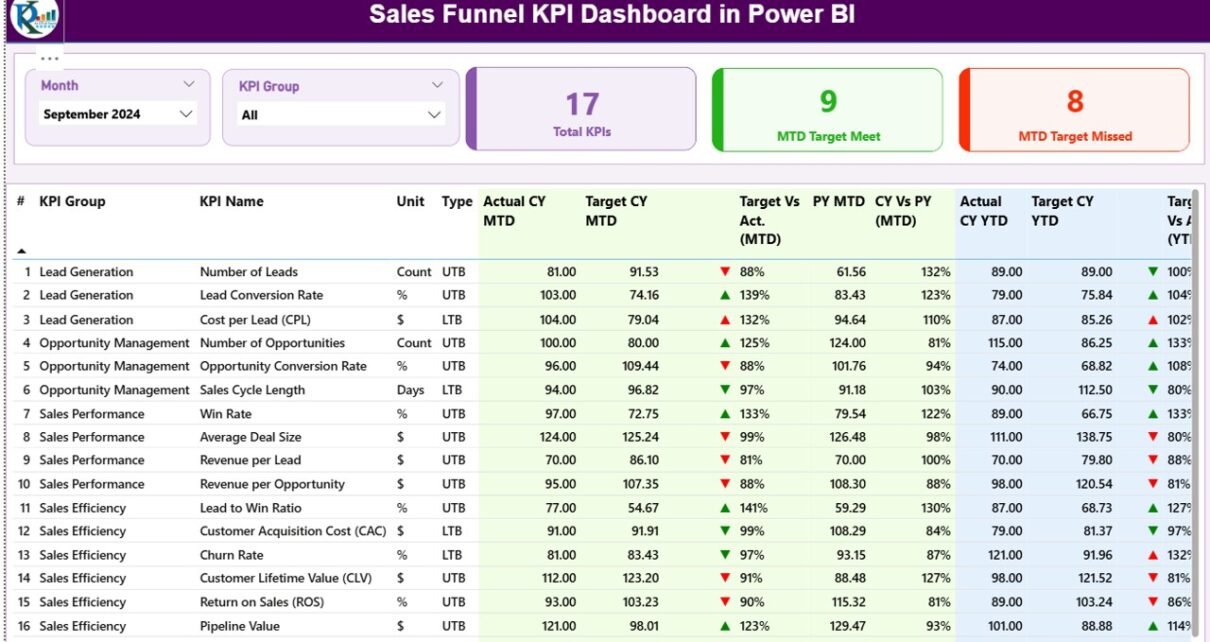
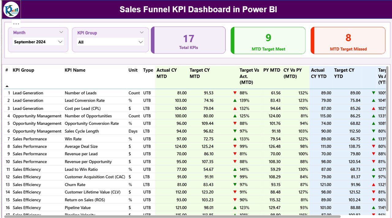
The dashboard tracks all your sales funnel KPIs on a single Summary Page with a 16-column detail table. Each KPI row displays KPI Number, KPI Group, KPI Name, Unit, Type (LTB/UTB), Actual CY MTD, Target CY MTD, an MTD achievement icon (▼/▲ in red/green), Target vs Actual MTD percentage, PY MTD, CY vs PY MTD percentage, Actual CY YTD, Target CY YTD, YTD achievement icon, Target vs Actual YTD percentage, PY YTD, and CY vs PY YTD percentage.
The LTB/UTB smart icon logic is one of the standout features. You flag each KPI in the KPI Definition sheet as either Lower-The-Better (LTB — for cost and churn metrics) or Upper-The-Better (UTB — for revenue and conversion metrics), and the dashboard automatically applies the correct green/red coloring to the ▼/▲ icons. No conditional formatting rules to maintain manually.
The KPI Trend Page features two combo charts — one for MTD trends and one for YTD trends — each plotting Current Year Actual, Previous Year Actual, and Target across months. A KPI Name slicer on the left updates both charts instantly, making it ideal for QBR presentations and leadership review decks.
The hidden KPI Definition drill-through page allows you to right-click any KPI row on the Summary Page and navigate directly to that KPI’s complete documentation: its formula, business definition, Group, Unit, and LTB/UTB type. The page is hidden from the main navigation to keep the report clean. A Back button on the top-left returns you to the Summary Page.
Dashboard Pages Explanation
Page 1 — Summary Page: This is the main page of the dashboard. Month and KPI Group slicers sit at the top. Three KPI cards display Total KPIs count, MTD Target Meet count, and MTD Target Missed count. Below is the full 16-column KPI detail table — every sales funnel KPI in one scrollable view, with MTD and YTD actuals, targets, achievement icons, percentage variances, and prior-year benchmarks side by side.
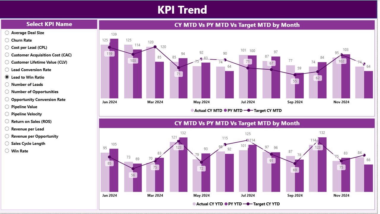
Page 2 — KPI Trend Page: Two combo charts dominate this page — one for MTD and one for YTD. Each combo chart plots Current Year Actual, Previous Year Actual, and Target across all months of the year. Use the left-side KPI Name slicer to switch between any KPI in your definition list. This page is designed for leadership presentations and trend analysis: you can instantly show whether a KPI is recovering toward target or drifting further away compared to last year.
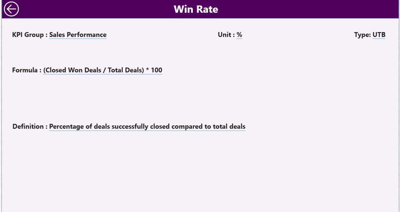
Page 3 — KPI Definition (Hidden Drill-Through): This page is hidden from the standard navigation. To access it, right-click any KPI row on the Summary Page and select the drill-through option. The page displays the complete KPI documentation for the selected metric: KPI Number, Group, Name, Unit, Formula, full business Definition, and LTB/UTB type. A Back button in the top-left corner returns you to the Summary Page.
Excel Data Source (3 Worksheets): The Power BI file connects to an Excel workbook with three sheets. The Input_Actual sheet captures KPI Name, Month (first date of month), MTD actual, and YTD actual. The Input_Target sheet captures KPI Name, Month, MTD target, and YTD target. The KPI Definition sheet holds the master list: KPI Number, KPI Group, KPI Name, Unit, Formula, Definition, and Type (LTB or UTB). You can add or remove KPIs from the definition sheet without editing the Power BI file itself — the report reads the list dynamically.
Sales Funnel KPI Dashboard in Power BI vs. Excel KPI Dashboard vs. Salesforce — Feature Comparison
| Feature | Sales Funnel KPI Dashboard in Power BI | Excel KPI Dashboard | Salesforce CRM Reporting |
|---|---|---|---|
| Cost | $11.99 one-time | ~$7–18 one-time | $25–300 / user / month |
| Platform | Free Power BI Desktop | Microsoft Excel | Salesforce cloud (paid) |
| Setup time | Under 10 minutes | 10–15 minutes | Days to weeks (admin config) |
| MTD + YTD + Prior-Year tracking | ✅ Built-in | Manual formulas needed | Custom reports required |
| LTB / UTB smart icon logic | ✅ Automatic | ❌ Manual formatting | ❌ Not built-in |
| Drill-through KPI definitions | ✅ Built-in | ❌ Not available | ✅ Custom dev needed |
| Interactive slicers | ✅ Month + KPI Group | Limited (dropdowns) | ✅ Yes |
| Year-1 cost at 5 users | $11.99 total | ~$18 total | $1,500–18,000 |
| No CRM subscription required | ✅ Standalone | ✅ Standalone | ❌ Requires Salesforce |
For sales ops teams that need MTD/YTD KPI tracking with prior-year benchmarks and smart LTB/UTB icons — without Salesforce pricing — the Sales Funnel KPI Dashboard in Power BI sits in the sweet spot.
Who Should Use This Template
Perfect for:
- Sales managers and VPs tracking funnel KPIs like lead conversion rates, pipeline velocity, quota attainment, and win rate on a monthly MTD/YTD basis
- Sales ops analysts who need MTD/YTD vs. target and prior-year comparisons without writing DAX or building Power BI models from scratch
- B2B and B2C sales teams with mixed KPI sets including both LTB (cost/churn) and UTB (revenue/conversion) metrics
- Consultants who need a client-ready Power BI KPI report deliverable in under an hour
- Business owners replacing per-user CRM reporting fees with a one-time template
Not a fit if:
- You need real-time automatic data refresh from a live CRM like Salesforce or HubSpot — this template uses manual Excel data entry
- Your organization requires Power BI row-level security or multi-tenant Service deployment (requires Power BI Premium)
Real-World Use Cases
Marcus leads sales ops for a 40-person B2B SaaS company. He uses the Sales Funnel KPI Dashboard in Power BI to track 12 funnel KPIs — MQL-to-SQL conversion rate, average deal cycle time, win rate, and churn — against monthly targets and the prior year, all in a single scrollable table. Every Monday he filters by KPI Group to run the pipeline review meeting in Power BI rather than a manually updated Excel spreadsheet.
Priya is a sales consultant working with retail clients across three regions. She fills the KPI Definition sheet with each client’s custom metrics, points the Excel data source to that client’s data file, and delivers a professional Power BI report in under an hour per client. The LTB/UTB logic means she never manually recolors a cost KPI that should show green when it goes down.
David runs inside sales at a mid-market distribution company. He uses the KPI Trend Page to present the monthly leadership review: two combo charts show each KPI vs. target and vs. last year. The drill-through Definition page answers the inevitable “how is this calculated?” questions before leadership even asks them.
Advantages of Sales Funnel KPI Dashboard in Power BI
The biggest advantage is the combination of the 16-column KPI table, dual trend combo charts, and the drill-through definition layer in a single file. Most ready-made Power BI templates offer either a summary scorecard or trend charts — rarely both, and almost never with built-in formula documentation. The LTB/UTB logic also removes a common pain point: sales KPI sets always mix direction types (you want conversion rate high and cost per lead low), and this template handles both correctly without any customization.
The Excel data entry model is also an advantage for teams without a centralized CRM or data warehouse. Any team member can fill the three worksheets, refresh the Power BI file, and distribute an up-to-date report — no IT dependency, no API keys, no scheduled pipelines.
For more on how Power BI connects to Excel data sources, see Microsoft Learn: Connect to Excel in Power BI.
Opportunities for Improvement
The manual Excel data entry model is also the template’s main limitation. If your sales data lives in Salesforce, HubSpot, or another CRM, you’ll need to export monthly data to the Excel sheets rather than connecting directly. Teams with real-time reporting requirements would benefit from setting up a direct Power Query connection to their CRM’s API or a scheduled data export into the Excel source.
The template is designed for KPI-level summary reporting rather than individual deal or rep-level drill-down. If you need pipeline-stage funnel charts or rep leaderboards, you may want to complement this template with a dedicated sales Power BI Dashboard template.
Best Practices
Use the first date of each month (e.g., 2026-01-01) consistently in the Month column across both Input_Actual and Input_Target sheets — this ensures the date slicer on the Summary Page filters both tables correctly.
Populate the KPI Definition sheet completely before filling the data sheets. The LTB/UTB type flag must be set for every KPI before you refresh, otherwise the icon logic won’t apply correctly.
Group your KPIs logically in the KPI Group column (e.g., “Lead Generation”, “Conversion”, “Revenue”, “Retention”). The KPI Group slicer on the Summary Page lets you filter to just one group during team reviews, which keeps the table focused and presentation-friendly.
Refresh the Power BI data source after every monthly data entry by right-clicking the dataset in the Fields pane and selecting Refresh. If you move the Excel file, update the data source path in Transform Data → Data Source Settings.
Explore Relevant Templates
Also available as: Sales Funnel KPI Dashboard in Google Sheets — the same MTD/YTD KPI logic in a no-install Google Sheets format for teams without Power BI Desktop.
For browser-based sales analytics without any software installation: Sales and Revenue Command Center Dashboard in HTML — Chart.js visuals, CSV export, and interactive filters in a single HTML file.
For CRM-style pipeline tracking: CRM Dashboard in HTML — customer relationship analytics and pipeline stages in a standalone browser tool.
Browse all Power BI KPI Dashboard Templates in the NextGenTemplates catalog.
Frequently Asked Questions
What does the Sales Funnel KPI Dashboard in Power BI track?
The Sales Funnel KPI Dashboard in Power BI tracks any KPI you define, displaying 16 data points per KPI: Actual CY MTD, Target CY MTD, MTD achievement icon (▼/▲), Target vs Actual MTD %, PY MTD, CY vs PY MTD %, Actual CY YTD, Target CY YTD, YTD icon, Target vs Actual YTD %, PY YTD, and CY vs PY YTD %. The KPI list is fully dynamic — you control it through the KPI Definition Excel worksheet.
Do I need Power BI Pro to use this dashboard?
No. The Sales Funnel KPI Dashboard in Power BI runs entirely on the free Power BI Desktop application, which you can download from Microsoft at no cost. Power BI Pro is only needed if you want to publish and share the report on the Power BI Service cloud platform with other users.
Can I use my own KPIs in this template?
Yes. The KPI list is fully configurable via the KPI Definition worksheet in the Excel data source. Add your own KPI Number, Group, Name, Unit, Formula, Definition, and LTB/UTB type — the Sales Funnel KPI Dashboard in Power BI reads the list dynamically with no changes to the .pbix file required.
What is the difference between LTB and UTB in this template?
LTB (Lower The Better) marks KPIs where lower values indicate better performance, such as Cost per Lead or Customer Churn Rate. UTB (Upper The Better) marks KPIs where higher values indicate better performance, like Conversion Rate or Monthly Revenue. The dashboard uses this setting to color the ▼/▲ achievement icons correctly — green always means the KPI is performing well, regardless of direction.
How does the KPI Trend Page work?
Select any KPI from the left-side slicer on the Trend Page and two combo charts update instantly — one for MTD and one for YTD — each plotting Current Year Actual, Previous Year Actual, and Target across all months. This makes it easy to spot seasonal patterns, validate targets, and build leadership review slides directly from Power BI.
How does this compare to building KPI reports in Salesforce?
Salesforce KPI reports require active CRM subscriptions at $25–300 per user per month and often need admin customization. The Sales Funnel KPI Dashboard in Power BI costs $11.99 once, works with any Excel data, and includes MTD/YTD dual tracking plus prior-year benchmarks — features that typically require custom Salesforce development or a dedicated BI tool at significant added cost.
How do I access the KPI Definition drill-through page?
On the Summary Page, right-click any KPI row in the detail table. A context menu will appear — select the drill-through option to navigate to the KPI Definition page, which displays the full formula, business definition, KPI Group, Unit, and LTB/UTB type for the selected KPI. Click the Back button in the top-left corner to return to the Summary Page.
About the Author
Built by PK — Microsoft Certified Professional with 15+ years of Excel, Google Sheets, and Power BI experience. Founder of NextGenTemplates, reaching 300K+ subscribers across YouTube channels. Every template is hand-built and tested before release. Visit Youtube.com/@PK-AnExcelExpert for free tutorial videos.
Conclusion
The Sales Funnel KPI Dashboard in Power BI brings together a 16-column KPI scorecard, dual MTD/YTD trend combo charts, and a built-in drill-through KPI definition layer — everything a sales team needs for monthly KPI reviews, in a single Power BI Desktop file that connects to a familiar Excel data source. No DAX writing. No manual icon coloring. No CRM subscription required.
Click here to Purchase the Sales Funnel KPI Dashboard in Power BI
✅ Instant download · One-time payment · No subscription · Lifetime access
Last updated: May 2026