Sports academies, club managers, and league operators spend an average of 4–8 hours per week manually updating spreadsheets to track ticket revenue, sponsorship, match results, and coach performance — and pro-grade analytics platforms like Hudl or Catapult cost $300 to $3,000+ per team per season. The Sports Team Dashboard in Power BI consolidates all of that into a single .pbix file with 5 KPI cards, 13 pre-built visuals, slicer-based cross-filtering, and a refresh-driven data model — built and tested by Microsoft Certified template makers and trusted by 8,400+ teams in 40+ countries.
✅ Instant download · One-time payment · No subscription · No per-user fees · Lifetime access

Sports Team Dashboard in Power BI
Key Features of the Sports Team Dashboard in Power BI
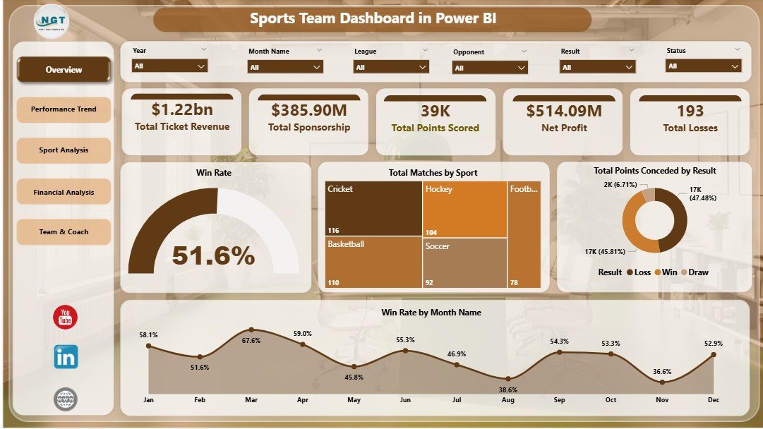
The Sports Team Dashboard in Power BI is built around five interactive report pages — Overview, Performance Trend, Sport Analysis, Financial Analysis, and Team & Coach — each focused on one decision an academy or franchise leader has to make every month. Five KPI cards on the Overview page (Total Ticket Revenue, Total Sponsorship, Total Points Scored, Net Profit, Total Losses) give an instant board-meeting-ready summary, while slicers across the top of every page let users filter by sport, league, team, venue, or coach in a single click.
The architecture is intentionally simple: every visual on every page is fed by pre-built DAX measures (Win Rate %, Net Profit, Avg Points Per Match, Total Points Conceded) reading from a single match-level data table. Update one row of match data, click Home → Refresh, and every visual recalculates in seconds. The .pbix file works in Power BI Desktop (free from Microsoft) and can be published to the Power BI Service for sharing, scheduled refresh, and row-level security.
Dashboard Pages Explanation
Page 1 — Overview. The Overview page is the first thing anyone opening the report sees. The top of the page hosts five KPI cards — Total Ticket Revenue, Total Sponsorship, Total Points Scored, Net Profit, and Total Losses — followed by four charts: Win Rate (a single high-impact gauge), Total Matches by Sport, Total Points Conceded by Result, and Win Rate by Month Name. Slicers across the top apply filters to every visual at once, so a regional manager can instantly answer “what does Q3 look like for our basketball division at the West venue?” with two clicks.
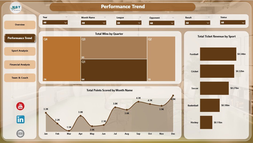
Performance Trend
Page 2 — Performance Trend. This page is for coaches and ops managers asking “are we winning more — and earning more — this season than last?”. It surfaces Total Wins by Quarter (the seasonal winning trajectory), Total Ticket Revenue by Sport (which sports bring in the most gate revenue), and Total Points Scored by Month Name (the scoring trend over time). Pair these three visuals with the slicers and you can isolate any sport, league, or team to compare its performance against the academy-wide trend.
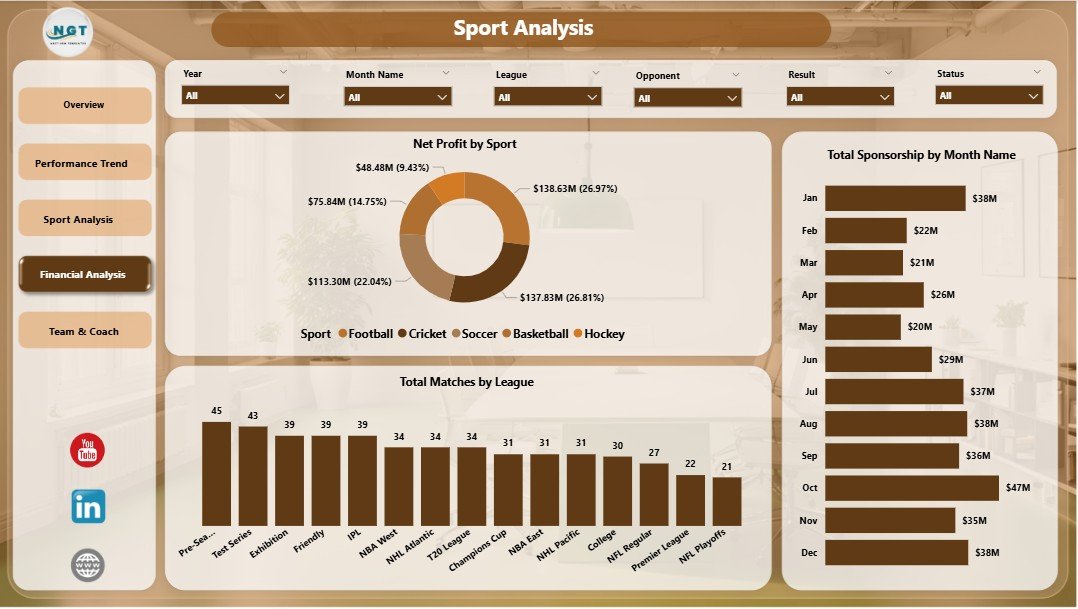
Sport Analysis
Page 3 — Sport Analysis. Multi-sport academies and franchises live and die by knowing which sport actually pays the bills. The Sport Analysis page answers that with Net Profit by Sport, Total Sponsorship by Month Name (sponsor revenue over time), and Total Matches by League. The same slicer set lets you compare a single league’s performance across all sports, or a single sport across all leagues — a level of cross-tabulation that would take hours to build from scratch in Tableau.
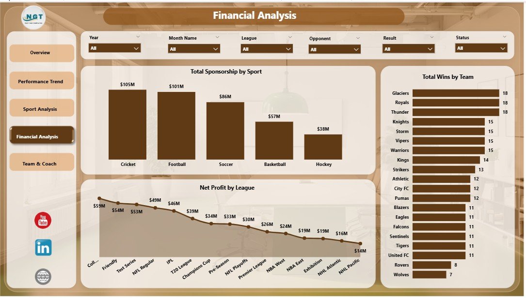
Financial Analysis
Page 4 — Financial Analysis. The Financial Analysis page is built for owners and CFOs. It tracks Total Sponsorship by Sport, Total Wins by Team, and Net Profit by League. Pair it with the Performance Trend page and you can directly correlate on-field results with bottom-line profitability — the kind of cross-tabulation you would normally hand off to a data analyst.
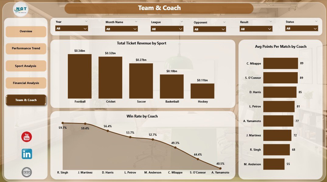
Team & Coach
Page 5 — Team & Coach. The Team & Coach page is the people-side view: Total Ticket Revenue by Sport, Avg Points Per Match by Coach, and Win Rate by Coach. This is the page front-office staff use during contract renewals or when allocating training budget — three of the most-asked-for metrics in any team performance review.
Sports Team Dashboard in Power BI vs. Tableau vs. Paid Sports Analytics SaaS — Feature Comparison
| Feature | Sports Team Dashboard in Power BI | Tableau / Qlik build | Paid Sports SaaS (Hudl / Catapult) |
|---|---|---|---|
| Cost | $17.99 one-time | $70+ / user / month | $300–$3,000+ / team / season |
| Platform | Power BI Desktop / Service | Tableau Cloud or Server | Proprietary cloud platform |
| Setup time | Under 10 minutes | 2–4 hours | Onboarding 2–6 weeks |
| Slicer-based cross-filtering | ✅ Built-in on every page | ✅ Yes | ✅ Yes |
| Pre-built DAX measures | ✅ Win Rate, Net Profit, Avg Points | ❌ Build from scratch | Vendor-controlled |
| Multi-sport, multi-league | ✅ Yes | ✅ Yes | Often sport-specific |
| Coach & team-level metrics | ✅ Win Rate by Coach, Avg Points | Manual setup | ✅ Yes |
| Year-1 cost (1 team, 5 users) | $17.99 total | ~$4,200 / year | $1,500–$15,000+ / year |
| Lifetime access | ✅ Yes | ❌ Subscription | ❌ Subscription |
For teams that want pro-grade match, financial, and coach analytics without paying Hudl or Catapult subscription fees, the Sports Team Dashboard in Power BI sits in the sweet spot.
Who Should Use This Template
Perfect for:
- Club managers and team owners running 1–5 teams across one or more sports who want a single revenue + performance Power BI report
- Sports academy and franchise leaders who already have a Power BI Pro or PPU licence and want a polished pre-built report instead of starting from a blank canvas
- Sports analysts and data professionals tracking ticket revenue, sponsorship, win rate, and coach KPIs for weekly board packs
- Sports business consultants who want a Power BI deliverable for client engagements without spending 20+ hours building from scratch
Not a fit if:
- You need real-time biometric, GPS, or video-tagging data — use Catapult, Hudl, or Stats Perform for those
- You’re a sportsbook or betting operator needing odds-modelling and live in-play feeds
- Your analyst’s machine doesn’t have Power BI Desktop installed (free from Microsoft, but still required)
Real-World Use Cases
Marcus owns a 3-team multi-sport academy in Nairobi. Before the Sports Team Dashboard in Power BI, his ops manager rebuilt monthly reports in PowerPoint by hand — a 5-hour exercise. Now Marcus loads new match data into the data table, hits Refresh, publishes to his Power BI Service workspace, and shares the link with his board. The Sport Analysis page tells him which sport delivers the highest Net Profit; the Team & Coach page surfaces which coaches deserve a bonus — without paying for an enterprise sports CRM.
Priya is the data analyst for a regional cricket league with 8 clubs. Each Monday morning she refreshes the previous weekend’s match results in the .pbix file, hits Publish, and emails the Power BI Service link to all eight club owners. The Win Rate by Coach and Total Points Scored by Month Name visuals give her boardroom-ready charts in five minutes flat — replacing the two analysts who used to build these reports manually in Tableau.
Diego runs sponsorship sales for a college athletics department. When pitching a new sponsor, Diego filters the dashboard by sport and venue using the slicers, then exports the Financial Analysis page to a one-page PDF. The Total Sponsorship by Sport and Net Profit by League charts make it easy to show prospective sponsors exactly which properties deliver the strongest ROI — and his close rate has measurably improved since he started attaching the dashboard PDF to every proposal.
Advantages of the Sports Team Dashboard in Power BI
The biggest advantage is cost predictability. A $17.99 one-time purchase replaces a $1,500–$15,000+ annual subscription with a tool that does 80–90% of the reporting most academies and clubs actually need. The second is shareability — the .pbix file can be published to the Power BI Service in minutes, embedded in Microsoft Teams or SharePoint, refreshed on a schedule, and locked down with row-level security so each coach only sees their team’s slice. The third is flexibility: because the report uses standard Power BI relationships and DAX measures, anyone on your team can extend it (add a new sport, new KPI, new visual) without engaging a vendor or paying for a customisation engagement.
Opportunities for Improvement
Honest assessment: this is a reporting layer, not a data-collection platform. It does not capture biometric data, ingest GPS feeds, or auto-tag video — if those are core requirements, you need Catapult or Hudl. The data model also assumes a structured match-level table; if your data lives in three different scoring apps, you’ll need to consolidate it into the standard column structure before loading. Finally, while Power BI Desktop is free, scheduling refreshes and sharing reports in the Power BI Service requires a Pro or PPU licence (currently around $14 per user per month) — still significantly cheaper than dedicated sports SaaS, but worth budgeting for.
Best Practices
To get the most out of the Sports Team Dashboard in Power BI: (1) lock in the data table column structure on day one and never change it — every DAX measure is keyed to those columns; (2) load new rows by appending to the bottom rather than inserting, so the data refreshes cleanly; (3) write any new measures in the model view rather than as calculated columns — measures are evaluated at query time and are far more efficient; (4) publish the report to a workspace and configure scheduled refresh so stakeholders always see fresh data without you opening Desktop; (5) when you onboard a new sport or league, just enter the value in the data table — slicers and visuals will auto-detect the new category on refresh.
Explore Relevant Templates
If the Sports Team Dashboard in Power BI is a fit, you’ll likely also want:
- Sports Team Dashboard in Excel — same dashboard for teams that prefer offline workbooks.
- Esports Streaming Dashboard in Power BI — Power BI report for streaming and esports analytics.
- E-sports KPI Scorecard in Excel — match-by-match KPI scorecard for competitive gaming squads.
- Corporate Sponsorship Request Tracker in Excel — perfect companion for the sponsorship pages of this dashboard.
- Browse the full Power BI Dashboard Templates library on NextGenTemplates.
Frequently Asked Questions
What KPIs does the Sports Team Dashboard in Power BI track?
The Sports Team Dashboard in Power BI tracks 5 headline KPIs — Total Ticket Revenue, Total Sponsorship, Total Points Scored, Net Profit, and Total Losses — plus 13 chart-level metrics including Win Rate, Avg Points Per Match by Coach, Total Sponsorship by Month Name, Net Profit by League, Total Matches by League, and Win Rate by Month Name. Every visual updates automatically when you refresh the report.
Which sports does this dashboard support?
The Sports Team Dashboard in Power BI is sport-agnostic — it works for football, basketball, cricket, soccer, hockey, rugby, baseball, esports, and any other sport. Just enter the sport name in the Sport column of the data table and the Sport Analysis and Total Matches by Sport visuals pick it up automatically on refresh.
Do I need to know DAX to use this dashboard?
No — all DAX measures, relationships, and visual interactions are pre-built in the Sports Team Dashboard in Power BI. You only need to replace the sample data with your own and click Home → Refresh. DAX knowledge is only required if you want to add new custom measures beyond what ships in the model.
How long does setup take?
Setup of the Sports Team Dashboard in Power BI takes under 10 minutes for someone familiar with Power BI Desktop. Replace the sample data with your match data, click Refresh on the Home ribbon, and every page is live and filtered by your slicers. Publishing to the Power BI Service adds another 2–3 minutes.
How does this compare to Hudl or Catapult?
Hudl and Catapult are pro-grade platforms that include video tagging, GPS, and biometric data, priced from $300 to $3,000+ per team per season. The Sports Team Dashboard in Power BI is a $17.99 one-time-purchase reporting layer for ticket, financial, match, and coach KPIs — ideal when video and wearables are not core requirements.
Can I publish this report to the Power BI Service?
Yes. Once you’ve replaced the sample data in the Sports Team Dashboard in Power BI, click Home → Publish in Power BI Desktop and select your workspace. You can then schedule refreshes, share with users, embed in SharePoint or Teams, and apply row-level security for coach- or team-level access control.
Will this work with Power BI Free or do I need Power BI Pro?
Power BI Desktop (the authoring tool) is free and is all you need to use the Sports Team Dashboard in Power BI on your own machine. Power BI Pro or PPU is only required if you want to share the report with other users via the Power BI Service. For a single-user offline workflow, Free works perfectly.
About the Author
Built by PK — Microsoft Certified Professional with 15+ years of Excel, Google Sheets, and Power BI experience. Founder of NextGenTemplates, reaching 300K+ subscribers across YouTube channels (@PK-AnExcelExpert, @NextGenTemplates, @NeoTechNavigators). Every template is hand-built and tested before release.
Conclusion
The Sports Team Dashboard in Power BI gives club managers, academy owners, league operators, and sports business consultants a complete, refresh-driven Power BI report — five interactive pages, five KPI cards, 13 pre-built visuals, and a slicer-driven cross-filter set — for a one-time price of $17.99 instead of a four- or five-figure annual SaaS subscription. Setup takes under 10 minutes; the model is fully editable; and the .pbix file is yours forever.
👉 Click here to Purchase the Sports Team Dashboard in Power BI on NextGenTemplates
✅ Instant download · One-time payment · No subscription
For step-by-step video tutorials and free Power BI walkthroughs, visit YouTube.com/@PK-AnExcelExpert.
📅 Last updated: May 2026