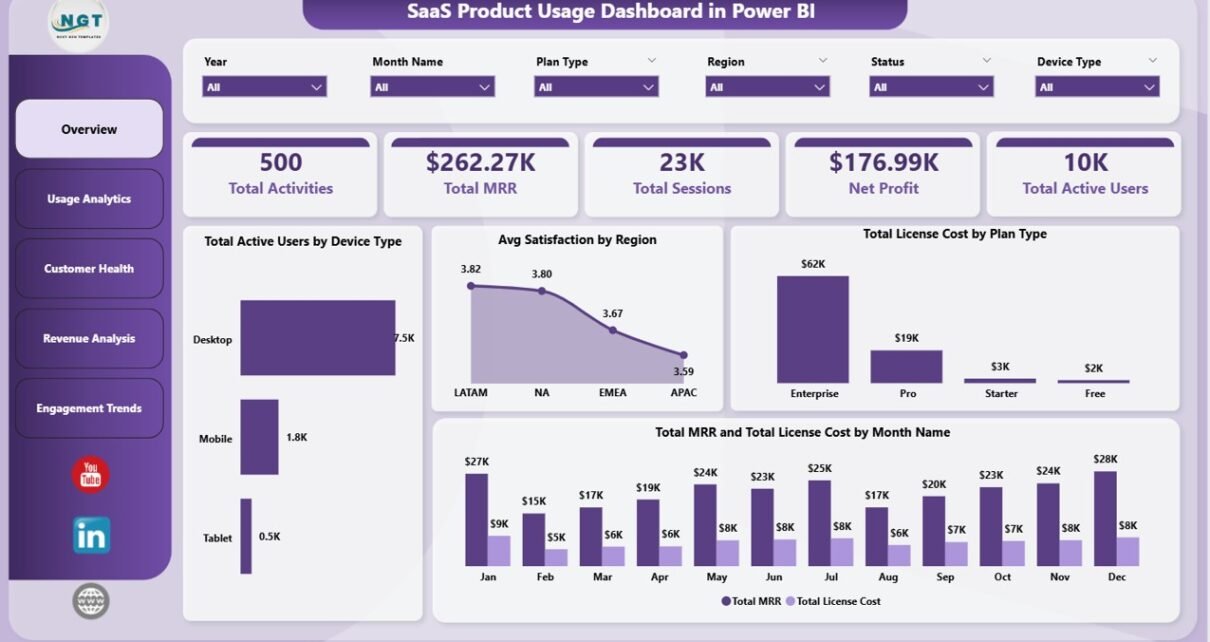
The SaaS Product Usage Dashboard in Power BI is a slicer-driven analytics report that tracks 5 SaaS KPIs — Total Activities, Total MRR, Total Sessions, Net Profit, and Total Active Users — across 5 interactive pages with 16 pre-built charts. Open the .pbix in Power BI Desktop, paste your usage export into the data model, and every page recalculates automatically through Power BI’s native cross-page slicer sync.
Most early-stage and mid-market SaaS teams don’t need a $400/month Mixpanel seat or a 6-week Amplitude rollout. They need MRR, churn, satisfaction, and product-usage signals in one place — fast, owned locally, and ready for the Tuesday investor call. That’s exactly what this Power BI dashboard solves: a one-time $17.99 .pbix file covering the same metrics that paid SaaS analytics platforms charge $1,500–$120,000 per year for at small team sizes.
👉 Click here to Purchase SaaS Product Usage Dashboard in Power BI
Key Features of SaaS Product Usage Dashboard in Power BI
🔹 5 KPI cards on the Overview page — Total Activities, Total MRR, Total Sessions, Net Profit, and Total Active Users refresh in one slicer click, giving leadership the at-a-glance numbers they ask for in every status meeting.
🔹 16 charts across 5 dedicated pages — Overview, Usage Analytics, Customer Health, Revenue Analysis, and Engagement Trends. Each page is engineered to answer one specific SaaS business question without writing a DAX measure from scratch.
🔹 Cross-page slicer sync — every visual is filtered through Power BI’s native sync slicers. Read more about how slicer sync works on Microsoft Learn.
🔹 Multi-dimensional filtering — filter the entire report by Plan Type, Device Type, Region, Module, Login Method, Industry, and Status. Slicer changes cascade across every page simultaneously.
🔹 Combined revenue + churn surface — pairs Total MRR and Total License Cost by Month with Avg Satisfaction by Region and Churn Rate by Plan Type, so finance and customer-success teams use the same source of truth instead of arguing over divergent reports.
🔹 Editable DAX measures — every measure ships unlocked. Add new pages, swap chart types, change the colour theme, or extend the model with calculated columns without breaking the slicer chain.
Dashboard Pages Explanation
Page 1 — Overview: 5 KPI cards (Total Activities, Total MRR, Total Sessions, Net Profit, Total Active Users) plus 4 charts: Total Active Users by Device Type, Avg Satisfaction by Region, Total License Cost by Plan Type, and Total MRR and Total License Cost by Month Name. Slicers anchor the page so every filter cascades to every chart on every page instantly.
Page 2 — Usage Analytics: Avg Satisfaction by Module, Total Activities by Login Method, and Total Sessions by Device Type. Identifies which product modules drive engagement and which login methods correlate with deeper usage — a signal often used to justify SSO or magic-link rollouts.
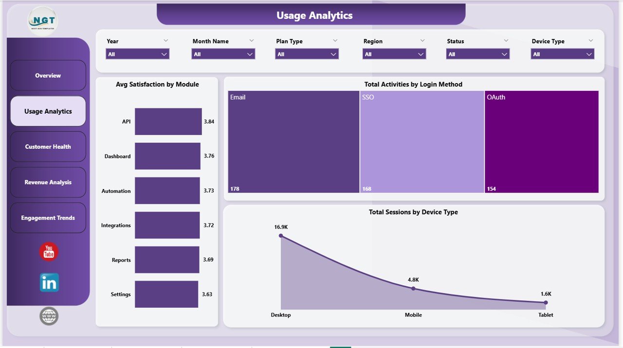
Usage Analytics page
Page 3 — Customer Health: Avg Satisfaction by Industry, Churn Rate by Plan Type, and Total Activities by Status. The Churn Rate by Plan Type visual lets CS leaders flag at-risk plan tiers 30–60 days before churn lands in next month’s invoice.
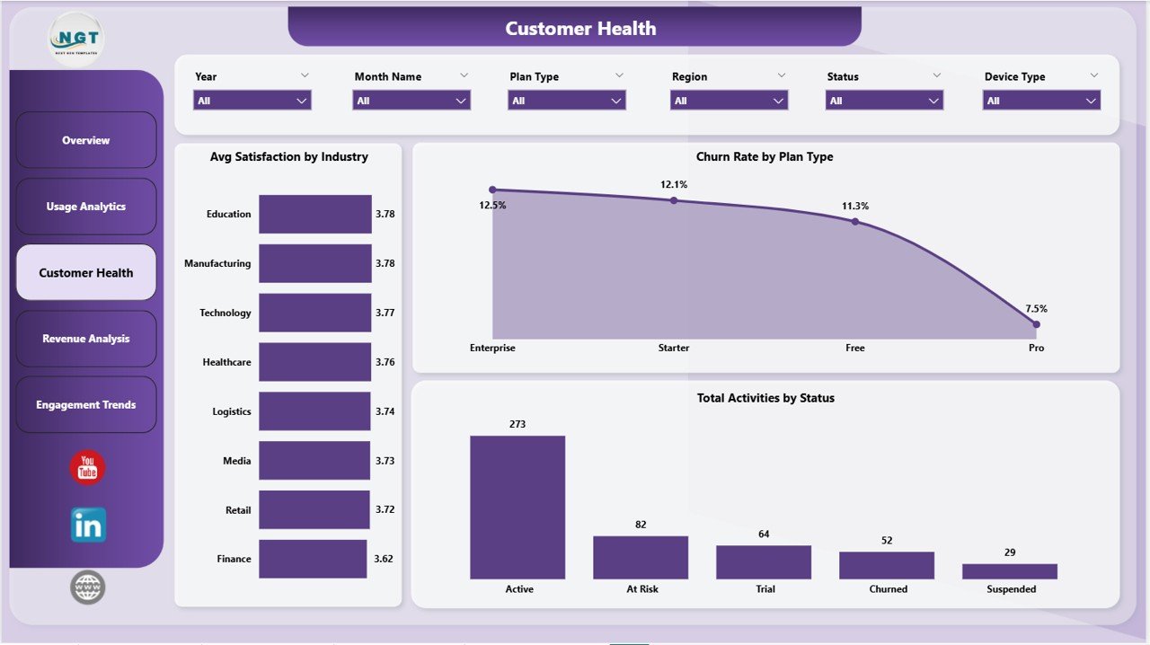
Customer Health page
Page 4 — Revenue Analysis: Total MRR by Month Name, Total MRR and Total License Cost by Region, and Total MRR by Device Type. Pairs revenue trends with infrastructure cost so gross-margin shifts surface immediately, well before a board meeting.
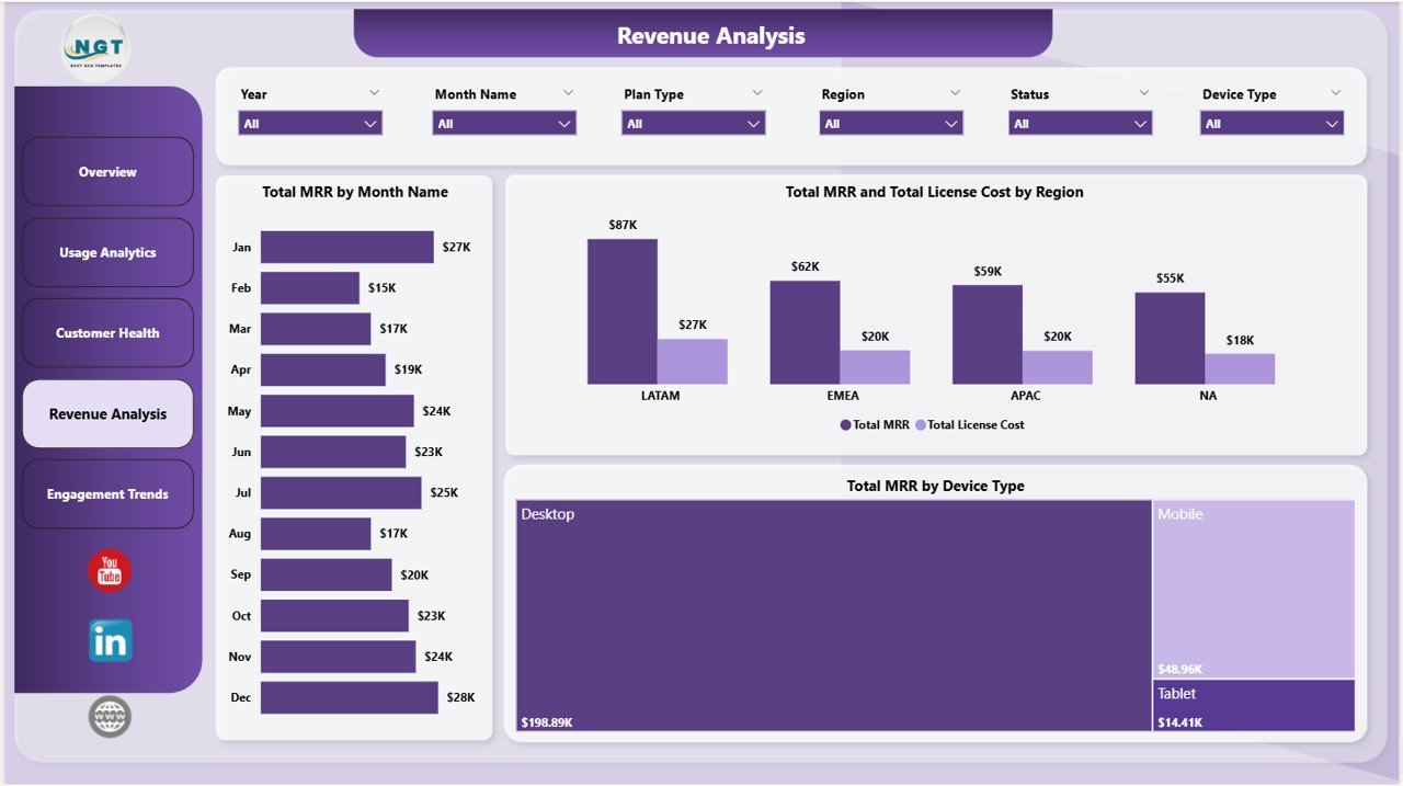
Revenue Analysis page
Page 5 — Engagement Trends: Total Active Users by Month Name, Avg Satisfaction by Month Name, and Total Activities by Module. Turns raw event logs into the WAU/MAU patterns product teams quote in board reports and investor decks.
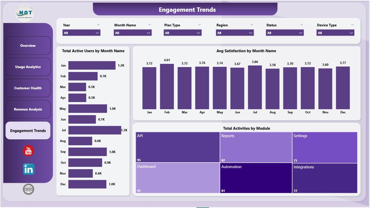
Engagement Trends page
SaaS Product Usage Dashboard in Power BI vs. Tableau / Qlik vs. Mixpanel / Amplitude / HubSpot — Feature Comparison
| Feature | SaaS Product Usage Dashboard in Power BI | Tableau / Qlik Equivalent | Mixpanel / Amplitude / HubSpot |
|---|---|---|---|
| Cost | $17.99 one-time | $70-100 / user / month | $25-2,000 / user / month |
| Platform | Power BI Desktop (free) | Tableau Desktop / Qlik Sense | Cloud SaaS (vendor lock-in) |
| Setup time | Under 10 minutes | 2-4 hours per dashboard | 2-6 weeks (event SDK + tracking plan) |
| Total KPIs + charts | 5 KPIs + 16 charts across 5 pages | Build from scratch | Unlimited (after instrumentation) |
| Cross-page slicer sync | ✅ Native | Yes (calculated fields) | Limited to vendor’s query builder |
| Editable DAX measures | ✅ Fully unlocked | Yes | Limited to platform presets |
| Data ownership | ✅ Local .pbix file | Yes | Stored on vendor servers |
| Year-1 cost at 5 users | $17.99 total | $4,200 – $6,000 | $1,500 – $120,000 |
| Publish to web (team sharing) | ✅ Power BI Service | Tableau Server / Cloud | Native cloud |
For SaaS founders, customer-success leads, and FP&A teams who want full MRR + churn + usage visibility without paying $1,500/year for Mixpanel seats, the SaaS Product Usage Dashboard in Power BI sits in the sweet spot.
Who Should Use This Template
Perfect for:
- SaaS founders and operators at 5–200 employee companies tracking MRR, churn, and product usage in one place.
- Customer-success managers who need a Customer Health page tied to satisfaction and churn by plan and industry.
- FP&A and finance leads who want MRR vs. license-cost margin trends without a Tableau or Looker license.
- Product managers replacing $30–$200/month seat-based analytics tools during seed and Series A stages.
- Power BI users who prefer customizable .pbix files over closed SaaS dashboards.
Not a fit if:
- You’re an enterprise SaaS team needing real-time event streaming and SOC 2 compliance — Mixpanel, Amplitude, or Heap are better choices.
- You don’t want to install the free Power BI Desktop application from Microsoft.
- You require row-level security on usage data tied to Active Directory groups.
- You’re looking for autopilot dashboards with no data preparation step at all.
Real-World Use Cases
Priya runs growth at a 25-person B2B SaaS startup. She uses the SaaS Product Usage Dashboard in Power BI every Tuesday morning to track Total MRR by Month Name and Total Active Users by Month Name for her investor update — generating the same numbers her old Mixpanel dashboard produced, but without the $400/month bill that became hard to justify after the seed round closed.
Marcus heads customer success at a 60-employee fintech SaaS. He pulls the Customer Health page weekly to monitor Avg Satisfaction by Industry and Churn Rate by Plan Type, flags any plan tier where churn drifts above 4%, and assigns a CSM to run a save call before renewal. Two plans caught early in Q3 saved roughly $48k in ARR that would otherwise have churned silently.
Anita, an FP&A analyst at a Series A vertical SaaS, uses the Revenue Analysis page at every month-end close to compare Total MRR and Total License Cost by Region. The dashboard surfaced gross-margin compression in two regions where infrastructure scaling outpaced subscription growth — three quarters before it would have appeared in the company’s QuickBooks-only finance reporting.
Advantages of SaaS Product Usage Dashboard in Power BI
🔹 One-time payment, no per-user fees — at a 5-person team using Mixpanel Growth or HubSpot Service Hub, you’d pay $1,500–$15,000 in Year 1. This dashboard is $17.99, total.
🔹 Native Power BI, no event SDK — no JavaScript snippets, no tracking-plan sprint, no engineering tickets. If you can export a CSV from your CRM or billing tool, you can run this dashboard.
🔹 Local data ownership — the .pbix file lives on your laptop or company drive. No vendor servers, no migration risk if you switch tools later.
🔹 Slicer-based exploration for non-technical users — answer “How is the Pro plan trending in EMEA?” in 3 clicks without writing SQL or learning a new query language.
🔹 Publish to Power BI Service — share specific pages with leadership, embed in Teams, or auto-email PDF snapshots — all without a separate viewer license.
Opportunities for Improvement
🔹 No real-time data — the dashboard updates on a refresh schedule, not on a streaming event basis. If you need second-by-second telemetry, this isn’t the tool.
🔹 Power BI Desktop is Windows-only — Mac users will need to author through the browser-based Power BI Service or use a Windows VM. Power BI Service viewing works on Mac and mobile fine.
🔹 No native cohort analysis — retention cohorts and funnel drop-off charts aren’t included by default. They can be added by extending the data model with DAX, but that takes Power BI skills.
Best Practices
🔹 Refresh weekly, not daily — most SaaS metrics move on weekly trends. Daily refreshes generate noise; weekly cadence shows real signal.
🔹 Use Sync Slicers across pages — Power BI lets you sync a single slicer across all 5 pages. Set this up once on the Plan Type and Region slicers and your filters carry through the whole report.
🔹 Publish to Power BI Service for sharing — instead of emailing the .pbix file, publish to Power BI Service and share view-only links. Team members see the latest data without ever installing Power BI Desktop.
🔹 Version-control the .pbix file — save monthly snapshots (e.g., SaaS_Dashboard_2026-05.pbix) so you can compare May vs. June without overwriting history.
Explore Relevant Templates
🔹 SaaS Product Usage Dashboard in Excel — same 5 KPI cards and 5 pages, built natively in Excel with pivot-driven refresh.
🔹 Subscription Box Dashboard in Power BI — Power BI sibling for subscription-revenue businesses with plan-level profit views.
🔹 SaaS Onboarding Dashboard in Excel — pair with this dashboard to track activation alongside long-term usage.
🔹 SaaS Customer Success Dashboard in Google Sheets — Google Sheets equivalent for teams already living in Drive.
🔹 Sales Funnel KPI Dashboard in Power BI — adjacent template covering top-of-funnel conversion alongside SaaS usage metrics.
Frequently Asked Questions
What KPIs does the SaaS Product Usage Dashboard in Power BI track?
The SaaS Product Usage Dashboard in Power BI tracks 5 high-level KPIs — Total Activities, Total MRR, Total Sessions, Net Profit, and Total Active Users — plus 16 chart-level metrics covering customer satisfaction, churn rate, license cost, and active users by plan, device, region, industry, and module.
How long does setup take for the SaaS Product Usage Dashboard in Power BI?
Setup takes under 10 minutes. Open the .pbix file in Power BI Desktop, paste your usage data into the existing data table keeping the same column headers, and click Refresh on the Home ribbon. Every chart, slicer, and KPI card on all 5 dashboard pages updates automatically through Power BI’s native cross-page sync.
How does the SaaS Product Usage Dashboard in Power BI compare to Mixpanel or Amplitude?
Mixpanel and Amplitude charge $25-$2,000 per user per month with per-event pricing and seat fees. The SaaS Product Usage Dashboard in Power BI is a one-time $17.99 purchase with no subscription, no per-user limits, and full data ownership — ideal for early-stage SaaS teams who don’t need real-time event streaming or SOC 2 compliance.
Can I customize the DAX measures and visuals in the SaaS Product Usage Dashboard?
Yes — every DAX measure in the SaaS Product Usage Dashboard in Power BI is fully editable. You can add new pages, swap chart types, recolour visuals, change the data model, or extend the report with calculated columns and tables without breaking the slicer sync or the existing KPI cards.
Does the SaaS Product Usage Dashboard track churn and customer health together?
Yes — the dedicated Customer Health page tracks Avg Satisfaction by Industry, Churn Rate by Plan Type, and Total Activities by Status side-by-side. It lets you spot industries where satisfaction is dropping before the churn rate spikes, typically giving 30–60 days of advance warning before churn shows up in MRR.
What data fields do I need for the SaaS Product Usage Dashboard in Power BI?
The data model expects fields like Date, Region, Plan Type, Device Type, Module, Login Method, Status, Industry, Active Users, Sessions, Activities, MRR, License Cost, Satisfaction Score, and Churn Rate. Sample data is included so you can see the exact format before mapping your own export from Stripe, HubSpot, or Salesforce.
Does this work in Power BI Service and on mobile?
Yes — once you publish the .pbix to Power BI Service, the report is viewable in any browser, in the Power BI mobile app, and embeddable inside Microsoft Teams. Power BI Desktop is Windows-only for authoring, but viewing works on Mac, iOS, Android, and the web.
About the Author
Built by PK — Microsoft Certified Professional with 15+ years of Excel, Google Sheets, and Power BI experience. Founder of NextGenTemplates, reaching 300K+ subscribers across YouTube channels (@PK-AnExcelExpert, @NextGenTemplates, @NeoTechNavigators). Every template is hand-built and tested before release.
Conclusion
The SaaS Product Usage Dashboard in Power BI gives early-stage and mid-market SaaS teams MRR, churn, customer health, and product-usage visibility in one .pbix file — without subscription fees, event instrumentation, or vendor lock-in. Five KPI cards, 16 charts, 5 dedicated pages, native cross-page slicer sync, and editable DAX that lets you extend the model whenever your data grows.
👉 Click here to Purchase SaaS Product Usage Dashboard in Power BI
✅ Instant download · One-time payment · No subscription · No per-user fees · Lifetime access
🎥 Visit our YouTube channel for step-by-step Power BI tutorials: 👉 Youtube.com/@PK-AnExcelExpert
📅 Last updated: May 2026