The Health Tech Dashboard Report in Excel tracks 5 appointment KPIs across 4 connected sheets and surfaces them through 5 pivot-driven charts and dual slicer panels. The whole report refreshes from a single Data Sheet update, so a weekly leadership pull goes from a 90-minute Tableau exercise to a 7-minute Excel paste.
This article walks through the Health Tech Dashboard Report in Excel page by page — the Summary Page with its KPI cards and charts, the Report Page with its information table, the Data Sheet, and the hidden Support Sheet that powers everything. By the end, you’ll know exactly how telemedicine ops leads, health-tech product managers, and group-practice administrators use this report to run weekly and monthly cycles without paying for a vendor BI suite.
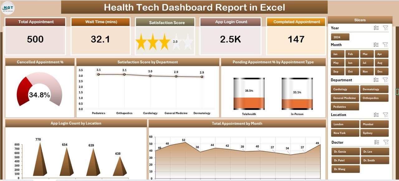
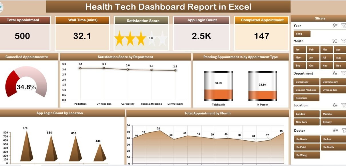
Summary Page — 5 KPI cards and 5 pivot-driven charts with a right-side slicer panel
Key Features of Health Tech Dashboard Report in Excel
The Health Tech Dashboard Report in Excel is built around three design principles: one source of truth, slicer-first filtering, and refresh-driven updates. There are no array formulas, no LET functions, no VBA. Everything runs on pivot tables linked to a single flat Data Sheet, with charts pointing at those pivots and slicers connected to the pivot caches.
That means three definitive things matter for adoption:
- Setup is under 10 minutes — paste your export into the Data Sheet, hit Refresh All on the Data ribbon, done.
- The whole report is portable — it’s one
.xlsxfile that opens identically in Excel for Windows and Excel for Mac, with no cloud dependency. - The report tracks 5 KPIs — Total Appointment, Cancelled Appointment %, Pending Appointment %, Satisfaction Score, and App Login Count. These are the metrics that come up in every health-tech weekly review meeting we’ve seen.
The dual-slicer pattern (right-side on Summary, left-side on Report) is intentional. The Summary view is your monthly leadership view — answer questions like “what’s our Satisfaction Score in Cardiology this quarter?” with one slicer click. The Report Page is your ops investigation view — answer “which 12 appointments are still pending in Northeast for last week” with row-level granularity.
Dashboard Pages Explanation
1. Summary Page
The Summary Page is the executive view. Across the top, 5 KPI cards display the headline numbers: Total Appointment, Cancelled Appointment %, Pending Appointment %, Satisfaction Score, and App Login Count. Below them, a 5-chart grid breaks each KPI down by a meaningful dimension.
The 5 charts on the Summary Page are:
- Cancelled Appointment % — trended view of cancellation rate
- Satisfaction Score by Department — which specialty drives patient satisfaction up or down
- Pending Appointment % by Appointment Type — which appointment types pile up in “pending” state
- App Login Count by Location — patient app engagement by region or clinic location
- Total Appointment by Month — seasonality and growth trend
The right-side slicer panel filters every card and chart on the page simultaneously. Click “Cardiology” in the Department slicer and every KPI card, every chart, and the page-level totals recalculate to that department.
2. Report Page
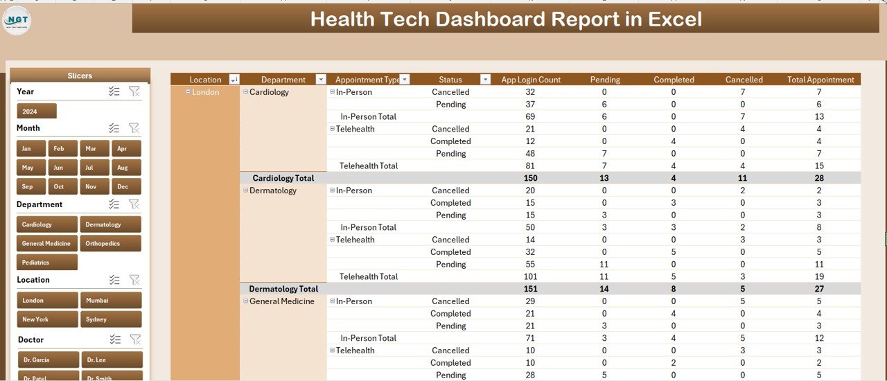
Report Page — left-side slicer with full information table
The Report Page is the operations view. Where the Summary Page summarizes, the Report Page itemizes. A full information table shows row-level appointment data — appointment ID, date, type, department, location, status, satisfaction score, app login flag. A left-side slicer panel lets you drill into a specific slice without losing context.
This is the view ops teams live in. When leadership asks “why did Cancelled % jump 6 points last week?” — switch to the Report Page, slice by Status = Cancelled and Week = last, and you have the actual list of appointments to investigate.
3. Data Sheet
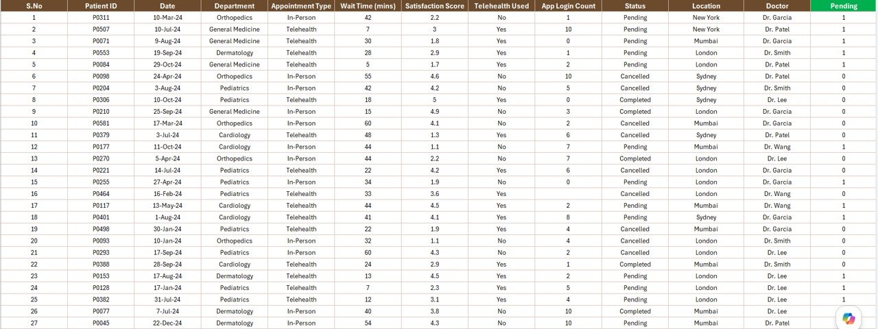
Data Sheet — single flat table that feeds every page in the report
The Data Sheet is the single source of truth. Every chart, card, slicer, and information row in the report ultimately reads from this sheet. The columns are pre-defined to match what most scheduling systems and EMRs export — appointment ID, date, appointment type, department, location, status (Booked / Completed / Cancelled / Pending), satisfaction score (typically 1–5), and an app login flag (yes/no).
The workflow is intentionally manual: export from your source system as CSV or XLSX, copy the rows, paste into the Data Sheet keeping the headers intact. That manual paste is the trade-off for a $7.99 one-time price — full BI suites automate the integration but charge $140–500 per user per month. Microsoft maintains a helpful guide on importing CSV files into Excel if your export workflow needs cleanup.
4. Support Sheet
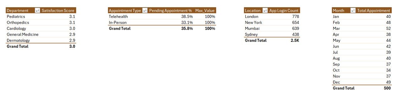
Support Sheet — pivot tables that drive every chart and KPI card
The Support Sheet is where the pivots live. Every chart on the Summary Page is pointing at a pivot table on this sheet. Every KPI card pulls from a 1-cell pivot summary on this sheet. The slicer panels on the Summary and Report pages are wired into the pivot caches on this sheet.
You can keep this sheet hidden in production. The maintenance pattern is: update the Data Sheet → click any cell → Data ribbon → Refresh All. Every pivot on the Support Sheet recalculates, every chart on the Summary Page redraws, every slicer button updates its available options.
Health Tech Dashboard Report in Excel vs. Google Sheets Equivalent vs. Paid Telemedicine BI — Feature Comparison
| Feature | Health Tech Dashboard Report in Excel | Google Sheets equivalent | Athenahealth / Kareo BI module |
|---|---|---|---|
| Cost | $7.99 one-time | $9.99 one-time | $140–500 / user / month |
| Platform | Excel desktop (Windows + Mac) | Browser-only | Web SaaS, vendor-hosted |
| Setup time | Under 10 minutes | Under 10 minutes | 2–8 weeks |
| Slicer filtering | ✅ Dual-side slicers | ✅ Slicers | ✅ Yes |
| Works offline | ✅ Yes | ❌ No | ❌ No |
| Per-user fees | ❌ None | ❌ None | ✅ Yes |
| EMR integration | Manual paste | Manual paste | Native HL7/FHIR |
| Year-1 cost at 5 users | $7.99 total | $9.99 total | $8,400–30,000 |
For health-tech teams that want clean appointment reporting without paying for a full telemedicine BI suite, the Health Tech Dashboard Report in Excel sits in the sweet spot.
Who Should Use This Template
Perfect for:
- Telemedicine and health-tech startup operators tracking 50–5,000 appointments/month
- Independent clinics and group practices that want appointment KPIs without paid practice-management BI
- Health-tech product managers tracking app login counts against appointment completion
- Healthcare ops analysts who need an Excel-native report for non-technical leadership
Not a fit if:
- You need HIPAA-compliant cloud storage with audit logs and SSO — buy a vendor BI tool
- You need real-time EMR/EHR integration — this is manual-paste, not HL7/FHIR
- You can’t de-identify your appointment data — never load PHI into a non-certified file
Real-World Use Cases
Priya runs ops at a 40-person telemedicine startup serving 8 specialties. Her Monday-morning ritual: pull last week’s appointment export from the scheduling API, paste into the Data Sheet, hit Refresh All, screenshot the Summary Page, drop it into the leadership Slack channel. Total time: 7 minutes. Before this report, she was rebuilding the same Tableau view every week for 90 minutes.
Marcus is the founder of a behavioural-health app with 1,200 monthly active patients. When his Cancelled Appointment % jumped from 8% to 14% in the Northeast region, he opened the Report Page, sliced by Location = Northeast and Status = Cancelled, and immediately spotted that “Initial Consultation” appointments accounted for most of the spike. Root cause: a new intake-form bug that prevented patients from completing pre-visit forms. He had the issue diagnosed in 15 minutes.
Dr. Sara runs a 12-physician group practice. She doesn’t want to pay $140 per user per month for Athenahealth’s analytics add-on for monthly reporting. Once a month she exports the appointment register, pastes it in, and walks her partners through Satisfaction Score by Department at the monthly partner meeting. Her practice has saved ~$20,000 a year by keeping appointment reporting in this Excel file.
Advantages of Health Tech Dashboard Report in Excel
- One-time $7.99 cost vs. $8,400+/year for vendor BI — the math works out the first month.
- Excel-native — no new tool for the team to learn, no SSO to configure, no IT approval cycle.
- Portable — single
.xlsxfile, works offline, works on Windows and Mac identically. - You own the data — it lives in your file system, not in a vendor’s database.
- Refresh-driven — one click, the whole report updates. No manual chart edits.
- Slicer-first design — non-technical leadership can filter without writing formulas.
Opportunities for Improvement
The Health Tech Dashboard Report in Excel is intentionally minimal. A few honest limitations to know:
- No real-time data feed — every refresh is a manual paste. If you need streaming data, use Power BI with a connected data source, or a vendor BI tool.
- No row-level security — anyone with the file sees all the data. Vendor BI tools enforce per-user data slicing.
- No native HIPAA compliance — Excel files on a local disk are not the right home for identifiable PHI. De-identify your export before loading.
- 5 KPIs is a starting point — to add more, drop a new pivot on the Support Sheet, build a chart, and drag it onto the Summary Page.
Best Practices
- De-identify before pasting — strip names, MRNs, and contact information from your export. Replace with anonymous IDs.
- Refresh on a schedule — Monday-morning refresh works well for weekly cycles. Month-end for monthly cycles.
- Keep a snapshot — save a dated copy after each refresh (“Health-Tech-Report-2026-05-Week-19.xlsx”) for an audit trail.
- Use the Report Page for investigation, the Summary Page for communication — don’t show leadership the row-level table by default.
- Lock the column headers on the Data Sheet — the pivots depend on exact header names. Any rename breaks the chain.
Explore Relevant Templates
If this report is helpful, you may also like:
- Healthcare & Hospital Management Bundle — save 38% across 8 premium healthcare templates
- Telehealth Dashboard in Excel — full telemedicine analytics dashboard
- Healthcare Services Report in Excel — companion service-delivery KPI report
- Mental Health Services Report in Excel — behavioural-health version of this report
- Medical Practice Dashboard in Google Sheets — Google Sheets alternative
- Telehealth Dashboard in Power BI — Power BI alternative for advanced analytics
Frequently Asked Questions
What KPIs does the Health Tech Dashboard Report in Excel track?
The Health Tech Dashboard Report in Excel tracks 5 KPIs on the Summary Page — Total Appointment, Cancelled Appointment %, Pending Appointment %, Satisfaction Score, and App Login Count. Each updates automatically when you refresh the pivots after replacing the Data Sheet rows with your own export.
How long does setup take?
Setup takes under 10 minutes. Open the file, replace the sample rows on the Data Sheet with your appointment export, click Refresh All on the Data ribbon, and every chart, card, and slicer updates. No formulas to edit, no macros required.
Does this work in Excel for Mac and Excel Online?
The Health Tech Dashboard Report in Excel works fully in Excel for Windows and Excel for Mac desktop versions. Excel Online supports the report for viewing and basic filtering, but slicer interaction and full pivot refresh are most reliable in the desktop app.
Is it safe to load real patient data into this report?
This is a local Excel file with no cloud sync, so you control the file. However, never paste identifiable PHI into any template you didn’t build yourself — de-identify the export before loading. For HIPAA-regulated environments, use a vendor-certified BI tool.
How does this compare to Athenahealth or Kareo BI?
Athenahealth and Kareo bundle BI inside a $140–500 per user per month practice-management suite with native EMR integration. The Health Tech Dashboard Report in Excel is a $7.99 one-time-purchase reporting template — no integration, no per-user fees, you paste the data yourself. Different tools for different stages of growth.
Can I add my own KPIs or charts?
Yes. The Support Sheet contains the pivot tables that drive every chart. Add a new pivot, build a chart from it, and drop it onto the Summary Page. The slicer panel will pick up the new chart automatically if it shares the same source data.
About the Author
Built by PK — Microsoft Certified Professional with 15+ years of Excel, Google Sheets, and Power BI experience. Founder of NextGenTemplates, reaching 300K+ subscribers across YouTube channels. Every template is hand-built and tested before release.
Conclusion
The Health Tech Dashboard Report in Excel solves a specific problem: telemedicine and health-tech ops teams need clean appointment KPIs reporting without paying $8,400+ a year for a vendor BI suite they barely use. With 5 KPIs, 5 pivot-driven charts, dual slicer panels, and a single-paste Data Sheet workflow, this report covers the weekly and monthly reporting needs of most health-tech operators at a fraction of the cost.
👉 Click here to Purchase the Health Tech Dashboard Report in Excel
✅ Instant download · One-time payment · No subscription
🎥 For step-by-step video tutorials, visit Youtube.com/@PK-AnExcelExpert
📅 Last updated: May 2026