Laboratory Instruments Dashboard in Excel is a ready-to-use reporting template for labs that need clearer visibility into instrument usage, downtime, maintenance cost, calibration cost, asset value, test runs, and inventory status. Instead of checking multiple spreadsheets manually, this workbook gives you 5 dashboard pages, 5 KPI cards, 20 analysis charts, a structured data sheet, and a support sheet. For teams that manage diagnostic, research, pharmaceutical, or quality-control equipment, even a few hours of unplanned downtime can delay testing and increase cost. This dashboard helps you review those signals in one place.
Click here to purchase Laboratory Instruments Dashboard in Excel
Laboratory Instruments Dashboard in Excel
Key Features of Laboratory Instruments Dashboard in Excel
- Overview Page: Review total usage hours, downtime hours, maintenance cost, purchase value, and average satisfaction score.
- Utilization Page: Analyze usage by lab, downtime by criticality, test runs by location, and vendor-level service cost.
- Maintenance Page: Track downtime by instrument type, purchase value by cost band, technician cost, and calibration event status.
- Calibration Page: Review calibration pass percentage, failed tests, vendor calibration cost, and purchase value by location.
- Inventory Page: Monitor assets by lab, purchase value by criticality, assets by quarter, and calibration cost by month.
- Interactive slicers: Apply quick filters to review specific labs, instruments, locations, vendors, months, and status groups.
- Refresh-ready Excel design: Replace data in the Data sheet, click Refresh All, and update pivots, charts, cards, and slicers.
Dashboard Pages Explanation
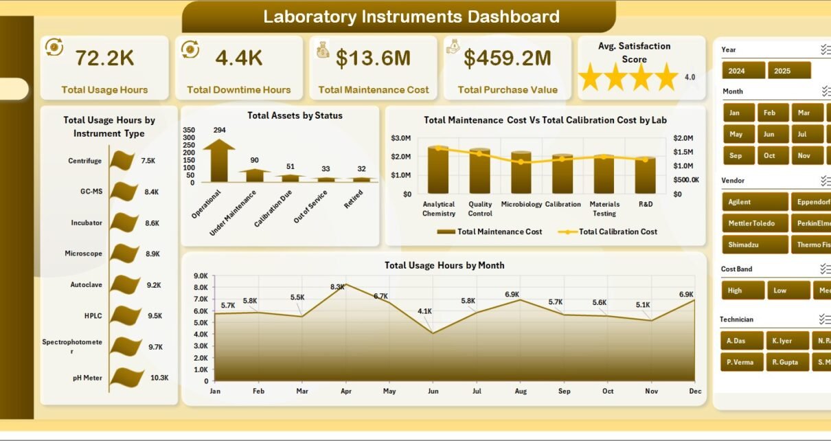
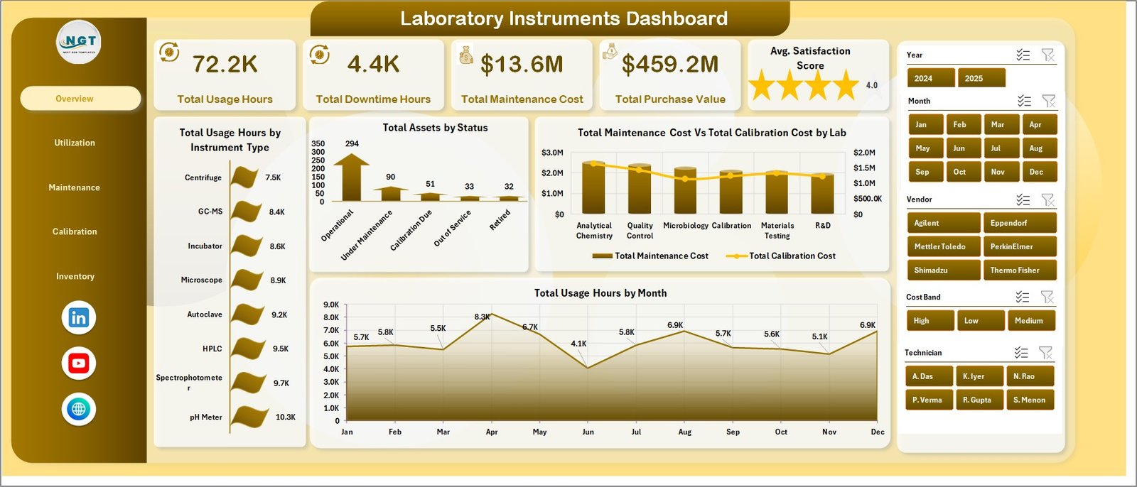
1. Overview Page
The Overview Page is the executive summary of the workbook. The top cards show Total Usage Hours, Total Downtime Hours, Total Maintenance Cost, Total Purchase Value, and Avg. Satisfaction Score so decision-makers can quickly understand operational health.
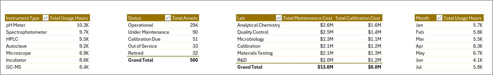
Total Usage Hours by Instrument Type: This chart compares how many hours each instrument type is used. It helps identify high-demand equipment groups and underutilized categories.
Total Assets by Status: This visual shows the asset count by current status. It helps teams see whether instruments are active, under maintenance, retired, or waiting for action.
Total Maintenance Cost Vs Total Calibration Cost by Lab: This chart compares maintenance and calibration spending by lab. It helps managers find labs where service cost may need further review.
Total Usage Hours by Month: This trend shows how instrument usage changes month by month. It supports workload planning and helps detect seasonal demand.
2. Utilization
The Utilization page focuses on how instruments are used across labs, locations, criticality levels, and vendors.
Total Usage Hours by Lab: This chart compares workload across labs. It helps identify labs that may require more capacity, better scheduling, or additional equipment support.
Total Downtime Hours by Criticality: This visual groups downtime by criticality level. It helps teams prioritize high-criticality instruments before downtime affects testing schedules.
Total Test Runs by Location: This chart compares test volume across locations. It helps operations teams understand where laboratory activity is concentrated.
Total Maintenance Cost Vs Total Calibration Cost by Vendor: This chart compares vendor-level service and calibration cost. It supports vendor review, negotiation, and cost control.
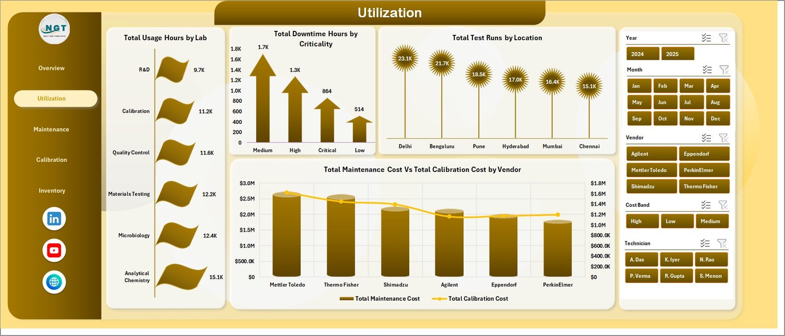
Utilization
3. Maintenance
The Maintenance page helps teams understand downtime, technician cost, asset value, and calibration event status.
Total Downtime Hours by Instrument Type: This chart identifies which instrument groups create the most downtime. It helps maintenance teams decide where preventive action should begin.
Total Purchase Value by Cost Band: This visual groups equipment investment into cost bands. It helps leaders understand where high-value assets are concentrated.
Total Maintenance Cost by Technician: This chart compares cost by technician. It supports workload review, service tracking, and maintenance accountability.
Total Calibration Events by Status: This visual shows calibration events by status. It helps teams follow up on pending, failed, overdue, or completed calibration work.
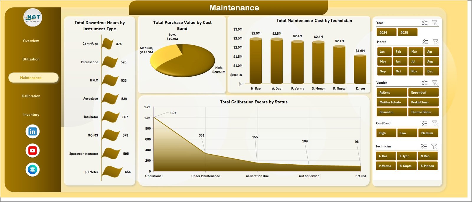
Maintenance
4. Calibration
The Calibration page is useful for quality, compliance, and lab operations teams that need to monitor calibration outcomes and cost.
Calibration Pass % by Instrument Type: This chart compares calibration pass percentage across instrument types. It helps identify equipment groups that may need process review.
Total Failed Tests by Year: This chart shows failed test counts over time. It helps quality teams see whether failures are increasing, decreasing, or staying stable.
Total Calibration Cost by Vendor: This visual compares calibration cost across vendors. It helps evaluate supplier cost patterns and budget impact.
Total Purchase Value by Location: This chart shows asset value by location. It helps leaders understand where the largest instrument investment sits.
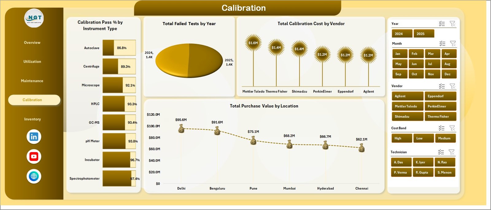
Calibration
5. Inventory
The Inventory page focuses on asset distribution, value, criticality, quarterly movement, and calibration cost trends.
Total Assets by Lab: This chart compares asset counts across labs. It helps teams see where equipment is concentrated.
Total Purchase Value by Criticality: This visual connects asset value with operational importance. It helps determine how much investment is tied to high-criticality instruments.
Total Assets by Quarter: This chart tracks asset count by quarter. It helps identify inventory growth, retirements, and asset changes over time.
Total Calibration Cost by Month: This trend shows monthly calibration cost. It helps teams plan budgets and investigate unusual cost spikes.
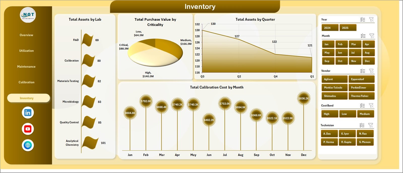
Inventory
6. Data Sheet Tab
The Data sheet is where you enter or replace the laboratory instrument records. Keep the same format when adding your own rows so the dashboard, slicers, pivot tables, and charts continue to refresh correctly.
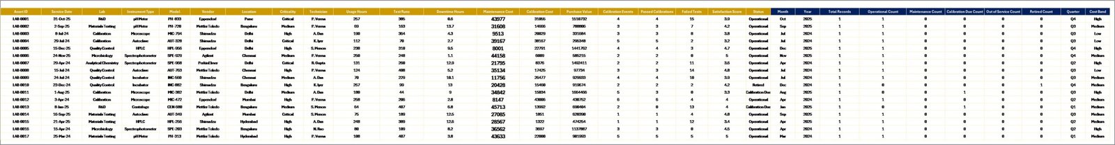
Data Sheet tab
7. Support Sheet
The Support sheet contains the pivot tables used to build the dashboard dynamically. After updating the Data sheet, go to the Excel Data tab and click Refresh All. You can keep the Support sheet hidden after setup.
Support sheet tab
Laboratory Instruments Dashboard in Excel vs. Google Sheets vs. Paid CRM/SaaS – Feature Comparison
| Feature | This Excel dashboard | Google Sheets alternative | Paid SaaS alternative |
|---|---|---|---|
| Cost | One-time template price | Low software cost but may need rebuild work | Monthly or annual subscription |
| Setup time | Replace data and refresh pivots | Import data and rebuild charts if needed | Implementation and onboarding |
| Customizable fields | Editable Excel sheets, pivots, charts, and slicers | Editable spreadsheet logic | Limited by vendor settings |
| Laboratory instrument analysis | Built-in usage, downtime, maintenance, calibration, and inventory pages | Must be designed or adapted | Depends on module |
| Share with link | Possible through OneDrive or SharePoint | Native share links | Depends on user license |
| Year-1 cost at 5 users | Template cost plus Microsoft licensing | Software plus build time | Often much higher |
Who Should Use This Template
This template is useful for laboratory managers, quality control teams, calibration coordinators, diagnostic centers, research labs, pharmaceutical labs, equipment maintenance teams, and analysts who report on instrument performance. It is best for teams that already collect instrument records in a structured format and want a faster Excel dashboard layer.
Real-World Use Cases
Laboratory director: Reviews usage hours, downtime, purchase value, and satisfaction score before monthly performance meetings.
Maintenance lead: Uses downtime, technician cost, vendor cost, and calibration event status to prioritize service work.
Quality analyst: Tracks calibration pass percentage, failed tests, and vendor calibration cost for quality reviews.
Advantages of Laboratory Instruments Dashboard in Excel
- It centralizes multiple lab instrument views in one workbook.
- It reduces manual chart preparation for recurring reporting.
- It gives leadership a quick top-level view through KPI cards.
- It connects utilization, maintenance, calibration, and inventory in one reporting flow.
- It works inside Microsoft Excel, so most teams can adapt it without a new platform rollout.
Opportunities for Improvement
This is an Excel dashboard, so it depends on accurate data entry and regular refreshes. It is not a live equipment monitoring system, LIMS, CMMS, regulatory filing application, or automated alerting tool. Teams that need real-time sensor feeds, approval workflows, or user-level audit trails may need a dedicated system in addition to this workbook.
Best Practices
- Keep the Data sheet column structure unchanged when replacing sample rows.
- Refresh all pivot tables after every data update.
- Review critical instruments separately when downtime increases.
- Use consistent vendor and technician names to avoid duplicate categories.
- Back up the workbook before making structural changes.
Microsoft also provides guidance on refreshing PivotTables in Excel here: Refresh PivotTable data.
Explore Relevant Templates
You may also like Laboratory Instruments KPI Dashboard in Excel, Laboratory Instruments KPI Dashboard in Power BI, and IVF Centers Dashboard in Excel. Browse more Excel dashboard templates at NextGenTemplates Excel Dashboard category.
Frequently Asked Questions
Do I need advanced Excel knowledge?
No. You can use the dashboard by replacing data, refreshing pivots, and using slicers.
Can I add my own laboratory records?
Yes. Add your own rows in the Data sheet while keeping the same format.
How do I refresh the dashboard?
After changing the Data sheet, go to the Excel Data tab and click Refresh All.
Can the Support sheet be hidden?
Yes. It contains pivot tables for the dashboard and can be hidden after setup.
Is this a live monitoring tool?
No. It is an Excel reporting template and updates when you refresh the workbook.
Can I customize the charts?
Yes. Since it is an Excel workbook, you can edit charts, pivots, formatting, and fields.
About the Author
Built by PK – Microsoft Certified Professional with 15+ years of Excel, Google Sheets, and Power BI experience. Founder of NextGenTemplates, reaching 300K+ subscribers across YouTube channels. Every template is hand-built and tested before release.
Conclusion
The Laboratory Instruments Dashboard in Excel gives laboratories a practical way to review instrument usage, downtime, maintenance cost, calibration cost, purchase value, and inventory trends without building a workbook from scratch. It is especially useful for monthly reporting, management reviews, and operational follow-up.
Click here to purchase Laboratory Instruments Dashboard in Excel
Visit our YouTube channel for step-by-step Excel tutorials: Youtube.com/@PKAnExcelExpert