Part of the free Module 7: Conditional Formatting · Lesson 4 of 15 · Full Excel course
Updated on 5 September 2026 · Works in Excel 365, 2021, 2019 and 2016 unless noted.
Color scales in Excel are a conditional formatting rule that shades every cell in a range on a two-colour or three-colour gradient according to its value, turning a plain table into a heat map. The highest value gets the first colour, the lowest gets the last, and everything between blends. You find them under Home > Conditional Formatting > Color Scales.
What a colour scale does
A colour scale looks at all the numbers in the selected range at once. It finds the smallest and largest values, assigns each end a colour, and then colours every other cell in proportion to where it sits between those two ends. Because the rule reads the whole range, a colour scale is relative: add a bigger number and every other cell shifts a little towards the low colour.
That relative behaviour is what makes colour scales good at showing patterns rather than pass or fail. Sales by day and location, temperature logs, survey scores, attendance grids, risk matrices and correlation tables all read faster as a heat map than as a block of digits. When you need a fixed threshold, such as anything under 150 in red, a Highlight Cells Rule is the better tool.
The 12 preset colour scales
The Color Scales gallery holds twelve presets in two rows. The top row contains six 3-colour scales and the bottom row six 2-colour scales. The preset name lists the colours from the highest value to the lowest, so in the Green – Yellow – Red Color Scale the top value is green and the bottom value is red, while Red – Yellow – Green reverses that.
| Row | Preset (high to low) | Colours | Best for |
|---|---|---|---|
| 3-colour | Green – Yellow – Red | 3 | High is good: sales, scores, output |
| 3-colour | Red – Yellow – Green | 3 | Low is good: costs, defects, delays |
| 3-colour | Green – White – Red | 3 | Above and below a midpoint, white in the middle |
| 3-colour | Red – White – Green | 3 | Same as above with low values green |
| 3-colour | Blue – White – Red | 3 | Colour-blind friendly diverging scale |
| 3-colour | Red – White – Blue | 3 | Temperature style: hot red, cold blue |
| 2-colour | White – Red | 2 | Intensity, high values stand out in red |
| 2-colour | Red – White | 2 | Intensity, low values stand out in red |
| 2-colour | Green – White | 2 | Intensity, high values green |
| 2-colour | White – Green | 2 | Intensity, low values green |
| 2-colour | Green – Yellow | 2 | Gentle single-direction ramp |
| 2-colour | Yellow – Green | 2 | Reverse of the above |
A 2-colour scale shows intensity only: darker means more. A 3-colour scale adds a midpoint colour, which lets the reader see at a glance whether a value is above or below the middle of the range. The 3-colour scales with white in the middle are the classic diverging heat map used for variance from target or from average.
Step by step: apply a colour scale to a sales table
The example uses a day-wise, location-wise sales table in B2:G9. The numbers are daily sales for six locations across seven days.
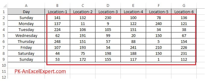
- Select the numeric range, here B2:G9. Leave out headers and any total row or column, because a total is always the largest number and would take the top colour for itself.
- Go to Home > Styles > Conditional Formatting > Color Scales. The gallery opens with the twelve presets.
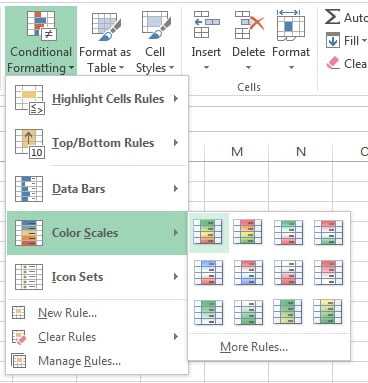
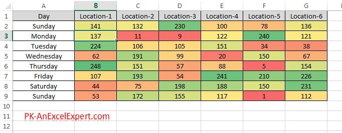
- Hover over a preset and the sheet previews it live. Click Green – Yellow – Red Color Scale to apply it. Sales are a high-is-good measure, so green belongs on the top values.
- Check the result. The largest sale in the range is solid green, the smallest is solid red, and the rest blend through yellow according to their position.
How Excel maps values to colours
Behind every preset sit two or three anchor points: Minimum, Midpoint (3-colour scales only) and Maximum. Each anchor has a type that tells Excel which value earns that anchor’s colour. Cells at or beyond an anchor get the anchor colour in full; cells between two anchors get a straight blend of the two colours.
| Type | What the anchor value is | When to use it |
|---|---|---|
| Lowest Value / Highest Value | The smallest or largest number currently in the range. Default for Minimum and Maximum. | Quick heat maps where the data has no outliers |
| Number | A fixed value you type, for example 150 | Fixed targets, so the colours mean the same thing every month |
| Percent | A percentage of the distance from lowest to highest value. 50 percent sits halfway between the two, whatever the values are. | Evenly spread data with no extreme values |
| Percentile | A rank position. The 90th percentile is the value that 90 percent of cells fall at or below. Default for the Midpoint at 50. | Skewed data or outliers, because ranks ignore the size of the gap |
| Formula | A formula that returns a number, for example =AVERAGE($B$2:$G$9) |
Anchors that follow a calculated target or the mean |
Percent and Percentile look similar but behave differently. With values 10, 20, 30, 40 and 500, the 50 percent point is 255 (halfway between 10 and 500), so four of the five cells sit in the bottom half. The 50th percentile is 30, the middle-ranked value, so the colours are spread evenly. Percentile is the setting that rescues a heat map from a single large number.
The midpoint in a 3-colour scale
The midpoint is the anchor that gives a 3-colour scale its meaning. By default it is the 50th percentile, so half the cells lean towards the low colour and half towards the high colour. Change it to a Number equal to your target and the scale becomes a variance map: above target shades towards green, below target towards red, and a cell exactly on target shows the pure middle colour. Set it to Formula with =AVERAGE($B$2:$G$9) and the scale centres on the mean instead.
Two rules apply to the midpoint. It must lie between the minimum and maximum, and if you type a midpoint number outside the data the middle colour never appears. The Formula type needs absolute references; a relative reference such as =B2 is rejected because a colour scale rule is evaluated for the whole range at once, not cell by cell.
Customise a colour scale with More Rules or Edit Rule
- Select the range and choose Home > Conditional Formatting > Color Scales > More Rules. To change an existing scale instead, open Manage Rules, select the rule and click Edit Rule.
- In the New Formatting Rule dialog the rule type is Format all cells based on their values. In the Format Style drop-down pick 2-Color Scale or 3-Color Scale.
- For each anchor set the Type (Lowest Value, Number, Percent, Percentile or Formula), the Value and the Color. The Color drop-down accepts any theme or custom colour, so you can match a company palette.
- Watch the Preview bar at the bottom of the dialog, then click OK.
Two options you may look for are missing on purpose. Colour scales have no Stop If True checkbox and no Show Value option; they always keep the cell value visible and always shade the cell fill. The Format all cells based on their values lesson walks through the same dialog for data bars and icon sets.
Reading a heat map correctly
A heat map answers the question where, not how much. Read it in three passes. First scan for the solid anchor colours: they mark the extremes. Second look for blocks of similar colour, which show a pattern such as one location that is always paler than the others or one weekday that is dark everywhere. Third check the middle tones against the midpoint setting, because with the default 50th percentile the yellow cells are the median, not the target.
Add a legend in a nearby cell when the sheet will be shared, for example three cells filled with the anchor colours labelled Low, Median and High. Readers who cannot see the rule dialog have no other way to know what the colours mean.
Colour scale, data bars or icon sets?
| Feature | Shows | Best when | Weakness |
|---|---|---|---|
| Colour scale | Position of every value in the range as a fill colour | Dense grids where the pattern matters more than any single number | Relative, so one outlier flattens the rest; hard to read in greyscale print |
| Data bars | Size of each value as a bar length | Single columns where you compare magnitudes, including negatives | Bars hide small differences and clutter wide tables |
| Icon sets | Which of three to five bands a value falls in | Status reporting with fixed thresholds, KPI scorecards | Only a few bands; icons take space and need aligned columns |
A simple rule: colour scales for a grid, data bars for a column, icon sets for a status. Do not stack a colour scale and data bars on the same cells; the bar hides the fill and the reader sees neither clearly.
Per-row colour scales for comparing months
One rule over the whole table compares every cell with every other cell. When rows hold products with very different volumes, the big product is always green and the small one always red, and the month-to-month pattern disappears. To compare months within each row, give each row its own scale:
- Select the first data row only, for example B2:G2, and apply the preset.
- With B2:G2 still selected, double-click Format Painter on the Home tab and click each remaining row in turn. Each click creates a separate rule whose Applies to range is that row alone.
- Open Manage Rules to confirm one rule per row. Because each rule has its own range, the lowest and highest values are found within the row.
The same technique works column by column when you want to compare locations within each month. The cost is a longer list in the Rules Manager, so for large tables it can be simpler to add a helper block that divides each value by its row maximum and colour that instead.
Outliers and the Percentile fix
With Lowest Value and Highest Value as anchors, a single huge number takes the top colour and squeezes every other cell into the bottom of the gradient, so the map looks flat. The fastest cure is to open Edit Rule and change the Maximum type to Percentile with a value of 95. The top 5 percent of cells, including the outlier, share the full high colour and the remaining 95 percent spread across the gradient again. Setting the Minimum to Percentile 5 does the same job at the low end. If the target is fixed, use Number instead so the colours keep the same meaning from month to month.
Worked example: monthly sales with one large order
A distributor records monthly sales for three regions in B2:D7. May in the North region includes a one-off bulk order.
| Month | North | South | East |
|---|---|---|---|
| Jan | 120 | 95 | 140 |
| Feb | 135 | 110 | 128 |
| Mar | 142 | 88 | 151 |
| Apr | 128 | 130 | 149 |
| May | 610 | 118 | 133 |
| Jun | 150 | 124 | 160 |
- Select B2:D7 and apply Color Scales > Green – Yellow – Red. The 610 turns solid green, 88 turns solid red, and every other cell, all between 95 and 160, sits in the lowest 14 percent of the 88 to 610 range, so the table is almost entirely red and orange. The pattern is lost.
- Open Manage Rules > Edit Rule. Set Maximum to Percentile 95, keep Midpoint at Percentile 50 and Minimum at Lowest Value. Click OK. Now 610 and 160 share the top green, the median value of about 131 is yellow, and the gradient is spread across the real range of the business.
- For a target view, edit again and set Midpoint to Number 130. Any month above 130 leans green and any month below leans red, which answers the question the manager actually asked.
Result: the same eighteen cells tell three different stories depending on the anchors, which is why the anchor settings deserve as much attention as the colours.
Tips and common mistakes
- Select numbers only. Headers are text and are ignored, but a total row or column is a number and will always claim the top colour.
- Use one measure per scale. Mixing percentages with currency or units with rupees produces a gradient that means nothing.
- Prefer diverging scales for variance. Green – White – Red or Blue – White – Red with a Number midpoint reads clearly; Green – Yellow – Red hides where the target is.
- Test in greyscale before printing. Red and green print as similar greys. Blue – White – Red survives a black and white printer and suits colour-blind readers.
- Check Manage Rules before applying a second preset. Each click in the gallery adds a new rule; the top rule wins and the others waste calculation time.
- Keep the Applies to range tight. A colour scale on whole columns scans a million rows on every recalculation and slows the workbook.
- Zeros are values, blanks are not. A zero takes the low colour and drags the scale; a blank is skipped. Clear placeholder zeros or use a Number minimum.
Errors and how to fix them
| Problem | Cause | Fix |
|---|---|---|
| Some cells have no colour at all | They contain text, including numbers stored as text, or an error value; colour scales ignore both | Convert with Data > Text to Columns or VALUE, and wrap error-prone formulas in IFERROR |
| Blank cells are not shaded | Blanks are ignored by design | Enter 0 if a blank means zero, otherwise leave it, or add a separate Highlight Cells rule for blanks |
| The whole table looks the same colour | One outlier at Highest Value stretches the range | Edit Rule, set Maximum to Percentile 95 or a fixed Number |
| Midpoint colour never appears | The midpoint Number lies outside the data, or equals the min or max | Choose a midpoint between the smallest and largest values, or return to Percentile 50 |
| Formula type shows an error message | The formula uses a relative reference or returns text | Use absolute references such as =$H$1 and make sure the result is a number |
| Colours change when new data is added | Lowest and Highest Value anchors recalculate with the data | Expected behaviour; switch to Number anchors if the colours must stay fixed |
Practice exercise
Open the course practice file or use any table of numbers, then:
- Apply the Green – Yellow – Red preset to B2:G9 and identify the best and worst day for each location.
- Edit the rule to a 3-Color Scale with the Midpoint set to Number 170. Note which cells change colour.
- Type 900 into one cell, watch the map flatten, then set the Maximum to Percentile 95 and compare.
- Delete the rule and rebuild it row by row with Format Painter so each day is compared across locations only.
- Switch the preset to Blue – White – Red and print preview in black and white to see which scale survives.
Key takeaways
- A colour scale shades cells by their position between the smallest and largest value in the range, producing a heat map.
- The gallery has six 3-colour and six 2-colour presets; the preset name lists colours from the highest value to the lowest.
- Minimum, Midpoint and Maximum anchors can be Lowest or Highest Value, Number, Percent, Percentile or Formula.
- Percentile anchors and a fixed Number midpoint are the two settings that turn a pretty gradient into a useful report.
- One outlier flattens a Lowest to Highest scale; Percentile 95 on the Maximum restores the spread.
- Use colour scales for grids, data bars for single columns and icon sets for status bands.
Related lessons
- Conditional Formatting course hub
- Data Bars in Excel: gradient, solid and negative bars
- Icon Sets in Excel: traffic lights and thresholds
- New Rule: Format all cells based on their values
- Excel Dashboard course, where heat maps become dashboard tiles
- Microsoft Support: Use data bars, color scales and icon sets to highlight data
Frequently asked questions
Which colour means the highest value in an Excel colour scale?
The first colour in the preset name. In Green – Yellow – Red the highest value is green and the lowest is red; in Red – Yellow – Green the highest value is red. If you are unsure, open Manage Rules, click Edit Rule and read the Color box next to Maximum, which always shows the colour given to the largest value.
What is the difference between a 2-colour and a 3-colour scale?
A 2-colour scale blends from one colour to another and shows intensity only, so darker means more. A 3-colour scale adds a midpoint colour, usually the 50th percentile or a target number, so you can see which values are above and which are below the middle. Use 3-colour scales for variance and 2-colour scales for simple ranking.
Why does one large value make everything else the same colour?
The default anchors are Lowest Value and Highest Value, so the gradient stretches all the way to the outlier and the normal values crowd into one end. Open Edit Rule and set the Maximum type to Percentile with a value of 95, or to a fixed Number just above your usual range. The outlier keeps the top colour and the rest spread out again.
Can a colour scale ignore text, blanks and errors?
It already does. Colour scales only evaluate numeric cells, so text, numbers stored as text, blanks and error values receive no fill. Zero is a number and is included, which is why placeholder zeros pull the scale downwards. If you want blanks to show a colour, add a separate Highlight Cells or formula rule for them.
Can I apply a colour scale to each row separately?
Yes. Apply the scale to the first row, then use Format Painter to copy it to each other row one at a time. Every row gets its own rule with its own Applies to range, so the lowest and highest values are found within that row. This is the right approach when rows hold products or regions with very different volumes.
Want the finished version? Ready-made Excel KPI dashboards with heat map tables and variance colouring built in are available at NextGenTemplates.com.