Home>Blogs>Charts and Visualization>Filling Circle Chart
Filling Circle Chart
Charts and Visualization

Filling Circle Chart

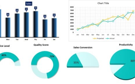
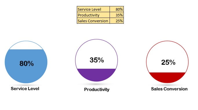
Filling Circle Chart is very informative visual in excel created by our team. This chart can be used for a KPI Metrics like- Service Level, Quality Score, Sales Conversion etc. Filled are of the circle shows the metric performance. To create this chart, we have taken the support of power point presentation to merge the shape and column chart in excel. This is totally data driven chart and will be updated as soon as the number will be change in the source.


Filling Circle Chart


Click here to download this excel file.


Watch step by step video tutorial learn how to create Filling Circle Chart in excel:


PK
Meet PK, the founder of PK-AnExcelExpert.com! With over 15 years of experience in Data Visualization, Excel Automation, and dashboard creation. PK is a Microsoft Certified Professional who has a passion for all things in Excel. PK loves to explore new and innovative ways to use Excel and is always eager to share his knowledge with others. With an eye for detail and a commitment to excellence, PK has become a go-to expert in the world of Excel. Whether you're looking to create stunning visualizations or streamline your workflow with automation, PK has the skills and expertise to help you succeed. Join the many satisfied clients who have benefited from PK's services and see how he can take your Excel skills to the next level!
https://www.pk-anexcelexpert.com

Leave a Reply