Part of the free Module 11: Excel Dashboards · Lesson 2 of 10 · Full Excel course
Updated on 5 September 2026 · Works in Excel 365, 2021, 2019 and 2016 unless noted.
A performance dashboard in Excel tracks employee and process KPIs on one screen and lets a manager filter by person, team and period. This five-page Performance Dashboard covers a call centre or sales team: calls handled, sales, average handle time, login hours, login efficiency and sales conversion, all driven by PivotTables and four shared slicers, with speedometer, battery and moving man charts on the Summary page. No VBA is used.
What the Performance Dashboard shows
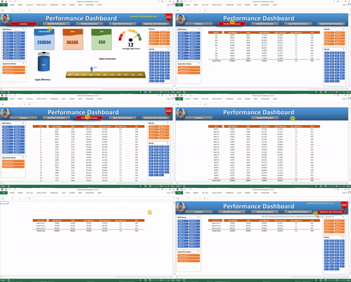
Below the title sits a navigation bar with five buttons: Summary, Monthly Performance, Weekly Performance, Agent wise Performance and Supervisor wise Performance. The active page’s button is highlighted in red. The top-left logo and the top-right image are placeholders for your company and client logos. Every page shares the same four slicers, EMP Name, Supervisor Name, Month and Week, so a selection on one page filters the whole workbook.
| KPI | Definition | How it is calculated |
|---|---|---|
| Calls Handled | Number of calls answered | Sum of the Calls Handled column |
| Sales | Number of sales closed | Sum of the Sales column |
| AHT | Average handle time per call | Total Handle Time / Calls Handled (weighted, not an average of averages) |
| Average Login Hours | Hours logged in per day | Sum of Login Hours / number of days |
| Login Efficiency | Time logged in against target | Actual Login Hours / Target Login Hours |
| Sales Conversion | Share of calls that became sales | Sales / Calls Handled |
The workbook structure
The workbook follows the three-layer pattern used throughout this course: a Raw Data sheet, a hidden Support sheet holding PivotTables and helper cells, and five display pages that only show results. The display pages never contain typed numbers; every card, table and chart traces back to a PivotTable.
| Element | Technique | Formula or feature |
|---|---|---|
| Navigation buttons | Rectangles with hyperlinks | Right-click shape, Link, Place in This Document, pick the sheet |
| Slicers on every page | PivotTable slicers, copied to each sheet | Report Connections ticked for all PivotTables |
| KPI cards | Shapes linked to cells | Select shape, type =Support!C4 in the formula bar |
| Weighted AHT | Helper column + calculated field | =[Calls Handled]*[AHT] then ='Total Handle Time'/'Calls Handled' |
| Login Efficiency | Calculated field | ='Login Hours'/'Target Hours' |
| Speedometer, battery, moving man | Doughnut and stacked charts on Support values | See the Advanced Charts module links below |
| Monthly, weekly, agent, supervisor tables | One PivotTable per page | Row field changes; Values are the same six KPIs |
How each page is built
Summary
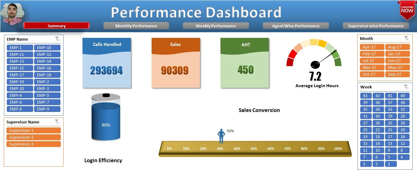
Three cards display Calls Handled, Sales and AHT. Average Login Hours is drawn on a speedometer chart, Login Efficiency on a battery chart and Sales Conversion on a moving man chart. All three charts read a small block on the Support sheet that references the grand-total row of a PivotTable, so they respond to the slicers like everything else.
Monthly Performance
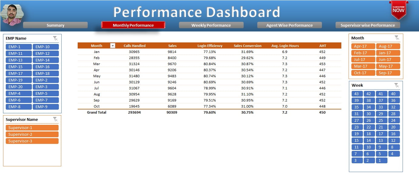
A month-wise PivotTable lists Calls Handled, Sales, Login Efficiency, Sales Conversion, Average Login Hours and AHT. The efficiency, conversion and AHT columns are calculated fields (PivotTable Analyze > Fields, Items & Sets > Calculated Field), so they stay correct whatever the slicers select.
Weekly Performance
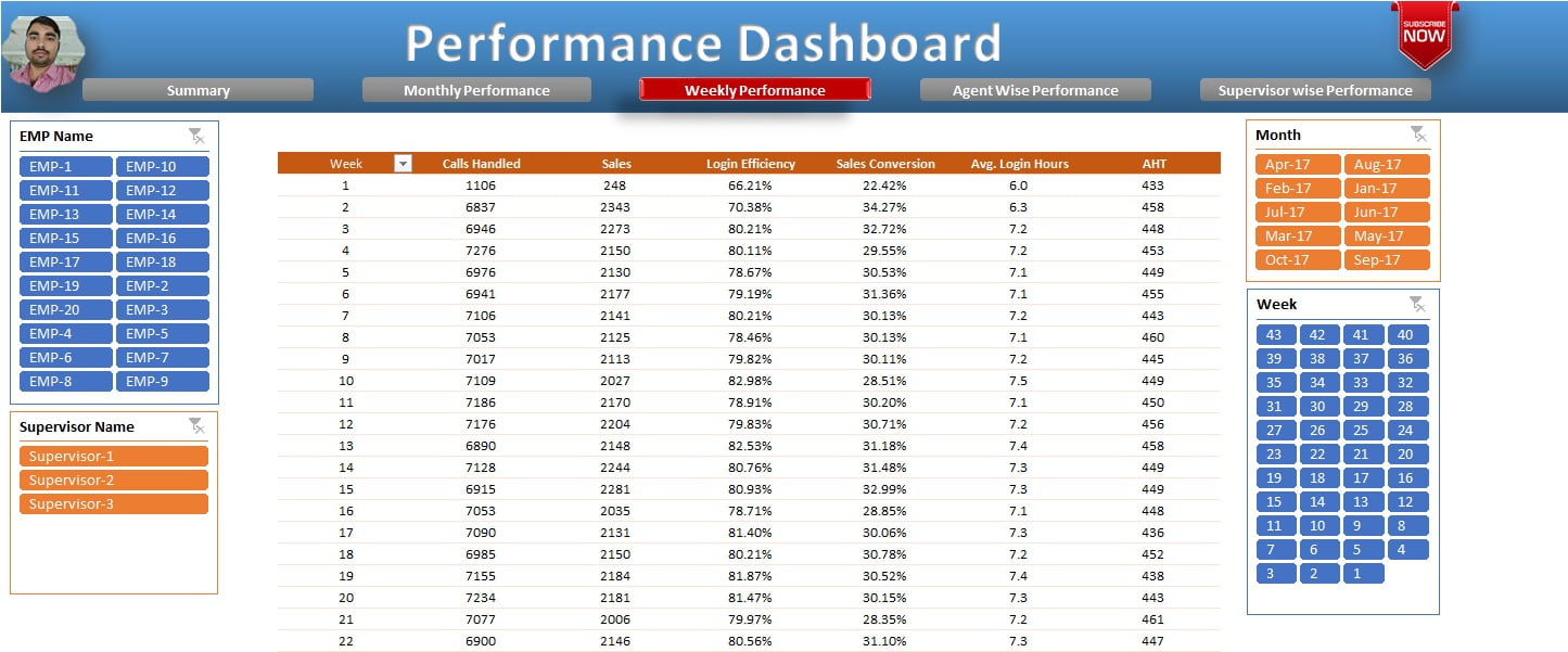
The same six metrics grouped by week, useful for spotting a dip inside a month. It is a copy of the monthly PivotTable with Week in the Rows area instead of Month.
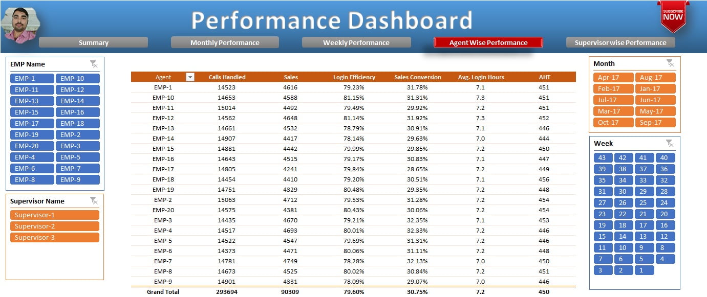
Agent wise Performance
Metrics by employee name, the page supervisors use for one-to-one reviews. Conditional formatting data bars on the Sales Conversion column make the best and worst agents stand out.
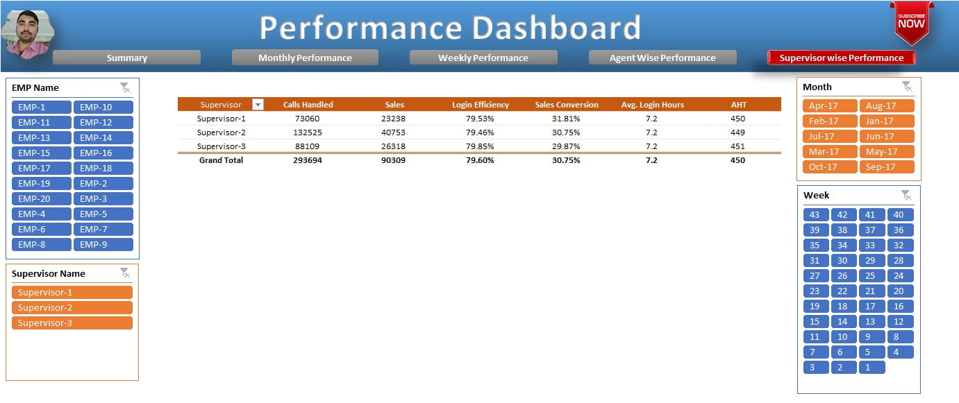
Supervisor wise Performance
Metrics rolled up by supervisor for team-level comparison. Because AHT is a calculated field, the supervisor figure is a true weighted average of the team’s calls.
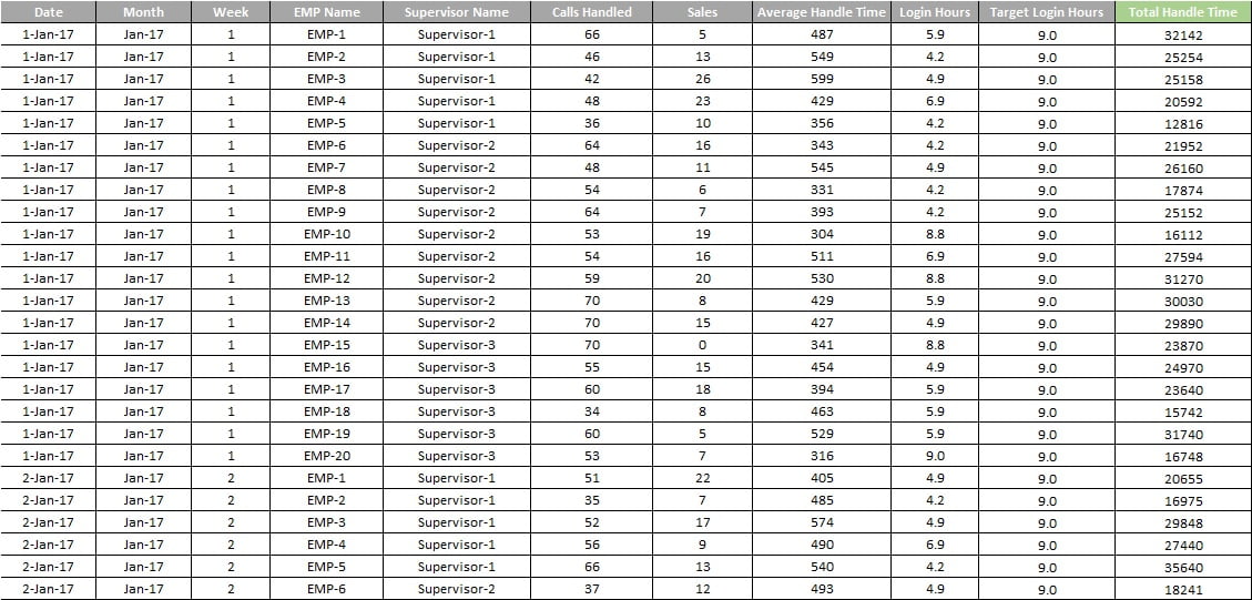
Raw Data (hidden)
One row per agent per day with EMP Name, Supervisor, Month, Week, Calls Handled, Sales, AHT, Login Hours and Target Hours. A helper column, Total Handle Time (=E2*G2, calls multiplied by AHT), lets the PivotTables compute a correct weighted AHT. Convert the range to a Table with Ctrl+T so new rows are picked up on refresh. To show the sheet, right-click any sheet tab and choose Unhide.
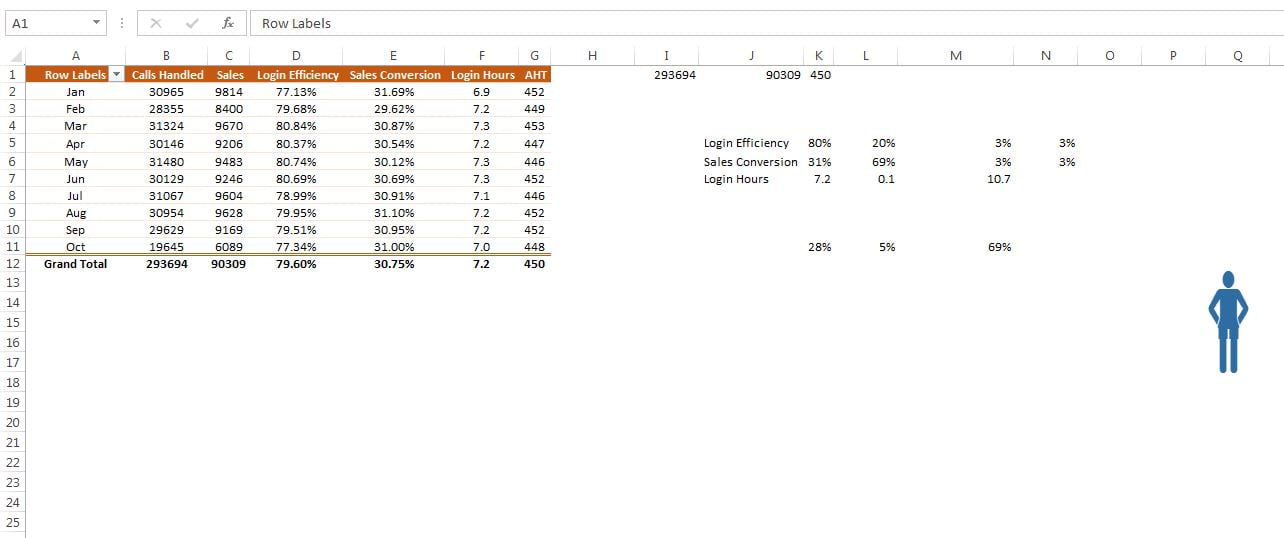
Support (hidden)
Holds the PivotTable and helper cells that feed the Summary cards and charts, plus the man picture used by the moving man chart. The speedometer reads a three-cell block (value, remainder, hidden half), the battery reads value and 1 minus value, and the moving man reads the conversion percentage as a position on a 0 to 100 track.
Worked example
Three rows of raw data for one agent show why the helper column matters.
| Day | Calls Handled | Sales | AHT (sec) | Total Handle Time | Login Hours | Target Hours |
|---|---|---|---|---|---|---|
| Mon | 40 | 6 | 300 | 12,000 | 8.0 | 8.5 |
| Tue | 20 | 2 | 420 | 8,400 | 7.5 | 8.5 |
| Wed | 60 | 9 | 280 | 16,800 | 8.5 | 8.5 |
The PivotTable sums the columns: 120 calls, 17 sales, 37,200 seconds of handle time, 24 login hours against 25.5 target. The calculated fields then return AHT = 37,200 / 120 = 310 seconds (a plain average of 300, 420 and 280 would wrongly give 333), Sales Conversion = 17 / 120 = 14.2 percent and Login Efficiency = 24 / 25.5 = 94.1 percent. Select this agent in the EMP Name slicer and the Summary cards, speedometer, battery and moving man all show these three numbers.
How to use it with your own data
- Unhide Raw Data and paste your records under the same headers; keep one row per agent per day.
- Fill the Total Handle Time helper column down to the last row (automatic if the sheet is a Table).
- Go to Data > Refresh All or press Ctrl+Alt+F5.
- Replace the two logo images and change the title text.
- Hide Raw Data and Support again and save as .xlsx.
Get the finished file
The finished Performance Dashboard workbook is available as a ready-to-use template: Get the Performance Dashboard in Excel. You can also rebuild it from scratch by following the four videos below.
Watch the video
Four-part build tutorial:
Visit our YouTube channel for more step-by-step dashboard tutorials.
Tips and common mistakes
- Never average the AHT column directly. Divide total handle time by calls, as the helper column and calculated field do.
- Connect every slicer to every PivotTable. Right-click the slicer, Report Connections, tick all. One missed PivotTable and a page ignores the filter.
- Use one PivotCache. Build the later PivotTables by copying the first so they share a cache; slicers can only connect PivotTables that share a cache.
- Convert Raw Data to a Table. New rows are included on refresh without changing the data source.
- Keep Month and Week consistent. Either text labels or real dates in every row; mixing them breaks the slicer sort order.
- Link cards to cells, do not type in them. A shape with
=Support!C4in the formula bar updates itself.
Errors and how to fix them
| Symptom | Cause | Fix |
|---|---|---|
| A page does not respond to a slicer | Slicer not connected to that page’s PivotTable | Slicer > Report Connections > tick the PivotTable |
| Slicer greyed out for one PivotTable | PivotTable uses a different PivotCache | Delete it and copy an existing PivotTable instead |
| AHT looks too high or too low | Average of AHT instead of weighted calculation | Use the Total Handle Time calculated field |
| New rows missing after refresh | Data source is a fixed range | Convert Raw Data to a Table (Ctrl+T) and refresh |
| Chart shows #DIV/0! | Slicer selection has zero calls | Wrap the Support formula in IFERROR(...,0) |
Practice exercise
- Add a Quality Score column to Raw Data and show it as a seventh KPI on the Monthly page.
- Add a Location slicer and connect it to all five PivotTables.
- Replace the Sales Conversion moving man with a progress circle chart fed by the same Support cell.
- Add a sixth page, Daily Performance, by copying the Weekly PivotTable and putting Date in Rows.
Key takeaways
- Raw Data, Support and display pages: the three-layer structure keeps a multi-page dashboard maintainable.
- Ratios such as AHT and conversion must be calculated fields, never averages of a ratio column.
- Slicers copied to every page and connected to every PivotTable give a consistent filter across the workbook.
- Advanced charts are ordinary charts reading two or three helper cells on the Support sheet.
- Navigation with hyperlinked shapes needs no VBA.
Related lessons
- Excel Dashboards course hub
- Prepare data for an Excel dashboard
- Sales Dashboard in Excel
- C-SAT Dashboard in Excel
- Calculated field and calculated item in a PivotTable
- Slicers in a PivotTable
- Microsoft Support: Use slicers to filter data
Frequently asked questions
Does the Performance Dashboard use VBA?
No. Navigation uses shapes with hyperlinks, filtering uses slicers and all calculations are PivotTables, calculated fields and cell formulas, so it runs in any Excel from 2013 to Microsoft 365 on Windows or Mac without enabling macros.
How do I calculate average handle time correctly in a PivotTable?
Add a helper column Total Handle Time = Calls Handled x AHT in the raw data, then create a calculated field Total Handle Time / Calls Handled. Averaging the AHT column gives each day equal weight even when call volumes differ, which overstates or understates the true figure.
Can I add more KPIs?
Yes. Add the column to Raw Data, refresh the PivotTables, drag the new field into the Values area on each page and add a card or chart on the Summary sheet linked to the Support cell that holds its total.
Why does a chart not change when I use a slicer?
The slicer is not connected to the PivotTable that feeds the chart, or that PivotTable uses a separate PivotCache. Right-click the slicer, choose Report Connections and tick every PivotTable; if one is missing from the list, recreate it by copying a connected PivotTable.
How many rows of data can this dashboard handle?
PivotTables handle several hundred thousand rows comfortably. Around one million rows, move the data to Power Pivot or Power Query and keep the same PivotTable layout; the display pages do not need to change.
Want the finished version? Ready-made Excel dashboards, trackers and VBA systems are available at NextGenTemplates.com.