The Driving School Dashboard in Power BI tracks 5 headline KPIs across 5 interactive report pages, with 16 pre-built visuals covering Total Revenue, Total Bookings, Total Lesson Hours, Avg Satisfaction, and Total Cost. Setup takes under 15 minutes — install free Power BI Desktop, point Power Query at your booking Excel or CSV file, and click Refresh to update every visual on every page.
Driving schools today juggle multi-branch operations, instructor performance reviews, course profitability analysis, and student demographic tracking — usually across spreadsheets, paper logs, and a $50+ per-month-per-branch SaaS subscription. The Driving School Dashboard in Power BI consolidates all of that into a single .pbix file your manager can refresh in under a minute and publish to Power BI Service for the whole team.
Driving School Dashboard in Power BI
Key Features of the Driving School Dashboard in Power BI
- 5 Headline KPI Cards on the Overview Page — Total Revenue, Total Bookings, Total Lesson Hours, Avg Satisfaction, and Total Cost give you a one-glance view of operational health.
- 5 Interactive Report Pages — Overview, Branch Performance, Instructor Analysis, Course Insights, and Student Trends, each answering a specific business question.
- 16 Pre-Built Power BI Visuals — Total Bookings by Month Name, Completion Rate, Total Revenue by Branch, Total Revenue by Instructor Name, Test Pass Rate by Customer Type, Total Revenue by Vehicle Category, and 10 others.
- Power Query Auto-Refresh — Replace the sample dataset with your own Excel or CSV booking file and every card and visual recalculates with one click.
- Cross-Page Slicers — Filter the entire report by Branch, Course Type, Instructor Name, Payment Mode, Customer Type, or date range with sync filters across pages.
- Power BI Service Ready — Publish the .pbix to your workspace for browser and free Power BI mobile app access.
Dashboard Pages Explanation
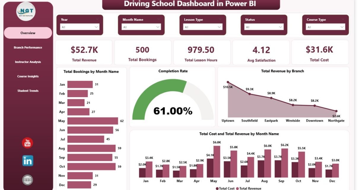
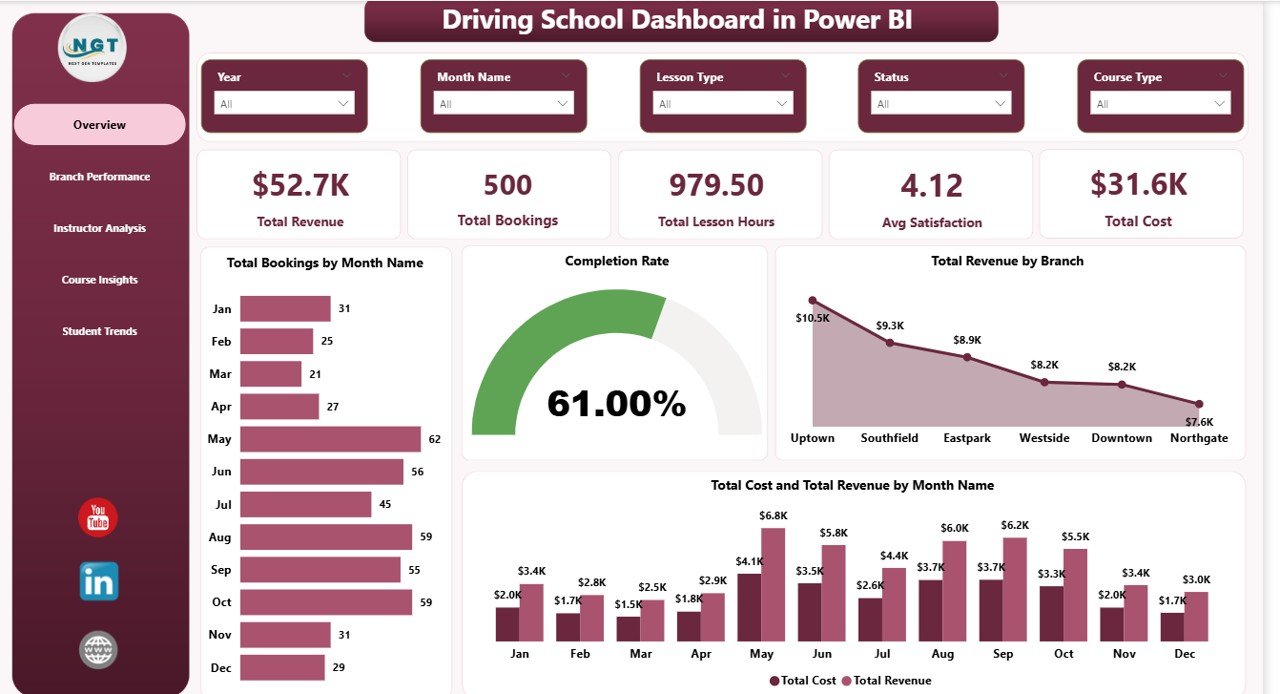
1. Overview Page
The Overview is the executive landing page. Five KPI cards across the top show Total Revenue, Total Bookings, Total Lesson Hours, Avg Satisfaction, and Total Cost for the filtered period. Below the cards sit four analytical visuals:
- Total Bookings by Month Name — month-over-month booking volume with a trend line so seasonality and growth jump out immediately.
- Completion Rate — what percent of booked lessons end up completed, the single most important quality KPI for a driving school.
- Total Revenue by Branch — quickly identifies your highest- and lowest-performing locations.
- Total Cost and Total Revenue by Month Name — overlaid bars or columns that surface margin compression and seasonal cost spikes at a glance.
Slicers above the canvas filter the whole report — pick a branch, a date range, or a course type and every visual on every page recomputes.
Overview Page
2. Branch Performance
This page is built for multi-location owners. Three visuals tell you which branches deserve more marketing, more instructors, or harder questions:
- Total Bookings by Course Type — which courses (Beginner, Refresher, Highway, Commercial, etc.) drive volume.
- Total Bookings by Branch — straight ranking of branches by booking volume.
- Total Cost and Total Revenue by Branch — sees both sides of the margin equation, surfacing branches with revenue but poor profitability.
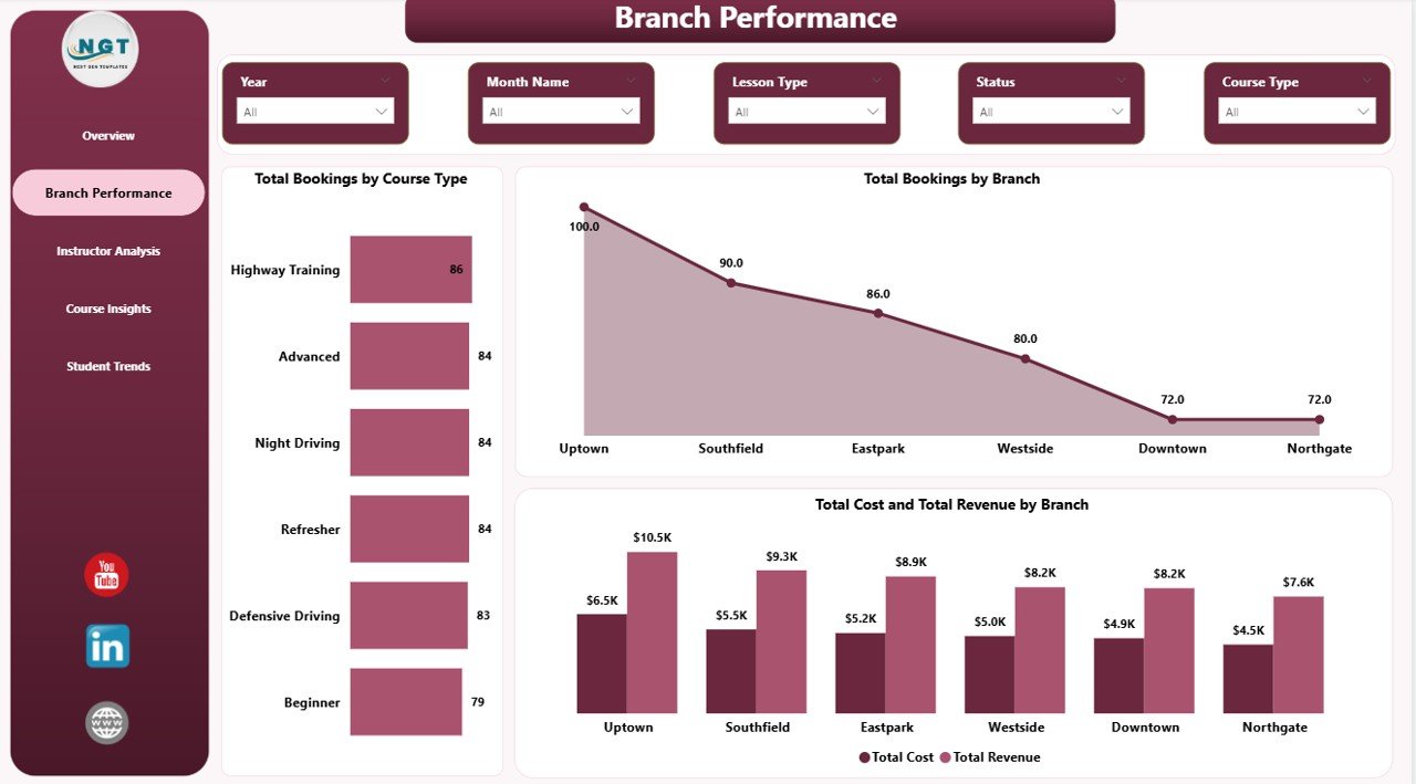
Branch Performance
3. Instructor Analysis
Training managers live on this page. Three visuals make instructor performance and customer mix analysis effortless:
- Total Revenue by Instructor Name — ranks instructors by revenue contribution so high performers can be incentivized and laggards coached.
- Total Bookings by Payment Mode — surfaces the cash vs card vs UPI vs corporate-billing mix that affects working capital.
- Test Pass Rate by Customer Type — shows whether corporate clients, individual learners, or refresher students pass at higher rates, informing both pricing and marketing.
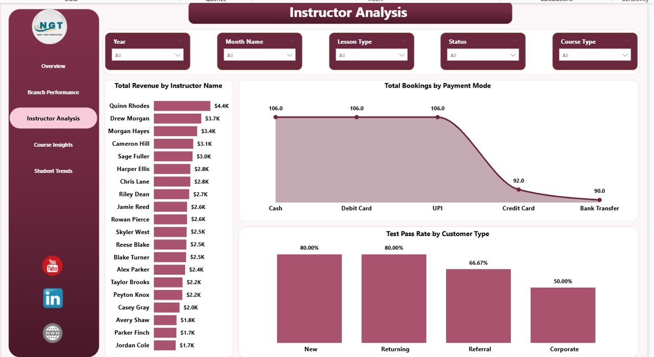
Instructor Analysis
4. Course Insights
The course profitability page. Three visuals tell you which products in your catalogue deserve more inventory of instructor hours and vehicles:
- Total Bookings by Lesson Type — single-lesson vs package vs intensive course mix.
- Total Revenue by Course Type — revenue contribution of each course offering.
- Total Revenue by Vehicle Category — car, motorcycle, truck, commercial vehicle revenue mix so fleet investments can be aligned with demand.
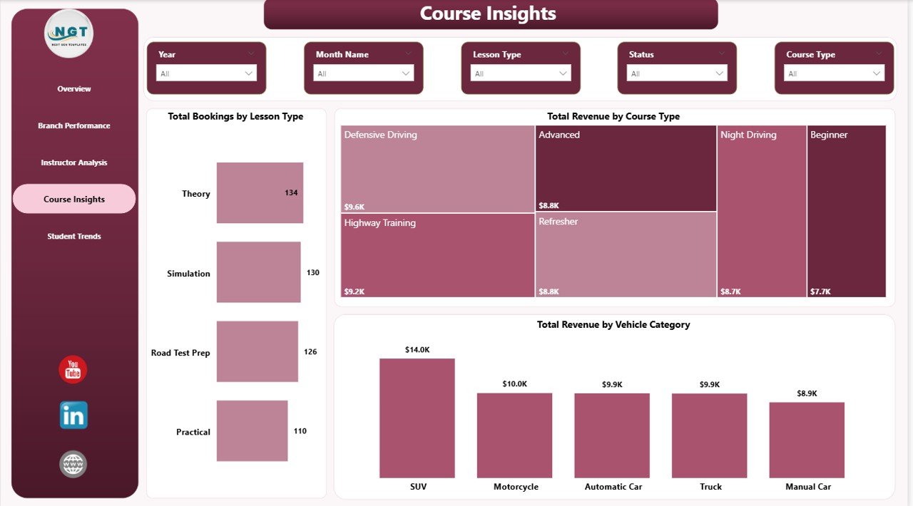
Course Insights
5. Student Trends
The marketing-team page. Three visuals reveal who pays you, what they buy, and which segments are growing:
- Total Revenue by Payment Mode — same dimension as Instructor Analysis but on revenue rather than count.
- Total Bookings by Vehicle Category — booking volume by vehicle type, complementing the revenue cut on Course Insights.
- Total Bookings by Customer Type — individual vs corporate vs returning vs referral so marketing spend can be tilted toward the highest-value segments.
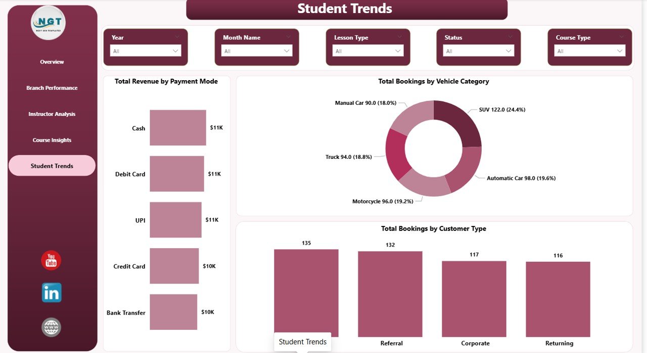
Student Trends
Driving School Dashboard in Power BI vs. Tableau / Qlik vs. Paid Driving School SaaS — Feature Comparison
| Feature | Driving School Dashboard in Power BI | Tableau / Qlik build | Paid Driving School SaaS (DriveScout / TotalDrive) |
|---|---|---|---|
| Cost | $17.99 one-time ✅ | $70+ / user / month + build cost | $49–$129 / month per branch |
| Platform | Power BI Desktop (free) + optional Power BI Service ✅ | Tableau Desktop / Qlik Sense | Web + mobile app |
| Setup time | Under 15 minutes ✅ | 3–6 weeks build cycle | 2–4 weeks onboarding |
| Mobile access | Free Power BI mobile app ✅ | Tableau Mobile / Qlik mobile | Vendor mobile app |
| Customizable KPIs & visuals | Unlimited — it’s your .pbix ✅ | Unlimited | Limited to vendor’s data model |
| Multi-branch analysis | Built-in Branch Performance page ✅ | Available with custom build | Available |
| Instructor ranking & pass-rate analysis | Built-in Instructor Analysis page ✅ | Custom build required | Available |
| Year-1 cost at 3 branches | $17.99 ✅ | $2,520+ in licenses | $1,764–$4,644 |
| Data ownership | 100% local .pbix, no cloud lock-in ✅ | Mixed (cloud + extract) | Vendor cloud only |
For driving schools that want branch, instructor, and course analytics without paying $50–$130 per branch every month, the Driving School Dashboard in Power BI sits in the sweet spot.
Who Should Use This Template
Perfect for:
- Driving school owners running 1–15 branches who already use Power BI Desktop
- Training managers tracking instructor performance and test pass rates across multiple instructors
- Multi-vehicle academies offering car, motorcycle, truck, and commercial vehicle courses
- Franchise driving school operators who need a consistent KPI report template across locations
- Power BI-literate analysts who prefer owning their .pbix locally instead of subscribing to SaaS
Not a fit if:
- Your team doesn’t use Power BI Desktop and isn’t willing to install the free Microsoft client
- You need an integrated booking engine, payment processor, or student-facing portal
- You operate a 50+ branch network needing real-time row-level security across millions of records
- You’ve never opened Power BI Desktop and aren’t comfortable refreshing data sources
Real-World Use Cases
Ravi runs a 4-branch driving school in Pune. He uses the Driving School Dashboard in Power BI every Monday morning to review Total Cost and Total Revenue by Branch and Completion Rate on the Overview page. In the first 90 days of use, he identified that his Kothrud branch had a noticeably lower completion rate, drilled into Instructor Analysis, and rebalanced assignments — saving roughly $14,000 a year he would have otherwise spent on DriveScout’s 4-branch subscription.
Priya manages instructor performance at a commercial vehicle training academy. She uses the Instructor Analysis page to rank her 18 instructors on Total Revenue by Instructor Name and Test Pass Rate by Customer Type. The pass-rate visual revealed that her academy’s pass rate for corporate clients was meaningfully higher than individual students — insight she used to pitch B2B contracts that now account for a significant share of revenue.
Anil operates a motorcycle training school with 2 locations. He uses the Course Insights page’s Total Revenue by Vehicle Category visual to decide which courses deserve more marketing budget. When he saw which vehicle categories generated the highest revenue, he doubled down on Facebook ads targeting heavy motorcycle license seekers.
Advantages of the Driving School Dashboard in Power BI
The biggest advantage is cost. A 3-branch driving school using DriveScout pays roughly $1,764–$4,644 in year one. The Driving School Dashboard in Power BI costs $17.99 once. That’s a 99%+ saving for an operation that simply needs reporting — not booking management.
The second advantage is data ownership. Your bookings, students, and instructor records stay in your file. Power BI Service is optional, not mandatory, and even when you publish, your raw data lives in your refresh source — not a vendor cloud you can be locked out of. Combined with the cross-platform Driving School Dashboard in Excel sibling, you have full flexibility on which engine your team prefers.
Third: customization. Every visual is unlocked. Add new DAX measures, drag in custom visuals from Microsoft AppSource, change the colour theme to match your branding, or duplicate a page and add new analyses. Power BI’s documentation on Microsoft Learn covers every extension point if you want to go deeper.
Opportunities for Improvement
The dashboard is reporting-only — it doesn’t book lessons, take payments, or notify students. If you need an integrated end-to-end driving school operations platform, the Driving School Dashboard in Power BI is meant to sit alongside whatever booking system you already use, not replace it.
The data model is a starter star schema, not an enterprise warehouse. For 50+ branch networks tracking millions of bookings with row-level security per branch manager, you’ll want a custom-built data model on top of an Azure SQL or Fabric backend — though the Driving School Dashboard in Power BI is a great starting reference.
Charts use stock Power BI visuals, not heavy custom theming. If you want a fully bespoke design, Power BI Desktop’s theming JSON gives you full control to match your brand identity — pulling in fonts, colours, and corner radii.
Best Practices
1. Keep your Data Source columns aligned — the dashboard expects specific column names like Branch, Course Type, Instructor Name, and Vehicle Category. If you rename them, also update the Power Query steps once.
2. Refresh weekly, not daily — driving school KPIs are weekly trends, not real-time. A Monday morning refresh ritual gives you clean week-over-week comparisons.
3. Publish to Power BI Service after major data updates — once a week is enough. Set up scheduled refresh in the Service so managers always see fresh data without you doing the work.
4. Use bookmarks for “tell-the-story” presentations — bookmarks let you save filter states like “Q3 Pune branch only” and jump between them in one click during a board review.
5. Combine with the Excel sibling — many teams use the Excel version for daily entry and the Power BI version for monthly reporting. Both share the same column structure.
Explore Relevant Templates
If you found this useful, also browse:
- Driving School Dashboard in Excel — same KPIs and pages built natively in Microsoft Excel.
- Tutoring Business Dashboard in Power BI — sister education-services dashboard for tutoring businesses.
- Music School Dashboard in Power BI — for music academies and private music studios.
- Coaching & Tutoring Dashboard in Power BI — multi-page Power BI dashboard for coaching institutes.
- Browse the full library of Power BI Dashboard Templates on NextGenTemplates.
Frequently Asked Questions
What KPIs does the Driving School Dashboard in Power BI track?
The Driving School Dashboard in Power BI tracks 5 headline KPIs on the Overview page — Total Revenue, Total Bookings, Total Lesson Hours, Avg Satisfaction, and Total Cost. It also includes 16 deeper analysis visuals across Branch, Instructor, Course, and Student pages covering revenue, cost, completion rate, payment mode, vehicle category, course type, and customer type.
How long does setup take for a new driving school?
Setup of the Driving School Dashboard in Power BI takes under 15 minutes. You install free Power BI Desktop, open the .pbix file, point Power Query at your own booking Excel or CSV file with the same column structure, and click Refresh. Every visual and KPI across all 5 report pages updates automatically — no DAX edits required.
How does the Driving School Dashboard in Power BI compare to DriveScout or TotalDrive?
The Driving School Dashboard in Power BI is a one-time $17.99 reporting template focused on KPI analytics, while DriveScout and TotalDrive are $49–$129 per month per branch full operations platforms. For driving schools that only need analytics and already manage bookings elsewhere, the Power BI dashboard saves $1,500–$4,500 per year at 3 branches.
Can I track multiple branches in the same .pbix file?
Yes. The Driving School Dashboard in Power BI has a dedicated Branch Performance page with Total Bookings by Branch, Total Bookings by Course Type, and Total Cost and Total Revenue by Branch. You can analyze unlimited branches as long as each booking record has a Branch column populated in your source data.
Does it work on Power BI Service and the mobile app?
Yes. The Driving School Dashboard in Power BI publishes cleanly to Power BI Service from Power BI Desktop. Once published, your team can view the report in a browser or on the free Power BI mobile app for iOS and Android — no additional licenses needed beyond standard Power BI access.
Can I add custom visuals or change the existing ones?
Yes. The Driving School Dashboard in Power BI is fully editable. Add new DAX measures, drag in additional visuals, change the colour theme, or import custom visuals from Microsoft AppSource. Every chart, KPI card, and slicer is unlocked — you own the .pbix file end-to-end.
About the Author
Built by PK — Microsoft Certified Professional with 15+ years of Excel, Google Sheets, and Power BI experience. Founder of NextGenTemplates, reaching 300K+ subscribers across YouTube channels. Every template is hand-built and tested before release.
Conclusion
If you run a driving school and you’re tired of either piecing together monthly reports in Excel by hand or paying $50–$130 per branch per month for a SaaS platform, the Driving School Dashboard in Power BI gives you a five-page, 16-visual analytics report for the price of a coffee — once.
👉 Click here to Purchase the Driving School Dashboard in Power BI
Instant download · One-time payment · No subscription
For more Power BI tutorials and dashboard walkthroughs, visit our YouTube channel: YouTube.com/@PK-AnExcelExpert.
📅 Last updated: May 2026