Shelf space is the single most expensive asset in retail — and the easiest one to under-measure. Modern retailers are losing 8–12% of potential sales every month to under-performing shelf positions, slow-moving SKUs, and stockouts that go undetected for weeks. The Shelf Space Utilization KPI Dashboard in Power BI tracks every shelf metric across 3 dedicated report pages with MTD, YTD, Target, and Prior Year comparisons in one .pbix file.
This article walks through the dashboard’s structure, the 16-column KPI scorecard, the LTB/UTB icon logic that flags off-target retail KPIs in red and green, and how to set up the entire system in under 10 minutes by filling out three Excel sheets. Whether you run a single boutique or 50-store regional chain, this template removes the manual work from monthly category reviews.
What Is the Shelf Space Utilization KPI Dashboard in Power BI?
The Shelf Space Utilization KPI Dashboard in Power BI is a ready-to-use .pbix report file that turns retail merchandising data into actionable insights. Built around three integrated pages — Summary, KPI Trend, and a hidden KPI Definition drill-through — the dashboard reads from a simple Excel data source and refreshes in seconds. It’s purpose-built for retail managers, category buyers, and merchandising analysts who need monthly KPI scorecards without DAX expertise or expensive analytics software.
Unlike static spreadsheets, the dashboard lets users filter by Month and KPI Group with two top-level slicers, drill through to formula definitions with right-click, and visually compare Current Year vs Prior Year vs Target trends on combo charts — all natively inside Power BI Desktop, free from Microsoft.
Key Features of Shelf Space Utilization KPI Dashboard in Power BI
- 3-Page Power BI Report File — Summary page, KPI Trend page, and a hidden KPI Definition drill-through page, all packaged in one .pbix file.
- 16-Column KPI Summary Table — Track Actual CY MTD, Target CY MTD, PY MTD, Actual CY YTD, Target CY YTD, PY YTD, plus Target vs Actual % and CY vs PY % calculated automatically.
- ▼▲ Status Icons in Red/Green — Both MTD and YTD icon columns show colored arrows so off-target KPIs surface instantly without reading raw numbers.
- LTB and UTB KPI Logic — Each KPI is classified Lower-the-Better or Upper-the-Better. The icon color logic respects KPI type, so a rising Out-of-Stock Rate correctly shows red while a rising Sales per Square Foot shows green.
- Month & KPI Group Slicers — Two top-level slicers filter the entire Summary page by month and by KPI category.
- KPI Trend Combo Charts — MTD and YTD combo charts plot CY Actual, PY Actual, and Target on the same axis for any selected shelf KPI.
- Hidden Drill-Through KPI Definition Page — Right-click any KPI row to see Formula, Unit, KPI Group, and Definition. Back button returns to the Summary page.
- Excel Data Source — No DAX Required — Plain Excel file with three sheets: Input_Actual, Input_Target, and KPI Definition.
Dashboard Pages Explanation
Page 1 — Summary Page (Main Dashboard)
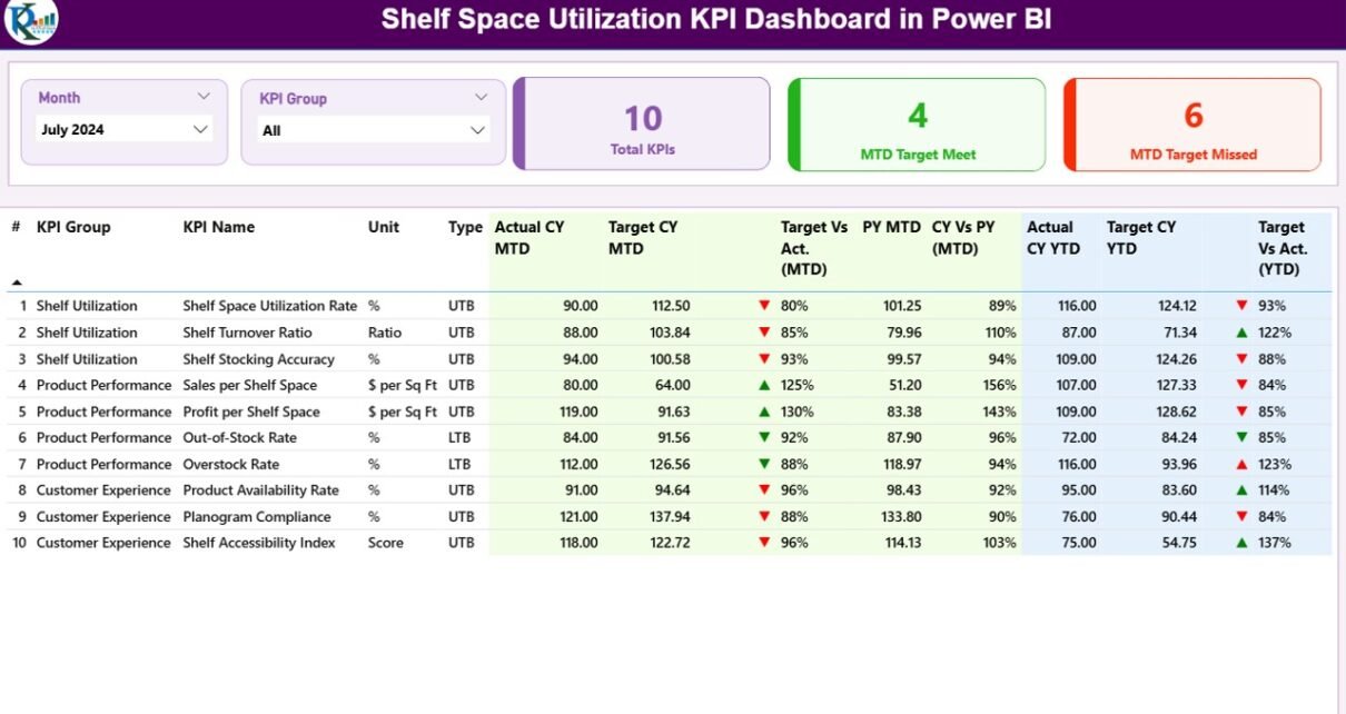
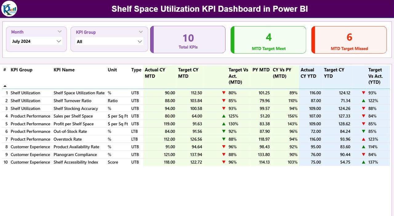
The Summary page is the heart of the Shelf Space Utilization KPI Dashboard in Power BI. At the top, a Month slicer and a KPI Group slicer let users filter every visual on the page in one click. Three headline cards immediately show Total KPI Count, MTD Target Met, and MTD Target Missed — perfect for opening the monthly review meeting with one clear number.
Below the cards sits the 16-column KPI Detail Table, the most information-dense view in the report. Every shelf KPI you’ve defined appears as a row, with these columns:
- KPI Number — Sequence number for ordering
- KPI Group — The category or theme (e.g., Sales Efficiency, Inventory Health, Visual Merchandising)
- KPI Name — The metric name (e.g., Sales per Square Foot, Out-of-Stock Rate)
- Unit — The measurement unit ($, %, days, units)
- Type — LTB (Lower the Better) or UTB (Upper the Better)
- Actual CY MTD, Target CY MTD, MTD Icon, Target vs Act. (MTD), PY MTD, CY vs PY (MTD)
- Actual CY YTD, Target CY YTD, YTD Icon, Target vs Act. (YTD), PY YTD, CY vs PY (YTD)
The MTD Icon and YTD Icon columns display ▼ and ▲ arrows in red and green based on each KPI’s LTB/UTB classification. The percentages calculate Target vs Actual = Actual ÷ Target and CY vs PY = Current Year Actual ÷ Prior Year Actual automatically.
Page 2 — KPI Trend Page
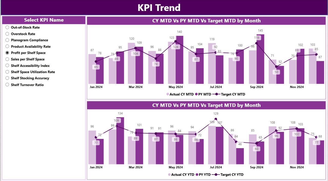
The KPI Trend page reveals patterns the Summary table can’t. A KPI Name slicer on the left lets users select any single shelf metric — Sales per Linear Foot, Inventory Turnover, Planogram Compliance %, anything you’ve defined — and the page renders two combo charts:
- MTD Trend Chart — Plots CY Actual, PY Actual, and Target month by month for the selected KPI
- YTD Trend Chart — Same three lines but for the running year-to-date series
This is where seasonal shelf patterns become obvious. A grocery merchandiser quickly sees holiday spikes in Sales per Square Foot for snack categories. A fashion retailer spots back-to-school surges in Sell-Through Rate. The CY vs PY overlay tells you immediately whether this year is tracking ahead of, behind, or on pace with the prior year.
Page 3 — KPI Definition Page (Hidden Drill-Through)
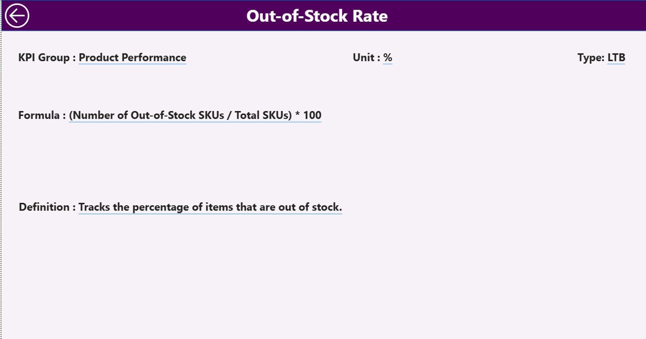
The KPI Definition page is hidden from the Power BI navigation bar — it only appears when users right-click a KPI row on the Summary page and select drill-through. The page then displays the selected KPI’s Formula, Unit, KPI Group, and Definition. A back button in the top-left corner returns to the Summary view.
This is the single best feature for new analysts joining the team or for client-facing consultants. Instead of explaining ‘Out-of-Stock Rate equals (number of stockout days ÷ total tracked days) × 100’ verbally, you click into the formula and the dashboard documents itself.
Excel Data File — 3 Input Sheets
The data source for the Shelf Space Utilization KPI Dashboard in Power BI is a plain Excel workbook with three input sheets:
- Input_Actual — Enter KPI Name, Month (using the first date of the month), MTD Number, and YTD Number for each row.
- Input_Target — Same column structure for monthly MTD and YTD targets.
- KPI Definition — Define KPI Number, KPI Group, KPI Name, Unit, Formula, Definition, and Type (LTB or UTB).
Shelf Space Utilization KPI Dashboard in Power BI vs Excel Manual Tracking vs Paid Retail Analytics SaaS — Feature Comparison
| Feature | Shelf Space Utilization KPI Dashboard in Power BI | Excel Manual Tracking | Paid Retail Analytics SaaS |
|---|---|---|---|
| Cost | $11.99 one-time ✅ | Free but hours of setup | $50,000+/year contract |
| Platform | Power BI Desktop (free) | Microsoft Excel | Proprietary cloud SaaS |
| Setup time | Under 10 minutes ✅ | Days of formula work | 3–6 months implementation |
| MTD & YTD vs Target | Built-in ✅ | Manual formulas | Built-in but vendor-locked |
| Prior-Year comparison | Built-in ✅ | Manual setup | Built-in |
| LTB/UTB icon logic | Built-in ✅ | Not available | Custom rule engine |
| Drill-through KPI definitions | Built-in ✅ | Not available | Custom config |
| Customizable shelf KPIs | Fully editable ✅ | Yes | Restricted to vendor metrics |
| Year-1 cost (5 users) | $11.99 total | $0 + high time cost | $50,000+ per year |
For retail teams that need monthly Shelf Space Utilization KPI reporting without an enterprise category-management contract, the Shelf Space Utilization KPI Dashboard in Power BI sits in the sweet spot.
Who Should Use This Template
Perfect for:
- Retail managers and store owners running monthly shelf efficiency reviews across 1–50 store locations
- Category buyers tracking SKU performance, slow-mover detection, and planogram compliance
- Supply chain and inventory leaders monitoring out-of-stock rates and turnover against monthly targets
- Multi-store operations directors needing MTD vs YTD vs Prior Year scorecards in one Power BI report
- Retail consultants delivering shelf space audits and category management reviews to client accounts
Not a fit if:
- You need real-time POS feeds or live planogram-software integration
- You’re an enterprise grocery or big-box retailer requiring SOC 2, SSO, and Row-Level Security across hundreds of regional managers
- You want photo-based shelf-image recognition or computer-vision compliance scoring built into the same tool
Real-World Use Cases
Anika manages category planning for a 12-store regional supermarket chain in the Midwest. Each month she fills the Excel Input_Actual sheet with Sales per Linear Foot, Inventory Turnover, and Out-of-Stock Rate numbers across grocery, frozen, and household categories. The Shelf Space Utilization KPI Dashboard in Power BI gives her a 16-column scorecard with ▼▲ icons flagging underperforming sections — she walks into the monthly category review meeting with a one-page printable summary instead of three different Excel files. Anika reports the entire month-end process now takes under 30 minutes versus the four hours she used to spend rebuilding the deck.
A retail consultancy serving 8 mid-size client retailers uses one .pbix file pointed at separate Excel files per client. The drill-through KPI Definition page lets consultants show client buyers exactly how Gross Margin Return on Inventory or Days of Supply is calculated, without walking through a spreadsheet formula in front of the client. The team reports that this single feature has been worth the entire $11.99 license cost for credibility alone.
The merchandising director at a 35-store fashion retailer tracks 14 shelf space KPIs — including Sales per Square Foot by Department, Sell-Through Rate, Markdown %, Days of Supply, and Planogram Compliance % — against quarterly targets. The KPI Trend page’s CY vs PY vs Target overlays make it immediately obvious whether the new visual merchandising playbook is gaining traction season over season, instead of waiting for the year-end review to confirm.
Advantages of Shelf Space Utilization KPI Dashboard in Power BI
- 📊 Centralized retail KPI scorecard — every metric in one Power BI file, no copy-paste between Excel tabs
- ⚡ Under 10-minute setup — fill three Excel sheets, click Refresh, the dashboard auto-populates
- 🎯 Status icons surface misses instantly — colored ▼▲ arrows replace 16-column eye-strain
- 📅 MTD/YTD/PY tracking built-in — no DAX measures needed, all comparison logic is pre-baked
- 🔄 Drill-through formula transparency — every KPI documents itself for analyst onboarding and client reviews
- 💰 $11.99 one-time vs $50,000+/year SaaS — same scorecard logic, fraction of the cost
Opportunities for Improvement
No template fits every retailer. The Shelf Space Utilization KPI Dashboard in Power BI is intentionally scoped for monthly KPI scorecard reporting — it does not replace a full retail planning suite. Three honest limitations worth noting:
- Static Excel data source — the dashboard refreshes when you click Refresh, not in real time. If you need POS-streaming data, pair this with a separate ETL pipeline.
- No row-level security out of the box — Power BI Service users can publish and apply RLS, but the .pbix ships without RLS roles configured.
- Designed for KPI tables, not deep-dive ad-hoc analysis — the Summary page is a structured scorecard. For exploratory drill-down across thousands of SKUs, you’ll want to extend the data model.
These trade-offs are why the template costs $11.99 instead of $50,000. Build on top of it for what you need next.
Best Practices
- Standardize your KPI Definition sheet first — agree on formulas with stakeholders before populating actuals. The drill-through page makes this transparency permanent.
- Use the first date of each month consistently in Input_Actual and Input_Target — the date column is what Power BI joins on, so 1-March-2026 and 01/03/2026 should never appear in the same column.
- Tag every KPI as LTB or UTB explicitly — leaving the Type column blank means the icon color logic falls back to UTB by default, which is wrong for stockout and discount metrics.
- Save monthly snapshots — duplicate the Excel file each month-end. Year-end you’ll have a clean trail of every actual and target ever entered.
- Pair with a retail data warehouse if you outgrow Excel — when your KPI count crosses 30+ or your stores cross 100+, swap the Excel input for a SQL Server or Azure SQL connection. The .pbix layer keeps working.
Explore Relevant Templates
- 🔹 Shelf Space Utilization KPI Dashboard in Power BI — The product covered in this article.
- 🔹 Shelf Space Utilization KPI Dashboard in Excel — Same template in pivot-table-driven Excel format.
- 🔹 Pricing Strategy KPI Dashboard in Power BI — Same scorecard format applied to pricing margin and discount KPIs.
- 🔹 Sales Funnel KPI Dashboard in Power BI — MTD/YTD sales funnel tracking with the same 3-page structure.
- 🔹 Convenience Stores Dashboard in Power BI — Adjacent retail dashboard tracking sales, profit, shifts, and product categories.
- 🔹 Browse the full Power BI Dashboard Templates collection on NextGenTemplates.
Frequently Asked Questions
What KPIs can I track with the Shelf Space Utilization KPI Dashboard in Power BI?
The Shelf Space Utilization KPI Dashboard in Power BI is fully flexible — you define your own KPIs in the Excel KPI Definition sheet. Common shelf KPIs include Sales per Square Foot, Sales per Linear Foot, Inventory Turnover, Out-of-Stock Rate, Planogram Compliance %, Sell-Through Rate, Gross Margin Return on Inventory, and Days of Supply. Any retail metric with an MTD and YTD target can be tracked.
Do I need Power BI Pro to use this dashboard?
No. The Shelf Space Utilization KPI Dashboard in Power BI runs in Power BI Desktop, which is free. A paid license is only required if you want to publish to the Power BI Service and share the report online with regional managers, store teams, or external collaborators.
How does the LTB/UTB icon logic actually work?
Each KPI in the Excel KPI Definition sheet is tagged as LTB (Lower the Better) or UTB (Upper the Better). For UTB metrics like Sales per Square Foot, a green ▲ icon means actual exceeded target. For LTB metrics like Out-of-Stock Rate, a red ▼ icon fires when actual is higher than target — so cost and stockout metrics get flagged correctly even when their numbers go up.
How long does setup take?
Setup of the Shelf Space Utilization KPI Dashboard in Power BI takes under 10 minutes. Fill in the three Excel sheets, open the .pbix file in Power BI Desktop, update the data source path to your saved Excel file, and click Refresh. The entire dashboard auto-updates from that point forward — no DAX or modeling work required.
Can I use this for non-retail KPIs too?
Yes. While the Shelf Space Utilization KPI Dashboard in Power BI is built for retail merchandising, the underlying MTD/YTD vs Target vs Prior Year framework works for any KPI scorecard — warehouse, e-commerce, hospitality, finance, or QSR teams can repurpose the template by swapping the KPI Definition sheet.
How does this compare to enterprise retail platforms like RELEX or Blue Yonder?
Enterprise retail planning platforms like RELEX or Blue Yonder typically require $50,000+ annual contracts and 3–6 months of implementation. The Shelf Space Utilization KPI Dashboard in Power BI is $11.99 one-time and focuses purely on monthly KPI scorecard reporting — ideal for small-to-mid retailers, consultants, and teams that don’t need real-time replenishment automation.
Can I add or remove KPIs after initial setup?
Yes. Add new rows to the KPI Definition sheet and corresponding rows in the input sheets. Power BI reads the Excel tables dynamically, so new shelf KPIs appear in the Summary table on the next refresh — no changes to the .pbix file needed.
About the Author
Built by PK — Microsoft Certified Professional with 15+ years of Excel, Google Sheets, and Power BI experience. Founder of NextGenTemplates, reaching 300K+ subscribers across YouTube channels. Every template is hand-built and tested before release.
Conclusion
The Shelf Space Utilization KPI Dashboard in Power BI takes the most expensive asset in retail — shelf space — and turns it into a structured, monthly KPI scorecard with MTD, YTD, Target, and Prior Year comparisons in one .pbix file. The 16-column Summary table, ▼▲ red/green icons, KPI Trend combo charts, and hidden drill-through definition page give retail managers, category buyers, and consultants everything they need for the monthly review without enterprise software.
👉 Click here to Purchase Shelf Space Utilization KPI Dashboard in Power BI
✅ Instant download · One-time $11.99 payment · No subscription · Lifetime access
📅 Last updated: May 2026
Visit our YouTube channel for step-by-step video tutorials on Power BI dashboards, Excel KPI templates, and retail analytics walkthroughs.