The Cardiac Care Units Dashboard in Excel tracks 4 headline KPIs and 14 pivot-driven charts across 5 interactive analysis pages, with native Excel slicers filtering Department, Severity, Diagnosis, Admission Type, Insurance Provider, and Month. Setup takes under 10 minutes — paste your CCU export into the Data Sheet, click Refresh All, and every KPI card, chart, and slicer updates automatically.
For cardiac care unit managers, finance leads, and quality directors who need a clean monthly view of patient outcomes, treatment cost, and physician performance without a $140–500-per-user-per-month BI suite, the Cardiac Care Units Dashboard in Excel sits between manual spreadsheets and enterprise EMR analytics. This post walks through every page, the comparison against Google Sheets and Athenahealth/Epic, real-world use cases, and FAQs.
👉 Click here to Purchase the Cardiac Care Units Dashboard in Excel
Key Features of the Cardiac Care Units Dashboard in Excel
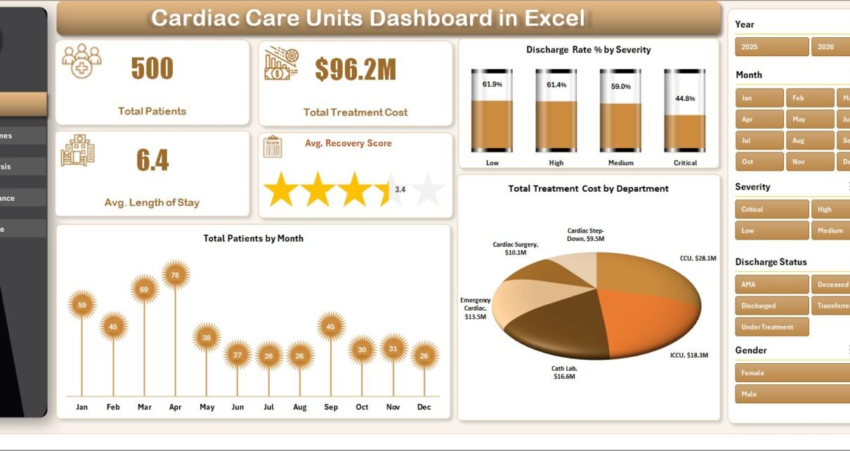
- 🔹 4 KPI cards on the Overview page — Total Patients, Total Treatment Cost, Avg. Length of Stay, and Avg. Recovery Score recalculate the moment you click Refresh All.
- 🔹 14 pre-built charts across 5 analysis pages — Every chart points at a pivot table on the Support Sheet, so adding 500 new patient records and clicking Refresh All rebuilds every visual in seconds.
- 🔹 Native Excel slicers on every page — Filter the entire dashboard by Department, Severity, Diagnosis, Admission Type, Insurance Provider, or Month with one click.
- 🔹 Pivot-table engine on the Support Sheet — All pivots live on one hidden sheet so end users see only the polished front-end pages.
- 🔹 Pre-formatted Data Sheet — Columns for Patient ID, Admission Date, Department, Diagnosis, Severity, Length of Stay, Treatment Cost, Insurance Coverage, Doctor, Discharge Status, Recovery Score, Readmission flag, and Admission Type.
- 🔹 Works offline on Windows and Mac — No VBA macros, no security prompts. Microsoft Excel 2016+, Microsoft 365, and Excel for Mac all supported.
- 🔹 One-time $17.99 — Replaces $140–500 per user per month vendor BI suites for cardiac care unit reporting.
Dashboard Pages Explanation
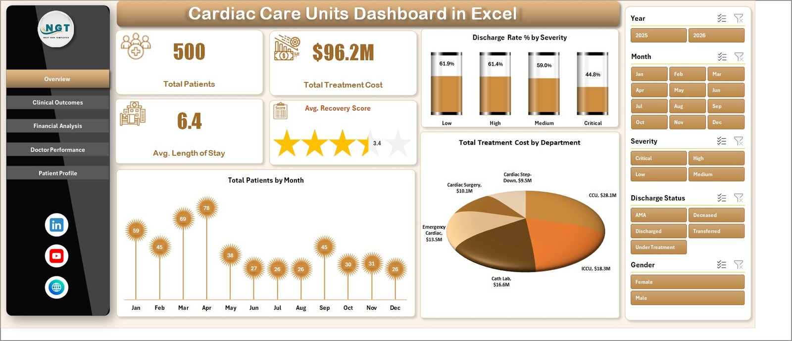
Page 1: Overview
The Overview page is the executive command center. Across the top, four KPI cards display Total Patients, Total Treatment Cost, Avg. Length of Stay, and Avg. Recovery Score. Below, three charts break the volume down by meaningful dimensions: Discharge Rate % by Severity, Total Patients by Month, and Total Treatment Cost by Department. Slicers on the page filter every card and chart simultaneously, so clicking “Cardiology” or “Critical” recalculates the entire view instantly.
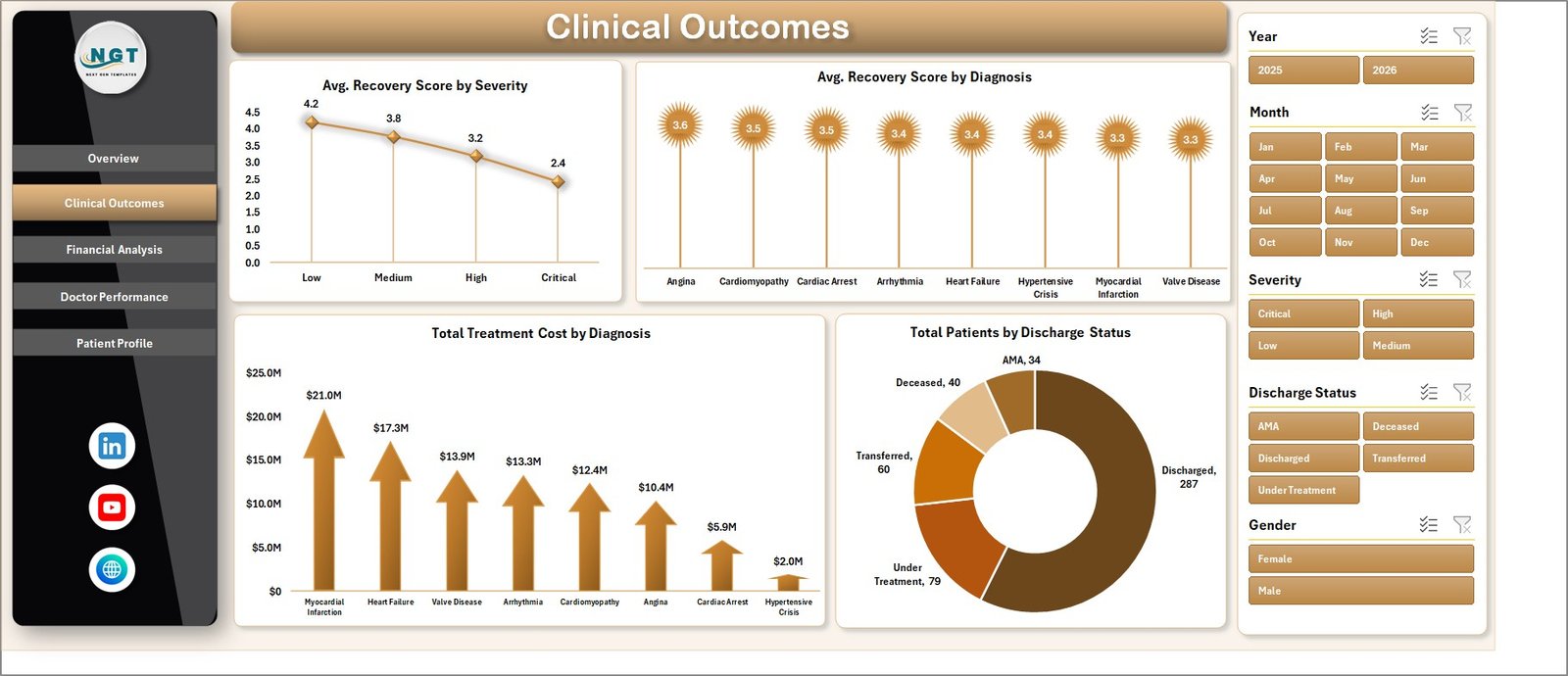
Page 2: Clinical Outcomes
The Clinical Outcomes page focuses on patient recovery quality with four charts: Avg. Recovery Score by Severity, Avg. Recovery Score by Diagnosis, Total Treatment Cost by Diagnosis, and Total Patients by Discharge Status. Use this view to spot diagnoses with below-average recovery scores or unusually high treatment costs.
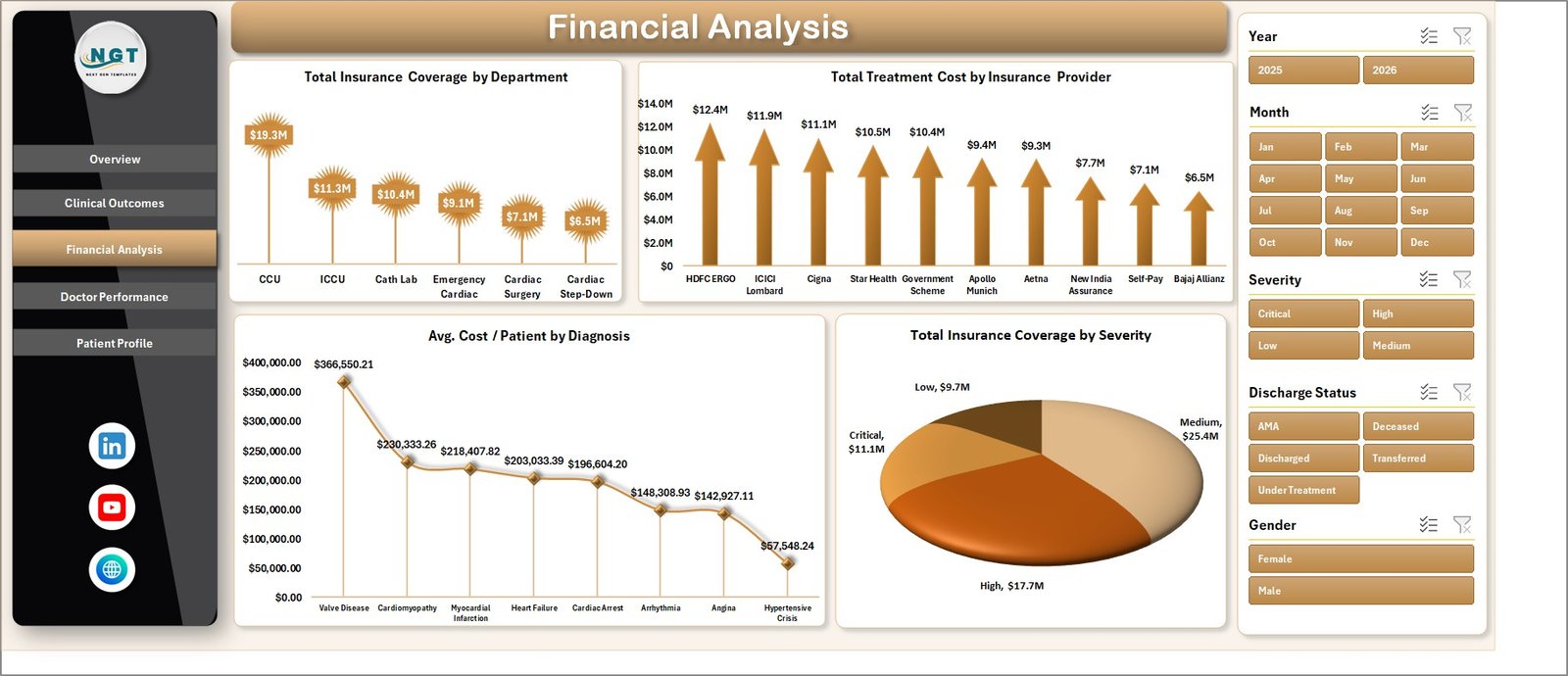
Page 3: Financial Analysis
The Financial Analysis page exposes where treatment cost concentrates and how insurance coverage stacks up. Four charts surface: Total Insurance Coverage by Department, Total Treatment Cost by Insurance Provider, Avg. Cost per Patient by Diagnosis, and Total Insurance Coverage by Severity. Finance teams use this view to diagnose underinsured diagnosis groups and renegotiate with providers driving the highest claim volume.
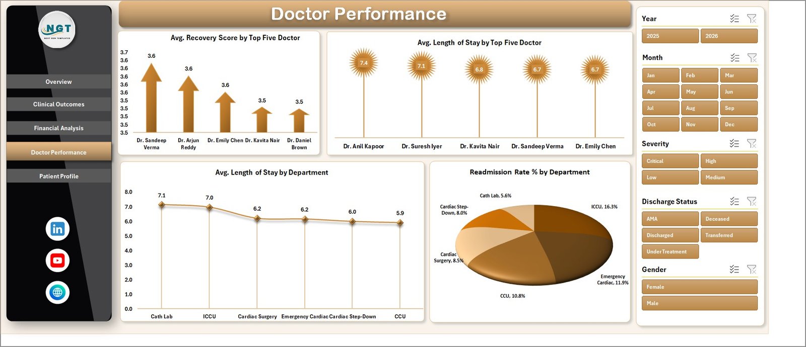
Page 4: Doctor Performance
The Doctor Performance page ranks clinicians on outcome and efficiency metrics with four charts: Avg. Recovery Score by Top Five Doctor, Avg. Length of Stay by Top Five Doctor, Avg. Length of Stay by Department, and Readmission Rate % by Department. Clinical directors use this view in monthly reviews to identify training gaps, balance caseloads, and surface high-readmission departments before they hit a quality audit.
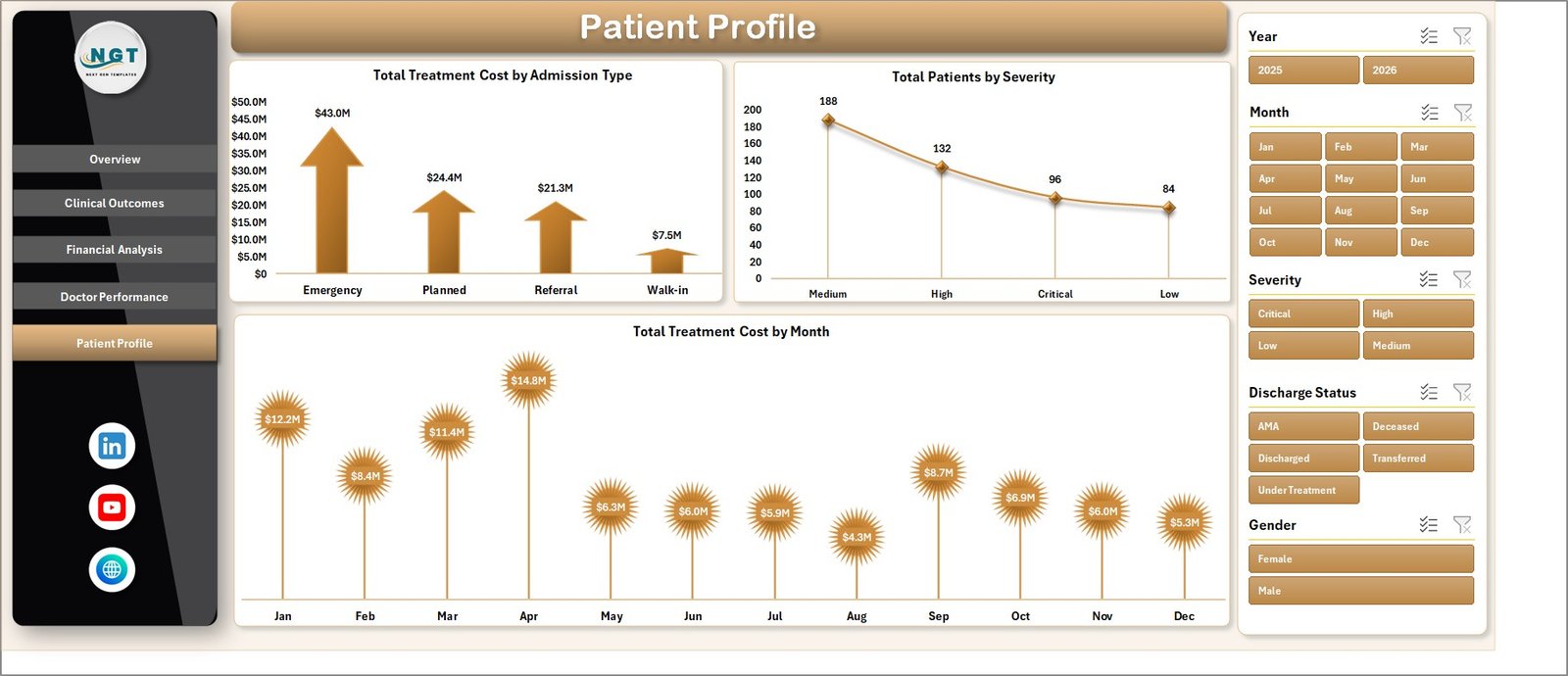
Page 5: Patient Profile
The Patient Profile page segments the patient population by admission characteristics and time. Three charts surface: Total Treatment Cost by Admission Type (Emergency, Scheduled, Transfer, Walk-in), Total Patients by Severity, and Total Treatment Cost by Month. Use this page to size emergency surge capacity, project monthly cost trends, and align staffing to admission-type mix.
Data Sheet
The Data Sheet is the single source of truth. Every chart, KPI card, and slicer reads from this one flat table. Columns are pre-defined to match typical hospital EMR exports — Patient ID, Admission Date, Department, Diagnosis, Severity, Length of Stay, Treatment Cost, Insurance Coverage, Provider, Doctor, Discharge Status, Recovery Score, Readmission flag, and Admission Type. Paste your CCU export over the sample rows, keep the headers intact, click Refresh All. Microsoft has a useful walkthrough on importing CSV files into Excel if your EMR export needs cleanup before paste.
Support Sheet (Hidden)
The Support Sheet holds every pivot table that drives the 14 charts and 4 KPI cards. Maintenance pattern is simple: update the Data Sheet, go to Data → Refresh All, and every pivot recalculates while every chart redraws. Keep this sheet hidden in production so end users only see the polished front-end pages.
Cardiac Care Units Dashboard in Excel vs. Google Sheets vs. Athenahealth / Epic — Feature Comparison
| Feature | Cardiac Care Units Dashboard in Excel | Google Sheets Equivalent | Athenahealth / Epic CCU Module |
|---|---|---|---|
| Cost | $17.99 one-time | $19.99 one-time | $140–500 / user / month |
| Platform | Excel desktop (Windows + Mac) | Browser-only | Web SaaS, vendor-hosted |
| Setup time | Under 10 minutes | Under 10 minutes | 6–12 weeks implementation |
| Slicer filtering | ✅ 6 slicer dimensions | ✅ Slicers | ✅ Native filters |
| Works offline | ✅ Yes | ❌ No | ❌ No |
| Per-user fees | ❌ None | ❌ None | ✅ Yes |
| EMR / HL7 integration | Manual paste | Manual paste | Native HL7/FHIR |
| Year-1 cost at 5 users | $17.99 total | $19.99 total | $8,400–30,000 |
For cardiac care units that want clean patient, financial, and clinician KPIs without paying for a full vendor BI suite, the Cardiac Care Units Dashboard in Excel sits in the sweet spot.
Who Should Use This Template
Perfect for:
- Cardiac care unit administrators tracking 100–5,000 CCU admissions per month
- Hospital quality and finance leads consolidating Treatment Cost, Length of Stay, and Recovery Score into one monthly view
- Medical directors running monthly clinician performance reviews
- Healthcare analysts at small-to-mid hospitals who need an Excel-native CCU report for non-technical leadership
- Cardiology department heads in independent hospitals without Epic or Cerner BI add-ons
Not a fit if:
- Your environment requires certified cloud storage with HIPAA audit logs — buy a vendor BI tool
- You need real-time EMR/EHR integration — this is manual-paste, not HL7/FHIR
- Your team cannot de-identify PHI before loading — never paste identifiable PHI into a non-certified file
Real-World Use Cases
Dr. Aisha runs a 24-bed cardiac care unit at an independent hospital. Her monthly clinical review used to take a clinical analyst three days in Tableau. She now pastes the CCU export into the Data Sheet, clicks Refresh All, and her Recovery Score by Severity, Length of Stay by Doctor, and Readmission Rate by Department charts are board-ready in 8 minutes — without renewing the $18,000-per-year Tableau license.
Marcus is the CFO at a 4-hospital regional system. The Financial Analysis page surfaced that one insurance provider’s average coverage on critical-severity patients dropped 14% quarter-over-quarter. He renegotiated the contract in 30 days using the dashboard charts as evidence, recovering an estimated $240,000 in annual coverage.
Priya is the quality director at a teaching hospital. She uses the Doctor Performance page to identify the two cardiologists with consistently high readmission rates and routes them to focused CME refreshers — without burning credibility by naming names; the data does the talking.
Advantages of the Cardiac Care Units Dashboard in Excel
- Speed — Setup in under 10 minutes vs. 6–12 weeks for an EMR analytics module rollout.
- Cost — A one-time $17.99 vs. $8,400–30,000 per year for a vendor BI suite at 5 users.
- Privacy by default — File lives locally on your machine; no enforced cloud sync, no third-party data sharing.
- Editable — Add new pivots, KPIs, or charts on the Support Sheet without touching macros or DAX.
- No vendor lock-in — Your dashboard, your data, your file. Move it, copy it, version it freely.
Opportunities for Improvement
This is an honest “limitations” section so you know exactly what you’re buying. The Cardiac Care Units Dashboard in Excel is not a substitute for an HIPAA-certified BI platform. It does not pull data from EMR systems via HL7 or FHIR — you paste exports manually. It does not have row-level security or audit logging out of the box; that depends on your storage location (SharePoint, OneDrive, network share). It is not optimized for datasets above 200,000 rows; for very large CCUs running multi-year history, consider Power BI with a proper data model. Finally, dashboards in Excel are a snapshot tool — for real-time bedside monitoring, you need a clinical decision-support system instead.
Best Practices
- De-identify before you paste — Remove or hash patient names, MRNs, and dates of birth before loading into any non-certified file.
- Refresh All after every data update — Skipping this step leaves pivots and charts on the previous data; the visual will look right but the numbers will be stale.
- Keep a versioned copy — Save monthly snapshots so you can show trend-over-trend if leadership asks 6 months later.
- Don’t break the column structure — The pivots reference the Data Sheet by header. If you rename or reorder columns, pivots will need to be repointed.
- Use slicer presets for board meetings — Filter to “Critical severity, last 30 days” once, then screenshot or export to PDF before clearing slicers.
Explore Relevant Templates
- Health Tech Dashboard Report in Excel — Companion appointment-KPI report for telehealth and clinic ops.
- Per Traceries Counseling Tracker in Excel — Track patient counseling sessions and outcomes.
- Pet Care Business Dashboard in Excel — Veterinary-focused dashboard with similar architecture.
- Telehealth Dashboard in Power BI — Power BI alternative for telehealth analytics.
- Senior Living KPI Scorecard in Excel — KPI-scorecard style for senior care facilities.
- Browse all Excel Dashboard tutorials on PK: An Excel Expert.
Frequently Asked Questions
What KPIs does the Cardiac Care Units Dashboard in Excel track?
The Cardiac Care Units Dashboard tracks 4 headline KPIs on the Overview page — Total Patients, Total Treatment Cost, Avg. Length of Stay, and Avg. Recovery Score. The 14 charts across 5 pages also surface Discharge Rate, Readmission Rate, Avg. Cost per Patient, and Total Insurance Coverage across severity, diagnosis, department, and insurance provider dimensions.
How long does setup take?
Setup takes under 10 minutes. Open the Cardiac Care Units Dashboard in Excel, replace the sample rows on the Data Sheet with your CCU export, click Refresh All on the Data ribbon, and every KPI card, chart, and slicer updates. No formulas to edit, no macros to enable.
How does this compare to Athenahealth or Epic CCU analytics?
Athenahealth and Epic bundle CCU analytics inside a $140–500 per user per month suite with native HL7/FHIR integration. The Cardiac Care Units Dashboard in Excel is a $17.99 one-time-purchase template — no integration, no per-user fees, you paste the data yourself. Different tools for different growth stages.
Does this work in Excel for Mac and Excel Online?
The Cardiac Care Units Dashboard in Excel works fully in Excel for Windows and Excel for Mac (2019+) desktop versions. Excel Online supports the dashboard for viewing and basic filtering, but slicer interaction and pivot refresh are most reliable in the desktop app.
Is it safe to load real patient data into this dashboard?
This is a local Excel file with no cloud sync, so you control the file. However, never paste identifiable PHI into any template you didn’t build yourself — de-identify the export before loading. For HIPAA-regulated environments, use a vendor-certified BI tool.
Can I add my own KPIs or charts?
Yes. The Support Sheet contains the pivot tables that drive every chart. Add a new pivot, build a chart from it, and drop it onto any page. The slicer panel picks up the new chart automatically if it shares the same source data.
Where can I learn to build dashboards like this myself?
The YouTube channel @PK-AnExcelExpert has step-by-step tutorials on pivot tables, slicers, and dashboard design. The Microsoft Learn PivotTable guide is also an excellent foundation.
About the Author
Built by PK — Microsoft Certified Professional with 15+ years of Excel, Google Sheets, and Power BI experience. Founder of NextGenTemplates, reaching 300K+ subscribers across YouTube channels (@PK-AnExcelExpert, @NextGenTemplates, @NeoTechNavigators). Every template is hand-built and tested before release.
Conclusion
The Cardiac Care Units Dashboard in Excel turns a CCU’s raw patient export into a board-ready monthly view in under 10 minutes — covering patient volume, treatment cost, length of stay, recovery scores, insurance coverage, doctor performance, and readmission rates across 5 interactive pages. For small-to-mid hospitals and independent cardiac care units, it replaces a $140–500-per-user-per-month BI suite at a one-time $17.99.
👉 Click here to Purchase the Cardiac Care Units Dashboard in Excel
✅ Instant download · One-time payment · No subscription · Lifetime access
🎥 Visit our YouTube channel for step-by-step video tutorials: Youtube.com/@PK-AnExcelExpert
📅 Last updated: May 2026