The Influencer Collectives Dashboard in Power BI is built for marketing teams, creator agencies, and brand partnership managers who need to review influencer collective performance without rebuilding visuals from scratch. A single campaign portfolio can include many platforms, regions, creators, campaign goals, tiers, content types, impressions, conversions, spend, and revenue. When those numbers are reviewed separately, it becomes difficult to explain which creator groups are profitable and which channels need attention.
This ready-to-use Power BI dashboard gives you 5 report pages, 5 executive KPI cards, 15 focused analysis visuals, and slicers for fast filtering. You can review the product draft here: Influencer Collectives Dashboard in Power BI.
Influencer Collectives Dashboard in Power BI
Key Features of Influencer Collectives Dashboard in Power BI
- 5 KPI cards: Total Revenue, Total Spend, Total Impressions, Total Campaigns, and Net Profit.
- 5 report pages: Overview, Channel Mix, Creator ROI, Audience, and Operations.
- Channel analysis: Compare platform revenue, conversion rate, campaign goal performance, and engagement by content type.
- Creator ROI review: Analyze revenue by influencer, platform, and creator tier.
- Audience insights: Review content quality, impressions by region, and engagement rate by brand category.
- Operational monitoring: Track profit margin by platform, quality by collective, and impressions by month.
- Editable PBIX: Customize visuals, slicers, fields, measures, and report pages in Power BI Desktop.
Dashboard Pages Explanation
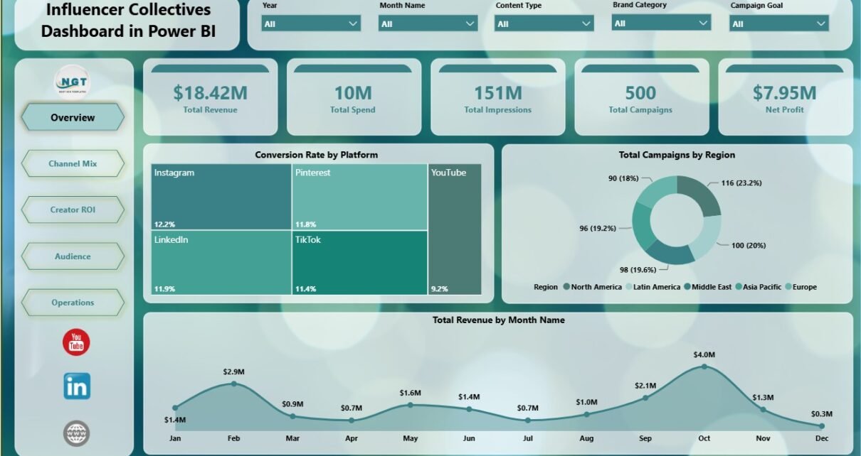
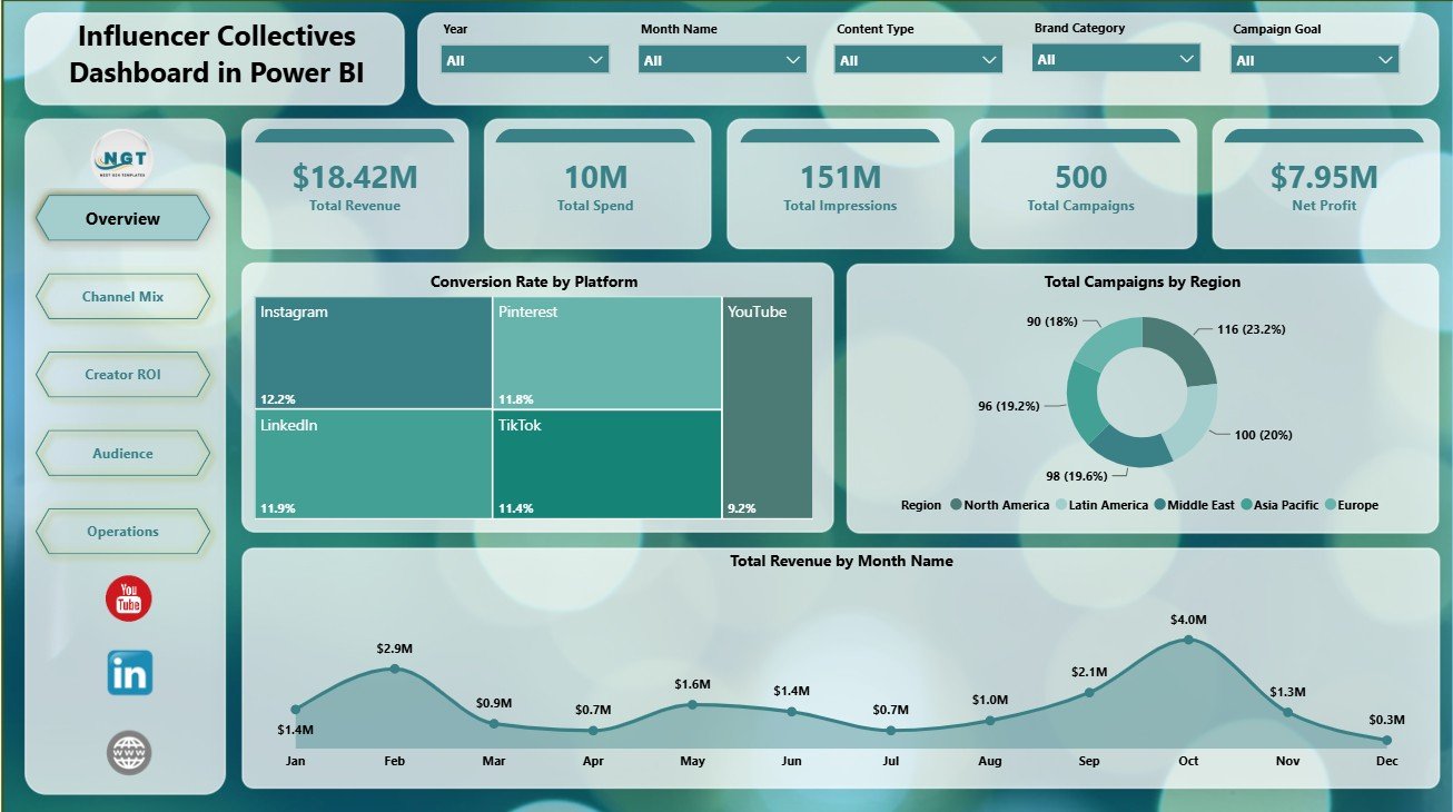
1. Overview Page
The Overview page is the executive summary of the report. At the top, the cards show Total Revenue, Total Spend, Total Impressions, Total Campaigns, and Net Profit. These cards help leaders understand financial return, campaign scale, audience reach, and overall activity volume before moving into deeper analysis.
Conversion Rate by Platform: This chart compares how efficiently each platform converts campaign attention into measurable outcomes. It helps users identify whether channels such as Instagram, TikTok, YouTube, or other platforms are producing enough conversion value.
Total Campaigns by Region: This chart shows where campaign activity is concentrated geographically. It helps teams see whether certain regions are receiving enough campaign coverage or whether the portfolio is too concentrated in one market.
Total Revenue by Month Name: This visual tracks revenue movement across months. It helps managers see seasonality, strong periods, weak months, and timing patterns that may affect planning.
Overview Page
2. Channel Mix
The Channel Mix page focuses on how campaign performance changes across platforms, campaign goals, and content formats. It is useful when the main question is where the marketing budget should go next.
Total Revenue by Platform: This chart compares platform-level revenue contribution. It helps users identify which social or creator channels are producing the strongest commercial output.
Conversion Rate by Campaign Goal: This chart compares efficiency across campaign objectives. It helps separate goals that create final outcomes from goals that may need stronger targeting or creative changes.
Engagement Rate by Content Type: This visual shows which formats generate stronger interaction. It is useful for planning future content mix and deciding which formats deserve more creator effort.
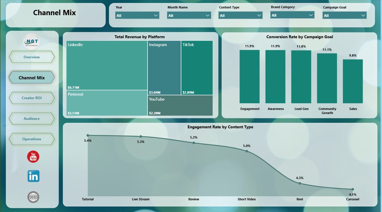
Channel Mix
3. Creator ROI
The Creator ROI page looks at performance from the creator and tier perspective. It is the page to use when you need to decide which influencers, tiers, or platforms deserve renewal, negotiation, or more budget.
Total Revenue by Platform: This chart keeps platform revenue visible from an ROI angle. It helps compare channel value while reviewing creator-level contribution.
Conversion Rate by Tier: This chart compares creator tiers by conversion efficiency. Smaller creators may sometimes outperform larger creators when their audience is more focused or more engaged.
Total Revenue by Influencer: This chart ranks influencers by revenue contribution. It supports renewal decisions, creator shortlist planning, and client reporting.
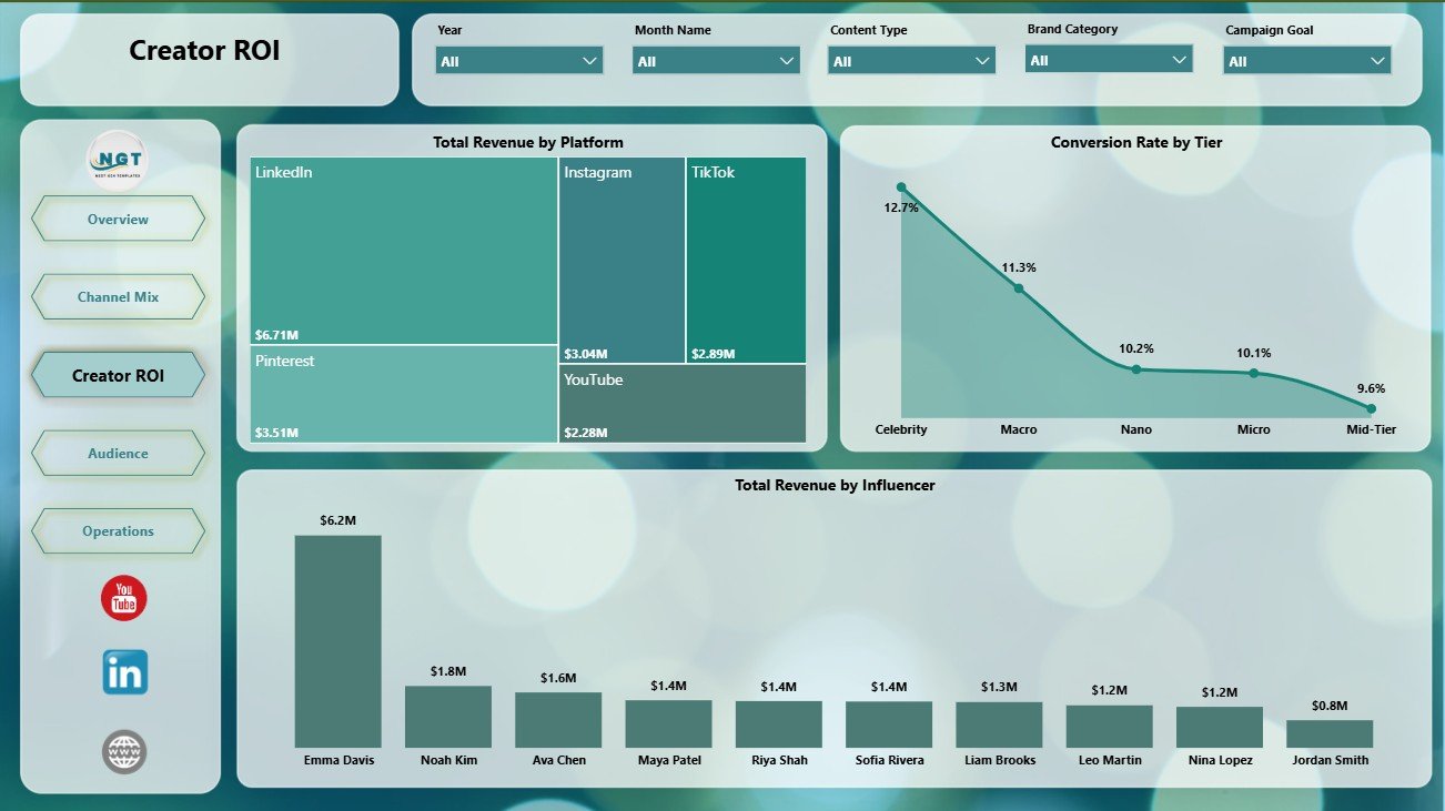
Creator ROI
4. Audience
The Audience page helps teams understand whether campaigns are reaching the right markets and whether the content quality is strong enough to support brand goals.
Avg Quality Rating by Content Type: This chart compares content quality across formats. It helps creative teams see which types of content are meeting brand standards most consistently.
Total Impressions by Region: This visual compares reach across regions. It helps teams identify high-visibility markets and areas where awareness may be weaker.
Engagement Rate by Brand Category: This chart shows which brand categories generate stronger audience interaction. It can guide category positioning and campaign theme planning.
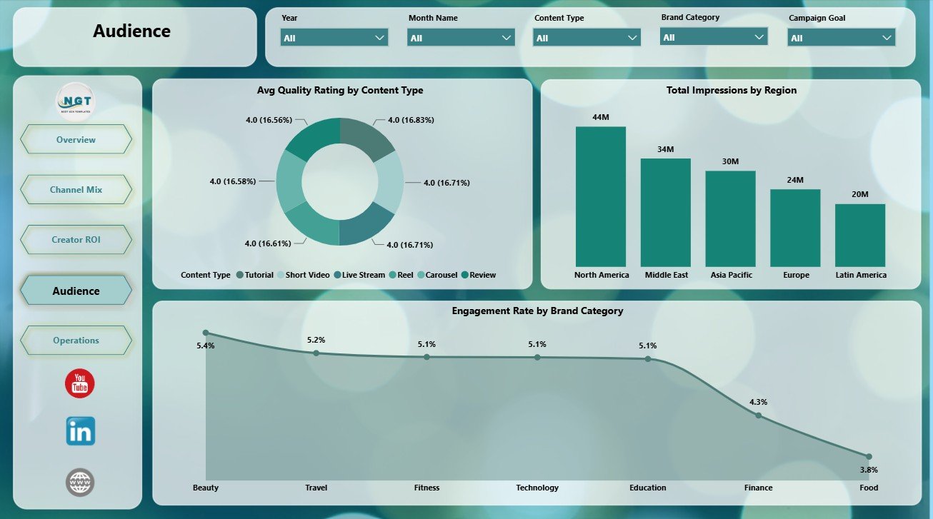
Audience
5. Operations
The Operations page supports regular campaign monitoring. It connects profitability, quality, and monthly delivery so managers can see whether execution is moving in the right direction.
Profit Margin by Platform: This chart compares profitability across platforms after spend is considered. It helps users spot channels that generate revenue but may not create enough margin.
Avg Quality Rating by Collective: This chart compares collective-level quality. It supports partner reviews, renewal discussions, and quality improvement conversations.
Total Impressions by Month Name: This visual shows monthly reach movement. It helps managers detect momentum, slowdowns, or seasonal patterns in campaign delivery.
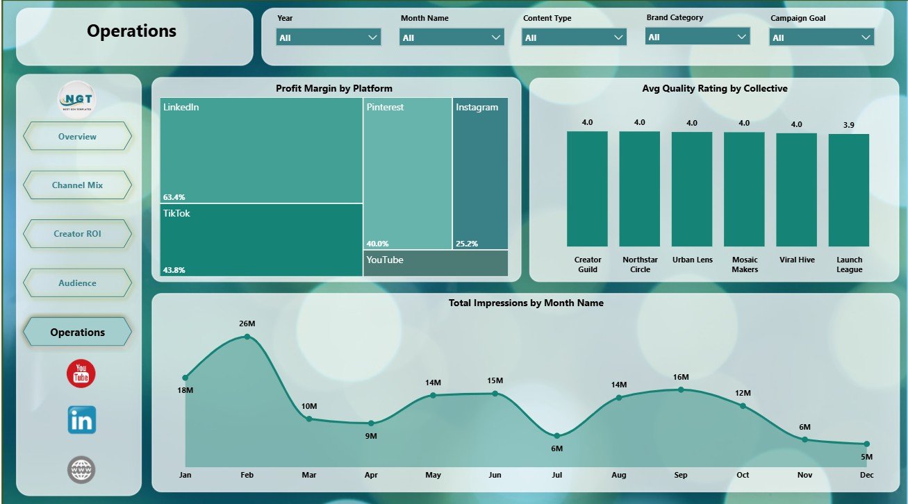
Operations
Influencer Collectives Dashboard in Power BI vs. Tableau vs. Paid CRM/SaaS – Feature Comparison
| Feature | Influencer Collectives Dashboard in Power BI | Tableau or Qlik Alternative | Paid Influencer SaaS |
|---|---|---|---|
| Cost | $17.99 one-time template | License cost plus report build time | Monthly or annual subscription |
| Platform | Power BI Desktop and Power BI Service | Tableau or Qlik environment | Vendor-hosted web app |
| Setup time | Open PBIX, replace or connect data, refresh | Build model and visuals manually | Implementation and onboarding |
| Real-time team collaboration | Available after publishing to Power BI Service | Available by platform plan | Usually included |
| Mobile access | Power BI mobile app after publishing | Vendor mobile app | Usually included |
| Customizable fields | Edit fields, visuals, measures, slicers, and pages | Editable with BI skills | Often limited by vendor permissions |
| Share with link | Available through Power BI sharing settings | Available through platform permissions | Usually login controlled |
| Year-1 cost at 5 users | Template cost plus any Microsoft licensing | License cost plus analyst time | Often hundreds or thousands |
| Creator ROI reporting | Included across creator, tier, and platform views | Must be designed manually | Depends on product module |
Who Should Use This Template
This dashboard is a strong fit for influencer marketing managers, brand partnership teams, creator agencies, media planners, campaign analysts, social media teams, and marketing consultants who use Power BI for reporting. It is especially useful when teams already collect campaign data but need a cleaner way to explain revenue, spend, platform mix, audience quality, and creator ROI.
It is not a full influencer management system. It does not replace creator discovery tools, automated social API imports, contract management, approval routing, or payment workflows. Instead, it works as a reporting layer for teams that want flexible Power BI analysis.
Real-World Use Cases
Maya, influencer marketing lead: Maya opens the Overview page before weekly leadership meetings to report Total Revenue, Total Spend, Total Impressions, Total Campaigns, and Net Profit.
Daniel, creator agency analyst: Daniel uses the Creator ROI page to compare influencer revenue and tier-level conversion. This helps him prepare renewal recommendations for account managers.
Priya, brand partnerships consultant: Priya uses Channel Mix and Audience pages to explain which platforms, content formats, regions, and brand categories are producing stronger results for clients.
Advantages of Influencer Collectives Dashboard in Power BI
- It gives users a ready Power BI structure instead of starting from a blank report.
- It separates executive, channel, creator, audience, and operations questions into clear pages.
- It supports deeper filtering through slicers and Power BI interactions.
- It can be customized for your own measures, colors, fields, and reporting style.
- It avoids a recurring template subscription while still giving a professional reporting format.
Opportunities for Improvement
Advanced users can extend this report with live data connections, scheduled refresh, row-level security, extra DAX measures, drill-through pages, and additional source tables for creator contracts, campaign budgets, or platform exports. The template is designed as a reporting base, so it can grow as your influencer data process becomes more mature.
Best Practices
- Keep platform, region, campaign goal, tier, influencer, content type, collective, and brand category names consistent.
- Validate revenue, spend, impressions, campaigns, and conversion fields before refreshing monthly reporting.
- Use the Overview page first, then move into Channel Mix, Creator ROI, Audience, and Operations for follow-up questions.
- Publish to Power BI Service only after checking slicers, cards, charts, and refresh behavior.
- Document any custom DAX measures so future users understand the calculations.
For users new to the Power BI desktop workflow, Microsoft provides official guidance here: Get Power BI Desktop.
Explore Relevant Templates
- Influencer Collectives Dashboard in Power BI
- Influencer Collectives Dashboard in Excel
- Influencer Platforms KPI Dashboard in Excel
- Power BI Dashboard Templates
Frequently Asked Questions
What is the Influencer Collectives Dashboard in Power BI?
It is an editable PBIX dashboard template for influencer collective campaign reporting across revenue, spend, impressions, campaigns, net profit, platforms, creators, tiers, audience, and operations.
What pages are included?
The report includes Overview, Channel Mix, Creator ROI, Audience, and Operations pages.
Do I need Power BI Desktop?
Yes. Power BI Desktop is needed to open, refresh, and customize the PBIX file. Power BI Service is optional for sharing and scheduled refresh.
Can I customize the report?
Yes. You can edit visuals, measures, labels, colors, slicers, fields, and report pages in Power BI Desktop.
Can I use my own influencer data?
Yes. Replace or connect the sample source with your own structured influencer campaign records, then refresh the report.
Does this automatically import data from social platforms?
No. It is a reporting dashboard, not an automatic social media API connector. You can connect your own cleaned export or data source if you want to extend it.
About the Author
Built by PK – Microsoft Certified Professional with 15+ years of Excel, Google Sheets, and Power BI experience. Founder of NextGenTemplates, reaching 300K+ subscribers across YouTube channels. Every template is hand-built and tested before release.
Conclusion
The Influencer Collectives Dashboard in Power BI gives marketing teams a clear way to review revenue, spend, impressions, campaign count, net profit, platform mix, creator ROI, audience quality, and operations. Instead of building a Power BI report from a blank page, users get a ready dashboard structure they can refresh, customize, and adapt to their own influencer campaign data.
Visit our YouTube channel for step-by-step Excel, Power BI, and dashboard tutorials.