In today’s fast-moving business world, planning strategically is not just an option—it is a necessity. Every organization, whether small or large, relies on strategy to align its goals, allocate resources, monitor performance, and ensure long-term growth. However, planning alone is not enough. You need a way to measure, track, and visualize progress. This is where a Strategic Planning Dashboard in Excel comes in.
This article will give you a detailed, practical, and step-by-step guide on the importance, structure, features, and benefits of a Strategic Planning Dashboard in Excel. You will also learn the best practices to implement it effectively and how it can transform your organization’s decision-making process.
Click to Purchases Strategic Planning Dashboard in Excel
What Is a Strategic Planning Dashboard in Excel?
A Strategic Planning Dashboard in Excel is a visual and analytical tool that helps businesses monitor progress against strategic goals. It provides a centralized view of performance indicators, budget utilization, stakeholder satisfaction, and alignment with organizational objectives.
Instead of going through multiple spreadsheets or lengthy reports, managers can view key performance indicators (KPIs) in one interactive dashboard. Excel makes it even more practical because it is widely accessible, customizable, and does not require complex software or coding skills.
Why Do Organizations Need a Strategic Planning Dashboard?
Every organization sets goals and objectives, but tracking them effectively is often a challenge. Teams work in silos, data is scattered, and reports are not timely. A Strategic Planning Dashboard solves these problems by:
-
Consolidating data into one view.
-
Providing real-time insights on performance.
-
Highlighting risks and delays before they become bigger issues.
-
Enabling data-driven decisions instead of assumptions.
-
Engaging stakeholders by presenting clear and visual information.
With Excel, you can build a highly customized dashboard that matches your organization’s needs while keeping it cost-effective.
Key Features of the Strategic Planning Dashboard in Excel
The Strategic Planning Dashboard template in Excel is designed to be user-friendly and functional. It comes with page navigation and structured views that make it easy to switch between different analyses.
Page Navigator
On the left side of the dashboard, you have a page navigator. This allows quick movement between the five main analytical pages, ensuring users can jump directly to the section they need.
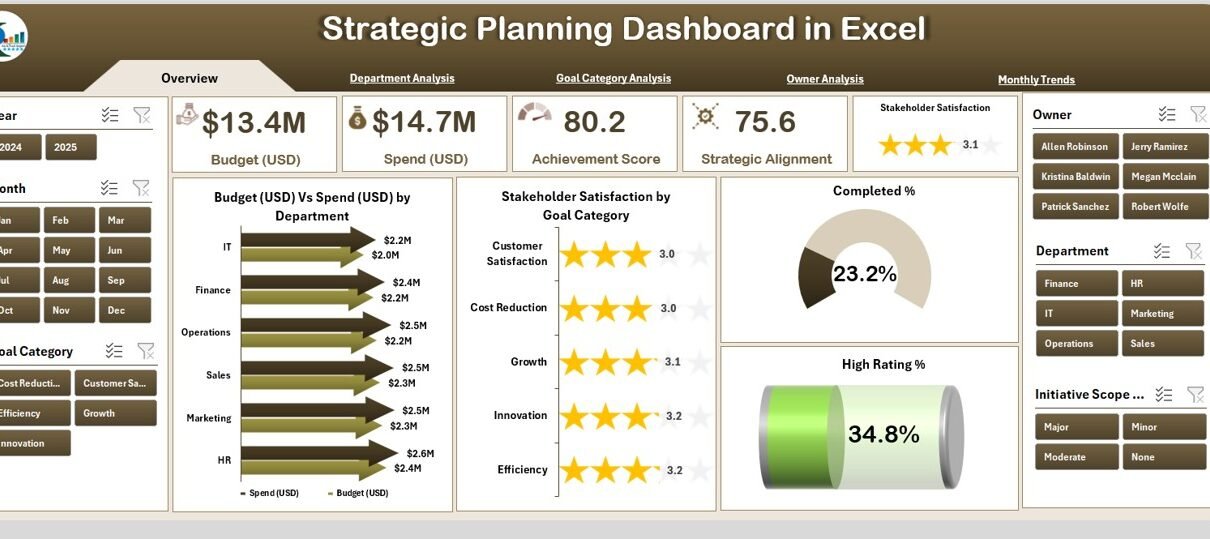
Overview Page
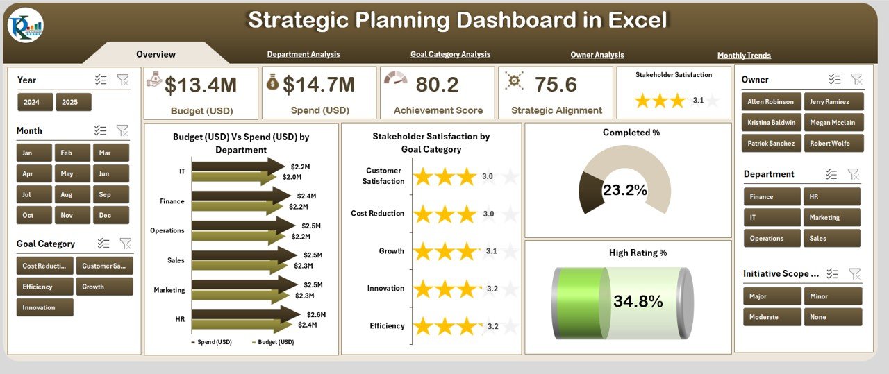
The Overview Page acts as the main control center. It displays essential insights at a glance, including:
-
Cards with high-level KPIs such as Budget, Spend, Completion Rate, and Satisfaction Score.
Charts for:
- Budget (USD) Vs Spend (USD) by Department
- Stakeholder Satisfaction by Goal Category
- Completed %
- High Rating %
This page answers the most critical question: “How are we performing overall?”
Department Analysis
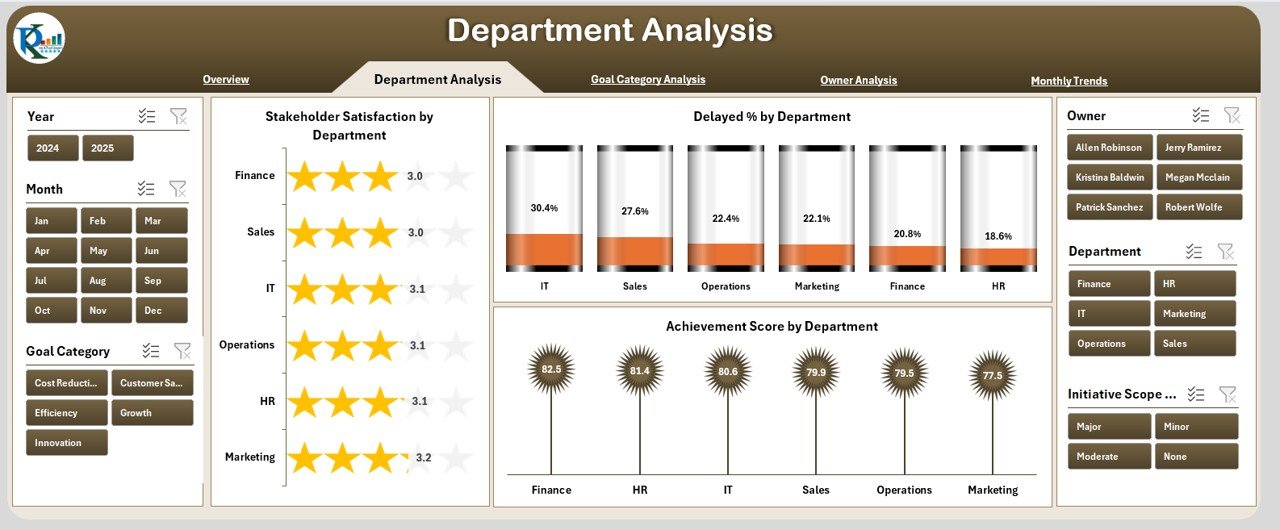
Departments play a crucial role in strategy execution. The Department Analysis Page provides insights into how each department contributes toward the overall plan. It includes:
-
Stakeholder Satisfaction by Department
-
Delayed % by Department
-
Achievement Score by Department
This view helps identify which departments are excelling and which need support or resource adjustments.
Click to Purchases Strategic Planning Dashboard in Excel
Goal Category Analysis
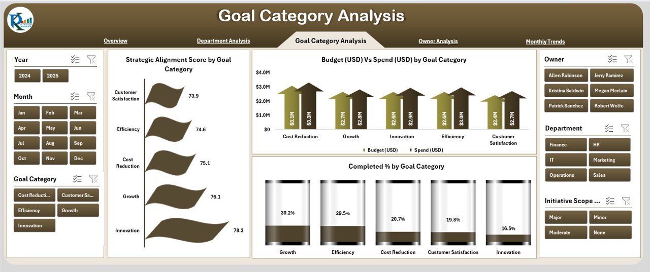
Goals are divided into categories for better alignment. The Goal Category Analysis Page provides visibility on:
-
Strategic Alignment Score by Goal Category
-
Budget (USD) Vs Spend (USD) by Goal Category
-
Completed % by Goal Category
This ensures every category of goals receives attention, and resources are not misallocated.
Owner Analysis
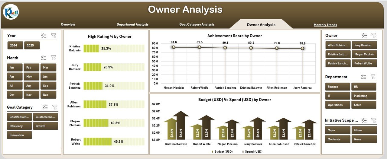
Every goal or task has an owner. The Owner Analysis Page highlights performance by ownership, ensuring accountability. It includes:
-
High Rating % by Owner
-
Achievement Score by Owner
-
Budget (USD) Vs Spend (USD) by Owner
This makes it easy for leadership teams to assess who is driving results and who may need guidance.
Monthly Trends
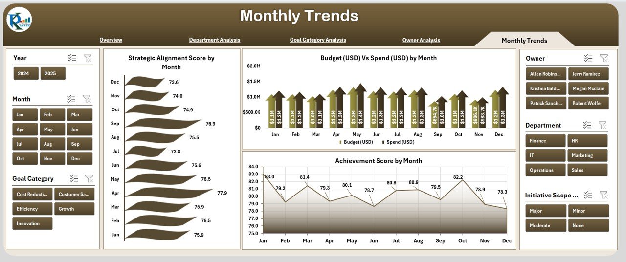
The Monthly Trends Page tracks performance over time. It includes:
-
Strategic Alignment Score by Month
-
Budget (USD) Vs Spend (USD) by Month
-
Achievement Score by Month
This time-based analysis shows seasonal variations, improvements, or declines in performance.
Data and Support Sheets
The dashboard also comes with a Data Sheet for storing raw inputs and a Support Sheet for managing dropdowns, lists, or lookup values. These sheets act as the backbone of the dashboard and ensure smooth functionality.
Advantages of Strategic Planning Dashboard in Excel
Implementing a Strategic Planning Dashboard offers numerous advantages. Some of the most important include:
✅ Centralized Monitoring – All performance data is consolidated into one place.
✅ Cost-Effective – No need to invest in expensive business intelligence tools.
✅ Easy Customization – Modify charts, KPIs, and visuals to match business needs.
✅ Improved Accountability – Owners and departments are clearly identified.
✅ Real-Time Insights – View up-to-date progress without manual reporting.
✅ Better Resource Allocation – Quickly see overspending or underperformance.
✅ Enhanced Stakeholder Communication – Present data visually for better understanding.
How to Create a Strategic Planning Dashboard in Excel
Creating this dashboard involves structured steps. Here’s a simplified process:
-
Define KPIs – Decide which metrics you want to track (e.g., Budget, Completion %, Satisfaction).
-
Collect Data – Gather information from departments, goals, and stakeholders.
-
Organize Data – Structure it into clean Excel tables for analysis.
-
Build Charts – Use PivotTables and PivotCharts for visualization.
-
Design Dashboard Pages – Create multiple sheets with logical navigation.
-
Add Interactivity – Use slicers, dropdowns, and filters for dynamic insights.
-
Test and Refine – Ensure calculations are accurate and visuals are clear.
Best Practices for the Strategic Planning Dashboard in Excel
To maximize the effectiveness of your dashboard, follow these best practices:
📊 Keep it simple – Avoid cluttered visuals and focus on actionable insights.
⏳ Update regularly – Refresh data to maintain accuracy.
🎯 Align with strategy – Ensure KPIs reflect true organizational goals.
👥 Engage users – Involve stakeholders in selecting KPIs and design.
🔄 Use slicers and filters – Give users the ability to drill down.
💡 Highlight trends – Use conditional formatting for positive/negative performance.
📈 Focus on outcomes – Measure not only activity but also results.
Opportunities for Improvement
Even though Excel dashboards are powerful, there are areas where improvements can be made:
🔹 Automation – Link data from other systems to reduce manual updates.
🔹 Scalability – For very large datasets, consider integrating Power BI.
🔹 Collaboration – Use cloud-based Excel (Office 365) for better teamwork.
🔹 Mobile Access – Optimize dashboards for viewing on mobile devices.
Conclusion
A Strategic Planning Dashboard in Excel is more than just a reporting tool—it is a strategic partner. By consolidating key data into one place, it helps leaders, managers, and teams align their efforts, track progress, and make better decisions. With proper design and best practices, Excel dashboards can transform how you manage strategy execution and stakeholder engagement.
Frequently Asked Questions (FAQs)
1. What is a Strategic Planning Dashboard in Excel?
It is a visual tool built in Excel that tracks goals, KPIs, budgets, and performance metrics, helping organizations monitor strategic progress.
2. Who can use this dashboard?
Business leaders, managers, project owners, and analysts across industries can use it to track performance and allocate resources effectively.
3. Is Excel better than other BI tools for strategic dashboards?
Excel is cost-effective and flexible. For advanced analytics or large datasets, tools like Power BI or Tableau may complement Excel.
4. Can I customize the KPIs in this dashboard?
Yes, you can add or remove KPIs, change charts, and redesign layouts to fit your organization’s needs.
5. How often should I update the dashboard?
Ideally, update it monthly or quarterly. However, for fast-changing industries, weekly updates may be required.
6. What are the limitations of Excel dashboards?
Excel dashboards may face challenges with large datasets, automation, and collaboration. Cloud integration can help overcome these issues.
7. Can non-technical users operate this dashboard?
Yes, once set up, it is user-friendly and requires minimal technical skills to navigate and use slicers or filters.
Visit our YouTube channel to learn step-by-step video tutorials
