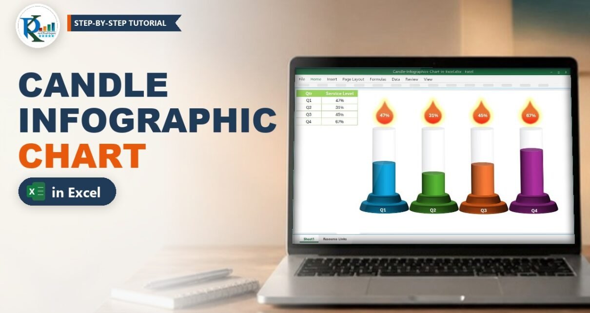
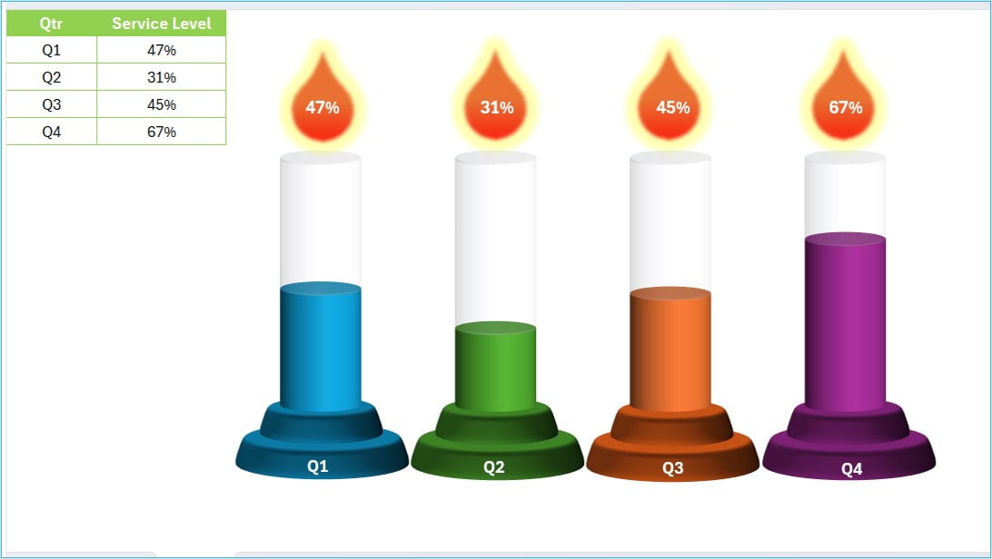
A candle infographic chart in Excel turns four plain percentages into four glowing candles: the coloured wax shows the value, the flame on top shows the number, and the whole thing still updates from your data. In this tutorial you build it from a 3-D stacked column chart with cylinder columns, a few shapes and cell-linked text boxes. It is perfect for quarterly service levels, completion rates or any KPI that runs from 0% to 100%. It works in Excel 2013, 2016, 2019, 2021 and Microsoft 365 for Windows.
Watch the Video Tutorial
The video builds the whole chart from a four-row table: the 3-D stacked column chart, the cylinder shape, the candle holders, the flames and the linked percentage labels.
What You Will Build
- A four-row data table with a Service Level column and a helper “Transparent Area” column.
- A 3-D stacked cylinder chart where every candle has the same height and the coloured part shows the value.
- Candle holders made from two stacked ovals with a 3-D bevel, one per quarter.
- Flames made from the Teardrop shape with a soft glow.
- Linked labels so the percentage in each flame changes when the data changes.
Step 1 – Set Up the Data
The chart needs only three columns. Put this table in A1:C5:
| Column | Header | What goes in it |
|---|---|---|
| A | Qtr | Q1, Q2, Q3, Q4 |
| B | Service Level | Your percentage for each quarter |
| C | Transparent Area | The rest of the candle: =1-B2, filled down |
While you build, you can fill B2:B5 with random test values so you see the chart move:
B2  =RANDBETWEEN(20,99)%
C2  =1-B2
Fill both down to row 5 and format B and C as percentages. Press F9 and the numbers change, which is a quick way to test that every label is linked. When the chart is ready, type your real values over the RANDBETWEEN formulas.
Why the helper column matters
Service Level plus Transparent Area always adds up to 100%. Stacked together, every candle therefore has exactly the same height, and only the split between the coloured wax and the pale top changes. Without column C, a 31% candle would simply be shorter than a 67% one and the “candle” look would be gone.
Step 2 – Insert the 3-D Stacked Column Chart
Create the chart
Select A1:C5, go to Insert › Insert Column or Bar Chart › 3-D Stacked Column. Excel puts Service Level at the bottom of each column and Transparent Area on top, which is exactly the order you want.
Turn the columns into cylinders
Right-click any column, choose Format Data Series and under Series Options › Column shape pick Cylinder. Set the Gap Width to about 115% so the candles are slim with space between them.
Straighten the 3-D view
Right-click the chart, choose 3-D Rotation, set X Rotation to 0°, Y Rotation to 10° and tick Right Angle Axes. The candles now face you straight on, with just enough tilt to show the round top of each cylinder.
Step 3 – Format the Candle Chart in Excel
Colour the wax
Click the Service Level series once, then click a single column again to select only that point. Give it a solid fill. Repeat for each quarter so every candle gets its own colour (blue, green, orange and purple in the example).
Make the top look like glass
Select the Transparent Area series and give it a light gradient fill from white to very pale grey, with no border. It reads as the unlit part of the candle and keeps the outline visible even when a value is low.
Remove the clutter
- Delete the chart title, the legend and the gridlines.
- Delete or hide the vertical axis. If you keep it, fix its Maximum at 1.0 so Excel never rescales it.
- Hide the horizontal axis labels; the candle holders will carry the Q1-Q4 labels.
- Set the chart area and plot area to No fill and No line, so the shapes blend in with the sheet.
Step 4 – Add the Holders, Flames and Linked Labels
Candle holders
Go to Insert › Shapes › Oval and draw a wide, flat oval under the first candle. Draw a smaller oval on top of it. In Format Shape › Effects › 3-D Format, add a top bevel (the example uses the Cool Slant bevel) and match the colour of the candle. Group the two ovals, then copy the group three times and recolour each copy.
Quarter labels
Insert a text box on each holder and type Q1, Q2, Q3 and Q4 in white bold text.
Flames
Insert the Teardrop shape from Basic Shapes and rotate it so the point faces up. Give it an orange-to-red gradient and a yellow Glow effect from Format Shape › Effects. Place one flame above each candle.
Link the percentage to the data
This is the step that makes the infographic dynamic. Insert a text box over the first flame, click its border, then click the formula bar and type:
=$B$2Press Enter. The text box now shows the Service Level for Q1 and changes whenever B2 changes. Repeat with =$B$3, =$B$4 and =$B$5 for the other flames.
How the linked label works
A text box that starts with an equals sign is a linked text box: it displays the formatted value of one cell. It shows the number exactly as the cell is formatted, so set B2:B5 to a 0% format if you want “47%” instead of “0.47”. A linked text box can only point to a single cell; it cannot hold a longer formula, so do any maths in a helper cell first and link to that cell.
Step 5 – Align and Lock Everything Together
Open Home › Find & Select › Selection Pane to pick the shapes easily. Use Shape Format › Align › Align Center to centre each holder, candle and flame on one line. When everything sits right, select the chart and all shapes and press Ctrl + G to group them, so the infographic moves and resizes as one object on your dashboard.
Common Errors & Fixes
- Candles have different heights. The Transparent Area column is missing or does not equal
=1-B2, or the axis maximum is set to Auto above 1. Check column C and fix the axis maximum at 1.0. - The flame shows 0.47 instead of 47%. The linked text box copies the cell format. Format B2:B5 as Percentage with 0 decimals.
- “Column shape” is missing. You inserted a 2-D stacked column. Change the chart type to 3-D Stacked Column first.
- Shapes drift away from the candles. Group the chart and the shapes, and in Format Shape › Properties choose “Don’t move or size with cells” if you resize rows often.
Tips
- Use the candle chart for values from 0% to 100%. For numbers above 100%, cap the wax with
=MIN(B2,1)in a helper column and base the Transparent Area on that capped value. - Keep it to four to six candles; more than that and the flames start to crowd each other.
- Use colours that mean something: one colour per quarter, or red/amber/green by target.
- Replace the RANDBETWEEN test values with real data before you share the file, or the numbers change every time Excel recalculates.
- Microsoft’s guide on creating a chart from start to finish covers the chart basics used here.
Want It Ready-Made?
If you would rather drop the finished chart straight into your report, the ready-to-use Candle Info-graphics Chart in Excel template is on NextGenTemplates.com, and you can browse more Excel templates there. To learn charts, slicers and complete dashboards step by step, join the video course Excel Pivot Tables & Dashboards: Basic to Advanced.
Related Tutorials
- Stunning Thermometer Chart in Excel
- Beer Mug Graph in Excel
- 3D Progress Circle in Excel
- Info-graphics with a Line Chart
- Sales Funnel Infographic Chart in Excel
Frequently Asked Questions
How do I make a candle chart in Excel?
Put your percentages in one column and =1-value in a helper column, insert a 3-D Stacked Column chart, change the column shape to Cylinder, then add oval holders, teardrop flames and text boxes linked to the value cells.
Is the candle infographic chart dynamic?
Yes. The wax height comes from the chart series and the flame labels are linked text boxes, so both update as soon as you change the Service Level values.
Why do all my candles need a Transparent Area series?
It fills each column up to 100%, so every candle has the same height and only the coloured part changes. Without it, the chart looks like ordinary columns of different heights.
How do I link a text box to a cell in Excel?
Select the text box border, click in the formula bar, type an equals sign and the cell address, for example =$B$2, and press Enter. The box then always shows that cell’s value.
Which Excel versions support the cylinder column shape?
Excel 2013 and later for Windows, including Microsoft 365, offer Column shape in the Format Data Series pane for 3-D column charts.
Can I use this chart for more than four quarters?
Yes. Add rows to the table, extend the chart data range, and copy a holder, flame and linked text box for each new candle. Six candles is a comfortable maximum.
About the Author
PK is a Microsoft Excel expert and trainer, and the founder of PK: An Excel Expert and NextGenTemplates.com. He has been teaching Excel charts, dashboards and automation on his YouTube channel since 2016.
Conclusion
A candle infographic chart in Excel is only a 3-D stacked cylinder chart, a helper column and a few shapes, but it turns a dull KPI table into something people actually look at. Build it once, link the flames to your data, and it keeps itself up to date every quarter.