The Data Analytics Dashboard Report in Excel is a 4-worksheet appointment-analytics report that tracks 5 headline KPIs across Summary, Report, Data, and Support sheets. It uses 5 charts, two slicer panels, and a pivot-driven model that refreshes the entire dashboard with one click. Setup takes under 10 minutes for a typical 1,000-row appointment log.
If your team runs weekly KPI reviews on appointment data — clinics, salons, customer-success queues, telehealth practices, multi-location service brands — and you don’t want to pay $14–$75 per user per month for Power BI Pro or Tableau, this is the report file that replaces the spreadsheet you’re rebuilding from scratch every Monday.
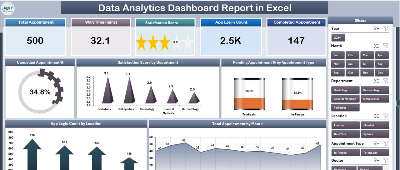
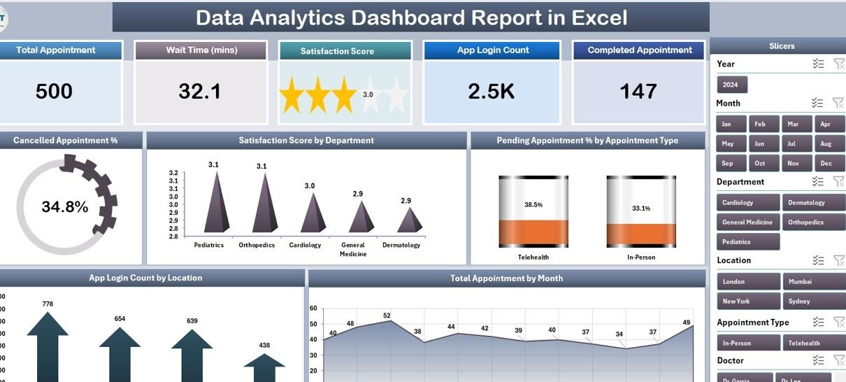
Summary page — 5 KPI cards, right-side department slicer, and 5 analysis charts
Key Features of the Data Analytics Dashboard Report in Excel
The report is built on a strict separation of concerns: one sheet to host data, one sheet to drive analysis, one sheet to print, one sheet to power the pivots. That structure is what makes it refresh-safe.
- 5 KPI cards at the top of the Summary page — Total Appointments, Cancelled Appointment %, Pending Appointment %, Satisfaction Score, and App Login Count.
- Right-side slicer panel on the Summary page — one click filters every card and every chart by Department, Location, or Appointment Type.
- 5 charts on the Summary page — Cancelled Appointment %, Satisfaction Score by Department, Pending Appointment % by Appointment Type, App Login Count by Location, and Total Appointment by Month.
- Report page with a left-side slicer and a structured Information Table for printable PDF exports and weekly leadership packs.
- Pivot-driven Support sheet that wires every chart to a refreshable pivot table — change the data, hit Data → Refresh All, and the entire dashboard rebuilds.
- Zero VBA, zero macros — opens cleanly on Windows, Mac, and Excel for the web with no security prompts.
Sheets Explanation — Page by Page
Below is a walk-through of all four worksheets, in the order they appear in the file.
1. Summary Page
Summary page — KPI cards, slicer, and 5 charts in a single screen
The Summary page is the page leadership sees. The top row holds the five KPI cards. Underneath, the five charts are laid out in a 2-and-3 grid. The right-side slicer panel filters the entire page — pick “Cardiology” and every card and chart instantly recalculates for that department only.
The five charts on the Summary page are:
- Cancelled Appointment % — single-metric callout that flags cancellation pressure.
- Satisfaction Score by Department — bar comparison across departments to spot CSAT outliers.
- Pending Appointment % by Appointment Type — which service categories have the biggest backlog.
- App Login Count by Location — which branches are pushing customers to digital booking.
- Total Appointment by Month — seasonality view for headcount and capacity planning.
2. Report Page
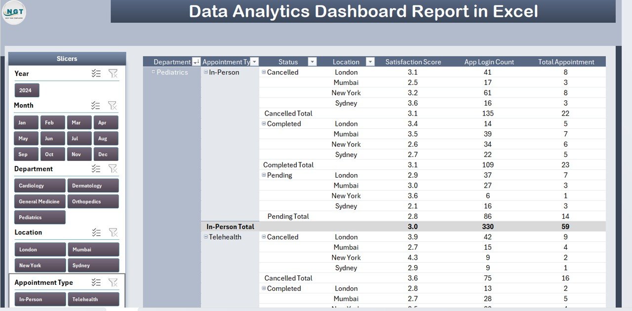
Report page — left-side slicer plus a printable Information Table
The Report page exists for one job: the weekly PDF that goes to leadership. The left-side slicer lets the user filter the Information Table by Department, Location, or Appointment Type. The table itself is row-by-row appointment data — exactly what an ops lead needs to attach to a status email.
Print to PDF directly from this sheet. Page breaks and column widths are pre-tuned for letter-size landscape printing.
3. Data Sheet
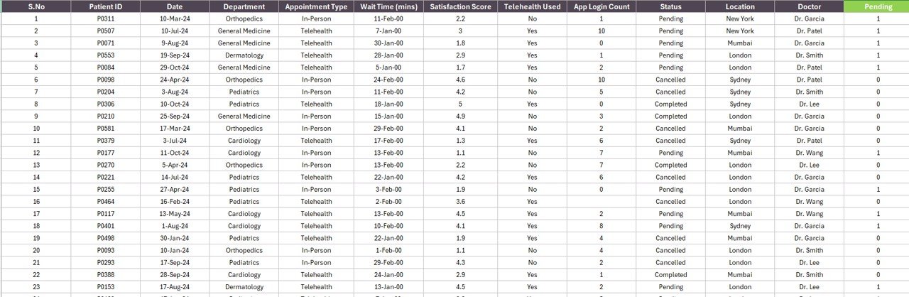
Data sheet — paste your appointment log here, keep the column headers
The Data sheet is the single source of truth. The columns are pre-set: Date, Department, Appointment Type, Location, Status (Booked / Cancelled / Pending / Completed), Satisfaction Score, and App Login flag. Paste your appointment log into the rows beneath the header. Don’t rename the headers or the pivot tables on the Support sheet will break.
4. Support Sheet
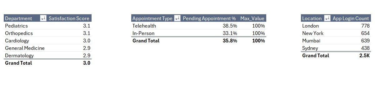
Support sheet — pivot tables that feed every chart on the Summary page
The Support sheet is the engine room. Every chart on the Summary and Report pages is sourced from a pivot table here. To extend the model — say, add an Appointment Source dimension — you’d build a new pivot here, then point a new chart at it. For most users, the Support sheet stays hidden from end users via Format → Hide Sheet.
Data Analytics Dashboard Report in Excel vs. Google Sheets vs. Paid BI SaaS — Feature Comparison
| Feature | Data Analytics Dashboard Report (Excel) | Google Sheets equivalent | Power BI Pro / Tableau / Domo |
|---|---|---|---|
| Cost | $7.99 one-time | $8–$12 one-time | $10–$70 / user / month |
| Platform | Microsoft Excel (desktop) | Google Sheets (browser) | Standalone BI app |
| Setup time | Under 10 minutes | 10–15 minutes | 2–5 days |
| Works offline | ✅ | ❌ | ❌ (mostly) |
| Slicer-based filtering | ✅ 2 slicers | Slicers (limited) | ✅ |
| Year-1 cost at 5 users | $7.99 total | $8–$12 total | $600–$4,200 |
| Vendor lock-in | None — your file | None — your file | High |
For teams that want a refreshable, slicer-driven appointment analytics report without paying $25–$70 per user per month for Power BI Pro or Tableau, the Data Analytics Dashboard Report in Excel sits in the sweet spot.
Who Should Use This Template
Perfect for:
- Operations leads at appointment-driven businesses tracking 50–10,000 appointments per month
- Customer service managers who report weekly on cancellation %, pending tickets, and CSAT by department
- Small-to-mid healthcare practices, telehealth providers, and multi-location service brands needing a single Excel report for QBRs
- Excel-comfortable analysts who want pivot-refresh control without learning DAX or Power Query M
Not a fit if:
- You need real-time API connections to a booking platform — this is a paste-and-refresh report, not a live integration
- Your team works exclusively on mobile — desktop Excel only for full slicer support
- You need SOC 2 audit logs or row-level security on the report itself
Real-World Use Cases
Priya runs operations at a 12-location dental chain. Every Monday, she exports the previous week’s appointment log from her practice-management system, drops it into the Data sheet, and clicks Refresh All. She then opens the Summary page, picks a Location from the right-side slicer, and flags any clinic where the Cancelled Appointment % crosses 8%. The printed Report page is her leadership deliverable — five minutes of work, no Power BI license, no analyst dependency.
Marcus is a customer-service director at a 60-person SaaS firm. He repurposed the report by mapping his support-ticket data to the appointment columns: ticket type → Appointment Type, agent team → Department, customer region → Location. The Satisfaction Score by Department chart became the centerpiece of his QBR slide. He estimates the template replaced a $1,440-per-year Tableau Creator seat for one analyst — a 99.4% cost reduction for the same level of insight.
Lina manages a 4-location salon group. She uses Total Appointment by Month for stylist headcount planning and the App Login Count by Location chart to identify which branches are pushing customers toward online self-booking. The Pending Appointment % by Appointment Type chart tells her which services have the highest no-show risk before she invests in promotions or reminder campaigns.
Advantages of the Data Analytics Dashboard Report
- One-time cost beats subscription stack. A 5-person team using Power BI Pro pays $840 in year one. The same team using this report pays $7.99 — a 99% reduction.
- No DAX, no Power Query M, no learning curve. If you can paste data into a sheet and click Refresh All, you can run this report.
- Print-ready leadership pack built in. The Report page is pre-formatted for letter-size landscape PDF — no manual formatting before every weekly send.
- Pivot model is fully exposed. Unlike SaaS dashboards where the model is locked behind a vendor’s UI, every pivot is right there on the Support sheet for you to extend.
- Mac and Windows parity. Zero VBA means the file opens identically on both platforms — no “this template only works on Windows” surprises.
Opportunities for Improvement
It’s worth being honest about what this report doesn’t do. Live API connections to booking systems aren’t included — you have to export and paste, which is fine for weekly cadences but not for real-time monitoring. Mobile Excel can read the file but slicers behave inconsistently, so phone-first workflows aren’t ideal. And if your data volume crosses ~100,000 appointments, you’ll want to move to Microsoft Power BI for performance reasons — but at that scale, you’ve also outgrown a $7.99 template.
Best Practices
- Keep the Data-sheet headers exactly as shipped. Renaming a header silently breaks the pivot tables on the Support sheet.
- Refresh first, then look. Always click Data → Refresh All after pasting new rows. The pivots don’t auto-refresh on data change in Excel by default.
- Hide the Support sheet from end users. Right-click the tab → Hide. They’ll only see Summary, Report, and Data.
- Use the workbook theme to re-skin in 30 seconds. Page Layout → Themes — every chart inherits the new colors.
- Save a clean master copy. Before you start dropping production data in, duplicate the file and rename it with your fiscal-period suffix.
Explore Relevant Templates
Browse the full Excel Reports library on NextGenTemplates, or pair this with related products:
- Public Relations (PR) Report in Excel — same 4-page structure, tuned for media-relations teams.
- Mental Health Services Report in Excel — appointment analytics for behavioral-health practices.
- Administration Report in Excel — cross-departmental ops reporting.
- Telehealth Dashboard in Excel — fuller dashboard with more pages and KPIs ($17.99).
- Medical Practice Dashboard in Google Sheets — Google Sheets equivalent for practice analytics.
Frequently Asked Questions
What KPIs does the Data Analytics Dashboard Report in Excel track?
The Data Analytics Dashboard Report tracks 5 headline appointment KPIs: Cancelled Appointment %, Pending Appointment % by Appointment Type, Satisfaction Score by Department, App Login Count by Location, and Total Appointment by Month. All five refresh automatically when you replace the sample data on the Data sheet.
Does this Excel report work on Mac?
Yes. The Data Analytics Dashboard Report works in Microsoft Excel for Mac (2019 and later). Slicers, pivot tables, and Refresh All behave the same as on Windows, and there are no VBA macros so there’s no macro-security prompt to clear.
How long does setup take?
Under 10 minutes for a typical 1,000-row appointment log. Open the file, paste your data into the Data sheet under the existing headers, click Data → Refresh All on the ribbon, and every chart and KPI card on the Summary page rebuilds. No formula edits or chart-source repointing required.
How does this compare to Power BI Pro or Tableau?
Power BI Pro is $14 per user per month and Tableau Creator is $75 per user per month — both require modeling time and a license per analyst. The Data Analytics Dashboard Report in Excel is $7.99 one-time, runs in the Excel you already own, and covers most weekly appointment-reporting use cases without a subscription.
Can I add more departments, locations, or appointment types?
Yes. Add new values directly to the Data sheet and click Data → Refresh All. The slicers on both the Summary and Report pages auto-extend to include the new values. You can also add new fields to the pivot tables on the Support sheet to chart additional dimensions.
Is the file safe to share with security-conscious IT teams?
Yes. The Data Analytics Dashboard Report is a pure pivot-and-slicer Excel file with zero VBA macros. It opens without any “Enable Macros” warning, runs identically on Windows, Mac, and Excel for the web, and contains no external data connections by default.
About the Author
Built by PK — Microsoft Certified Professional with 15+ years of Excel, Google Sheets, and Power BI experience. Founder of NextGenTemplates, reaching 300K+ subscribers across YouTube channels (@PK-AnExcelExpert, @NextGenTemplates, @NeoTechNavigators). Every template is hand-built and tested before release.
Conclusion
The Data Analytics Dashboard Report in Excel is the report file you keep open every Monday morning. Four worksheets, two slicers, five charts, one click to refresh — and a $7.99 one-time price that pays itself back the first time you skip a Tableau seat. If you run weekly appointment-reporting cadences, this is the smallest, simplest, fastest file that gets the job done without a subscription stack.
👉 Click here to Purchase the Data Analytics Dashboard Report in Excel
✅ Instant download · One-time payment · No subscription
🎥 For step-by-step Excel tutorials, visit YouTube.com/@PK-AnExcelExpert
📅 Last updated: April 2026