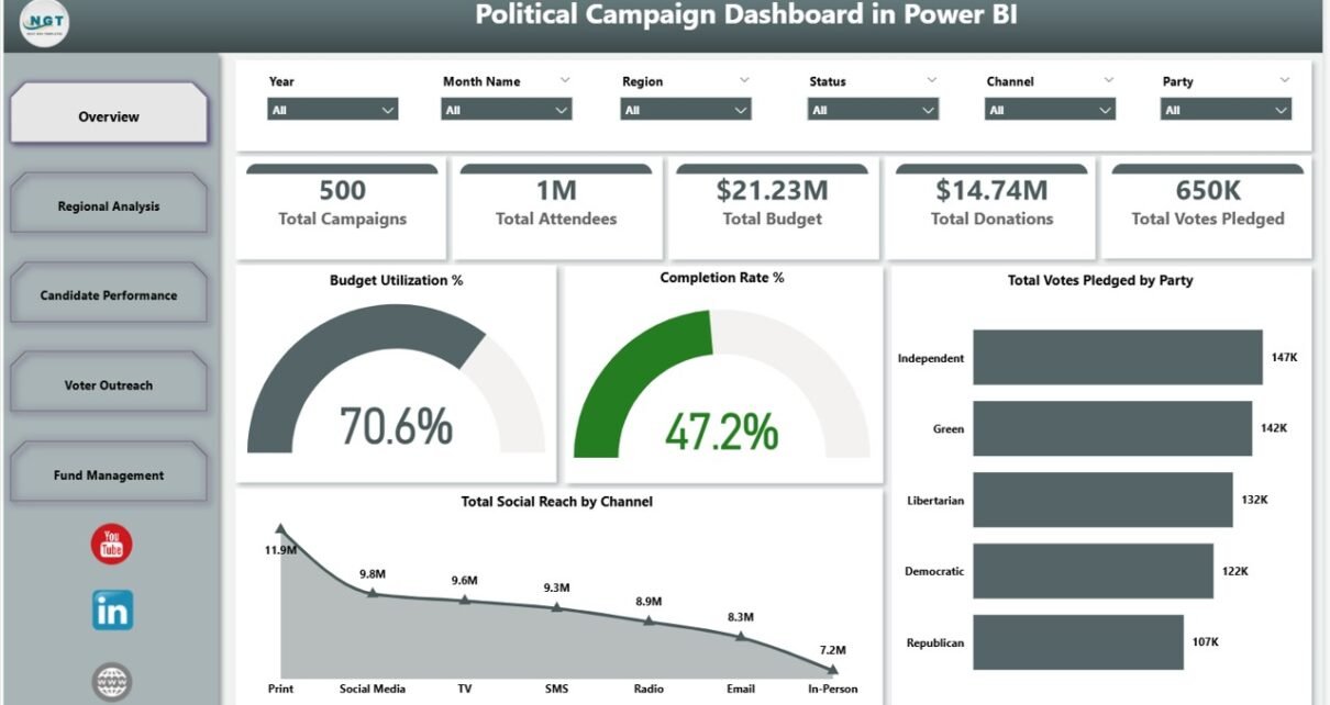
The Political Campaign Dashboard in Power BI tracks 5 headline campaign KPIs across 5 interactive report pages, with 16+ pre-built Power BI visuals and cross-filter slicers wired through a single dataset. Setup takes under 10 minutes — point Power BI Desktop at your campaign data file, click Close & Apply, and every KPI card, chart, and slicer on the Overview, Regional Analysis, Candidate Performance, Voter Outreach, and Fund Management pages refreshes automatically.
🌍 Join 8,400+ teams in 40+ countries using NextGenTemplates to replace paid SaaS tools with one-time-purchase Excel, Google Sheets, Power BI, and HTML templates.
✅ Instant download · One-time payment · No subscription · No per-user fees · Lifetime access
👉 Click here to Purchase the Political Campaign Dashboard in Power BI
Introduction
Modern political campaigns generate enormous amounts of operational data — donations, voter pledges, rally attendance, social-channel reach, constituency-level performance, and ever-shifting budgets. According to the U.S. Federal Election Commission, U.S. political committees raised over $15.9 billion in the 2024 cycle, and the campaigns that won were almost always the ones that turned that data into clear weekly decisions instead of letting it sit in spreadsheets.
The Political Campaign Dashboard in Power BI is built for exactly that. It is a single Power BI Desktop file (.pbix) that consolidates campaigns, candidates, parties, donations, voter outreach, and fund management into a fully cross-filtered analytics report. It works for a local council race, a state-assembly campaign, a national party operation, or a political consultant managing multiple clients — all from one file, with no premium capacity, no gateway, and no monthly software fees. Pair it with the broader Power BI Dashboard Templates library on NextGenTemplates if you also need adjacent reporting tools for fundraising, events, or marketing.
Key Features of Political Campaign Dashboard in Power BI
🔹 5 interactive report pages — Overview, Regional Analysis, Candidate Performance, Voter Outreach, and Fund Management — each focused on a specific decision-making angle. Together they cover every operational lever a campaign manager pulls during a typical election cycle.
🔹 5 KPI cards on the Overview page — Total Campaigns, Total Attendees, Total Budget, Total Donations, and Total Votes Pledged. Each card recalculates instantly when you swap the underlying dataset via Power Query.
🔹 16+ pre-built Power BI visuals across the 5 pages, including Budget Utilization % (gauge), Completion Rate % (gauge), Total Votes Pledged by Party, Total Social Reach by Channel, Total Budget by Region, Total Attendees by State, Total Donations by Party, and Total Amount Spent by Campaign Type.
🔹 Cross-filter slicers on every page — filter the entire report instantly by Party, Region, Candidate, Voter Segment, or Campaign Type. One slicer click cascades through every visual on the page.
🔹 Fully unlocked .pbix file — edit DAX measures, rewire visuals, rebrand colors to your party palette, and republish without restrictions or licensing locks.
🔹 Runs on free Power BI Desktop — no Power BI Pro, Premium, or premium capacity required. Only need Pro if you want to publish to Power BI Service for cloud sharing.
🔹 Works offline after download — no internet connection required once the .pbix is open. Power BI Mobile (iOS / Android) also supported for in-the-field viewing.
Dashboard Pages Explanation
1. Overview Page — The cross-campaign command center. Five KPI cards display Total Campaigns, Total Attendees, Total Budget, Total Donations, and Total Votes Pledged. Below the cards, four headline visuals deliver the strategic read: Budget Utilization % (gauge) tracks how much of allocated funds you have deployed; Completion Rate % (gauge) shows progress against planned milestones; Total Votes Pledged by Party compares pledged-vote share across parties; and Total Social Reach by Channel shows where digital impressions are converting into engagement. Slicers on the right filter every card and visual in one click.
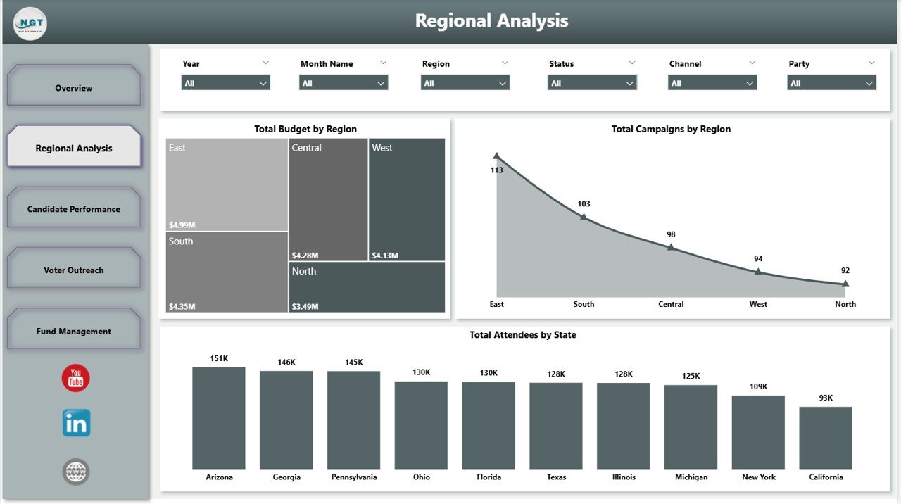
Regional Analysis
2. Regional Analysis — Geographic deep-dive covering Total Budget by Region, Total Campaigns by Region, and Total Attendees by State (Power BI map visual). Use this page to identify which regions over-perform on attendance, where budget is concentrated, and which states need a field-staff push mid-cycle. This is where state directors make the call to redirect resources before the final 30 days.
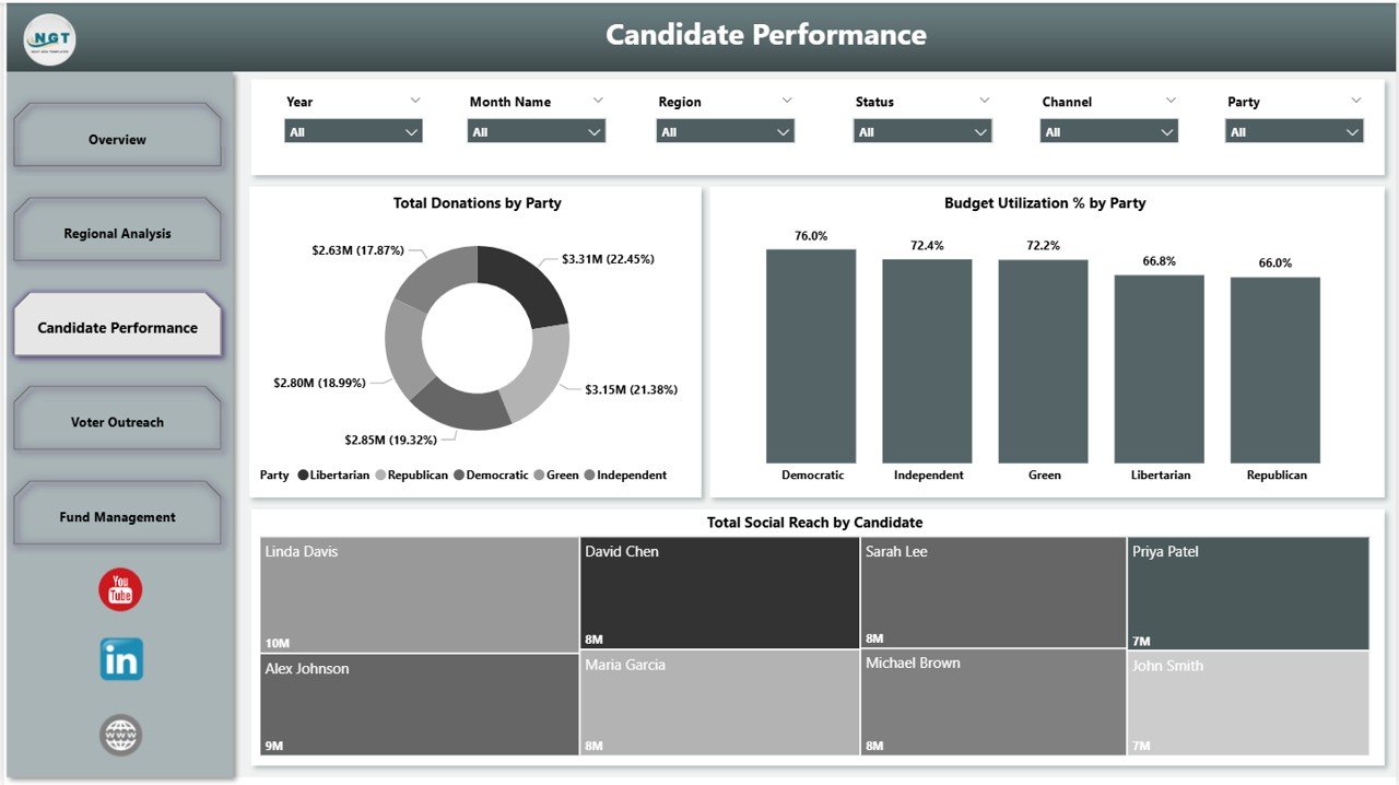
Candidate Performance
3. Candidate Performance — Per-candidate and per-party scorecards with Total Donations by Party, Budget Utilization % by Party, and Total Social Reach by Candidate. This page is the one party leadership stares at every Monday — it tells you which candidates resonate with donors and voters, which are spending efficiently, and which need strategic intervention before runoff weeks.
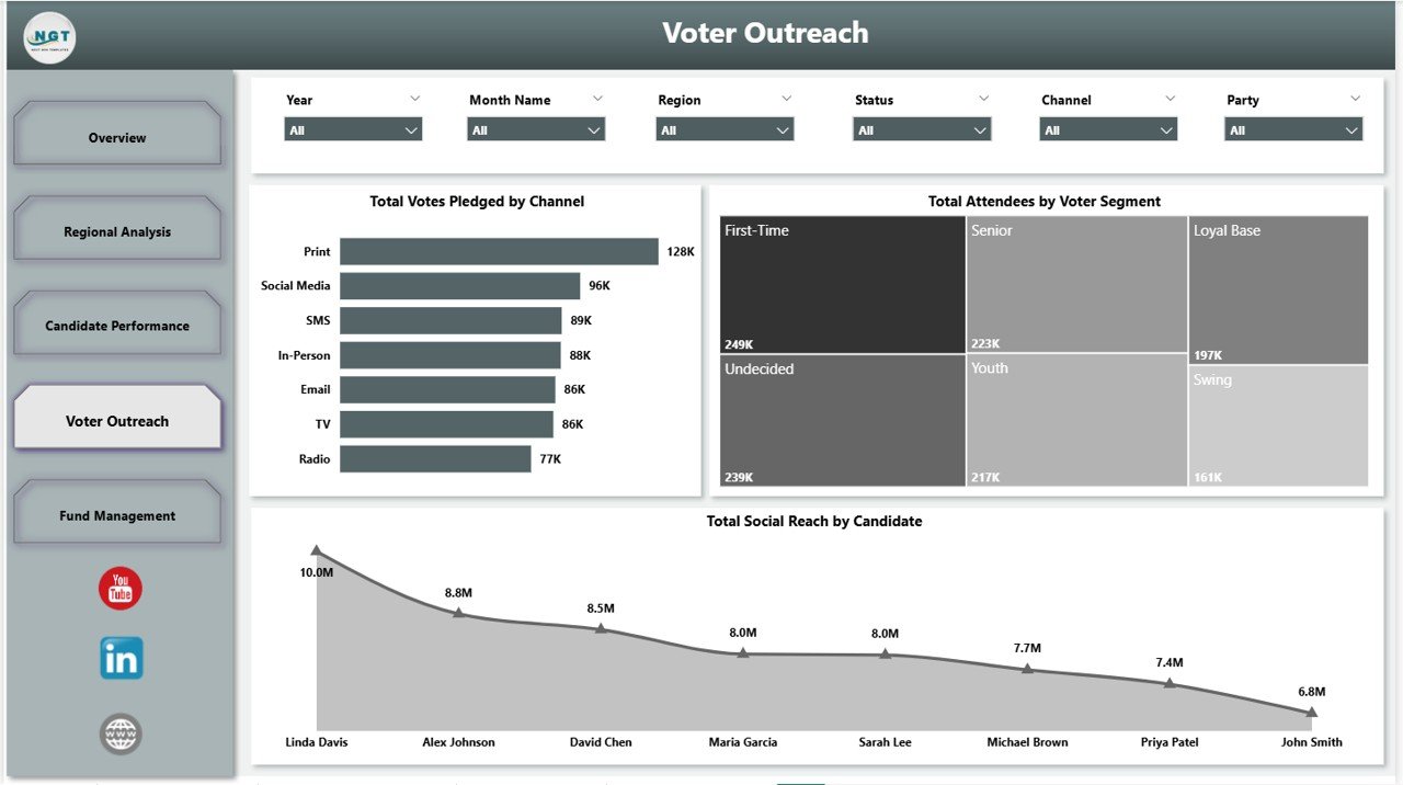
Voter Outreach
4. Voter Outreach — Three visuals focused on engagement mechanics: Total Votes Pledged by Channel (donut), Total Attendees by Voter Segment, and Total Social Reach by Candidate. Use this page to optimize tactic-level decisions — door-knocking vs. town halls vs. social ads — based on which channels and demographics convert reach into pledged votes during the final 30 days.
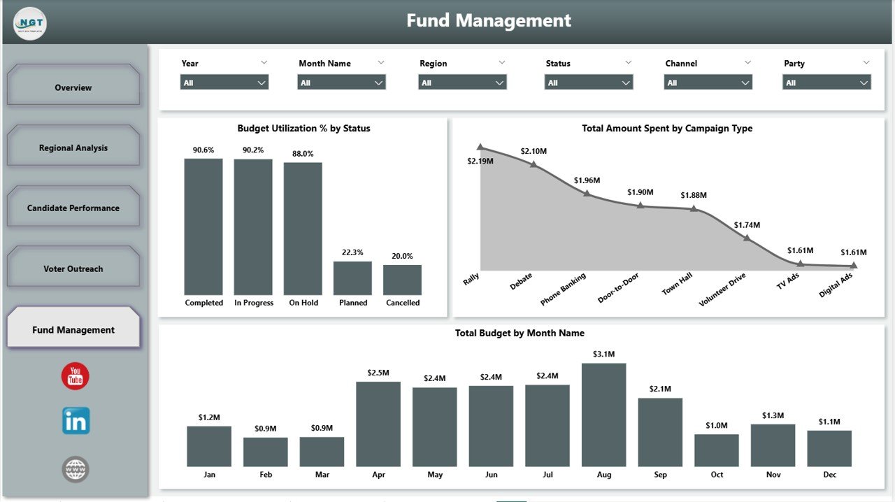
Fund Management
5. Fund Management — The treasurer’s page. Three visuals cover Budget Utilization % by Status, Total Amount Spent by Campaign Type, and Total Budget by Month Name. Spot overspending early, defend audit-ready budgets, and assemble the numbers you need for FEC quarterly filings or your country’s equivalent regulatory disclosure.
Political Campaign Dashboard in Power BI vs. Tableau / Qlik vs. NGP VAN / NationBuilder — Feature Comparison
| Feature | Political Campaign Dashboard in Power BI | Tableau / Qlik Sense | NGP VAN / NationBuilder / Salesforce for Nonprofits |
|---|---|---|---|
| Cost | $17.99 one-time | $70 – $1,200 per user / year | $50 – $500+ per month |
| Platform | Power BI Desktop (free) | Tableau Desktop / Qlik Sense | Proprietary SaaS |
| Setup time | Under 10 minutes | 1 – 3 days (build from scratch) | 2 – 8 weeks onboarding |
| Pre-built campaign KPIs | ✅ 5 cards + 11 visuals out-of-box | ❌ Build your own | ✅ But CRM-focused, not analytics-first |
| Cross-filter slicers | ✅ Native (Party · Region · Candidate · Segment · Campaign Type) | ✅ With manual setup | Limited (vendor UI) |
| Customizable visuals | Full (.pbix unlocked) | Full | Limited (vendor-controlled) |
| Mobile access | ✅ Power BI Mobile | ✅ Tableau Mobile | ✅ Web + mobile |
| Voter file integration | Manual import via Power Query | Manual import | Native (state voter files) |
| Year-1 cost at 5 users | $17.99 total | $350 – $6,000 | $3,000 – $30,000+ |
| Best for | State, party, consultant operations | Custom enterprise analytics builds | National presidential campaigns |
For state and party-level campaigns that need enterprise-grade analytics across regions, candidates, and budgets without paying $3,000+ per year for a hosted political CRM, the Political Campaign Dashboard in Power BI sits in the sweet spot — production-ready visuals on day one, full DAX control when you need it.
Who Should Use This Template
✅ Perfect for:
- State and parliamentary campaign managers running 10 – 100 constituency races who want Power BI’s visual depth over Excel.
- Party organizers tracking 5 – 50 candidates simultaneously across regions, donations, votes pledged, and budget.
- Field directors managing voter outreach across constituencies, events, and demographics with Power BI Mobile for in-the-field viewing.
- Campaign treasurers and PAC managers monitoring budgets and net fund balance for FEC, ECI, or equivalent regulatory filings.
- Political consultants delivering Power BI dashboards to multiple candidate, party, and PAC clients via Power BI Service.
- Civic-tech and political-tech startups building reporting layers for their clients without reinventing the visual stack.
❌ Not a fit if:
- You are running a national presidential campaign with 1M+ voter records — use NGP VAN, NationBuilder, or a custom data warehouse.
- You need automated SMS or email blast capability — this is an analytics report, not an outreach CRM.
- You don’t want to install Power BI Desktop — consider the Political Campaign Dashboard in Excel edition instead.
Real-World Use Cases
🔹 State Assembly Campaign Manager. Sarah is running a 12-constituency state assembly campaign in the Midwest. Every Sunday night she swaps the previous week’s outreach export into Power Query, hits Refresh, and the Voter Outreach page tells her that Total Social Reach by Channel shows Instagram outperforming Facebook 3-to-1 among the 18–34 voter segment. She redirects $4,000 of social-ad spend from Facebook to Instagram, lifting Total Votes Pledged by 18% in the final 30 days of the cycle.
🔹 State Party Organizer. The state party tracks Total Donations by Party and Budget Utilization % by Party across 47 candidates. The Candidate Performance page surfaces 3 candidates burning treasury 40% faster than donations come in. Leadership uses that flag to redirect emergency support and put those candidates on a tighter weekly cash-flow review before runoff weeks — saving two seats from financial collapse.
🔹 Campaign Treasurer. Marcus is the treasurer for a congressional campaign. He uses the Fund Management page to monitor Total Amount Spent by Campaign Type against Total Budget by Month Name. The audit-ready monthly view cuts his FEC quarterly filing prep from 6 hours to 90 minutes — and during October reconciliation, the dashboard caught a $2,300 vendor overcharge that would otherwise have gone unnoticed until the post-election audit. For event-specific tracking, he pairs it with the Event Management Analysis Dashboard in Excel alongside this one.
Advantages of Political Campaign Dashboard in Power BI
The biggest single advantage is cost-versus-capability. A typical political CRM like NGP VAN or NationBuilder runs anywhere from $3,000 to $30,000 per year depending on seat count and add-ons. Tableau or Qlik Sense desktop licenses run $70 – $1,200 per user per year. This dashboard delivers 80% of the analytics value those tools provide for a one-time $17.99 purchase — and the 80% you get is exactly the part most campaign managers use day-to-day: KPI snapshots, cross-filter analysis, and budget tracking.
The second advantage is visual depth on free software. Power BI Desktop’s visualization engine is genuinely best-in-class — interactive cross-filtering, native map visuals, DAX measures, and conditional formatting all out of the box at zero subscription cost. You get enterprise visualization quality without the enterprise subscription. For sharing, you can either email the .pbix file directly or publish to Power BI Service with a Pro license.
The third advantage is auditability and portability. Every number on the dashboard traces back to a specific row in the source dataset via Power Query. When a journalist or compliance officer asks “where did that number come from?”, you can answer in seconds. And because the .pbix is fully unlocked, there is no vendor lock-in, no admin account to transfer during campaign-staff transitions, and no exit data extraction process. You own the file.
Opportunities for Improvement
This template is a reporting layer, not an outreach engine. It does not import voter files automatically, send SMS or email blasts, or integrate natively with payment processors like ActBlue or WinRed. If you need any of those capabilities, you will pair this dashboard with a dedicated tool for that one job rather than expecting the dashboard to replace it.
Power BI Desktop is a Windows-only application (macOS users have to run it via a Windows VM or use Power BI Service in a browser). If your team is Mac-heavy and you cannot use Power BI Service, the Excel edition is the better choice. Power BI Mobile works on iOS and Android for viewing, but editing visuals requires Power BI Desktop on Windows.
Best Practices
Update the source dataset on a fixed weekly cadence — Sundays work well so the dashboard is fresh for Monday leadership reviews. Use Power Query parameters to switch between sample data and your live dataset cleanly. Save versioned copies each Friday (e.g. PoliticalCampaign_2026-W18.pbix) so you have a clean weekly audit trail. And use slicers to filter before presenting — leadership absorbs filtered views (single party, single state) much faster than the full unfiltered dashboard. When publishing to Power BI Service, set up row-level security (RLS) if you need to restrict candidates to seeing only their own data.
Explore Relevant Templates
If this template is useful for you, also consider:
🔹 Political Campaign Dashboard in Excel — The same campaign analytics ported to Excel for teams that don’t use Power BI Desktop.
🔹 Influencer Campaign Dashboard in Power BI — Track multi-creator marketing campaign ROI with the same Power BI design language.
🔹 Nonprofit Grant Dashboard in Power BI — Grant pipeline, donor segmentation, and fundraising analytics for political-adjacent nonprofits and PACs.
🔹 Event Management Analysis Dashboard in Google Sheets — Manage rallies, town halls, and campaign event logistics end-to-end.
🔹 Browse all Power BI Dashboard Templates across 50+ industries.
Frequently Asked Questions
What KPIs does the Political Campaign Dashboard in Power BI track?
The Political Campaign Dashboard in Power BI tracks 5 headline KPIs on the Overview page — Total Campaigns, Total Attendees, Total Budget, Total Donations, and Total Votes Pledged — plus 11+ supporting visuals covering Budget Utilization %, Completion Rate %, Total Social Reach by Channel and Candidate, Total Attendees by State and Voter Segment, and Total Amount Spent by Campaign Type.
How does this compare to NGP VAN or NationBuilder?
NGP VAN and NationBuilder are full political CRMs costing $3,000–$30,000 per year with multi-week onboarding. The Political Campaign Dashboard in Power BI is a $17.99 one-time purchase you own outright. It covers analytics and reporting for 80% of campaigns but does not include voter-file integration, automated outreach, or payment processing — pair it with a dedicated CRM for those.
How long does setup take for this Power BI campaign dashboard?
Setup takes under 10 minutes. Open the .pbix file in Power BI Desktop, click Transform Data → Data Source Settings to point the source to your own campaign Excel or CSV file, and click Close & Apply. Every chart, KPI card, and slicer across all 5 report pages refreshes automatically against your data — no DAX rewriting required.
Do I need a paid Power BI license to use this dashboard?
No. The Political Campaign Dashboard in Power BI runs on Power BI Desktop, which is completely free from Microsoft. You only need a Power BI Pro or Premium license if you want to publish the dashboard to Power BI Service and share it via cloud links with your team. The .pbix file works fully offline on Power BI Desktop.
Can I customize the parties, candidates, and constituencies in this dashboard?
Yes. The Political Campaign Dashboard in Power BI is fully dynamic and data-driven. When you swap in your own party names, candidate names, constituencies, voter segments, event types, and social channels via Power Query, every visual, slicer, and KPI card automatically reflects your unique campaign data on the next refresh.
Can I use this template for non-U.S. political campaigns?
Yes. The Political Campaign Dashboard in Power BI is region-agnostic. Replace U.S.-specific labels (states, parties, constituencies) with your country’s political structure — UK constituencies, Indian Lok Sabha seats, Canadian ridings, Australian electorates. All visuals auto-adapt to whatever geographic and party labels you import into Power BI.
Is this dashboard suitable for FEC reporting and audit purposes?
Yes. The Fund Management page tracks Total Budget by Month Name, Total Amount Spent by Campaign Type, and Budget Utilization % by Status — all the visuals you need to support FEC quarterly filings and treasurer reports. Export any page as PDF directly from Power BI Desktop. Keep a separate audit log of source documents alongside this dashboard for full compliance.
About the Author
Built by PK — Microsoft Certified Professional with 15+ years of Excel, Google Sheets, and Power BI experience. Founder of NextGenTemplates, reaching 300K+ subscribers across YouTube channels (@PK-AnExcelExpert, @NextGenTemplates, @NeoTechNavigators). Every template is hand-built and tested before release.
Conclusion
The Political Campaign Dashboard in Power BI is the fastest way to consolidate campaigns, candidates, parties, donations, voter outreach, and fund management into one decision-ready Power BI file — without paying $3,000+ a year for a hosted political CRM or $1,200/user/year for Tableau. Five interactive report pages, five headline KPIs, 16+ Power BI visuals, cross-filter slicers on every page, and a fully unlocked .pbix that you own outright.
👉 Click here to Purchase the Political Campaign Dashboard in Power BI
✅ Instant download · One-time payment · No subscription · Lifetime access
📅 Last updated: May 2026
🎥 Visit our YouTube channel for step-by-step video tutorials: YouTube.com/@PK-AnExcelExpert