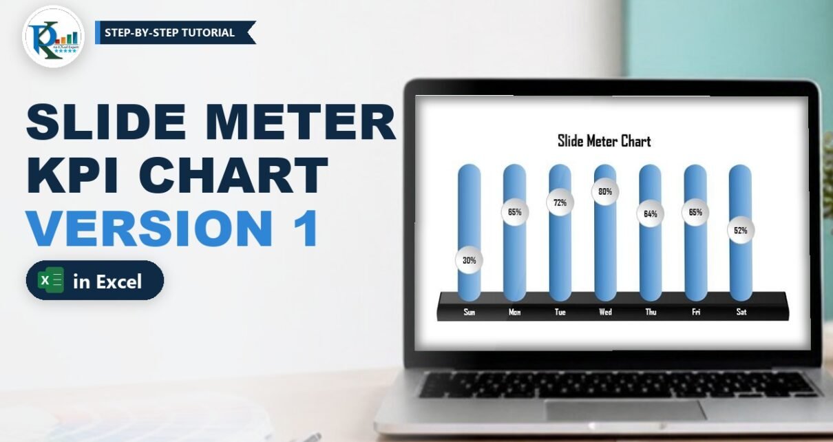
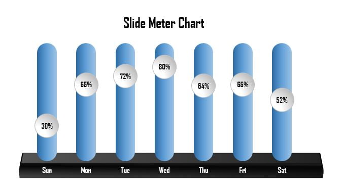
A slide meter chart in Excel shows a KPI as a bubble that slides up and down a rounded track, so you can read every day’s score at a glance. In this tutorial you build Version 1 of PK’s slide meter: a solid blue pill for each day, a glossy bubble with the percentage inside it, and a 3-D black base underneath. It is a combo of a clustered column chart and a line chart with markers, plus a few shapes. No VBA, and it works in Excel 2013, 2016, 2019, 2021 and Microsoft 365.
Watch the Video Tutorial
In the video PK builds this chart from a blank workbook: the Max helper column, the column chart, the rounded-rectangle bars, the oval markers, the data labels and the 3-D base.
What You Will Build
- Seven rounded tracks, one per day, made by pasting a gradient rounded rectangle into a 100% helper series.
- A sliding bubble on each track: a line-with-markers series whose markers are replaced by a glossy oval.
- Value labels inside the bubbles in Agency FB, centred on each marker.
- A 3-D base made from a bevelled, rotated rectangle sent behind the chart.
- A fully live chart: change a percentage and the bubble moves to the new height.
The Data Behind the Slide Meter Chart
The chart uses a small two-column table: the day name and the service level (SL%) for that day.
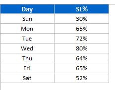
In the video the table sits in A1:B8: Day in column A (Sun to Sat) and SL% in column B (30%, 65%, 72%, 80%, 64%, 65%, 52%). Turn off gridlines from the View tab first so the finished chart sits on a clean sheet.
Part 1: Build the Base Combo Chart
Step 1: Add the Max helper column
Type Max in C1 and enter 100% in C2, then fill it down to C8. A service level can never go above 100%, so this column describes the full height of every track. The Max series draws the track; the SL% series draws the position on it.
Step 2: Insert a clustered column chart
Select A1:C8 and go to Insert › Charts › Column › 2-D Clustered Column. You now see two columns per day: a short blue SL% column and a full-height orange Max column.
Step 3: Fix the vertical axis from 0 to 100%
Right-click the vertical axis, choose Format Axis and set Minimum = 0 and Maximum = 1 (which is 100%). Fixing the bounds matters: if Excel picks the axis automatically, it may stretch it to 120% and your tracks will no longer reach the top. Once the bounds are set, select the axis and press Delete. Then use the Chart Elements (+) button to remove the gridlines and the legend.
Step 4: Make the columns wider
Right-click a column, choose Format Data Series and change the Gap Width from 219% to 100%. Wider columns leave room for the bubble.
Part 2: Turn the Max Columns into Rounded Tracks
Step 5: Draw a rounded rectangle
Go to Insert › Shapes › Rectangles › Rounded Rectangle and draw a tall, narrow shape next to the chart. Drag the small yellow handle to increase the corner radius until both ends are fully round, like a pill.
Step 6: Give it a gradient and no outline
Right-click the shape, choose Format Shape › Fill & Line and set:
- Fill: Gradient fill, Preset gradient Medium Gradient – Accent 1 (the third one from the top).
- Direction: one of the Linear directions, so the light runs across the bar.
- Line: No line.
Step 7: Paste the shape into the Max series
Copy the shape (Ctrl+C), click once on any Max column so the whole series is selected, and paste (Ctrl+V). Every Max column now becomes a blue pill. Excel stretches the pasted picture to the size of each column, which is why all seven tracks look identical.
Part 3: Add the Sliding Bubble
Step 8: Change SL% into a line with markers
Right-click the SL% series and choose Change Series Chart Type. For SL% pick Line with Markers and click OK. The value is now a point on a line instead of a column, and each point sits at the height of its percentage on the 0 to 100% axis.
Step 9: Draw a glossy oval
Go to Insert › Shapes › Basic Shapes › Oval and click on the sheet to create one. In Format Shape set a gradient fill with the preset Top Spotlight – Accent 3, keep a solid line and change its colour to a light grey. In the Size options make the height and width equal (PK uses 0.5 and 0.5) so it is a perfect circle.
Step 10: Paste the oval onto the markers and hide the line
Copy the oval, click the line series and press Ctrl+V. Each marker turns into the bubble. Now right-click the line, choose Format Data Series › Fill & Line › Line and select No line. Only the bubbles are left, each sitting on its own track.
Step 11: Put the value inside each bubble
Right-click a bubble and choose Add Data Labels. Then right-click a label, choose Format Data Labels and set Label Position = Center. On the Home tab make the labels bold, font Agency FB, size 11, black. Format the horizontal axis labels the same way (bold, Agency FB, size 12).
Part 4: Clean Up and Add the 3-D Base
Step 12: Remove the chart background
Select the chart and go to Format › Shape Fill › No Fill and Shape Outline › No Outline. Select the horizontal axis and set its Shape Outline to No Outline too. The chart is now transparent, so whatever sits behind it shows through.
Step 13: Build the base
Insert a plain Rectangle under the tracks. In Format Shape › Effects:
- 3-D Rotation: preset Perspective Relaxed, then nudge the Y rotation (in the video it ends at about 309.6°).
- 3-D Format: Top bevel Circle with a height of about 25 pt, so the front edge looks thick.
Give it a black fill and no outline, then right-click it and choose Send to Back so it sits behind the transparent chart.
Step 14: Make the day names readable
The day names now sit on the black base, so select the horizontal axis and change its font colour to white.
Step 15: Add a title and group everything
Add a chart title such as Slide Meter Chart in Agency FB, bold, black. Finally select the chart and the base shape, right-click and choose Group, so they move together.
How the slide meter works
- Max series (columns): always 100%, so every track fills the full 0 to 1 axis.
- SL% series (line with markers): plotted on the same axis, so a 30% point sits 30% of the way up the track and an 80% point sits near the top.
- Pasted shapes: the rounded rectangle replaces the column fill and the oval replaces the marker, which is why the chart still updates like any other chart.
- Fixed bounds: without Minimum 0 and Maximum 1 the bubbles and tracks would not line up.
Common Errors and Fixes
The tracks do not reach the top
The axis maximum is set to Auto. Re-add the axis if you deleted it, set Maximum to 1 and Minimum to 0, then delete it again.
Only one column turned into a pill
You clicked a column twice, which selects a single point. Click once so all seven Max columns are selected, then paste again.
The bubbles look like ovals, not circles
The oval’s height and width are different. Fix the size in Format Shape › Size, copy it again and repaste it on the line series.
A thin line still joins the bubbles
The line series still has a line. Open Format Data Series › Line and choose No line.
Tips
- Use it for any 0 to 100% KPI: quality score, conversion rate, attendance or on-time delivery. The video uses day-wise service level.
- Keep the Max column, even if you hide it with a white font. If you delete it, the tracks disappear.
- Try a different preset gradient on the rounded rectangle to match your dashboard colours, then repaste it into the Max series.
- Microsoft’s guide to using a picture in a chart covers picture and shape fills for chart series.
The Slide Meter Chart Series
This is the first of three versions. Once Version 1 works, try the next two:
- Semi-Filled Slide Meter Chart in Excel (Version 2): the track fills only up to the value.
- Slide Meter Chart with Target-Based Conditional Formatting (Version 3): bars turn red below target and green at or above it.
Want It Ready-Made?
If you would rather plug in your numbers than build the shapes yourself, the finished Slide Meter Chart – Version 1 template is available on NextGenTemplates.com, along with many more Excel templates. To learn charts, infographics and dashboards like this step by step, take the course Excel Pivot Tables & Dashboards: Basic to Advanced on NextGenTemplates Academy.
Related Tutorials
- Column Chart in Excel
- Line Chart in Excel
- Filling Circle Chart in Excel: KPI Infographic Without VBA
- 5 KPI Cylinder Chart in Excel
- Thermometer Chart in Excel
Frequently Asked Questions
What is a slide meter chart in Excel?
It is a KPI chart where each category gets a tall pill-shaped track and a round bubble slides up or down that track to show the value. In Excel it is a clustered column chart for the track plus a line with markers for the bubble, dressed up with shapes.
Why do I need a Max column with 100%?
The Max series draws the full-height track for every day. Because the axis runs from 0 to 1, a value of 100% always fills the whole height, so every track is the same size and the bubble shows how far along the track the KPI has reached.
Can I use this chart for KPIs other than service level?
Yes. Any percentage KPI that sits between 0% and 100% works, for example quality score, sales conversion, attendance or on-time delivery. Replace the SL% values and the day names with your own data.
Does the chart update when the data changes?
Yes. The bubble is a line marker linked to the SL% cells, so typing a new value moves the bubble and its data label straight away. Only the base shape and the title are static.
What is the difference between Version 1, Version 2 and Version 3?
Version 1 shows the value as a bubble on a solid track. Version 2 fills the track only up to the value, giving a semi-filled bar. Version 3 adds a target and colours each bar red or green with formulas.
Do I need VBA for the slide meter chart?
No. It is built with a normal combo chart, shapes pasted into the series and formatting options only, so it works in a standard .xlsx workbook.
About the Author
PK is a Microsoft Excel expert and trainer and the founder of PK: An Excel Expert and NextGenTemplates.com. He has been teaching Excel, Power Query and Power BI since 2016 on his YouTube channel.
Conclusion
A slide meter chart in Excel is just a column chart and a line chart sharing one 0 to 100% axis. The Max column becomes the track, the SL% line becomes the bubble, and a couple of pasted shapes and a 3-D base give it the finished look. Build it once with your own KPI, then move on to Version 2 and Version 3 to add semi-filled bars and target colours.